Project Updates
-
vr-mfa design document and presentation
Here is the design document and the presentation.
-
Final Design Document
Design Document PDF Final Presentation
Live Demos, Please Don’t Modify Them (you can play them though) http://mediabitch.mit.edu:8000/#69e77f63-42bf-46ed-9902-b9e40e2028c4 http://mediabitch.mit.edu:8000/#ec7fe0c6-486b-457a-89fd-379690e94a8a
-
Annotating the Air
Here is our final paper
and our final presentation
-
NewsConnect Design Document Final Draft
I. Project name
II. Team members
Meghana Bhat is a sophomore in Course 6 at MIT. For the NewsConnect project, Meghana created the code that made the app a reality. She worked to incorporate news data with our map, and transferred UI ideas into code.
Karleigh Moore is a junior in CMS at MIT. For the NewsConnect project, Karleigh initially worked on the news data scraper, but then focused on deciding what sorts of news data (keywords, sources, places) we would look for with a different scraper. She worked to brainstorm UI features, create mockups, and was in charge of creating the documentation and presentations regarding the project.
III. Concept overview/abstract
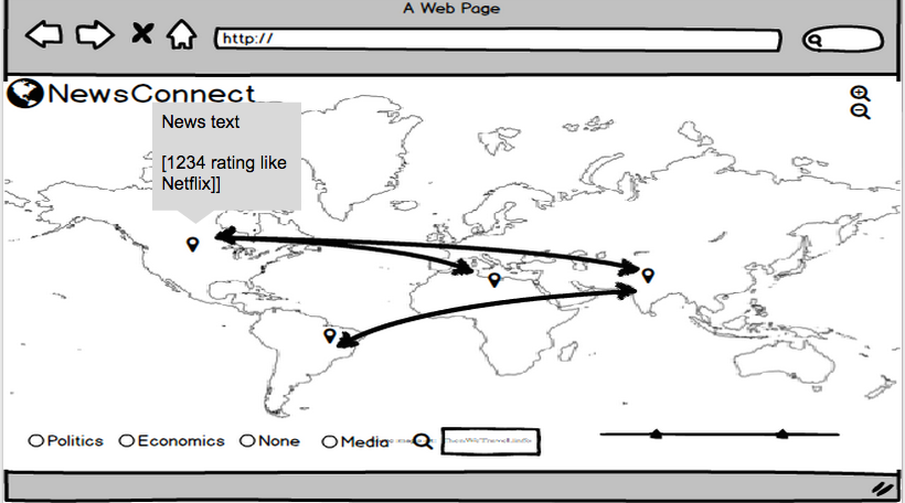
NewsConnect is a web application that allows users to see global connections in news, and makes it easy to find only the news you want to read.
Key features of NewsConnect include:
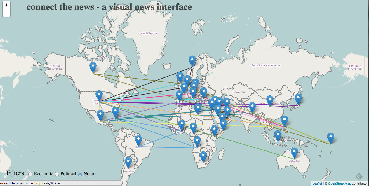
- Lines connecting points within nations (that represent an article). So if an article has to do with China and India, the two countries will have a connection line.
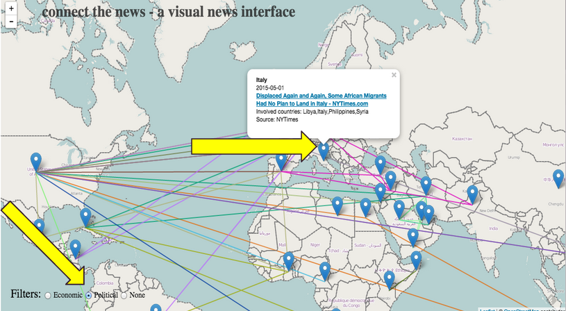
- Users can filter articles by category. This would make it easy, for example, to narrow down articles to only economics articles.
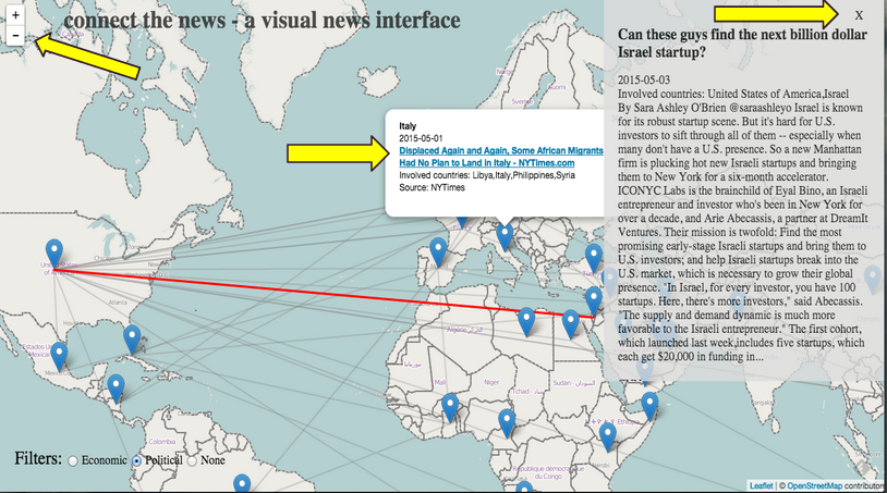
- Users can get a preview of an article by hovering over a map point.
- NewConnect will eventually include a timeline filter so that users can see articles in a particular time range, in addition to a specific category and/or country.
It’s very easy to find news articles to read on the internet, but it can be overwhelming to sift through so much text, and to find what you’re looking for beyond basic categories of “politics” and “economics”. In particular, with world news, it can be hard to track patterns of news across nations. A student might be doing a research project on international relations between, for example, China and European countries. He or she can look up news about China, or news about Europe, or news about the world, but seeing news connecting both locations, and seeing the development of that news over time, is significantly harder. A user might also, for example, have an interest in West African nations and articles relating to politics of the region. It would take a lot of effort to track news about the particular region related to one specific topic, especially if you want news from many sources.
To address these problems, we want to make NewsConnect, a visual and engaging news webapp. We want to avoid walls of text, and make the interface informative, but not intimidating. We did this by putting news articles on a world map, associating the articles with the countries discussed in the text, and visually showing links between countries mentioned. A user will have access to the news they are looking for (with the help of our features) without having to skim through many articles, disrupting their workflow as they are taken to new pages with every click. Better, they can investigate a particular news issue over time in a geographic context. NewsConnect is also a way to discover trends in world news including coverage, source bias, and more.
IV. Background research
We met with Liam Andrew, and he showed us a webapp called Gistory.co. Gistory.co is a visual news interface that lays articles on a map according to the location of the events in the article. We thought it was a great idea to overlay news on a map to give a clear visual idea of the places mentioned in the article, and we wanted to apply this concept to world news — keeping with the theme of visually connecting news content to places.
The MIT Center for Civic Media conducted a project that we thought was pretty useful too — CLIFF. CLIFF extracts people, places, and organizations from news articles, and it’s goal is to understand what the article is really about, rather than an amalgamation of all the places mentioned. These ideas were particularly relevant to our project because at times, an article about Egypt and Israel would be linked also to Korea because a Korean journalist was mentioned. We didn’t use CLIFF technology in our project, and we took care of this issue later by using webhose.io to gather location data provided by the news sites themselves. Though perhaps in the future, we would want to use something like CLIFF to do this instead, to eliminate any possible bias that exists from getting this information from the content source.
V. Project Developments/Process
The first phase of our project was to prototype and determine how we were going to gather our news data. We drew some paper sketches of what we wanted our interface to look like [see below]. We began to scrap news data from CNN using a scraper we built using the Newspaper Python library. Choosing a scraping method is something that we continued to have problems with throughout the project because there were a variety of pros and cons between different software. We settled on webhose.io to scrape news data. With webhose.io we can specify which new sites we want articles from, specify a popularity feature (to only include articles with a high number of hits, to increase the relevancy of a given article), and we can input keywords we want the scraper to look for within articles. This helped us establish our category feature on our web app. We decided on a few lists of terms commonly associated with “politics” and “economics” and so forth, and the scraper helps us to allow users to sort articles with these parameters. In the future, this capability will expand to include many more search terms, hopefully in some automated way. Additionally, webhose.io provides location data for some news sources which helps us get around using geopy for location information for the world map interface.
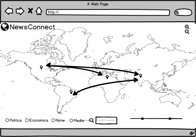
The second component of our project had to do with the user interface. We really wanted the focus of the project to be making reading news a more visual and interactive experience. We decided that having a full screen map with pins and connecting lines to indicate which articles were associated with which countries was the first component of our app. We wanted connecting lines to be color coordinated with topic: all the blue lines, for example, could represent articles about politics, and red lines could indicate economics. We thought that radio buttons would be the most straightforward option for users to select which news topics they’d like to see, but this could easily evolve into a multi-option selection process in the future, when we have more categories and comparison/connection data. When a user hovers over a country’s pinpoint, a list of articles about that country appear. A user can then hover over a specific article, and then only the paths connecting that article to various countries will be highlighted, all the other lines on the map turn more transparent. We wanted users to be sure that they found an article they want to read before they have to travel to the news site and sift through the article. By the time they are given articles to read, they already know the article’s topic and the countries the article deals with. Additionally, a preview of the article appears on the page if a user clicks on the article block element — the user can read this short preview and decide if they want to click the article link to go to the full article.
VI. Enabling Technologies
Balsamiq: A wireframing tool we used to prototype our project, and to create a vision for future directions of the app.
Leaflet: Leaflet is an open-source JavaScript library for making interactive maps. We used Leaflet to generate the map and it’s features that are the main visual component to our app.
Newspaper +Stanford NER + webhose.io : Our first data scraping setup used the Python library Newspaper, and then scanned the articles that it scraped using the Stanford Named-Entity-Recognition tool for location data. This wasn’t the best process because the NER wasn’t as consistent or accurate as we would’ve liked (an article mentioned the animal “turkey” and associated the article with the country Turkey). The Newspaper library didn’t have a way for us to extract category data either, which we decided was a key point of our project. We found that webhose.io was much better suited for our project. It’s an API that can gather information from any number of sources, and allows us to query by keyword. With this, we selected sources that we knew would provide location data, so we were able to get accurate location data and sidestepped using the NER. Additionally, we were able to easily implement category funtions with the data webhose.io scraped.
Heroku: Heroku is a cloud service that takes care of server management, and we hosted our app using Heroku.
Flask: Flask is a Python library for micro web application frameworks. We used this for our server related code.
Geopy: We used the Python Geopy library to match location data we got from the NER and later, webhose.io to places on the world map. The library contains coordinate data, so we were able to place articles in and connect them with the countries that mentioned them.
VII. Journey Map
a. The user will see a world map, populated with news
b. The user can change what he or she sees on the map by doing any combination of the following: - Selecting a country to zoom in on by double clicking on a region - Adjusting the timeline range with the slider bars - Selecting a specific news topic by checking a labeled radio button
c. The user can get a list of the articles pertaining to a specific country by hovering over the pin in the country.
d. The user can hover over an article in the the list of articles and see a preview of the article appear on the screen.
e. A user can click on the link to the article they see (before or after seeing the preview) and the article will open in a new tab. Or if a user decides that the article is not one they want to read, they can close the preview, and zoom back out to the world view.
VIII. Future Directions
With more time and access to more robust APIs, we would like to incorporate more news sources from all around the world, have more comprehensive category/search terms, and a way of saving, sharing, and rating news articles users discover on our app. We’d like to incorporate a time line feature using a slider bar that a user can interact with to indicate a range of dates they’d like to see news from. Additionally, we wanted to have a “Zoom back to world” button, which would be the Globe icon next to the site title — a standard way of returning to the home screen of a site.
VIII. Works Cited
https://civic.mit.edu/cliff-entity-extraction-and-geoparsing-for-news-articles
https://gistory.co/
-
MuRoam Final Presentation and Paper
Hi all,
To see our current progress check out our final slide deck that we have prepared! Click here to be directed.
We have had a few issues with formatting on Annotation Studio. We have our latest draft on Google drive. Click here to be directed.
We are happy to answer any questions.
Cheers,
Team MuRoam
-
Link to dry run NewsConnect presentation
https://docs.google.com/presentation/d/1aTa7jq9VqeMWC1wvPXu-jygGD5yVP_0_UecxVVlr3sA/edit?usp=sharing
-
Design Document Draft
Wubify.me
Yanni Coroneos Massachusetts Institute of Technology, Electrical Engineering and Computer Science Programmer
Corey Walsh Massachusetts Institute of Technology, Electrical Engineering and Computer Science Programmer
Abstract
In this paper we will describe a novel medium for collaborative audio synthesis. By combining the achievements of previous products and taking into account the needs of the user, we have created wubify.me. We will show how users at every level of expertise can meaningfully benefit from the featureset and we especially believe that our shareable user-contributed block library can elevate the experience of audio synthesis to a social activity.
Concept
We envision a collaborative sound generation platform, accessible through the web so that both amateurs and professionals can create sound and have fun together. There are current technologies, such as SuperCollider, that can be used to collaboratively generate sound but they are mostly a niche product that is exclusive to audio professionals who are also expert programmers.
These technologies are powerful, and lend themselves well to our goal of sound generation, but are difficult for everyday users to access. Therefore, we decided to build a visual representation of the interface to bridge the gap in experience levels. We’re also able to leverage the nature of this visual interface to enable both real-time collaboration and a shared repository of reusable prior work.
Like some other programs, the users have a set of transfer functions that they can manipulate and compose. Filters, function generators, and even interactive elements are in the repository. A key advantage of wubify.me though is that this is all done in the browser, including the final composition step that actually plays the sounds.
Background Research
The need for wubify.me was realized when a hobbyist electronic music composer expressed interest in a visual composition system. He complained about the current status of SuperCollider and its lack of portability. The whole system is complicated and clunky which makes it difficult for artists to distribute their work. Additionally, the complications prevent new users from entering the scene. Despite these shortcomings though, there are several things SuperCollider does extremely well.
SuperCollider is the current leader in the field of algorithmic music generation. By allowing users to create and manipulate audio signals directly in frequency space through the use of basic building blocks, electronic music composition became more accessible for everyone with a computer. The basic principle of SuperCollider carries through to wubify.me: signals are shaped through a tree of transfer functions. For example, a sine wave might go through a low pass filter which then is fed into a block to modulate the frequency of a square wave. This direct manipulation of the frequency domain gives the user complete control of the spectrum of the audio signal. By combining this approach with a conventional sequencer, like is present in Audacity or garageband, the audio signal can be completely specified in both frequency domain and in time domain. This is critical for electronically composed music which often relies on un-naturally occurring sounds and spectra.
Project Development
Our application has a few goals:
- Improve accessibility of existing tools
- Utilize that improved access to allow collaboration
- Allow for persistence and reuse of the collaborative works
To accomplish these goals, we designed and implemented a proof-of-concept application with the following basic requirements:
- A visual interface to a tool like SuperCollider
- Real-time collaboration over the internet
- A shared, persistent ‘block’ library
The basic premiss of the proposed application is such: commutations on sounds or sound generators can be represented as building blocks, and any set of composed blocks can be represented by a single block. Starting with the set of “unit generators” (“ugens”) provided by Flocking.js, users can compose blocks to create more complex sounds and processing pipelines.
This premiss lends itself well to accomplishing all three of our requirements. A visual interface must simply allow for basic graph manipulation. Real-time collaboration is done by synchronizing the states of the visual graph representation across the users’ browsers. Finally, a block library must allow users to upload the data representation of their creations to a centralized location and then serve that information to other users alongside the standard ugens.
The implementation of this project decomposes into a few parts:
- Flocking.js Representation
- Graph Representation
- User Interface - Shared block library, real time collaboration
- Web Serving
- Persistence
The primary ‘brains’ of the technology is the algorithm that converts the graph representation into the valid JSON object that Flocking.js requires. This algorithm traverses the graph, at each node it generates a corresponding Ugen descriptor, populated with default values and user specified options. Finally, it sews the fragments into a cloth that represents the network of commutations in the frequency domain.
Enabling Technologies
Our proof-of-concept application would not be possible without the help of a long list of enabling technologies. Most notably:
Flocking.js - Flocking is a SuperCollider inspired JavaScript library that provides a similar interface and operation. It has the benefit of being executable in the browser - greatly simplifying the process of delivering audio output to our users
JointJS/Rappid - “A complete diagramming toolkit.” [1] JointJS is a JavaScript library that provides support for visualization and interaction with graphs. Rappid provides a set of higher level features that greatly sped up the development process of our proof-of-concept. While JointJS has a free and open source MPL 2.0 license, Rappid is a commercial product that was provided free of charge for our academic use.
Node.js - A leading, open source web-server platform written on top of Chrome’s high performance V8 JavaScript runtime. Node provides a platform for both our file serving needs and our application’s runtime requirements.
Journey Map
Wubify.me has a straightforward UI. The user simply logs in and is presented with an empty graph and a myriad of ugens on a left side pane. As mentioned previously, ugens are like function generators; Triangle waves, sawtooth waves, and square waves are among the basic ugens currently available. The user drags a few ugen blocks into the empty space and notices that they have input and output ports. By dragging arrows from outputs to inputs, the user can cascade the ugens. Mathematically, this is equivalent to multiplying transfer functions. Each ugen can have different inputs but the most common ones are add, mul, freq, and phase. Connecting an output to each of these ports either adds the output to the base frequency, multiplies the output with the base frequency, changes the base frequency, or changes the phase angle of the target ugen block. From there the user composes ugens and then hears the result by clicking the play button. If desired, the current cascade of blocks can be saved into a new super-block in the user block library by clicking the save button.
Future Direction
Our proof of concept application provides the basics, but we believe that this project could be taken much further. A built in sequencer would allow for more natural coordination of multiple generators. Currently, a similar effect can be achieved with multiple delay blocks and triggers, but the process could be greatly streamlined for the common use-case.
While our implementation is built on Flocking.js, only relatively minor changes would be required to make it work with SuperCollider. The UI would be virtually unchanged (aside from the available ugens); only a new graph parser would be required to generate valid SuperCollider code. The larger implementation challenge, however, would be integrating SuperCollider’s synthesis servers with the in-browser web application for near real-time sound playback.
Works Cited
http://jointjs.com/about-rappid
http://flockingjs.org/
-
Annotating the Air: Penultimate Update
Annotating the Air Documents:
-
Virtual Reality Museum - Paper Draft and Slides
Here is our Draft of our Paper
Here are our Dry Run Slides
Note that these may change a lot until the deadline on Wed, May 6.
-
Wubify.me
##Update
We have the UI basically finished. Parsing the graph and playing sounds also works now. There are some bugs and edge-cases in the code that we need to deal with but our next big goal is increasing the size of the block library and coming up with some cool demos.
-
Virtual Reality Museum Update
In summary, here are our updates:
- Built museum generation (floor plan, rooms, paintings)
- Designed and built most of server logic
- Display pre-fabricated rooms in Unity (and improve painting placement)
- Did research on curation practices and feminist art
For our full writeup, see here:
https://docs.google.com/document/d/1bbb01vIHIxEHEkSiOLgIfarJvd6RVrJncfkaPoKOr34/edit?usp=sharing
For our slides, see here:
https://docs.google.com/presentation/d/1QLM2gJioOXIVYdjxbQJ9lhLzHqQrFOBXd2DYK1o4msY/edit?usp=sharing
-
The Community Speaks for Itself - Write Up 1
Ariana created our first prototype in App Inventor (which can now post text, images, and sound) and explored the SoundCloud API. Sherry led a review of Halsey’s Round: Cambridge app together to decide on what we liked and disliked. The most important take aways were to ask relevant and evocative questions and to always have some media for the user. So, we decided to have 3 large range sounds that always cover our area. To do this, we decided to narrow our focus to just the Berklee campus and Berklee college culture. So, we also explored the Berklee campus together to explore the ethnographics and to think of good questions. Meridian kept notes of our exploration and research (online from Berklee’s website to Soundcloud to FB’s Overheard at Berklee and in-person contacts). Meridian also created some wireframes of the application and will continue to work on questions and starting media for the app.
-
NewsConnect Update 4/22
-
MuRoam Updates
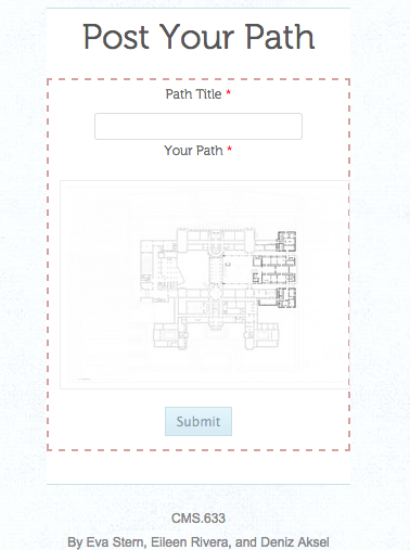
powerpoint link: https://docs.google.com/presentation/d/1lfWwxOdCzc3zUUHZ-A7djCxrPDOFi8XlHHSuyg8EkiA/edit#slide=id.gae980478f_0_0
Thanks to the help of the Artbot team (Desi Gonzalez and Liam Andrew) we were able to come across many resources and readings on location based apps designated specifically for museums.
The first paper by Matthew Tarr from the American Museum of Natural History, was about indoor location tracking technologies and its implications for museums. Tarr made some very important points on the limitation of current indoor positioning systems (IPSs), which cannot be achieved via traditional GPS methods. Many large-scale companies (like Apple and Google) are now working on solving this problem, but as of yet, “there isn’t a standout winner”. We were personally restricted by this technological limitation when our most promising IPS IndoorAtlas failed to properly calibrate in the large rooms of the MFA.
However, other points in Tarr’s paper, along with a project from the Metropolitan Museum was essential in providing us with new direction for MuRoam. The project for the Met, designed by an Intern at the Metropolitan Media Lab, is a “path generator”, that allows users to pick paths through the museum based on illumination, crowdedness and loudness of rooms. However, this automated path generator also comes with a HTML based toolkit that allows users to draw their own paths on any floorplan in the form of lines and nodes, and upload these maps in the form of a JSON file. This tool is extremely beneficial for us, as we hope to use it in our design.
So to keep our approach realistic for the span of this class, we will go about the “draw-your-path-as-you-go” approach for MuRoam. Users will draw their paths as they walk around the museum, double tapping at location where they wish to drop pins. With the pins, we not only hope to encode a pausing point by the visitor, but also other important metadata, such as user orientation (which direction is the person facing), wait duration, and annotations. We realize that this is not the most ideal approach, but given our current restrictions and resources, it is feasible. We want to design our app such that it is flexible for the potential implementation of IPS in the future.
We have had the opportunity to experiment and create beta versions of our technology. We developed a mobile site that holds a lot of the functionality we envisioned our application having.
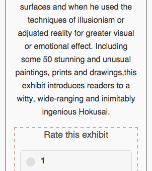
One of the pages contains the current exhibits with user ratings. Upon reading/visiting the description of the exhibit, the user has the ability to leave a rating, which we believe is a simple yet powerful form of user participation.
Additionally, we have a section for drawing paths. On this page, users have the ability to upload paths they created and view other user created paths.
Implementing our iOS application has proved to be a challenge, at this time we will work on developing polished mockups of our application, but keep the functionality in the website. We now hope to add the augmentations mentioned above (direction encoding by replacing node circles with arrows, encoding of wait durations via node size) to the path drawing page weithin the next couple of weeks. Finally, we will be thinking of ways to make our app a better participatory tool by thinking of ways to make the interface more user-friendly and intuitive.
-
The Community Speaks for Itself
-
vrmfa - the virtual reality museum for all
https://docs.google.com/presentation/d/16oe5IiNOX1D1_kAxPiQXYYzb28FZLFP-4t4bg4GrY0o/edit?usp=sharing
-
MuRoam
Presentation Link: https://docs.google.com/presentation/d/1wT6H9HVkyfU3_-6tdJORLNpIWHQC66FI7-5br9iwhpU/edit?usp=sharing
-
Wubify.me Captain
Problem Statement
Collaborative audio generation.
There is currently no very good way for people to collaborate on audio generation. Currently, one must have advanced knowledge of various complex software options which is not very accessible to your every day internet user. We would like to provide an avenue for people to contribute to and build from a centralized library atomic units of music generation.
Approach
There’s a type of audio creation toolchain called Supercollider that lets you programmatically create music/sounds. You can define types of signals or modulations and then cascade them into new sounds which can also be operated on. We want to make a website front-end for this system. We envision a site which has a “block library” of sounds that each user can use in his/her sound generation. Additionally, multiple users can upload new blocks so that everyone can use them in their own designs. In this way, we will create a collaborative system for people to make new sounds.
Audience
People on the internet who are interested in music generation and/or are bored.
Skills Needed
- Knowledge of Web/GUI technology
- Javascript, Clojure, Object Orientation
- UI/UX
Presentation
-
NewsConnect
(This project may need a better name.)
Problem statement The newspaper has been around for so long that its categories and text-based format have become “the way things are.” But in reality the categories aren’t so intuitive for seeing the larger visual picture of what’s been happening to the world. Some issues, for example, are easily neglected when the next “in” topic comes by. This application is meant to bridge those gaps.
Approach Take years-worth of news data and display it as points on a world map, with heat maps and line connections between countries to show country relations and popular world issues over time. Each news item marker could get its own blurb headline with links to news articles for more information.
Audience People interested in international relations could make use of the country connections and heat map of news over time. People who don’t like reading news as text but want to get up to date on modern world history could use it as a visual tool for learning. People involved in non-profits could use it to identify issues that are still ongoing but passed over in the wake of more popular news, such as in small third-world countries that don’t have much attention.
Skills needed App programming, UI design, familiarity with news sources
http://prezi.com/tcb4w-rhosft/?utm_campaign=share&utm_medium=copy
-
MIT Museum
I visited the MIT Museum. While many people within the MIT community visit this museum at least once over their enrollment in MIT, I was curious to see how other members of the general public acted while in the museum.
I visited the museum around noon on a weekday so the primary atendees appeared to be families with young children. There were a couple older groups around and some adults as well. As the museum is only open from 10am to 5pm, I feel like most weekdays are similar to this one as other demographics will be in work or school.
As would be expected for a museum with MIT in the name, many displays had some sort of tech associated with them. Two stuck out to me in particular. First, on the first floor, there were many interactive videos detailing different teaching styles at MIT. I was intrigued by the presentation style as they covered topics such as “why math is important” and descriptions of the edx program. While these topics are not as flashy as some exhibits that could be shown, one woman was intently watching one of the videos when I visited.
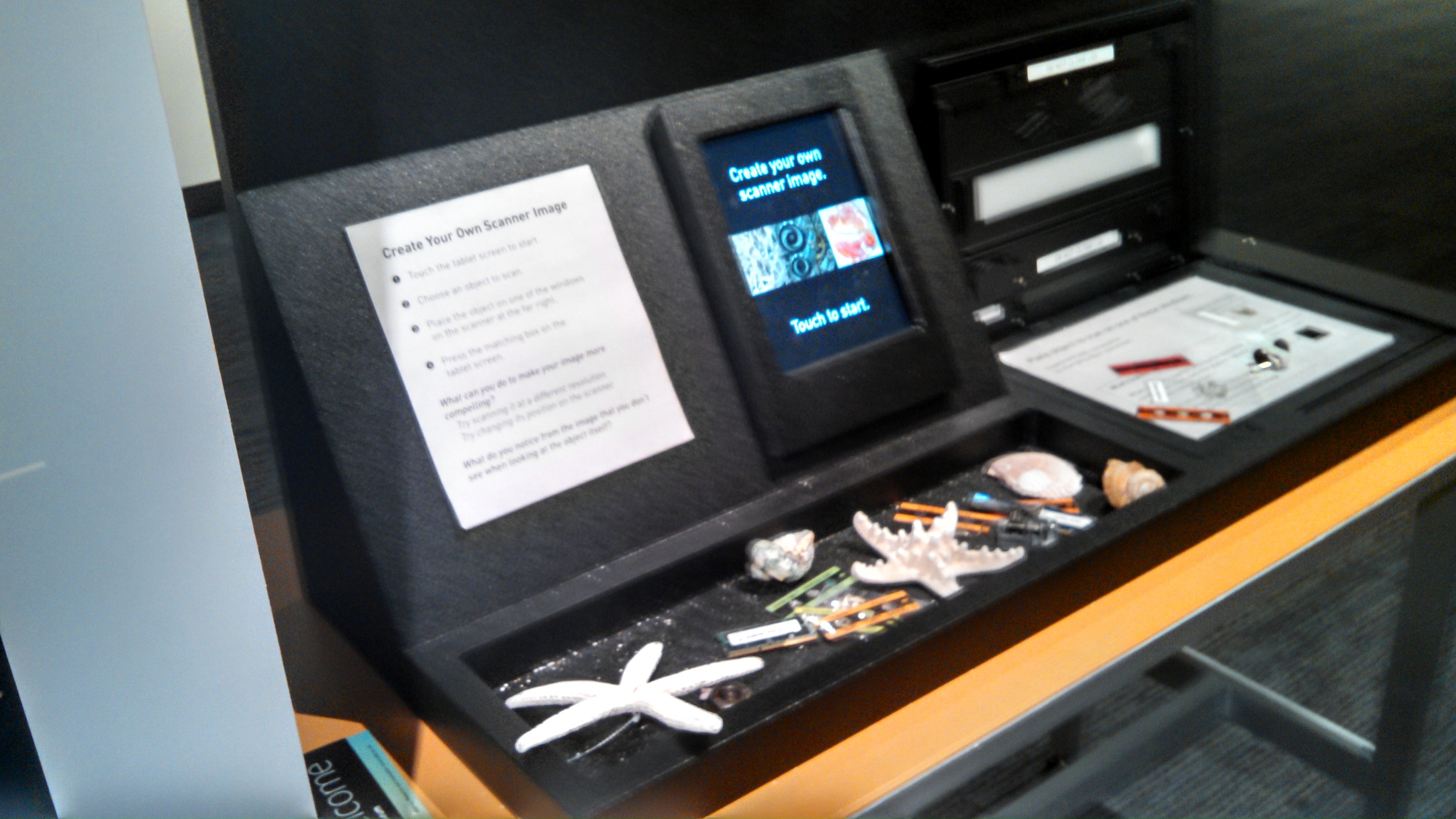
A second interactive technology was the ability to recreate several of the scientific photographs on display. The museum displays several of these images outside and I thought giving attendees the ability to recreate the images on their own added a enticing and interesting way to interact with the exhibits and learn the science behind the pictures.
From what I saw many exhibits encouraged hands on participation (mind et manus), and visitors took advantage of this. The only instance of unintended use that I observed was a station meant for working out problems that a couple of kids were drawing pictures at.
I think a reason for lack of unexpected use is that the museum does not encourage long amounts of reflection, which means that visitors, especially children, are encouraged to move through at a quick place. While the space embodies many of the quiet, solitary attributes discussed in the MFA visit, I believe that to be more due to number of people present, rather than design. I am not sure more technology will help this probably, but perhaps a different design which encouraged longer at each activity.
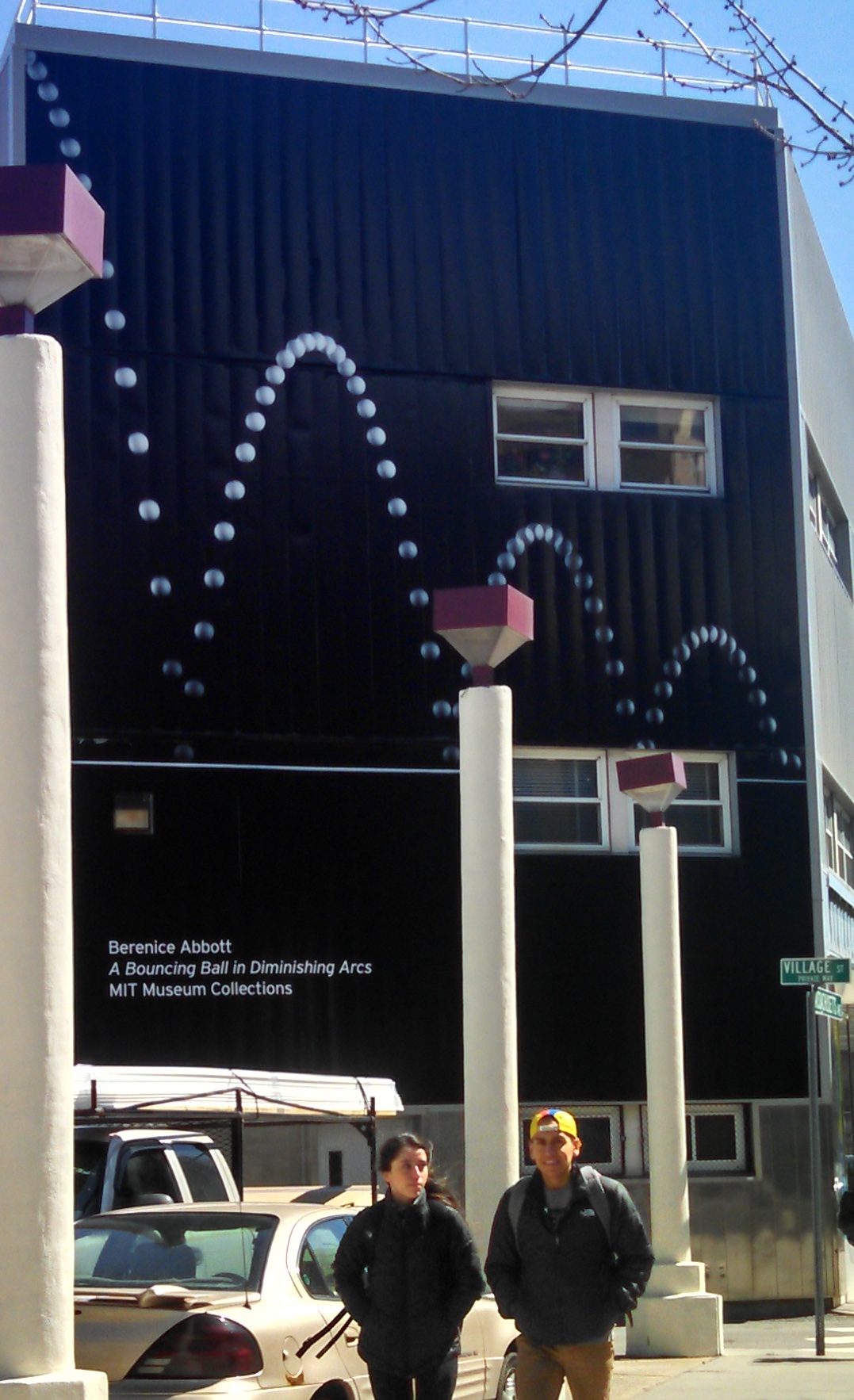
I think the MIT Museum struggles with visitor due to location. As mentioned above, they use a large image of a bouncing ball on the side of a building, to alert people to the museums presence.
In addition, there is a sign saying they are open outside.
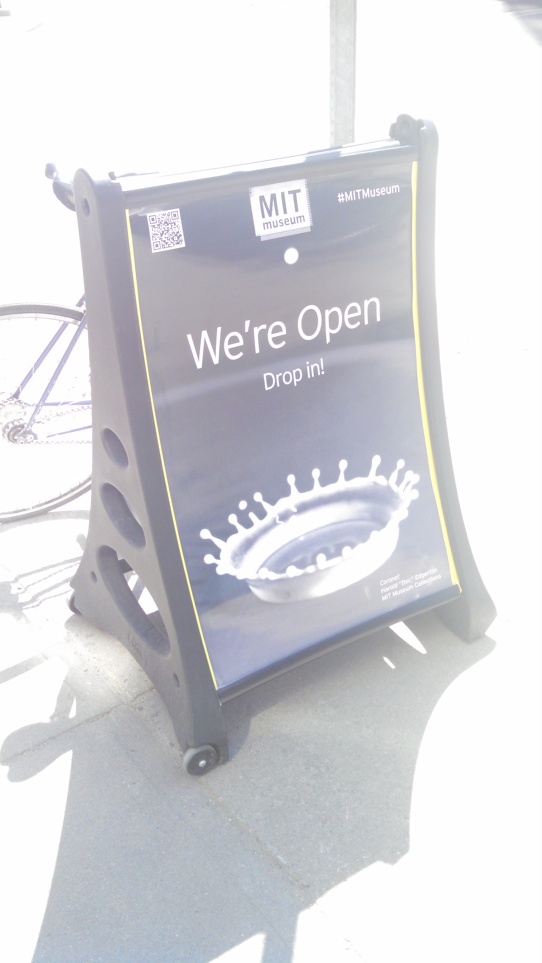
The biggest interaction between the outside and the museum comes from a clear glass window which allows visitors to see into the museum. Additionally there are screens displaying video in this window. Unfortunately I do not think either of these entices visitors to the museum. The screens are hard to see in the daylight when the museum is open and the area seen through the window has relatively few interactive displays compared to the rest of the museum. Once inside, navigation is not initially intuitive, which further complicates museum visits.
-
Geographic and Time Based Hip-Hop Music Evolution
Problem Statement:
Music can be an important indicator and influencer to cultural shift and movements. Being able to analyze the historical development of music across time and space can be a helpful resource in analyzing these trends. Rather then simply reading song names, being able to listen to the music would add an additional level of understanding.
Approach:
In order to display both geographic and chronological trends, I propose a web site that shows the major cities for hip-hop development. A yearly timeline can be stepped through starting in 1970 until 2015. Selecting a city brings up a sampling of the music being created in that location at that time, as well as a description of the style. The music blurbs will be similar to those on: http://techno.org/electronic-music-guide/
Thus audiences can track changes over time as well as changes from place to place, while listening to the movements as they occurr.
Audience:
This website can be used for Hip-Hop aficionados looking to explore hip hop music or music historians looking to develop an understanding of trends across time and space.
Skills needed:
Web-development, Database management
-
Final Project Pitches: Annotating the Air / Urban Libraries 2.0
My pitch is very much up to be changed. I would love to grab the attention and ideas of any students interested in moving beyond rectangles (display screens, computer screen, or piece of paper). Specifically, I am interested in concepts of the third place, augmented spaces, community involvement in urban libraries, and getting DH tools in the hands of communities (I consider myself a techno-constructivist so I want communities to use technology to use technology to learn about and construct their own experiences). With all that in mind, I have two project pitches.
Pitch 1
Project Title: Annotating the Air – Community Histories, Diaries, and Catharsis
Problem Statement: I feel that although there are multitudes of rich sources (typically academic content) for Digital Humanities, communities also have important stories to tell. I want to create a technology that puts DH tools in their hands and allows them to learn about each other, themselves, and the technology.
Approach: I imagine a mobile application rooted in AR ideas. While exploring community spaces, a community member can leave a digital trail of memories, voice recordings, words, photos and videos attached to particular locations for others to stumble upon. It would be like geocaching taken to the next level.
In first iteration, the medium could be a mobile application but I would want further iterations to allow the medium to be more ambient and ubiquitous (a non-disruptive experience that unanchored to a typical screen… that in fact only some people can access).
Audience: I would want all members of the community telling their stories, so the application would need to be usable by people of all ages and technical abilities. Skills needed: For this project, I would love another person to brainstorm and design with but I really need 2 people skilled in mobile native application creation (preferably iOS). I am a programmer as well, but I am unfamiliar with mobile applications so I would need help getting started and knowing what is feasible for our timeline.
The foci would be: making the experience of content pulling and content creation as easy as possible for users, creating a backend where this wide variety of content is geotagged and accessible to users, and learning to use the phone’s geolocation system (would the app constantly run and constantly take the user’s location?).
Pitch 2
Project Title: Urban Library 2.0
Problem Statement: Due to my experiences in DC Public Libraries, I find myself yearning for technological innovations in more library spaces. I am used to having my library be (at least the beginnings of) a hub of tech innovation / a maker space. Libraries must be early adopters of interesting technology. In addition, library resources are continually hidden and undiscoverable.
Approach: I want to create a better library experience with ambient user interfaces (such that it would augment but not disrupt reading and discovering processes). I would like to design a better library experience in which you can find and preview books, interact with other readers, create art with text, and leave a digital footprint.
Audience: As a mobile application, targeting high school college students and older. As ubicomp, all library users
Skills needed: I need another designer to help me brainstorm and design. I also need 2 programmers (they would be free to pitch a medium they are familiar with to host our new library experience).
-
Final Project Pitch - (Never) Lost in Museums
Problem Statement: As someone who is very directionally challenged, whenever I’m in a big museum or even a medium sized museum (MFA in Boston), I have a lot of difficulties knowing where I am. Sometimes I find myself going back to the same section of the museum all the time unable to find the sections I actually want to go to. I think it would very helpful to have a mobile app that maps out different recommended route of the museum. In addition, if the party is separated during the visit, it is often awkward to call each other in a quiet museum. If there is a way to connect friends’ phones, it would be much easier to find each other in a museum.
During my visit, I would love to not have to worry about getting lost and focus on the exhibit itself. For someone like me, it is hard to do so without a good real-time map.
Approach: I envision this being a mobile app with the layout of the museum pre-loaded and can track the location of the visitors by use GPS. Users can also tag their location on a map by scanning a QR-code, bar-code or taking a picture of the nearby exhibit. If the users tag a certain exhibit, they will also be given additional information about the exhibit.
I don’t think we will be able to implement this part in this class but it would be cool to give children some kinda of braclet that has a GPS tracker or a scanner in case they get separated with their parents in the museum.
Audience: The audience would be anyone who wants to stop scrathing their heads trying to understand the paper maps of the museums and anyone who has trouble finding their way around in buildings with complex layout. It will also help people who want to get more information on each specific piece of art or artifact.
Skills needed: Mobile app development skills especially with GPS location tracking, UI/UX design, and maybe data scraping as well.
-
Final Project - Museum a Day
I’m not great at outlining these so I’m just going to follow the sections outlined in the handout:
Problem Statement:
Museums can be difficult to approach, occaisionally pretentious, and often expensive or difficult to get to. Also, many museums feature only works that could be considered “fine art” or otherwise well-known pieces in an accepted, established style. I want to create a museum that is easy to access, open to all types of artistic works, and most importantly, free.
Approach:
The Museum a Day project is a virtual museum, automatically generated or hand-curated in special circumstances, that can either be explored in a browser or through the use of a Google Cardboard headset and a phone. I will cover the automated case, as a hand-curated museum is fairly easy to imagine.
First, we gather art through a web-scraper, not only from established gallery websites that contain images and data on fine art, but also from websites such as DeviantArt, to gain a mixture of classically expected museum art, and strange, unconvential art from creators on the Internet.
Next, using a set of predefined “museum rooms” that the team creates the system will generate a museum and populate the rooms with the selected art. This can be thought of as having a bunch of empty rooms with defined “art spots” and then mixing and matching until a museum is made and filling the rooms by sorting art according to some clustering or semantic matching algorithm. The algorithm to determine what art goes together in what rooms should be thought of as building a virtual curator. It could care about metadata attached to the art (tags, descriptions) or maybe the visuals of the art itself (clustering similarly colored, composed, etc art). That is more a question for the group to answer together, though.
Finally, the newly-created museum will be uploaded to a server, where users with the app can download it and view it in 3D on their phones, or else use a browser to access the museum. In this way, we’ll have created a museum with a very different collection of art that is accessible to anyone with an Internet connection (which, of course, is not everyone).
Audience:
The audience for this project is mainly a younger audience, probably under 30. The reason I say this is that not only does accessing Museum a Day require finding a technologically-accessed museum interesting, the museum itself will be populated by a mixture of classical art and strange art collected on the Internet. I personally feel that appeals to a younger, more technologically-focused group of people who would be interested in seeing art but perhaps not interested in going to a museum.
Skills Needed:
Web Scraping: I am not a web developer, and the methodology for automatically finding and acquiring artwork from the Internet is a task that frankly leaves me very scared. I’m sure it’s not impossible, it’s just outside of my realm of expertise
Designing Museum Rooms: I would like the museum rooms to be hand-created, rather than automatically generated. This way I think they’ll look nicer. I’m not a great designer, and someone with an eye towards architecture/user experience could perhaps have a better idea of how to build the museum rooms so that they fit together nicely.
Building the game/museum generator: This I am good at. I have built many games and particularly am proficient with the Unity3d game engine, which supports Google Cardboard and browser interaction.
Building a server to host the Museum a Day: I don’t know much about servers and websites, so someone (perhaps the web scraping specialist as well?) who enjoys putting together a website that could deliver the Museum a Day would be great.
That’s the Museum a Day. I’d love to work on it, and I hope maybe others are interested as well.
-
de Young Ethnography
I visited the de Young Museum, an art museum in San Francisco. (I was in California during Spring Break.) This museum mostly seemed to have an older audience, though there was one group I saw around my age and some families with children. The outside of the museum is a beautiful park of trees and fountains, and the lobby is spacious. The museum has two floors and a basement where they keep a rotating exhibition you have to pay extra to visit. I didn’t end up visiting the basement.
The exhibits in the museum covered a range of mediums including paintings and sculptures, furniture, textiles, and old pottery and artifacts. They were grouped in collections, often having little description for individual pieces but a little blurb for each collection of items.
The museum didn’t use much technology as a whole. It did offer an audio tour. There was also a total of four displays in the museum. One was an art piece itself, a display split into many panels which transitioned between different photos of nature scenery. (As it was a borrowed piece, I could not take a photo of it.)
The second was in the section on pueblo pottery, showing how the pottery was made. Unfortunately, it was quite close to the loud lobby, so I felt like having a display with sound located right there wasn’t optimal in placement. But it was nice to be able to see the work put into the pottery. I did see some people sitting on the bench right there and watching the video.
The third was also a video on the art pieces being displayed in the room, except it was a large projection onto a wall rather than a small TV, probably since the room was quite dark and the pieces being displayed were also much larger. (They were large pieces of jewelry from Indonesia.) I didn’t have enough interest to stay and watch.
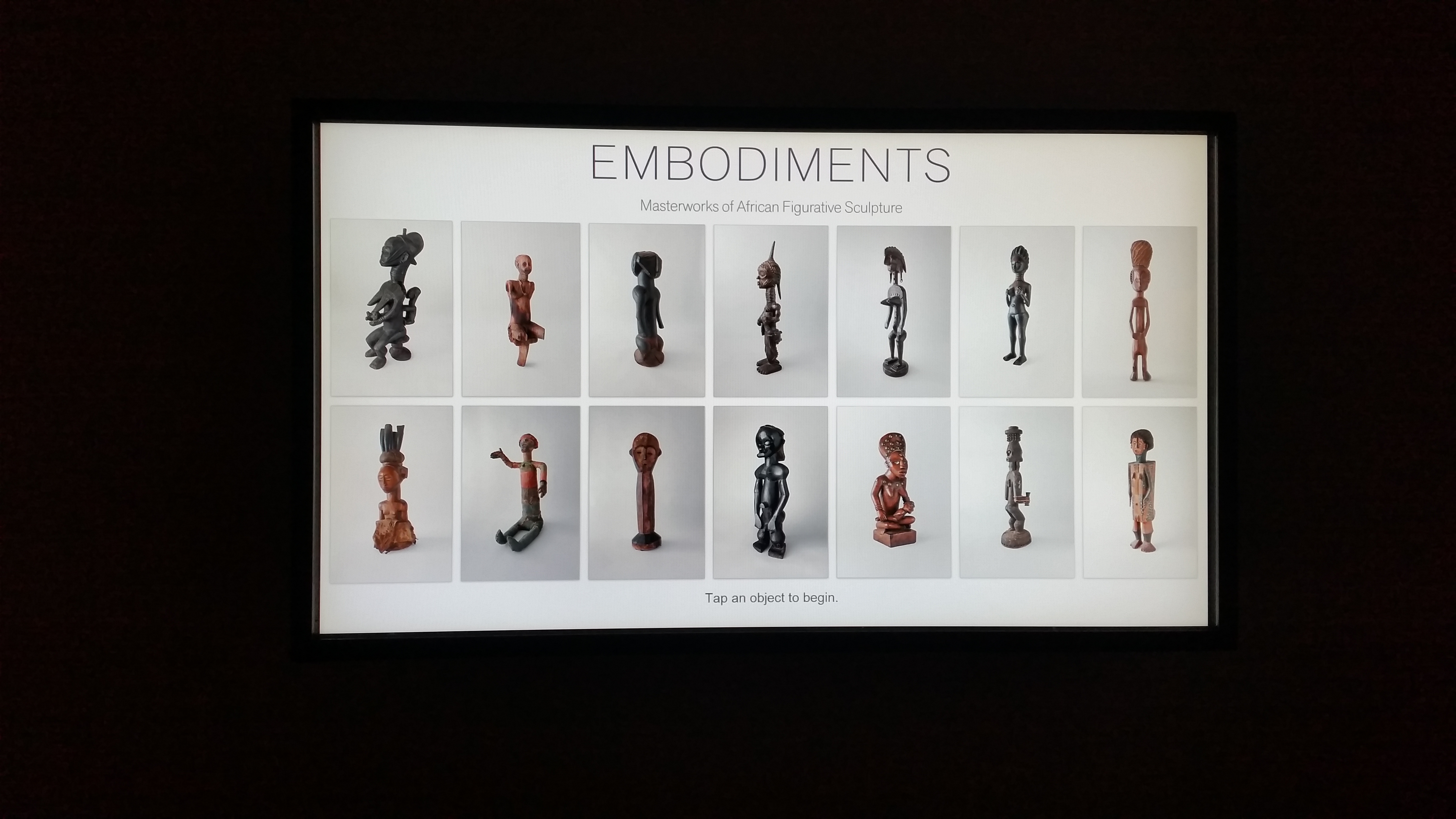
The fourth was a really cool display that was actually interactive, but it was hidden in a small corner behind an exhibit of African figurative sculptures. I almost missed the little alcove, but for my mom pointing it out. In this display you could look up more information about some individual sculptures, such as how scientists figured out what materials made up the sculpture, and sometimes some extra history. I found some of the pieces fascinating (I didn’t imagine that the wood sculpture with the snakeskin pattern was using actual lizard skin), and I wish they could have brought the display more attention. There were only about ten sculptures featured in this display.

Coming to this museum with a different perspective, I realized some things about their use of space. The rooms with paintings were more wide and bright open spaces, incorporating skylights and parts of walls turned into windows. I did like that use of glass window-like walls in some portions of the museum. You could even view a sculpture display outside from in one room, and it was a bright sunny day, which made it work really well.
The rooms with older artifacts and pottery were much darker and smaller rooms, probably a factor of trying to preserve the artifacts, but it also made the space feel a bit more confined, especially near the loud entrance.
I didn’t like that they hid this one interesting exhibit room on a textile collection behind a souvenir shop. I didn’t even recognize it as an exhibit at first. The huge set of drawers contained random samples of textiles from the collection, like a surprise in each drawer. It’s a neat way to display the pieces, but I imagine it would not have worked so well had the room not been empty of other people. There was also a giant (but restricted access) textile library past the room.
One other criticism I have for the museum was that it wasn’t always clear where the artifacts were from in one exhibit upstairs on New Guinea. I missed the large plaque titling the exhibit (I took a slightly different path to enter) and reading the little descriptions of the pieces only mentioned the “northern coast” or “Asmat people” or some river or other unrecognizable and vague terms, and I looked for a while before I finally asked a passing tour guide where the artifacts were from. There wasn’t even any map of the region anywhere. That could be one place it might be useful to see technology—knowing where items are from in a historical exhibit.
Overall, though, it was a fun experience to go through the museum. It wasn’t too loud or crowded that day (other than near the lobby), and the exhibits were fun.
-
The Museum of Science
Corey and I decided to go investigate the museum of science because we’re engineers and we thought it would be more appealing to us than the MFA. Given its name and prime location, we both thought it would be filled with modern interactive exhibits which really leverage the power of technology to convey ideas. We were wrong and the experience was actually quite disappointing. Throughout our entire survey we kept getting the impression that the museum was stuck 20 years in the past.
Almost every exhibit had a large amount of signage and descriptive written material. Additionally, there were audio devices that would read to you exactly what was on the text. On one hand, this is nice for accessibility reasons, though it is a little sad to see that they weren’t doing more with the ‘multimedia’ side of things. The descriptions were of course static text, and the one multimedia element was actually just another rendition of the existing information. There were however a few instances of the museum using the existing technology for things other than just reading the text, such as this exhibit that would allow you to hear various bird calls.
 A relic from the 1989 Chernobyl disaster
This is a poorly done AR (augmented reality) tour of a recreated 19th century mansion. This room is real and you stand inside a control room where this image appears on a screen. From there you simply interact with the screen to explore whichever topic interests you. The problem with this is the very clear disconnect between reality and virtual reality. The program running on this computer is essentially a smartphone app and the actual, real room just serves as an enticing background. To make this better, the room needs to be the focus and not the screen. Maybe the museum could acquire some smart glasses and actually produce an AR tour where you can walk up to an object and some small description would appear in your view. Sure, smart glasses may be expensive and new, but this is the Museum of Science right? Show us cool new science.
Although there were clear attempts to encourage user engagement and incorporate interactive elements, almost all of them required museum visitors to initiate the process. They weren’t captivating in the sense that passers-by might stop and explore; there was always a button that you had to press before something interesting occurred.
This raises the question of what can museums and various public institutions do that will “reach out” and grab attention, without being annoying or having barriers to entry. I think that the Museum of Science could improve this aspect of things simply by replacing old technology with more modern and user friendly renditions. For example, the touch screens that they did have were all very unresponsive, which made the theoretically simple task of poking an animal to learn more about it more challenging. Similarly, most of the devices were running software that simply looked old and unfriendly to users that are well versed in the ‘web 2.0’ world.
-
The Virtual Museum of Bad Art
Problem Statement
One drawback to museums that we found in our exercise at the Museum of Fine Arts was the rather elitist nature of many museums. With the advent and subsequent proliferation of personal art and media hosting websites, such as DeviantArt, Flickr, and Vimeo, we can see that there are many artists in the world whose work is not and will probably never be featured in a material museum, whether due to obscurity of the artist or quality of their art. This project hopes to highlight these exclusionary tendencies of museums by creating a dynamic virtual museum of bad art.
Approach
In this project, I hope to create a “Virtual Museum of Bad Art”. By “bad art”, I am referring not only to the quality of the art, but also the value judgements made by traditional museums that relegate this art outside of the museum space. I hope to build a virtual, web-hosted museum that features art scraped daily from personal art and media hosting sites, such as those mentioned above. Some extra features might include human-curated exhibits, machine-curated exhibits (perhaps through a ‘search’ function?), and a mechanism to allow visitors to curate their own exhibit.
Audience
My audience is anyone annoyed by the elitist nature of some art museums, artists themselves, and people who want to curate art exhibits on the web. I less expect this project to be a useful, lasting tool; rather, I see it as an exercise or an art piece in itself.
Skills Needed
Scraping, web programming
Note: I do not currently have a group for this idea; if you have programming skills and are interested in this project, please let me know!
-
Studying Urban Libraries
Inspired by the Urban Libraries Council reading, I visited two of the three Cambridge Public Libraries. The first was the Central Square Branch of the Cambridge Public Library System. The second was the Main Cambridge Public Library.
The demographics of the Central Square Branch are varied widely (intending to serve the entire community). On a Monday afternoon, there were pre-teens hanging out, older homeless people resting and reading, non-native English speaking adults working in the Literacy Program, and college students enjoying the quiet and the Wifi. It was a rather intimate space, warm with brick and wood furniture (so intimate I was uncomfortable taking pictures).
The demographics of the Cambridge Branch were completely different. On the same Monday afternoon, there were nannies watching their children, and college students snacking in the café and using their Mac computers with hipster-looking adults. It was very lively for a library. The space was grand and open, full of light and glass. Some places were roped off with velvet rope and the community room remained mysteriously locked. Although an awesome resource, I found the space intimidating.
The Central Square Branch lends out Nooks preloaded with books (a practice common to all Cambridge libraries). The library also had computers in the Literacy Project space, catalog computers, and a computer lab. I saw all of these technologies used, except for the Nooks.
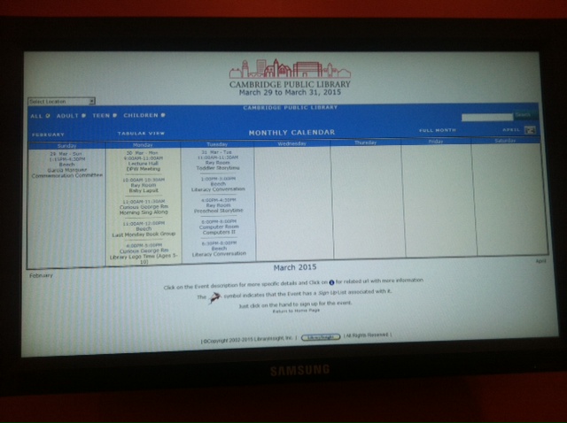
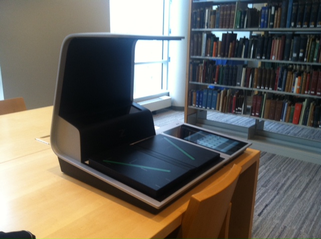
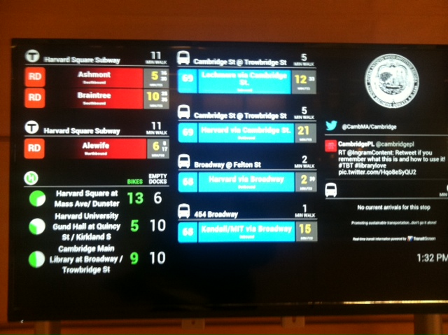
The main library had a lot more technology. In addition to the common library technologies, large monitors acted as bulletin boards (with information ranging from transit congestion to calendars of library activities). There were also machines for accessible reading and printing (a braille machine and magnifying readers). In addition, there was an amazing upright scanner in the archives. I loved the open access to unusual resources.
However, neither library really capitalized fully on innovative uses of technology to foster social interaction or discoverability of library resources.
-
Okay, I'm Here. Now What?
Problem
Some museums are quite large and have content from many different fields. For example the Museum of Natural History in NYC has displays on animals, physics, and Ancient China. It’s easy to enter a museum and feel excited and overwhelmed, even with a museum map in hand; there is simply so much to see and sift through. Sometimes this leads to you wandering around the ancient history section walking past every pottery display in hopes of seeing cool prehistoric weapons.
Approach
This would be an app that will measure the amount of time you spend at a given exhibit (this will give curators an idea of how popular certain displays are) and provides a list of “other exhibits you might like” that updates when the app recieves new information. So if you are at a dinousaur exhibit but skip all of the chemistry exhibits, the app might suggest an exhibit on monkeys. The app would cross reference time spent with tags/keywords that curators associate with each exhibit. The suggestions could include a map showing current location and path the suggested display and maybe even a “how good was this suggestion?” (out of five stars).
I have no idea how to implement this app, I imagine each exhibit would need some sort of bluetooth signal to communicate with the app since apparently geolocation inside a building is hard and largely not accurate. The app would pick up the signal when the phone is within a certain physical distance and keep track of when it first picked up the signal and when it last picked up the signal. Again, I don’t really have a clue about how this would work and there is probably a better way of accomplishing this.
Audience
This tool would be useful for the average tourist or avid museum goer. It would also be of use to the curators of the museum so they can get a better idea of what types of displays are popular and maybe figure out why others aren’t so popular (maybe they are out of the way, in a typically crowded area, or surrounded by more popular displays).
Skills Needed
- Someone who can make an app.
- Someone artistically inclinded to help with graphics/design/mockups.
-
New England Aquarium
I didn’t actually have a chance to go to any of the museums listed this past week since I was out of town from Mar. 18 to Mar.29. My schedule also doesn’t allow me to go any time this week before the class. I figured the best alternative I have is to do this assignment on a place I’m very familiar with. Although I’ve been to the MFA, Musuem of Science, Harvard Museum of Natural History, and Boston Children’s Museum more than once, I have been to the New England Aquarium 5 times in the past five years. I think I’ve seen almost every corner of the aquarium including the the 4D theater. Therefore, I believe it is fair to complete this assignment without going there again. All the pictures in this assignment are chosen from the pictures I took during previous visits.
##Demographics: The aquarium attracts many families especially family with young kids and K-12 school field trips. Though the aquarium also offers private event hosting - for example, MIT 2015 class council had two events there in the past. The aquarium offers a fun and relaxing experience while providing educational values at the same time. These qualities make it very attractive to parents and educators.
##Technology: The aquarium has small boards that introduce the species next to each tank. Visitors often skim the text and not actually read them because they are often long and not interesting to the kids. The lighting is also very dim so it is hard to read things. Making these boards more visible might encourage people to use it more. I think it would also be helpful if the visitors can download an app for the visit and automatically show the information if the visitor scans a QR-code on a display next to the tank.
One example of an interactive display is the sound examples at the penguin section that allows visitors to press buttons and play the sounds of the different penguins. I personally loved pressing them I was there but I didn’t see very many people using it. Younger kids who might benefit more from this feature often can’t see or understand this. Making it more intuitive to younger kids will make is more useful.
##Unexpected/Unintended Uses: There are very few misuses of technologies at the aquarium since there isn’t anything complicated to use.
##Frustrations: One of the biggest issues I experienced during my visits is the visibility inside the aquarium. It is understandable that the lighting needs to be dim for the health of the animals. However, the dim lighting makes it very hard to locate friends or family members if the party is separated. Technology could definitely help here. If each visitor is given a bracelet with a tracker inside and is able to activate tracking of each desired tracker on their smart phones, it will be much easier for parents to find their children or for friends to find each other during the visit.
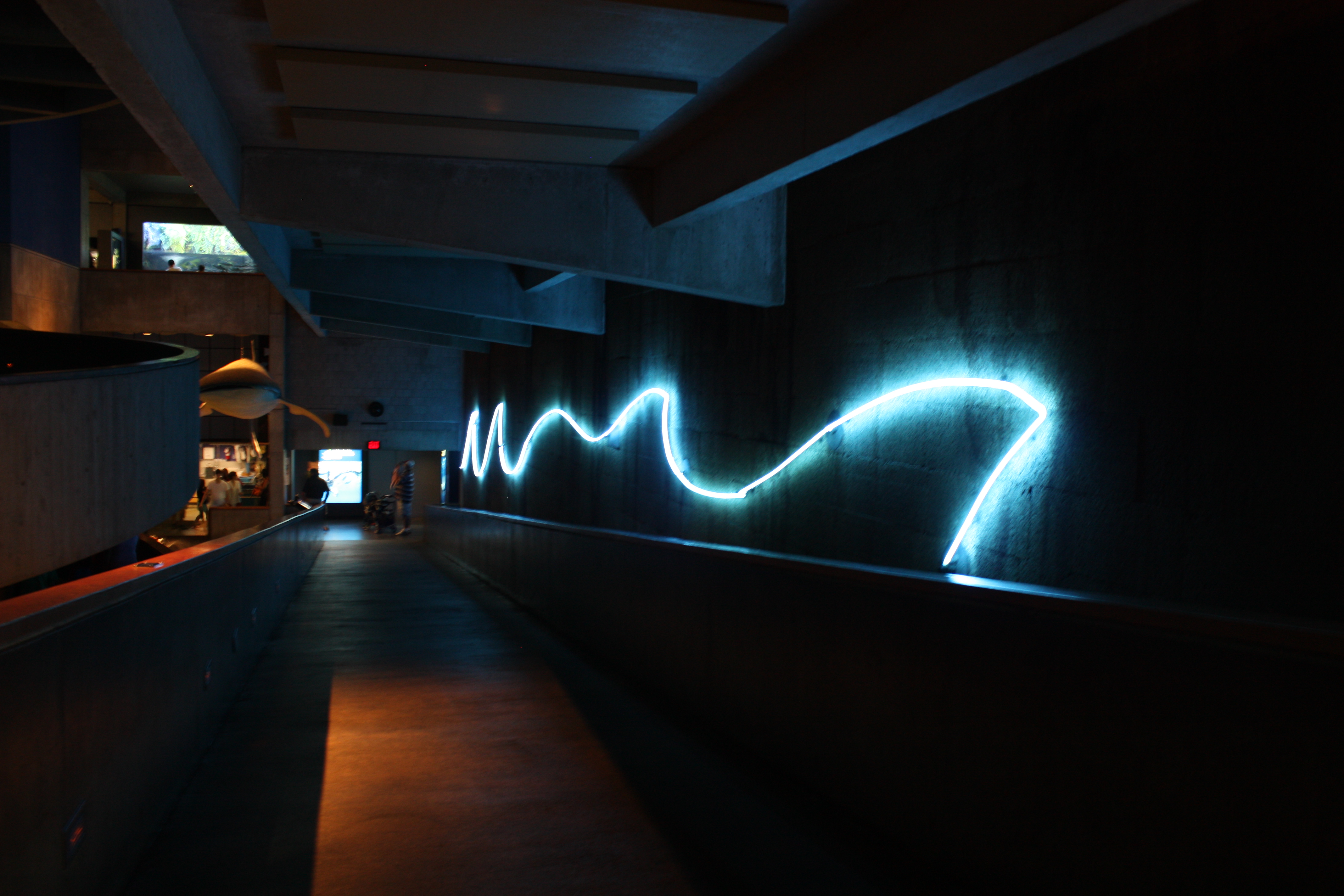 Main hallway of the aquarium.
##Interior/Exterior: The exterior of the aquarium is very modern and cool looking which can attract people to visit.
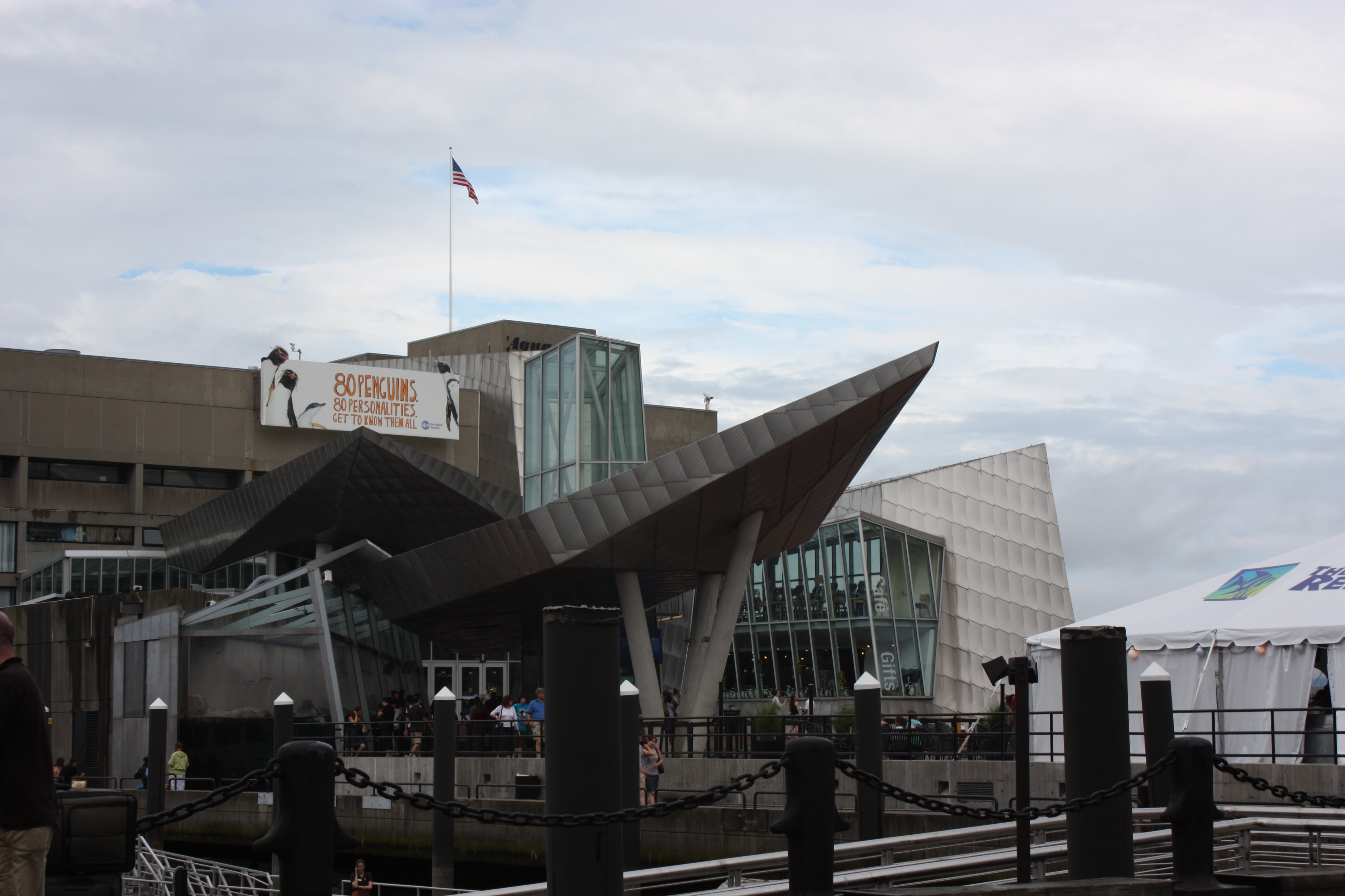 It is also located near the harbor and is generally a very touristy area.
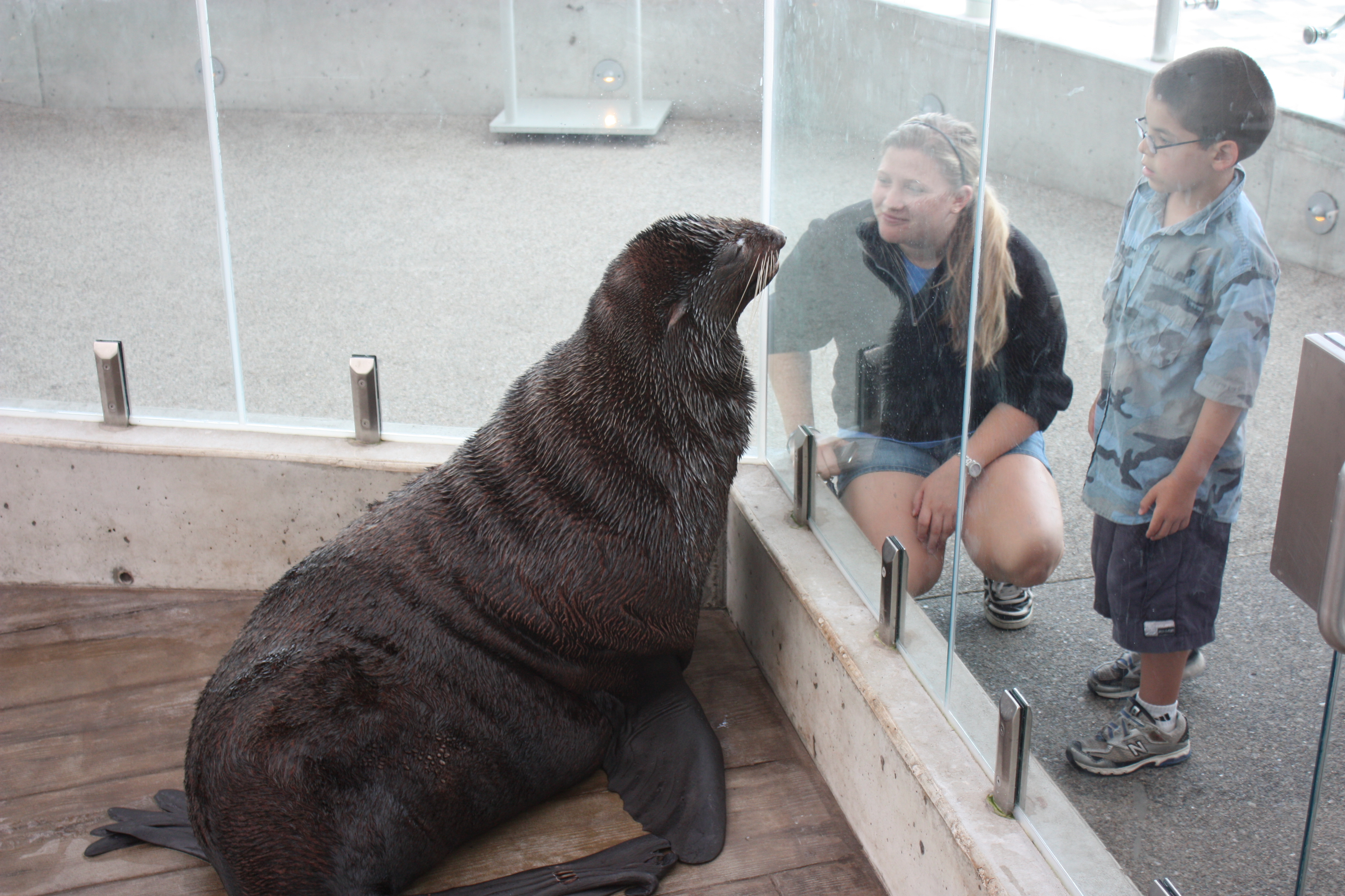
Visitors can see the seals through some glasses before they even enter the aquarium or when they are waiting outside for the rest of the party. This makes the aquarium more welcoming and intriguing before the visit.
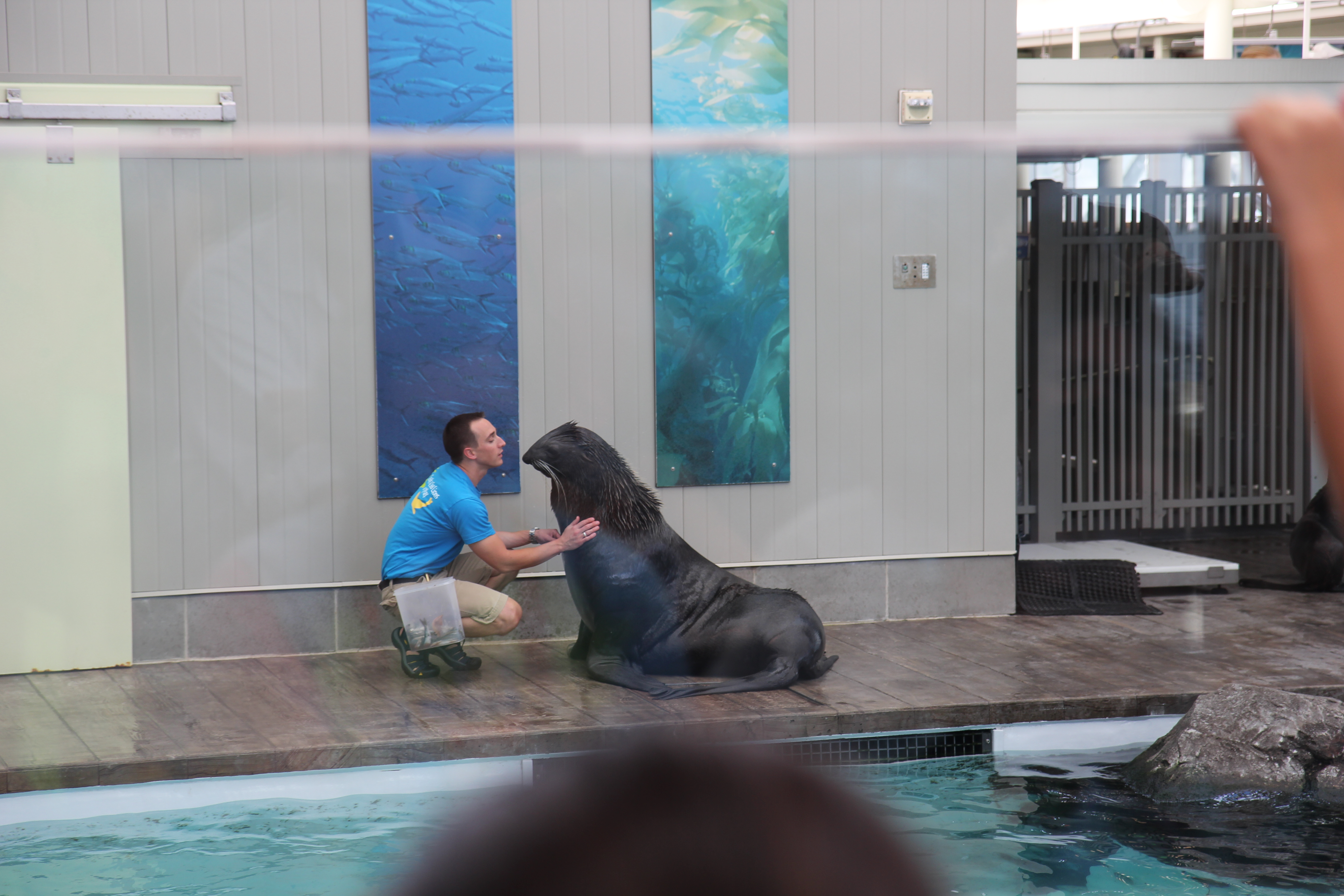
Although the aquarium doesn’t have a lot of technology-based features, it does offer fun interactions for the visitors by having a “petting zone” and animal performances. These features allow the visitors to be more engaged during their visits.
The stingray shallow tank is one of the most popular spot at the aquarium which gives the visitors an opportunity to feel the stingrays as they swim by. It is fun and unique for both the adults and the children.

The rotating hallway around the big tank not only conserved space but also allowed the visitors to have a fun and unique experience.
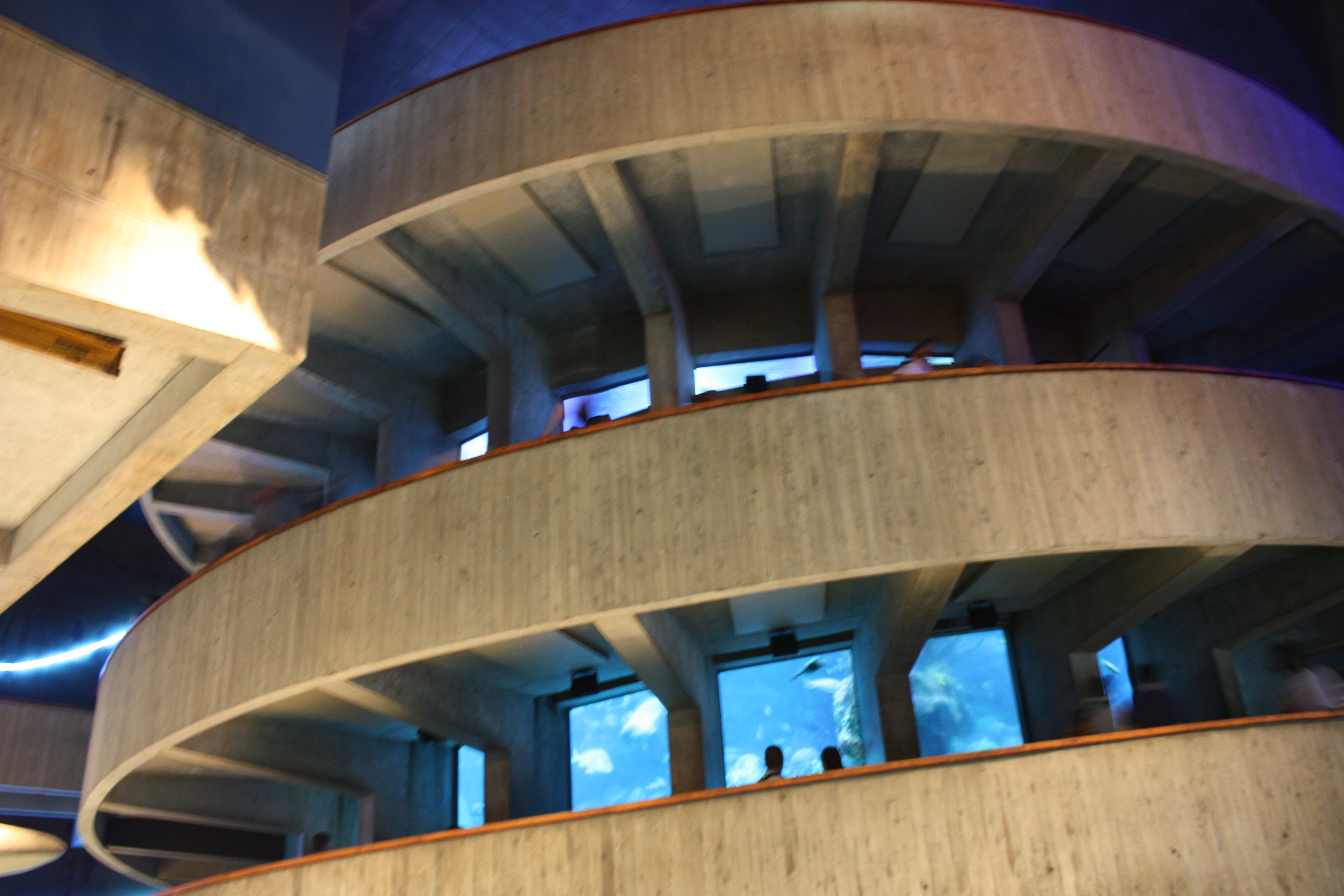
At the top of the big tank, visitors can see the sea turtles and other animals close up without the glass interference.

Overall, the aquarium welcomes its visitors by having a very fun-infused environment that allows visitors to have a deep engagemnt with the environment.
-
MuseRoam – A Social Platform to Design Personal Museum Experiences
Problem Statement:
The museum experience is often something very personal or shared with a small social circle. Especially in the case of open-roaming museums, where there is no designated path to follow, there is often an opportunity for visitors to generate their own narrative by experiencing different works or displays in different orders. Sharing this personal experience with others that have their own unique experience is often enriching for both parties, expanding their perspective on exhibitions. This is why a simple, museum-specific platform to share personal experiences and routes through a museum would be a very powerful digital tool that allows inspiring dialog among much larger groups of people.
Approach:
MuseRoam would act as a combination of a map tool with annotation capabilities. The app would scrape and organize floor maps of various museums from all over the world and across different concentrations (art, science, history, etc.). Using simple drawing mechanics, users can either draw custom paths through the museum, or use position tracking to have their own experience tracked and projected onto the map in an automated manner. At any point on the path, users can add nodes, which they can annotate with tags, text, hyperlinks, and images. Users can then save their paths, share them with either a select group, or make it open-access to the whole user community.
An additional feature can be integration with museum view capabilities of Google Art to allow “digital tours” for people that aren’t able to visit the museums.
Audience:
The audience for this app would be anyone who is visiting, or wants to visit a museum. Additionally, the app would be a great platform for people that have already toured a museum, and would like a different perspective on things. It would be open access for anyone to contribute routes and experiences, however user ratings, or collaboration with institutions can help create “curated experiences” for people with different expectations from the museum.
Skills Needed:
Visual design skills, experience with mapping, IOS or Android programming, (potentially) work with street/museum view Google APIs.
-
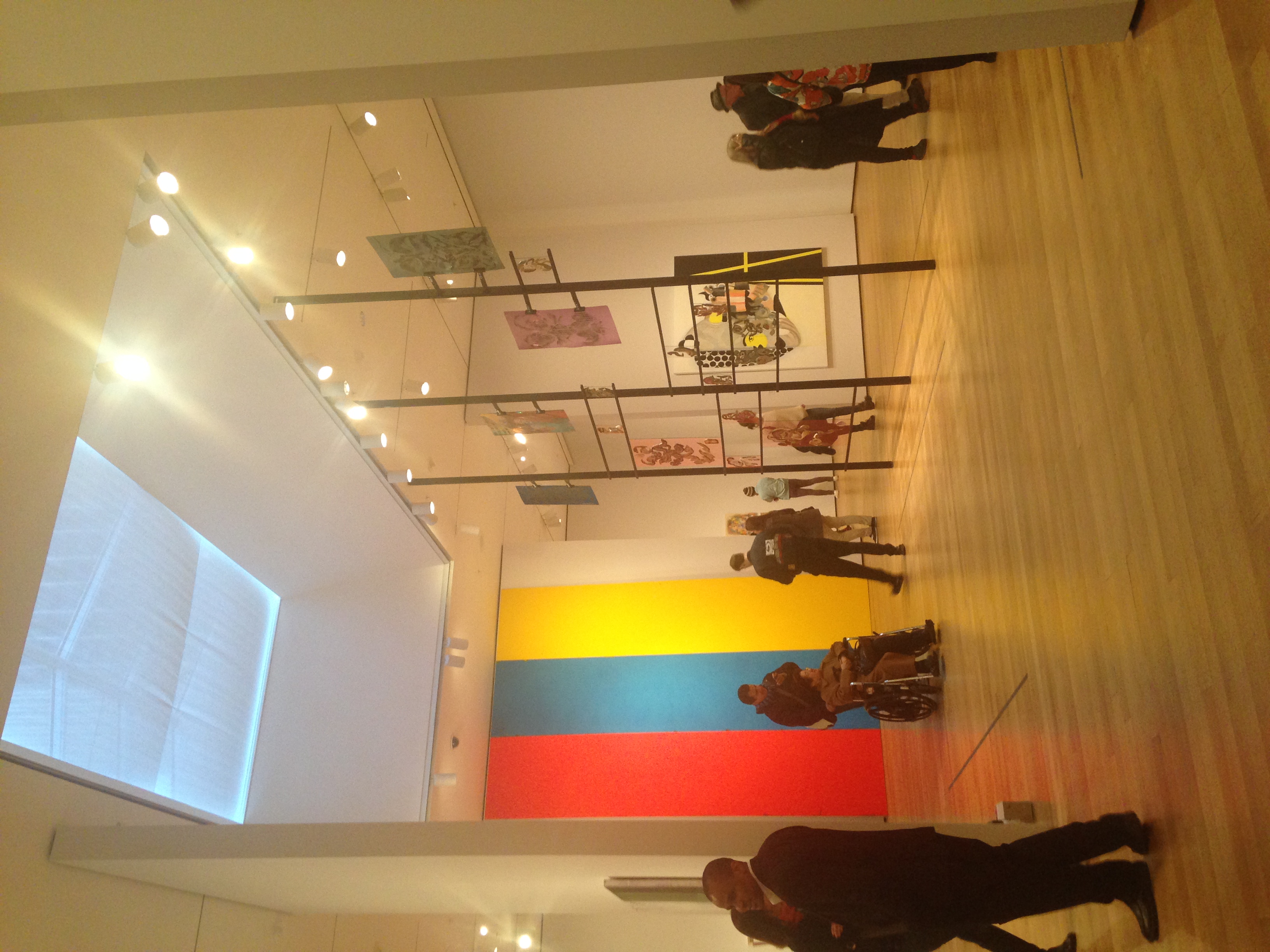
MoMA Ethnography
MoMA Ethnography
Over break, I visited the Museum of Modern Art in New York City. The building has a modern white and glass exterior, with a large open lobby where screens display current or upcoming exhibits and events, which then leads to a modern sculpture garden that is open to the public. The audience in the museum varied greatly from very young to very old, though certain age groups gravitated to different exhibits with the museum.
The MoMA is a huge museum, and the audience and technologies changed drastically given the floor and the kind of art displayed in an exhibit. Currently there is an exhibit on Bjork, which I did not have time to visit, but the line to get in was long and fairly young. Even from the exterior, I could tell that the exhibit would be laden with interactive and more interactive and tech-savvy displays, as outside of the exhibit a video of Bjork was projected on an enormous wall that could be seen from almost every floor.
I visited one of the more permanent exhibits, on a floor dedicated to more traditional art forms, namely painting and sculpture. These floors had no interactive screens, but instead had audio tours publicly available on what looked like an iPhone. I noticed that the overwhelming majority of people did not use these audio devices, but the few that did tended to be older. People generally relied on art labels or were simply at the museum to view art and not necessarily learn about it. The galleries were very spacious and open, which allows the viewer to explore freely.
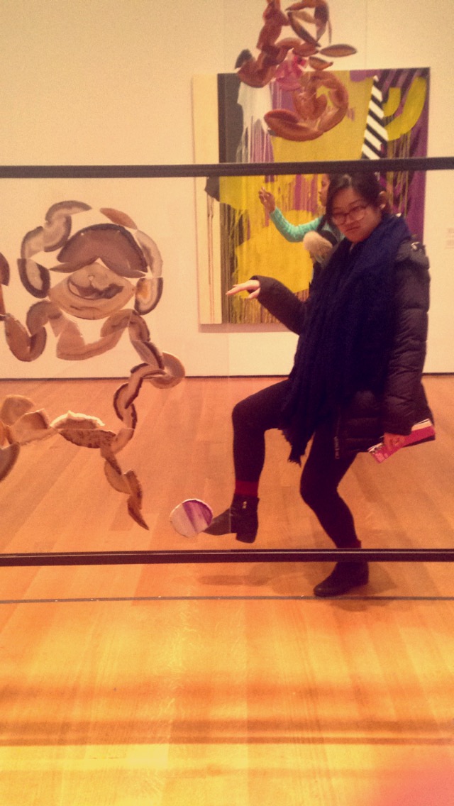
The layout of the gallery was unassuming, and I felt comfortable approaching the art. However, at times, I would have liked more information about pieces that the labels did not provide. I did not want to take an audio tour because I was interacting with friends in the exhibit, and in the moments when I felt confused or unsatisfied with the didactic labels, I thought an additional interface that allowed viewers to further explore information about the piece or artist would have been helpful.
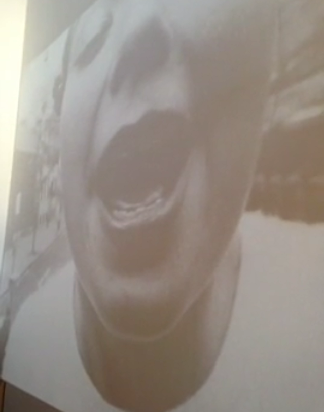
(ex: not exactly sure what the message of this piece is, though I do find it visually appealing)
To juxtapose the permanent exhibit, I also visited a temporary exhibit on Hong Kong architecture, development, and expansion. The exhibits focus on modernity and the future was reflected in the widespread use of technology and interactive displays in the exhibit. The amount of technology used in a particular exhibit seemed to hinge on the period or type of art on display.
Unintended uses of the space by visitors:
One could also see visitors interacting with art in unexpected ways. Perhaps pieces of art can become interactive depending on relative positioning in a room.
-
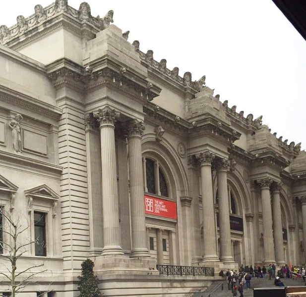
Ethnographic Evaluation of The Metropolitan Museum of Art in New York
I was fortunate to have the opportunity to spend a few days in New York over break, where I visited The Met.
Upon entering the space, it was evident how broad the audience and museum goers was. There appeared to be a great deal of diversity, while this could be surface level, it would be interesting to have a more detailed breakdown on the socioeconomic and educational background of the museum goers. I appreciated that at The Met, you are not required to pay a set fee, there are suggestions on the price that one should pay, but the individual has the power to chose what they want to pay for an entrance fee, whether than be $1 or $500, I believe this removes a large barrier that potential museum goers may worry about, it is considerate to ranges of economic statuses.
In regards to the technology in the space, I was very underwhelmed. Apart from text and arrangments of materials in varying physical manners, there were hardly any ways to engage with the material in a digital manner. The Met does have a mobil app, it lists the various exhibits, events for the day, and news regarding the museum. It has a very pretty interface, but the information was not transformed into anything valuable for me quick enough.There was an audio tour offered for around $7 and around the museum there were very few people making use of it. I am not a fan of audio tours for several reasons. I believe museum going can be largely social, and such social interactions can faciliate greater depth of understanding and engagement with the art, audio tours do not allow for social interactions, but rather restrict it completely. Additionally, with audio tours, I find that the user is prompted too quickly on what to think on particular works of art, rather than having an opportunity to explore and engage with the art. I would of have liked to see digital displays and interactive text fields. Throughout the museum the descriptions of the works were very vanilla and traditional, just text written on plaque on a wall next to the piece. Even the displays were dull and not visually appealing. This was very frustrating to me.
While I was looking at the various period rooms in the museum I envisioned a more exciting outlook on the space. The concept of preservation and museumification of spaces is odd to me. I like to think of the original functionality of a space and the individuals who interacted with the space on an everyday basis. Having furniture in a room, while it conveys interior architecture and design history to me, the purpose of the room isn’t always clear. I dreamt of having moving holograms of the people who once resided, worked, and interacted in the spaces being displayed. The holograms would be digital representations and extensions of the space. While some might find it distracting, I would greatly enjoy experimenting with interactive elements.Below is an image of one of the period rooms in The Met. It is stunning visually, but the effect is not longlasting and the majority of museum goers do not interact with the space at a deep level.
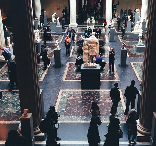
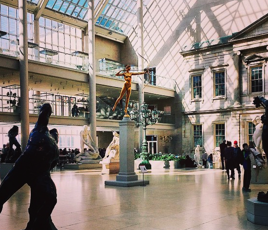
On another note, I was taken back in the best way possible by the stunning interior and exterior architecture of the museum building. It is large, open, and clean, as a result very welcoming. The clean space made me feel very comfortable and safe. For the amount of people at the museum I did not feel compressed, I was thankful for the open space and high ceilings, I believe it is an incredibly important feature of the museum. Additionally, the works are not cramped, they are nicely space out, as can be seen from the images, this helps give indivdiuls some privacy and sense of being while observing the works. Individuals should never feel pressured to move quickly through a museum, and I believe large crowds can have such an effect and can create great discomfort. While the interior and exterior are largely different, they both convey the grandness and importance of the building. The exterior has a large set of stairs that in conjuction with its locations draws attention to pedestraians and those transiting through the space.
While I didn’t have an opportunity to visit all of the exhibits in the museum, I felt as if I saw a large amount of the museum. Below are photos of my favorite works and gallerys from the museum, I hope from these images it is clear how there is no medium provided in the galleries to interact with the works apart from text. This is a large contrast to other museums I have visited, where museum goers can interact with the works, such as MoMA.
This museums houses a wide range of works. While the majority are not modern, I believe one should still have the opportunity to engage in a digital manner with the works, whether this digital engagement be limited to the app, offered through touch screen interactions and games in the galleries, it is missing something. There could even simply be QR codes located in the descriptions of select works, providing an opportunity to engage with the art deeper.
-
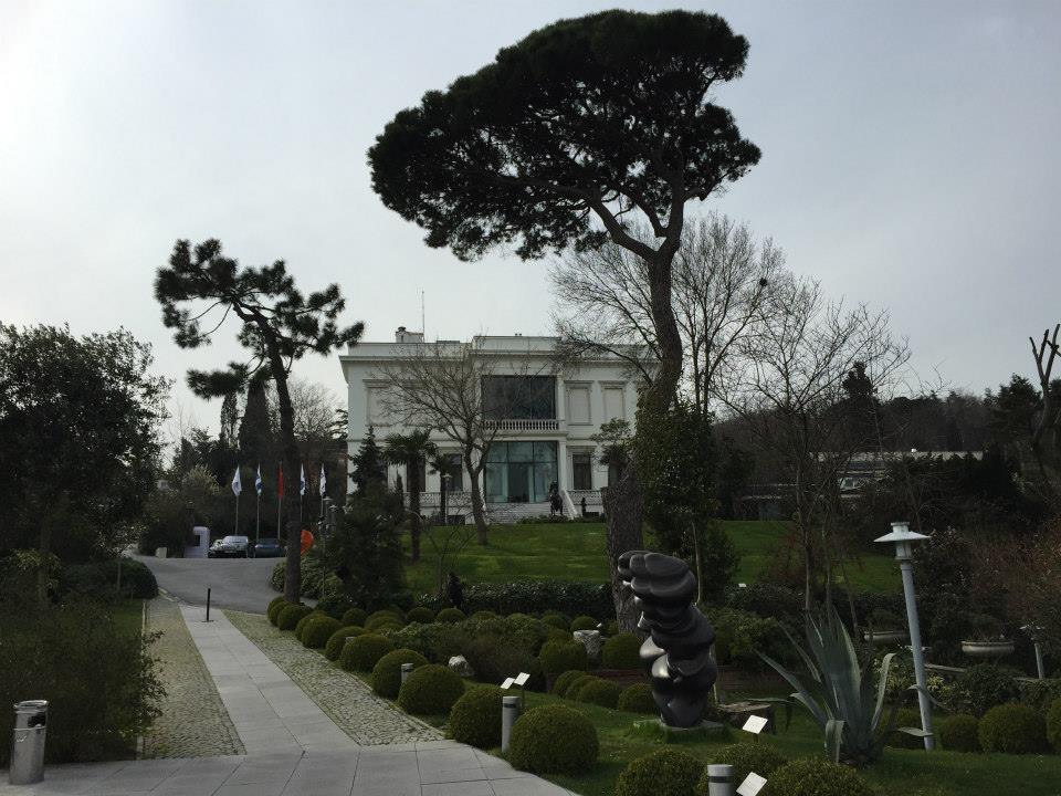
An Ethnography of the Sakip Sabanci Museum
Introduction & Context
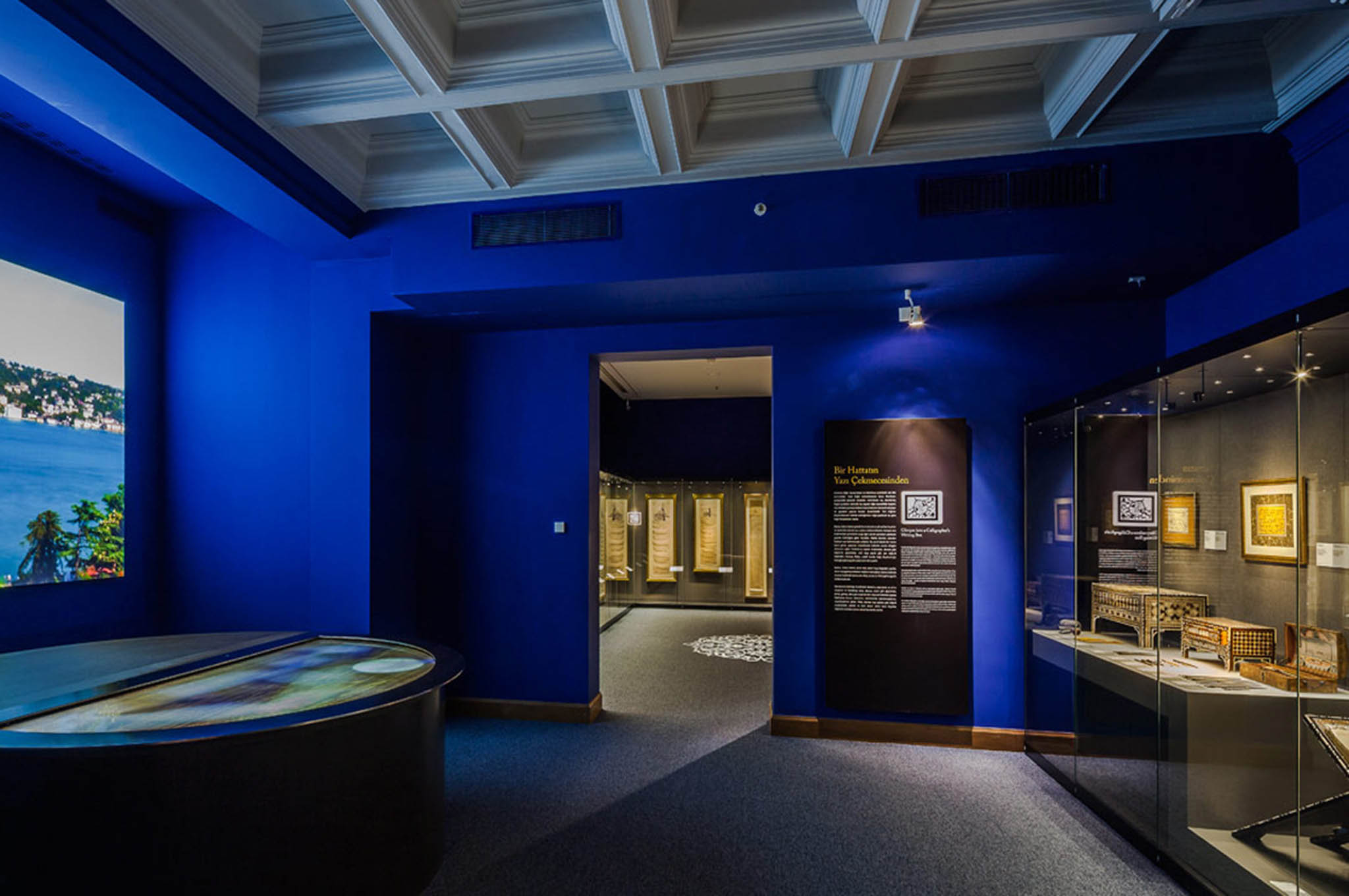
Having spent spring break in Istanbul, I visited the Sakip Sabanci Museum- a privately owned villa-turned-fine-arts-museum (a la Getty Villa). The SSM is well known in Turkey for hosting retrospective exhibitions on world-renowned artists like Salvador Dali, Rodin and Joseph Beuys. However, the permanent collection of the SSM is the home for a large collection of Islamic calligraphy art. This ethnography focuses on this collection and its display. I had the privilege to tour the collection with one of the curators, who talked me through the museums target demographic, and how they wish to expand it by incorporating different ways of information access. The museum is experimenting with various new methods – some I consider to be more effective than others.
Demographic
The Islamic calligraphy collection is somewhat of a niche interest area, and is not directly accessible for a broad audience. Additionally most of the art is in the form of old books (Quran’s etc.) that need to be well preserved and can only have one page open at any given time behind a glass display. The SSM came up with various interesting methods to overcome these challenges, and make the presented knowledge as accessible as possible. Additionally, there was a focus on making the museum interesting for children and modern art enthusiasts by introducing interactive technologies and parallels to contemporary works.
The Mobile App – A Great Way to Exhibit Books
The SSM developed a great iPad app that aims to augment the museum experience with digital expansion of the physically presented information. Acknowledging the novelty of these mobile technologies, the museum provides you with the option of renting an iPad with the app to use throughout your tour experience. This can be seen as a modern take on the outdated audio-tour option. Throughout the exhibit there are markers (similar to the one below) indicating you to point your camera while the app is running:
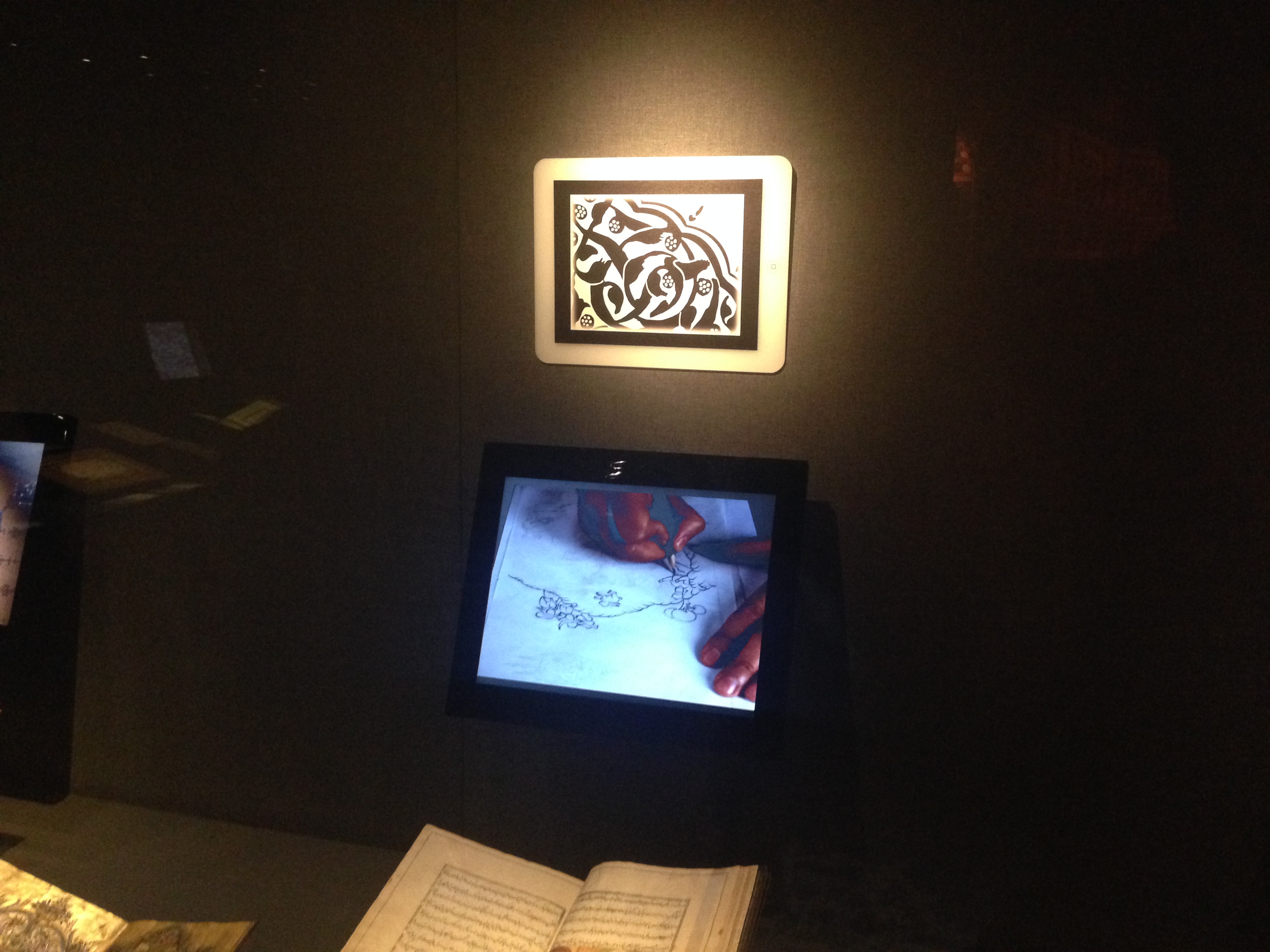
The app recognizes the unique pattern of this marker, and redirects the user to various interactive interfaces (e.g. photo libraries, text, scans). An example application can be seen at the lobby of the museum, which used to be a living room. A pattern here takes the user to a photo library of the late owner of the villa, Sakip Sabanci, hosting various celebrities and historical figures in this living space:
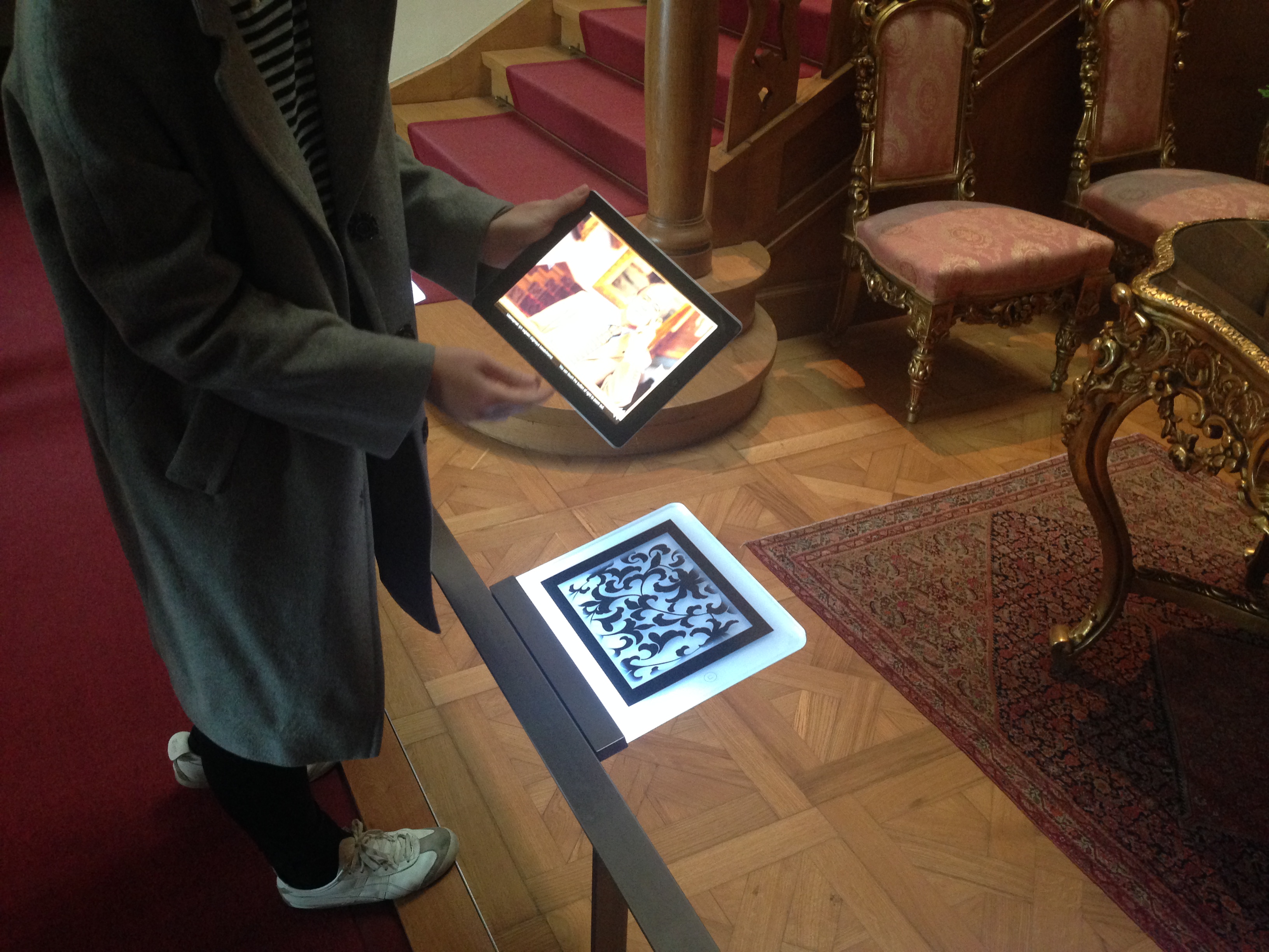
But I believe the greatest impact this technology has is in its use for exhibiting books. Scanning patterns near exhibited calligraphy books redirects the user to complete scans of all the books behind the glass display. The user can pick from many books, skim through the pages, and experience the dense text as a whole rather than being limited to the open page behind the glass. This is also an amazing resource for research purposes, which is why the museum has their whole scanned collection available online.
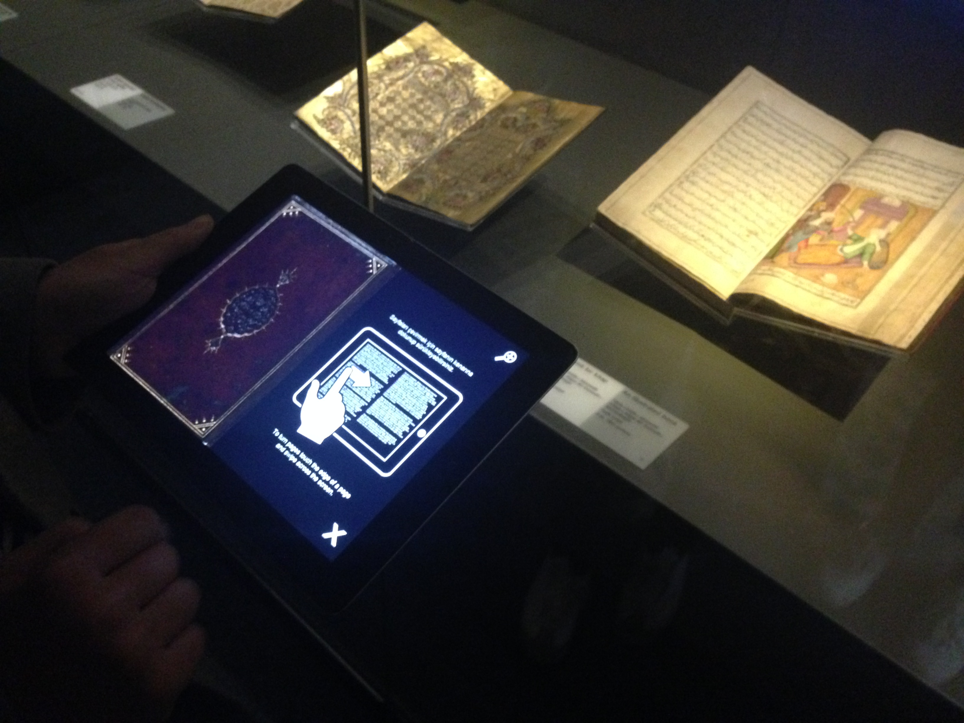 Image of a digital book
An Interactive Table for Kids
The museum also experimented with an interactive table and large display. This installation was primarily targeting younger visitors. The table contains many “eggs” that a user can manipulate and “throw” onto the large display showing an image of the Bosphorus. The eggs then crack, and the contents ( e.g. a calligraphic boat, or bird) move around on the Bosphorus before they disappear. Although the execution was impressive, I personally found this display somewhat gimmicky, as it had no goal of conveying any form of information to the kids. Rather it seemed like its purpose was to just entertain kids that might otherwise be bored of the exhibit to this point:
A Modern Take on Calligraphy by Kutlug Ataman
The calligraphy exhibition ends with a contemporary digital artwork that reinterprets the notion of making images out of text. In this work, the artist Kutlug Ataman overlays two videos of the Bosphorus water taken from the same location at two different times of day, typing the traditional call for prayer in Arabic with one video over the other. This “dynamic” calligraphy is connected with early traces of expressionist works from Ottoman art history. The incorporation of this somewhat out-of-place artwork acts as a great gateway for contemporary art enthusiasts to engage with work that is otherwise outside of their areas of interest.
-
Boston Museum of Science - Ethnography
NOTE: I notice that Karleigh also went to the Museum of Science and discussed some topics (ex. demographic, types of technology) in her post. So, in order to avoid repeating information, I will discuss the interior/exterior of the museum, an unexpected behavior, one possible frustration with the museum, and provide more examples of technology.
Interior/Exterior
Although the exterior of the building and the lobby (ticketing area + information booth) are quite typical, the museum distinguishes itself with a large T-Rex outside and a Rube Goldberg Machine inside.
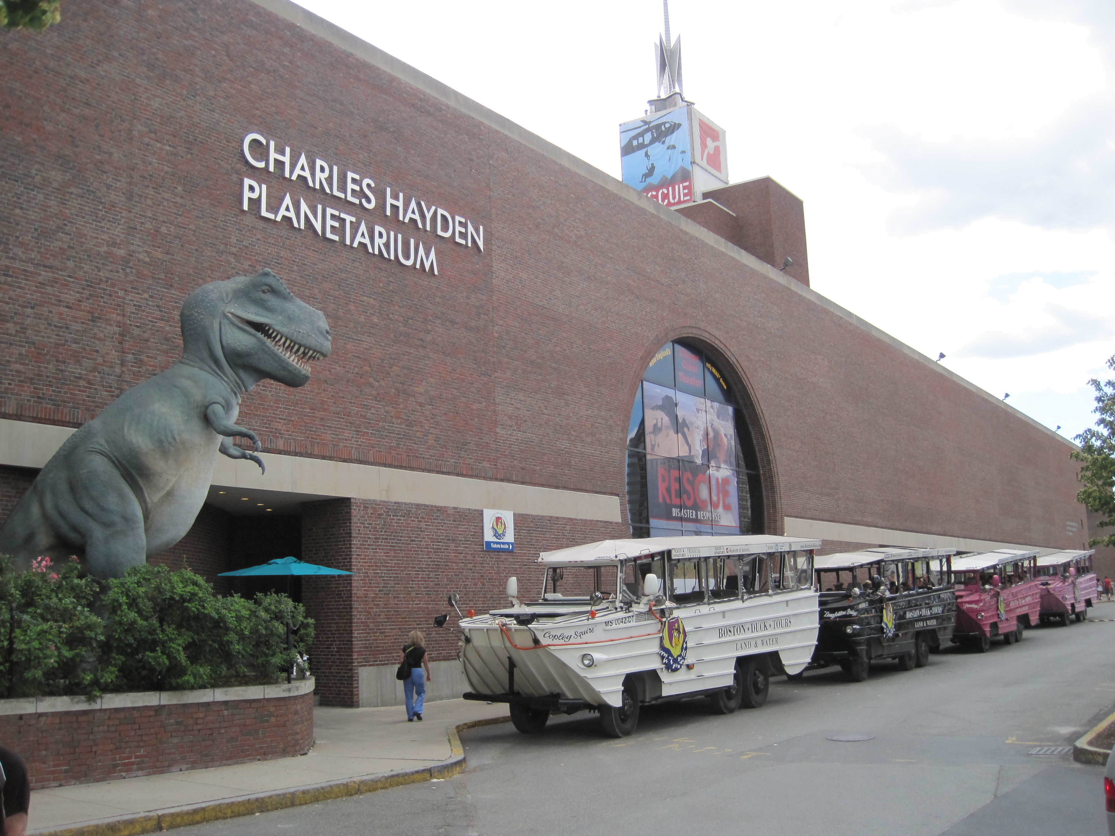
A T-Rex is outside. (source: http://www.afterhood.com/wp-content/uploads/2011/07/Science-Museum-6-11-7-01.jpg)
Rube Goldberg machine in lobby.
Unexpected Behavior
Interestingly, attendees tended to flock to displays which were mechanical, rather than purely digital. The novelty of the mechanical displays were the main attraction.
This screen in the food exhibit was abandoned for a long time.

I had to queue for several minutes before photographing the popular magnetic canvases.
Possible Frustration
While the museum captivates attendees and encourages interaction (ex. footrace between children), many of the attendees, adults included, did not pay attention to the informational content.
The audio tour was rarely used, and the sheer number of displays caused attendees to avoid reading informational boards, and instead move on to play with the next exhibit.
Children ran along this in this sensor-filled racetrack, but few read the information.
Many exhibits have audio tours, but I only saw two attendees use them.
In the wind exhibit, childen would play with the interactive display and run off before listening/reading the science.
Conclusion
The interior/exterior of the museum are typical, with a few distinguishing features. The exhibit halls themselves were highly unique and well decorated. The mechanical displays were very popular, but they were so widespread that attendees rarely read the science.
More Technology
###Mechanical
Artifical duststorm.

Tubes containing scents.
###Digital

Robotic bee.

Multi-screen aquarium.
Many displays used a computer and a few buttons.
-
[MuGo]- Simplifying Your Museum Visit
Project Title: [MuGo] Museum Trip Planner;”Easy, Breezy, Art”-MuGo
Problem: Often times you go out of your way to visit a museum, one may not be familiar with the area, amenities, and services offered by the museum. In fact, people may chose not to go to a museum because they feel like they will encounter inconveniences such as transportation, weather, and food issues. Another issue, is that people often feel that the information displayed in a museum is removed from one’s common knowledge and they may feel overwhelmed going to a museum. While there are applications that can provide such information, we aim to provide such information in a compiled, helpful manner.
Approach: We would like to streamline and concentrate the information in an interface that is easy to navigate and user friendly. One would be able to chose a museum and the date in which they hope to visit the museum. In response, the interface will display the weather for the day, tour times, museum events, transportation routes and travel time, and ratings of local restaurants and coffee shops near the museum. This way museum visits become less daunting and more feasible to the general public.
Audience: Our app targets a broad audience. We imagine our persona anywhere from young adult onwards. We hope that socioeconomic status will not be a limiting factor, however, our persona is most likely a more educated group;those who want to frequent museums, but don’t have time to plan out trips. Additionally, this app would prove useful to tourists and new residents of a given area.
Skills Needed: Front end developer, Minor Back End Developer, UI/UX designer, content development
-
Site Visit to the Museum of Science
The Boston Museum of Science
The Museum seemed to target families and in particular, school age children. This was initially clear just from taking stock of the people in line to get tickets and those enjoying the exhibits. There were large groups of children (seemingly on a class field trip), families with kids ranging from elementary to middle school ages. There were a few groups of college students as well. But the targeted age group was clear from the museum’s contents. Most of the exhibits were colorful, hands-on, or larger than life (or some combinations of all three).
As far as technologies associated with the museum they had many interactive and hand-on exhibits as well as a museum exhibit mobile app. I did not know about the museum app until after I left the museum though, so I am not sure how many people use it or know about it when at the museum (though I totally could’ve missed any signs advertising it). I can’t be sure if anyone was using the mobile app, but I did see many visitors with the museum map. Adults and children alike seemed to take advantage of the hands-on parts of displays, as well as the videos and sound recordings present at various exhibits.
Here are some examples and photos of the interactive exhibits I saw. Most of the interactiveness falls into audio, video, or tactile categories and many displays included a combination of these.
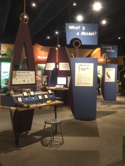
- Interactive exhibits that allow you to build “your own fish”, determine the energy efficiency of your home, and more. Used screens and computers.
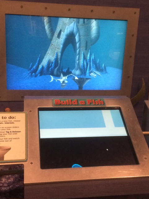
- Hands-on exhibits where you investigated an object and had to determine what it’s use was. Used physical, touchable objects.
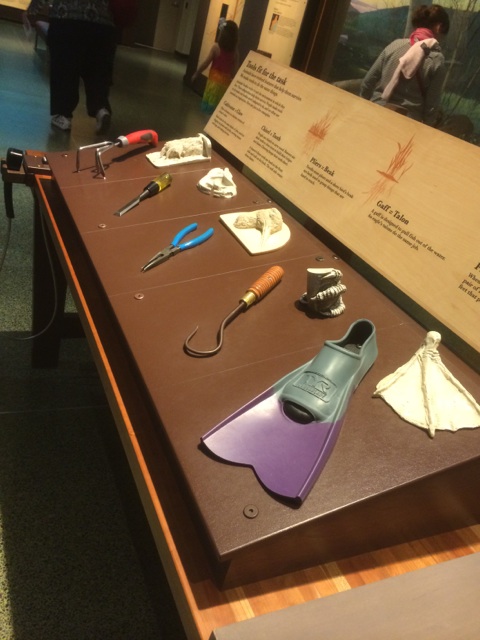
- In an exhibit regarding light and sound waves, there were interactive places to track your distance and plot it on a graph (using sound waves) and also a wall of mirrors placed at different angles to give life to the information presented on placards about light waves. Involved a person physically interacting with a data collection tool and computer. Other stations allowed guests to try things out for themselves, for example experimenting with the pressure per area of a bed of nails. Another allowed vistors to recreate Newton’s gravity experiments.
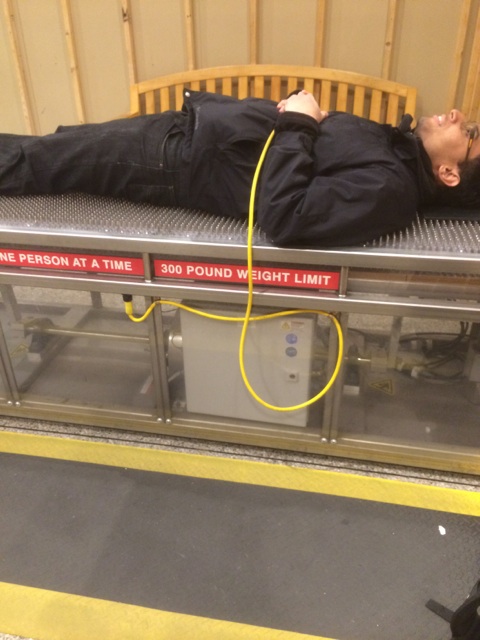
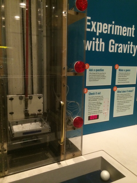
-
Many exhibits had tv/computer screens showing videos of elements of the exhibits in actions. For example, a display on recycling had a box filled with an amount of plastic grocery bags that a typical household uses each year, examples of different types of recyclable materials, and a video showing how recycling plants operate and actually turn recycled materials into new things. Combined video and audio as well as touchable exhibit elements.
-
In general, many exhibits featured “telephones” that guests could put to their ear to hear sound bytes explaining the display or it’s contents.
-
Ethnography of the Institute of Contemporary Art
This past Thursday, my friend and I visited Boston’s Institute for Contemporary Art. Located on Boston’s inner harbor, the rather top-heavy museum building features stunning glass walls. Outside, music played from some outdoor speakers planted in an outdoor seating area’s garden.
Entrance
We ducked out of the rain and into the museum. The entrance greeted us visitors with a rather large glass-walled atrium and a registration desk. We shook off our wet coats, checked in, donned our stickers, and took the elevator up to the fourth floor gallery space.
Gallery
The gallery space seemed to conform to the “white box” stereotype of museums, in that most rooms were painted white and rectangular in shape. However, the layout of the gallery space was rather intuitive; my friend and I wandered– sans map– and managed to see all of the exhibits with no repeats or crossovers. Several rooms featured cushy seating benches for patrons to rest upon during their stay.
Technologies
About halfway through our visit, we stumbled on the “Fox Family Mediatheque” room. The entrance opened to the top of a shelved seating area, with Mac computer monitors placed in front of the bench seating and colorful pillows scattered throughout. At the bottom of the stairs was a magnificent window that tilted slightly forward at the top, giving visitors a vertigo-inducing view of the harbor. The computers, equipped with headphones, displayed a handful of videos which the viewer could select to view. The videos themselves featured behind-the-scenes features of artists and exhibitions.
In addition to the Mediatheque, the ICA was equipped with several other augmenting technologies. The museum had a mobile guide, through which one could access tours, audio of artists speaking about their work, and other extra features using one’s own mobile device or one on loan from the museum. Pieces that had associated content displayed a mobile logo under their descriptive plaques.
-
Story Hunt
#Title Story Hunt - automatically generate visualizations to inspire data stories
#Problem Statement When we searched for data stories with the CFRP data, we realized that finding an interesting data story is not easy. You can try making various visualizations and graphs until you find something interesting. But, with so many variables + visualization types, this can be a time consuming process. Furthermore, it’s possible that you may completely miss an interesting story in your data. It would be useful to have a tool to assist in the hunt for a good data story.
#Approach Story Hunt is a piece of software which scan your dataset in search of interesting patterns. When it finds them, it will generate a set of visualizations to support each pattern it found. These patterns can be used as inspiration for a data story, or as the data story itself.
#Audience Data journalists must work with datasets and search for a story of interest. Story Hunt may make their jobs easier.
#Skills Needed Programming, visualization, and/or statistics
-
Visualizing Comedie Francaise
For our project we decided to explore the number of tickets sold by the type of ticket or the amount of money made by ticket. The following website will direct you to our data visualization. htttp://18.238.5.69:8880/ However this website has not been styled yet, we have much higher aspirations for what the website could look like and what we could accomplish with the give data. Below are some mockups that we created of what we hope the website will look like. We intended for the website to be easy to navigate and slightly more informal.
-
Transmedia + Moby Dick
I think that once the Moby Dick data is cleaned up a bit with metadata incorporated to decide if a location was simply mentioned or if it was a place that characters went/events took place, this could be really cool for a new form of audio (visual) books.
As someone is listening to the story, there could be a sort of animation, triggered at certain points in the narrative (namely, when a location is mentioned) that shows, say a ship for Moby Dick, travel to the new destination on a map. This could be a cool way of incorporating transmedia material, if we could do it in a way or at a time when it wouldn’t be too disruptive to the story. For example, let’s say Character A travels with his crew from England to South Africa, the animation would show the ship sailing (just to set the tone for the transmedia experience) and then once they’ve arrived at the destination, a sort of captains log or side story of one of the other characters at that location (the possibilities are endless), could appear to the side, so that the reader/listener can further explore the story world. This could also be a place to insert opportunities to discover more about the historical context and relevance to the story of the location. I have nowhere near the technical background to even know where to start doing this, so hopefully my description will suffice.
-
Moby Dick Project
Although I had big goals for this project, my lack of experience with HTML JavaScript was deffinitely a limiting factor in exectuing my ideas.
Similar to former projects, my main concern for this project was to contextualize the given data as much as possible. For this purpose, the given data of location names has to be reorganized and better charatirized with additional information. Here are a few ideas I had:
1. Drawing the Iteniary: This is a fairly obvious idea. It would be great to extract the points from the locations that the characters visit, and generate a route. This could be a great tool to augment the reading experience, especially if the locations on the map are further linked to images/photographs of those places. This would make the reading much more visual and interesting.
2. Assigning quotes to characters: It would be iteresting to sort the locations by the characters that mention them in the text. Naturally, most of it will be assigned to Ishmael, but it would be interesting to see if the other characters and their conversations are closely linked with certain regions around the world.
3. Linking locations with Melville’s Personal Experiences: It would also be extremely interesting to link additional data with each location that relates to Herman Melville’s biography and experiences as a whaler. This could be an interesting tool to identify the autobiographical elements of Moby Dick.
I think that this tool has amazing potential when used within the right context. However all three of my ideas above either require (a) A manual filtering of the data through in-depth reading of Moby Dick, or (b) further research and data collection and analysis.
As I lacked the time and expertise to complete any of these, I present to you what I accomplished within the 1 week time frame: a slider bar that adjusts the opacity of the overlaying map.
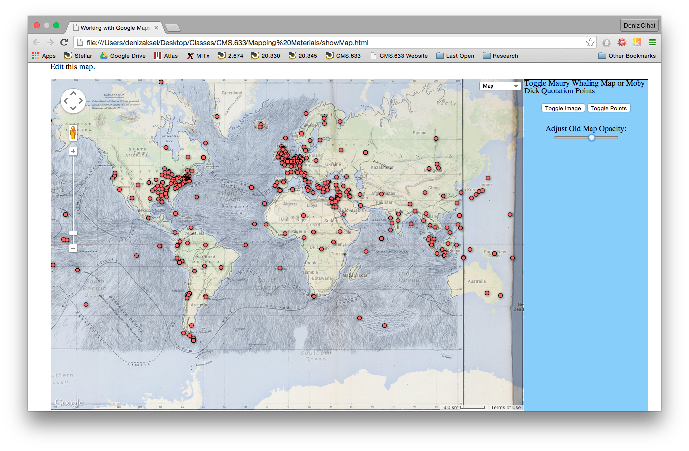
-
Moby Dick: Path of Thoughts
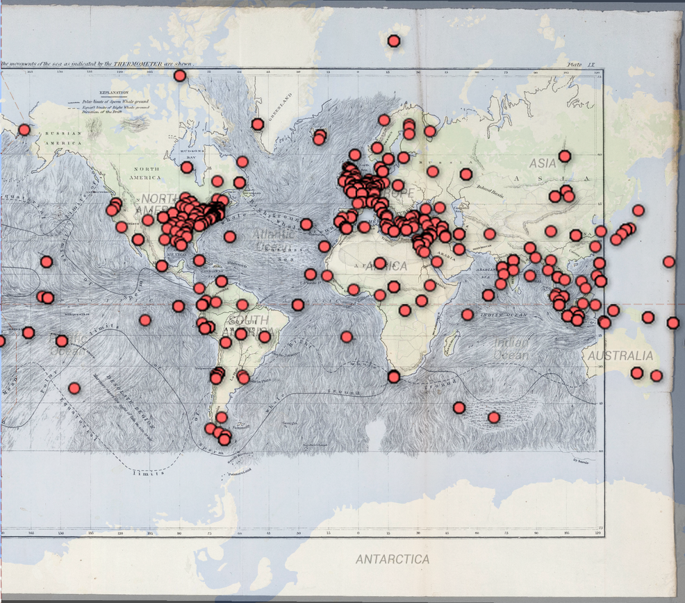 The markers on this map reflects every single location mentioned in the famous novel Moby Dick, everything from a place name someone said to a place the main characters have been to. Using Google Maps and Google Fusion Tables, we successfully mapped all these locations on the World Map. But if we were given flexibility to augment and modify this data, there are some changes that we hope to make.
First, we hope to make a distinction among location types. More specifically, for any place name mentioned, it can either simply mentioned as a place the main characters want to visit (e.g. “I want to go to Scotland”), a metaphor (“Go to Hell!”), or a place the characters at at right now (“We sailed through Spain”). If we are able to categorize these places, we can create a more specific map that illustrates the characters’ journey. For example, taking all the places that they physically went in chronological order, we can construct the actual journey by connecting the locations in a path. Then for each physical location node, we can look at all the places that the characters mentioned while they are at that physical location, and draw an edge between that place and the place mentioned. Now we can imagine that certain places are mentioned more than others when the characters are in a certain place, and this can help us visualize the characters’ though process.
Another idea would be a simple treemap that counts how many times each place is mentioned. This allow us to easily see which locations are mentioned more often than others, and also help us visualize the characters’ journey.
-
Moby Dick Mapping Project
This is more of a concept than an implementation since I’m not sure how to actually implement this in a web environment. It is definitely interesting to see how the story would change if it’s set in a different time period. My concept is to allow the users to select which year they would like to set the stories, and the map will highlight the most searched events and locations in that time period. The map of the original map will be overlayed onto the selected time period. Therefore, people will be able to get a feel of how the whale searching will be different if the story was set in a different time.
The outcome of this will allow people to get a feel of the important events of each time period as well as how it could affect the same kind of activities. This can be extrapolated to other activities and see how the change of the society can affect human interaction and experience. Below is a rough similated image of how I envision it to look
-
Moby Dick - Making Maps
After missing class, I was worried I would be behind but I am already familiar with the Google Maps API. I was excited to learn about Fusion Tables. I would have loved to use it when I created a map of some Historically Black Neighborhoods for a class. We used data from a Wikipedia page (we ended up hard coding in the latlongs, although we could have used JSON using Kimono).
However, I found FusionTable layers to unwieldly (difficult to customize infoWindows, create onClick events). It would have been easier to convert the FusionTable into JSON and recreate from there (or I will work with CartoDB). So, I have a very simple map of the Moby Dick location references.
My design proposals:
- onClick: make a call to the Wikipedia API for an extract from a page about the location clicked
- onClick: make a call to the Yelp API to find a nearby cafe to read the book on location
- overlay a map of Herman Meville’s travels
- overlay a map of popular travel locations in his time period
- overlap a map of the most mentioned places in the new in his time
- a slider time progression (per chapter intervals) : a good chapter summary
-
Mapping Exploration
For this exercise, I wanted to situate the novel Moby Dick by Herman Melville in the time period in which it was published. To do this, I decided to try to overlay my GIS map of locations mentioned in the novel on a world map I found of exploration and discovery routes. The novel was published in 1851, so I chose a map from 1850.
However, though I was able to position the world map on a map of the world, I had some technical problems with merging my fusion table with them.
However, as you can see from the map linked above, routes through the sea were still being established during that time. It seems incredible, then, that Melville would have even known of all of the places mentioned in the book, given the rather limited scope of the colonial and imperial project at that time. Looking at this map seems to visually historically situate both the novel and the author, which is one aspect of GIS technology I find inticing to explore.
Unfortunately, the map itself is a bit blurry. I feel that the quality of the visualization would improve if I could find a higher-quality map. If this could not be accomplished, it would be neat to have another GIS overlay highlighting the ship routes to make them more clear to the viewer.
-
Comparing locations across different page ranges
For my data mapping project, I created webpage that visualizes the locations in Moby Dick based on page ranges. Given a start page and an end page, you can filter down the results displayed on the map so that only references from the desired pages appear.
You can view a demo of the webpage here
I decided that this tool on its own is limiting, but becomes much more powerful if you have an easy way to compare the resulting references to those of another page range. Thus, I added another layer to the map that uses a different pin color. You can now enter two page ranges; one for the first layer, and one for the second layer, and see the results on top of one another for easy comparison.
Here is a screenshot of the interface:
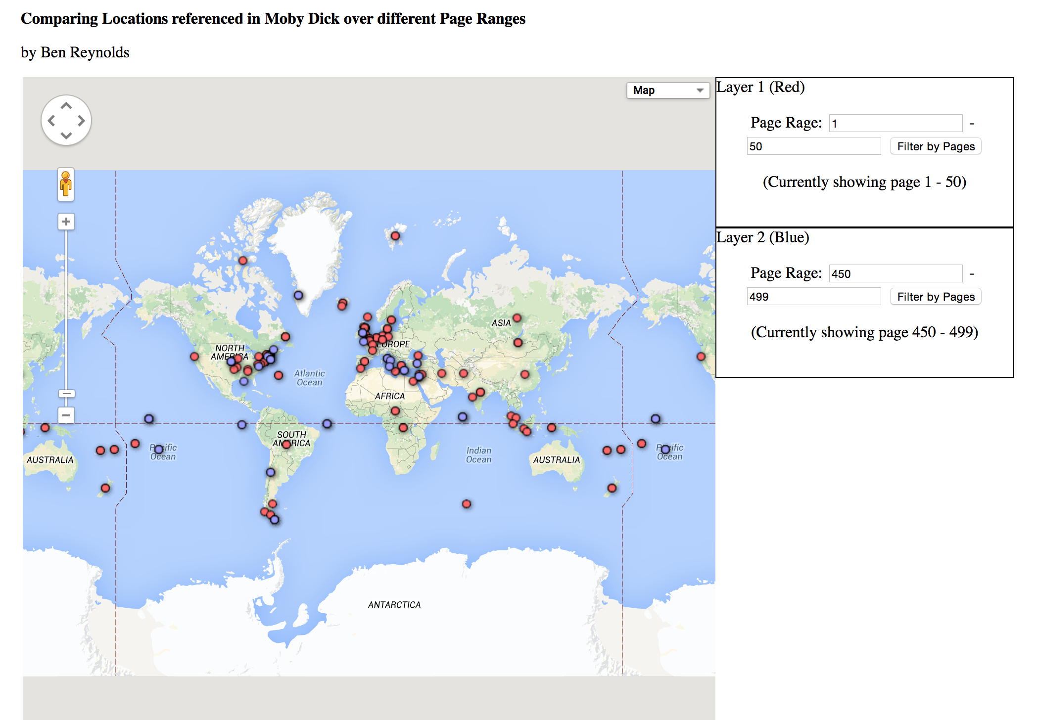
The red markers display the first layer, which in this case represents all the locations mentioned in the first 50 pages of Moby Dick. The blue markers display the second layer, which represent the last 50 pages in this example. It’s interesting to see the difference between the locations mentioned in the beginning, versus those mentioned at the end of this novel. For example, this visualization makes it clear that there are many more references to Western Europe in the beginning of the book than there are at the end.
-
Coloring the Map
My refined map: http://cdb.io/1E4K2We I brought the data set into CartoDB and added a gradient of colors that varies based on page number of the location mention. As you can see in the map, many locations are scattered in terms of page numbers and mentions. However, you can see a bit of a pattern in the way that the locations seem to approach two main locations as the book progresses: the Northeast coast of the US as well as the UK. There is also a shift to talk of the more nothern parts of Asia later in the book. I haven’t actually read the book, so I can’t make too many conclusions about the reasons for all these mentions and patterns just from looking at this map. However, I think it is worth looking at these patterns.
What I could not implement: It’d help more to be able to see, on the side, the entire page text in which a location was mentioned, perhaps at a click. Right now a hover brings up a little information like page and line and quote, but the quotes are so short they hardly tell anything. Also, some points share sentences–it might be nice to see that relation visualized, such as in the form of a line between the points. It might also be cool to see a sequence of arrows between points around the same area and close page numbers–it might help track paths through the story. Filtering for page number intervals and chapters would also help narrow down on certain groups of mentions–like in Harihar’s map.
I spent a long time trying to get fusion tables to display the color so I could incorporate it as an overlay, but in the end, it refused to accept any notion of styling, so I switched to CartoDB. This, however, meant I did not know how to include the whaling map overlay.
-
CartoDB
CartoDB
We put the locations data into cartodb and played around with heatmaps to see how they change over time. our results
-
Adding Sea Charts to Moby Dick Mapping
One of the ideas I became interested in pursuing when looking at the Moby Dick Maps was whether shipping charts would add to the given visualization. Luckily, there were several additional Maury Charts given to us to work with. I tried overlaying the Atlantic, next to the Americas and next to Africa and the Pacific, adjacent to Asia.
###Map of Atlantic #1 ###
I did not find that this chart added a large amount of insight to the data, so further examination of the text would be necessary to make this more useful.
###Map of Pacific###
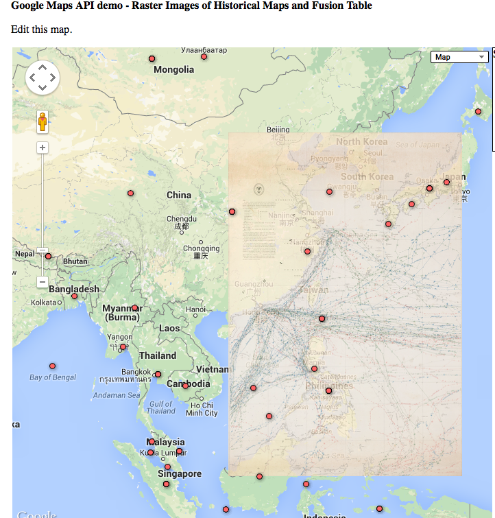
This map helps me understand the visualization better as the routes connect the location dots on the map.
###Map of Atlantic #2 ###
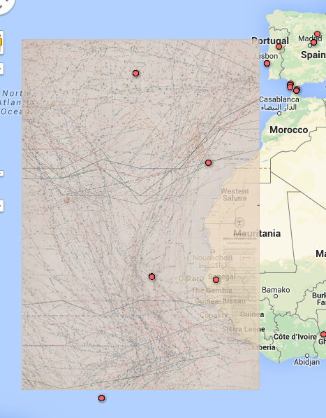
Similar with the Map of the Pacific, I feel this map helps contextualize the data points it covers.
Additional changes to UI that I would make is the ability to toggle each overlaid map individually. I also would explore different sea chart to see if any additional insight is revealed.
I think the whaling chart can add additional info by mapping the paths followed in the book. Additionally, we discussed the problem of generalized locations (Pacific Ocean, Mighigan, etc) and at least concerning the areas in water or along the coast, these charts could give a more logical location for the data points, such as along the provided routes.
-
Moby Dick, Dynamic Data
We struggled with some of the technical aspects of this assignment. While we were able to roughly generate a map with the points from the CSV file, we had trouble manipulating the visualization and data to out liking. However, we had many ideas for expanding the potential of the data set and the effectiveness of the visualization.
One approach we thought of to make the data more dynamic was manipulating the size of the drop pin based on the number of times a given location was referenced in the text. The greater the number of references the larger the point and vice versa. This would give users a map visualization whose information could be easily digested and therefore a more meaningful tool for learning. Instead of being accosted by an extremely large number of points, the visualization would consolidate some points if they were close enough in location to streamline the data.
Another idea we had was to parse through data points based on key words that appear in quotes throughout the book. There could be a search bar in the corner of the screen that allowed users to filter through points whose quotes did not contain a given word or phrase. For instance, a user trying to study the idea of wonder and Morocco in Melville’s novel could simply type the words into the engine and the corresponding points would enlarge while the others disappeared. This could be a useful tool for literary scholars trying to find patterns or repetition of descriptors in Moby Dick, and how these patterns apply to location. In addition to this feature, we would like to incorporate the ability to search by location in the same search bar, this would allow users to search some of his works based on the particular location.
We additionally would hope to make a few changes to the informatoin that displays when the user clicks on the points. Seeing that data would be grouped based on location, when the user clicks on the individual point, they have the option to search through the different indexes of occurences. For example if there were 3 mentions of Boston, MA in text, upon clicking on the point the indexes 0-3 would pop up and the user can look at the data of each occurence individually.We believe setting up the interface in such a manner would prove valuable to the user.
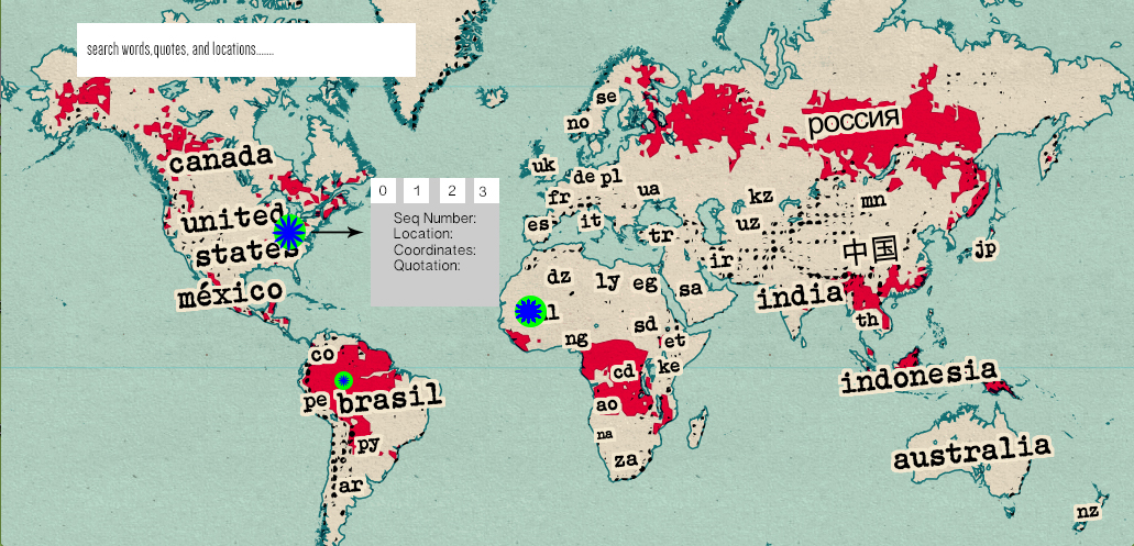
-
Map Update with Whale Populations
For my update, I found a map of sperm whale populations and tried to overlay it onto the map. I ran into a few problems with this. First, the map had the pacific ocean in the center, which meant that overlaying it with the Google Maps API was surprisingly difficult, and I had to fix it in GIMP.
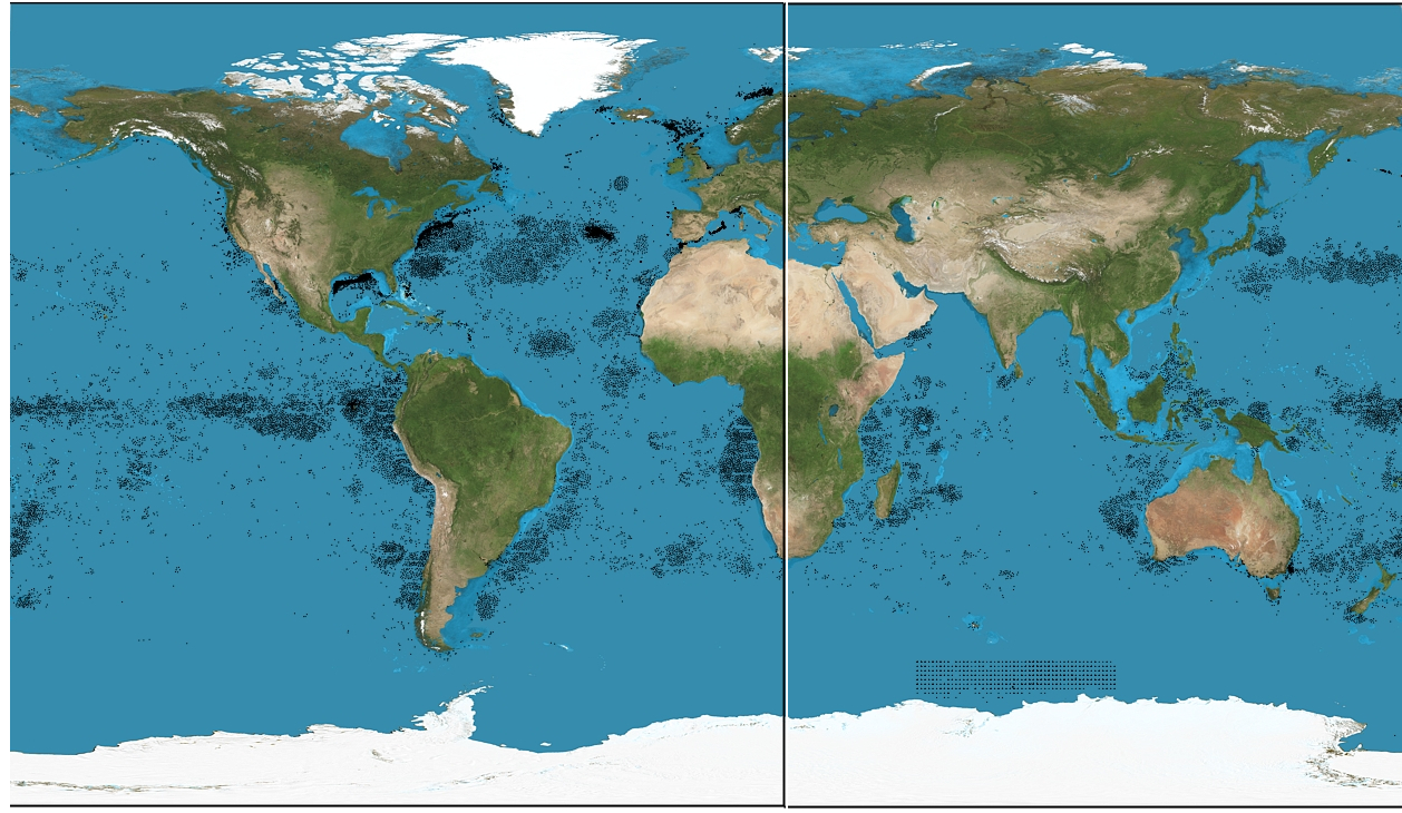 This was not that big a deal to fix, however, and was quickly (and mildly unprofessionally, sure) taken care of. The real problem was when I overlayed it on the actual map. At first look, it seems like there’s no problem except for a slight mismatch in my latitude and longitude coordinates:
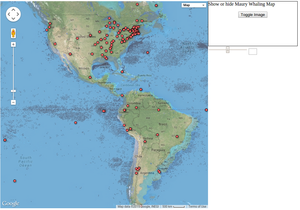
But then, if you look at other areas of the map, the problem becomes clear:
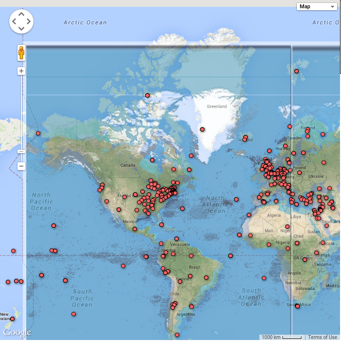
The map projections are different! This is something I would consider a major problem in any sort of geotagging experiment that involves the use of maps. The projection of the map matters enormously when trying to combine different maps, and mine was an incompatible projection.
The problem of projections is not unreasonable to solve. I could probably reproject the image onto a different map, or process the image to acquire the lat/long coordinates of the sperm whale grounds to be written directly onto the Google map. However, there is no easy tool to do this. I could write my own, but I feel that this reprojection problem should be solveable without cracking open an attempt at map reprojection software that I’ve never thought about before.
This is something I feel is a big problem with the mapping software: the different types of data (in this case, image overlays) have many different formats. Trying to overlay them all into a single map is potentially a daunting task, depending on the diversity of your data sources.
-
Moby Dick Map
I cleaned up the map we worked on in class and added some features.
The map occupies the full page now, which makes better use of the screen real-estate. The old version simply occupied a small part of the screen. Another change is that the map now loads points from the csv file, rather than from Fusion Table. The advantage here is that I can more easily hide/show points via the Google Maps API, and that the project is more self contained (it does not require access to Fusion Table).
I added the ability to search by quote. This way, you can look for similarities (ex. where do we see “Pine Barrens”). Another feature, which I didn’t implement but would be useful, is searching by regular expression. This would give you much more power in your searchs.
I also allow the user to filter down to a specific range of sequence numbers. This is helpful if you’re restricting your attention to a particular part of the book. I chose to use sequence numbers instead of page numbers because it required less cleaning, but using page numbers should be possible as well.
Finally, the user can animate the points. This is helpful to see how the focus of the story changes over time. Since dataset contains all referenced places, rather than the places that the story takes place in, the animation hops all over the globe. However, if we annotated the dataset to indicate the places that the story actually occurs in, then an animation might let us see the voyage.
Cleaning the data took some time, as did getting familiar with the Google Maps API. However, the features did not take too long to code. The website is still a bit slow, however.
See the website here
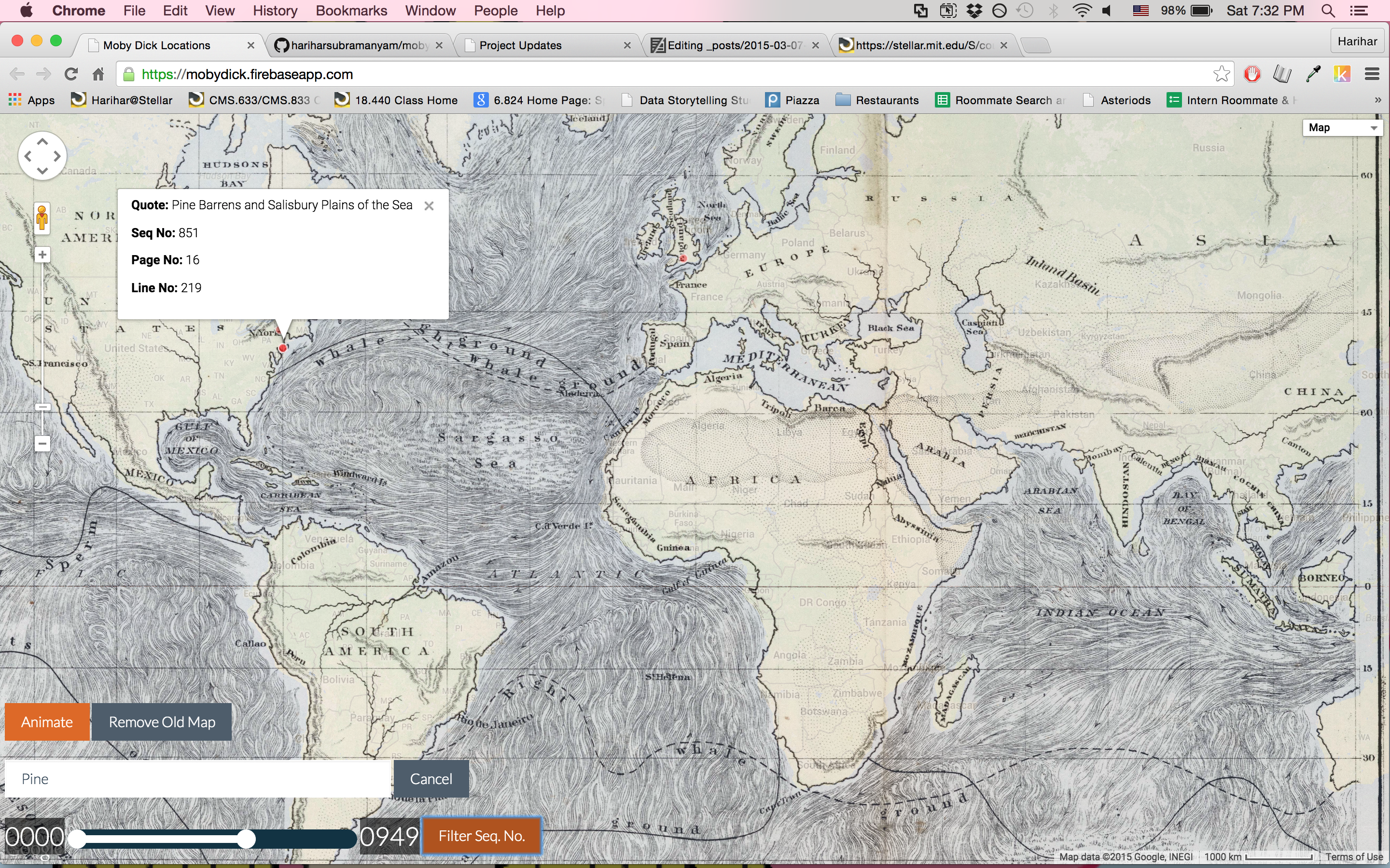
-
Popularity and Success of Plays and Genres Over Time
Our visualization: http://mit.edu/changycj/www/cfrp/cfrp.html
Our group decided to tackle the research question, how does the success and popularity of different genres and plays change over time? We decided to approach this question by looking at the number of performances of a genre/play in contrast to their ticket sales in different time spans. This visualization would aid research of French history and how events affected both the theatre and society. It could also be applied to current day, as we may be able to predict which genres or plays will sell more tickets–or possibly to figure out the optimal number of performances for getting ticket sales. We are starting with a small time span for our prototype, but we would stretch this to a larger number of years for the final version.
We initially envisioned that our visualization will look like the following:
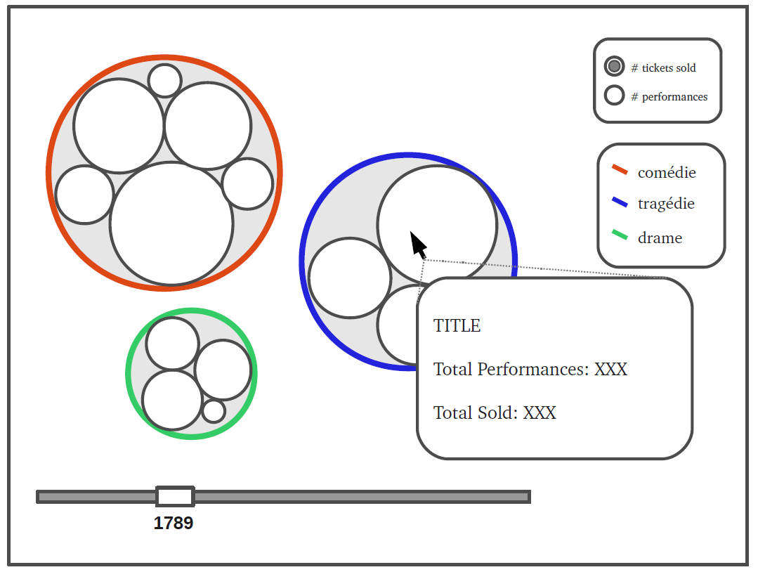
The larger bubble graph would show either the number of performances or total ticket sales (based on the radio button selection on the side menu) for each genre over time. Different colors (and a color guide) would make it easy to identify the genre. The nested bubble graphs inside each bubble will show the same for each play. Hovering over a certain play bubble will give more stats on the play: the name of the play, total ticket sales, number of performances, etc.
We did have to deal with a lot of constraints in the making of our prototype, however. We used a tree graph because of issues with the d3plus library; we could not adjust the bubble sizes and distance between bubbles. The tree graph still gives a good idea of the relative popularity of certain plays and genres, though. We also had to limit the size of the data we were dealing with, both so that we could process it and so that it would not take forever to load. We decided to limit our data set to 12 quarters, 4 quarters in each of the years 1788, 1789, and 1790. Our visualization makes 12 different query calls, one for each quarter (changing the date=gte.YYYY-MM-DD&date=lt.YYYY-MM-DD accordingly), so that we have 12 queries running in parallel instead of making one gigantic query for 3 years. (This is one example API query to Postman: https://cfrp-api.herokuapp.com/play_ticket_sales?total_sold=gt.0&date=gte.1788-01-01&date=lt.1788-04-01 )
-
That Pulsar Thing
Here is the link to our CFPR Pulsar Finder: roslin.mit.edu:2000
We decided to continue on with the use of Pulsar finders. Pulsar finding finds patterns as they appear over time (canceling out the noise and irrelevant outliers). In one of the first classes in CMS.633, we talked about clustering algorithms used to find correlations. Our pulsar finder does indeed find interesting correlations over time.
Our visualization shows the strong effects of day of the week, month, year, and decades on all other parameters (genre, title, and author). As a tool for historians, we decided to focus on chronology because the work of the CFRP lasts over a very long period of time.
Design changes: We used some simple CSS to edit the input and submit fields. However, the meat of our visual design is provided by the library Chart.js, so the more meaningful design changes would be creating meaningful x and y axis labels as well as point labels. We would also abstract away the way we search the API for information and provide more intuitive verbs. In addition, we would seek to compare to data sets as visualized below.
-
CRFP Data Visualization (RAW)
Note: This is a late posting of last week’s homework.
For my visualization, I decided to explore one of the lesser-used visualization chart types: the Voronoi Tessellation, which you can read about here. In this visualization, my goal was to show the popularity of genres in the period, using ticket sales as a metric of said popularity.
I started with the large dataset, which produced this:
The X axis represents the date, the y axis represents the total tickets sold, and the color represents the genre.
As you can see, the image is a bit difficult to parse. I decided to try it again with the smaller dataset, using the same dimensions for the axes and color:
This one is much more readable, though it also has no labels.
However, what does this data actually show? I confess, I did not know what a Voronoi Tessellation was- or how it was constructed- until after I made my graphs. While I initially thought that the size of each polygon would correlate with the number of tickets sold, but, when I looked into the matter, I realized that the polygons, in fact, represented every point that is closer to its point (seed) than any others.
So, do the size and shapes of these polygons created with this data actually mean anything? From what I can tell… not much.
Since the size of a polygon is determined by its point’s distance from other points, the only reasonable interpretation of the graph that I can think of is that, the larger the polygon, the more of an anamoly that day was, as far as ticket sales go for that period. However, even this is imperfect, given we are working with two variables and in 2D space. A polygon could be large due to fluctuations in ticket sales or due to a difference in frequency of shows.
However, one could glean some information about the popularity of certain genres. The light purple and dark purple polygons, which represent comedie-drame and tragedie-bourgeoise, are particularly high on the graph, which means they had higher ticket sales. However, the shape of the polygon may blur the viewer’s ability to see exactly how popular the show was. For example, the seed point of the dark purple polygon (tragedie-bourgeoise) sits quite low; the polygon reaches the top of the chart. This may lead the viewer to believe that the show was more popular than it was in actuality.
Lesson learned: know what your visualization actually does before employing it, or you may misrepresent your data, or even end up with a visualization that conveys nothing at all.
Finally, while this visualization is elegant (ignoring its ill-suitedness for this dataset), it is a bit complicated in its structure. This is a point we must remember when creating visualizations: not everyone is data-literate, and sometimes simple visualizations are the most effective.
-
Charles IX ou l'École des rois and The French Revolution
What question are we addressing?
Joseph Chenier’s “Charles IX ou l’École des rois” is considered a key catalyzer on the path leading to the French Revolution.
With his controversial depiction of the French Monarch Charles IX, Chenier presented a Republican perspective on the French aristocracy prior to the French Revolution. François Joseph Talma’s performance as the king also led to the plays popularity.
What were ticket sales like for performances of this play over time. In particular how did lodge attendance change over time and how did parterre attendance change over time?
Audience
This tool would be interesting for those studying the history of the French Revolution and particularly cultural contributions to tensions. This tool could be easily integrated with a museum exhibit regarding French history surrounding the Revolution or even the societal/political influences of art and theater.
Our API Approach
We built the website using d3.js to power the visualization. First, we send an HTTP GET request to the CFRP API to retrieve data about the number of tickets sold for this play. We do so for the lodge tickets and the parterre tickets, and we visualize each in a simple bar chart powered by d3.js. The charts are side-by-side so you can easily compare the types of tickets sold on a given night. Below is a screen shot of our website, showing the bar graphs that compare theater attendance, according to ticket sales, of wealthier and poorer classes to this controversial play.
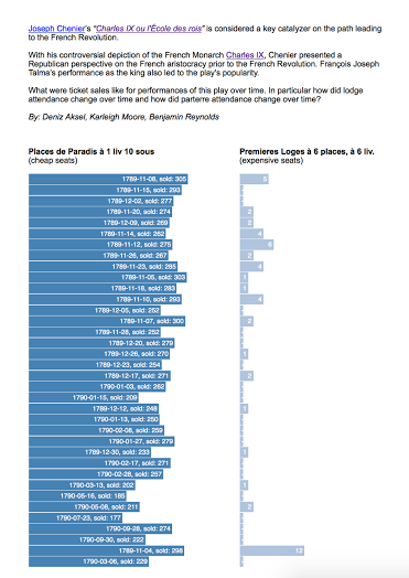
Mockup for Future Designs/Additions
For a future version of the project, we want to go for an even larger-scale design idea/question for our imagined website/tool: A tool for quantifying the effects of CF on the french revolution via the study of specific cases ( certain plays, performances by actors etc.) Basically we catch and present attendance/section ticket sale trends that we believe would be interesting within the context of the revolution. There is a summary of this idea under the “About” page shown below.
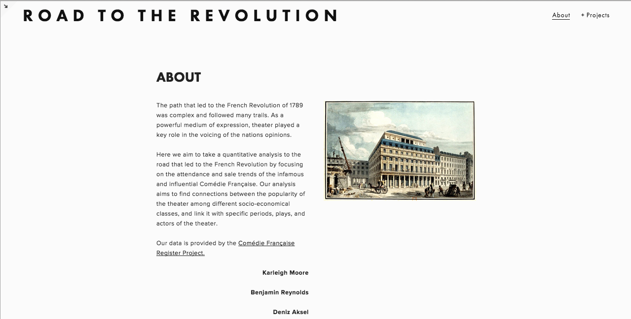
Here is an idea of what our home page would look like.
Also to add flexibility, we figured the data visualization graph could have options like looking at total sale numbers vs (tickets sold/tickets available). We tried to show this with selection buttons next to the graph.
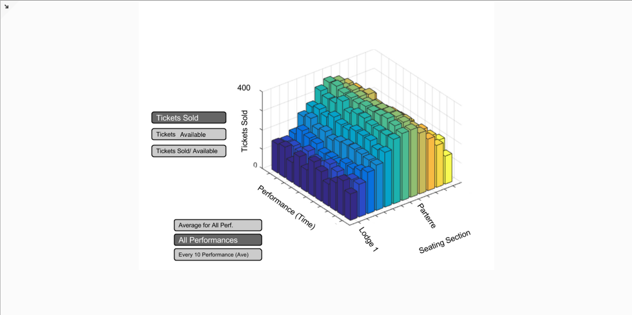
Also, notice that the text above the graph is full of hyperlinks! These are mostly to wikipedia pages of whatever is highlighted. Except for the play name itself: that one is a scanned copy of the script (can be found here). This could be a useful feature for those who want to know more about specific parameters and things mentioned on the site.
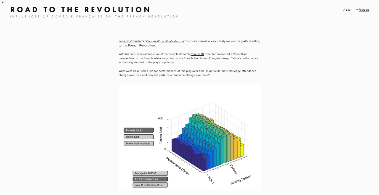
-
CFRP Author Timeline
Research Question: Who were the authors of the Comédie-Française?
To answer our research question we have created a website mimicking the Internet Movie Database (IMDB), but instead of using actors, we used the playwrights of the CF. Each playwright and their work is catalogued to be searched and viewed quickly.
There will be two primary ways to search this database. First is a standard text-field search. A second option is to locate specific authors along the timeline displayed on the main page of the website. Each author is marked at their date of birth. Searching a specific year causes the timeline to display the span of ten-years from the query. This method helps contextualize the authors’ work by graphically showing the period in which they were alive, allowing the user to view which playwrights were contemporaries as well as understand the historical influences which may have influenced their work. We found that initially the granularity of ten year periods resulted in an uncluttered visualization, which still displayed popularity trends, but that future iterations could include the option to change this scale. Additionally, we would include the ability to search plays as well as authors as well as the ability to scroll through the timeline. The initial mockup is shown below:
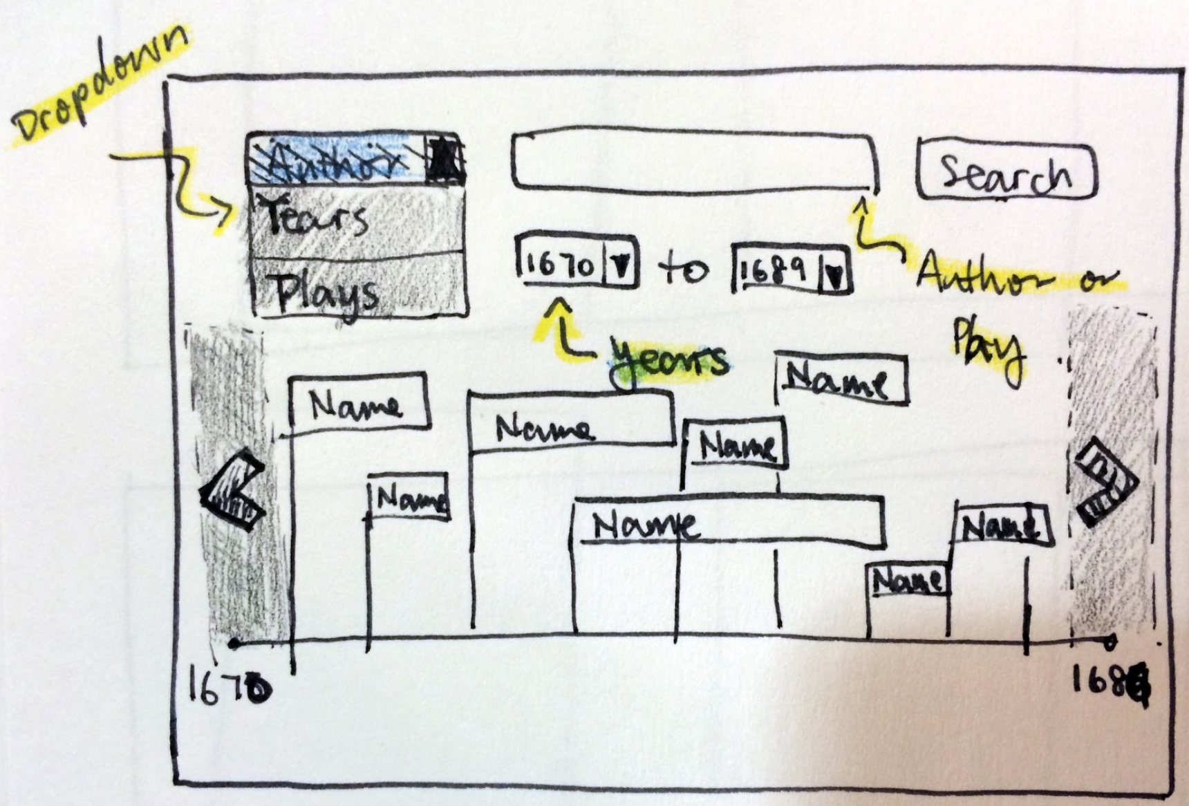
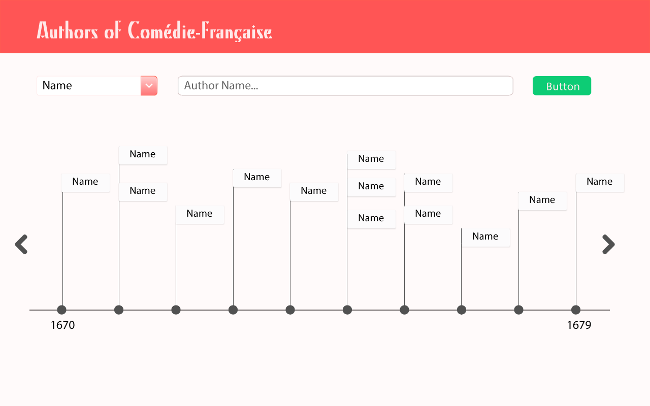
After clicking on a specific author, the CF API is queried and the web page displays the authors lifespan, plays written, and total number of performances, which are pulled from the API and processed in real time. The individual playwrights pages add more details such as the popularity of their work as well as their prolificness. It further contextualizes their work as it shown when the playwright was alive. A final iteration would show a graph detailing the number of tickets each type of ticket sold for each play, mapped against the year [Figure 2]. This graph will allow users to gauge which play was most popular and when it was playing. Outside sources of information, such as a link to the text of each play or a link to a biographical reference to each author, could be included on the individual author page as well. Another mockup is shown below:
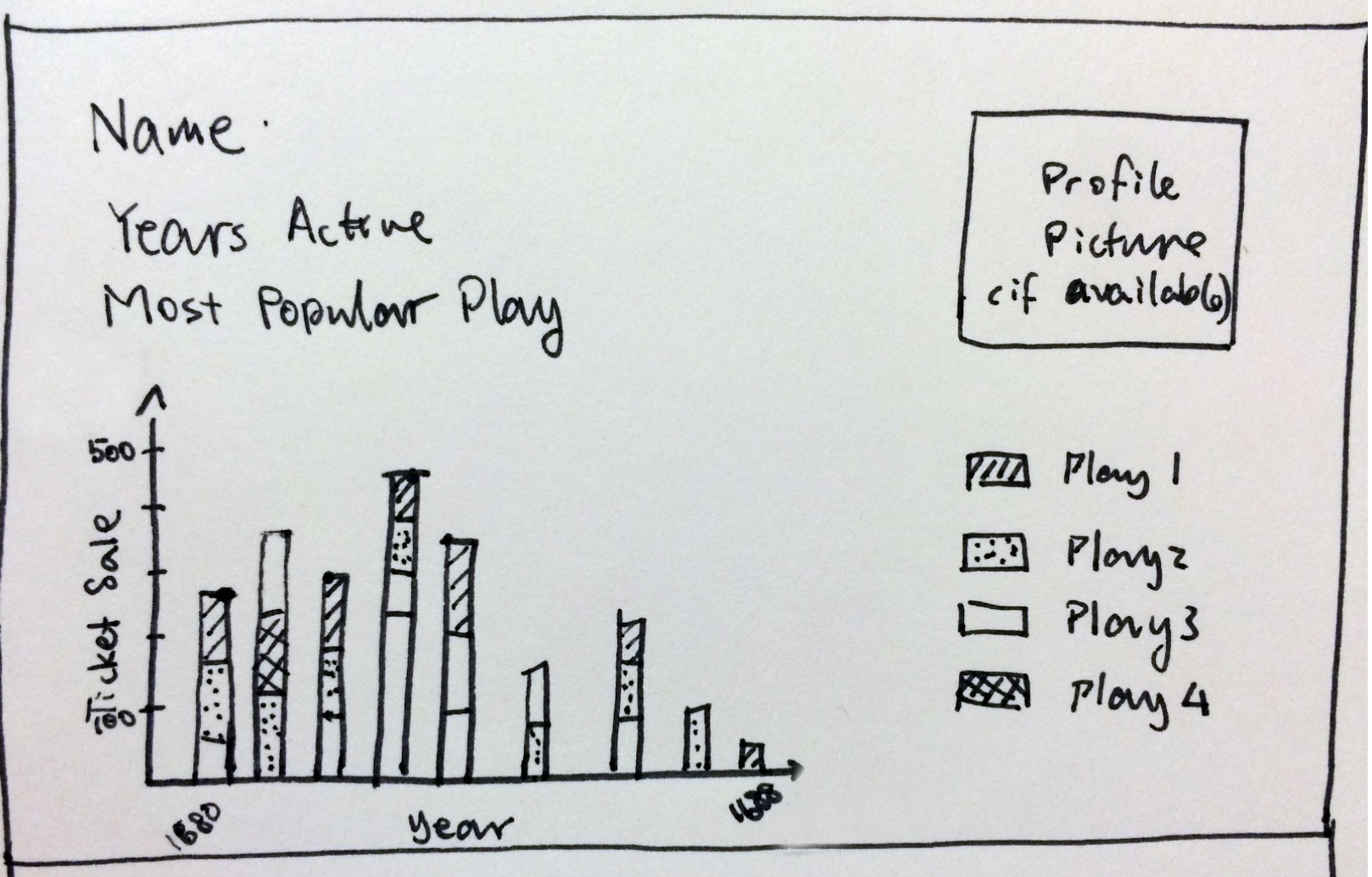
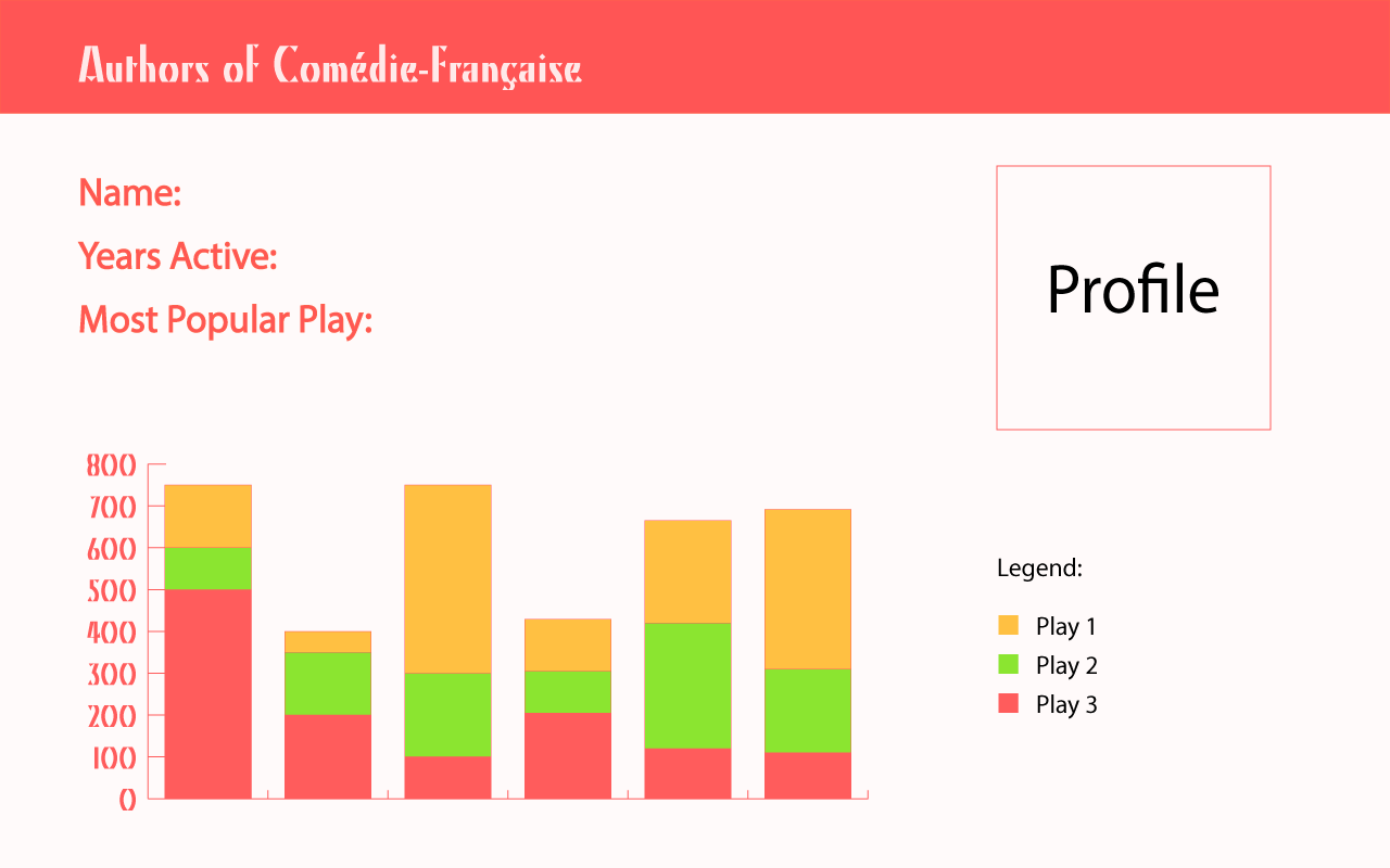
We implemented parts of the mockup in a website: https://infinite-tor-5541.herokuapp.com/. A screenshot of the website is shown below.
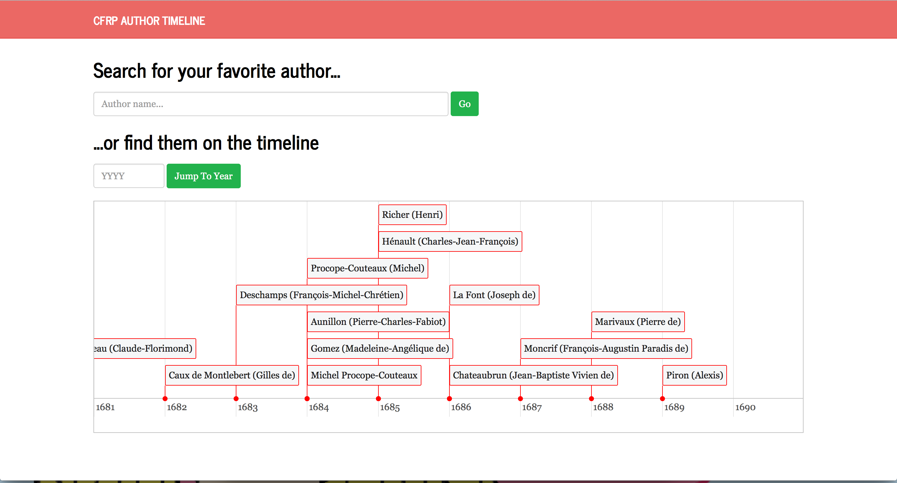
When an author is selected (either by searching or clicking on timeline), their page appears (shown below).
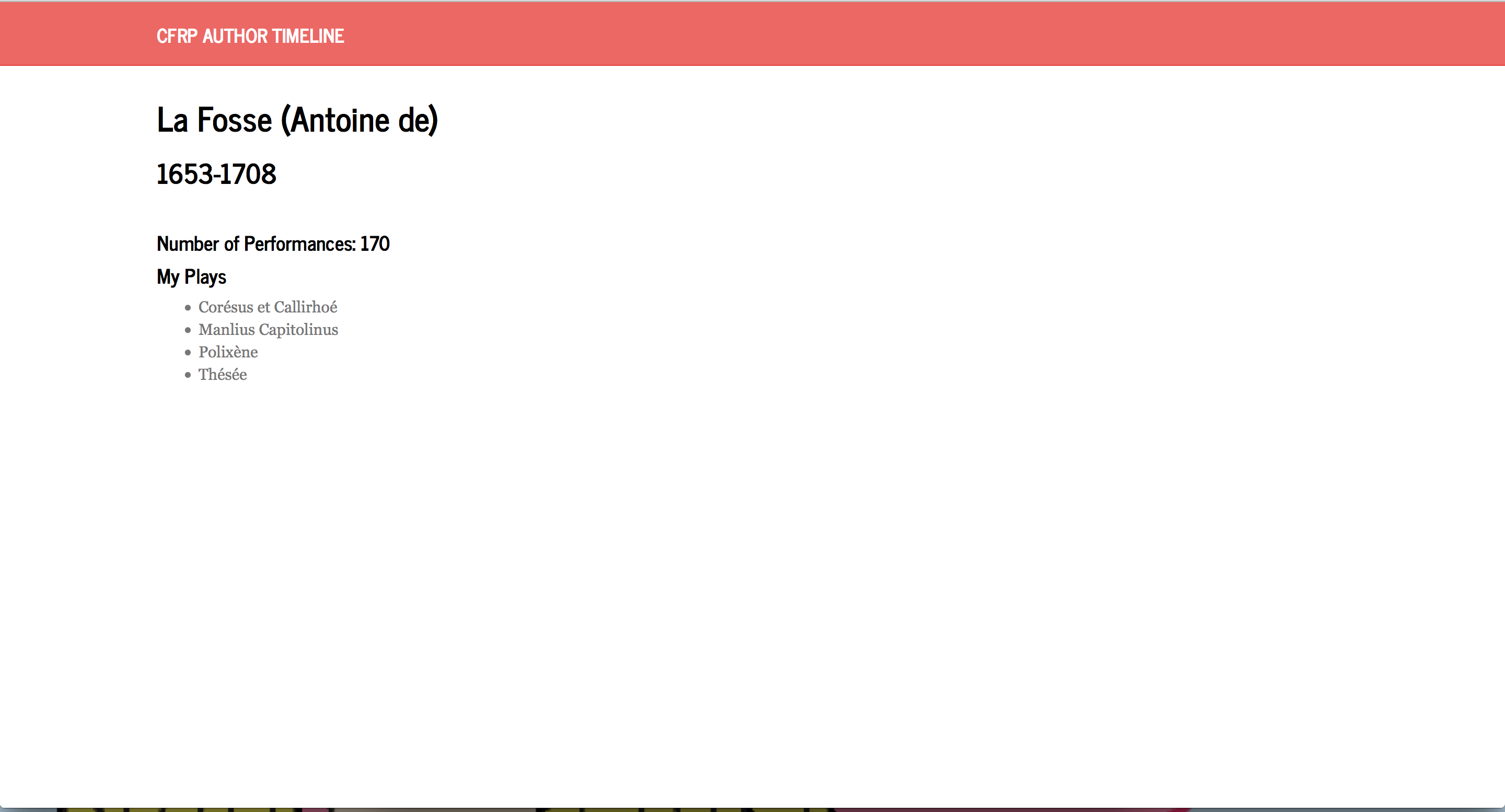
Authors appear multiple times in the dataset (ex. “Voltaire”, “Voltaire (François-Marie Arouet dit )”), but our project corrects for this and retreives all plays for the given author and computes the total number of performances for the given author. The birthdate and deathdate were scraped from Wikipedia.
As the CF API grows, we believe this database could include data on actors and other people involved in the Comédie-Française. Thus, it will more closely resemble IMDB where each entry is connected to all others involved with it, leading to a more interconnected web of information. The one challenge with adding this data is to ensure that the visualizations do not become overcrowded and unreadable.
This website is designed for any person interested in French Playwrights and can be used with either little or vast amounts of previous knowledge. The interface is easy to use and highly intuitive. Considering inexperienced users, anyone curious about a specific playwright or a specific time period can quickly find the relevant information. As the data in the API grows, these users can gain intuition into the many interconnections between playwrights, plays, actors, and other principles of the Comédie-Française, resulting in the rabbit hole effect seen in websites like Wikipedia. Concerning more knowledgeable users, historians can use this database to see how the trends in French history effected specific playwrights writing. They can also view whether the work of later playwrights was influenced by the popular plays of their childhood or adolescence. Contextual questions of current trends influencing author’s works can be answered. Additional data can expand these questions past authors and examine the relations between actor or play and time period.
-
Play Title Word Cloud
For my visualization update, I tried many different graphs and charts on the Many Eyes website. The one I found most interesting is below, a simple word cloud of all the plays in the 1770s. I like it because what most surprised me was the small number of very popular plays. I would have suspected that among the huge number of plays available, there would have been a larger set of popular plays. Instead, we can clearly see four winners. I also wish I had been able to improve their collisions detection. The word overlap bothers me a lot.
-
Visualizing Scale
The RAW data visualization platform offered a variety of ways to view the Comedie Francaise data. I decided to test out a similar visualization on different platform to compare how details of the platform affect our perception of the data.
For this task, I used IBM’s manyeyes visualization alongside DensityDesign’s RAW visualization.
I first looked at the Circle Packing visualization that RAW provided, sorting by genre and using total sold for the size of each circle. The result is the following image:
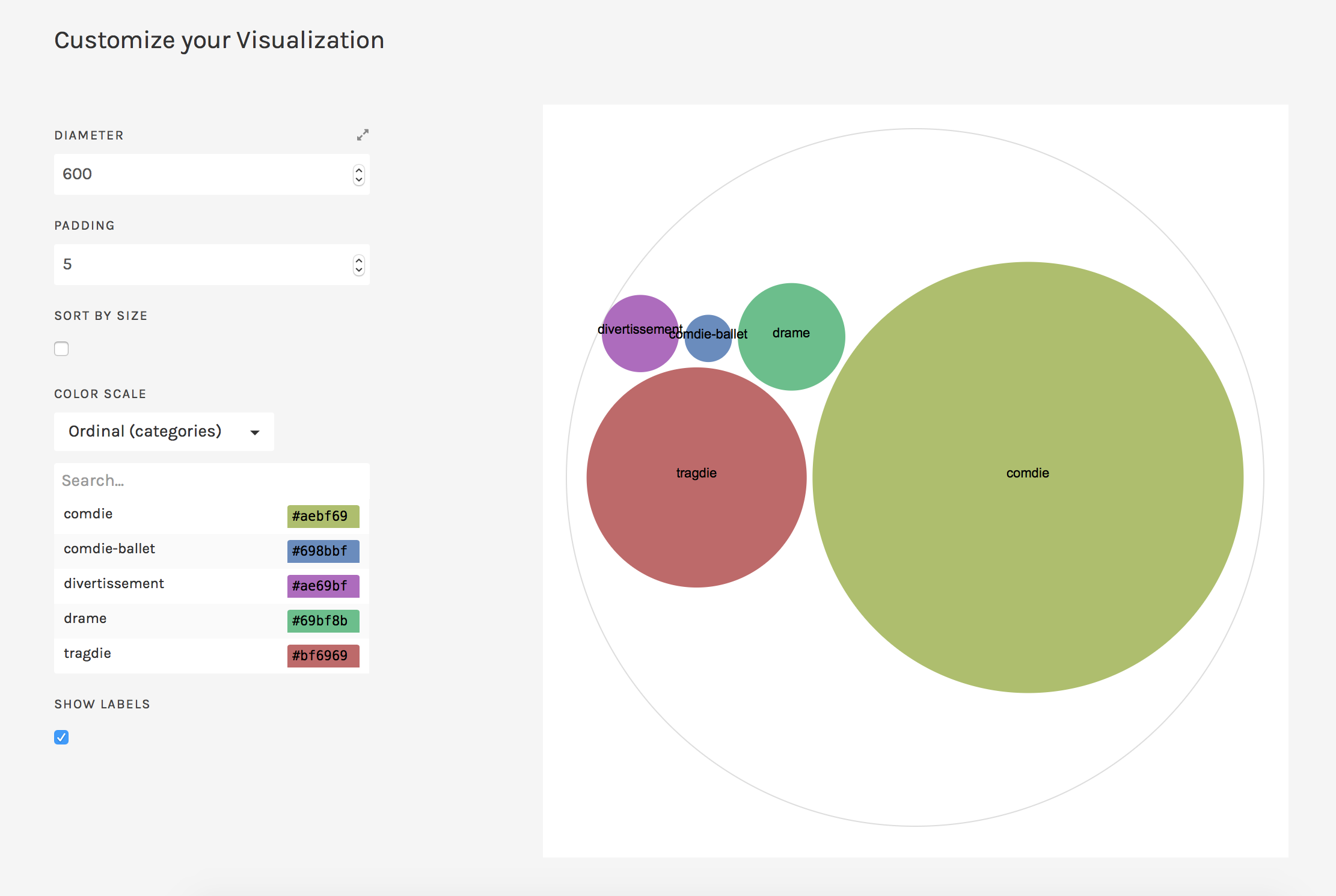
It’s apparent that the comedie circle is the largest, followed by the tragdie, and then the drame.
As a comparison, I looked at the same data in manyeyes’ Bubble Chart. The result is the following image:
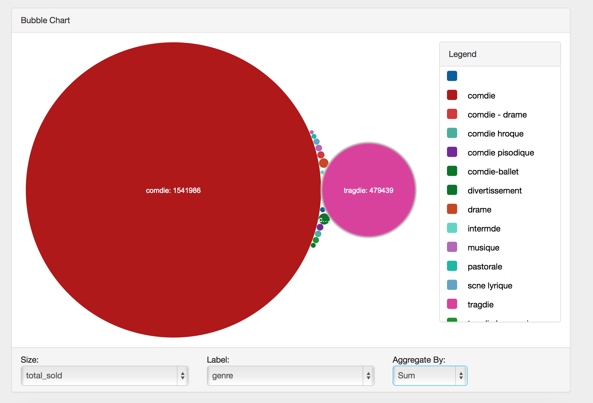
While the overall image is simlar, there are a few key distinctions that make a difference in how we interpret the data. The most prominent is that there appears to be a greater contrast in the size of the large and small bubbles. The comdie bubble is immense compared to the others, making it seem as if that genre dominated the theater by a wide margin. Contributing to this illusion is the inclusion of a number of tiny bubbles, whereas the RAW vizualization appears to have left out some of the smaller circles or perhaps grouped them together.
A final difference is that the manyeyes visualization prints the number sold along with the genre by default, while the RAW visualization left out that piece of data by default. So although the manyeyes visualization creates a more dramatic impression of scale, it also provides concrete numbers that one can use to numerically compare the categories.
Overall, it was interesting to see how the same data make a different impression due to tiny differences in the visualization software.
-
That Pulsar Thing
-
Stories Behind the Data
I really like the interface of RAW so I decided to use that as my main tool. RAW is intuitive, fun to use and quite powerful at processing large number of data. I was surprised by how fast it is at generating the graphs in a web environment. (A little side note: I misread the tutorial and thought I had to run it locally so I went through all the trouble to install python and all the necessary packages on my laptop only to find out that I didn’t need to do any of that. That was an hour well spent… Don’t be me if you’ve never used RAW. It works perfectly fine in the browser!)
The first graph I decided to make after poking through the interface for a bit was a “Cluster Dendrogram”. I thought it would be a way to show the differences between numbers of plays in each genre. To make the graph more interesting, I also added “author” and “title”. Since there is a large amount of data, I was only able to get a screenshot of the much more zoomed-out version of the whole graph.
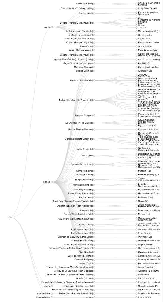
You can clearly see here that there are way more play in the “Comdie” genre than the others. This graph also allows us to see which author is more prolific. At first, I tried to add “total_sold” to the last layer, however, due to the size of the data set and the screensize, it was very hard to see everything. Therefore, my next goal was to create a graph that can show which title is more popular for each author.Previous findings lead me to create a “Circle Packing” graph. I chose to color by genre, group them by author, and size by total number of tickets sold. It gives me an insight on who has the more popular shows. It’s interesting that some of the more prolific authors have medium level of popularity and some authors who only has one show turned out to be a huge success. It is also interesting to see that some authors wrote multiple genres but some only focused on one.
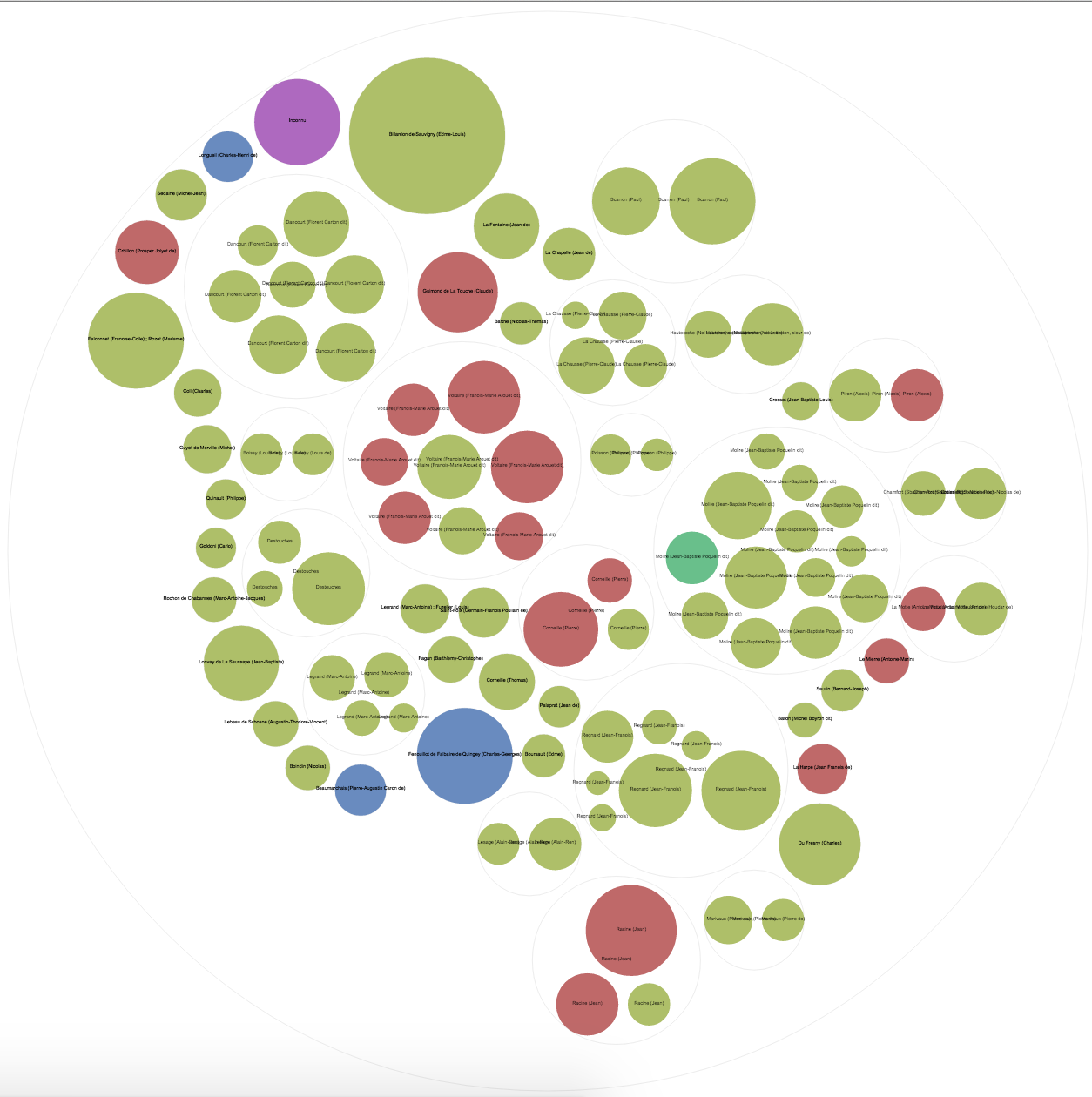
Though the graph is informative, the size of the data makes is very hard to read. Using the small set, the graph is much easier to read but contains less variance.
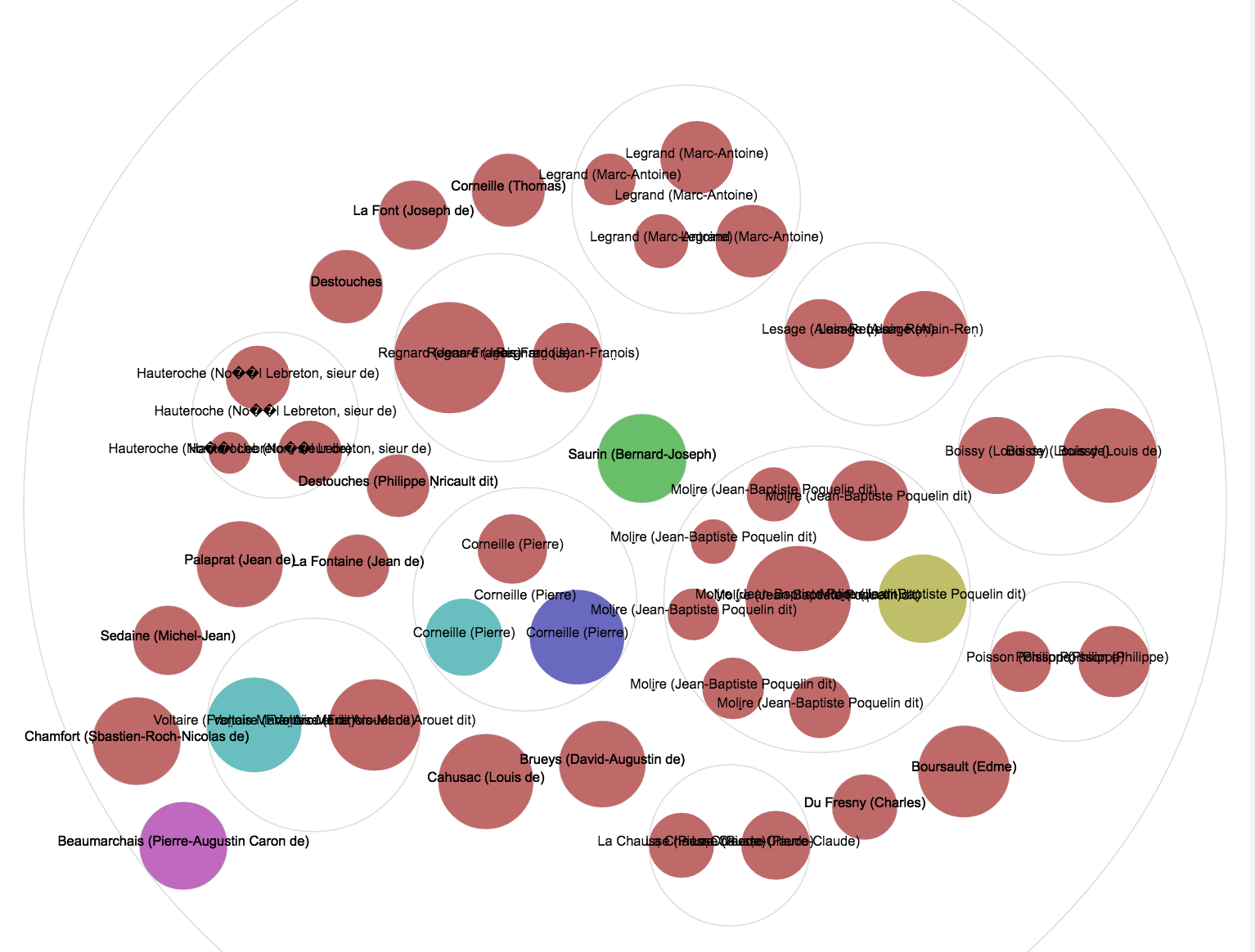
Overall, the tool is very handy but it would be nice if it could show the repeated labels only once.
-
RAW visualiztions
I focused on two data visualizations from RAW that I found to be particularly effective at relaying information. I enjoyed the range of visualizations RAW had to offer, but the lack of numerical data made it difficult to create relevant visualizations that enhanced the views knowledge rather than confused them. The first graph I focused on was the circular dendrogram with the play genre and total number of tickets sold as the dimensions of the graph. The visualization is a circular, tree like structure, where each branch corresponds to a different parameter.
I like the simplicity of this visualization and strong connection it makes between the data and the image. It is easy to conclude information about the correlation in ticket sales and genre, trend towards comedies is so prevalant.
In my second graph I decided to try the circle packing visualization. The strength of this graph lies in its ability to present a larger range of information without become overly complicated or confusing. The color of the graph correlates to the genre, and label corresponds to the author, and the size of the circle corresponds to the number of tickets sold. I liked the visual clarity that comes with color-coding the genres, as without so much reading the graph labels so much information is already conveyed.
-
Meaningful Data Storytelling
I really enjoy learning about and working with data visualiztion tools. For this assignment I utilized IBM’s online program ManyEyes. With my data I focused on analyzing the amount of tickets sold relative to the genre. I wanted to better understand which genres generated the most revenue and sold the most tickets. I believe this analysis would be more dynamic if I had a data set detailing revenue created from each of the genres on average. Then I could offer a more in depth analysis for areas that are of particular interest to me.
First, I used a bubble chart to gain understanding of which genres were most popular. The larger the bubble the larger the amount of tickets that was sold. For an audience this form of data visualization is very straight forward. The audience is instantly drawn to the larger bubbles, and one instantly sees which genres are the most popular. There is also a sense of scale that is easy to understand, one can understand the relationship between the genres.
Next, I used a radar chart, because it was a type of chart I had not previously encountered. The chart instantly makes it clear which genre generated the largest number of tickets sold. It is really only meaninful for the most popular genre Comedy. For the rest of the genres it is not clear how many tickets were sold, nor is the relationship between the genres and tickets sold understandable.
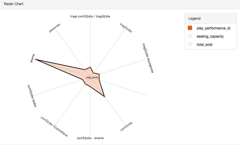
Lastly, I wanted to use an incredibly simplistic visualization tool, so I used a traditional scatter chart. Upon first glance, it is incredibly clear that comedy is the genre with the largest amount of tickets sold. Additionally, the relationship between the variables is more clearly understandable as the y-axis is labeled with numbers. Wheras with different sized bubbles, one does not understand the difference in a quantitative way. All in all, this data visualization was the most meaninful to me, but not the most exciting.
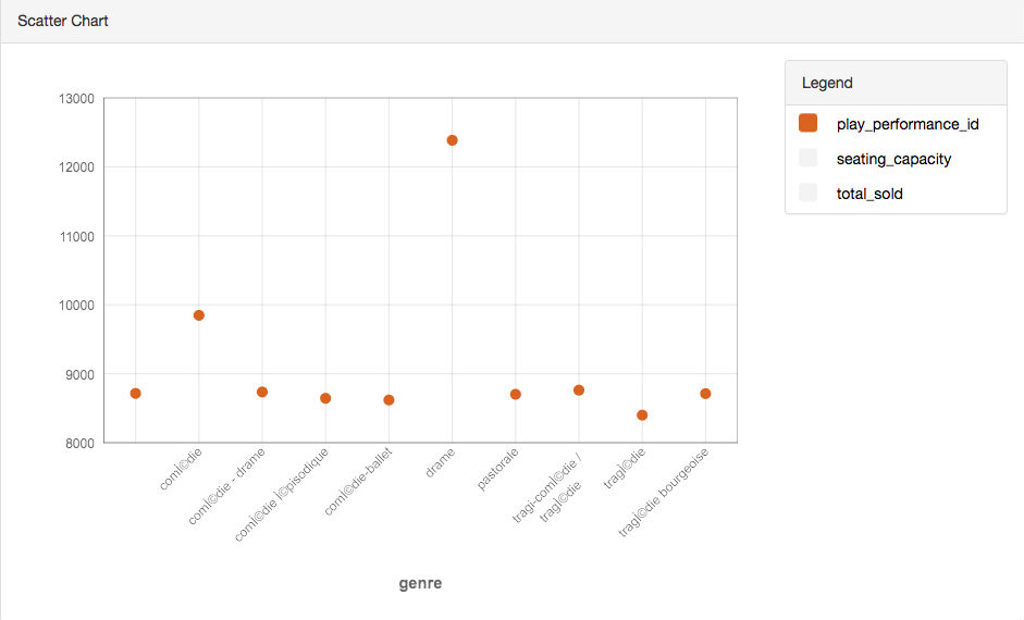
All in all, which data visualization tool one chooses to make use of should be highly dependent on the target and audience of the visualization. While we were looking at the same variables in the same data set, each told a different story, creates a different effect on the audience, ultimately a different understanding of the data set.
-
Data Visualizations CFRP
##Initial Visualization My first visualization follows the idea I presented in my initial proposal. I used Excel as it was the tool I was most proficient with, thus allowing me the execute the closest version of the idea I had on paper. This visualization shows the number of tickets sold on each day, separated into individual bar graphs for each year. The year starts on Januaray 1st and goes to December 31st. Each graph is stacked in chronlogical order.
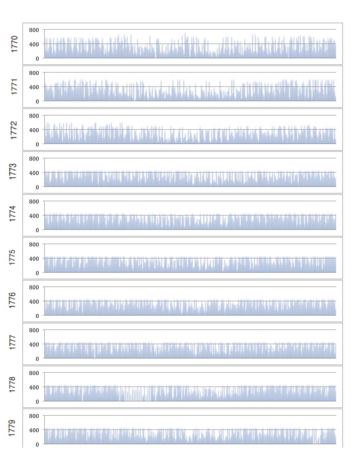 I feel as though this visualization would be improved with both linking the play to each day as well as different types of tickets sold.
##Other Visualization Tools My next visualization was done with **Raw**. I followed the same idea as the initial visualization, and created a scatter plot of tickets sold verses data. Additionally I colored the dots based on genre and displayed all twelve months on one line.
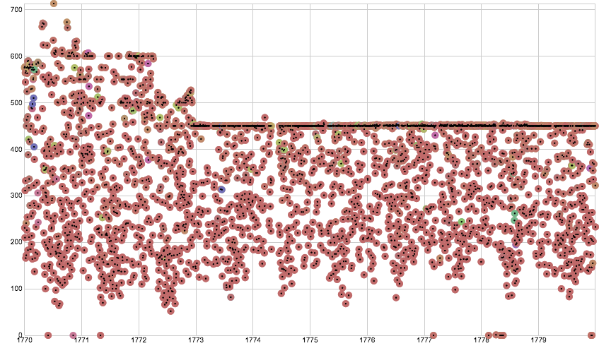 This visualization shows a sharp decrease in attendance to a stabilized plain. Isolating specific days of the week could reveal insights about which weekdays sold highest and if a trend occured there.
###Reimagining of Data I continued to used **Raw** for my rethinking of the data. First in an attempt to understand when certain genres became popular I plotted tickets sold in each genre against time, as shown below.
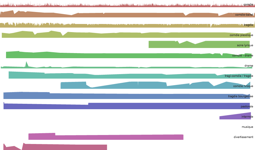 We can see that some genres such as comedy were continously popular while other came in and out of vogue. Adding which plays were playing at the time (by hyperlink, not visualization), could show whether the genre or the play cause a rise in popularity.
My final visualization followed a similar idea, but catagorized on author rather than genre, showing popularity trends. This visualization can be difficult to read due to number of authors.
 While trends can be observed, I believe this visualization would also benefit with additional linked information about the authors which could provide insight to the trends observed.
 -
Comedie Francaise Data Story
With the current rise in technology comes an explosion of data and observations we can make about the world, and the endless possibilities of our creativity if we could understand and harness it. However, with the vast amount of data out in the world right now, even the mere process of understanding what a dataset is telling us is becoming increasingly difficult. And this creates an entirely new field of data visualizations - how do we summarize what we observed into meaningful messages and how do we communicate such purposes?
Many tools, such as the Excel, RAW, Many Eyes, have been created to ease this process of data understanding, but each has its strengths, weaknesses, and impact. To understand the differences among tools, we take datasets from the Comedie Francaise Registers Projects and attempt to visualize the 3 fields: date, total tickets sold, and genre, in different graphs.
We start off with a simple scatter plot.
Here we can easily see that the dominant genre is comedy, with a brief period when tragedy is popular. We also note that we see a brief gap between April 1 to April 20, and we correspond that to be the Easter holidays in France, when the theater would be on break. We also note that there are no other genres than comedy after the holidays, and that the total number tickets sold increased after the break.
We attempt to visualize the same fields with a streamgraph.
With a streamgraph, we can still easily see that comedy is the dominant genre, but tragedy’s popularity seem to over-exaggerated as the red appeared at times when it shouldn’t have sales. The Easter holidays break is also not visible, as the streamgraph assumes no breaks in the data. Overall, this graph is good in that it communicates that the theater mostly played comedies but was interleaved with other genres, but it was poor in communicating other historical contexts.
We try another graph, the Small Multiples.
This graph was also confusing in that it seem to exaggerate the sales of tragedy shows. However this graph shows clearly when each genre had sales, because we can see that comedies are consistent in its popularity while the bottom 4 genres experienced periods of popularity. The graph would probably have been better improved if it showed a time x-axis, so we can see how each genre’s sales interleaved with each other.
Overall, I think the message I chose to communicate is still best done by a scatterplot or a line chart. The streamgraph and small multiples graph, although aesthetically pleasing, did not communicate the messages I was looking for. And that’s an important guideline in data visualizations, that we choose what’s best for the message, not necessarily the best of the eyes.
-
Clusters of Author Popularity Across Genres
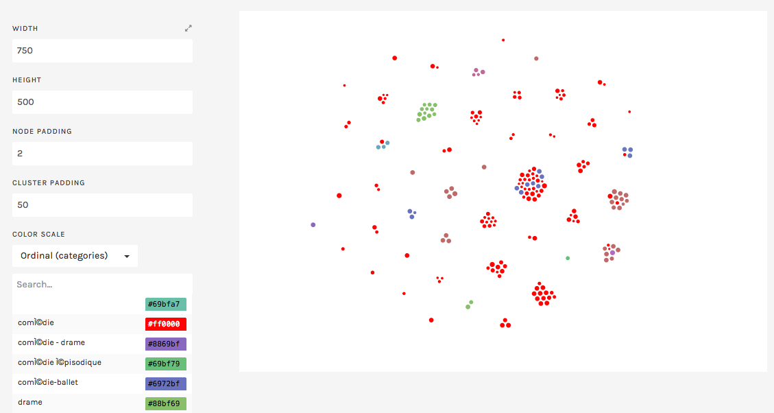
For my visualization, I continued working with the RAW toolbox. The question the given CFRP data inspired me to ask was: How popular were the works of different authors across different genres? Using the small dataset for this purpose, I generated a cluster-based visualization to answer this question.
In the figure above, each cluster represents different authors, with each element-or bubble- representing a given show. The size of each element represents the tickets sold for each element, and the color is indicative of the genre of the given play (as seen by the color legend on the right). This way, we are able to look at each cluster to observe how popular works within certain genres of each author compares to works in other genres.
As an example, we can look at the largest cluster, which represents Moliere’s works. From this, we immedeately observe that Moliere was most prolific in comedies, though some of his works fell under the category of comedy-ballets. An interesting observation is that while Moliere’s comedy-ballets were consistently popular among the community (all fairly large bubbles), his comedies had a wider distribution of attendance. This is both interesting with repect to the authors, and the audience preference for the authors plays.
There were a few issues that I came across as I attempted to visualize the given data meaningfully. First off, the given raw data was required a significant amount of scrubbing as well as reorganization to get meaningful comprable metrics. For instance, while attempting other visualizations with date as a variable, high granularity made all visualizations very messy and difficult to interpret. So meaningful visualization of this data would have required counting, averaging, or summing of some of the variables.
Additionally, RAW had many limitations in terms of generating visualizations that are easy to interpret. For instance, I was unable to label each cluster with the author name in the graphic above. This made it obvious that data sets, particularly if they are stemming from humanities, are fairly unique, and meaningful visualization of humanities data can often require tailored tools.
-
Averages and Sums, Success of Genres/Authors
I ended up using IBM’s ManyEyes for the visualization. I investigated the difference between the average and sum totals of the number of tickets sold based what genre the play was, and who the author of the play was. In class we had only looked at the sum totals, but I noticed that the comparison between the genres and authors looked a lot different when you looked at their average “success” instead (as measured by the number of tickets sold).
Consider, first, the following pie chart comparing the ticket sales of different genres:
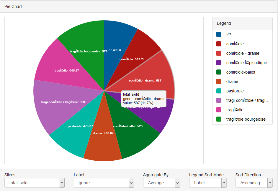 This shows that, in fact, tragedy/tragicomedy is the most successful genre on average. In contrast, consider the following pie chart on the sum of all ticket sales over the year for each genre:
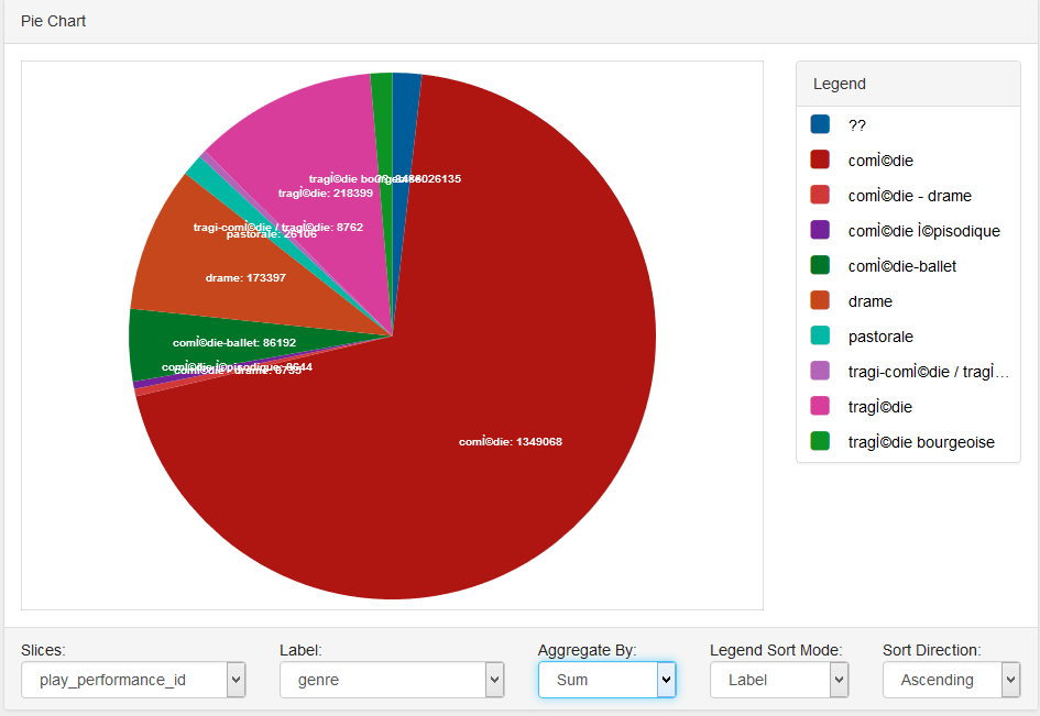 Comedy has by and large sold the most tickets over the course of the year. However, this is a deceptive number, as comedy had one of the lowest average ticket sales in the former graph! Thus, is comedy really the best genre? Perhaps people weren’t as interested in comedies. Or perhaps there were so many comedies playing that people were no longer so inclined to see them. But why did the theatre keep playing pure comedies when other genres (such as tragedies) seemed to be more fruitful in ticket sales this year?
In an attempt to investigate further, I looked at this box plot of the genres’ ticket sales:
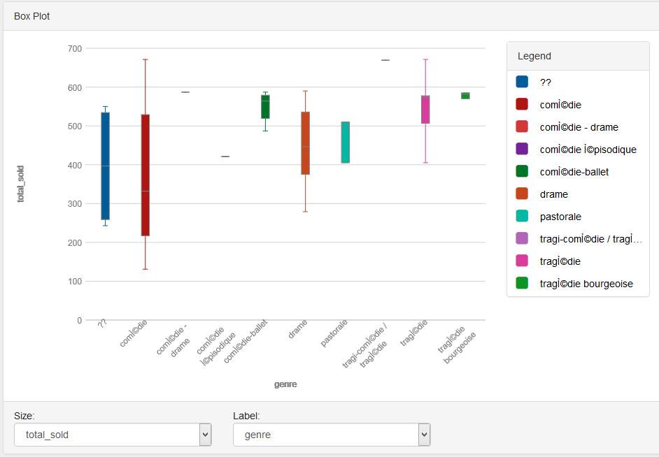 This shows that comedies had a huge variance in ticket sales (the standard deviation is high). In comparison, tragicomedy, the genre with the highest average sales, seems to have just one data point! Perhaps the conclusion we could reach from the first graph was false–given more data points, tragedicomedies may not be the best bet of play to show. No, what would help may be some “weighted” average, where the genre’s average lends bigger significance to the conclusion if there were more data points for that genre. We can still guess, though, from these graphs, that tragedies in general tend to have higher ticket sales during this year. Whether that means the theatre should have played more tragedies for higher profit, we cannot say.
I looked next at the authors’ success, since the analysis was interesting for the genres. The following shows the average ticket sales of each author: (done in a bar graph for easier reading, since there are a lot more authors than genres)
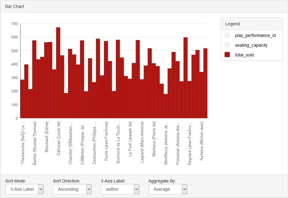 It looks like there are a few authors who have relatively abysmal ticket sales, and most authors seem to average around 400-500 tickets sold. However, Cahusac has significantly higher average ticket sales. But consider the total sold for each over the year:
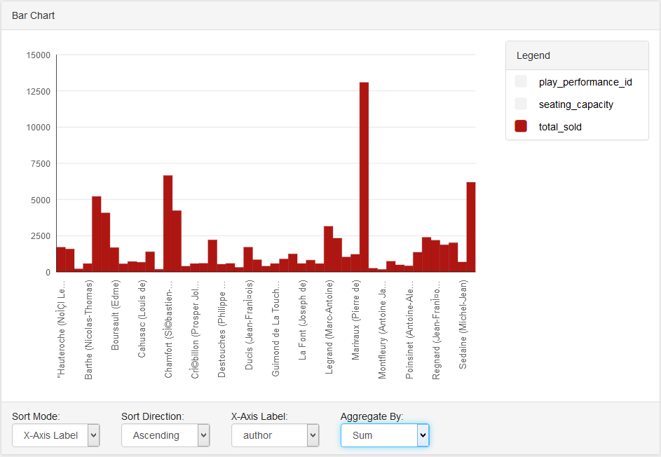 This time, Molilere takes the top position by a huge margin with 34 play performances. It turns out Cahusac just had one really good play performance. However, Molilere’s plays’ average ticket sales were a below-average 384. These were probably also, we can infer, the same comedies that had a high sum total of ticket sales.
The data suggests that Molilere’s comedies were shown too often in this theatre. I wonder if they changed tactics for the next year, or if those comedies had been successful in the previous year for them to try them so avidly this year. More data points may reveal the answers.
-
Data Visualizations of the Comedie Francaise
I found that using the RAW app made my computer overheat when trying to visualize the larger set of data, so I found a data visualization software service online, Tableau. I’m not really a computer person and I thought that RAW had an easier interface, but Tableau did the trick any way.
Here are a few visualizations that I put together.
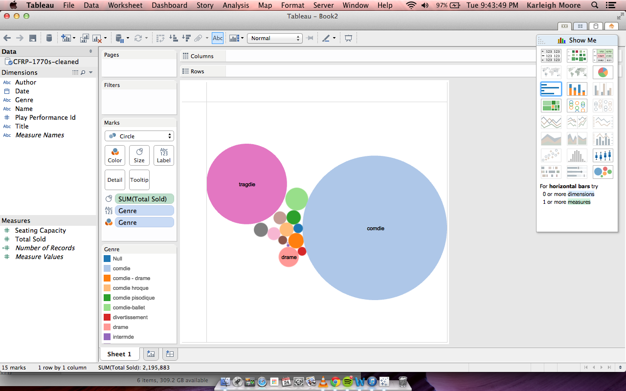
I really liked the bubble graphs I was able to make on the RAW site, so I was eager to see what I could do with this style of visualization with Tableau. The first (above) is a pretty straight forward representation: The most popular generes of play were comedy, tragedy, and drama according to total number of tickets sold. Comedy clearly dominated over tragedy, but those two generes were far more popular than third runner up, drama. The other generes had such small ticket sales in comparison that their genre labels didn’t even show up.
Next I wanted to be more specific in my explorations with genre and popularity. I added in an additional parameter, author, to see if which authors were most popular within each genre. I knew that comedy authors together would outweigh tragedy authors together, but I wondered if any particular author was popular regardless of genre. What I found was that tragedy’s main contributer was Voltaire, who was easily more popular than most comedy writers individually, save four: Jean-Baptiste, Marc-Antoine, Florent Carton, and Jean-Franios. Furthermore, Voltaire had some comedies that were about average as far as popularity goes in that genre. Here is that visualization.
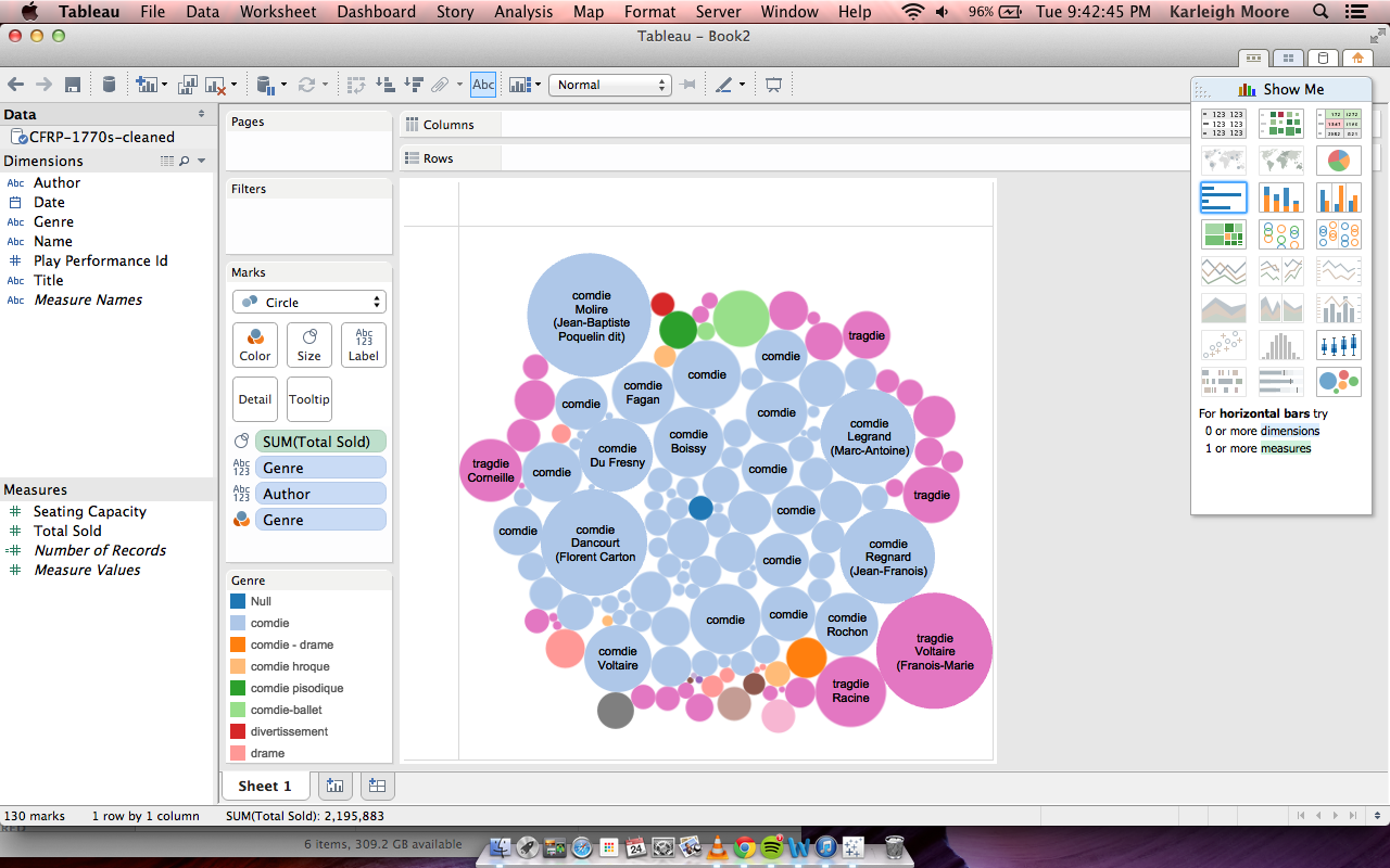
The last thing I wanted to see with a bubble graph was what genres were most popular in each year, measured in total ticket sales. From this visualization, we can see what we expect given the previous visualizations: comedies always sold more than tragedies or any other genre. But we can see years in which ticket sales boomed (the larger circles indicate more ticket sales). This can show us which years theater was most popular and profitable. This also shows a fairly constant difference in the ticket sales between comedies and tragedies, all of the blue (comedy) circles are about the same size and all of the pink (tragedy) circles are about the same size. Here is that visualization.
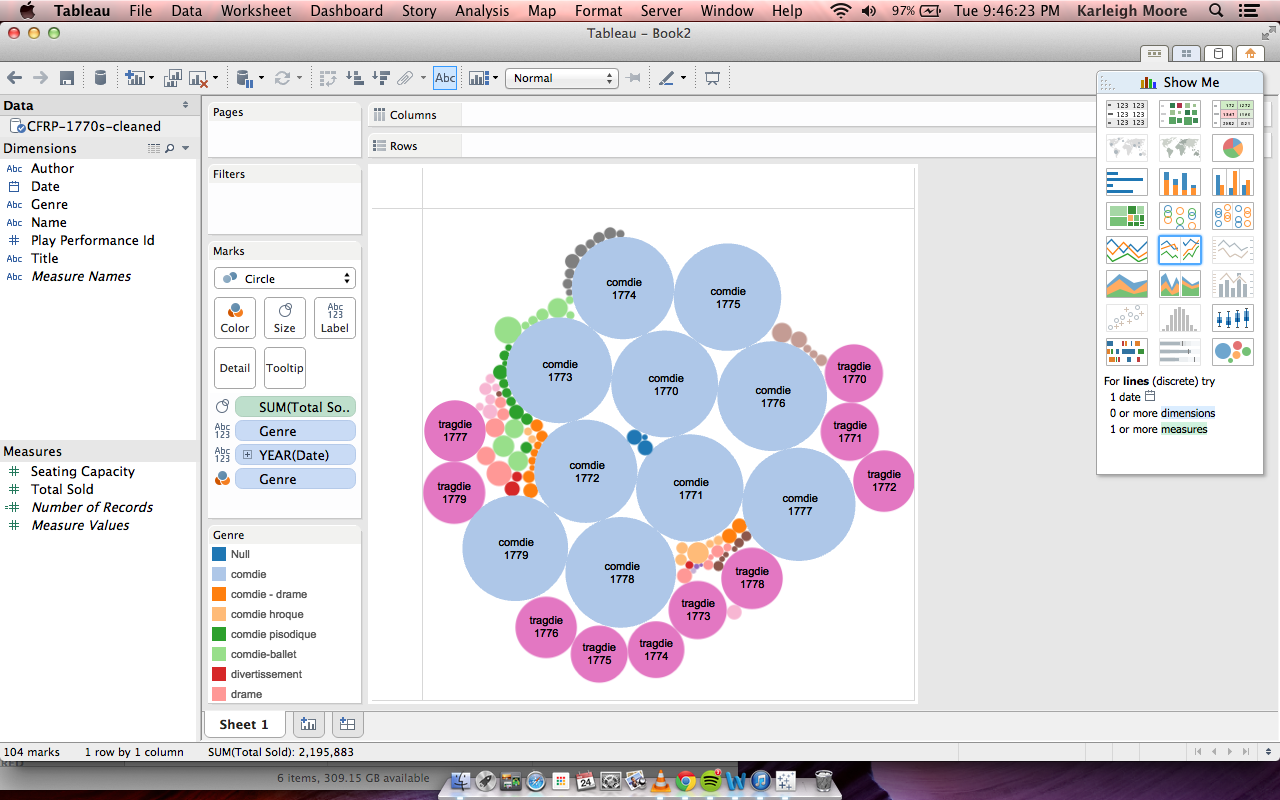
I decided to try other styles of visualization next. This graph essentially restates what we saw in the bubble charts: consistently over the years, comedies sold more than any other genre and tragedies second.
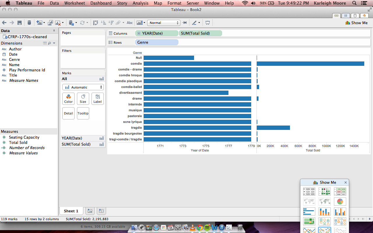
The next non-bubble graph I tried out was a histogram/dot graph looking visualization. It organized tickets sold according to title of the play with a point for each year. We see a spread of information, some plays generally sold high numbers of tickets, others had a gradient of good and bad years, while others constantly under performed.
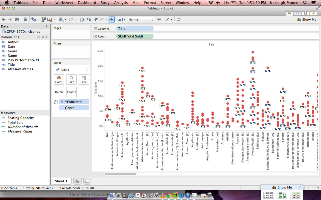
-
Data Visualization
I explore what I thought was the simple question of the relationship between the playwrights and tickets sold. I used two visualizations: tree map and a line graph.
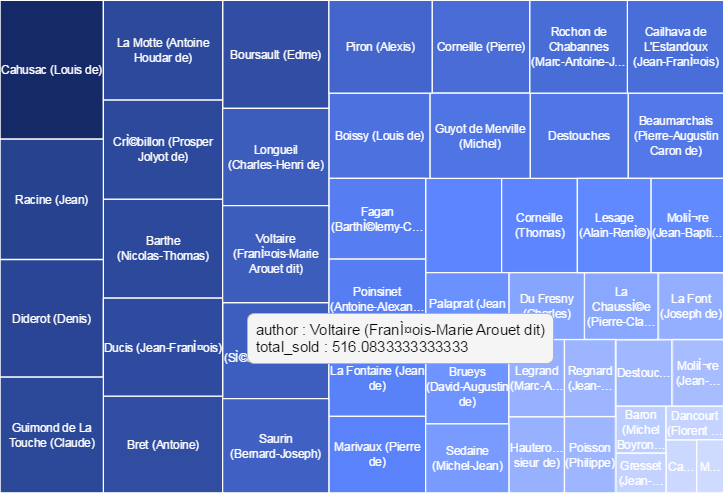
The tree map illustrated the authors with size and color according to the highest average tickets sold. It gave an abstract sense of who garnered the most and who gave the least (only by hovering could the user tell how much tickets were actually sold).
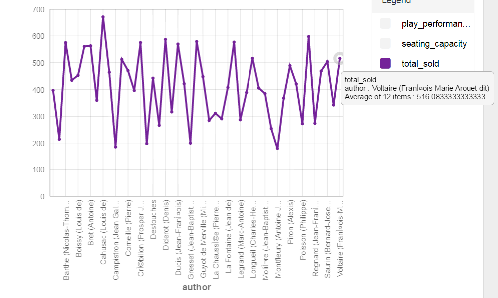
The line graph easily depicted the central tendencies of ticket sales for authors, how much that was, and how much the authors varied. I was pleasantly surprised by how much information was readily accessible in this illustration, especially because I normally would not try this illustration for this data set.
-
Finding a Data Story with Tableau Public
I decided to do some visualizations using a different software called Tableau Public (the free version of Tableau, a popular business intelligence and analytics tool).
I’m using the
CFRP-1770s-cleaned.csvfile.To start our story, we need some characters, so let’s figure out who the most prolific (in this case, we’ll approximate that by looking at who had the most performances) playwrights were. We’ll make a circle packing diagram where there is one circle per author, and the size of the circle is proportional to the number of plays they wrote. Furthermore, we’ll make the color of the circle reflect the genre of plays that the authors typically made. The result is shown below:
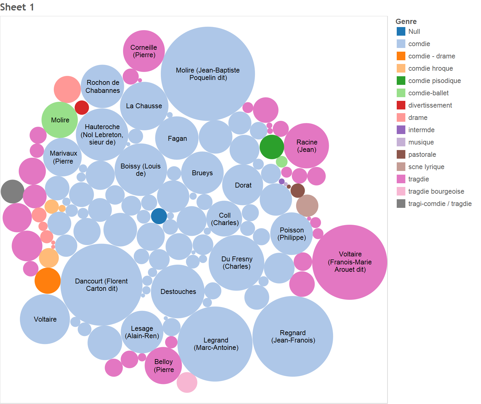
It looks like Molire was the most prolific playwright (biggest circle) and that Dancourt and Voltaire were close behind. However, Molire and Dancourt tended to write comedies while Voltaire wrote tragedies. On top of that it seems that most of the playwrights at the time seemed to write comedies. There were also a few that wrote dramas. The purple circle represents Iconnu (perhaps a group, not an author) who made divertissement (which appears to be an interlude within a play).
Now that we know the most prolific playwrights, let’s try and get an idea of who was the most successful (in terms of number of tickets sold) playwright. To do this, we’ll make a side-by-side circle chart (which is effectively a bar chart where the bars are replaced with circles). On the x-axis, we have the names of the authors. On the y-axis, we have the total number of tickets they sold over all their plays. I’ve cropped out some of the graph so it fits, but you can see it below.
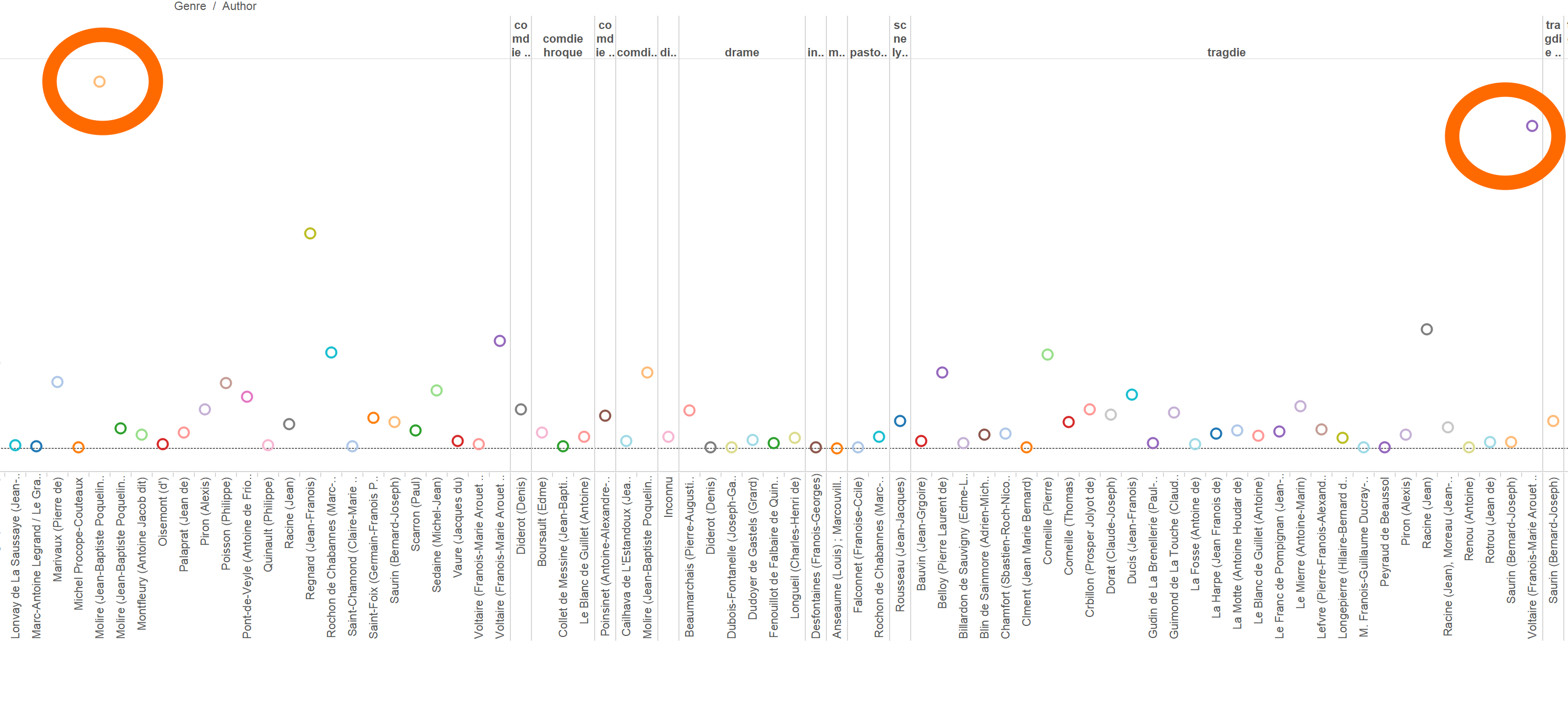
It looks like the most prolific playwrights (inside the big orange circle) tended to be the ones who sold the most tickets. Molire is first with almost 170k sales, followed by Voltaire (about 150k). Dancourt did pretty well too (about 125k).
I wonder if that has more to do with the theater than the playwright. If the theater was extremely popular and was always filled to capacity, then it makes sense that the playwright with the most performances had the most tickets sold. Let’s make a scatterplot with the play performance id on the x-axis and the number of tickets sold on the y-axis.
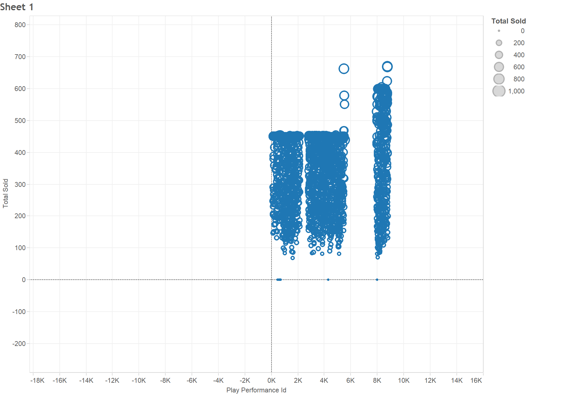
It looks like not all performances hit capacity, so Molire, Dancourt, and Voltaire appear to be popular, even for playwrights at this theater.
With that, let’s turn our attention to plays. Which play sold the most tickets? If we make a pie chart, we can’t really figure that out easily.
But what this does tell us is that there’s no play which was hugely more popular than the rest (the biggest slices are pretty close in size). That being said, it seems Avocat Pateline by Brueys had the most sales (almost 25k).
We could go on, but even just tells us a lot. We learned that tragedy writer (rare, because most playwrights wrote comedies) Voltaire and comedy writers Dancourt and Molire were the most popular playwrights (even for such a popular theater). However, it was Brueys who made the most popular play.
This is my first time using Tableau Public, but I really liked it. While it does not offer a huge number of visualizations, it can work with the full dataset (Many Eyes slowed to a crawl when I tried it) easily and lets you interact with the visualization and query/filter the data.
-
CFRP Prototype: Interactive Ticket Sales Graphs
a) I would like to make an interactive set of graphs. Example graphs could show daily/yearly/quarterly total ticket sales in a line/bar graph or ticket types and amounts in consolidated bar graphs. Notable events (political, economic, cultural) would be displayed with markers on the graphs, and one could reach an individual document (and its transcription) by clicking through the graphs. The transcriptions could also be searchable.
b) The photos could be stored on my site or on their original site. The graphs and transcriptions would be stored on my website. I would put a search bar on the side, as well as a link to the directory of the transcriptions. The main page, however, would feature an interactive graph, with buttons to change time segment and graph type.
c) I know only a bit of code, so I am unsure what tools I need. I suppose I could create the website in HTML and use some sort of data visualization software for the graphs.
d) My intended audience is scholars and other people who are interested in French culture, history, and commerce.
e) My project seeks to provide answers to questions of how commerce at this theatre has changed over time, situating its fluxes in sales in its historical, economic, political, and cultural context.

-
CFRP Prototype
In developing the CFRP prototype, I was inspired by the “Mapping the Republic of Letters” project. I believe this project conveyed a large amount of data in an intuitive fashion, while maintaining the ability to easily pinpoint details. Thus, my prototype connects the audience class and size, play, and time period in an attempt to convey broad societal trends in Paris and France as a whole, to promote a distant reading of the data. In addition, the prototype will be easily searchable through these categories to allow for closer reads as necessary. In this manner, both scholars and students, familiar and unfamiliar with the topics explored will be able to gain a meaningful understanding of the themes explored.
Data Extraction
For most of the history of the Comédie-Française, records of play attendance and revenue have been kept by hand. Thus, in order to extract meaningful data these records must be digitized. Several methods will be employed to complete this task. First we will use computer-vision tools, such as LeNet-5 [http://yann.lecun.com/exdb/lenet/index.html] to segment the words and numbers and attempt to parse them into digital versions. These initial attempts will need to be augmented to identify any words and numbers that could not be identified by the parser. For this mostly likely captchas and expert review will be used.
Data Presentation
The prototype will present the data in the form of a timeline on which represents all the days the theatre has been open. For readability, users will be able to select a span of years, and the timeline of the years, with a separate timeline for each year, will be displayed (see attached picture). From these timelines, graphs would be displayed showing the number of tickets sold of each type as well as include a hyperlink to an article on the play. Using historical data on where the CFR was currently located, different colors would be used to differentiate between the locations of the theatres showing the plays. Users can isolate certain ticket types to see when they occur most frequently. A scrolling bar of al the years will allow for users to quickly move between timelines.
Audience
The audience for this prototype will be researchers and students attempting to gain insight into into trends or snapshots into specific periods of French history. The intuitive interface should allow those without in depth knowledge of the time period to observe trends in French society. Simultaneously, scholars with in depth knowledge of the time period will be able to perform both broad and close reads of the data, while maintain coherent links between the individual details.
Research Questions
As mentioned above the questions that this work addresses involve the intersection between time period, attendee types, location, and play. Specifically, what types of plays appealed to specific demographics? Did these relations shift over time? Is there a relation between viewing population and location? This prototype would allow researchers to examine the connections between these factors.
Prototype Design
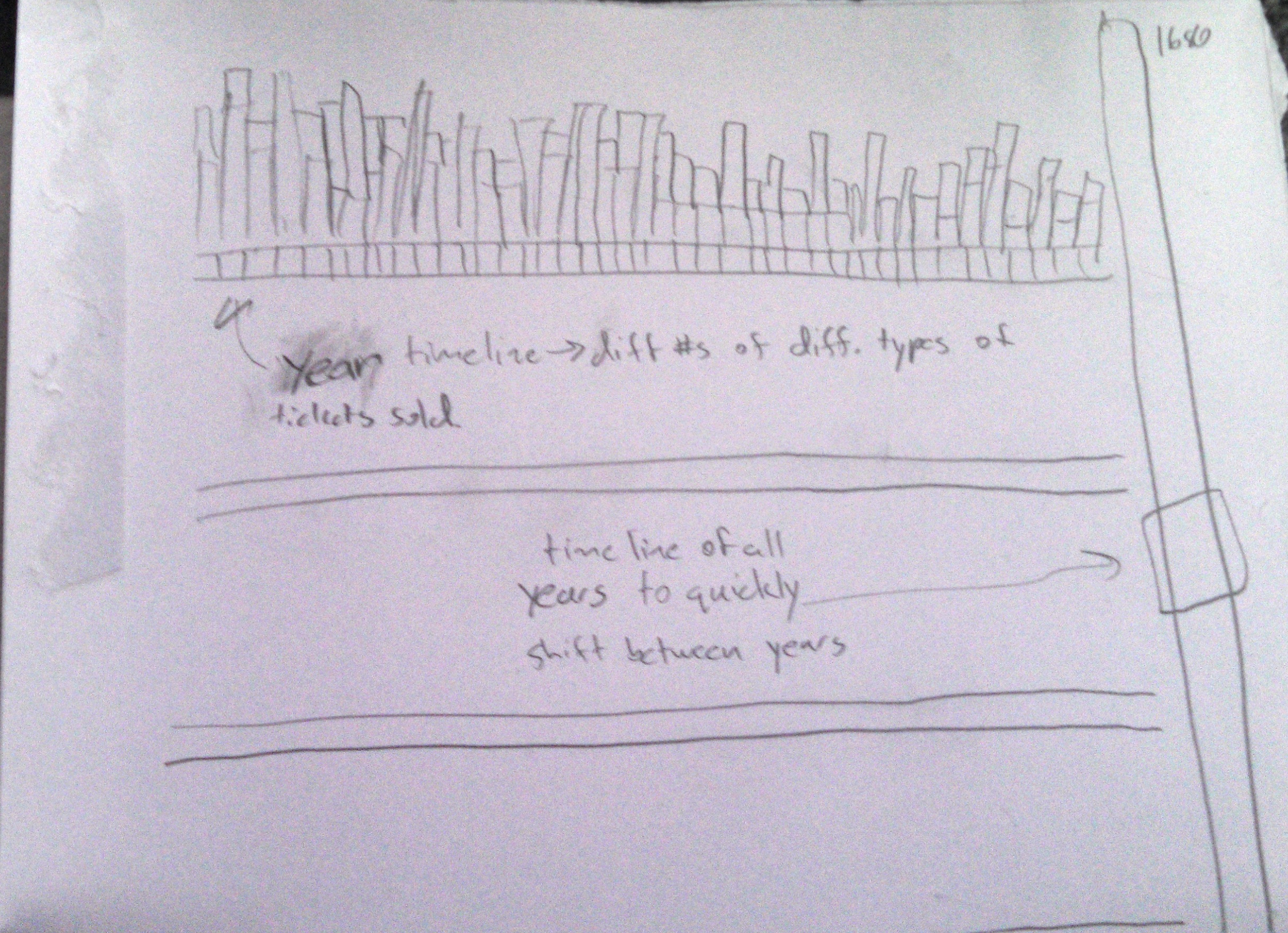
-
CFRP Prototype – CFTool: An Interactive Seat-Map
##Main Idea: Data visualization is a very powerful tool that can allow an observer to comprehend and interpret mass amounts of information within a short observation time. This is why my project aims to summarize the data stored in facimiles from the Comédie-Française Theater in a visual manner. I believe that an interactive map of the theater would not only help display knowledge relating to the attendance and pricing history of the theater in a intuitive fashion, but added features can make the data very accessible and flexible to various interpretations.
Data Extraction from Facimiles:
As seen in the four sample facimiles, the structure of data storage has gone through many variations over the 113-year time span. As a result, simply processing the data via OCR will likely not be sufficient for data extraction. A good approach to digitizing the data might involve:
1) A crude categorization of the documentation into different data storage formats: Using feature recognition, the scanned image files for the facimiles can be separated into clusters that have an overall similar outline.
2) Labeling regions within the image with the relevant data: With knowledge on the various different formats, we can now label each format with ROIs defining the nature of the information stored in that portion of the page.
3) OCR: the text can be digitized via various advanced character recognition algorithms.
4) Guided Translation: To make the resource accessible to an international audience of both scholars and laymen, it is important for the information to be translated into various languages. As context is critical for accurate translation, this can be done with a guided machine learning algorithm, which can intake manually translated sample pages as its training data.
Presentation and Accessibility of Data:
To make the extracted data as useful as possible, it is critical to present it in intuitive and simple formats. This is where visualization of the data could play a large role. Although there are other exceptional expenses included in the data, most of it the expense information involves seating prices and the number of tickets sold. Additionally, the date and play performed are two critical and consistent, extractable datasets.
One intuitive visualization method could utilize a seating map (similar to ones used by Ticketmaster etc.) for the CF Theater as its basis. The user could select to scroll through two distinct data sets over the span of 113 years with a granularity down to single days: (1) seating prices (2) attendance, both based on different parts of the theater. In addition to access to numerical values via mouse-overs, the data can be visualized with a color/heat map, with a corresponding legend.
Another mouse-over for the stage could lead to a hyperlink giving a brief overview for the play (potentially even incorporating defining clips from contemporary renditions) for the corresponding date. This will help the user link the content and context of the performed play with attendance numbers and ticket pricings via visual observation.
Additionally, the option of averaging or data summaries for longer time spans would be very critical to make broader observations compared to just individual dates. Options like averaging attendance and price values per play (over its complete show dates), summarizing attendance trends based on certain blocks (e.g. the premier lodges) can be automated outputs that facilitate interpretation of the data. Since flexibility in use is crucial for this tool to be beneficial for the scholar community, summaries based on user-defined constraints would also be a critical feature to incorporate.
Audience:
This format of visualization is primarily intended for scholars interested in extracting information relating to the theater. It intends to maximize flexibility of data analysis by incorporating features that allow the user to customize the span of the displayed data. However, the visual nature of the tool, in addition to its availability in various languages, makes it accessible to a broader audience, including younger students or theater history enthusiasts.
-
CFRP Prototype: CFRP 360 Seeing 18th Century France at All Angles
Using the facsimiles from the Comédie-Française Registers’ Project, our team seeks to craft a multi-modal and interdisciplinary learning experience. With a visual, interactive, and gamified experiences, all types of users will be able to learn about 18th century Parisian actors, their theatre, and so much more. The facsimiles we received documented four years of ticket sales. Each document detailed generally four categories of information: amount of money made, seat types and seat prices, date, and the plays put on. We proposed retrieving this information in many ways: from conventional means like crowdsourcing, manual extraction, optimal character recognition to other more interesting approaches like machine learning and image capturing. Because the information size is so small, we will simply hold the information in a database.
With this information available, we believed it would be interested to explore correlations between: year and cost, play and cost, and also to explore changing costs over time. In our brainstorming and designing, our team had two distinct and clear foci: multi-modality and leveraging what the user already knows. We wanted to do something visual that allows diverse representation for the diverse ways the ticket information was represented throughout the years. In addition, we wanted to contextualize this information in a practical and relevant way. With these emphasizes, we target any number of casual users. With our design, we pose and answer behavioral, sociological, historical, and economic questions about 18th century France.
We did this by first proposing the use of interactive visualizations like parallel axis grids and bar graphs to explore correlations. Then, we would also have information about ticket sales, cost, and seating overlaid their respective theatres and locations, very similar to how we purchase tickets online today. Lastly, we would explore the possibility of gamification. To contextualize the ticket sale information, we could assign the user a character of a certain socioeconomic level and allow the character to explore the theatre, buy tickets with his/her money available, and see a play.
Using our designed model, we hope to reach the people who do not know much about the French theater but are interested to know more. We want to make the originally dense and dry information more interactive so it is more appealing to the general public. The goal is to educate people on the history of the French theater and lead them to try to learn more about the 18th century France. We also envision the information to be used by educators to make students more involved in their learning.
As the information is set up for the layman to access and explore easily, we thought it would be best to display the data as a website and an app. The app would focus on the interactive aspects of the information displays and allow the users to manually manipulate graphs and theatre views to fit their specific interests or needs. Additionally, an application implies informal use and facilitates casual browsing of information during users downtime or commutes. The website would be a more formal extension of the application, with similar visuals but perhaps a wider and more comprehensive display of the data and statistics.
-
CFRP Data Visualization Prototype
From Fascimile to Data
We plan to use OCR (optical character recognition) to automate as much of the data extraction as possible. We would pair this with a crowdsourced approach such as the use of captchas to correct errors in the OCR and extract any of the handwritten text the OCR is unable to understand.
The data we plan to collect includes: date, ticket prices, number of tickets sold, types of tickets offered, total revenue, play title, and actor names.
We also plan to manually research additional data such as the genres of each play, and the dates of major historical events that may have impacted the theater.
Storing and Presenting the Data
We would store this data in a database such as MongoDB. Each register page would be stored as a separate entry with all of its associated data.
We would present the data in a number of ways. An interactive line plot will allow users to select certain data types and see their values plotted with respect to time: for example, users could view the total revenue over time, or the ticket prices over time.
We would also have a method for users to sort data in a ranked manner with respect to any of the data categories; for example, users can see which plays sold the most or fewest tickets.
We would also have a map of the theater that displays each section shaded in darker or lighter depending on the number of tickets sold in that section on a given timeframe. Users can select a timeframe (as narrow as a single night, or as broad as all-time), and see the relative number of seats sold in each section. Users can also filter this down by the type of play, for example comedies vs tragedies.
Tools to Build
We can build analytical tools for our audience. For theater owners, we can have multiple cross comparisons of theater profit versus showing patterns, so they can quickly see which shows are popular at what times, and etc. This can be a collection of multiple charts where the users can choose which fields to observe.
For researchers, a drag-and-drop graphic tool can also be built. There can be an efficient query tool for them to flip through the data, and also an easy selection tool for them to choose which columns of the data to compare and observe for patterns.
Audience
Our exact audiences can be two types: researchers and theater owners. The researchers who are studying cultures in that time period will be greatly benefited. Plots displayed will give a clear insight on the various details the researcher may be interested about the theater and its financial status. Our approach will also be beneficial to the theater owners in that they will be able to see how certain trend developed in a specific time period. Seeing how the historical events induced the growth of a trend will be a great data for the theater owner, who can use that information and apply that on his/her theater in order to optimize the profits.
Questions To Answer
Some questions our prototype can answer include:
- How did the historical events influenced the development of a genre in a time period?
- When did the theater make the most revenue from the ticket sales?
- Why did the theater sell the least amount of tickets at that time?
- How did the theater’s ticket prices change over time?
- Did the theater experience any sudden economic hardship?
- Did the ticket sales rise when the show featured a famous actor/actress?
- Which genre was loved by the French at all time periods?
- How did the change in theater’s design contribute to the ticket sales?
-
CFRP Prototype - Fun With Data
Collecting Data
Our idea hinges on the premise that we will be able to separate words and phrases. To this end, we could run the registers through an OCR algorithm and then run the textual output of that through a parser that correctly separates our text according to delimiters. For example, items on the registers are separated from their costs by commas or dots. The parser should know that the phrase/word on the left side of the dots is associated with the monetary value on the right. There are, of course, lots of edge cases where the specific dots example breaks down but the idea is correct.
Data Contained In Registers
The registers are essentially a catalog of the costs that go into running the plays. The most important data they contain are seating positions and how many of those seats were sold. Additionally, they also contain auxiliary costs such as the price of the bottles of wine that the actors consumed and certain decorative embellishments such as a chandelier. Interestingly, the verbosity decreases with time.
Data Storage and Presentation
Once the data is collected and indexed, it could be stored in either a relational or non-relational database. While non-relational is easier in implementation, relational databases such as SQL give a higher level of query access to the stored information. Once the backend was complete, it would open the gateway to building web-based interfaces, or even release a data-access API so that others could do the same.
The most important things in terms of presentation are:
- Simplicity - if users can’t figure out how to interact with it, it’s not doing a very good job
- Flexibility - a simple site isn’t very interesting if it can’t do anything
We propose building a small number of visualizations, that can be passed generic data models for display. On top of that, we recommend building a database query building UI that allows users to filter and select any data fields they so desire. This (if implemented correctly) accomplishes the second goal by removing limitations from the users’ access to data, and facilitates the first goal by logically reducing the problem to smaller pieces that can be individually optimized and streamlined by a programmer.
Tools
The proposed model relies on having tools to accomplish the following tasks:
- Building database queries
- Displaying the result of those queries
There are multiple ways to implement these tools. For the first, we envision a system that takes a list of raw data, and and applies user specified transformations to that data to map or filter that raw data. One way to do this would be to let the user add to a list of ‘transformations’ that do pre-determined things. They might add a transformation that “Filters based on the price field for all records greater than 300,” or “Maps the output of this function to a new field called ‘profit.’” The application would have to simply sequentially apply the transformations that the user defined. Once the data pipeline is created, one must have some way of displaying that data, we propose two initial visualizations:
- A line graph that allows for multiple lines
- A heat map overlayed with the theater layout
For the first, the user could define the x and y axis, and the data that should get graphed to each line. For the second, the system would just plot each data point based on seat location and build the heat map from the distribution of points.
Audience
Our end product targets a wide audience. We think that historians and students could really use our website to get a feel for the era and even pick up on some specific facts. Additionally, actors could even use our website if they want to incorporate old styles into their current work/layout. It could also be neat if the actual Comédie-Française used our product as a distraction during intermission. The audience could play around with it while the scene changes.
Questions Addressed
Our system allows for a large range of questions to be answered, limited primarily by the user’s imagination. Some example questions might include:
- Most sought after seat for a given play
- Most profitable wine selection
- How world events impacted theater attendance
Designs
-
CFRP Prototype: Multifaceted Exhibit on Actors and Actresses of the Comedie-Francaise
By Meghana Bhat and Karleigh Moore
Thought Process
In order to convert facsimile information into usable data, our group needed to decide what our end goal was to be and to identify an audience that would find our work useful. We decided that an interactive and visual project that allowed users to engage with and explore the history of particular actors would be a useful tool for students of theatre, present day actors and their managers, and owners of theatres.
We wanted to make a project that incorporated information about actors and actresses who have performed for the Comedie-Francaise in Paris. Information to include would be related to the types of roles they played and the genres of plays that they performed in. We could incorporate data regarding ticket sales, profits, dates of performances, and even the type of seats that were filled on each night of their performance to gauge their popularity, discover possible strengths and weaknesses of certain aspects of their performances, and identify other trends. We could incorporate data concerning important events (such as wars, famines, and social upheaval) that occurred around each performance to perhaps explain drops or increases in ticket sales that might be independent of an actor or actress’s performance but still related to his or her success or failure.
After identifying these factors, we brainstormed ideas for methods of how to accomplish our project goals. First, we would need a digital mode of access to the facsimile data that described ticket sales, types of seats that sold, plays performed, performance dates, and the names of the actors and actresses that performed in each production. In addition, we would be interested in consulting with a theater expert to help us classify each of the plays performed according to their genres. Second, we would need to acquire data concerning important historical events as well as data that describes the economic trends in Paris for each of the years that the Comedie-Francaise was in operation.
How to Extract the Data From the Facsimile Documents
Our team identified several methods that we could employ to actually retrieve information from the paper documents of the facsimiles and convert it into digital data. Our project could use the following methods:
- OCR/Digital text recognition software
- Crowdsourcing/CAPTCHA
- Manual Labor
- Division of parts of facsimile images into categories based on type of information/format
How to Store, Organize, and Present Data
We decided that using a database would be the best way to store and organize all of this data. With a database we could easily cross reference and compare data sets. Examples of possible comparisons would include:
- The number of dates a particular play was performed.
- How ticket prices related to the day of the week of the show.
- How number of tickets sold was affected if certain actors were performing.
- The types of seats that were bought if certain genres were playing.
- If ticket prices/sales changed due to times of war or economic depressions/booms
Additionally, we would want to process our data sets so that we could represent the information with line graphs, bar graphs, and timelines where the user could adjust the parameters according to their research interests. Another interesting way to represent attendance numbers and seat purchases by type would be to have a graphic representation of the theater itself and to populate the seats in the graphic as the user adjusts the parameters described earlier in this write-up. Both methods would be visually interesting and have different mechanism for user interface but convey essentially the same information.
Audience
This tool would be interesting and useful for academics and lay people alike. Such a tool could help a PhD student with thesis work in art history, theatre, or even economics and it could also be of use to a high school student working to complete an essay about theater. But this could also be an entertaining and enlightening interface to include at theatre locations with an interest in displaying a bit about their theatre’s history — sort of like a museum exhibit. In that line of thought, this interface would probably also be a welcome addition to art/theatre museums.
Research Questions
For the students and historians, this tool could be used educationally to discover the successes and failures of certain actors or actresses or plays. For actors and actresses, this could give them more insight on what role or play to participate in for their specific acting style, under different circumstances, as well as the effects of certain play performances on acting careers. Additionally, managers in theatre could use it to determine which actors and actresses would be more optimal to offer roles to.
-
CFRP Protoype - Theater Tycoon
A “Data-Driven Game” from the Comédie-Française Registers Project
Harihar Subramanyam, Yang Chen, James Hobin
Our approach to this project is unique in two ways. First, we will target a generalist audience, rather than historians or other experts. Our goal is to engage the audience and encourage them to explore the overall trends of the data without showing them any statistics. We aim to answer the questions: what was it like to manage the theaters? and why did the theater have the shows and locations that it did? We will achieve this by building a game in which the player manages a set of theaters around France. The mechanics of the game will be governed by statistics we have computed on the Comédie-Française Registers Project (CFRP).
First, we must digitize the scanned registers. This poses two challenges. First, the registers are images, not text. Second, the registers are in French. Our approach to digitization is the following. Since the registers tend to follow a specific format, we know which section of the register contains the prices, number of tickets, sold, play name, etc. We can identify these sections and tag them accordingly, which avoids the need for translating from French. Next, we will write some basic software to examine these sections and perform OCR (using OpenCV or Tesseract OCR). Anything that fails to be digitized will either be done manually (if there are only a few registers) or using crowdsourced techniques like CAPTCHA or Amazon Turk (if there are many registers). Anything that fails to be translated will be translated using a translation API (ex. Google, Bing) or by an interpreter. Since the dataset is small (conservative estimate 100 entries/register * 500 registers/year * 100 years * 100 bytes/entry = 500 MB), we can store it in a document database (ex. MongoDB - well suited for semi-structured data) and replicate it on a few machines.
After digitization, we’ll compute our statistics of interest. There are many statistics and visualizations we would compute, but the key ones are:
- Performance (attendees, revenue) vs. time to identify how each play/theater performed over the years
- Clustering to identify which play was associated with which distribution of ticket sales. This could help tell us if a play appealed to a particular demographic (ex. unusually high sales of expensive seats for a given play may indicate that the aristocracy liked it).
- Map to visualize how plays performed in different regions of France (may require some historical research to see where the theater)
- Visualization to highlight theater to see occupancy of different seat types during different plays We will make these publicly available, but their main goal is to guide us in building our game.
Our final task is to build our game. The premise is this: You are the manager of the Comédie-Française and you want to maximize the number of attendees and revenue generated by your theaters over your career. The gameplay is as follows. The player is presented with a map of France and given information about the plays and audience demographics. Every turn (one turn for every year), they make a set of moves. Moves include building a new theater (and determining the number and types of seats), playing a set of plays at a given theater, closing a theater, hiring/firing actors, and training actors for a new play. After they make their moves, a year in the game proceeds and the players sees an animation of how their theaters are doing (which plays are popular? which locations are succeeding? what are the demographics for the audience?). Using the profit generated from the year, the player can fund their moves for the next year (the player begins with an initial amount of money). The simulation of the year (ex. popularity of plays, success of locations, audience demographic) will be built heavily on the insights we made into our initial statistics and visualizations. We will include demo gameplay based on the actual history of the Comédie-Française.
In playing this game, we utilize the player’s desire to win in order to teach them. In order to win, they will learn which plays were popular with which demographics, which locations were good spots for the theater, what was the “lifecycle of play” over the years, and more. More importantly than the “what”, they will learn WHY the life of the theater was what it was.
-
CF Register pages for Activity/Assignment 1
Four pages (1680, 1714, 1754, 1789) from 113 years of daily records of detailed ticket sales at the Comédie-Française theater in Paris. For further instructions see Activity/Assignment. © Comédie-Française