Data Visualization
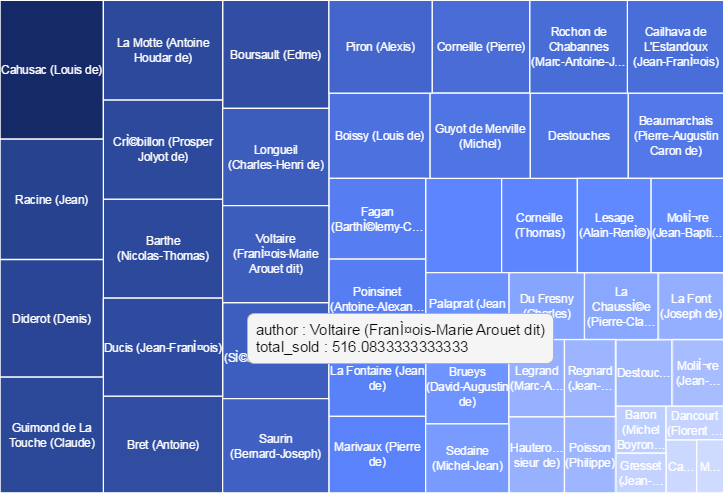
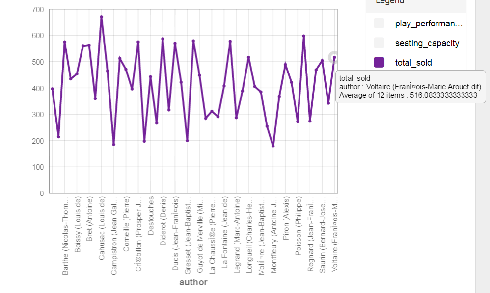
I explore what I thought was the simple question of the relationship between the playwrights and tickets sold. I used two visualizations: tree map and a line graph.

The tree map illustrated the authors with size and color according to the highest average tickets sold. It gave an abstract sense of who garnered the most and who gave the least (only by hovering could the user tell how much tickets were actually sold).

The line graph easily depicted the central tendencies of ticket sales for authors, how much that was, and how much the authors varied. I was pleasantly surprised by how much information was readily accessible in this illustration, especially because I normally would not try this illustration for this data set.