Ethnography of the Institute of Contemporary Art
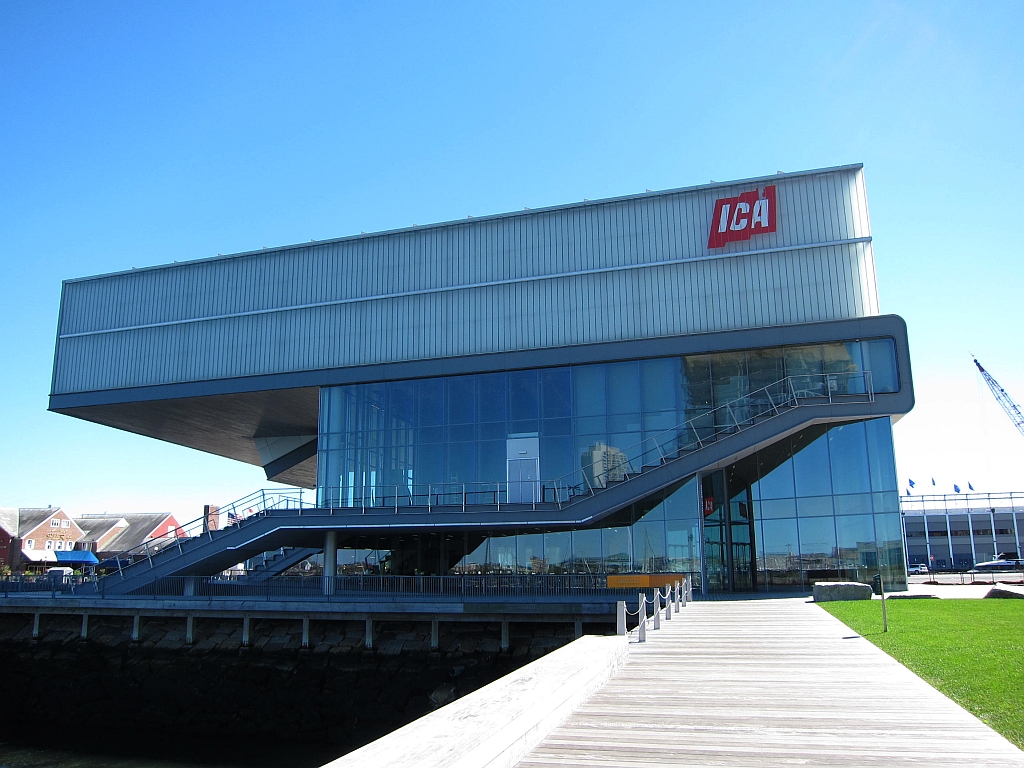
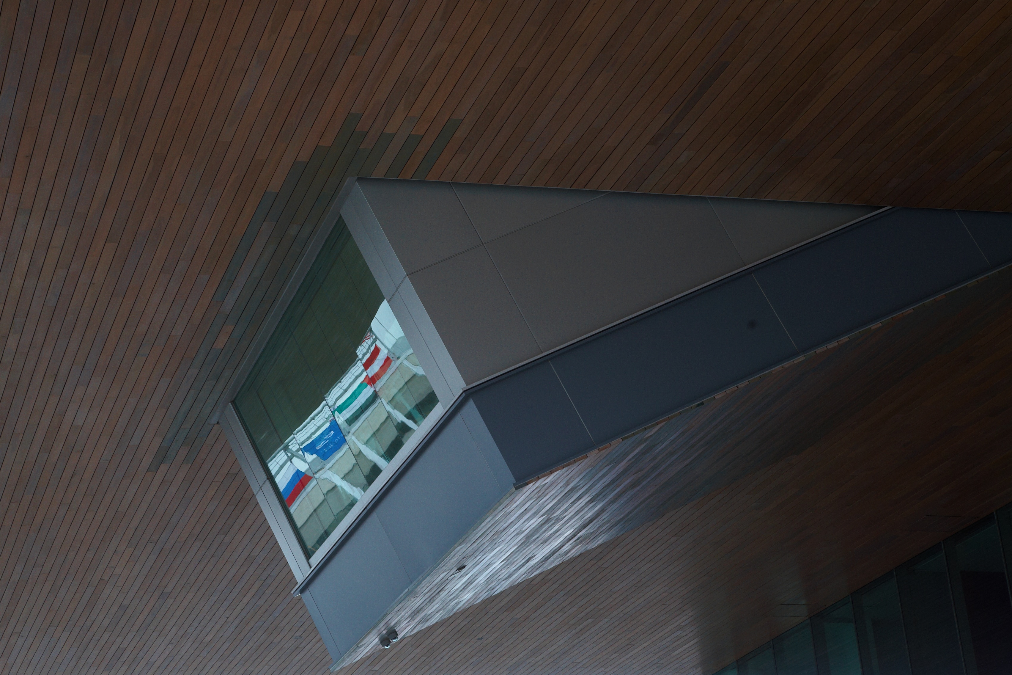
This past Thursday, my friend and I visited Boston’s Institute for Contemporary Art. Located on Boston’s inner harbor, the rather top-heavy museum building features stunning glass walls. Outside, music played from some outdoor speakers planted in an outdoor seating area’s garden.

Entrance
We ducked out of the rain and into the museum. The entrance greeted us visitors with a rather large glass-walled atrium and a registration desk. We shook off our wet coats, checked in, donned our stickers, and took the elevator up to the fourth floor gallery space.
Gallery
The gallery space seemed to conform to the “white box” stereotype of museums, in that most rooms were painted white and rectangular in shape. However, the layout of the gallery space was rather intuitive; my friend and I wandered– sans map– and managed to see all of the exhibits with no repeats or crossovers. Several rooms featured cushy seating benches for patrons to rest upon during their stay.
Technologies
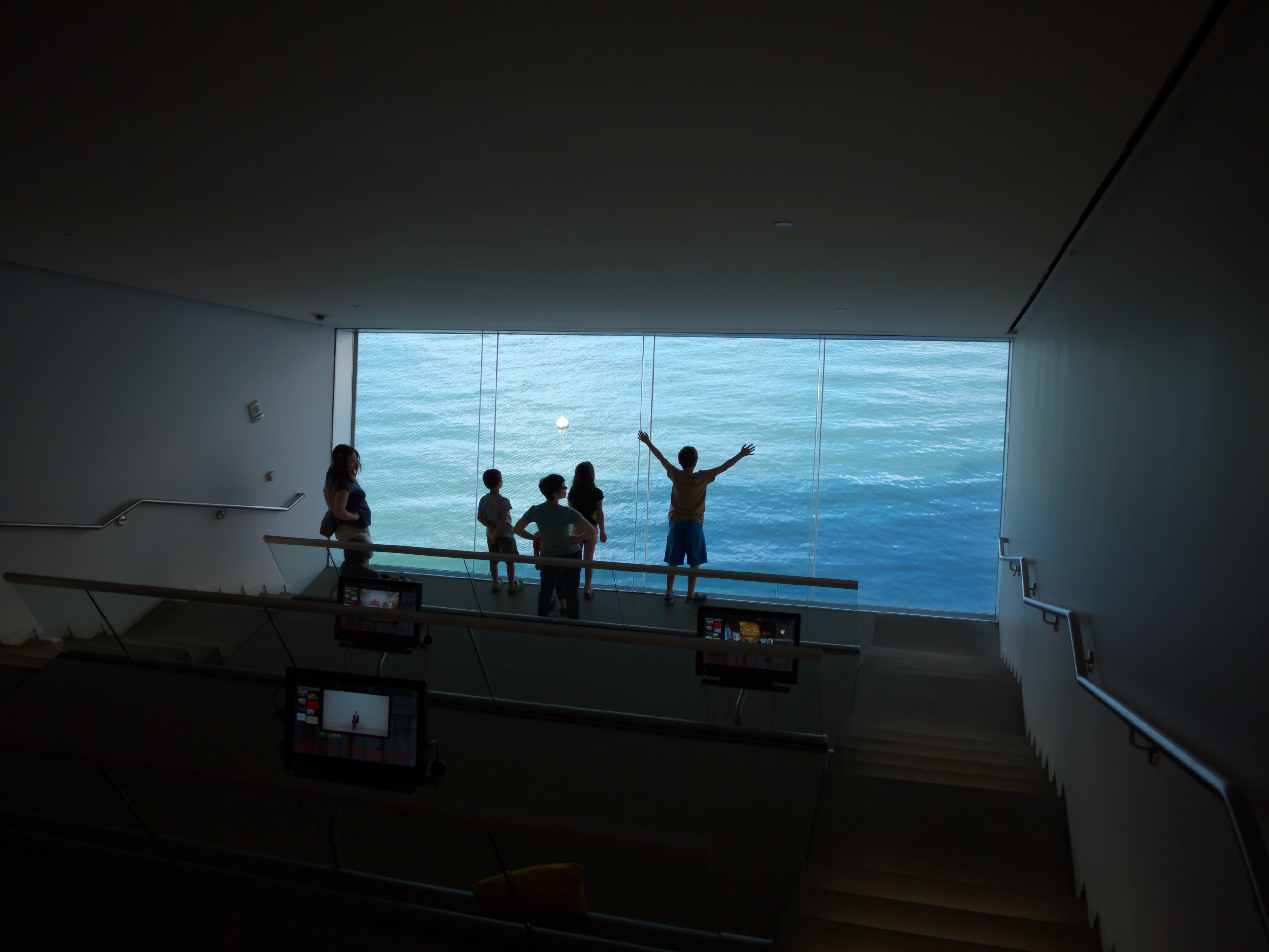
About halfway through our visit, we stumbled on the “Fox Family Mediatheque” room. The entrance opened to the top of a shelved seating area, with Mac computer monitors placed in front of the bench seating and colorful pillows scattered throughout. At the bottom of the stairs was a magnificent window that tilted slightly forward at the top, giving visitors a vertigo-inducing view of the harbor. The computers, equipped with headphones, displayed a handful of videos which the viewer could select to view. The videos themselves featured behind-the-scenes features of artists and exhibitions.


In addition to the Mediatheque, the ICA was equipped with several other augmenting technologies. The museum had a mobile guide, through which one could access tours, audio of artists speaking about their work, and other extra features using one’s own mobile device or one on loan from the museum. Pieces that had associated content displayed a mobile logo under their descriptive plaques.
