Data Visualizations CFRP
##Initial Visualization
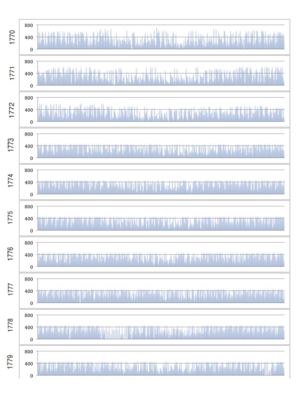
My first visualization follows the idea I presented in my initial proposal. I used Excel as it was the tool I was most proficient with, thus allowing me the execute the closest version of the idea I had on paper.
This visualization shows the number of tickets sold on each day, separated into individual bar graphs for each year. The year starts on Januaray 1st and goes to December 31st. Each graph is stacked in chronlogical order.
 I feel as though this visualization would be improved with both linking the play to each day as well as different types of tickets sold.
##Other Visualization Tools
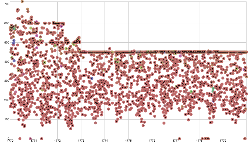
My next visualization was done with **Raw**. I followed the same idea as the initial visualization, and created a scatter plot of tickets sold verses data. Additionally I colored the dots based on genre and displayed all twelve months on one line.
 This visualization shows a sharp decrease in attendance to a stabilized plain. Isolating specific days of the week could reveal insights about which weekdays sold highest and if a trend occured there.
###Reimagining of Data
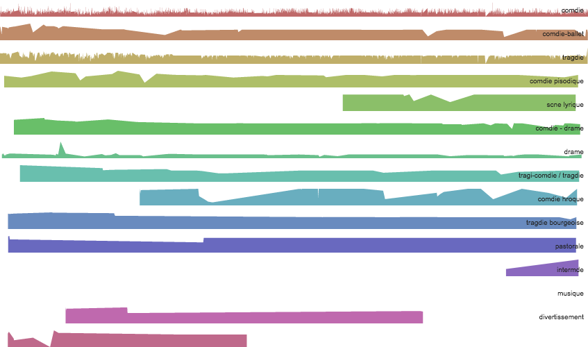
I continued to used **Raw** for my rethinking of the data. First in an attempt to understand when certain genres became popular I plotted tickets sold in each genre against time, as shown below.
 We can see that some genres such as comedy were continously popular while other came in and out of vogue. Adding which plays were playing at the time (by hyperlink, not visualization), could show whether the genre or the play cause a rise in popularity.
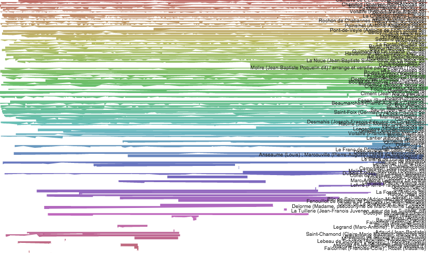
My final visualization followed a similar idea, but catagorized on author rather than genre, showing popularity trends. This visualization can be difficult to read due to number of authors.
 While trends can be observed, I believe this visualization would also benefit with additional linked information about the authors which could provide insight to the trends observed.