Visualizing Scale
The RAW data visualization platform offered a variety of ways to view the Comedie Francaise data. I decided to test out a similar visualization on different platform to compare how details of the platform affect our perception of the data.
For this task, I used IBM’s manyeyes visualization alongside DensityDesign’s RAW visualization.
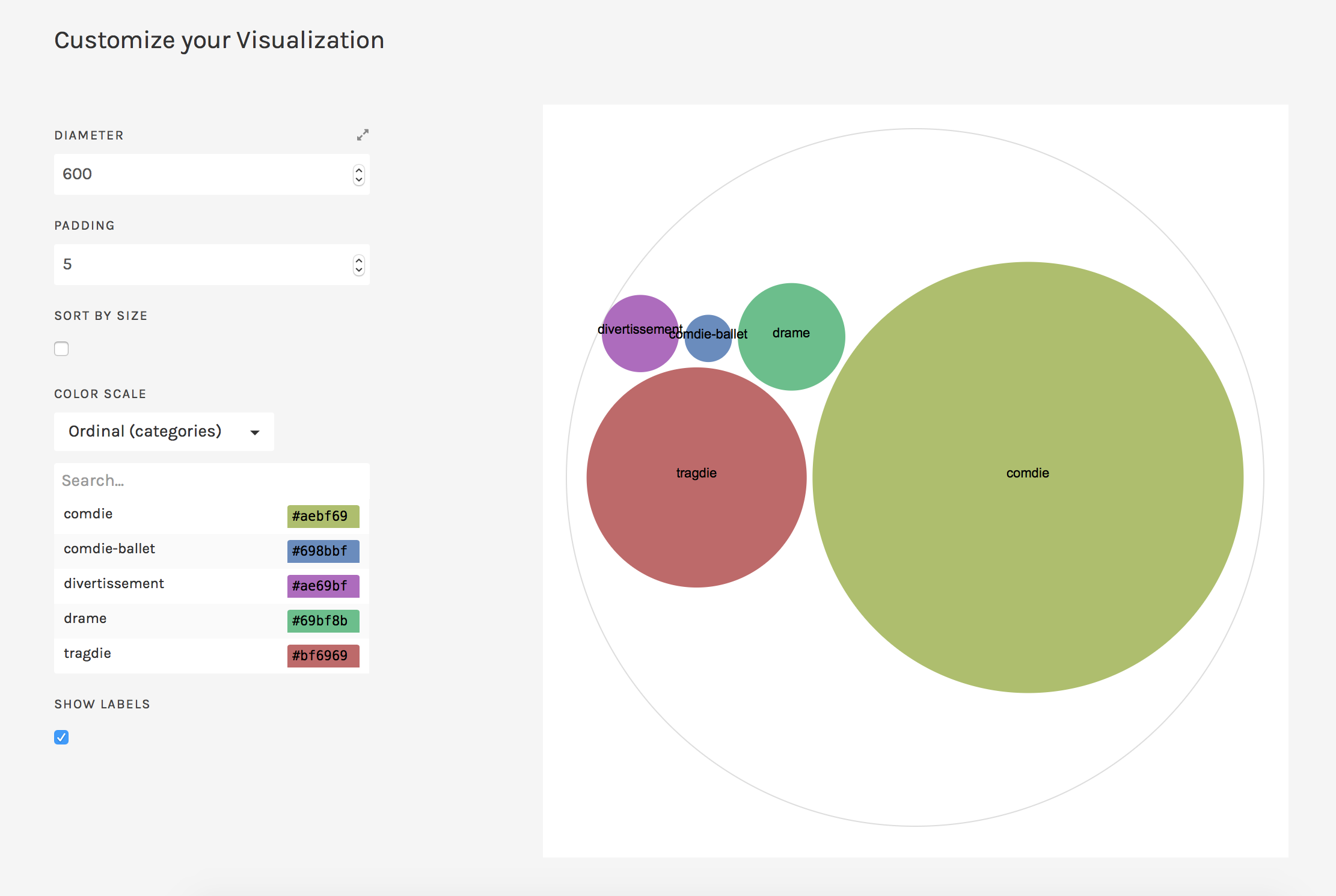
I first looked at the Circle Packing visualization that RAW provided, sorting by genre and using total sold for the size of each circle. The result is the following image:

It’s apparent that the comedie circle is the largest, followed by the tragdie, and then the drame.
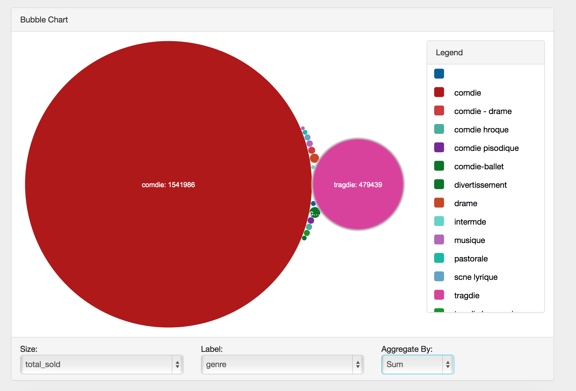
As a comparison, I looked at the same data in manyeyes’ Bubble Chart. The result is the following image:

While the overall image is simlar, there are a few key distinctions that make a difference in how we interpret the data. The most prominent is that there appears to be a greater contrast in the size of the large and small bubbles. The comdie bubble is immense compared to the others, making it seem as if that genre dominated the theater by a wide margin. Contributing to this illusion is the inclusion of a number of tiny bubbles, whereas the RAW vizualization appears to have left out some of the smaller circles or perhaps grouped them together.
A final difference is that the manyeyes visualization prints the number sold along with the genre by default, while the RAW visualization left out that piece of data by default. So although the manyeyes visualization creates a more dramatic impression of scale, it also provides concrete numbers that one can use to numerically compare the categories.
Overall, it was interesting to see how the same data make a different impression due to tiny differences in the visualization software.