Meaningful Data Storytelling
I really enjoy learning about and working with data visualiztion tools. For this assignment I utilized IBM’s online program ManyEyes. With my data I focused on analyzing the amount of tickets sold relative to the genre. I wanted to better understand which genres generated the most revenue and sold the most tickets. I believe this analysis would be more dynamic if I had a data set detailing revenue created from each of the genres on average. Then I could offer a more in depth analysis for areas that are of particular interest to me.
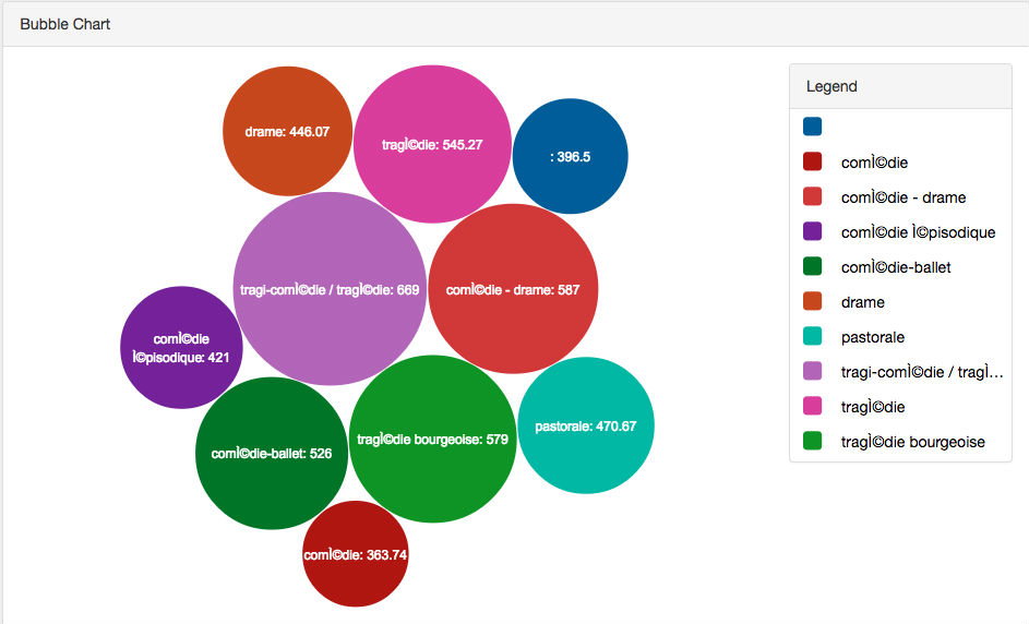
First, I used a bubble chart to gain understanding of which genres were most popular. The larger the bubble the larger the amount of tickets that was sold. For an audience this form of data visualization is very straight forward. The audience is instantly drawn to the larger bubbles, and one instantly sees which genres are the most popular. There is also a sense of scale that is easy to understand, one can understand the relationship between the genres.

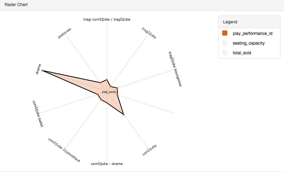
Next, I used a radar chart, because it was a type of chart I had not previously encountered. The chart instantly makes it clear which genre generated the largest number of tickets sold. It is really only meaninful for the most popular genre Comedy. For the rest of the genres it is not clear how many tickets were sold, nor is the relationship between the genres and tickets sold understandable.

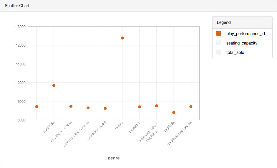
Lastly, I wanted to use an incredibly simplistic visualization tool, so I used a traditional scatter chart. Upon first glance, it is incredibly clear that comedy is the genre with the largest amount of tickets sold. Additionally, the relationship between the variables is more clearly understandable as the y-axis is labeled with numbers. Wheras with different sized bubbles, one does not understand the difference in a quantitative way. All in all, this data visualization was the most meaninful to me, but not the most exciting.

All in all, which data visualization tool one chooses to make use of should be highly dependent on the target and audience of the visualization. While we were looking at the same variables in the same data set, each told a different story, creates a different effect on the audience, ultimately a different understanding of the data set.