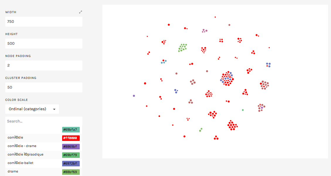
Clusters of Author Popularity Across Genres

For my visualization, I continued working with the RAW toolbox. The question the given CFRP data inspired me to ask was: How popular were the works of different authors across different genres? Using the small dataset for this purpose, I generated a cluster-based visualization to answer this question.
In the figure above, each cluster represents different authors, with each element-or bubble- representing a given show. The size of each element represents the tickets sold for each element, and the color is indicative of the genre of the given play (as seen by the color legend on the right). This way, we are able to look at each cluster to observe how popular works within certain genres of each author compares to works in other genres.
As an example, we can look at the largest cluster, which represents Moliere’s works. From this, we immedeately observe that Moliere was most prolific in comedies, though some of his works fell under the category of comedy-ballets. An interesting observation is that while Moliere’s comedy-ballets were consistently popular among the community (all fairly large bubbles), his comedies had a wider distribution of attendance. This is both interesting with repect to the authors, and the audience preference for the authors plays.
There were a few issues that I came across as I attempted to visualize the given data meaningfully. First off, the given raw data was required a significant amount of scrubbing as well as reorganization to get meaningful comprable metrics. For instance, while attempting other visualizations with date as a variable, high granularity made all visualizations very messy and difficult to interpret. So meaningful visualization of this data would have required counting, averaging, or summing of some of the variables.
Additionally, RAW had many limitations in terms of generating visualizations that are easy to interpret. For instance, I was unable to label each cluster with the author name in the graphic above. This made it obvious that data sets, particularly if they are stemming from humanities, are fairly unique, and meaningful visualization of humanities data can often require tailored tools.