Finding a Data Story with Tableau Public
I decided to do some visualizations using a different software called Tableau Public (the free version of Tableau, a popular business intelligence and analytics tool).
I’m using the CFRP-1770s-cleaned.csv file.
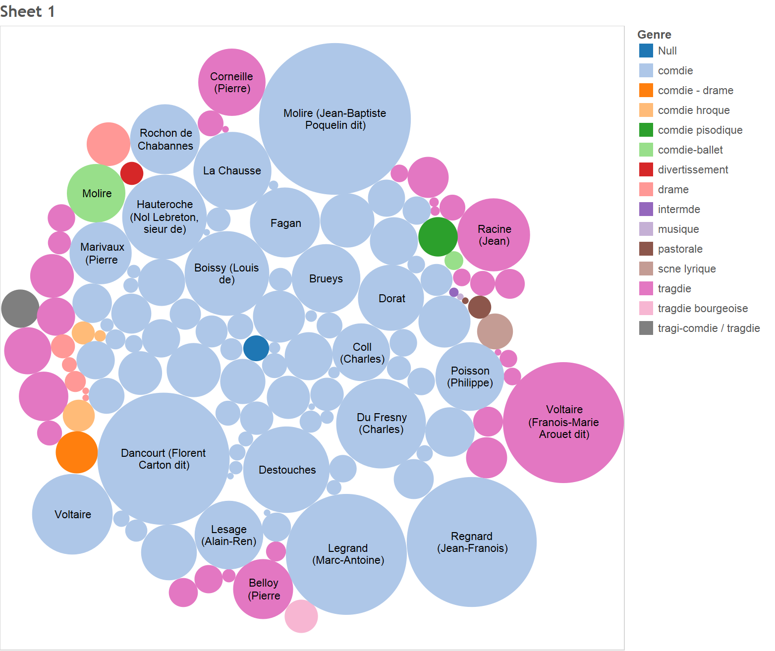
To start our story, we need some characters, so let’s figure out who the most prolific (in this case, we’ll approximate that by looking at who had the most performances) playwrights were. We’ll make a circle packing diagram where there is one circle per author, and the size of the circle is proportional to the number of plays they wrote. Furthermore, we’ll make the color of the circle reflect the genre of plays that the authors typically made. The result is shown below:

It looks like Molire was the most prolific playwright (biggest circle) and that Dancourt and Voltaire were close behind. However, Molire and Dancourt tended to write comedies while Voltaire wrote tragedies. On top of that it seems that most of the playwrights at the time seemed to write comedies. There were also a few that wrote dramas. The purple circle represents Iconnu (perhaps a group, not an author) who made divertissement (which appears to be an interlude within a play).
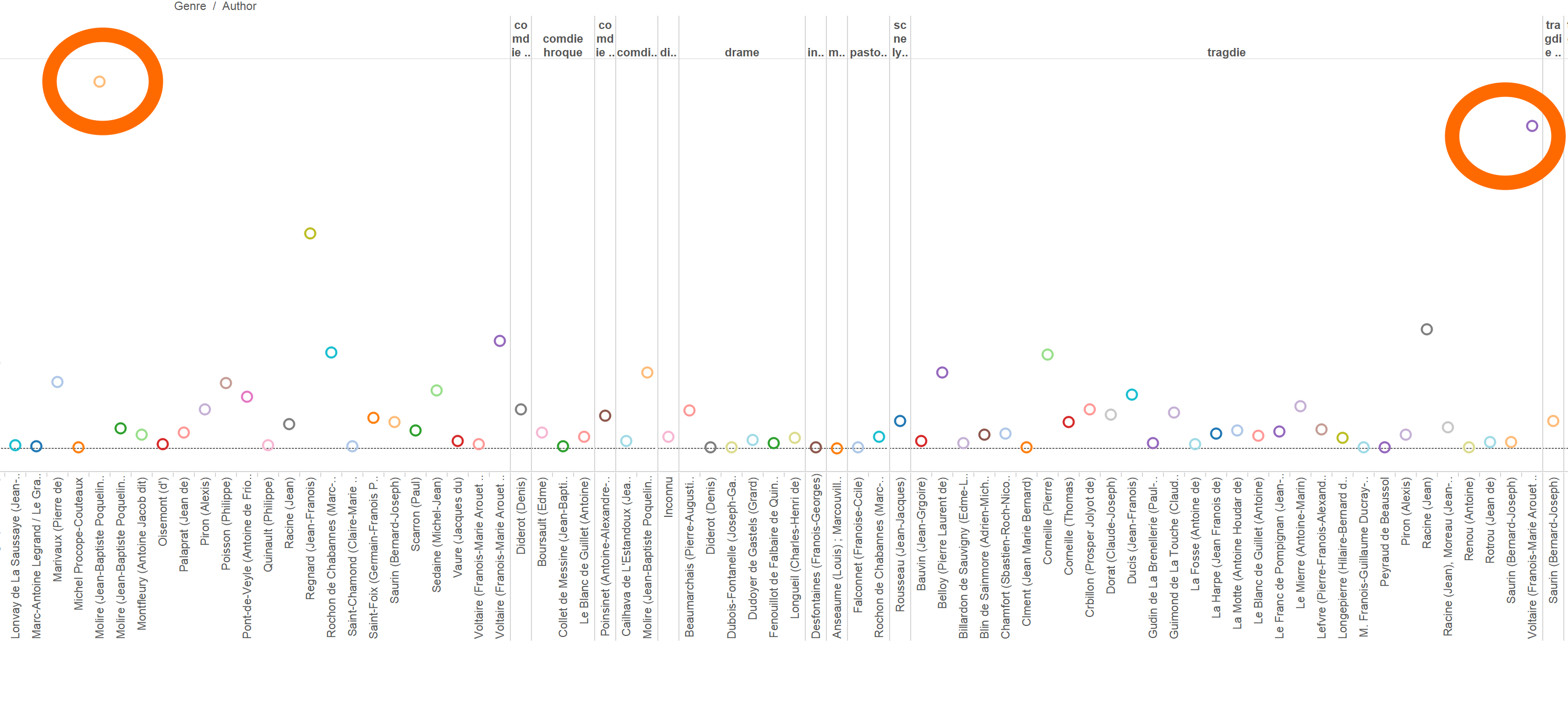
Now that we know the most prolific playwrights, let’s try and get an idea of who was the most successful (in terms of number of tickets sold) playwright. To do this, we’ll make a side-by-side circle chart (which is effectively a bar chart where the bars are replaced with circles). On the x-axis, we have the names of the authors. On the y-axis, we have the total number of tickets they sold over all their plays. I’ve cropped out some of the graph so it fits, but you can see it below.

It looks like the most prolific playwrights (inside the big orange circle) tended to be the ones who sold the most tickets. Molire is first with almost 170k sales, followed by Voltaire (about 150k). Dancourt did pretty well too (about 125k).
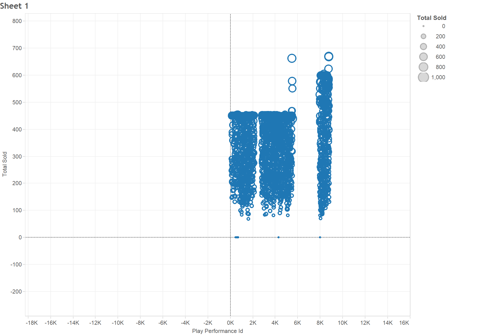
I wonder if that has more to do with the theater than the playwright. If the theater was extremely popular and was always filled to capacity, then it makes sense that the playwright with the most performances had the most tickets sold. Let’s make a scatterplot with the play performance id on the x-axis and the number of tickets sold on the y-axis.

It looks like not all performances hit capacity, so Molire, Dancourt, and Voltaire appear to be popular, even for playwrights at this theater.
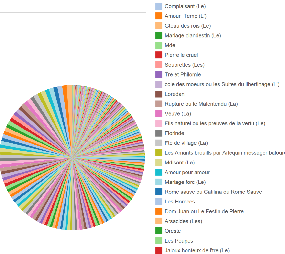
With that, let’s turn our attention to plays. Which play sold the most tickets? If we make a pie chart, we can’t really figure that out easily.

But what this does tell us is that there’s no play which was hugely more popular than the rest (the biggest slices are pretty close in size). That being said, it seems Avocat Pateline by Brueys had the most sales (almost 25k).
We could go on, but even just tells us a lot. We learned that tragedy writer (rare, because most playwrights wrote comedies) Voltaire and comedy writers Dancourt and Molire were the most popular playwrights (even for such a popular theater). However, it was Brueys who made the most popular play.
This is my first time using Tableau Public, but I really liked it. While it does not offer a huge number of visualizations, it can work with the full dataset (Many Eyes slowed to a crawl when I tried it) easily and lets you interact with the visualization and query/filter the data.