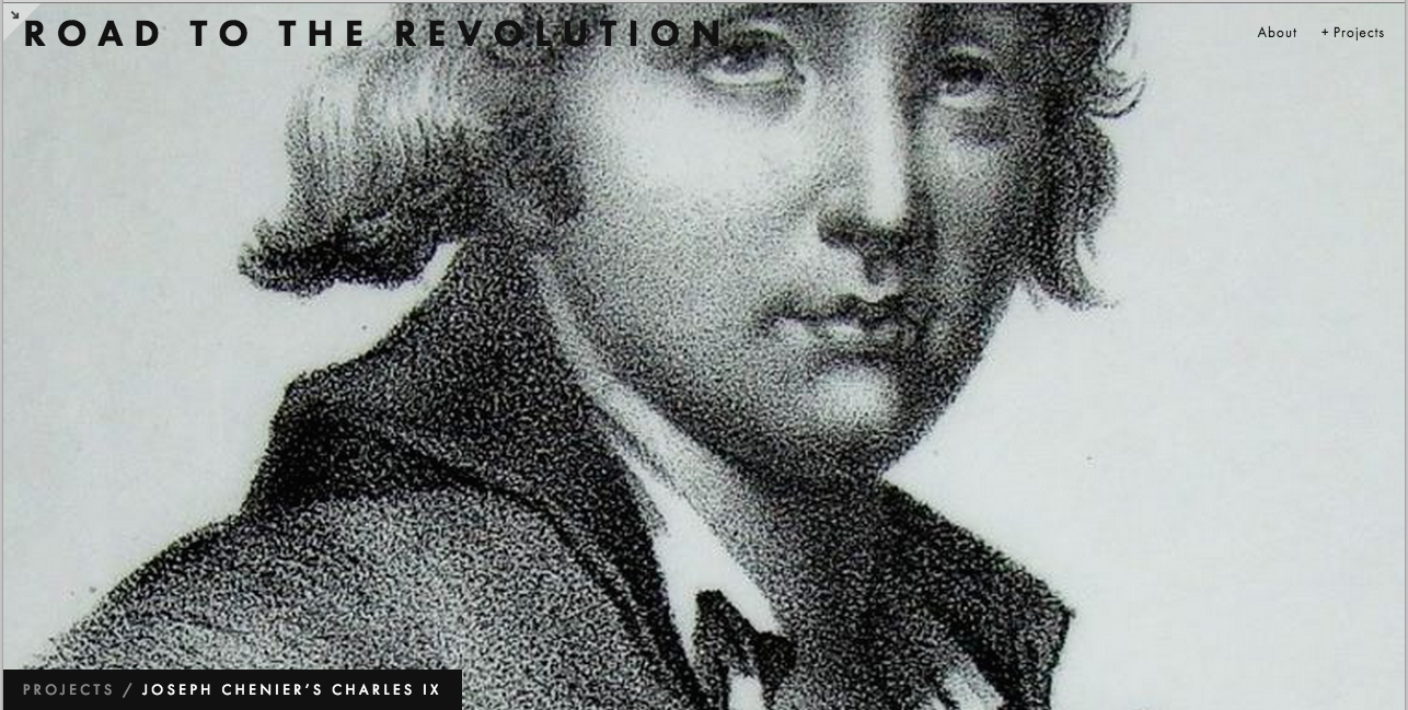
Charles IX ou l'École des rois and The French Revolution
What question are we addressing?
Joseph Chenier’s “Charles IX ou l’École des rois” is considered a key catalyzer on the path leading to the French Revolution.
With his controversial depiction of the French Monarch Charles IX, Chenier presented a Republican perspective on the French aristocracy prior to the French Revolution. François Joseph Talma’s performance as the king also led to the plays popularity.
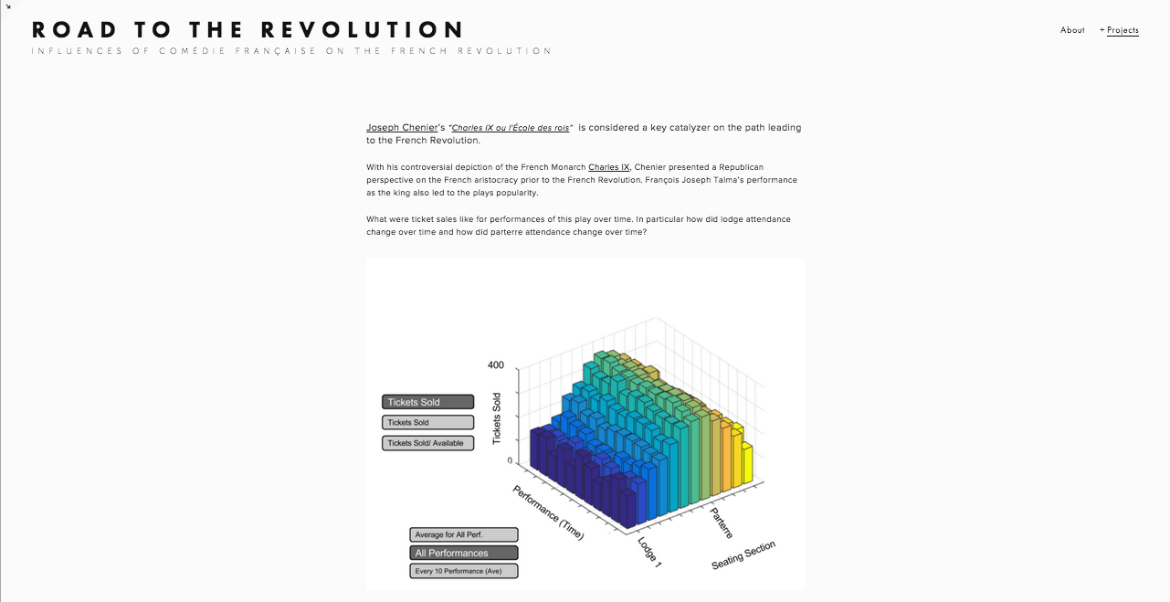
What were ticket sales like for performances of this play over time. In particular how did lodge attendance change over time and how did parterre attendance change over time?
Audience
This tool would be interesting for those studying the history of the French Revolution and particularly cultural contributions to tensions. This tool could be easily integrated with a museum exhibit regarding French history surrounding the Revolution or even the societal/political influences of art and theater.
Our API Approach
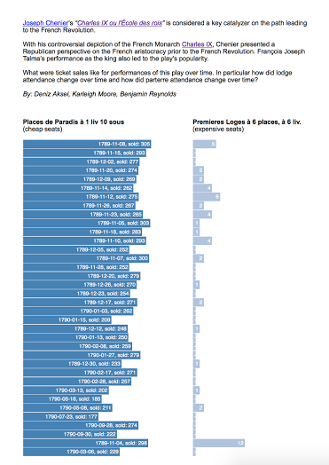
We built the website using d3.js to power the visualization. First, we send an HTTP GET request to the CFRP API to retrieve data about the number of tickets sold for this play. We do so for the lodge tickets and the parterre tickets, and we visualize each in a simple bar chart powered by d3.js. The charts are side-by-side so you can easily compare the types of tickets sold on a given night. Below is a screen shot of our website, showing the bar graphs that compare theater attendance, according to ticket sales, of wealthier and poorer classes to this controversial play.
Mockup for Future Designs/Additions
For a future version of the project, we want to go for an even larger-scale design idea/question for our imagined website/tool: A tool for quantifying the effects of CF on the french revolution via the study of specific cases ( certain plays, performances by actors etc.) Basically we catch and present attendance/section ticket sale trends that we believe would be interesting within the context of the revolution. There is a summary of this idea under the “About” page shown below.
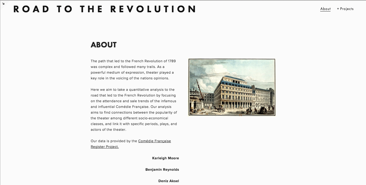
Here is an idea of what our home page would look like.
Also to add flexibility, we figured the data visualization graph could have options like looking at total sale numbers vs (tickets sold/tickets available). We tried to show this with selection buttons next to the graph.
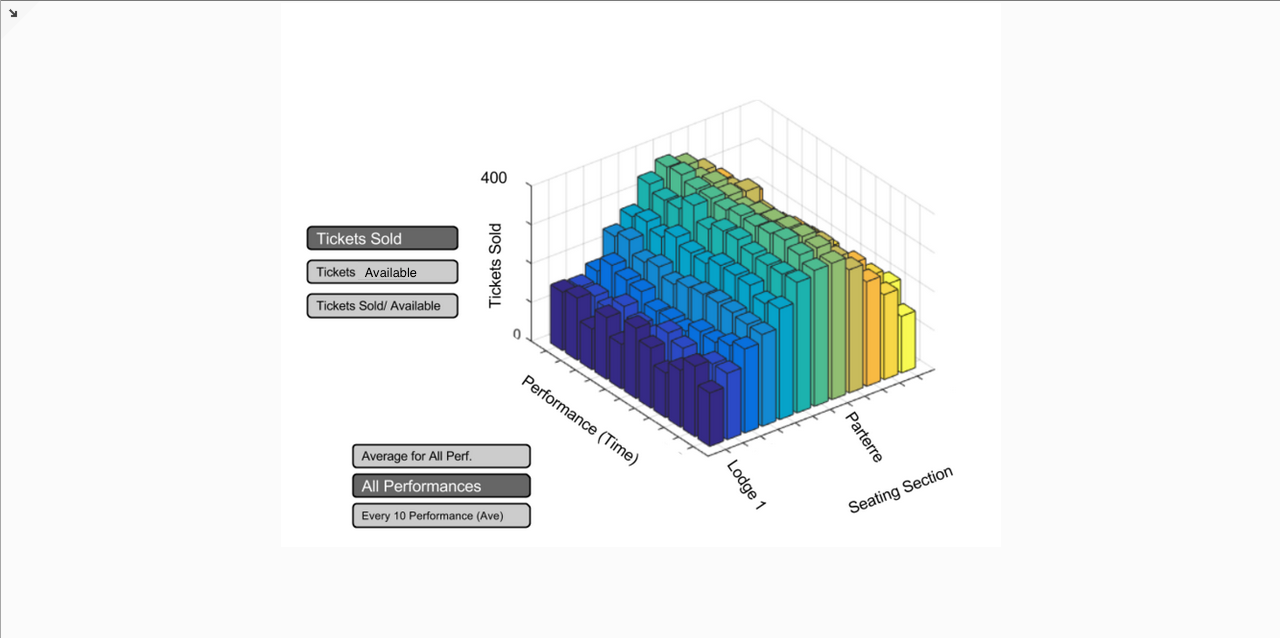
Also, notice that the text above the graph is full of hyperlinks! These are mostly to wikipedia pages of whatever is highlighted. Except for the play name itself: that one is a scanned copy of the script (can be found here). This could be a useful feature for those who want to know more about specific parameters and things mentioned on the site.
