Adding Sea Charts to Moby Dick Mapping
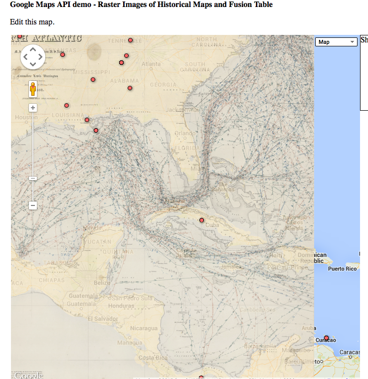
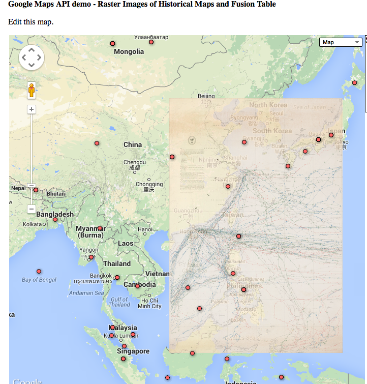
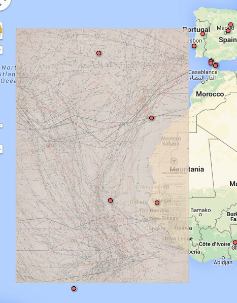
One of the ideas I became interested in pursuing when looking at the Moby Dick Maps was whether shipping charts would add to the given visualization. Luckily, there were several additional Maury Charts given to us to work with. I tried overlaying the Atlantic, next to the Americas and next to Africa and the Pacific, adjacent to Asia.
###Map of Atlantic #1 ###

I did not find that this chart added a large amount of insight to the data, so further examination of the text would be necessary to make this more useful.
###Map of Pacific###

This map helps me understand the visualization better as the routes connect the location dots on the map.
###Map of Atlantic #2 ###

Similar with the Map of the Pacific, I feel this map helps contextualize the data points it covers.
Additional changes to UI that I would make is the ability to toggle each overlaid map individually. I also would explore different sea chart to see if any additional insight is revealed.
I think the whaling chart can add additional info by mapping the paths followed in the book. Additionally, we discussed the problem of generalized locations (Pacific Ocean, Mighigan, etc) and at least concerning the areas in water or along the coast, these charts could give a more logical location for the data points, such as along the provided routes.