NewsConnect Design Document Final Draft
I. Project name
II. Team members
Meghana Bhat is a sophomore in Course 6 at MIT. For the NewsConnect project, Meghana created the code that made the app a reality. She worked to incorporate news data with our map, and transferred UI ideas into code.
Karleigh Moore is a junior in CMS at MIT. For the NewsConnect project, Karleigh initially worked on the news data scraper, but then focused on deciding what sorts of news data (keywords, sources, places) we would look for with a different scraper. She worked to brainstorm UI features, create mockups, and was in charge of creating the documentation and presentations regarding the project.
III. Concept overview/abstract
NewsConnect is a web application that allows users to see global connections in news, and makes it easy to find only the news you want to read.
Key features of NewsConnect include:
- Lines connecting points within nations (that represent an article). So if an article has to do with China and India, the two countries will have a connection line.
- Users can filter articles by category. This would make it easy, for example, to narrow down articles to only economics articles.
- Users can get a preview of an article by hovering over a map point.
- NewConnect will eventually include a timeline filter so that users can see articles in a particular time range, in addition to a specific category and/or country.
It’s very easy to find news articles to read on the internet, but it can be overwhelming to sift through so much text, and to find what you’re looking for beyond basic categories of “politics” and “economics”. In particular, with world news, it can be hard to track patterns of news across nations. A student might be doing a research project on international relations between, for example, China and European countries. He or she can look up news about China, or news about Europe, or news about the world, but seeing news connecting both locations, and seeing the development of that news over time, is significantly harder. A user might also, for example, have an interest in West African nations and articles relating to politics of the region. It would take a lot of effort to track news about the particular region related to one specific topic, especially if you want news from many sources.
To address these problems, we want to make NewsConnect, a visual and engaging news webapp. We want to avoid walls of text, and make the interface informative, but not intimidating. We did this by putting news articles on a world map, associating the articles with the countries discussed in the text, and visually showing links between countries mentioned. A user will have access to the news they are looking for (with the help of our features) without having to skim through many articles, disrupting their workflow as they are taken to new pages with every click. Better, they can investigate a particular news issue over time in a geographic context. NewsConnect is also a way to discover trends in world news including coverage, source bias, and more.
IV. Background research
We met with Liam Andrew, and he showed us a webapp called Gistory.co. Gistory.co is a visual news interface that lays articles on a map according to the location of the events in the article. We thought it was a great idea to overlay news on a map to give a clear visual idea of the places mentioned in the article, and we wanted to apply this concept to world news — keeping with the theme of visually connecting news content to places.
The MIT Center for Civic Media conducted a project that we thought was pretty useful too — CLIFF. CLIFF extracts people, places, and organizations from news articles, and it’s goal is to understand what the article is really about, rather than an amalgamation of all the places mentioned. These ideas were particularly relevant to our project because at times, an article about Egypt and Israel would be linked also to Korea because a Korean journalist was mentioned. We didn’t use CLIFF technology in our project, and we took care of this issue later by using webhose.io to gather location data provided by the news sites themselves. Though perhaps in the future, we would want to use something like CLIFF to do this instead, to eliminate any possible bias that exists from getting this information from the content source.
V. Project Developments/Process
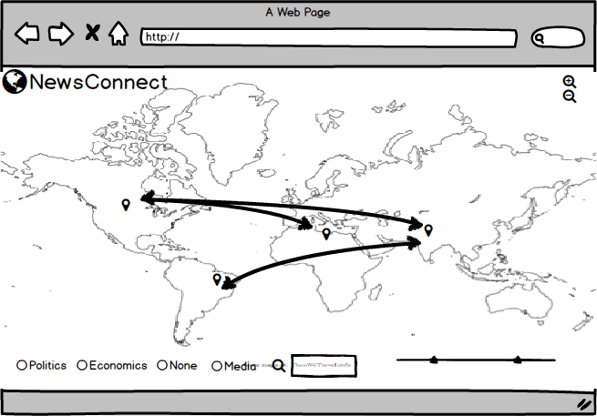
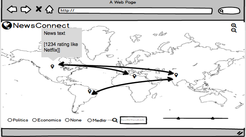
The first phase of our project was to prototype and determine how we were going to gather our news data. We drew some paper sketches of what we wanted our interface to look like [see below]. We began to scrap news data from CNN using a scraper we built using the Newspaper Python library. Choosing a scraping method is something that we continued to have problems with throughout the project because there were a variety of pros and cons between different software. We settled on webhose.io to scrape news data. With webhose.io we can specify which new sites we want articles from, specify a popularity feature (to only include articles with a high number of hits, to increase the relevancy of a given article), and we can input keywords we want the scraper to look for within articles. This helped us establish our category feature on our web app. We decided on a few lists of terms commonly associated with “politics” and “economics” and so forth, and the scraper helps us to allow users to sort articles with these parameters. In the future, this capability will expand to include many more search terms, hopefully in some automated way. Additionally, webhose.io provides location data for some news sources which helps us get around using geopy for location information for the world map interface.
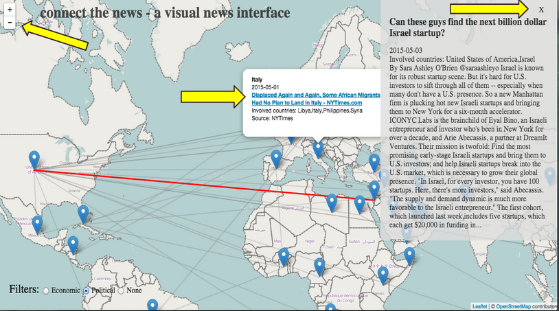
The second component of our project had to do with the user interface. We really wanted the focus of the project to be making reading news a more visual and interactive experience. We decided that having a full screen map with pins and connecting lines to indicate which articles were associated with which countries was the first component of our app. We wanted connecting lines to be color coordinated with topic: all the blue lines, for example, could represent articles about politics, and red lines could indicate economics. We thought that radio buttons would be the most straightforward option for users to select which news topics they’d like to see, but this could easily evolve into a multi-option selection process in the future, when we have more categories and comparison/connection data. When a user hovers over a country’s pinpoint, a list of articles about that country appear. A user can then hover over a specific article, and then only the paths connecting that article to various countries will be highlighted, all the other lines on the map turn more transparent. We wanted users to be sure that they found an article they want to read before they have to travel to the news site and sift through the article. By the time they are given articles to read, they already know the article’s topic and the countries the article deals with. Additionally, a preview of the article appears on the page if a user clicks on the article block element — the user can read this short preview and decide if they want to click the article link to go to the full article.
VI. Enabling Technologies
Balsamiq: A wireframing tool we used to prototype our project, and to create a vision for future directions of the app.
Leaflet: Leaflet is an open-source JavaScript library for making interactive maps. We used Leaflet to generate the map and it’s features that are the main visual component to our app.
Newspaper +Stanford NER + webhose.io : Our first data scraping setup used the Python library Newspaper, and then scanned the articles that it scraped using the Stanford Named-Entity-Recognition tool for location data. This wasn’t the best process because the NER wasn’t as consistent or accurate as we would’ve liked (an article mentioned the animal “turkey” and associated the article with the country Turkey). The Newspaper library didn’t have a way for us to extract category data either, which we decided was a key point of our project. We found that webhose.io was much better suited for our project. It’s an API that can gather information from any number of sources, and allows us to query by keyword. With this, we selected sources that we knew would provide location data, so we were able to get accurate location data and sidestepped using the NER. Additionally, we were able to easily implement category funtions with the data webhose.io scraped.
Heroku: Heroku is a cloud service that takes care of server management, and we hosted our app using Heroku.
Flask: Flask is a Python library for micro web application frameworks. We used this for our server related code.
Geopy: We used the Python Geopy library to match location data we got from the NER and later, webhose.io to places on the world map. The library contains coordinate data, so we were able to place articles in and connect them with the countries that mentioned them.
VII. Journey Map
a. The user will see a world map, populated with news
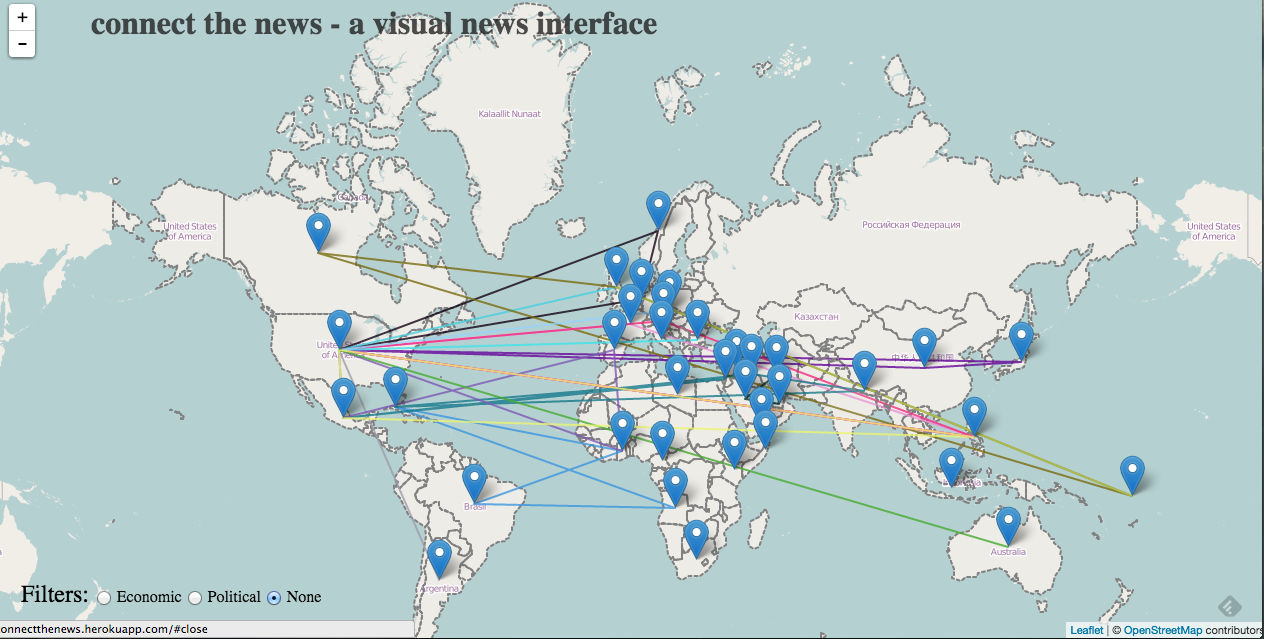
b. The user can change what he or she sees on the map by doing any combination of the following: - Selecting a country to zoom in on by double clicking on a region - Adjusting the timeline range with the slider bars - Selecting a specific news topic by checking a labeled radio button
c. The user can get a list of the articles pertaining to a specific country by hovering over the pin in the country.
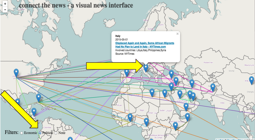
d. The user can hover over an article in the the list of articles and see a preview of the article appear on the screen.
e. A user can click on the link to the article they see (before or after seeing the preview) and the article will open in a new tab. Or if a user decides that the article is not one they want to read, they can close the preview, and zoom back out to the world view.
VIII. Future Directions
With more time and access to more robust APIs, we would like to incorporate more news sources from all around the world, have more comprehensive category/search terms, and a way of saving, sharing, and rating news articles users discover on our app. We’d like to incorporate a time line feature using a slider bar that a user can interact with to indicate a range of dates they’d like to see news from. Additionally, we wanted to have a “Zoom back to world” button, which would be the Globe icon next to the site title — a standard way of returning to the home screen of a site.
VIII. Works Cited
https://civic.mit.edu/cliff-entity-extraction-and-geoparsing-for-news-articles
https://gistory.co/