CRFP Data Visualization (RAW)
Note: This is a late posting of last week’s homework.
For my visualization, I decided to explore one of the lesser-used visualization chart types: the Voronoi Tessellation, which you can read about here. In this visualization, my goal was to show the popularity of genres in the period, using ticket sales as a metric of said popularity.
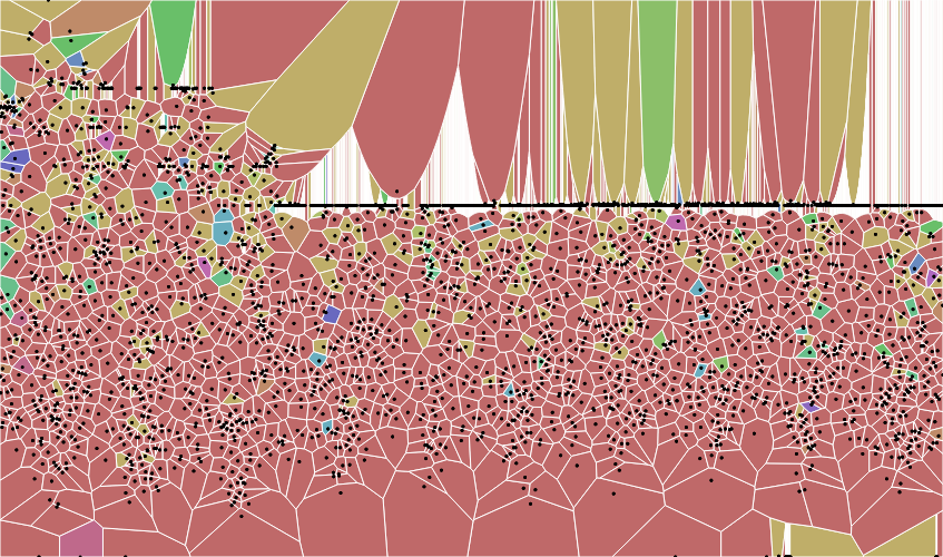
I started with the large dataset, which produced this:

The X axis represents the date, the y axis represents the total tickets sold, and the color represents the genre.
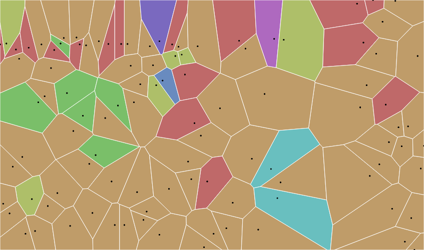
As you can see, the image is a bit difficult to parse. I decided to try it again with the smaller dataset, using the same dimensions for the axes and color:

This one is much more readable, though it also has no labels.
However, what does this data actually show? I confess, I did not know what a Voronoi Tessellation was- or how it was constructed- until after I made my graphs. While I initially thought that the size of each polygon would correlate with the number of tickets sold, but, when I looked into the matter, I realized that the polygons, in fact, represented every point that is closer to its point (seed) than any others.
So, do the size and shapes of these polygons created with this data actually mean anything? From what I can tell… not much.
Since the size of a polygon is determined by its point’s distance from other points, the only reasonable interpretation of the graph that I can think of is that, the larger the polygon, the more of an anamoly that day was, as far as ticket sales go for that period. However, even this is imperfect, given we are working with two variables and in 2D space. A polygon could be large due to fluctuations in ticket sales or due to a difference in frequency of shows.
However, one could glean some information about the popularity of certain genres. The light purple and dark purple polygons, which represent comedie-drame and tragedie-bourgeoise, are particularly high on the graph, which means they had higher ticket sales. However, the shape of the polygon may blur the viewer’s ability to see exactly how popular the show was. For example, the seed point of the dark purple polygon (tragedie-bourgeoise) sits quite low; the polygon reaches the top of the chart. This may lead the viewer to believe that the show was more popular than it was in actuality.
Lesson learned: know what your visualization actually does before employing it, or you may misrepresent your data, or even end up with a visualization that conveys nothing at all.
Finally, while this visualization is elegant (ignoring its ill-suitedness for this dataset), it is a bit complicated in its structure. This is a point we must remember when creating visualizations: not everyone is data-literate, and sometimes simple visualizations are the most effective.