Stories Behind the Data
I really like the interface of RAW so I decided to use that as my main tool. RAW is intuitive, fun to use and quite powerful at processing large number of data. I was surprised by how fast it is at generating the graphs in a web environment. (A little side note: I misread the tutorial and thought I had to run it locally so I went through all the trouble to install python and all the necessary packages on my laptop only to find out that I didn’t need to do any of that. That was an hour well spent… Don’t be me if you’ve never used RAW. It works perfectly fine in the browser!)
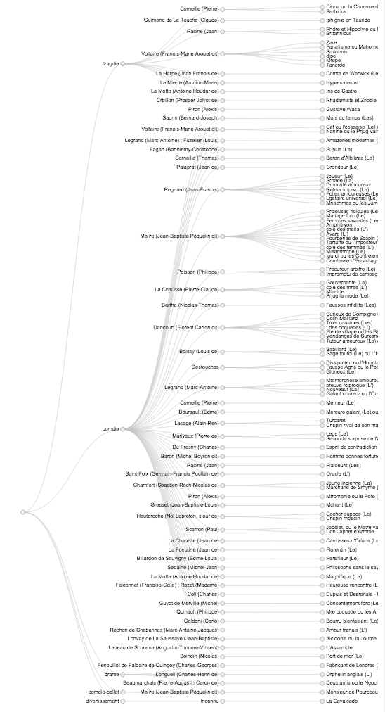
The first graph I decided to make after poking through the interface for a bit was a “Cluster Dendrogram”. I thought it would be a way to show the differences between numbers of plays in each genre. To make the graph more interesting, I also added “author” and “title”. Since there is a large amount of data, I was only able to get a screenshot of the much more zoomed-out version of the whole graph.

You can clearly see here that there are way more play in the “Comdie” genre than the others. This graph also allows us to see which author is more prolific. At first, I tried to add “total_sold” to the last layer, however, due to the size of the data set and the screensize, it was very hard to see everything. Therefore, my next goal was to create a graph that can show which title is more popular for each author.
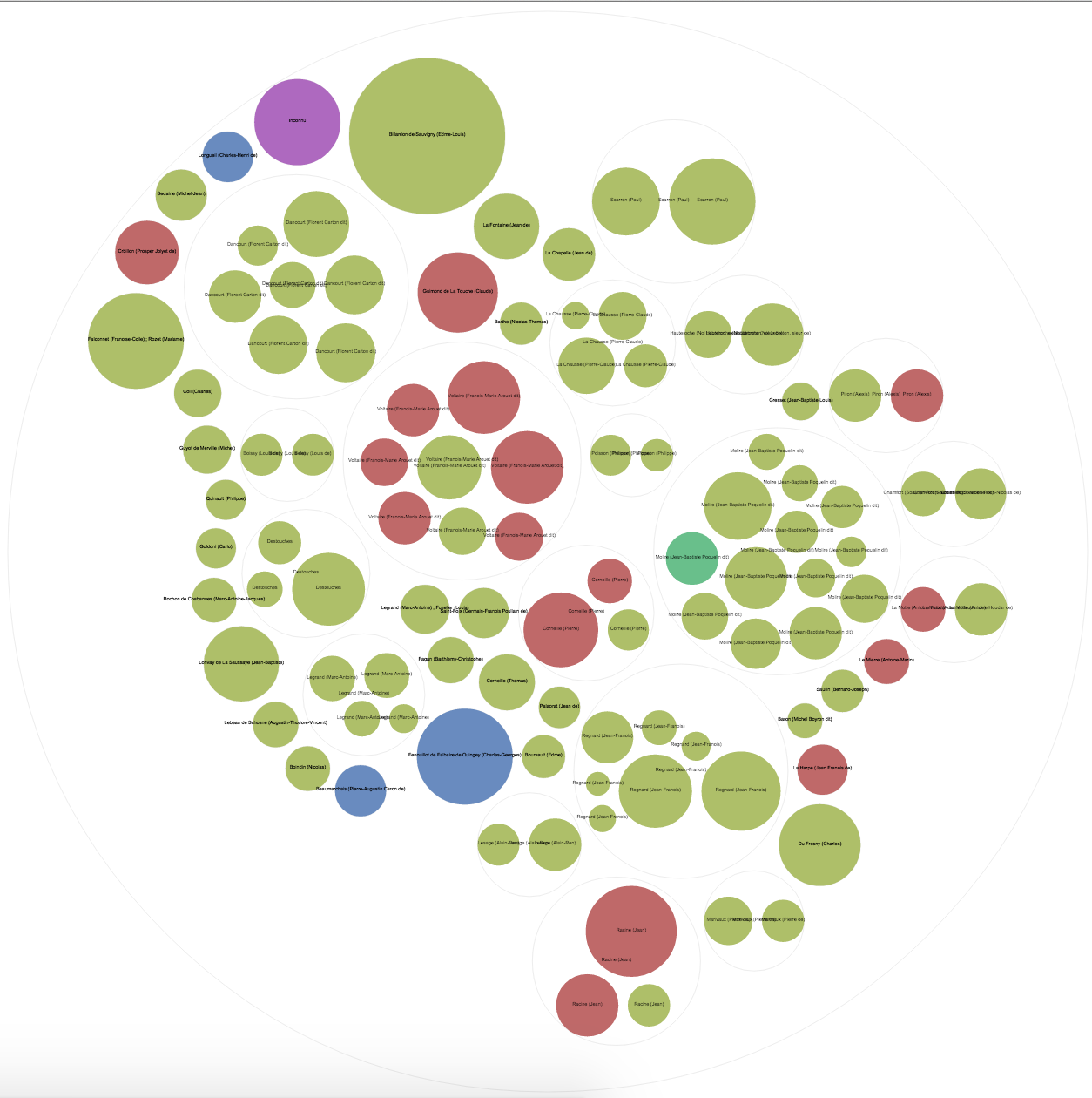
Previous findings lead me to create a “Circle Packing” graph. I chose to color by genre, group them by author, and size by total number of tickets sold. It gives me an insight on who has the more popular shows. It’s interesting that some of the more prolific authors have medium level of popularity and some authors who only has one show turned out to be a huge success. It is also interesting to see that some authors wrote multiple genres but some only focused on one.

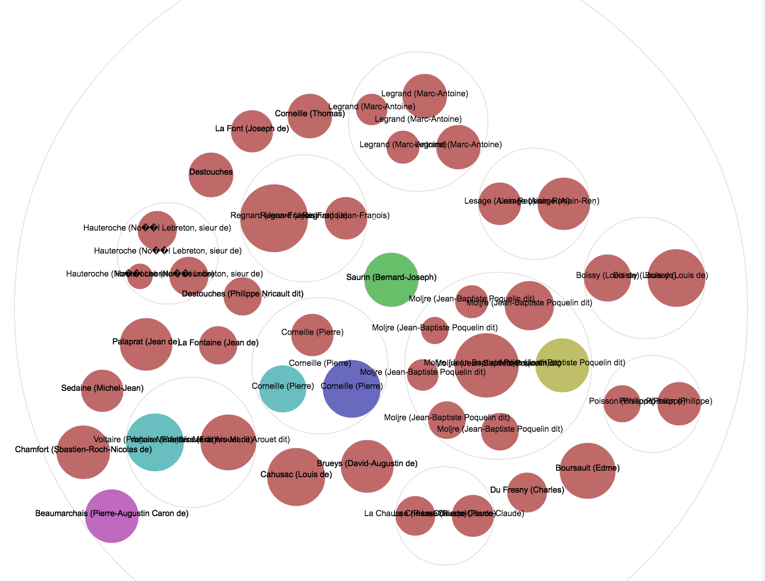
Though the graph is informative, the size of the data makes is very hard to read. Using the small set, the graph is much easier to read but contains less variance.

Overall, the tool is very handy but it would be nice if it could show the repeated labels only once.