RAW visualiztions
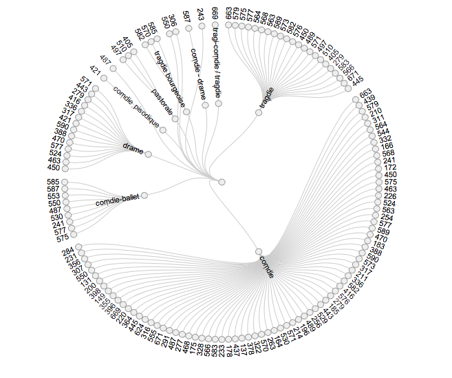
I focused on two data visualizations from RAW that I found to be particularly effective at relaying information. I enjoyed the range of visualizations RAW had to offer, but the lack of numerical data made it difficult to create relevant visualizations that enhanced the views knowledge rather than confused them. The first graph I focused on was the circular dendrogram with the play genre and total number of tickets sold as the dimensions of the graph. The visualization is a circular, tree like structure, where each branch corresponds to a different parameter.

I like the simplicity of this visualization and strong connection it makes between the data and the image. It is easy to conclude information about the correlation in ticket sales and genre, trend towards comedies is so prevalant.
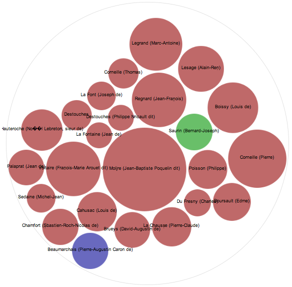
In my second graph I decided to try the circle packing visualization. The strength of this graph lies in its ability to present a larger range of information without become overly complicated or confusing. The color of the graph correlates to the genre, and label corresponds to the author, and the size of the circle corresponds to the number of tickets sold. I liked the visual clarity that comes with color-coding the genres, as without so much reading the graph labels so much information is already conveyed.
