Comedie Francaise Data Story
With the current rise in technology comes an explosion of data and observations we can make about the world, and the endless possibilities of our creativity if we could understand and harness it. However, with the vast amount of data out in the world right now, even the mere process of understanding what a dataset is telling us is becoming increasingly difficult. And this creates an entirely new field of data visualizations - how do we summarize what we observed into meaningful messages and how do we communicate such purposes?
Many tools, such as the Excel, RAW, Many Eyes, have been created to ease this process of data understanding, but each has its strengths, weaknesses, and impact. To understand the differences among tools, we take datasets from the Comedie Francaise Registers Projects and attempt to visualize the 3 fields: date, total tickets sold, and genre, in different graphs.
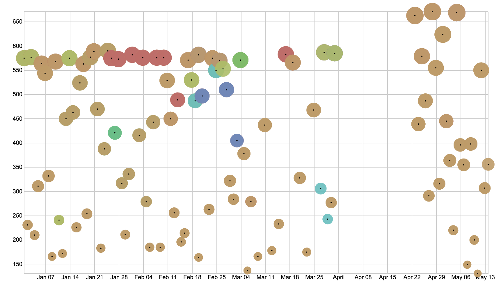
We start off with a simple scatter plot.

Here we can easily see that the dominant genre is comedy, with a brief period when tragedy is popular. We also note that we see a brief gap between April 1 to April 20, and we correspond that to be the Easter holidays in France, when the theater would be on break. We also note that there are no other genres than comedy after the holidays, and that the total number tickets sold increased after the break.
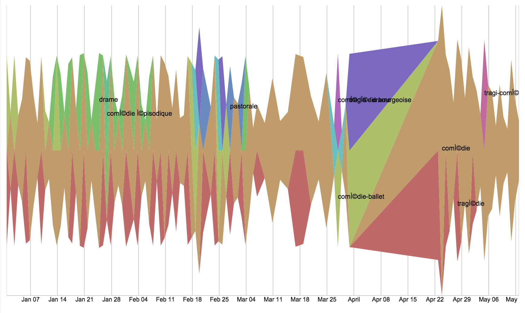
We attempt to visualize the same fields with a streamgraph.

With a streamgraph, we can still easily see that comedy is the dominant genre, but tragedy’s popularity seem to over-exaggerated as the red appeared at times when it shouldn’t have sales. The Easter holidays break is also not visible, as the streamgraph assumes no breaks in the data. Overall, this graph is good in that it communicates that the theater mostly played comedies but was interleaved with other genres, but it was poor in communicating other historical contexts.
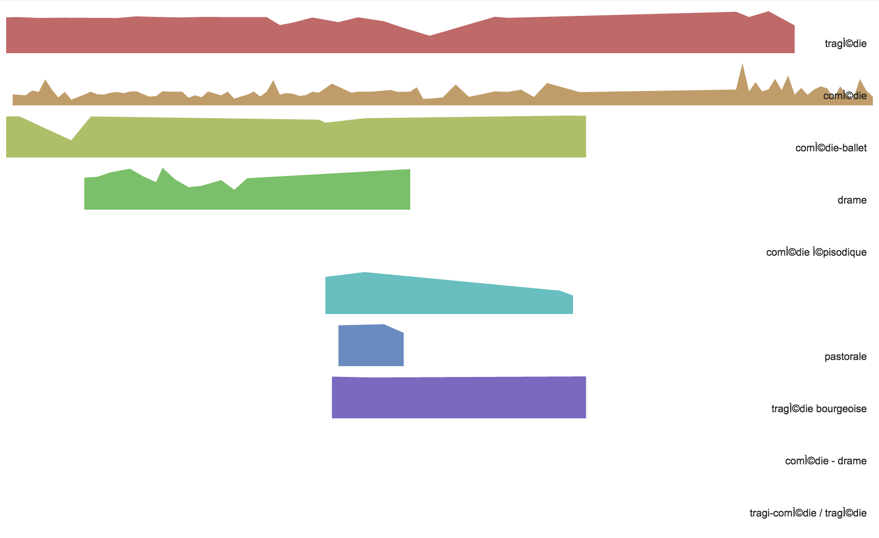
We try another graph, the Small Multiples.

This graph was also confusing in that it seem to exaggerate the sales of tragedy shows. However this graph shows clearly when each genre had sales, because we can see that comedies are consistent in its popularity while the bottom 4 genres experienced periods of popularity. The graph would probably have been better improved if it showed a time x-axis, so we can see how each genre’s sales interleaved with each other.
Overall, I think the message I chose to communicate is still best done by a scatterplot or a line chart. The streamgraph and small multiples graph, although aesthetically pleasing, did not communicate the messages I was looking for. And that’s an important guideline in data visualizations, that we choose what’s best for the message, not necessarily the best of the eyes.