Data Visualizations of the Comedie Francaise
I found that using the RAW app made my computer overheat when trying to visualize the larger set of data, so I found a data visualization software service online, Tableau. I’m not really a computer person and I thought that RAW had an easier interface, but Tableau did the trick any way.
Here are a few visualizations that I put together.
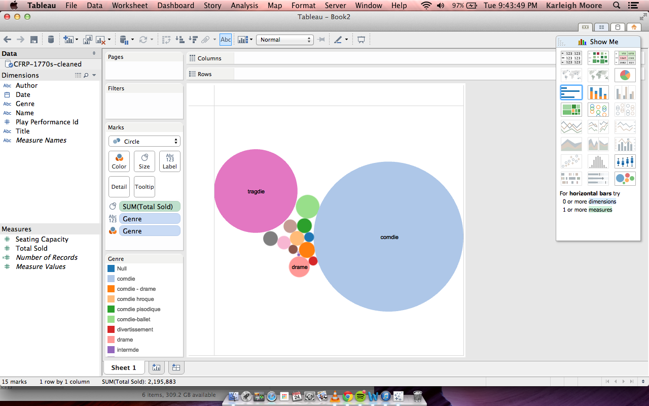
I really liked the bubble graphs I was able to make on the RAW site, so I was eager to see what I could do with this style of visualization with Tableau. The first (above) is a pretty straight forward representation: The most popular generes of play were comedy, tragedy, and drama according to total number of tickets sold. Comedy clearly dominated over tragedy, but those two generes were far more popular than third runner up, drama. The other generes had such small ticket sales in comparison that their genre labels didn’t even show up.
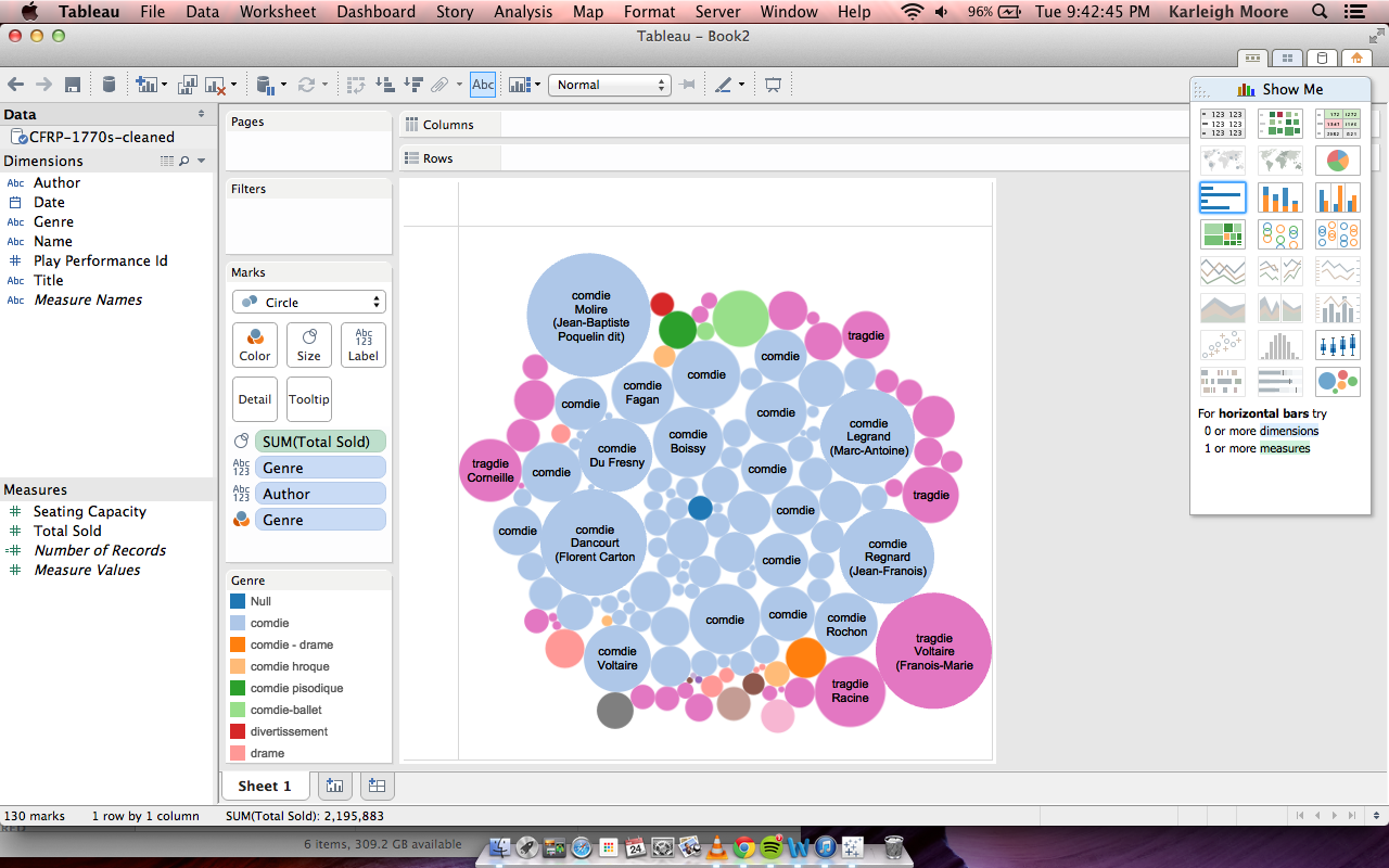
Next I wanted to be more specific in my explorations with genre and popularity. I added in an additional parameter, author, to see if which authors were most popular within each genre. I knew that comedy authors together would outweigh tragedy authors together, but I wondered if any particular author was popular regardless of genre. What I found was that tragedy’s main contributer was Voltaire, who was easily more popular than most comedy writers individually, save four: Jean-Baptiste, Marc-Antoine, Florent Carton, and Jean-Franios. Furthermore, Voltaire had some comedies that were about average as far as popularity goes in that genre. Here is that visualization.
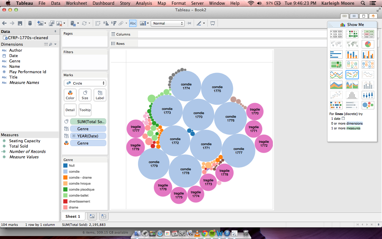
The last thing I wanted to see with a bubble graph was what genres were most popular in each year, measured in total ticket sales. From this visualization, we can see what we expect given the previous visualizations: comedies always sold more than tragedies or any other genre. But we can see years in which ticket sales boomed (the larger circles indicate more ticket sales). This can show us which years theater was most popular and profitable. This also shows a fairly constant difference in the ticket sales between comedies and tragedies, all of the blue (comedy) circles are about the same size and all of the pink (tragedy) circles are about the same size. Here is that visualization.
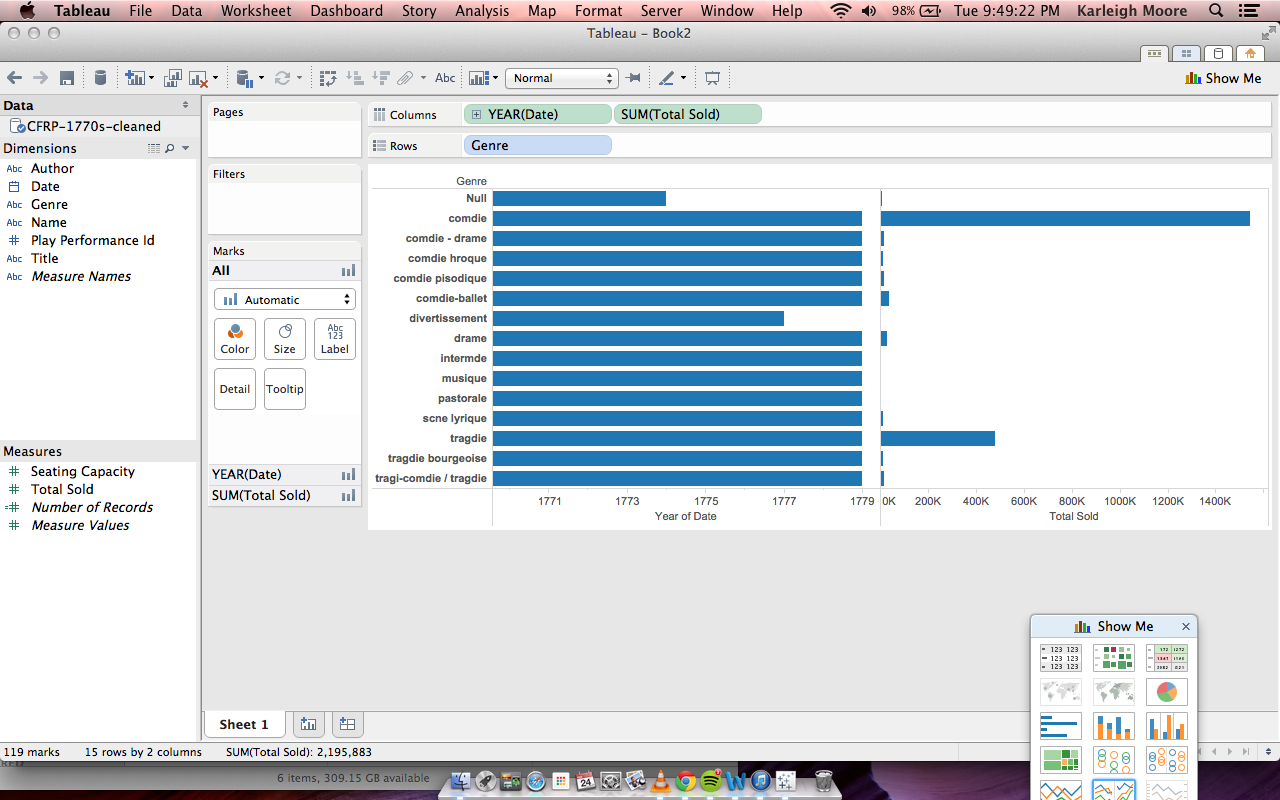
I decided to try other styles of visualization next. This graph essentially restates what we saw in the bubble charts: consistently over the years, comedies sold more than any other genre and tragedies second.
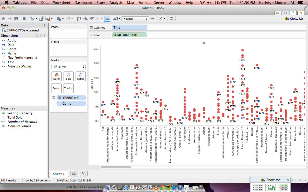
The next non-bubble graph I tried out was a histogram/dot graph looking visualization. It organized tickets sold according to title of the play with a point for each year. We see a spread of information, some plays generally sold high numbers of tickets, others had a gradient of good and bad years, while others constantly under performed.
