MIT Museum
I visited the MIT Museum. While many people within the MIT community visit this museum at least once over their enrollment in MIT, I was curious to see how other members of the general public acted while in the museum.
I visited the museum around noon on a weekday so the primary atendees appeared to be families with young children. There were a couple older groups around and some adults as well. As the museum is only open from 10am to 5pm, I feel like most weekdays are similar to this one as other demographics will be in work or school.
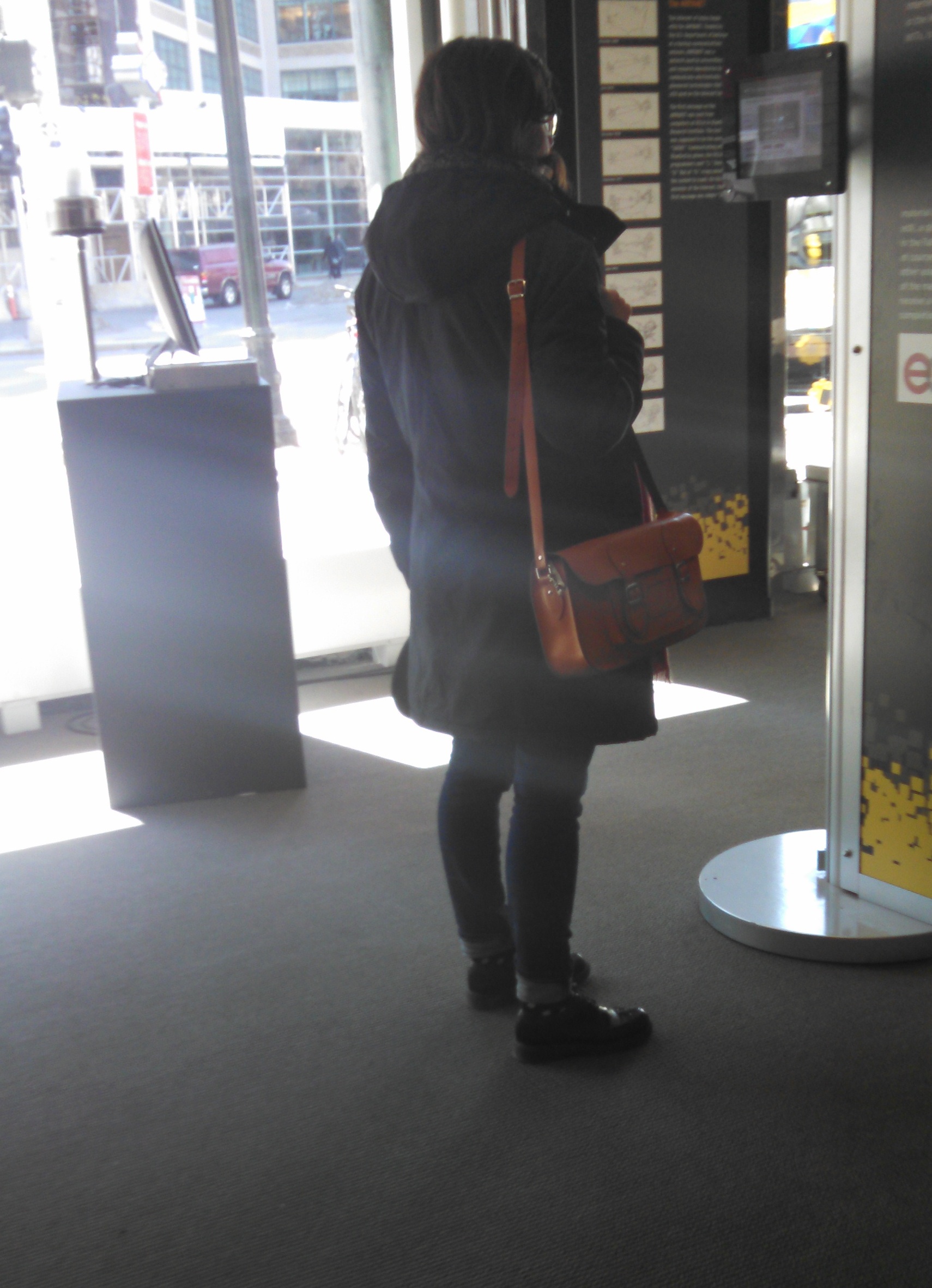
As would be expected for a museum with MIT in the name, many displays had some sort of tech associated with them. Two stuck out to me in particular. First, on the first floor, there were many interactive videos detailing different teaching styles at MIT. I was intrigued by the presentation style as they covered topics such as “why math is important” and descriptions of the edx program. While these topics are not as flashy as some exhibits that could be shown, one woman was intently watching one of the videos when I visited.

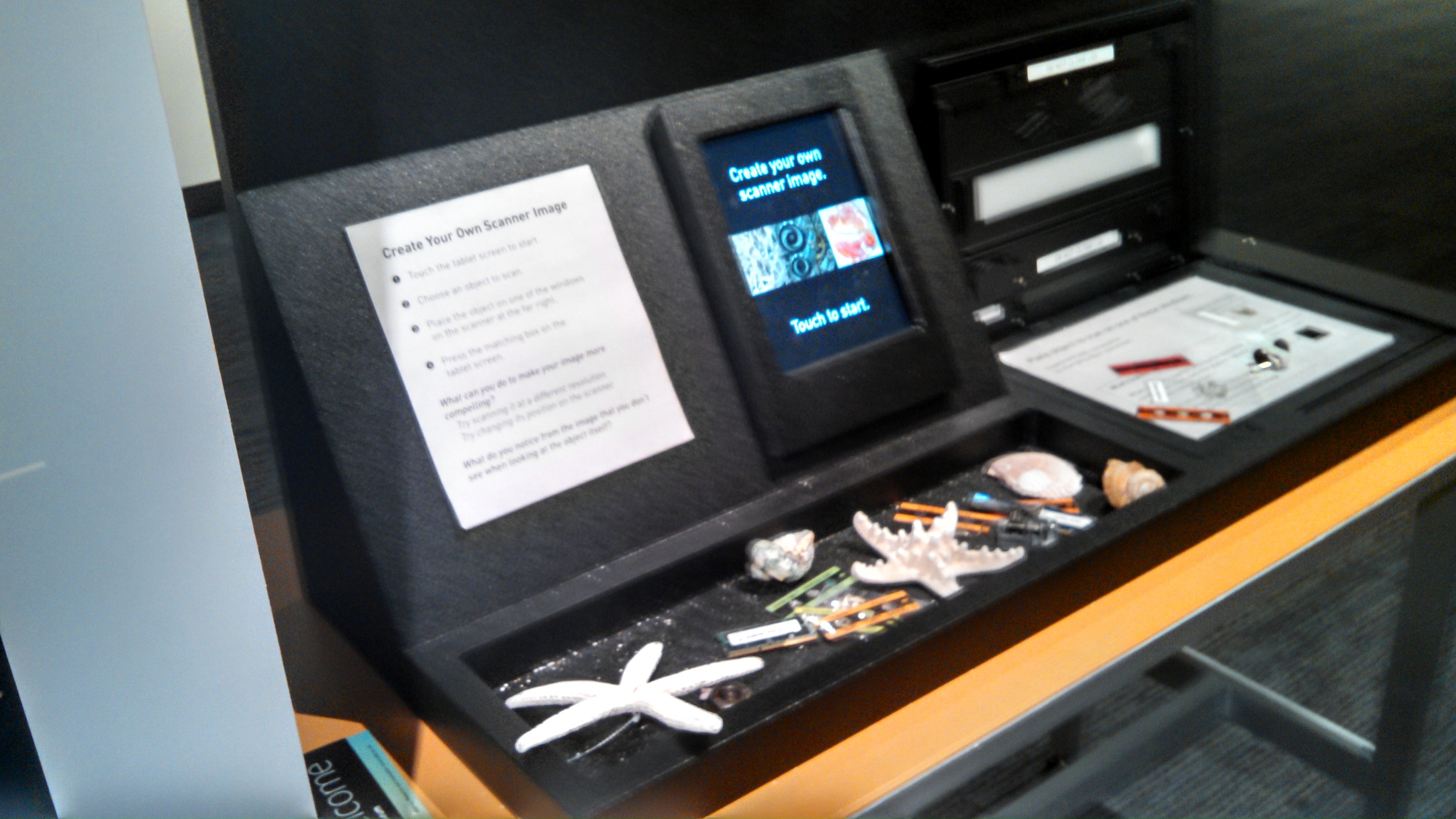
A second interactive technology was the ability to recreate several of the scientific photographs on display. The museum displays several of these images outside and I thought giving attendees the ability to recreate the images on their own added a enticing and interesting way to interact with the exhibits and learn the science behind the pictures.

From what I saw many exhibits encouraged hands on participation (mind et manus), and visitors took advantage of this. The only instance of unintended use that I observed was a station meant for working out problems that a couple of kids were drawing pictures at.
I think a reason for lack of unexpected use is that the museum does not encourage long amounts of reflection, which means that visitors, especially children, are encouraged to move through at a quick place. While the space embodies many of the quiet, solitary attributes discussed in the MFA visit, I believe that to be more due to number of people present, rather than design. I am not sure more technology will help this probably, but perhaps a different design which encouraged longer at each activity.
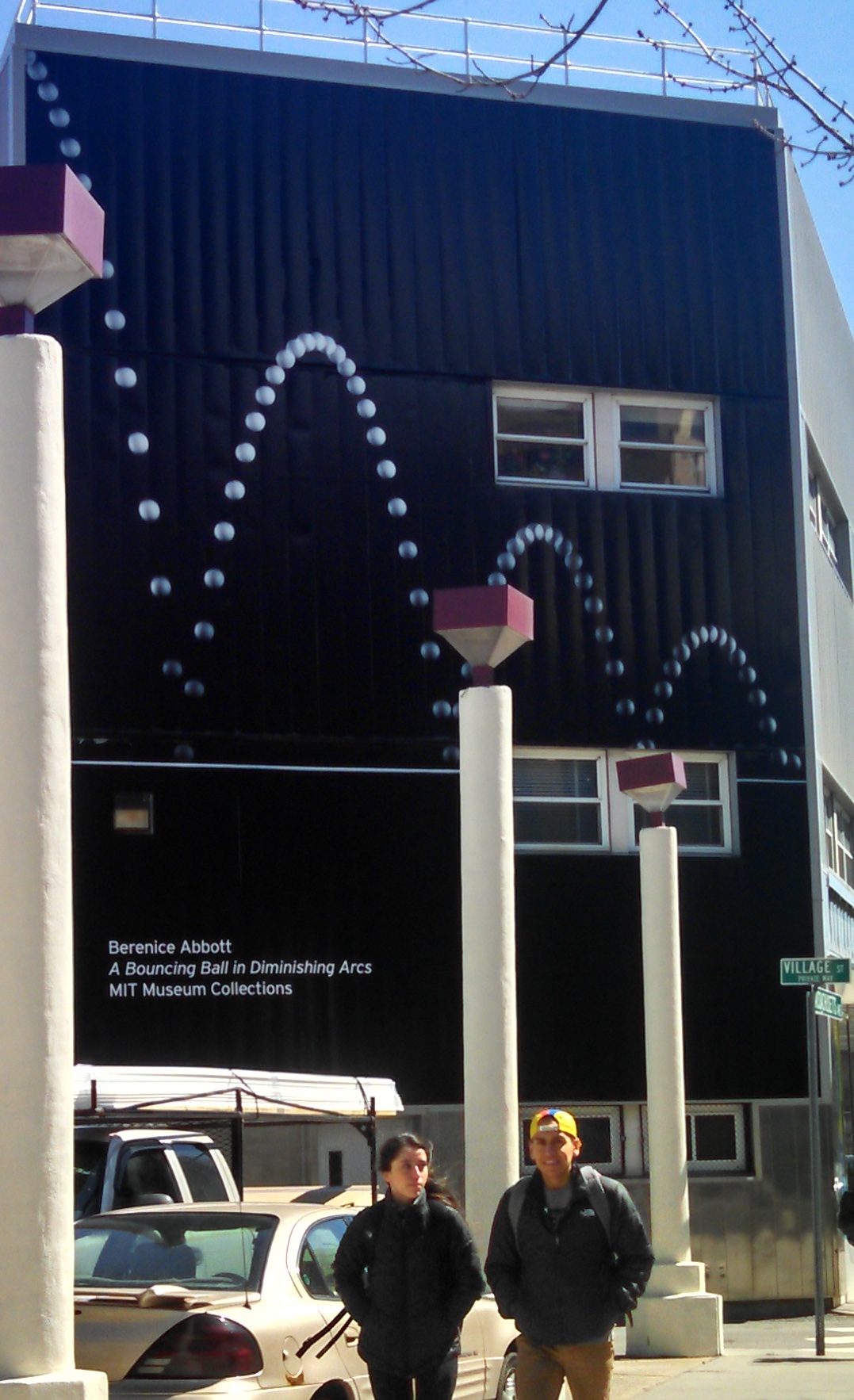
I think the MIT Museum struggles with visitor due to location. As mentioned above, they use a large image of a bouncing ball on the side of a building, to alert people to the museums presence.

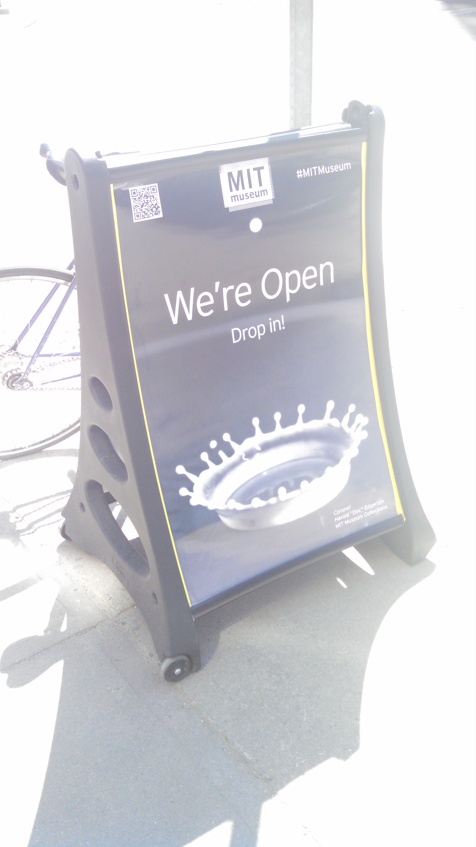
In addition, there is a sign saying they are open outside.

The biggest interaction between the outside and the museum comes from a clear glass window which allows visitors to see into the museum. Additionally there are screens displaying video in this window. Unfortunately I do not think either of these entices visitors to the museum. The screens are hard to see in the daylight when the museum is open and the area seen through the window has relatively few interactive displays compared to the rest of the museum. Once inside, navigation is not initially intuitive, which further complicates museum visits.