Project Updates
-
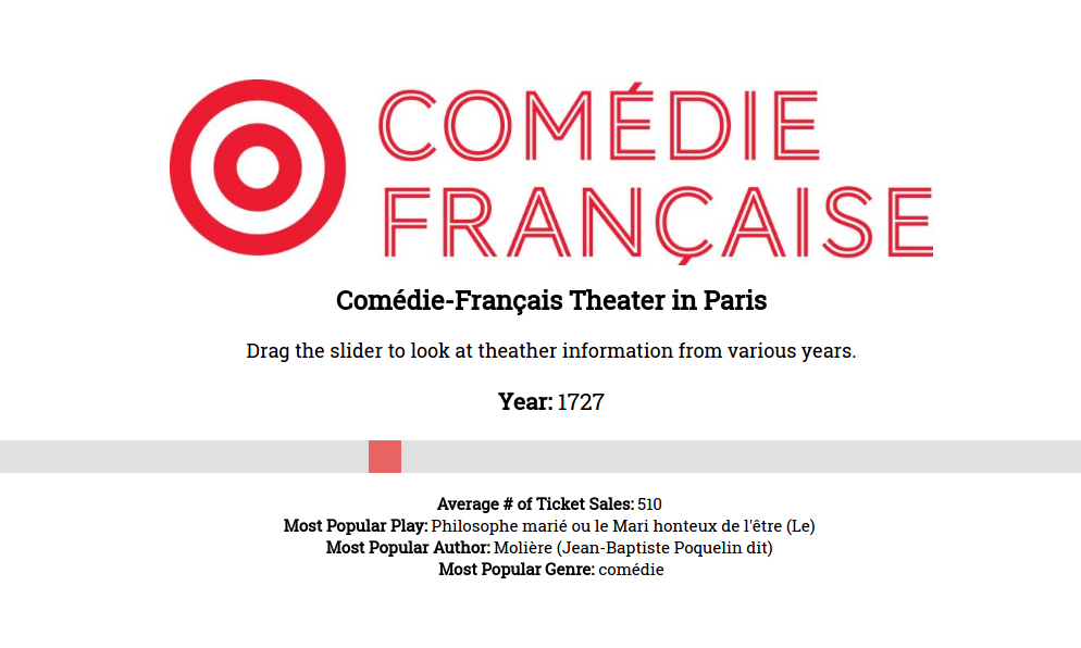
OBJIST Final Paper
-
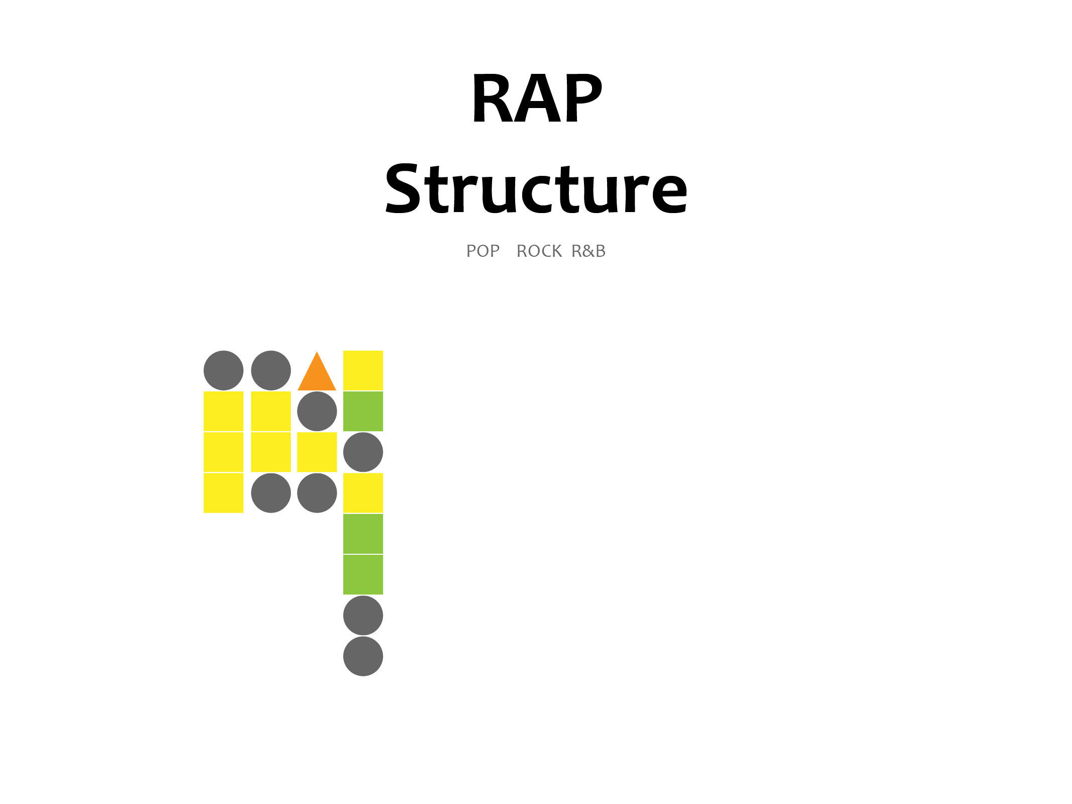
Pop Music Automation Project Final
-
Mood Map Final Presentation
Here’s the link to our final presentation: https://docs.google.com/presentation/d/1a58I85m8kke4LQeVTeAM3mF4z6tORTPNSWnDF5ZvomU/edit?usp=sharing
-
Boston Under Water Project - Final
Web Prototype
Design Paper
Boston Under Water design paper
Presentation
-
Materials_Objist Final Review
-
Pop Music Automation Final Drafts
Presentation: https://docs.google.com/presentation/d/1nA6Mn_W9kUP4cgTvCxEZrrkoxtTExuA-6wxrpp1CcJ8/edit?usp=sharing
Paper: https://docs.google.com/document/d/1sgG848uiZjM2QAyMp3ai5UPdxzSdXhNJTUaNrE8hY-s/edit?usp=sharing
-
Objist Update
Link to our dry-run presentation https://drive.google.com/open?id=1-HCKt30Zm9rr8Obk5hi4FL6iUnuk8A-g
Link to our prototype https://invis.io/DSETIPX2X
Paper Draft https://drive.google.com/file/d/1fEnSSZ9omgoRCzrQTHw3WSablrR0RgFv/view?usp=sharing
-
Boston Underwater – Practice Presentation
Practice Presentation and Draft Design Document
-
Project Update
Over the past week the content of our webpage was finalized, the moods and the tags, (reasons for the users’ moods). We made further progress on the design, utilizing templates online that would complement the data visualization page, and applying our previously developed design concepts. We’ve thought more about the UI and UX, and now have a coherent layout that should allow easy navigation and quick interactions, while also including space for some information on the project if the user wish to know more. On the programming side of things, the basic framework is done, with the ability to retrieve and display the data live, ie display the data on the visualization page right after a user submits.
-
Project Update - Objist
Wireframe
.jpeg)
-
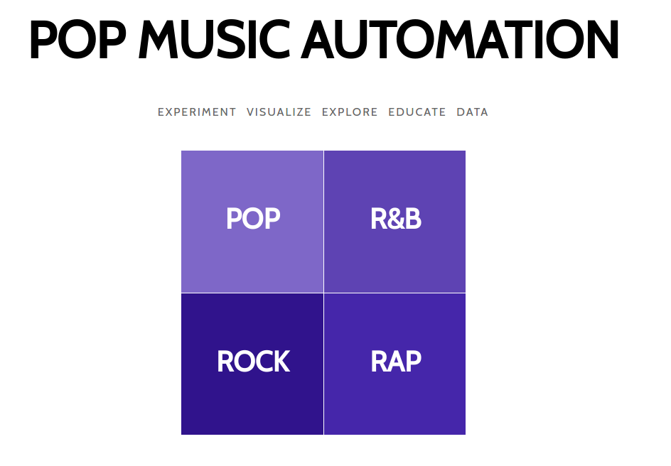
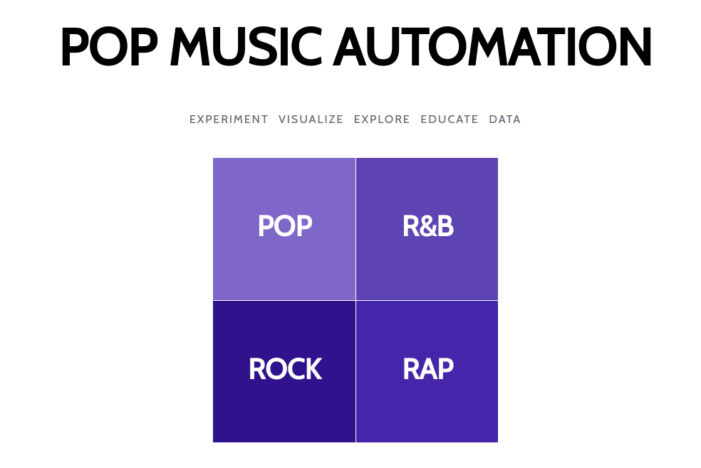
Pop Music Project Update
 https://cms633-pop.herokuapp.com/
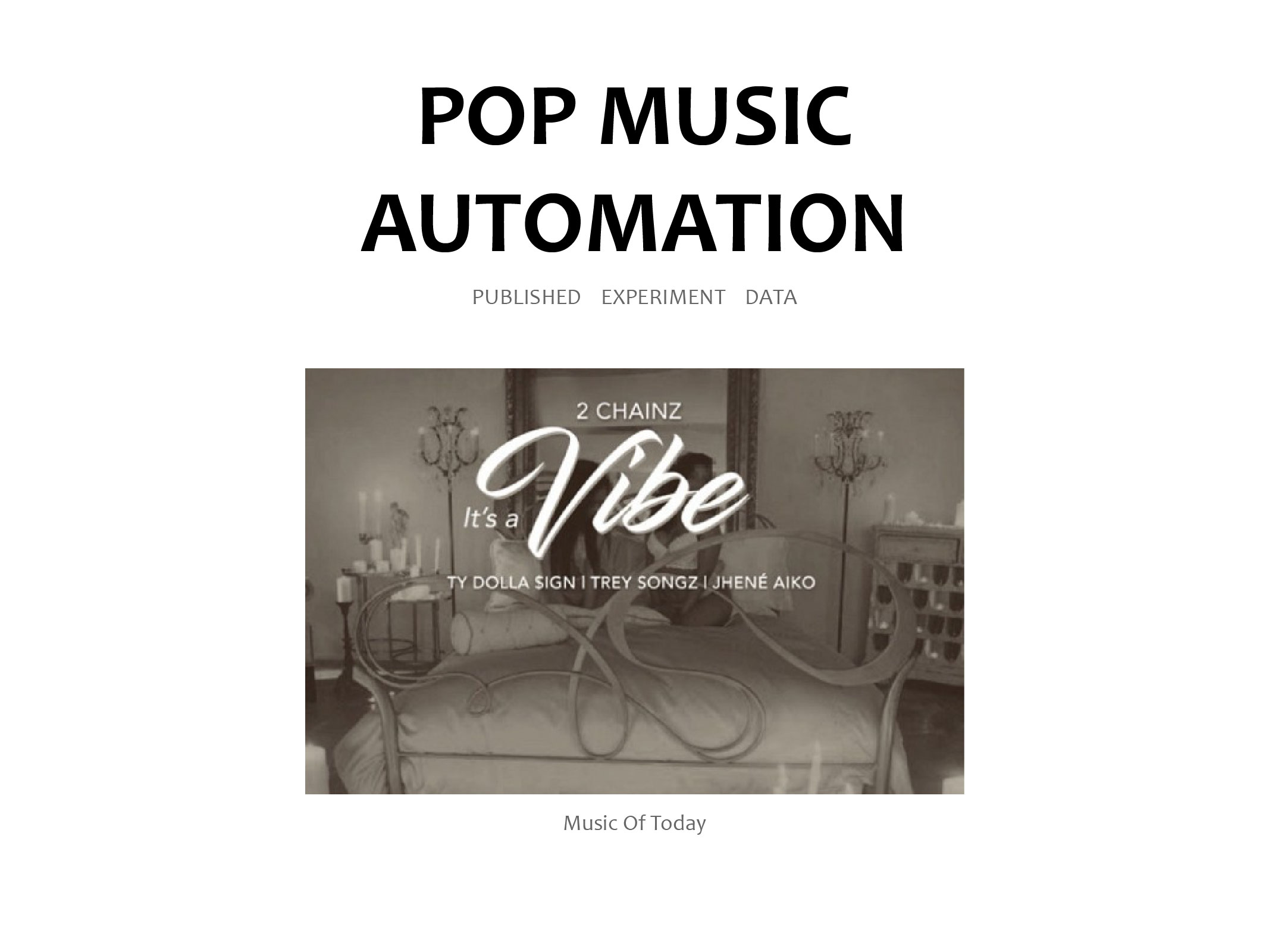
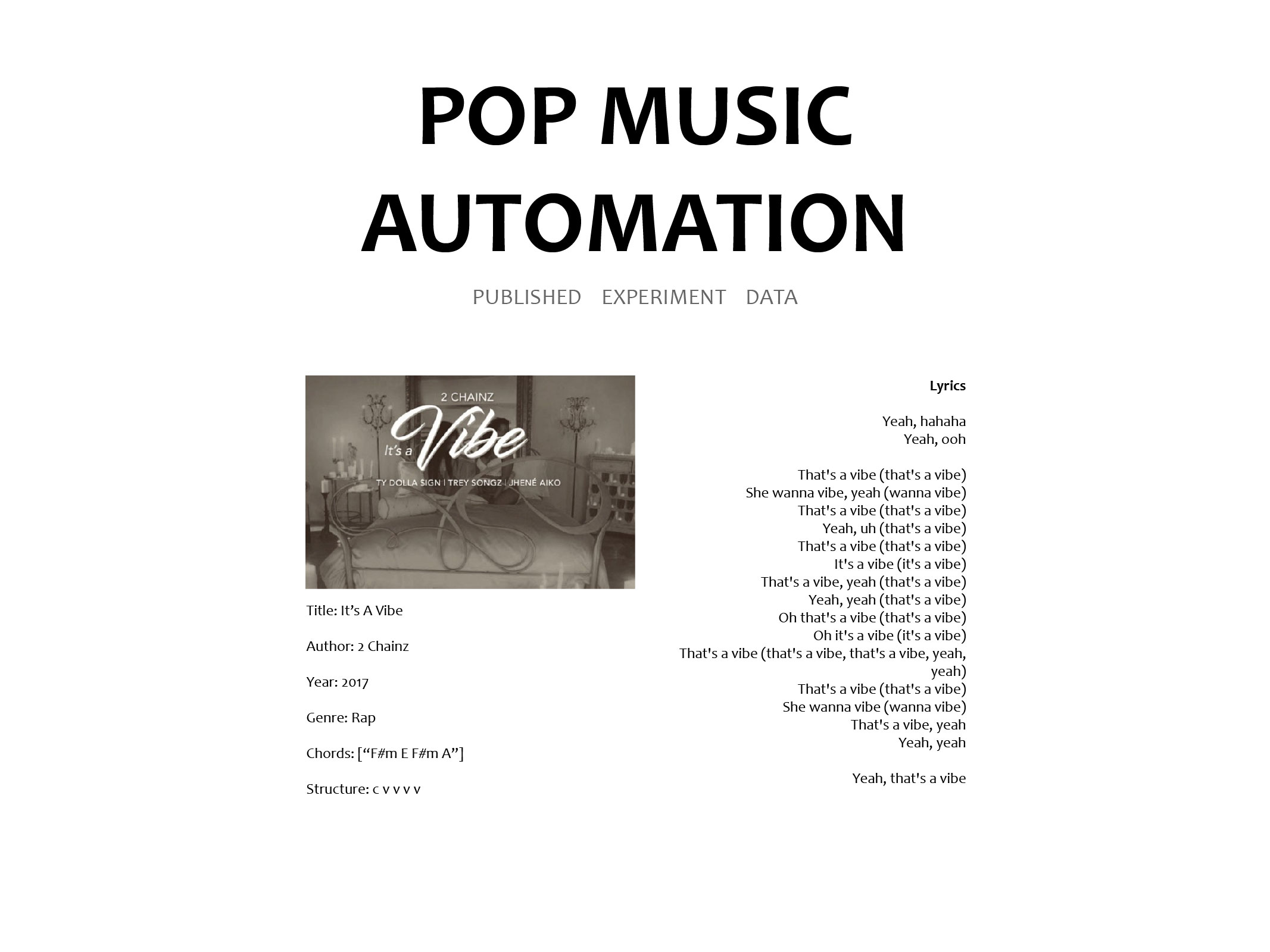
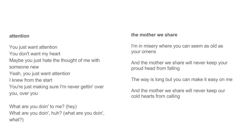
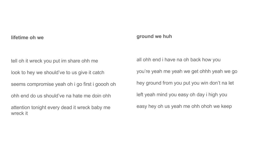
We are now at a stage in the project process where the most of the digital prototype has been developed. In the past week I modified the lyric generation code and created the on-demand lyric generation that can be done by clicking into a specfic song and clicking the “generate” link. This was a bit involved as it involved understanding the original NLP project enough to recode it and generate new songs by the original song’s genre. I also looked into playing with increasing the prior probability analysis to include more of the original song, hopefully increasing the readability and retaining the orginal artist’s style. Users of the site can then edit the chords and lyrics of the song by clicking on them and typing. I also spruced up the home navigation and figured out how to upload the site to Heroku (a web hosting site). Ran into a few snags for a bit, but figured it out!! Next main steps are to expand the visualization page and to allow users to upload their creations to the the database. After this, there are a ton of tiny updates I would like to explore, as well as an expansion of the original song database.
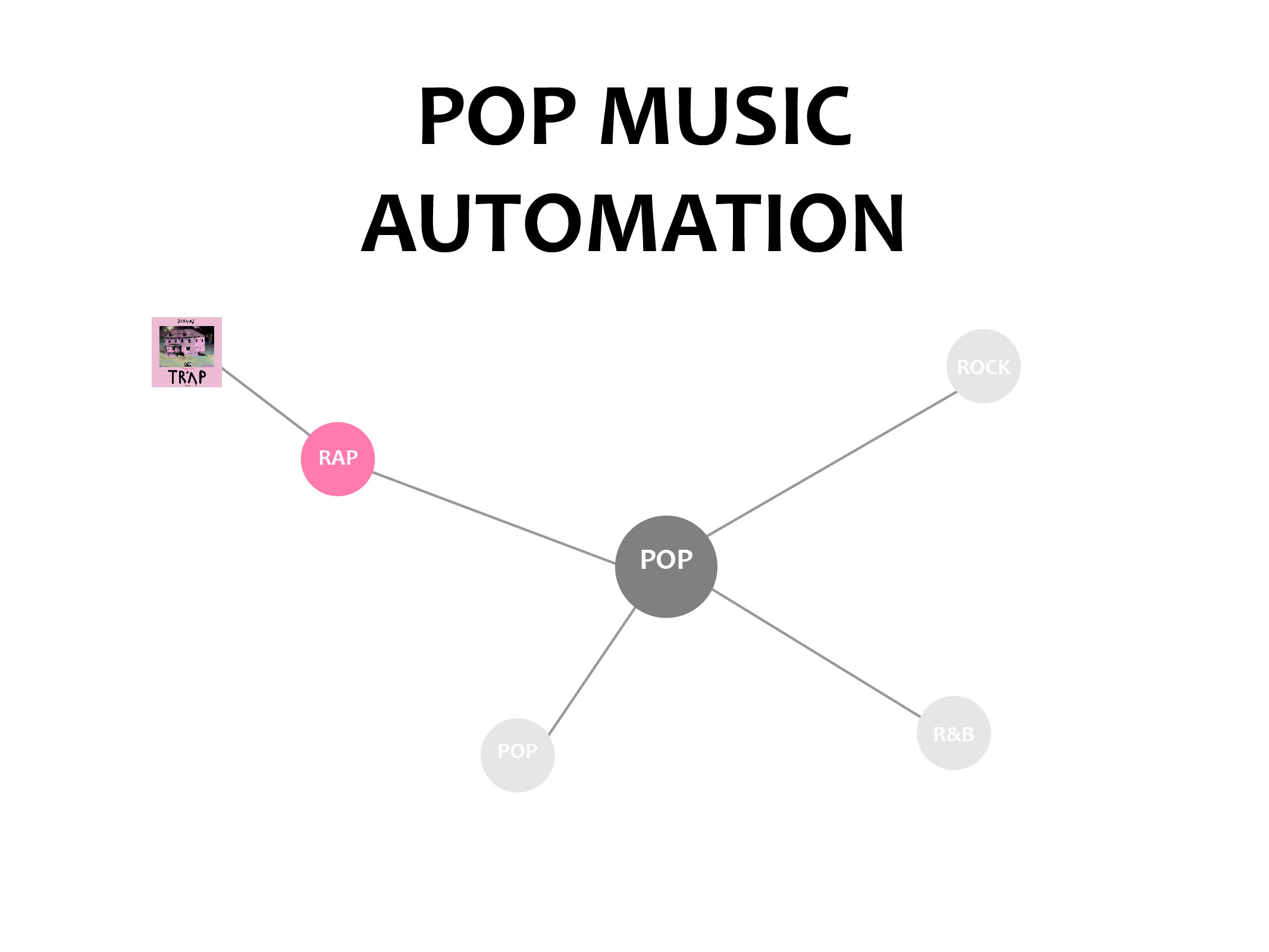
The Visualization part aims to guide the music absolute beginners to study the fundamental theories of the Pop Music and help the experienced music lovers to rethink the additional art layer of music itself. In general, our project will mainly start on telling the story of the structure and lyrics interpretation. The first part would be a compared structure analysis of our database, and then we would start to choose sample music to do further explanation. The first step would allow the users to differentiate the similarity and difference among five genres. It also shows the various possibilities of song structure in one genre. Later by studying the specific songs, the user could find that the repeat pattern of pop music both in structure and lyrics. After exploring this part, the users could take advantage of the pattern to build his or her new song efficiently. During the process, we would apply the same color which shown in different diagrams to help strengthen the user’s memory. And the sample song explanation could also combine with the related song tracks to enrich the understandings.
-
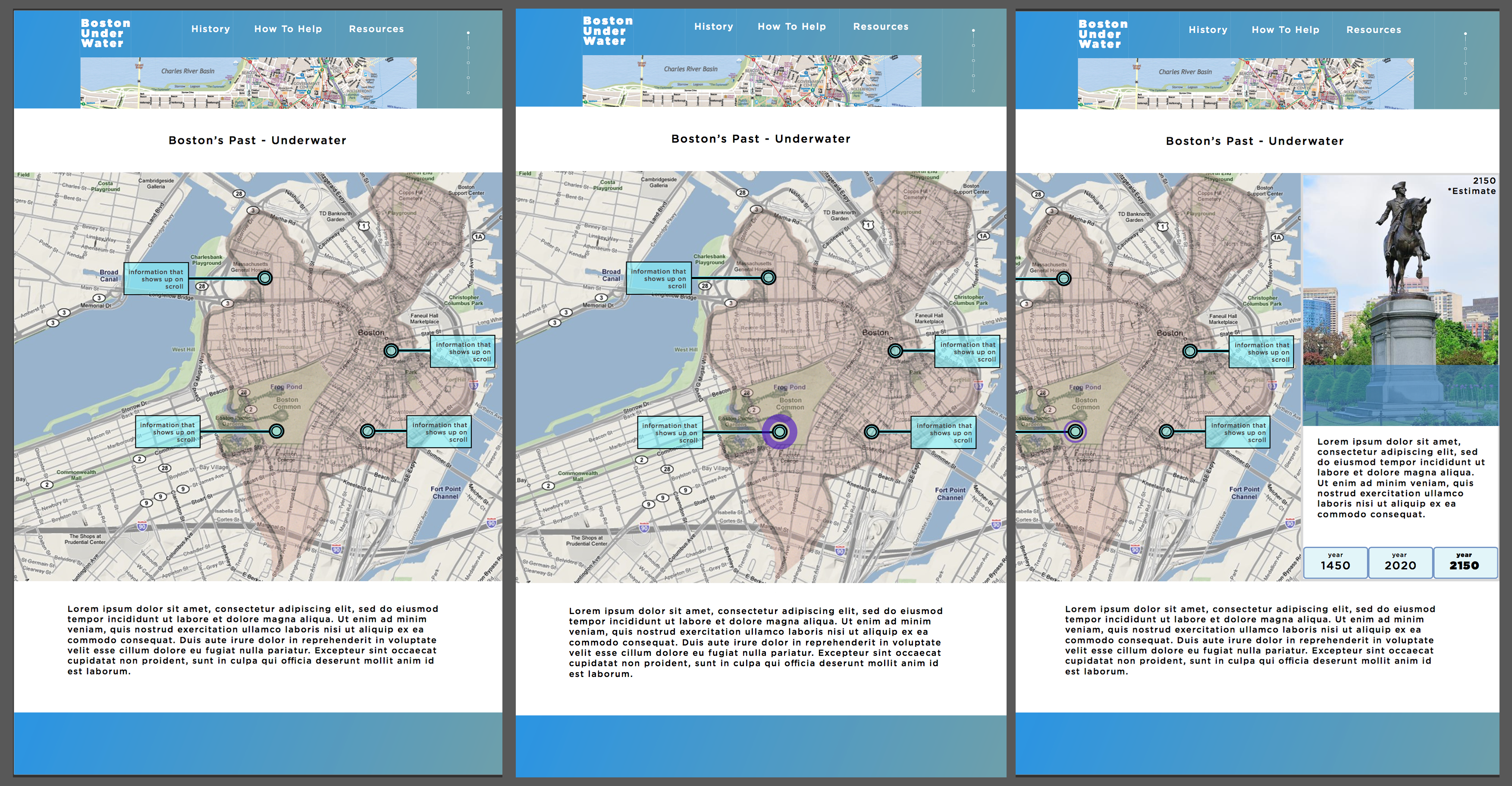
Boston Under Water - Project Update 11/28
After prototyping visuals in Sketch and interaction flows in Flinto + Keynote, we’ve moved on to actually creating our web prototype, which currently is just an implementation of scroll controls for placeholder imagery + the first iteration of our text narrative. The text moves to seamlessly match the user’s location within the narrative of changing images. In our next prototype, these images will be switched by a video of changing typographic maps that we’ll have created.
This first iteration acts as a proof-of-concept for the technology we are implementing as we’re still developing our own textual narrative, typographic maps, and more details to enrich the information we plan to showcase.
-
Everyday Objects - Project Update
Project Introduction
Children are born into history. They have no memory of it, yet they find themselves in the middle of a story that began before they became one of its characters. Children also want to have a place in history. However, given the limited ability of their reading ability and cognitive development, engaging children with history is not an easy task.Nonetheless, there’s one thing children enthusiastic about and probably do better than we expected—-playing games, which provides a good opportunity to involve children into a learning process at the same time having a lot of fun.
This project aims right at addressing the question of how we can effectively engage children with historical learning using an educational game, the target audience of which are pre-school children aging from 6 to 10. This game can prepare them with a preliminary sense of history before they receive proper historical education at school.
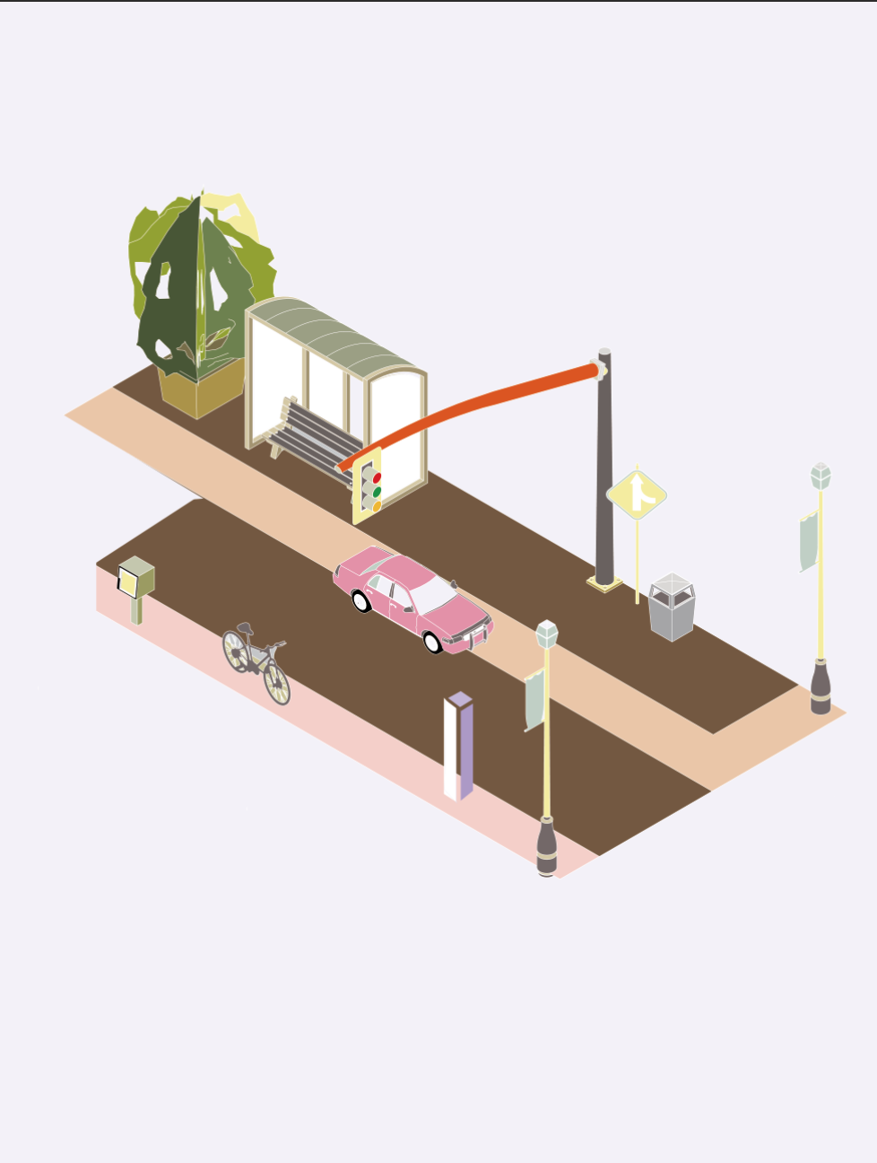
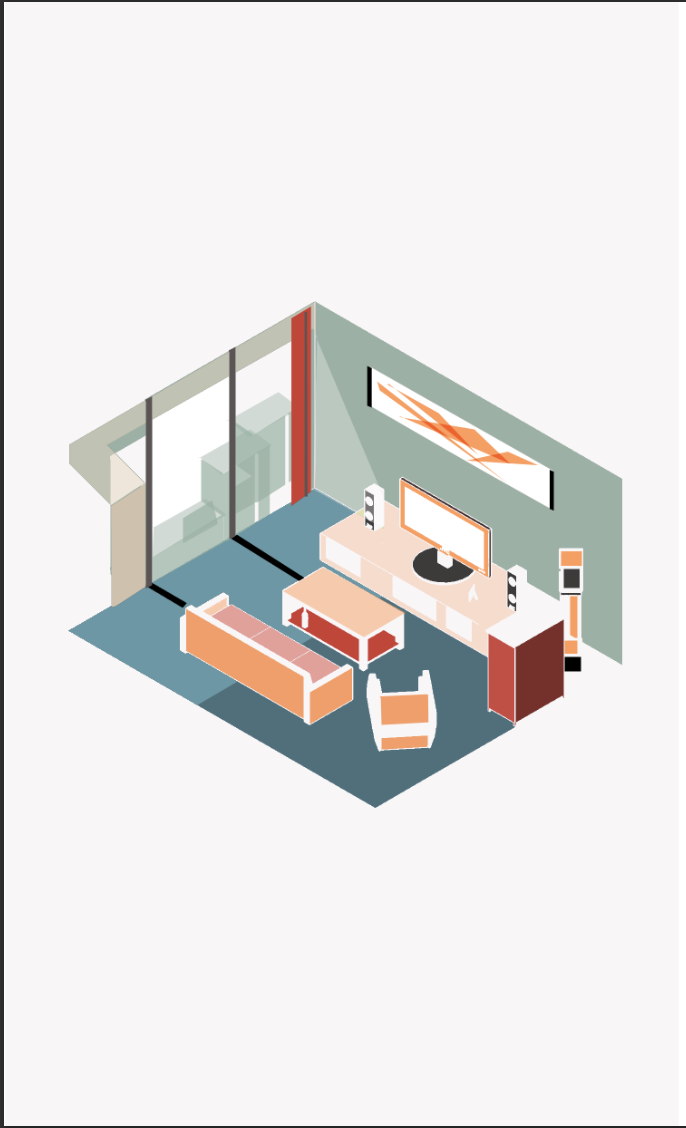
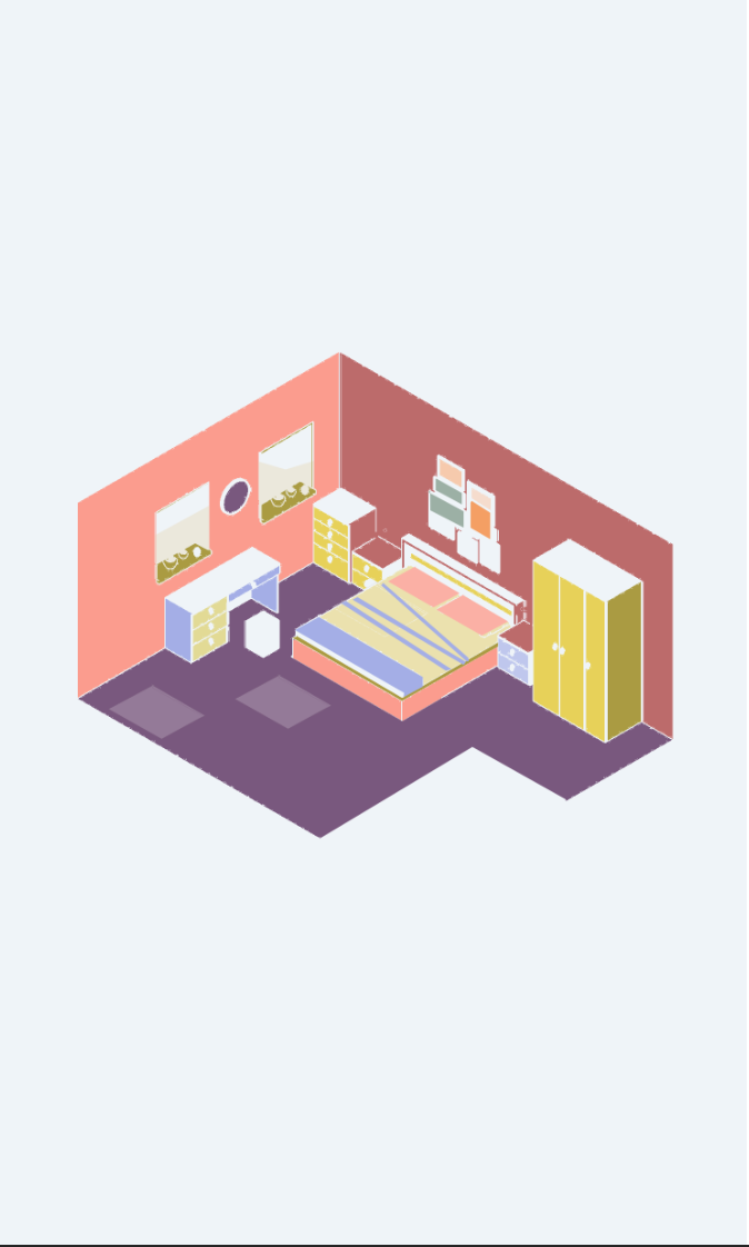
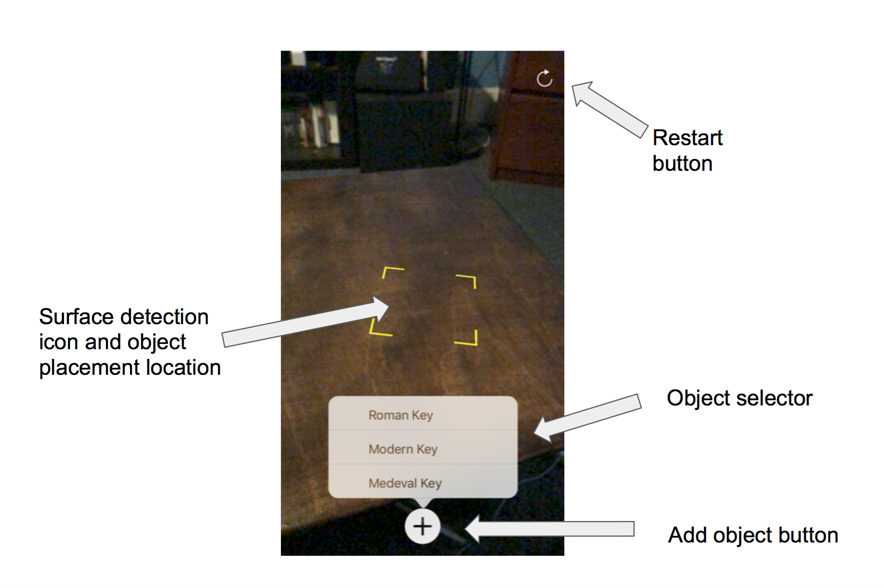
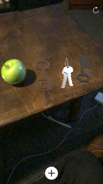
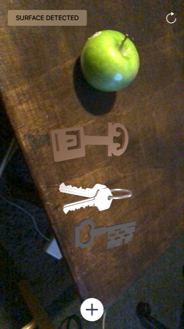
The aspect of history covered in the game is about the evolution of everyday table objects encountered by children in their daily life. They are required to decorate tables from different time period(eg.Roman Emoire era, Medieval era, Industrial Revolution era etc.). Augmented reality technollogy will be employed in this learning process. Children can scan any horizontal surface to place the 3D historical models of those objects, they will also be asked to pickup correct objects corresponding to the era they are in from a given library of objects provided by the game system, once they place all the correct objects on the table, they will unlock next level and proceed with the game.In this process, children will realise that things around them actually don’t always stay immutable as they are when they were born but in constant envolution in history, thus forming a sense of temporality in everything around them.
First Sketch
The initial idea of the project was just to show a series of historical versions of an object for children to compare, the objects were categorized according to the place where they usually belong to, such as living room, bedroom and street.The idea of game didn’t really come into play, the entire projects acts more like an demonstration APP.
Flow Diagram
User Interface Design
Wireframe
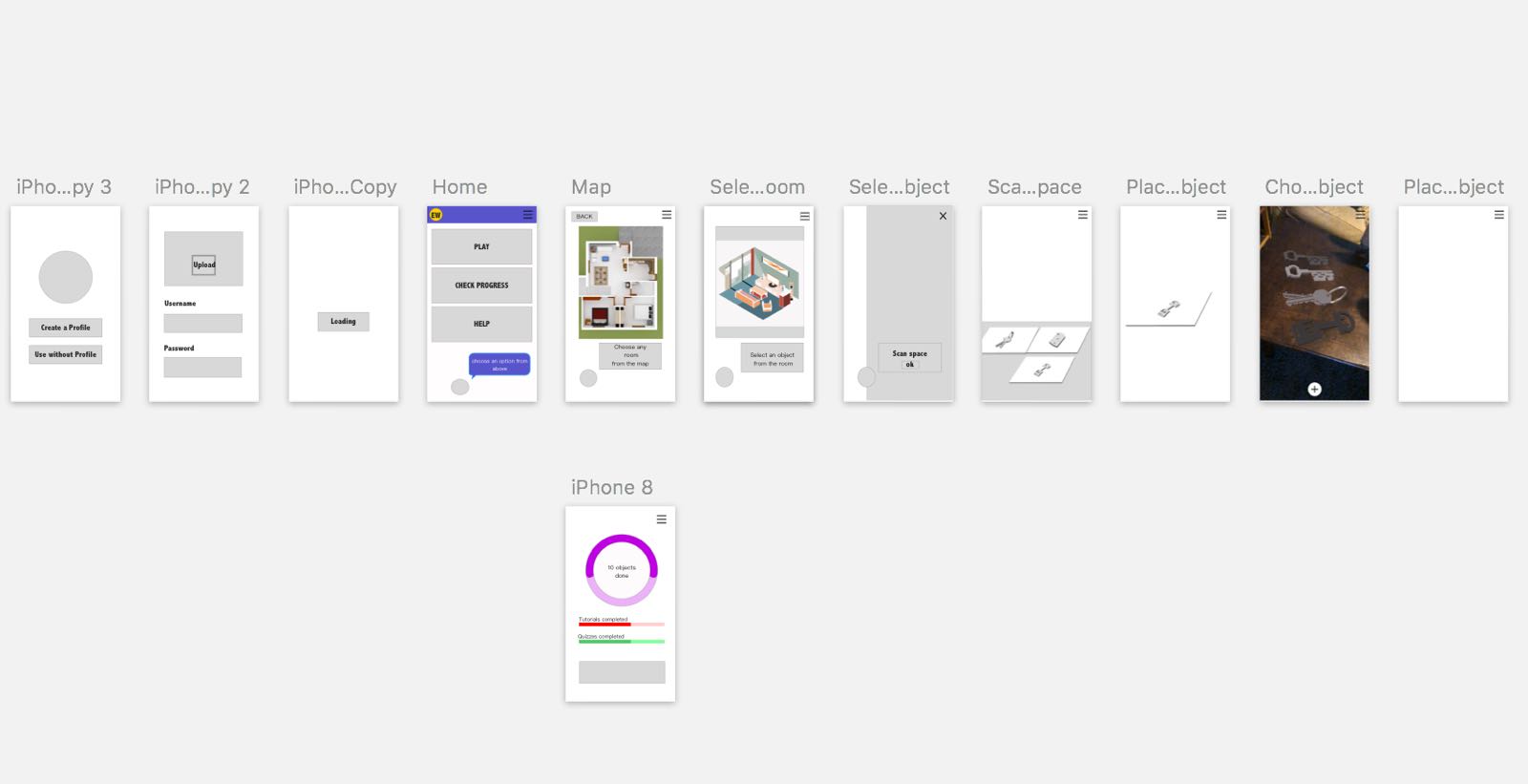
Second Sketch
In the second sketch, we narrowed our idea down to table decoration and decided to develop the project into a game which we believe can better raise children’s interests.
The current biggest challange of the project is basically about matching object with particular era, we really want children to actively analyse the characteristics of different objects from different eras before they pick up the objects rather than learn passively by a series of trial and error. The memory formed in the former process is more durable. In this sense, we need to provide some hints for the children to help them making the right choice.
Wireframe
AR application


-
Assignment 08
##Alien Reading: Text Mining, Language Standardization, and the Humanities
The aspects that I’m most interested in this article is the relationship between topic modeling and figurative language. Rhody argues that topic models of poetry should be read differently from those based on scientific journals for two reasons. One reason is that poetry uses larger amount of figurative language and produces more meaning than “non-figurative” texts. I personally agree with her argument and would take it as a foundation for my opinion. For poetic language, topic modeling implies a necessarily reductive methodology of sorting it into regular and stable categories, which is somehow at odds with the laws of their creation. As we all know, the ambiguity of figurative language is appreciated in poetry and many textual genres. I’m not sure whether it is really necessary to use topic modeling on those textual genres that values ambiguity as kernel. Or should tools and techniques be developed from topic modeling to target specifically the figurative language?
-
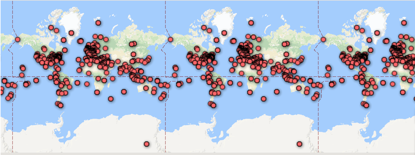
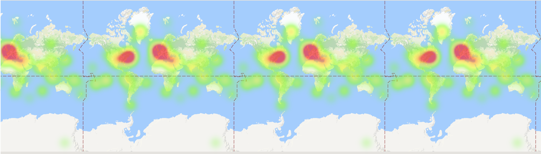
Mood Map Update
We’ve been working on the backend of our mood map visualization web app. We now have a database to store the user input with a simple slider to input data that we will use in the event that we don’t have time to implement the prettier sliders. We’ve also worked on the setup for the visualization of the data:
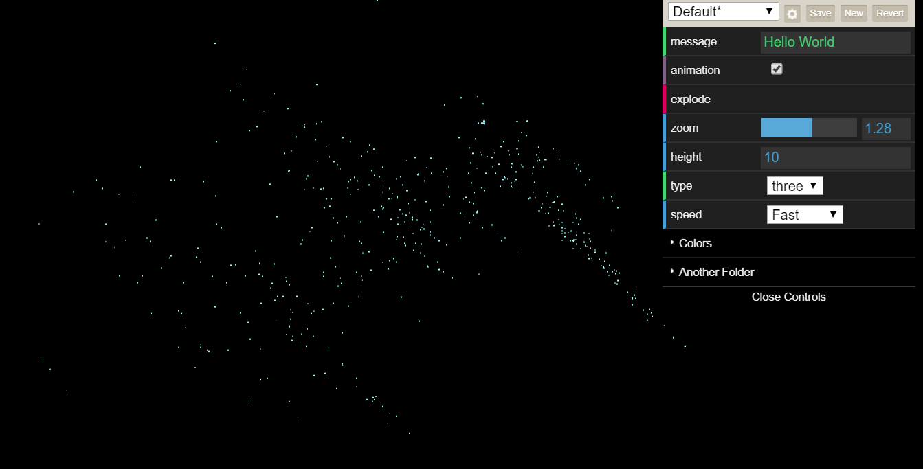 The input buttons allow the user to rotate the point clusters, zoom in/out, and change some settings for the visualizations.
 -
POP MUSIC AUTOMATION_update

-
Mood Map bubble design
This is the rough prototype I presented in class: https://invis.io/FXECMD4YE (hotspots: Happy, Tense, Tired, Tell us why) The idea of the design is that users would click and hold on each circle, or perhaps a minimum of three, which will grow bigger, and words describing the levels of intensity will pop up one at a time above the circle, e.g. slightly, somewhat, definitely, very. The users would release the click when the description they want pops up, and the word and the size of the circle will stop changing. Once the user starts clicking, the text “All done? Tell us why” will appear under the existing title and a short instruction. Clicking on “Tell us why” which would be formatted as hyperlinked text, will take users to a second webpage with tags and keywords they can click on, to associate their moods with causes or events. There would be a done button on this second page to submit the data, and perhaps text will show up to confirm the submission. There would then be a link to return to the starting page, and if possible, the page would also redirect itself to the starting page after a short period of inactivity.
-
Digital Curation
Approach
Since the annotations were not particularly good, I ended up going through the collection of photos and tagging the ones related to music and instruments. Since this didn’t reach the 30-photo minimum, I also added other kinds of entertainment such as tennis and other games.
Challenges: As for uploading to Omeka, this was quite frustrating. The site was pretty unintuitive, and the import functionality didn’t even let me bulk-upload the images (so I had to do that individually). This probably isn’t the forum for it, but I feel like this curation project would be much easier on a modern website-building platform such as SquareSpace or even an alternative exhibit as an instagram profile, or something like that (though you don’t get the same form of metadata). I’d also like to second all of Parker’s points from his post.
Goals
- Show the close relationship between entertainment and war in 16th-century France.
- Experiment with Omeka for digital curation
- Make visitors think about modern relationships between entertainment and war.
Story and Findings
Although they arose at different times throughout history, war and entertainment often mimicked each other, and both procedures informed each other. In particular, these pieces of art show art as a symbol of status–representing wealth and power, and war as a reality for the masses. The particularly interesting pieces show the two integrated with each other: War heroes’ glory exaggerated by musicians, and musicians accompanying processions. In this online exhibit, I particularly find myself wondering how the two concepts relate in my life, where the tables have turned: entertainment belongs to everyone, and war is a more distanced concept.
Omeka Sites
-
Digital Curation Project: War + Peace?
For this project, after examining the metadata and images, I decided I wanted to create an exhibit that would explore the juxtaposition of war related photos and festival related photos in this particular neighborhood. The story I wanted to tell with these images and these exhibits is how events of mass anger, sadness, and fear could occur in a place where mass happiness, joy, and energy exists as well (not necessarily at the same time).
I went through and used the subject column to filter for the appropriate war and festival tagged photos, and then extracted the 31 photos’metadata I would use for the for the exhbit website, and then obtained the relative photos.
Using Omeka was a confusing experience. I decided to go with making two items, War and Peace, and adding the images to the items. It was a slight pain that you had to upload photos individually, and I could see that being a barrier to building larger exhibits without arduous amounts of time. I also found it very confusing to import the CSV and match the photos to the metadata. I think it would have been easier to write a script to generate web pages matching the images to the csv. If I had more time, I would have tried using the Google Open Gallery tool.
-
Boston Under Water - 11/7 Update
Static Prototypes
More Dynamic Prototype
Data:
- https://data.boston.gov/group/geospatial (annual flooding with 9 inch sea level rise & annual flooding with 21 inch sea level rise)
- http://historicalmaps.arcgis.com/usgs/
- https://waterdata.usgs.gov/ma/nwis/gw
- https://msc.fema.gov/portal
More Info/Inspiration
-Old Boston Creation Maps https://blogs.loc.gov/maps/2015/12/putting-boston-on-the-map/
-Boston Landfill Animation https://imgur.com/gallery/0C349u9
-Boston Over Time http://i.imgur.com/dUlkAIs.jpg
-
Asst 6: Digital Curation Project
The first thing that we did for this project was take a look at the types of photos and their different components in the dropbox file. There were a few different categories and patterns that we could see, from the date of the picture to the type and subject. Once we sorted the files into broad groupings, we looked into the history of Le Marais to get a sense of what the area was like and what types of people it attracted over time. This is because we initially wanted our exhibition to be educational, so we needed to factor in the sociocultural context of the pieces themselves and determine who would be interested in the area.
What we learned was that Le Marais is a neighborhood whose identity has changed multiple times and which is famous for its architecture. Not only did this help us narrow down what we wanted our exhibition to be on, but it also made us question what our curatorial goal was. Le Marais was once aristocratic, and was also once a Jewish community. We thought that the causes of these changes could lead to interesting conversations, which made us want to pursue a less purely educational and more open approach, similar to that which was described in the second article.
We settled on photos that displayed public spaces in the area, with our rough title being “The Evolution of Public Spaces in Le Marais, Paris.” As we sorted through the photos, we realized that this was too broad and narrowed down our topic to areas where people tended to congregate, e.g. public squares. Our goals for this exhibition are broad; ideally, visitors would get a sense of where the communities that were prevalent in the area gathered and what they saw in those spaces, and be able to draw their own conclusions about the relationships between the two. We think more historical background and context, plus a better layout, would need to be included to make this more useful for public audiences.
We had quite a bit of trouble with Omeka and generally agree with all the other posts impression of it- the site isn’t user friendly at all; we had to individually upload images and couldn’t get the csv to match up with the data.
http://evolutionpublicspacemarais.omeka.net/items/browse?collection=1
-
Assignment 6
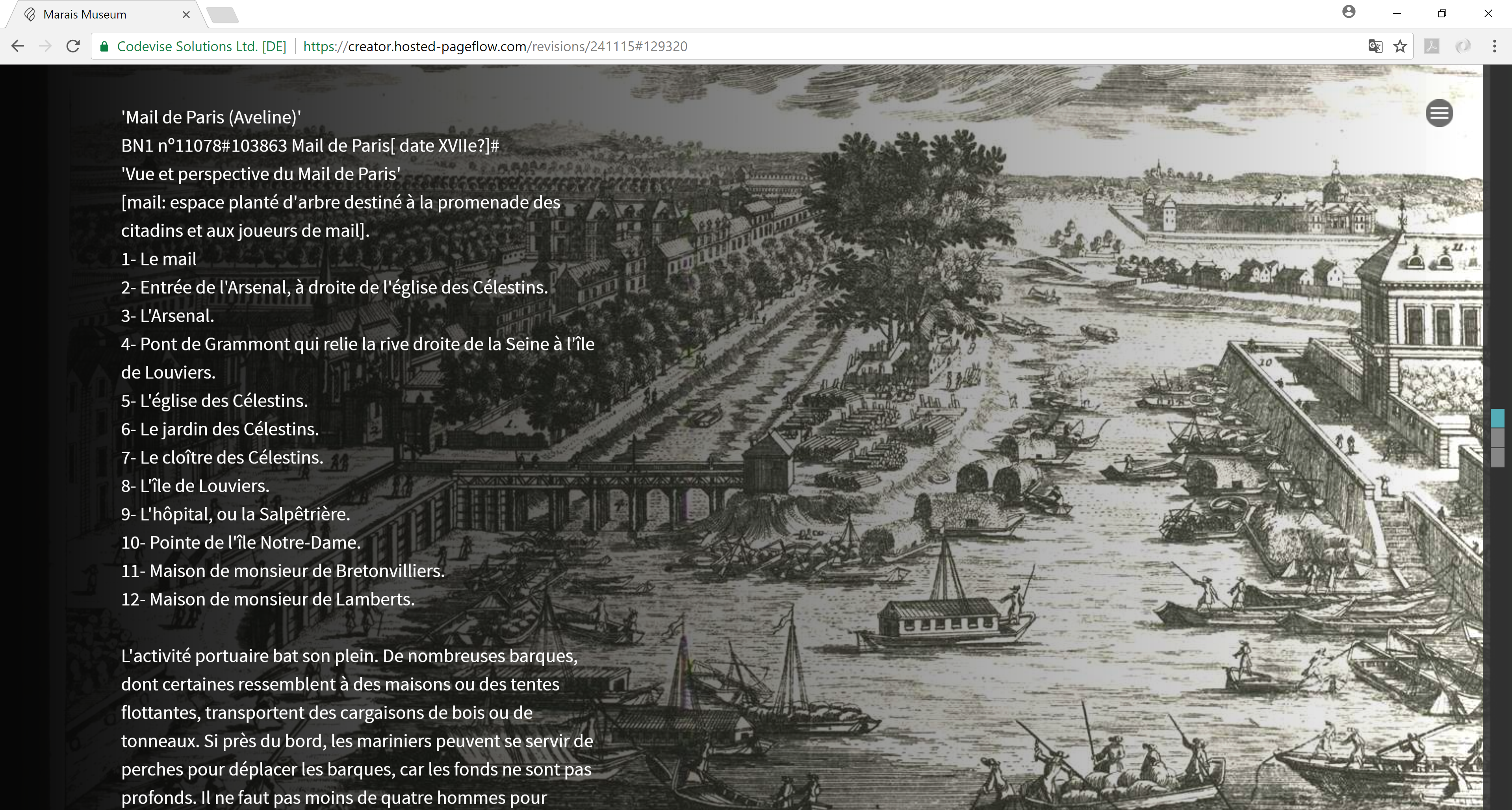
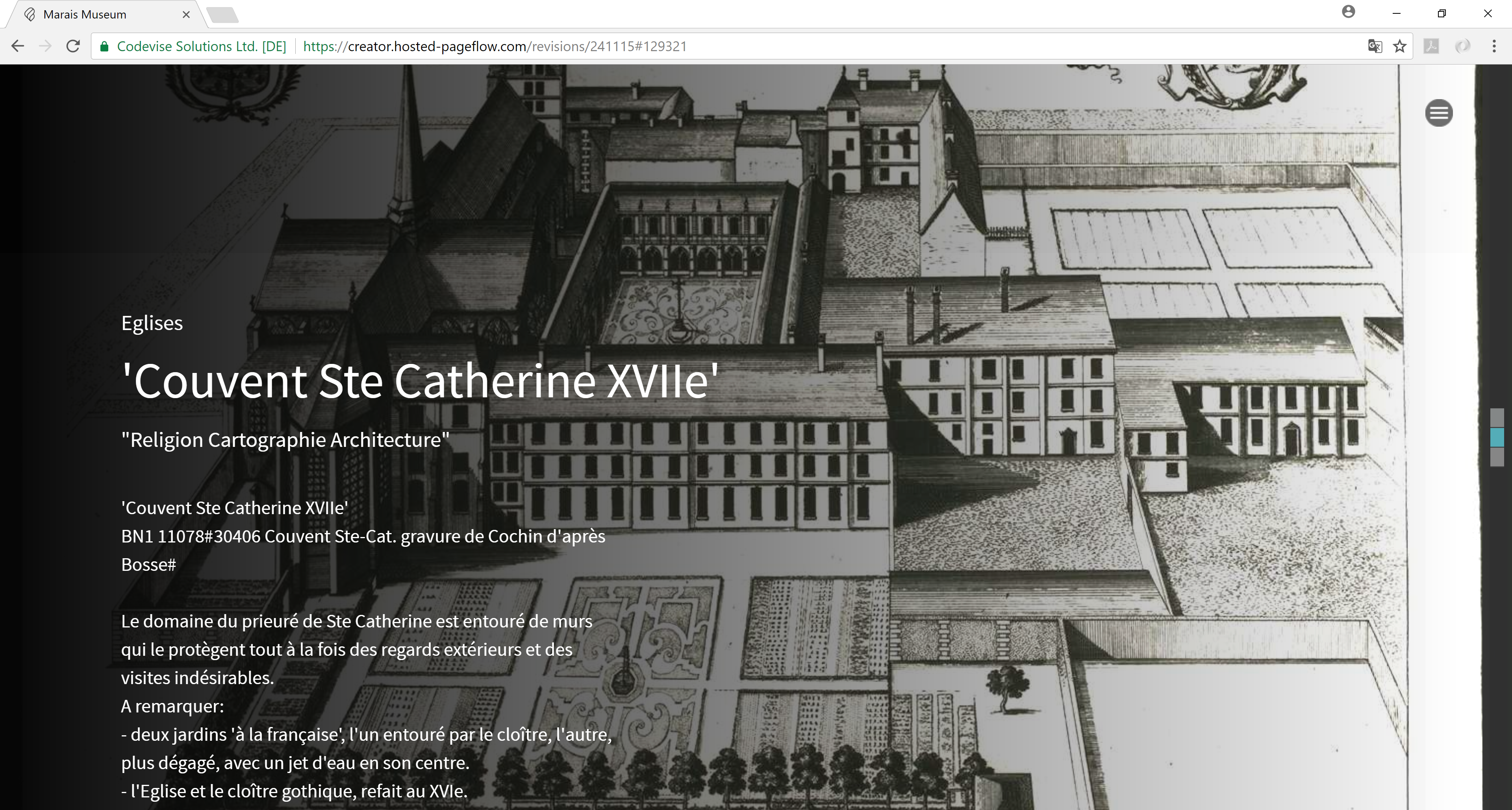
I failed in playing with omeka in the data processing part. When I try to import the CSV data, the website made me very confused with the untitled subjects. I tried to use Google open gallery then I realized it requires application and organization permission. My original plan is to create a immersive experience for the visitor of the digital museum to understand the transformation of urban grid and landscape during the past centuries. So all the pictures I chose are mainly bird-eye view perspectives no matter it is photo or drawing. Through the storytelling, the visitor could see the function transformation of public space and the growing density of urban area. So I chose another website tool called pageflow to replace Google open gallery which I like most. Here are the examples:
-
Marais Museum Project
Description My Omeka Exhibit groups together images of people from similar groups, such as “L’Aristocrate” and “Gens du Peuple.” Visitors can see how the clothes and lifestyles of people from these different groups differed from one another
Method I used a python script to go through the csv file and extract the images where the “Subject: People” had L’Aristocrate in the column. I then uploaded these files to the Omeka site with their corresponding metadata from the csv.
Challenges I found the Omeka site a bit difficult to use and confusing at times. I wanted to upload both my images and their matching metadata from the csv file, but couldn’t find a way to do so. I also didn’t find much correlation between the columns in the csv and the Omeka categories when I tried the csv plugin. There seemed to be no way of uploading an entire directory of images to the site, so I had to individually add each one, which was tedious
-
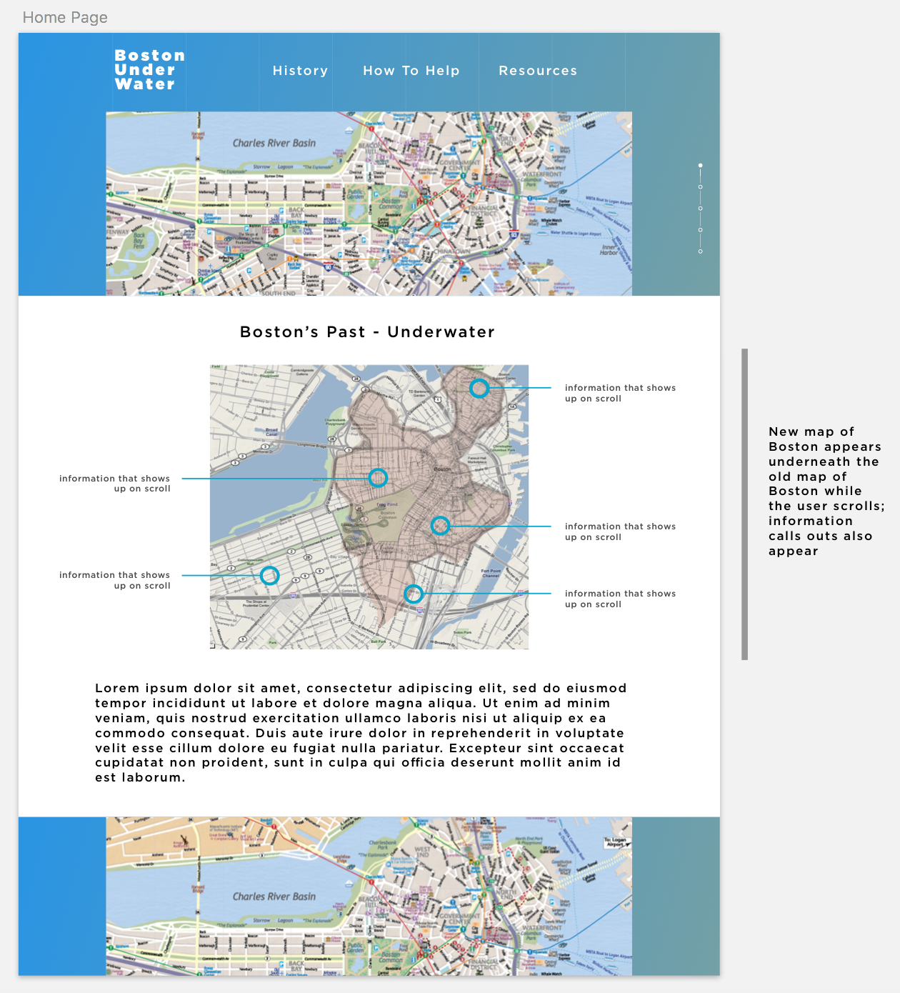
Boston Under Water - Project Update
Initial interface ideas
Below is a digital sketch prototype of the homepage of our site. It shows a map of present Boston overlaid on a map of the old Boston, which could have a fade-in effect when the user scrolls.

-
Moop Map Update
Visualization
Start from http://msbarry.github.io/threejs-tool-page/scatterplot.html and modify to add interactivity and make more visually appealing. For interactivity: https://github.com/dataarts/dat.gui (example: http://learningthreejs.com/blog/2011/08/14/dat-gui-simple-ui-for-demos/) to allow the user to toggle visualization options e.g. filtering by specific tags. On how to use color in the visualization: probably k-means clustering or similar method to color the clusters. Useful reference material: https://github.com/kylemcdonald/Coloring-t-SNE
Alternatively: we found something very close to what we want to make that uses three.js: https://experiments.withgoogle.com/ai/drum-machine/view/ source code: https://github.com/googlecreativelab/aiexperiments-drum-machine but it looks a lot more difficult to understand how to use. We will try to get technical help.
Enter text in Markdown. Use the toolbar above, or click the ? button for formatting help.
-
Project update Oct. 24th
Here is the main presentation of our project update. https://docs.google.com/presentation/d/1gYXFyO2c-V5LOnBngaly0qf2aDiRoNVfi9GGOr08dv0/edit?usp=sharing
Kelly
-
Project Update Week of 10/17
Here is the slideshow with our project proposal and current designs:
https://docs.google.com/presentation/d/1l0Tflwe_am6AN2G_VOfy6NnAU92RIfP0D7wCLHIKX8c/edit?usp=sharing
-
Assignment 5
melville_in_london Map
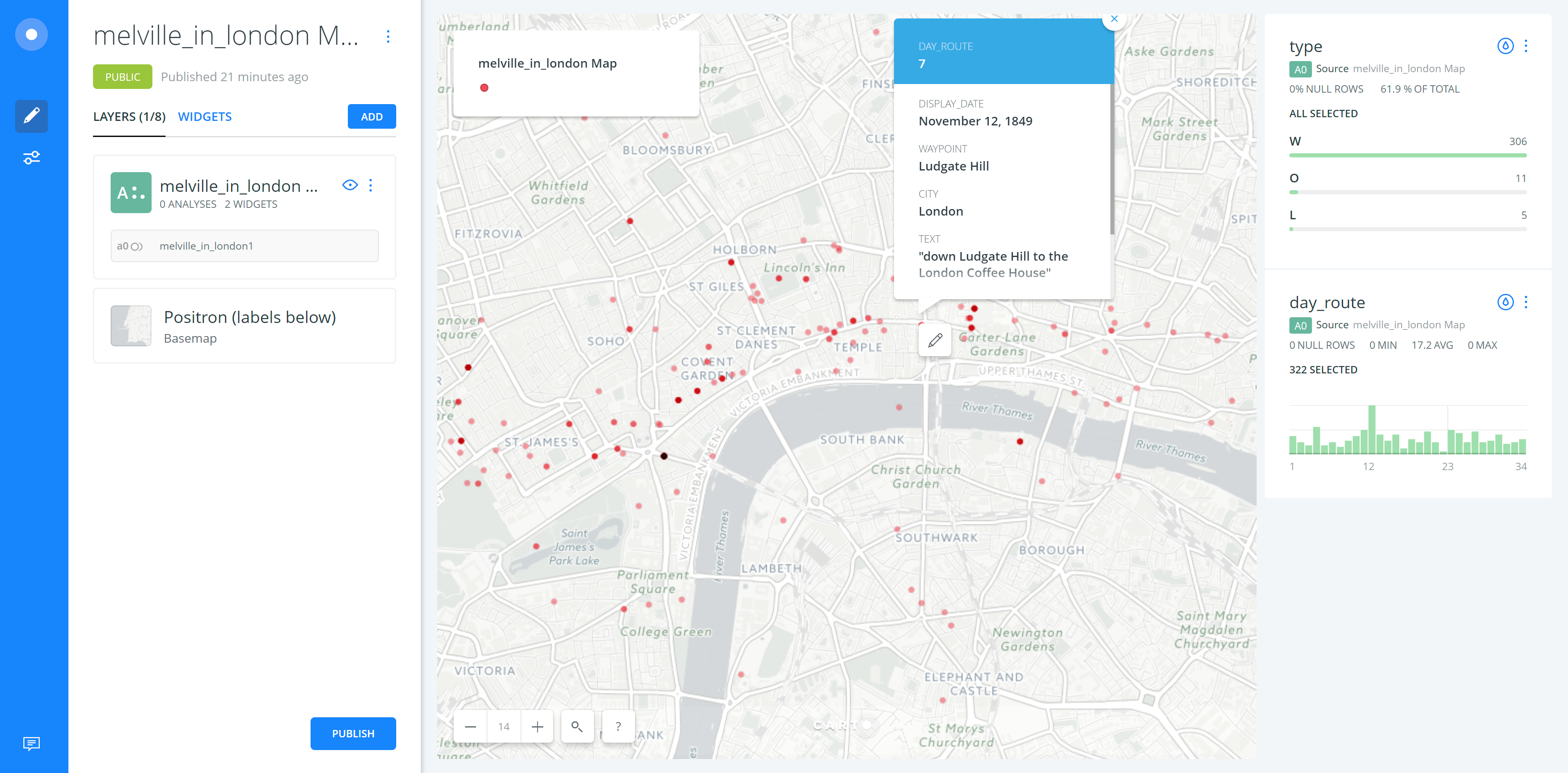
For this assignment, I chose to use melville_in_london data with Carto which has well-designed user interface. But I haven’t figured out how to change the base map into historical map. In this exercise, I used transparent dots to show the spots where Melville has visited and the layering weight would represent where Melville most traveled to. In the dynamic live map which has been shown in the video, the transformation of spots has been visualized. But I couldn’t represent the transportation methods which Melville has chosen. In the more general map, I used the widget tool to get the information chart of type and day_route. In the day route chart, we can clearly noticed which day or route he has visited most spots. And also, when we added the selection layer of day route, we can see the route in specific day rather than exploring all the information. The click-on pop-up info chart is also helpful. My suggestion for improving the Carto tool is that it should allow users to add on their own maps and make the manual functions more reasonable.
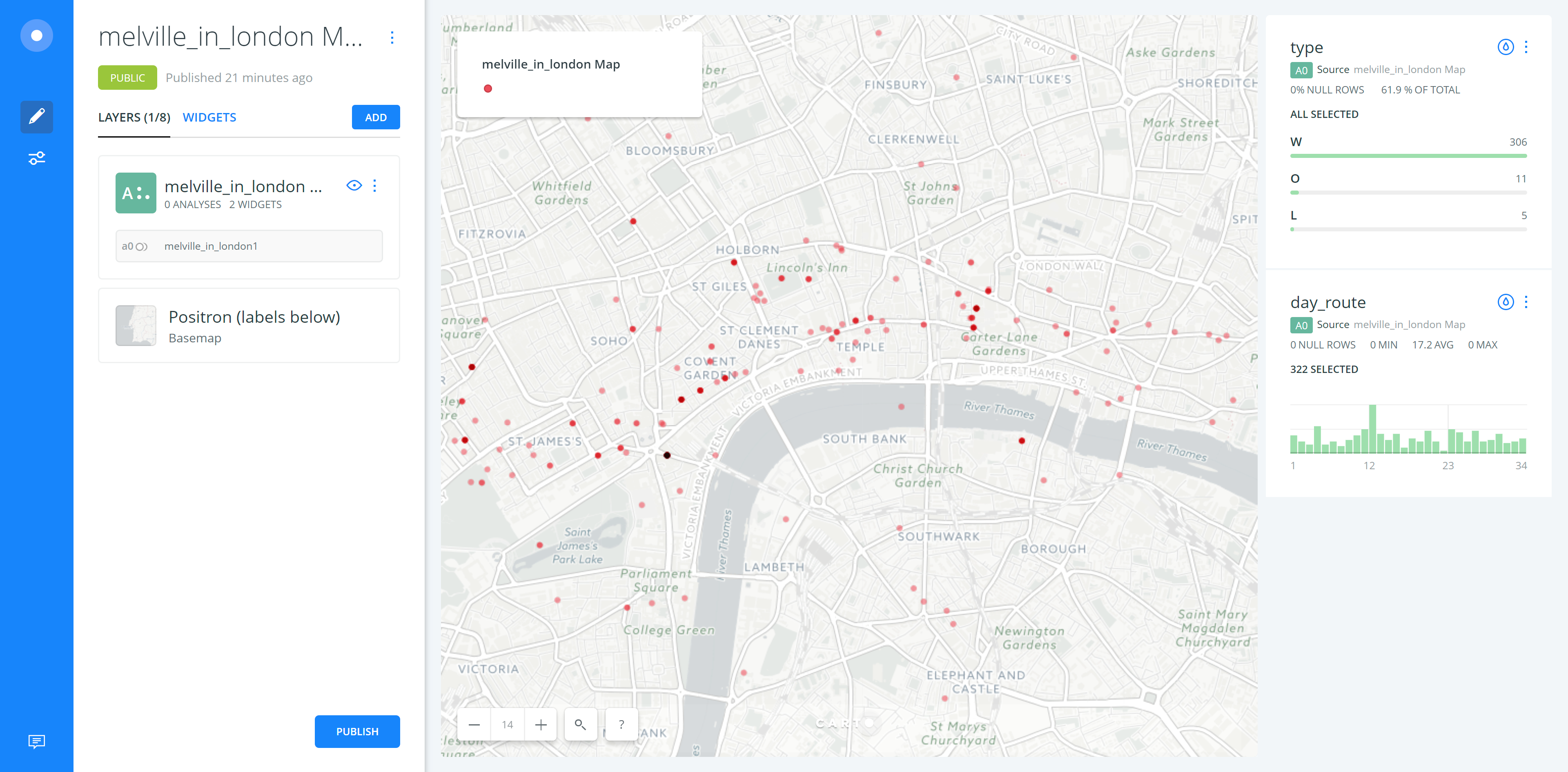
https://drive.google.com/open?id=0B20fOTX11unaZ0o4NDd0WkFNa0U
Dynamic Map
-
Using Google Fusion Tables
Thoughts on Google Fusion Tables
Google fusion tables seemed like a useful tool, and I am curious about why they were never taken out of beta.
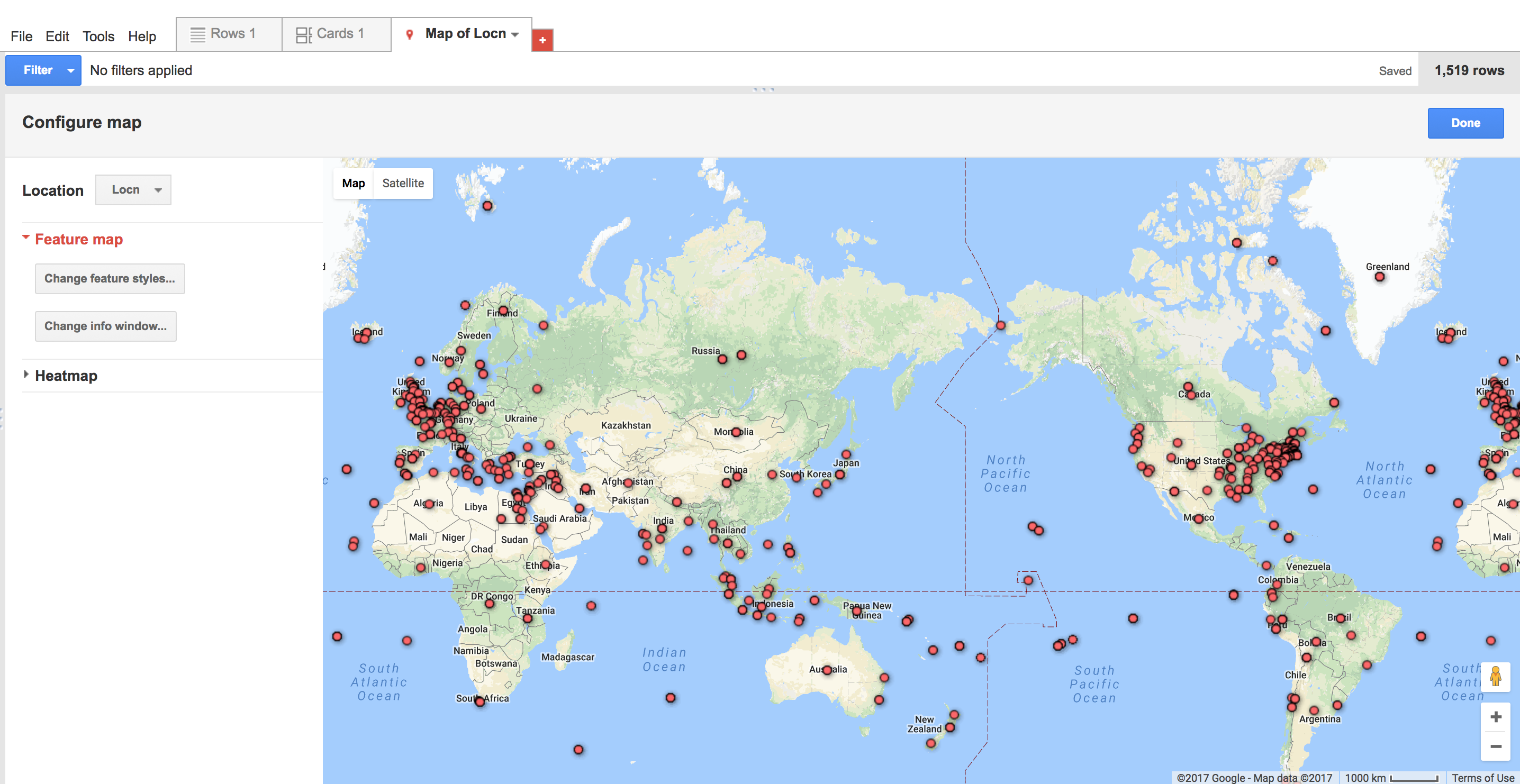
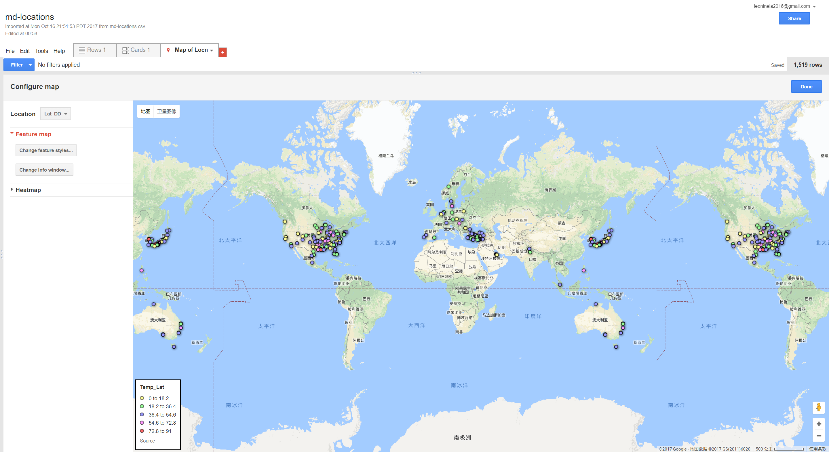
Feature Map
 I thought this was a simple and easy to interpret map, though there were issues when too many points were close together, in which many overlaps happened and it was difficult to tell how many points were in one place.
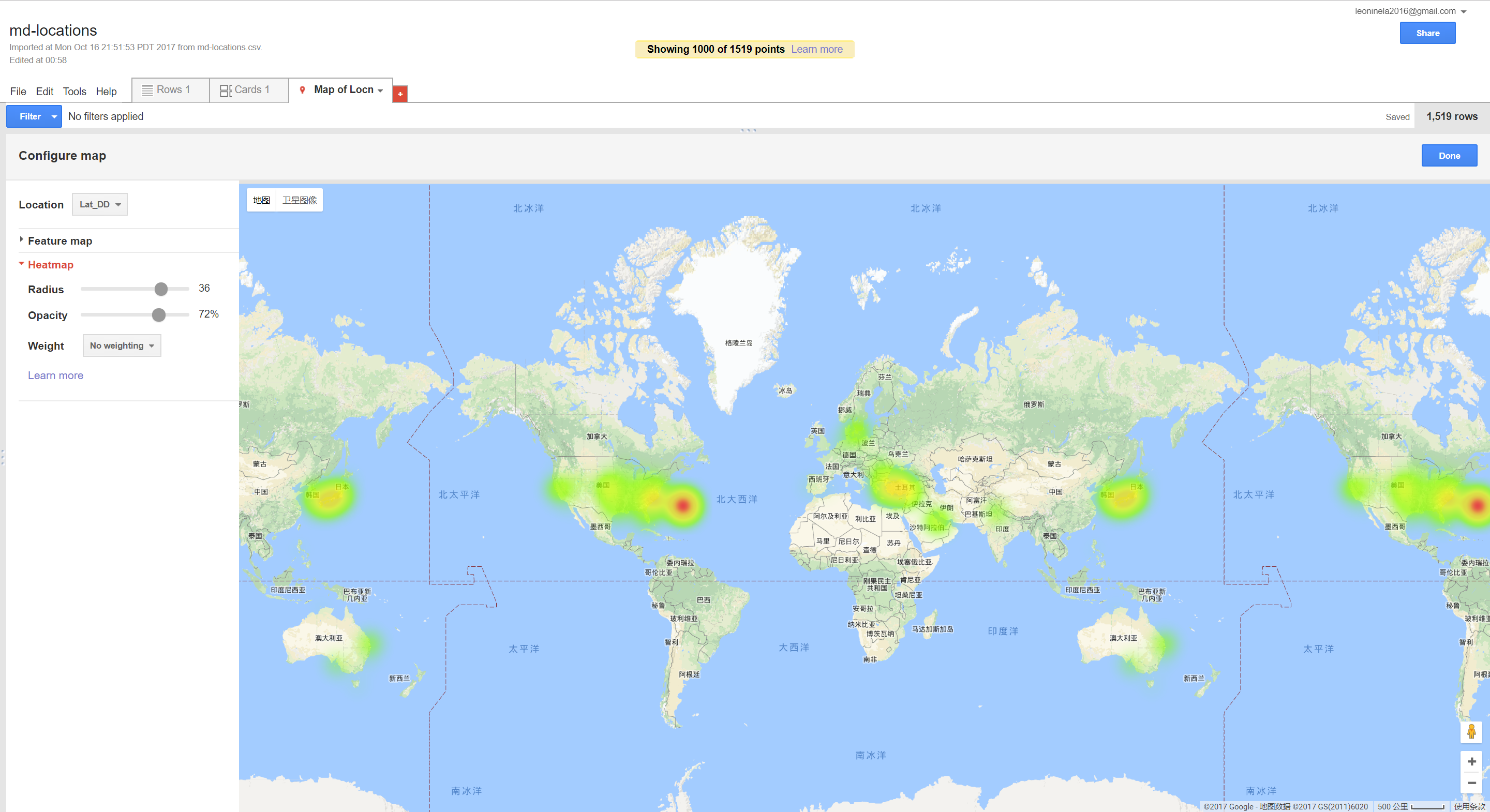
Heat Map
 This issue could be addressed with the heat map, although it requires some experimentation to determine the best radius. With a small radius, it just looks like a blurred verison of the feature map, but when the radius is too large it becomes difficult to pinpoint very dense parts of the map because the density becomes overly diffuse.
Composite Map
 Getting the code to work for this was not straightforward, given my lack of web programming knowledge. The function was not complex; it probably reflects the fact that Google fusion tables were never finished and taken out of beta that it was not made more user friendly.
Being able to overlay other images on top of the map was an interesting feature, however there were some issues when zooming in and scrolling - this sometimes caused the image to disappear.
Getting the code to work for this was not straightforward, given my lack of web programming knowledge. The function was not complex; it probably reflects the fact that Google fusion tables were never finished and taken out of beta that it was not made more user friendly.
Being able to overlay other images on top of the map was an interesting feature, however there were some issues when zooming in and scrolling - this sometimes caused the image to disappear.Enter text in Markdown. Use the toolbar above, or click the ? button for formatting help.
-
Project Proposal
Visualizing the Future: Rising Water Levels
https://docs.google.com/presentation/d/1HfEl_k4JrWwG7a-2X1_t5vi8uwKWSjurxE6ouJb-qQc/edit?usp=sharing
-
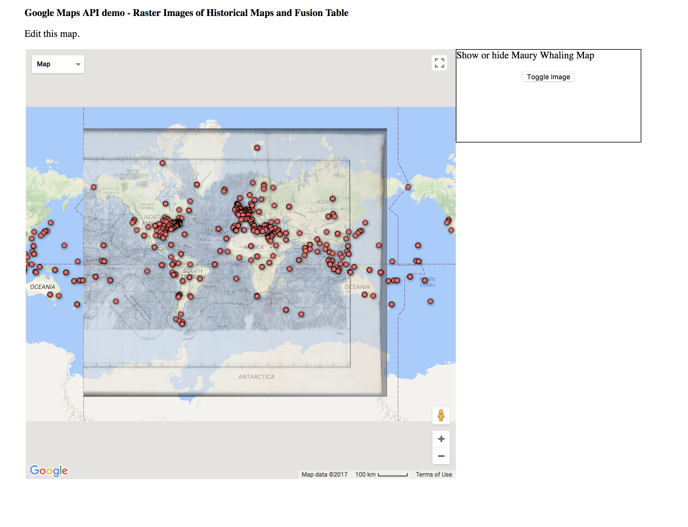
Moby Dick Mapping with Google Fusion
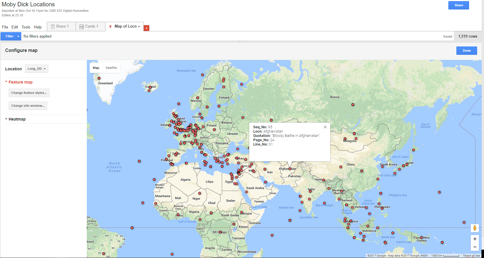
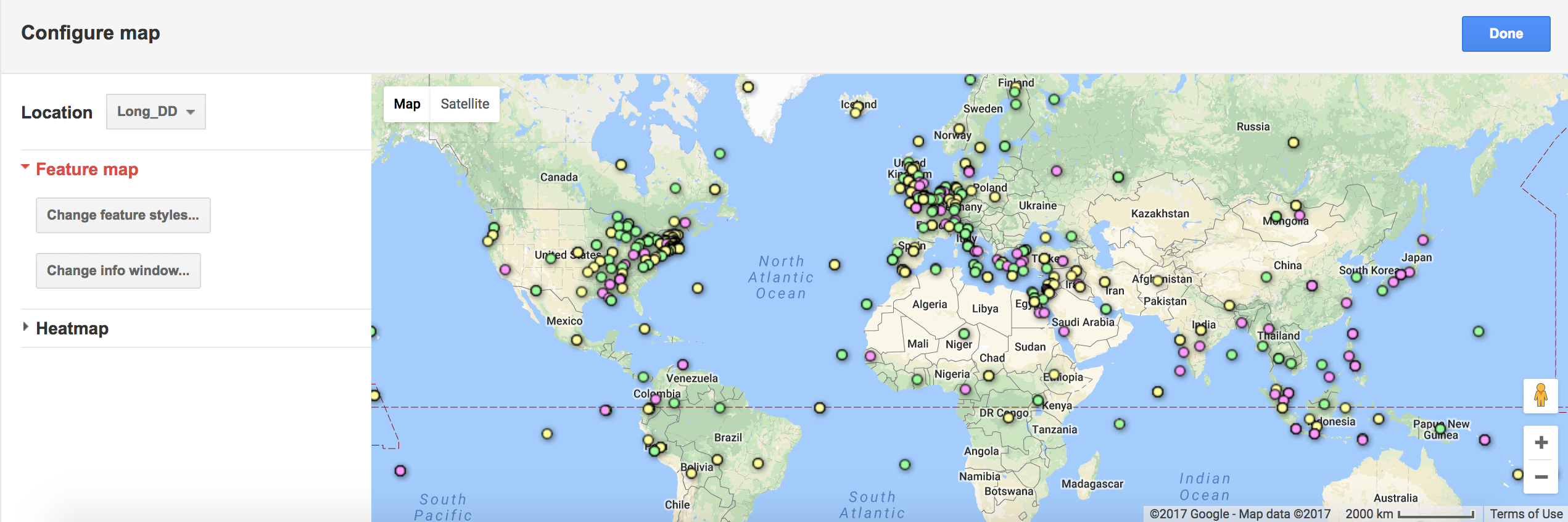
I found Google fusion kind of hard to use. I think it would greatly benefit from some improvements, such as clearer user interface and more customization capabilities that don’t require knowledge of HTML. The feature map was very cluttered:
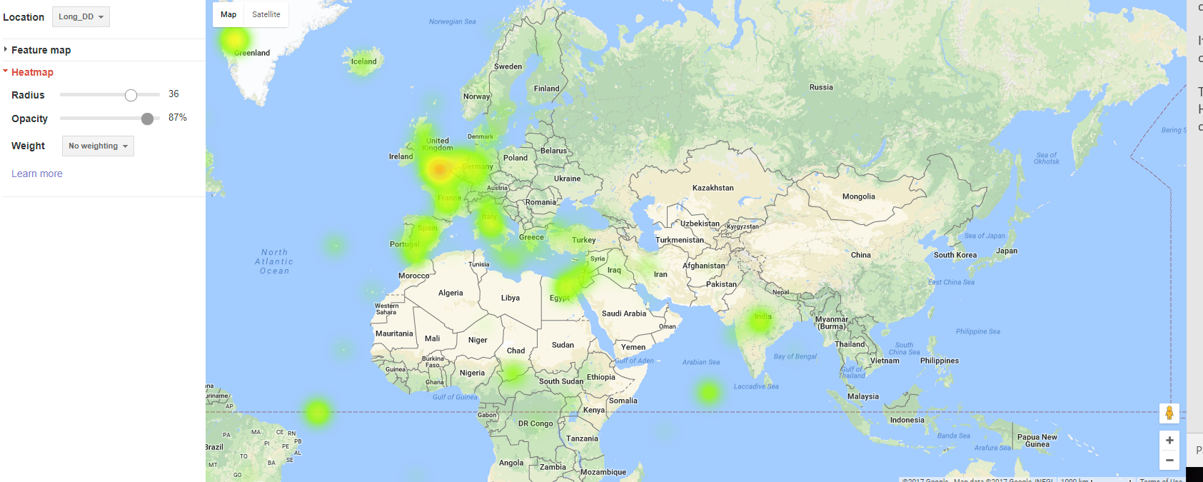
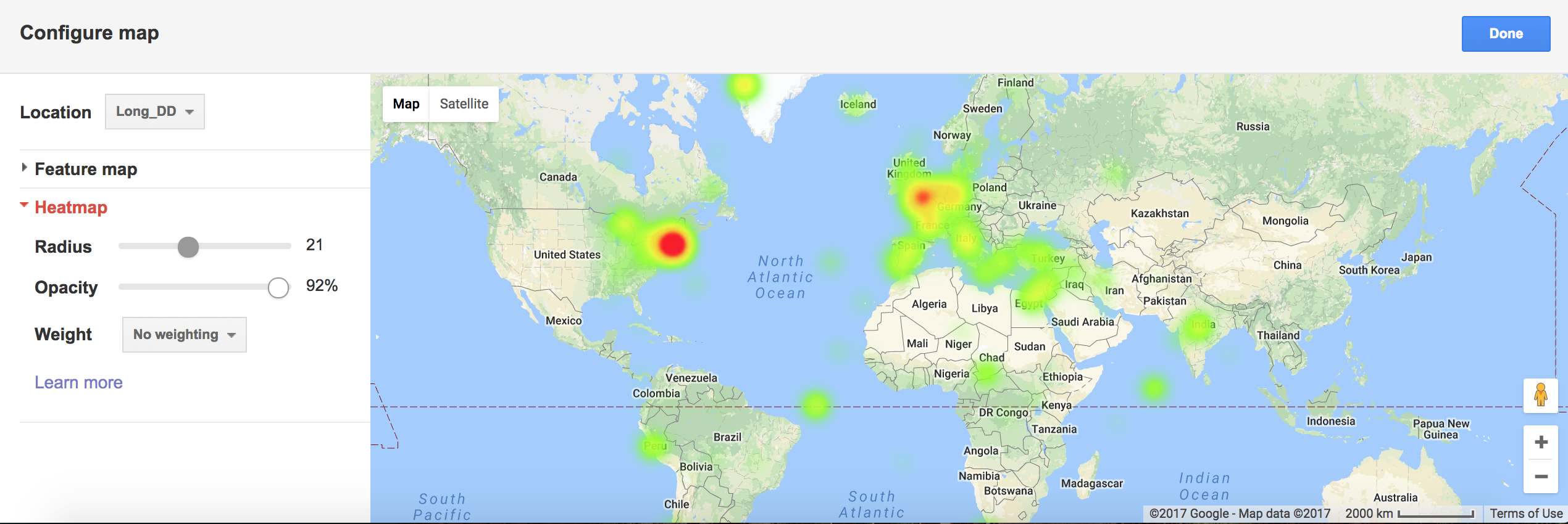
 I liked the heat map because it kind of gave a general overview of the point clusters:
-
Moby Dick Mapping Exercise
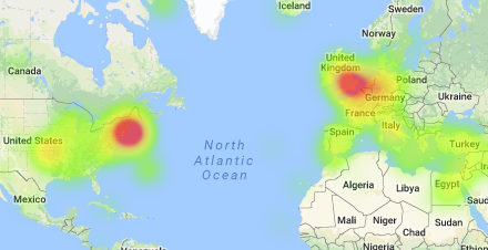
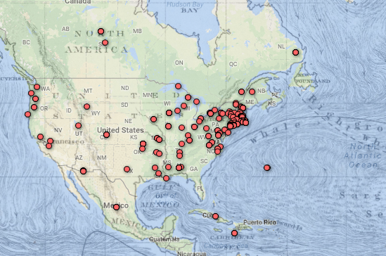
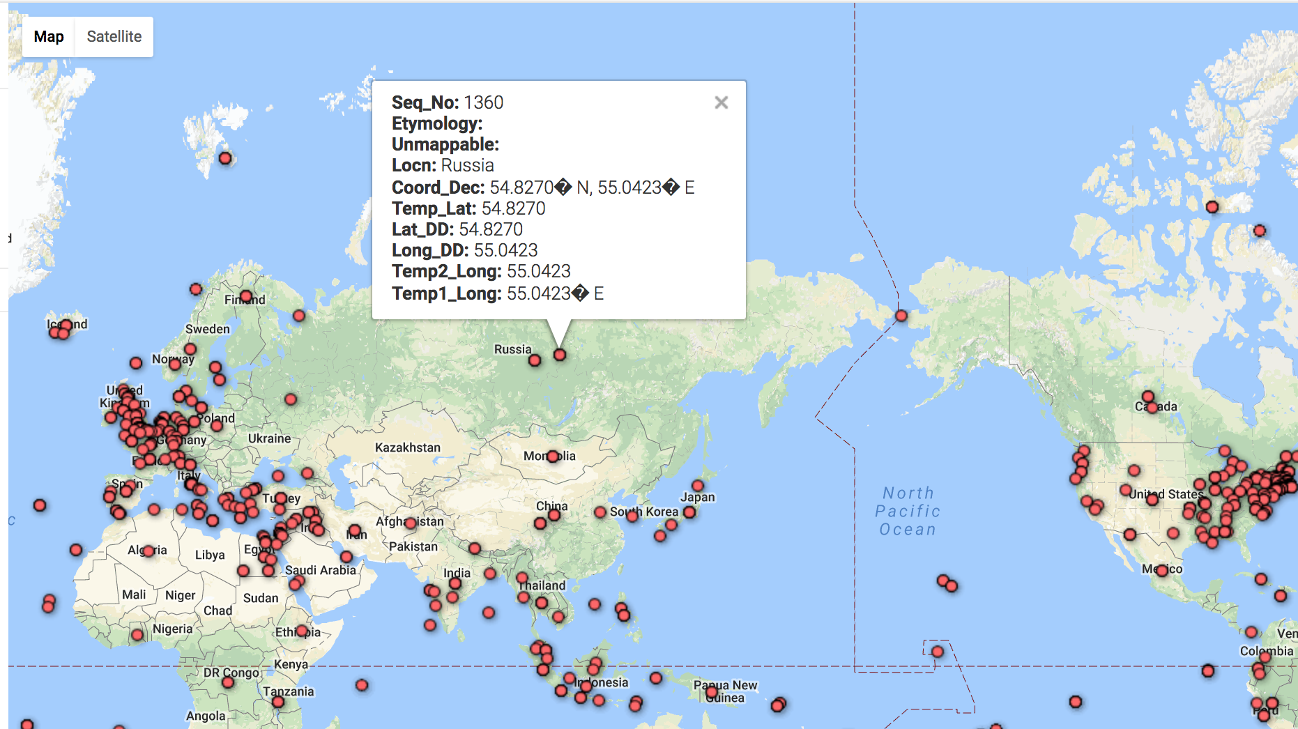
I thought while Fusion Tables was definitely still in beta and could use some improvements on the UI, it was an interesting exercise seeing what it could do in tandem with the Google Maps API. In Fusion Tables itself, I immediately gravitated towards the filtering tool. I used this to explore some of the text and how accurately the locations were. I also used this to quickly examine the points in the text that were labelled “unmappable”. After this, I explored the heat map. Like I expected, most of the points centered around the United Kingdom and the New England areas. This was really only detectable on the heatmap, as points definitely look a lot more dispersed on the feature map.
In conjunction with the Google Maps API, I could definitely see even more capabilities to uncover. The GMaps API is quite mature and is used in millions of applications, so I know it would work well. However, I did experience some lag with implementing the Fusion Layer and the overlay. Wasn’t sure if it was my computer. I thought it was interesting to look at the various location names on the old map, and how they possibly correlate to the various points. In general, when playing with the fusion layer and the map overlay, I thought of Bodenhamer’s text, and the concept of “deep maps”. I definitely this use of layering over a standard map is a initial implementation of some of the layers of a deep map. A future extension of this exercise might be combining the map with the actual text, allowing the user to click on the text and zoom into the exact spot of the book, providing more context around the quotations.
-
Moby Dick Data
Plotting on the google fusion tool was an efficent way to proces the bulk of information and represnt it visually. I worked a little with the filters, and tried the heat map setting, it was interesting to see how dispersed the data is when plotting individual points and how this varies with the heat map.
-
Moby Dick Data Using Google Fusion Tables
After using the given instructions to input the Moby Dick data I changed around different settings to see what would happen. Generally speaking, I found that the Fusion tables convenient and useful for visualizing spatial data. The bucketing and heatmap features were particularly helpful, as was the option of editing the info window.
However, there were a few things that could be changed. For example, the bucketing mechanism isn’t intuitive, and it reverse changes isn’t a straightforward process. Additionally, the need to change columns when editing info windows seems impractical.
Bucketed Data
Heatmap
It would be interesting if the relationships between and types of data points could somehow be represented, whether by differentiating point styles or somehow connecting them.
-
Mapping Space
For this exercise, I used google fusion tables as a tool and Moby Dick data as a data source. After the map is formed( which somhow took quite a few minutes), I found that users can further design the map by changing feature styles and information windows. Heatmap is also provided to better illustrate the information. Google also allows users to share the generated link for customized fusion tables with others.
But when I clicked into the marker icon, the information could not be shown in correct format due to the incompatible format when the data was imported.
The data visualization web application like Google Fusion Tables enables users without any programming skills easily to visualize and map out data. But it is highly dependent on what information is inputed. It also has limited options for users to interact with the data or add more layers to the map. For me, it is more of a tool to display one’s collected data rather than a tool which can function as a basis for further relavant research.
-
Mapping Space - Moby Dick
Here is a link to my final product
I found out that while the Fusion Tables was a bit limiting, the Google Maps Javascript API allowed much more freedom in implementing different ways to interact with the map and display different types of information. The overlay feature specifically was really interesting, as it allowed the user to visualize the same map created with modern technology along with a historical map, which allowed for a temporal representation to accompany the spacial aspect of maps. This gave the data an extra dimension that would otherwise not be there.
-
Google Fusion Tables
Using the google fusion tables prototype was an interesting experience - the tool itself is obviously a powerful way to visualize location based data. As a prototype, it was not a very intuitive tool in its UI, especially in regards to setting up the map visualization and understanding exactly the order of operations for properly filtering information. It really was cool to see how fast the app could synthesize so much data - the geocoding went faster than I expected. Also, I tried to customize the visual aspects of the cards but saw no option to do that, which I think would be a great addition to this tool if it were to be further developed. As Calvin mentioned, this tool would be really helpful for our own visualization project, especially because it’s capabile of showcasing two different data sets.
-
Exercise of Google Fusion Tables
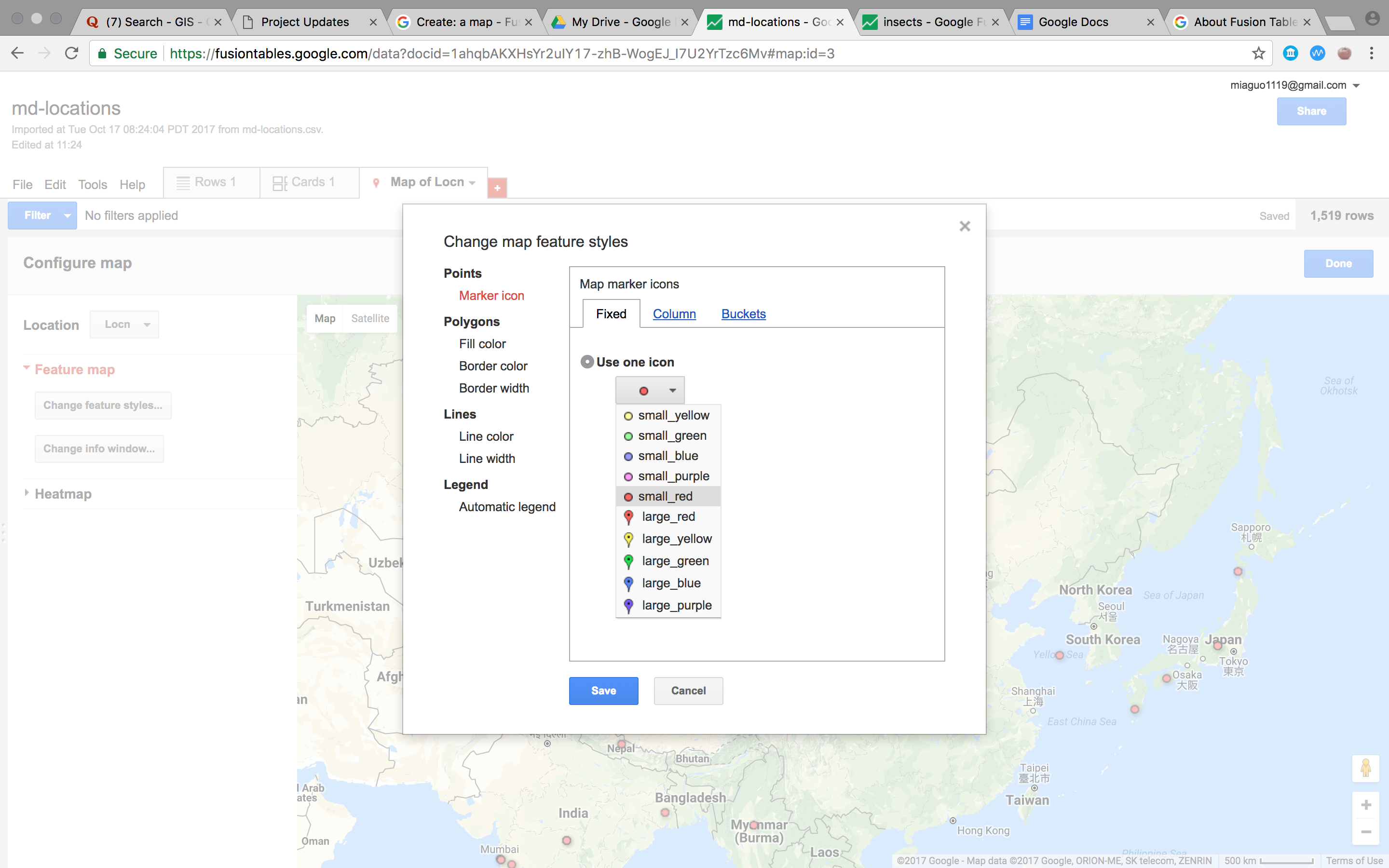
When implementing the exercise, I found this tool really fun and handy to use, as long as you gather the proper information in the excel table, you can visualize the geographic related data easily. What I’ve found more interesting is that after the raw data is imported, the user can further categorize the data into buckets with certain purposes, legends can also be generated automatically[Fig.1]. This provides opportunities for further intepretation of the data.
 Also, the popups can also be customized which gives the user more flexiblity editing the data.
I also find the heat map a good feature for this tool to show which location are most heavily illustrated in the book[Fig.2].
Also, the popups can also be customized which gives the user more flexiblity editing the data.
I also find the heat map a good feature for this tool to show which location are most heavily illustrated in the book[Fig.2].
However, this tool is currently incapable of adding other geometric elements such as lines, polygons etc.,would be cooler if these features could be implemented to show a certain path, connections or relations.
Enter text in Markdown. Use the toolbar above, or click the ? button for formatting help.
-
Erick's Assignment 4
Mini Project
I used Fusion Tables since I’ve worked with CartoDB before, and here’s what I made!
Tooltips
First, I added a simple tooltip that displays a table of information, as guided by the instructions.

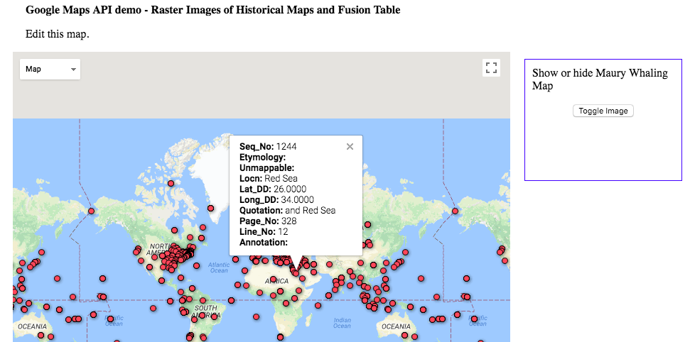
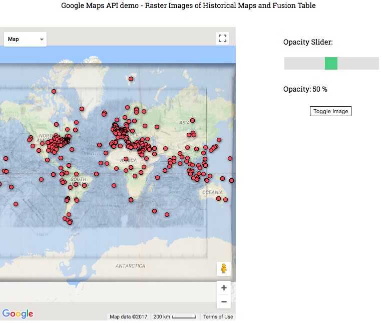
Next, I overlayed an image (with sli
 ghtly lower opacity than instructed), to show the datapoints in line with the old map!
While FusionTables is nice and easy to use, other mapping tools such as Carto are more modern and flexible. In particular, they take a more database-centric approach rather than focusing on CSV files or spreadsheets.
-
Mapping Space - Moby Dick Exercise
Using Google Maps + Fusion Tables
With the demo provided, I began to play around with using Google Fusion Tables and the Moby Dick location data. I found the use of the Google Maps API was cool and easily integrates into many projects. Adding the slider was simple, and the map was pretty robust.
The Fusion Table was a little confusing, and the interface definitely seems like one of the things that hasn’t been worked on too much. I wanted to play around with different data, but wasn’t sure how to approach this yet. I think an easier interface would have reduced that activation barrier.
Finally, I think it would be really interesting to look at data at a smaller scale, like at the city or street scale. I think it would be more impactful, especially for architecture. I think this would be really useful for our final project, looking at data related to rising water levels in Boston.

-
Google Fusion Tables
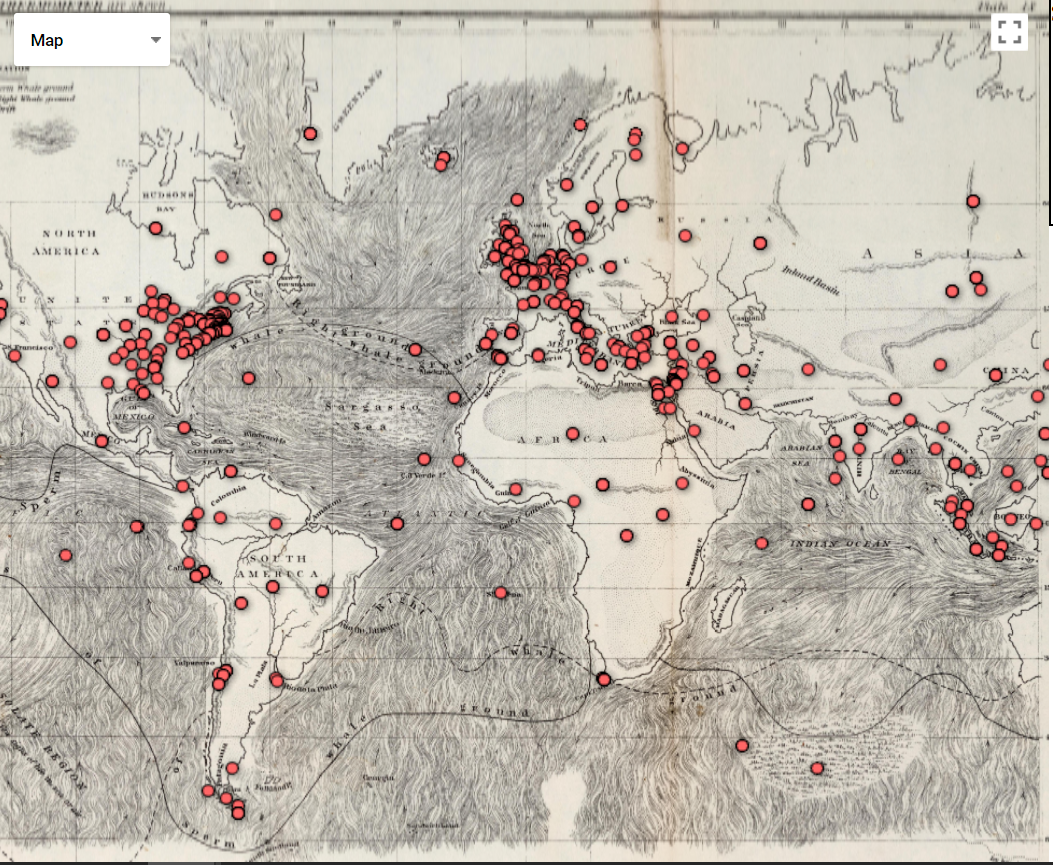
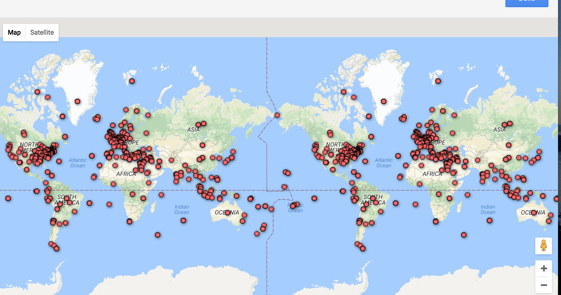
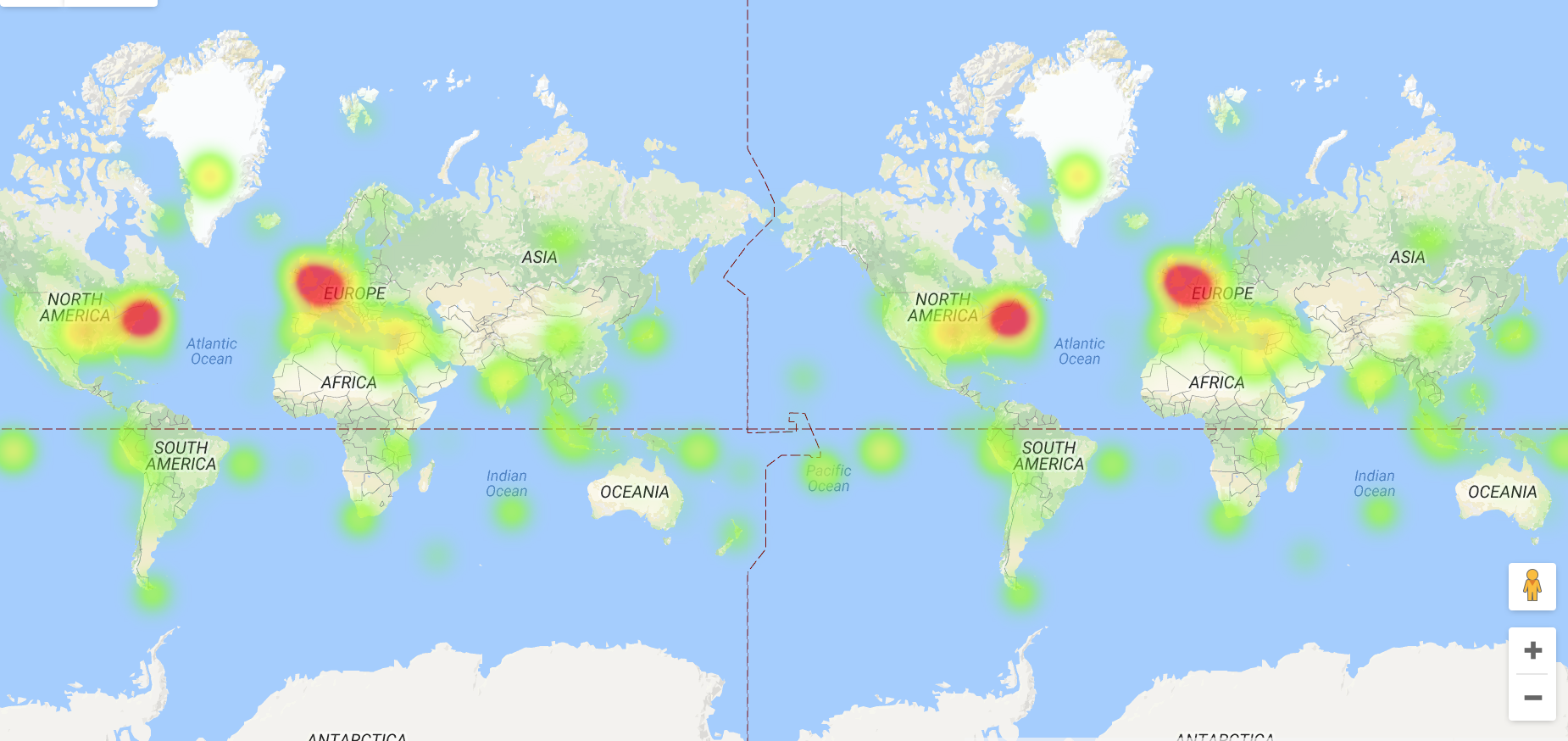
I had a bad time exploring mapbox and carto because I couldn’t upload the database in right format. So I choose to use google fusion tables even though there are limited options to play with the data. When I first look at this data, I’m wondering which locations are mentioned in the conversation and which are they really experience physically? But I have no way to differentiate it unless I read the whole context. So it’s impossible to draw curve lines to show the travel history. Then I look carefully at the excel sheet, I found in the Etymology row, “chapter 71” and “chapter 76” highlighted for some reason. Although I didn’t understand the real context and main ideas of these chapters, I assumed they are two important time points and divided the locations into three parts based on chapters. I found the pop up column is useful because of the quotations. In the heat map, we can clearly see which part of the world are most frequently mentioned in this novel. I wish there could be more options to layer on the map.
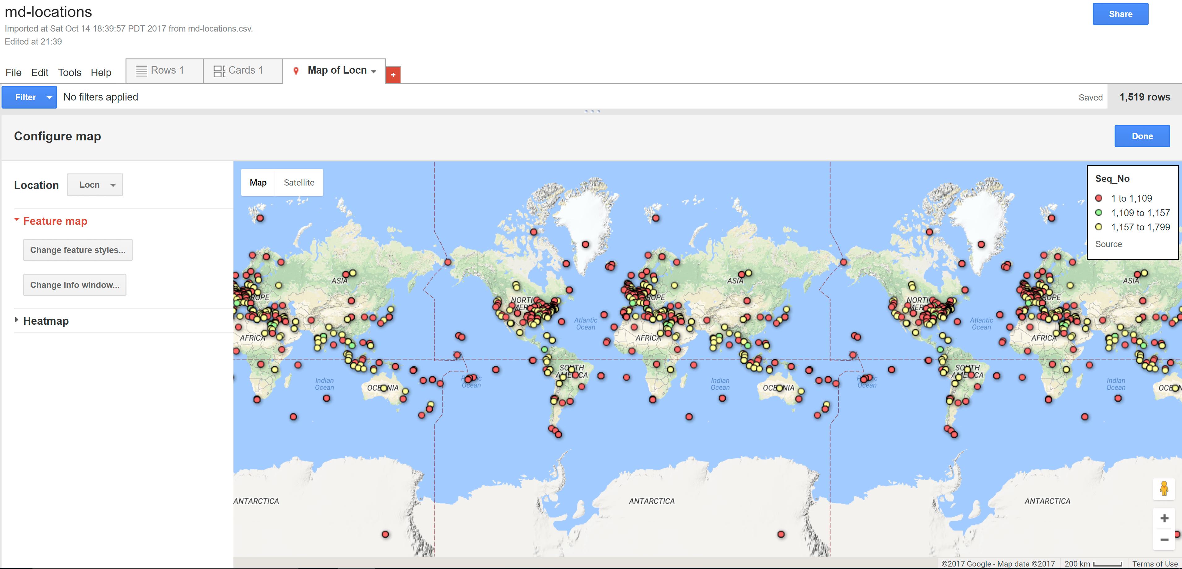 The locations shown in dots divided by chapters
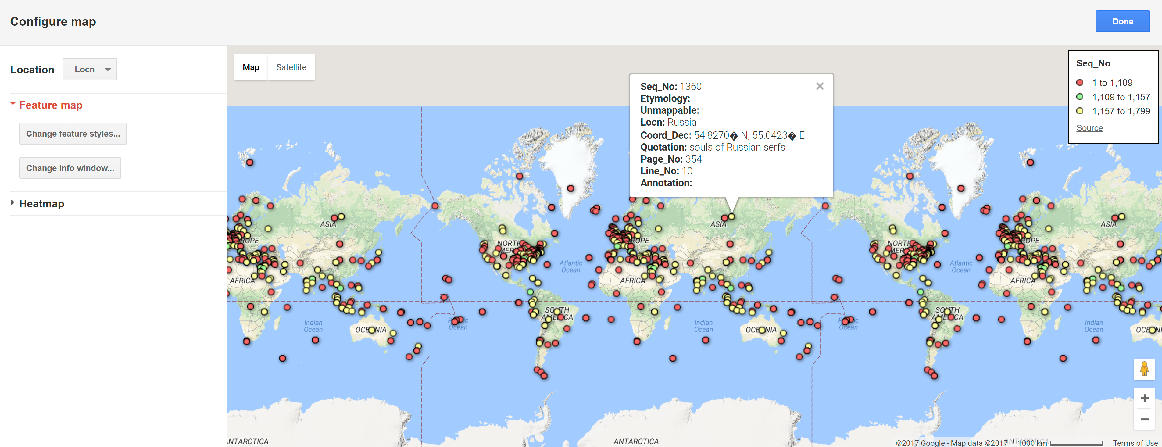 Pop-up
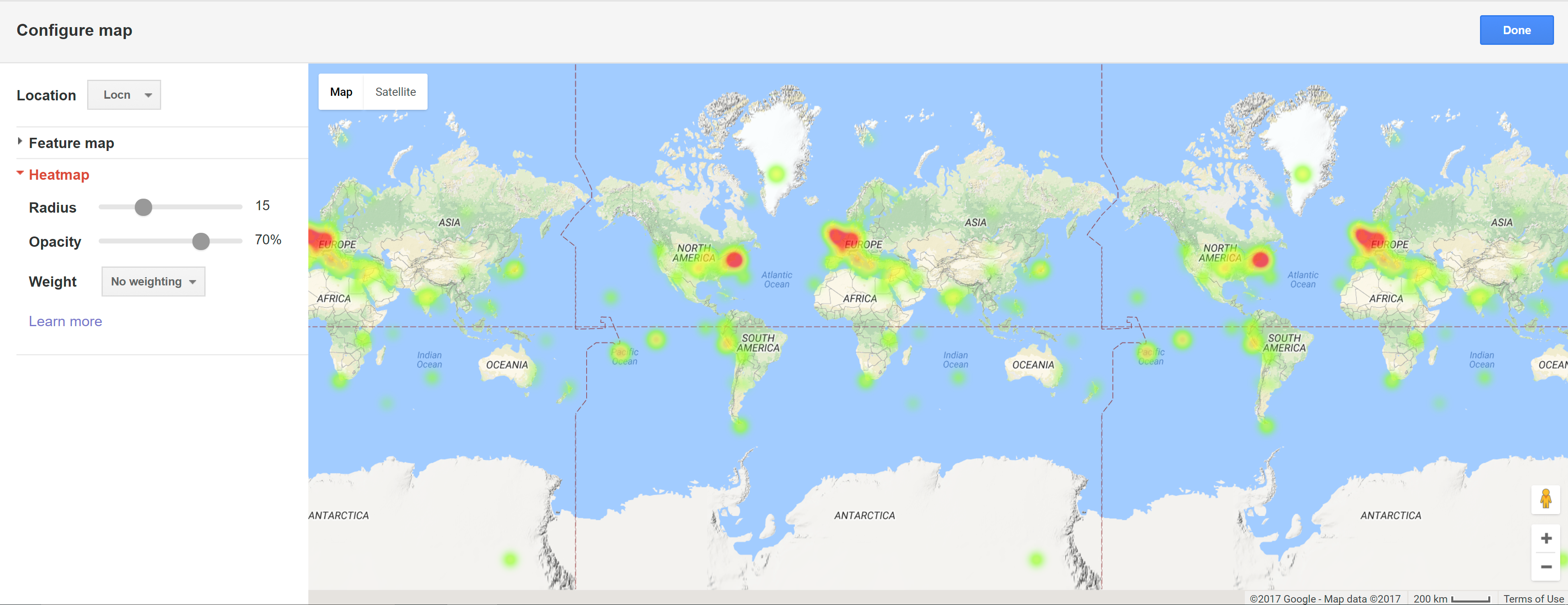 Heat Map
 -
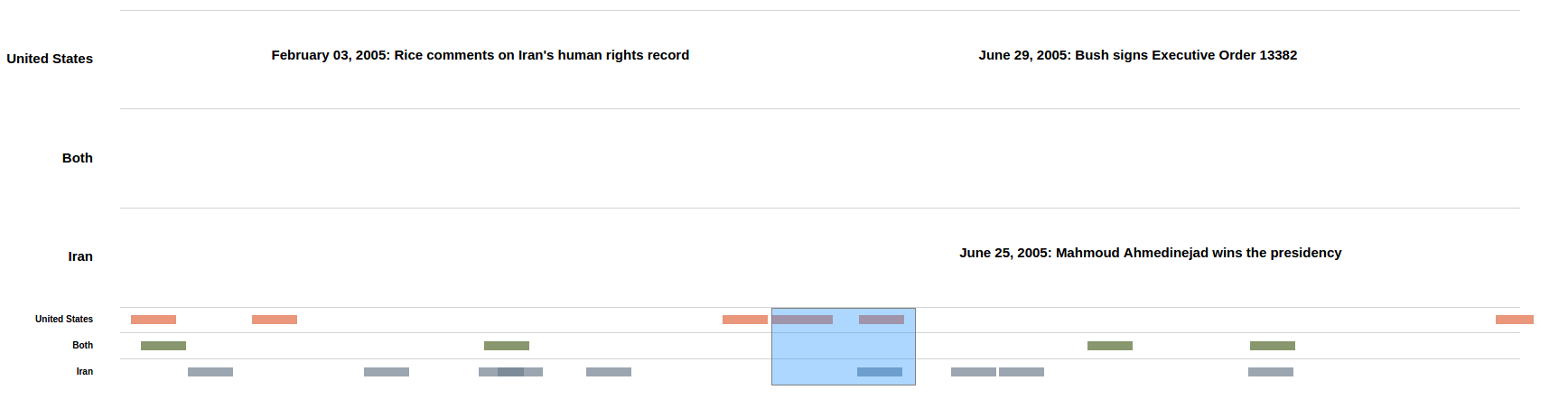
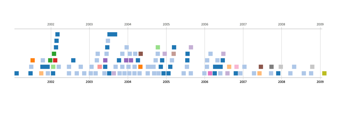
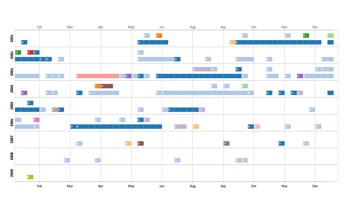
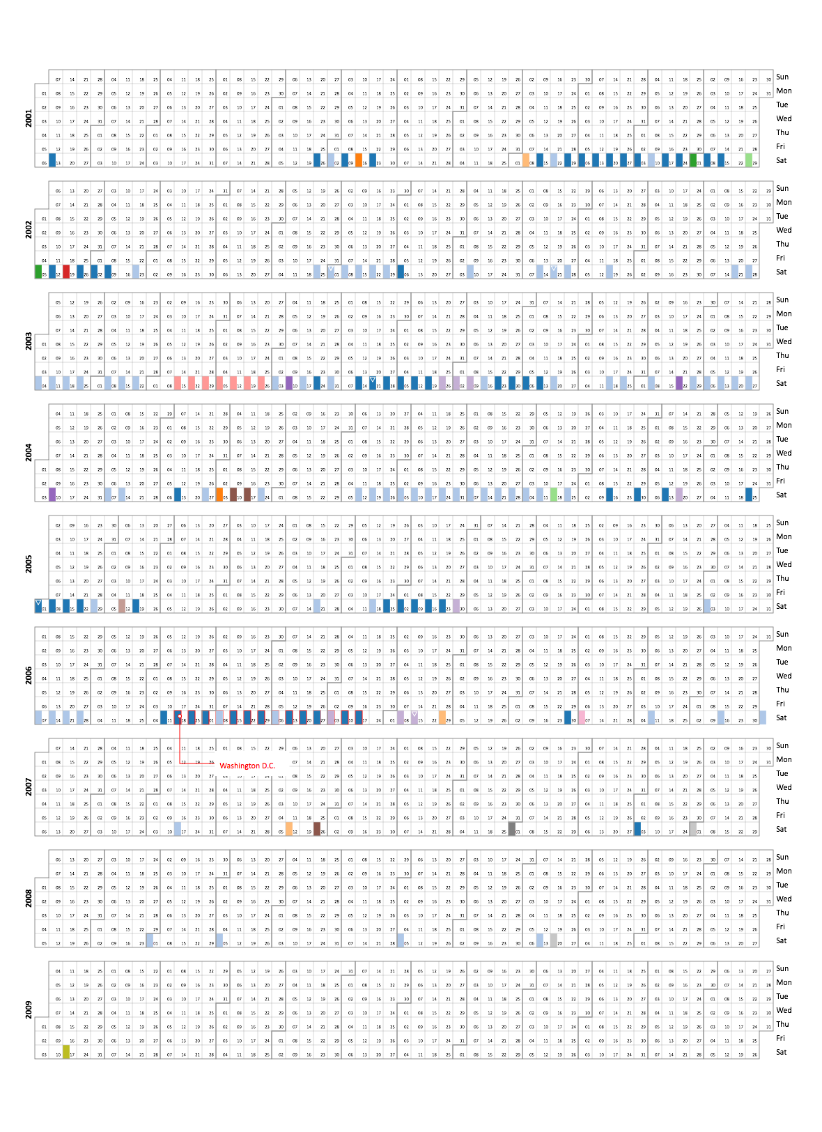
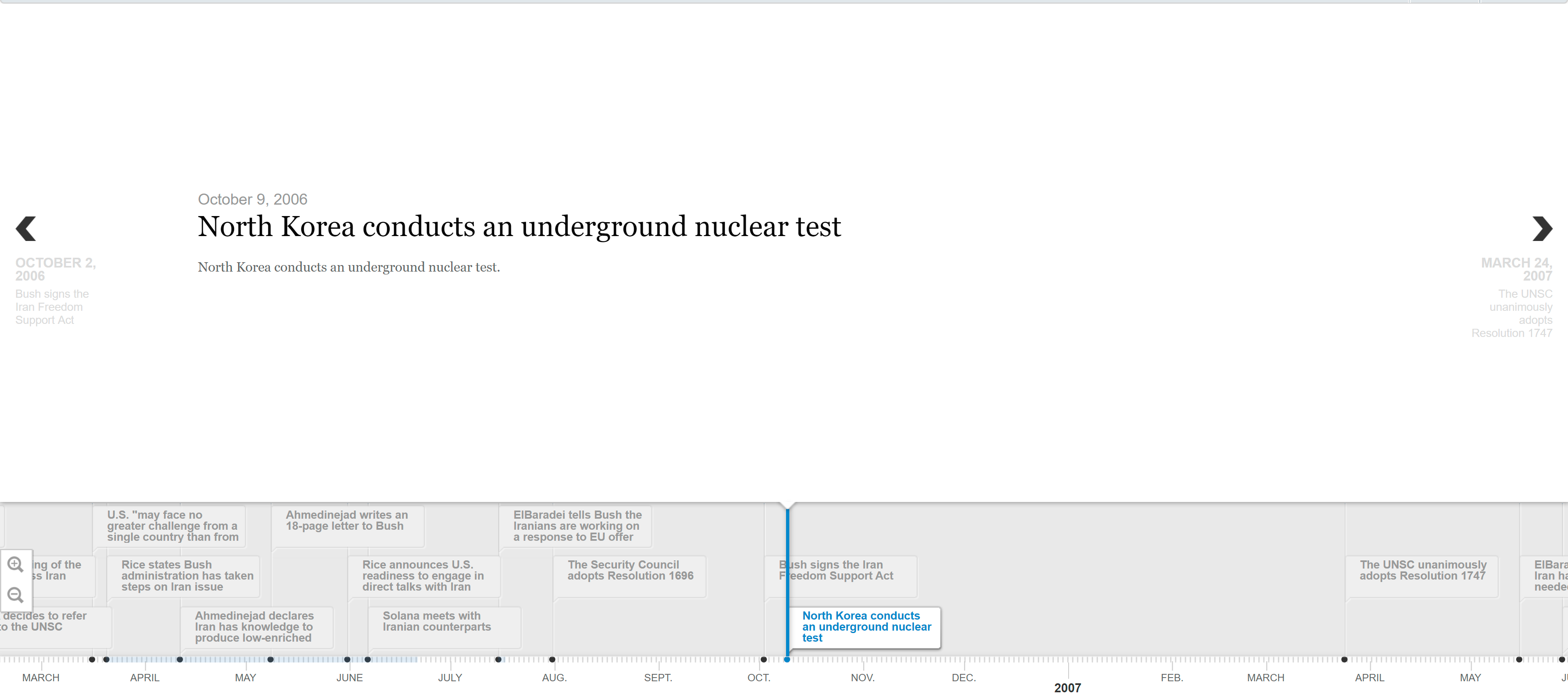
US-Iran Relations Temporal Display
For this assignment, I experimented with forming two different visualizations using d3.js.
Visualization #1 Visualization #2
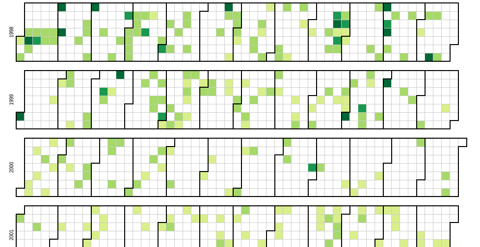
For the first one, I focused on something that could be used as a high level understanding of the US-Iran relations over time. The outcome was this heatmap visualization. It relies on dataset 1 & 3, and provides a visual comprehension of the timeline/density of events in the relationship of the US & Iran. A further expansion I would take is allowing users to hover over a date and see the headlines of that date.
For the second visualization, I focused on something that provided a more low-level detail of relations over time. I also wanted to stress the idea that many events had contesting events that occured at the same time. The outcome was this zoomable timeline that allows for stratification of events. I decided to seperate events by US valued, Iran valued, and events valued/affecting both parties. To stratify the data, I wrote a script that would allow me to read each headline individually and categorize them as US, Iran, or both.
This is the visualization:
-
Temporal Display
After we briefly look through the raw data, we found that one of the factors that contributes to the complexity of US-Iran relation- s is the variaty of actors, including many other countries and international organizations. Thus we further categorized the events into different types according to the major actors involved. With the assistance of the given timeline tool of timelinestoryteller, engagements of actors were represented in different colors.
Enter text in Markdown. Use the toolbar above, or click the ? button for formatting help.
-
Project Proposal
Digital Journalism
The rise of interactive digital journalism has powerful implications for news dissemination– in an effort to tackle a post-truth society, we hope to develop an idea focusing on the accurate representation, delivery, and accessibility of data in media. Through a project that will focus on the reporting of legalization/decriminalization of marijuana and its ties to the prison-industrial complex, we hope to analyze quantitative prison data provided by the government, via https://www.bjs.gov/index.cfm?ty=daa. Moreover, it will tie in qualitative information to create a holistic approach to representing the issue that takes a position, critically explains the data, and removes ambiguity between truth and alternative fact for the public. This project will re-evaluate the role of data scientists, journalists, and designers in informing the public and making information once-again accessible for everyone.
Examples/Links: http://vallandingham.me/scroll_talk/examples/ http://muyueh.com/greenhoney/ https://pudding.cool/2017/03/music-history/index.html https://svds.com/rockandroll/#thebeatles https://www.dezeen.com/2017/09/28/emma-king-rewrites-george-orwells-1984-donald-trump-tweets-graphics
Data Ideas Prison Data: https://www.bjs.gov/index.cfm?ty=tp&tid=131
-
Project Pitch
Tracking Artists
##Problem:
Over time, artwork has been scattered in museums and collections across the globe. Because of this, it has become very difficult for people who are passionate about one artist to view their work together. This poses several issues because I feel it is important when studying art, to analyse work over time.
##Solution:
Moving exhibitions often solve this issue as they are sometimes specifically curated per artist. However, they visit very limited number of places, and often pose a security risk through trasnportation. I want to create an app that collects informationfrom the web about a specific artist and curates artwork, historical facts and news articles chronologically to a person interested in viewing the work. The focus would be on the experience of presenting all material by the same artist viewed on one platform. e.g. If I searched Rembrandt, different work would show up and I could view paintings from museums across the world
-
Project Pitch: The Virtual Freedom Trail
(2 versions - AR and VR)
Augmented Reality: Idea: A smartphone app tracks your location as you navigate the trail and can help you relocate it if you lose the trail. If you point it at a building/landmark along the trail, you can see historical information about it.The freedom trail can be difficult to navigate, especially for tourists that aren’t familiar with Boston. They don’t know which landmarks are nearby or what they’re looking at most of the time Audience: tourists, locals that haven’t been on the trail Platform: smartphones
Virtual Reality: Idea: Create a virtual space in which users can explore the freedom trail and interact with the landmarks around it. It would be very similar to the AR experience, but instead the users are in a completely virtual world. This would be ideal for people to experience the history of Boston along the trail without actually having to be on the trial Audience: amateur history buffs, tourists that can’t travel/don’t want to spend the money to come to Boston Platform: VR headset experience (Rift, Vive, Google Cardboard, etc)
-
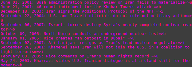
Assignment 3: US-Iran Relations Location and Language
The data about the US-Iran relation is displayed chronologically on a timeline that includes the title, description, photo, and location of the events. In this first iteration, we attempt to display the accounts of the events from an objective point of view. Below is the link to the timeline. (http://timemapper.okfnlabs.org/trista_tho/1stbriefingbook-eventsxlsx)
Nevertheless, we realize that the accounts offer conflicting interpretation and value for each side, so that in the second iteration we would like to highlight these perspectives and the dynamics of the US-Iran relation.
Language Timeline
Noticing lots of quotations in the data provided, we also decided to explore ways to vizualize the statements made by each side over time as a way of providing insight into the evolving sentiments between the US and Iran.
The events described in the data provided are points in a contested relationship between two countries, many of which have different and often conficting interpretations and values for each side- any description of an event thus cannot be taken at face value. Johanna Drucker in Humanities Approaches to Graphical Display warns that the graphical display of information carries the assumptions of knowledge as observer-independent and certain, rather than observer co-dependent and interpretative. Therefore, presenting the event descriptions in a graphical timeline could mislead the viewer.
To avoid this, we created a display of language that does not attempt to present an objective account of events. The language used by each side about the other (and the way the US chooses to describe and present its own policies towards Iran to the American public) provides a view into the relationship between the two sides which the reader can interpret themselves.
We created the timeline using Microsoft’s Timeline Storyteller, categorizing and color-coding the quotes by which side said them and what they were directed towards- in this case, statements the US made about Iran, statements the US made about its policy on Iran, statements Iran made about the US, and statements made by the media about the relationship between the US and Iran.
-
Final Project Proposal
Interdisplinary Projects Platform
The idea for this project is developing a web platform where artists will be able to collaborate and create interdisciplinary projects with other artists. Musicians, visual artists, graphic designers, dancers, and the like will be able to upload their creations and have others add on to to them via various mediums. Artists will also be able to see others’ creations and be inspired to contribute to them as well. The basic question that this too is trying to answer is how can artists collaborate with others when they might not the physical/social access to other artists of various mediums. The data for the project will be created by the people who use the platform. The idea would most likely start out as a web platform, but possibly could be translated to a mobile application as well.
-
Final Project Ideas
Initial Thoughts
1. Whole Earth Archive A website that would provide a comprehensive look into the contents of the Whole Earth Catalog, as it is not working online. The site sketch could also include user profiles so they could remix the content
2a. Freedom Trail AR A supplemental app for the Freedom Trail that would augment the tour with additional information, particularly focusing on communities whose voices are otherwise invisible on that tourist journey.
2b. Freedom Trail Site An archival site for the monuments in the Freedom Trail. This would try to use 3D rendering of the monuments, exploring digitizing methods other than photo documentation.
2c. Freedom Trail Tour A mobile application that propose to customize each tourist’s own tour. After the tourist select the estimated time and his or her preferred theme (e.g. people, event, architecture), a customized tour will be created.
3. Sackner Archive of Concrete Poetry A redesign of the Sackner Archive of Concrete Poetry, that would provide a more user-friendly exploration of their content and teaching tools for digitizing concrete poetry.
-
Comparisons of Timelines for Iran-US Data
We chose to display the data using both TimeMapper and Timeline Storyteller. We compared the two and identified the pros and cons of using them. We manually added a “location” category that was derived from the description, which was then utilized to get the locations in TimeMapper and category (color) in the Timeline Storyteller.
TimeMapper
The result is here: TimeMapper
Pros: This interface is great for understanding the events from a spatial perspective. The user can sequentially click the different events in the timeline window and see the map jump around to the location where they happened. The user can also get a good idea of where in the world a majority of the events are taking place, as they can see clusters of pinpoints on the map.
Timemapper is very easy to set up and use.
Cons: The default TimeMapper interface isn’t very customizable, and the creator is limited in the different types of views they want to display: map, timeline, or timemap. I wish there was some way of changing the colors of the events and map pins to correspond with each other.
Microsoft Timeline Storyteller
Here’s a couple results of the same set of events:
Linear, Chronological, Unified:
 Linear, Chronological, Segmented:
 Calendar, Chronological, Segmented:
The colors correspond to the location that the events took place.
Pros: Very customizable: the creator/user can choose a variety of different categories and mix-and-match them together (see above for three examples of the mix-and-match aspect, where chronological was always used since it best fit this kind of data). Its great for exploring different displays of the same data, as the user can choose to add or subtract details as they please. The last display above makes it very easy to see when the most concentration of events were.
Cons: There is no location aspect for any of the available display options, unfortunately. It would have been nice to get a sense of position in addition to time.
-
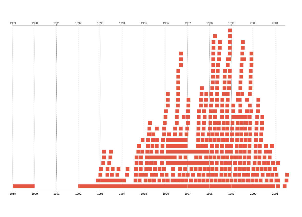
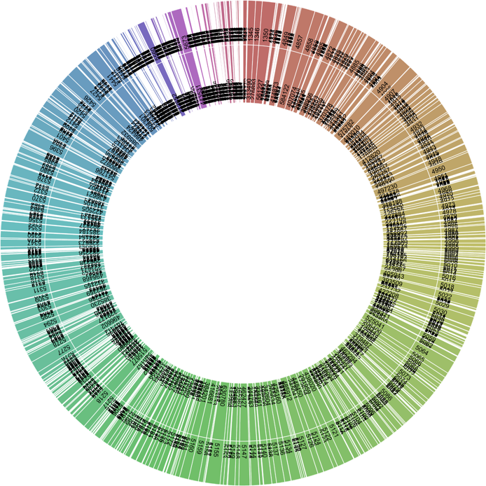
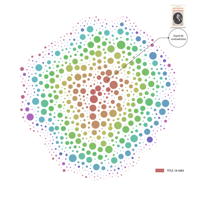
CFRP Genre Timeline
Assignment 1 and 2: CFRP
The tool we’d build would be an interactive timeline with each show encapsulated inside a bubble color-coded by the genre of the show, the size of the bubble proportional to the number of tickets sold. Users can hover their cursor over the timeline to get exact ticket numbers, the name of the performance, and other details.
It would look something like this:

**Audience and Research Questions Addressed** This tool would be useful for historians studying what genres the french public were most interested in watching across history- this could reflect the mood of the public, for instance growing unrest may be reflected by a run of popular tragedies.
Implementation
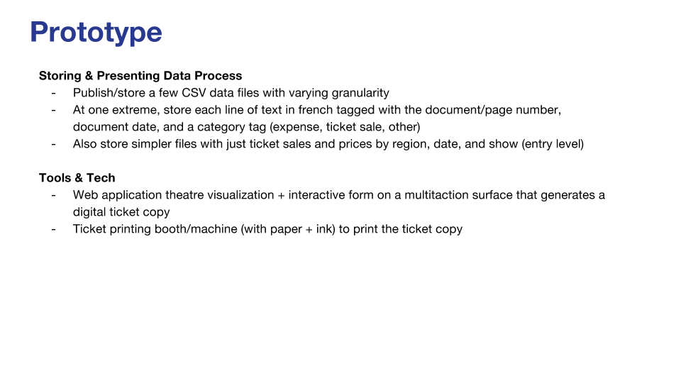
**Data Extraction** To go from facsimile to data, we would use computer vision algorithms to process the images and extract text, then use a translation tool like Google Translate to convert the text to English. These automated methods are cheap, fast and scalable - nowadays many readily available libraries exist to detect writing in images and parse it to text (for example https://www.mathworks.com/help/vision/examples/automatically-detect-and-recognize-text-in-natural-images.html). The facsimiles contain quite simple language- mostly nouns and numbers- without any complex grammar, so it should be straightforward to translate. However, using machine vision may not be quite as accurate and reliable as typing up the pages by eye. There is such a large quantity of facsimiles that it would not be practical to do this, so computer vision is nevertheless the best method to use for this task.
**Data Storage and Presentation** We can extract the names of the performances, the number of tickets sold, and the annual income generated by the shows from JSON files. We can write a software program that directly take these pieces of info as input. This program would process the data and output an organized version of the data. Using this data, we organize the info onto a timeline in a html template and display the timeline on a webapp. Lastly, we can deploy the webapp into the Cloud.
-
Assignment 3
Hidden stories
In this exercise, I chose to use Time Mapper as the tool to visualize 4th briefing data. In this timeline, there are a lot of interactions between US and Iran which are also represented in density. Although the web is clear and beautiful, I still want to add different colors to differentiate the two players. Also, one thing I found interesting is that countries other than the two actors have shown their attitudes and generated their own stories during the same process. If we can connect the nuclear tests in North Korea in 2006 and today, then would the same story happened in Iran replay?
-
Assignment 3: US-Iran Relations Display
I used Microsoft’s timeline storyteller tool to look at the 3rd Briefing Book.
Drucker emphasized in her article that most visualizations oversimplify ambiguous concepts. Given that this dataset represented a contentious topic, I was worried about doing anything that might project a false sense of objectivity, which is one of the reasons why I tried keeping things simple. I also wanted to create something that gave a sense of the volume of events that were occurring simultaneously, which I thought that this format did well. However, if I was more proficient with this tool, I would have liked to have sorted the events by type and source.
-
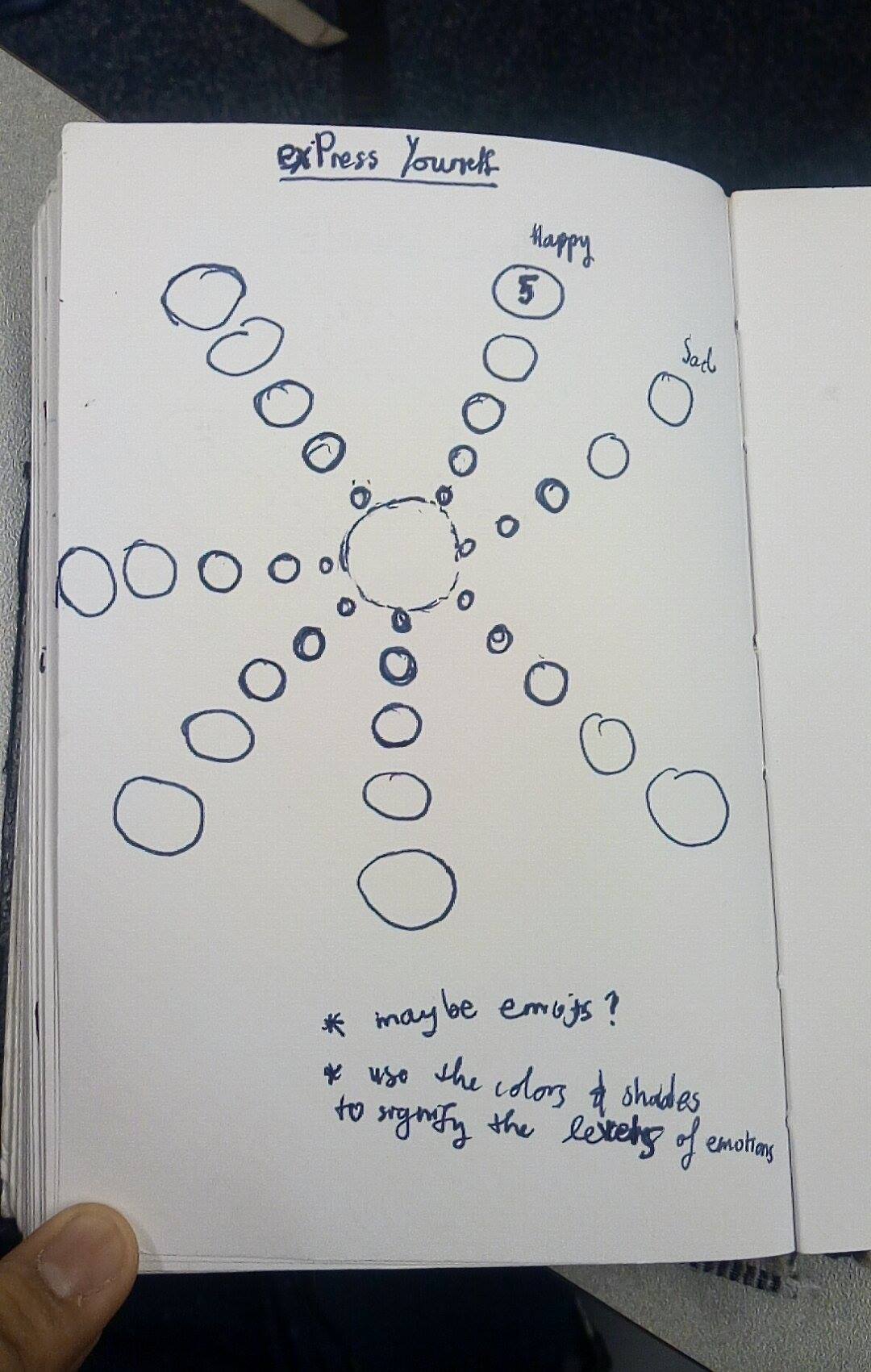
Project Pitch: Mood Mural
Assignment 3 part 3
Idea:
An interactive visualization of the emotions of people around campus.
Delivery Platform
It would probably be a web-app so it could be accessed from any laptop or mobile phone, but it would ideally also exist on physical touch-screens - maybe one on the infinite, and/or one in the MIT Mental Health and Counselling hallway.
Passers by would be able to input how they feel in less than a minute with a simple intuitive interface (maybe using sliders between opposite emotions such as tired<—->energetic, or with emotions inside bubbles which can be expanded based on the strength of the feeling) and even tag reasons for their emotions (e.g. problem sets, exams, friends, projects, music) then get to see how their mood fits into a visualization of all the other mood data from that day.
Features:
Display mood data on different time scales (past day, past week, past month etc), display mood by location - overlaid on a map of campus (this would work well if many people access the web app without using the mural), use clustering algorithms to categorize moods
Basic question (what are you trying to solve)
Feeling connected across the MIT community, tracking mood over time, mindful reflection.
Audience
MIT community
Data
Collected from the audience.
-
Assignment 3 - Temporal Display
Assignment 3
Assignment 3 - Iran & US Timeline
When surveying the multitude of events in the given data files describing US-Iran relations, we decided to hone in on curating a basic timeline of events focusing in on the proliferation of Iran’s nuclear program, the U.S. Administration’s reaction, and related international events. We selected to highlight the years between George W. Bush’s presidency and the election of Barack Obama. Using timeline.js, we compiled compelling photos to match the desired data points and created an interactive timeline for about 25 prevalent events that could be used in educational settings.
- Michelle G. + Calvin Z.
-
CFRP Sliding Timeline
Check out our demo here!
We decided to approach our idea by building a web application that would take data we received from the API and display a slider that would show average ticket sales for that year and various other facts, such as the most shown play of the year.
One of the main implementation decisions we had to make was how we display time across the 113 years. When we originally thought of our idea, we thought we would show data for every day on our timeline. Once we actually started implementing our idea, we realized that it would be unefficient to scroll through 133x365 days of data. We then decided to aggreate the data and show averages by the year, as that was much more feasible.
We didn’t end up having the time to implement this idea, but originally we also wanted to heat map the slider, so it would have changed color based the percentage of tickets sold that year as compared to the max # of tickets sold. We thought this would provide more information and tell a much more visual story.
-
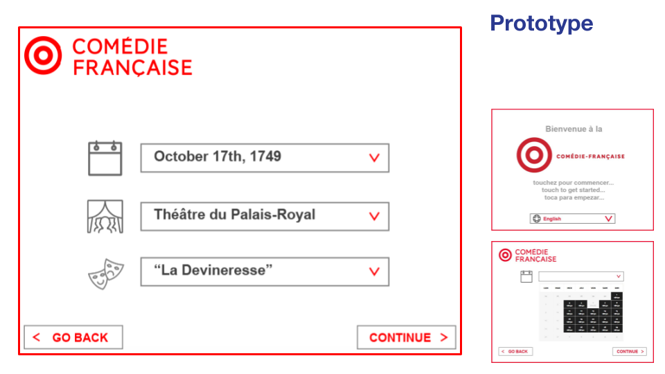
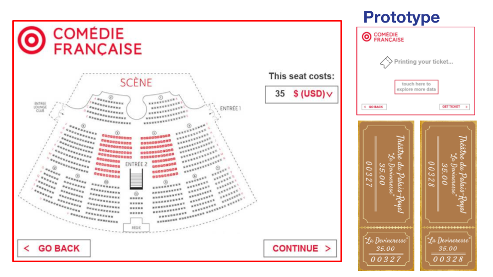
Facsimile Ticketmaster Updates
When going through the CFRP data, we were fortunate to find that it almost supported our envisioned product. The only problem: there weren’t exact numbers of tickets sold–only associated revenues by section.
Since displaying a “ticketmaster-like” scene was important to us, we found that we could fairly accurately estimate the ticket sales by finding nearby maximum revenues, and associating them with “full section” statuses, and then figuring out the fraction of seats sold (and therefore remaining as well). This allowed us to complete our product exactly the same, using the following API requests:
- Select a Language -> Built in (No API Request)
- Select a Date -> Display dates from 1680 onward (No API Request)
- Display Shows on Date (request to http://api.cfregisters.org/play_ticket_sales?&date=eq.{date} http://api.cfregisters.org/play_ticket_sales?&date=eq.1776-07-04 for 1776-07-04, for instance) and aggregate by “title” field.
- Select a Show
- Display tickets for that show (request to http://api.cfregisters.org/play_ticket_sales?&date=eq.{date}&title=eq.{title} http://api.cfregisters.org/play_ticket_sales?&date=eq.1776-07-04&title=eq.M%C3%A9lanide for showings of Mélanide for example) on ticketmaster chart
- Select a Ticket, and print it
We recorded our prototype here:
For more information on how the story came together, see our previous post on Facsimile Ticketmaster!
-
Comédie-Française
Comédie-Française Exhibition Proposal
We plan to extract ticket sales by ticket type for each individual recorded year. First, we would work with an expert to translate the French content of the documents to English. If expert time is unavailable, we plan to crowdsource the translation of the French content. An expert would be preferable, because the documents are written in an anarchic version of the French language; we could encounter translation discrepancies in consulting with modern French speakers. Once translated, we plan to summarize ticket sales and attendance data by ticket/class tier purchased, for each given year, and present these data alongside the original documents, as well as supplementary historical representations.
We aim to present the data included in the facsimile as a cultural and historic exhibition. Specifically, we consider pricing information as a means of representing the economic composition of the Comédie-Française’s attending populace. Beyond the immediate use value of representing the price and popularity of cultural activities, we recognize that economic data is representative of class structure. Thematically, artists and historians have explored class, its constructions and its manifestations in a variety of ways. We plan to pair our representation of the cultural data with a timeline of related historical events, curating something of a commentary on this particular theme. We plan to include events through the temporal availability of the original documents, in addition to architectural sketches and blueprints of the theater and similar cultural institutions.
We anticipate that our exhibition will be of interest to cultural scholars and historians who might appreciate the opportunity to review cultural attendance by class, over time with this particular theatrical institution. We also anticipate that our exhibition would be of interest to the general public, as a presentation of objects of cultural interest alongside information from this particular period of French history. We imagine that members of the public might take an interest in the kinds of visitors such theaters hosted prior to the French Revolution, and the relationship between cultural institutions and historical events. Our exhibition and presentation of the ticket sales data would seek to address the following questions:
- How did theater attendance change over time?
- What types of individuals attended cultural events hosted by Comédie-Française? How does the composition compare with the composition of French society at the time?
- What is the relationship between theater attendance, cultural activities, and socio-political events leading up to the French Revolution? Can any parallels be drawn?
- What is the relationship between attendance of cultural activities and economic changes?
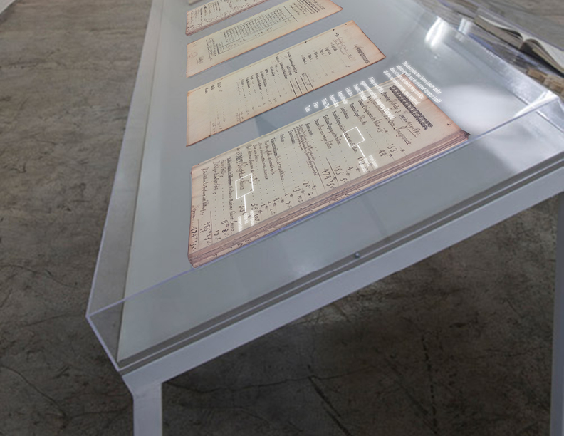
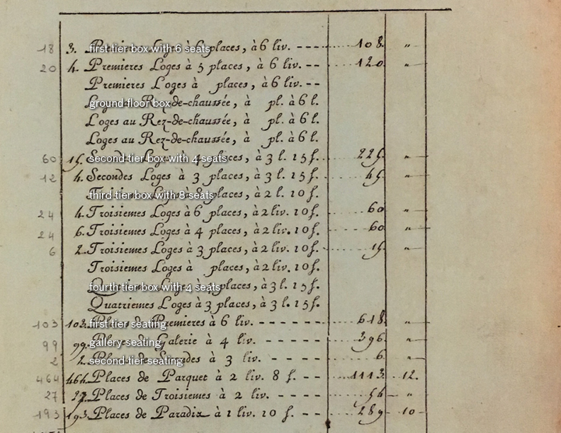 Translation overlay example
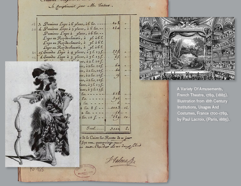 Additional information about the performance
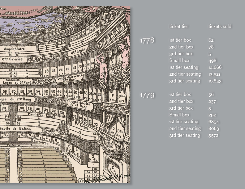 Timeline and cross-cut diagram
View PDF
-
CFRP Prototype Data Visualization
We found it tricky to work with the data due to the way it was organized in the database. However, we adapted it to our idea and convey the information in a way that would be useful to researchers.
Ideally, the data would be stored per year, so that a query to display data for a span of years (i.e. 1650-1750) would update the chart in real time. Currently, the data is not organized this way on the API, so updates to the graph take a couple seconds to compute. This is because the javascript on the web page needs to query the API for all of the data on performances for that timespan, then go through each one while keeping a running total of the revenue per year.
The graph shows a line graph over a time span (in years). The user can change which time interval they would like to be displayed. Currently, there is no option to add additional data, as this would require either an adjustment to the y-axis scale, or an entirely different y-axis scale. In the future, this web page could scrape the API to compute other types of data from the CFRP database, or allow the user to input their own data for a desired time period.
http://web.mit.edu/pwgreene/www/CMS-633/CFRP_prototype.html
We then played around with a couple of additional visualization techniques. We maintained the concept of a timeline, creating a web application that tracked total revenues over time and including informational bubbles with the specifics of each point. See below for examples:
-
Working with CFRP data
Last time we said we would like to integrate data visulization with spatial representation to make the data visualization process more playful for either scholars or general public. We continued and further developed this idea using csv data.
Since neither of us knows anything about API or javascript, we relied on a graphical scripting software called Rhino+Grasshopper plus Excel to extract and visualize data.We firstly sorted the data according to seat tiers and date in Excel, then imported the sorted data into Grasshopper to calculate the revenue of the tickets for each type of the seat.
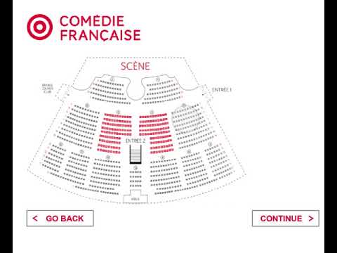
By clicking into each type of seat, user will be directed into the next page where they can have a virtual view of the stage space from the perspective of the selected seating type. The revenue of the given type of seat will be exhibited along the visualize the data.
After associating the data with geometries in Grasshopper, the graphic was then )exported into Illustrator for post editing.
[Presentation of the Assignment](Presentation of the Assignment
Enter text in Markdown. Use the toolbar above, or click the ? button for formatting help.
-
Facsimile Ticketmaster
When observing the four different families of register pages, our group decided to focus on creating meaningful data visualizations for both travelers passing by the Comédie-Française in person or perusing its site. Since the Comédie-Française is one of the oldest actively running theatres in the world, we assumed that its audiences will be fascinated in learning about the historical data extracted from the facsimiles in a relevant context, and we wanted to make it accessible to them.
While it is compelling to view the facsimile information in its original form, it’s not necessarily meaningful to the viewer if they do not speak French nor use French currency. Travelers from across the globe are visiting the Comédie-Française to learn about it, so we believe that the best way of presenting this data is to translate it so that each individual can understand what they’re looking at. We’re aiming to contextualize these facsimiles by allowing users to browse a Historic Ticketmaster and customize a visualization output in the form of a ticket souvenir.
Our prototype sketches showcase a large multitaction screen which would stand outside the Comédie-Française or in a niche within its auditorium. We’d create a web application for this screen that presents visitors with an interactive Historical Ticketmaster form which allows them to customize their own ticket, which can be printed in a tangible form via a printing machine. We can use the information for data we have on the dates, number of tickets purchased per show, and productions to create this, as well as combine this with already existing data of the Comédie-Française.