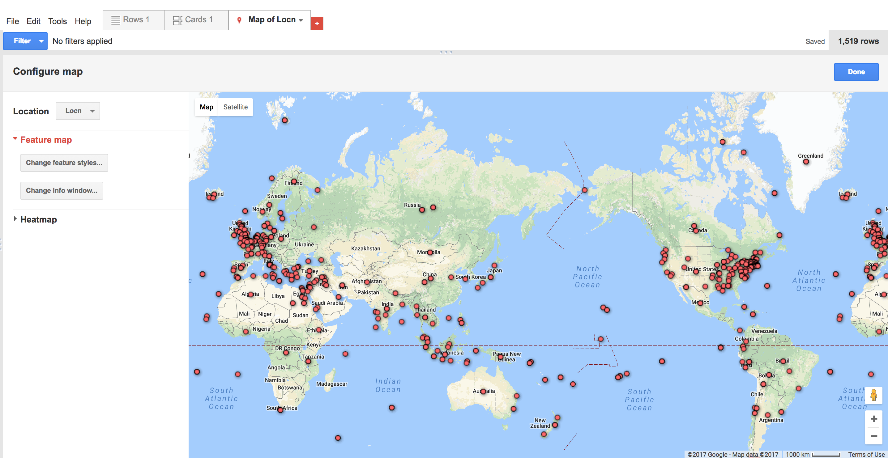
Mapping Space
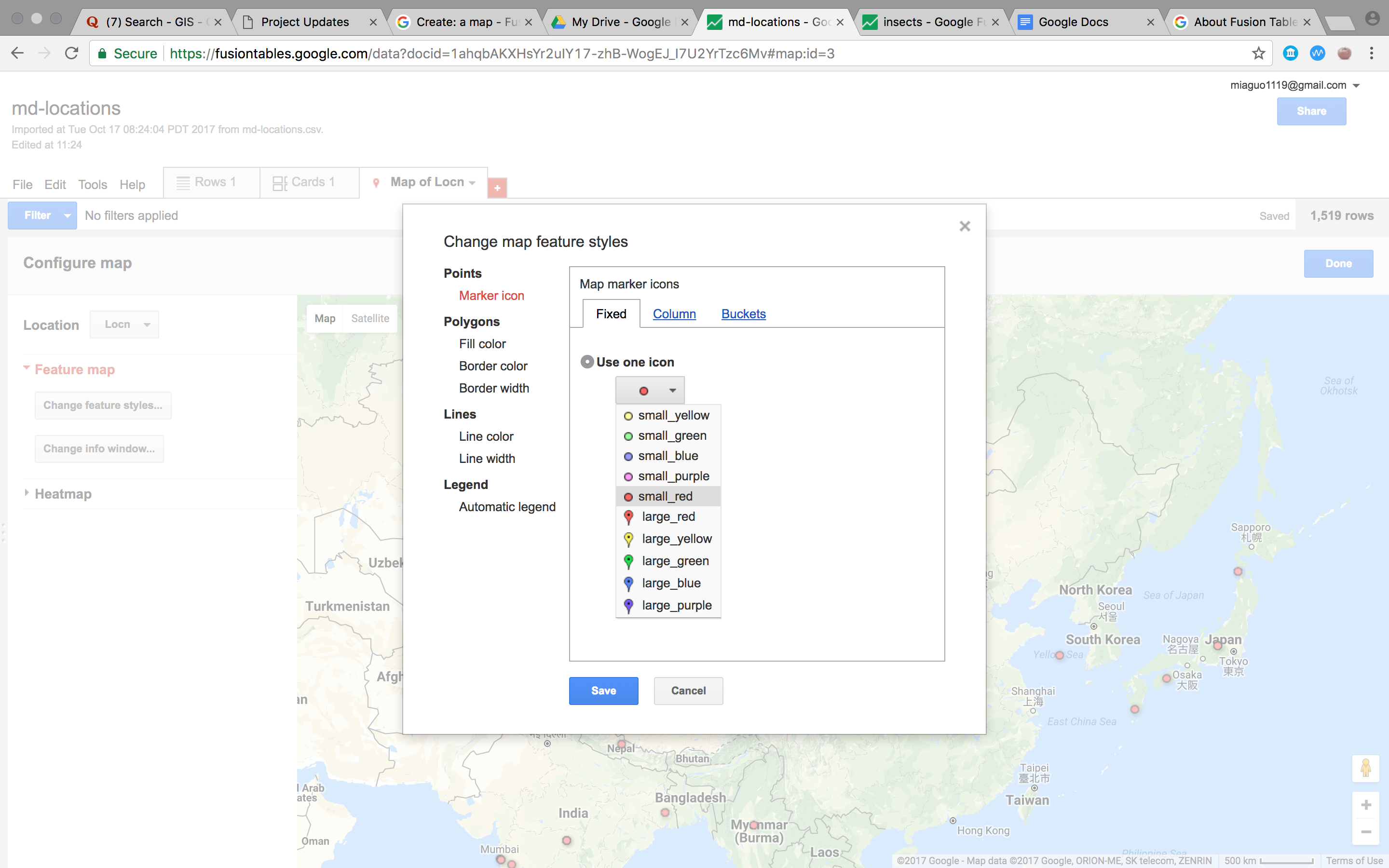
For this exercise, I used google fusion tables as a tool and Moby Dick data as a data source. After the map is formed( which somhow took quite a few minutes), I found that users can further design the map by changing feature styles and information windows. Heatmap is also provided to better illustrate the information. Google also allows users to share the generated link for customized fusion tables with others.
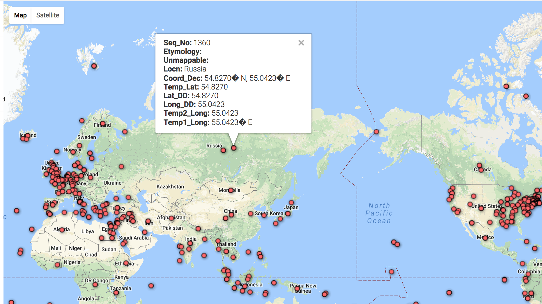
But when I clicked into the marker icon, the information could not be shown in correct format due to the incompatible format when the data was imported.
The data visualization web application like Google Fusion Tables enables users without any programming skills easily to visualize and map out data. But it is highly dependent on what information is inputed. It also has limited options for users to interact with the data or add more layers to the map. For me, it is more of a tool to display one’s collected data rather than a tool which can function as a basis for further relavant research.