Google Fusion Tables
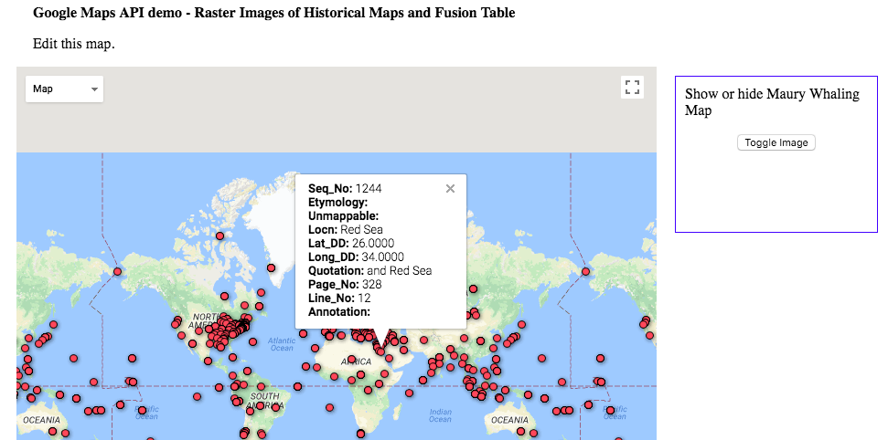
Using the google fusion tables prototype was an interesting experience - the tool itself is obviously a powerful way to visualize location based data. As a prototype, it was not a very intuitive tool in its UI, especially in regards to setting up the map visualization and understanding exactly the order of operations for properly filtering information. It really was cool to see how fast the app could synthesize so much data - the geocoding went faster than I expected. Also, I tried to customize the visual aspects of the cards but saw no option to do that, which I think would be a great addition to this tool if it were to be further developed. As Calvin mentioned, this tool would be really helpful for our own visualization project, especially because it’s capabile of showcasing two different data sets.