Using Google Fusion Tables
Thoughts on Google Fusion Tables
Google fusion tables seemed like a useful tool, and I am curious about why they were never taken out of beta.
Feature Map
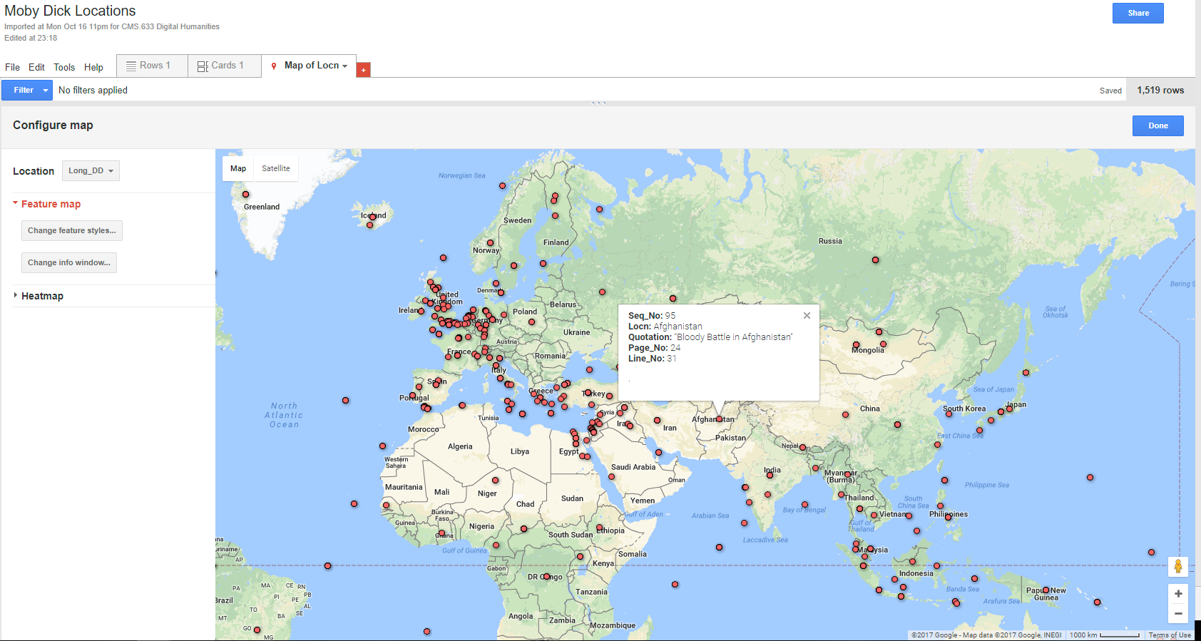 I thought this was a simple and easy to interpret map, though there were issues when too many points were close together, in which many overlaps happened and it was difficult to tell how many points were in one place.
Heat Map
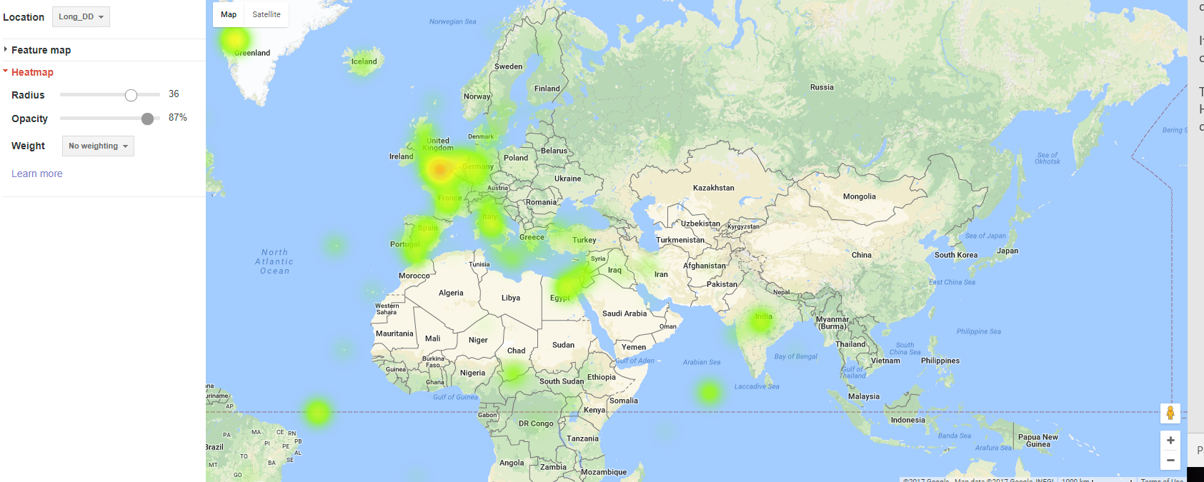 This issue could be addressed with the heat map, although it requires some experimentation to determine the best radius. With a small radius, it just looks like a blurred verison of the feature map, but when the radius is too large it becomes difficult to pinpoint very dense parts of the map because the density becomes overly diffuse.
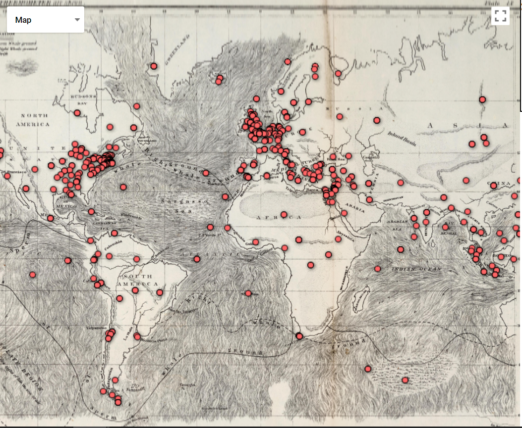
Composite Map
 Getting the code to work for this was not straightforward, given my lack of web programming knowledge. The function was not complex; it probably reflects the fact that Google fusion tables were never finished and taken out of beta that it was not made more user friendly.
Being able to overlay other images on top of the map was an interesting feature, however there were some issues when zooming in and scrolling - this sometimes caused the image to disappear.
Getting the code to work for this was not straightforward, given my lack of web programming knowledge. The function was not complex; it probably reflects the fact that Google fusion tables were never finished and taken out of beta that it was not made more user friendly.
Being able to overlay other images on top of the map was an interesting feature, however there were some issues when zooming in and scrolling - this sometimes caused the image to disappear.
Enter text in Markdown. Use the toolbar above, or click the ? button for formatting help.