Exercise of Google Fusion Tables
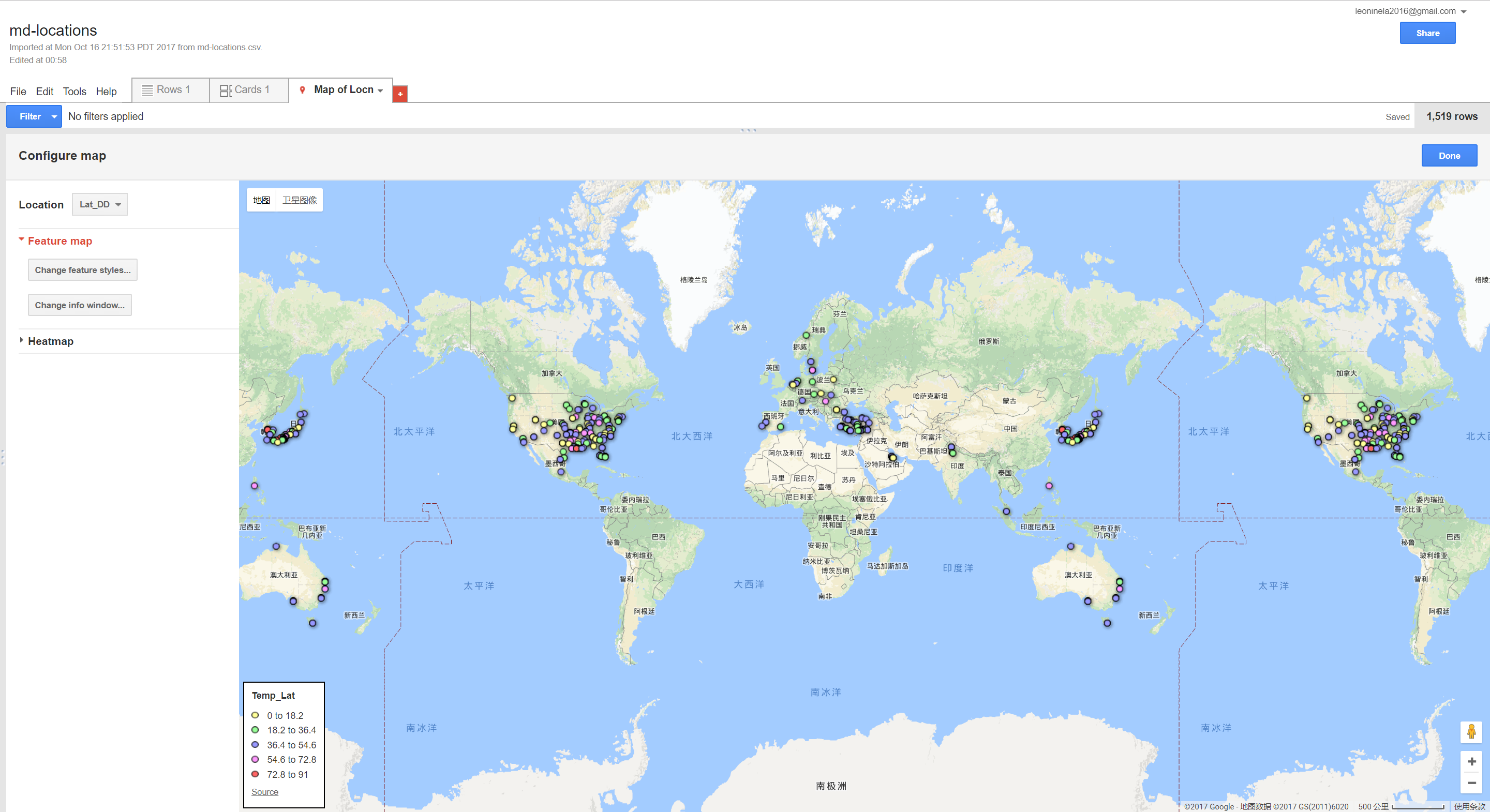
When implementing the exercise, I found this tool really fun and handy to use, as long as you gather the proper information in the excel table, you can visualize the geographic related data easily. What I’ve found more interesting is that after the raw data is imported, the user can further categorize the data into buckets with certain purposes, legends can also be generated automatically[Fig.1]. This provides opportunities for further intepretation of the data.
 Also, the popups can also be customized which gives the user more flexiblity editing the data.
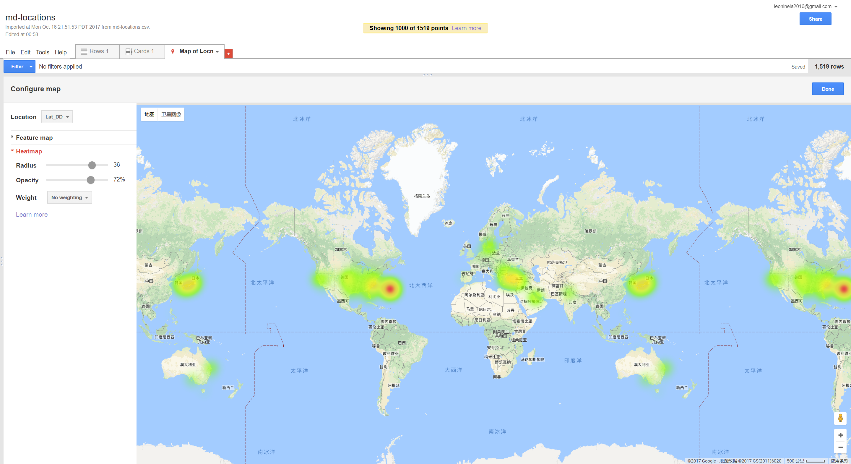
I also find the heat map a good feature for this tool to show which location are most heavily illustrated in the book[Fig.2].
Also, the popups can also be customized which gives the user more flexiblity editing the data.
I also find the heat map a good feature for this tool to show which location are most heavily illustrated in the book[Fig.2].
However, this tool is currently incapable of adding other geometric elements such as lines, polygons etc.,would be cooler if these features could be implemented to show a certain path, connections or relations.
Enter text in Markdown. Use the toolbar above, or click the ? button for formatting help.