Moby Dick Data
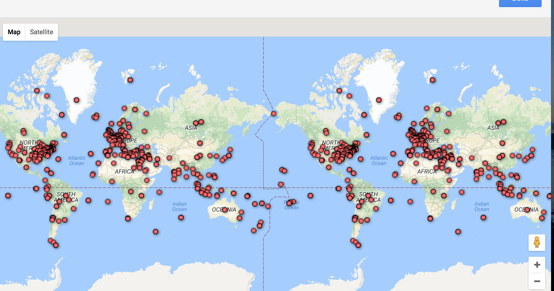
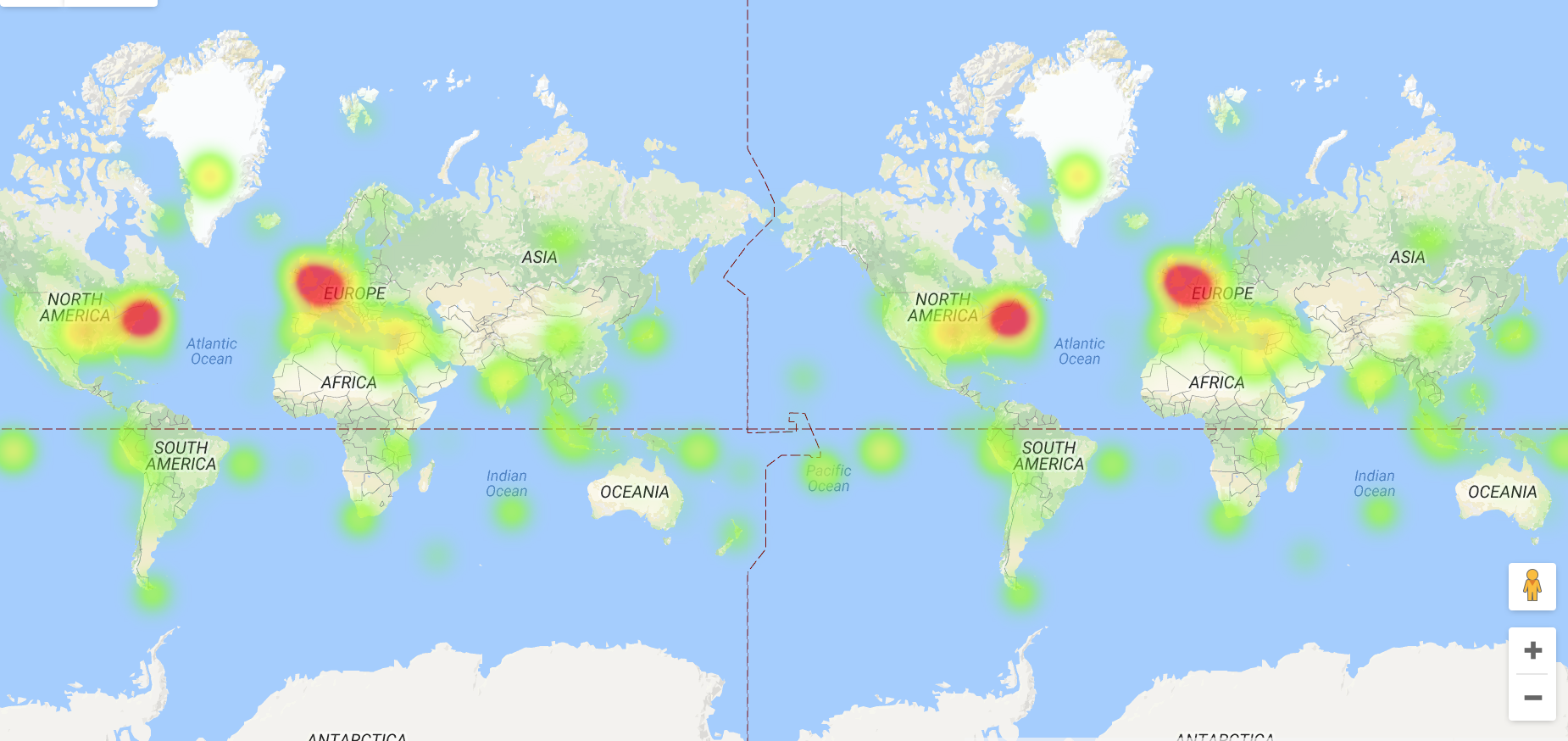
Plotting on the google fusion tool was an efficent way to proces the bulk of information and represnt it visually. I worked a little with the filters, and tried the heat map setting, it was interesting to see how dispersed the data is when plotting individual points and how this varies with the heat map.