CFRP Prototype Data Visualization
We found it tricky to work with the data due to the way it was organized in the database. However, we adapted it to our idea and convey the information in a way that would be useful to researchers.
Ideally, the data would be stored per year, so that a query to display data for a span of years (i.e. 1650-1750) would update the chart in real time. Currently, the data is not organized this way on the API, so updates to the graph take a couple seconds to compute. This is because the javascript on the web page needs to query the API for all of the data on performances for that timespan, then go through each one while keeping a running total of the revenue per year.
The graph shows a line graph over a time span (in years). The user can change which time interval they would like to be displayed. Currently, there is no option to add additional data, as this would require either an adjustment to the y-axis scale, or an entirely different y-axis scale. In the future, this web page could scrape the API to compute other types of data from the CFRP database, or allow the user to input their own data for a desired time period.
http://web.mit.edu/pwgreene/www/CMS-633/CFRP_prototype.html
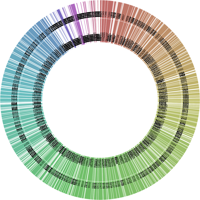
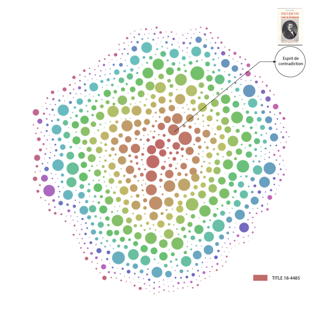
We then played around with a couple of additional visualization techniques. We maintained the concept of a timeline, creating a web application that tracked total revenues over time and including informational bubbles with the specifics of each point. See below for examples: