US-Iran Relations Temporal Display
For this assignment, I experimented with forming two different visualizations using d3.js.
Visualization #1 Visualization #2
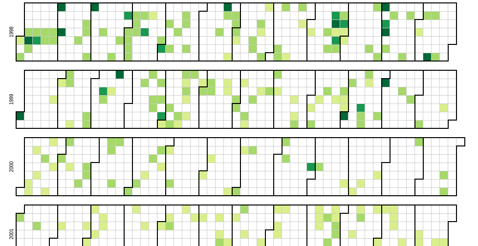
For the first one, I focused on something that could be used as a high level understanding of the US-Iran relations over time. The outcome was this heatmap visualization. It relies on dataset 1 & 3, and provides a visual comprehension of the timeline/density of events in the relationship of the US & Iran. A further expansion I would take is allowing users to hover over a date and see the headlines of that date.
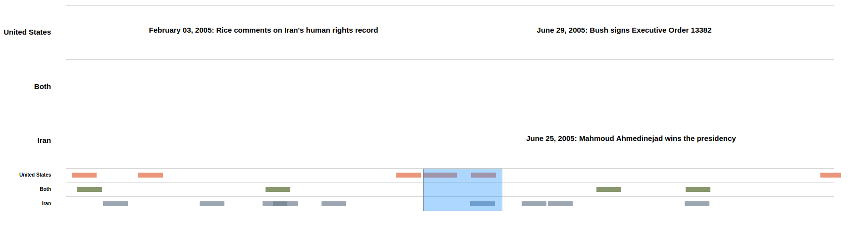
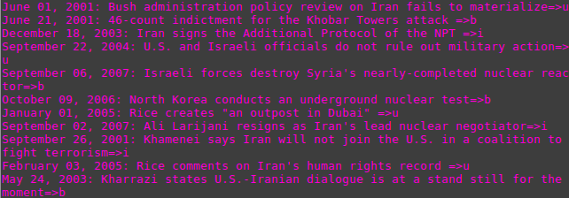
For the second visualization, I focused on something that provided a more low-level detail of relations over time. I also wanted to stress the idea that many events had contesting events that occured at the same time. The outcome was this zoomable timeline that allows for stratification of events. I decided to seperate events by US valued, Iran valued, and events valued/affecting both parties. To stratify the data, I wrote a script that would allow me to read each headline individually and categorize them as US, Iran, or both.
This is the visualization: