Commentary
-
Reading Commentary
In Temporality and the Multimedia Archive, Wolfgang Ernst
In In Temporality and the Multimedia Archive, I appreciated Ernst’s thoughtful take on media archaeology – the field of function and poetry through digital archiving. I also believe that the form of a digital archive greatly informs the content showcased. He also discusses the dynamic nature of these spaces, an active archive rather than a static one. Archives these days are can also be increasingly banal, and provides a larger overview of a person or era, rather than an interest in every separate artifact. More than data back-ups or clones of existing sources, they are authored by the archivist, who should consider a variety of user experience types. While his content is interesting, his writing style is not very accessible and could be simplified to push forward his claims.
-
Memory and the Archive
The three chapters in “Digital Memory and the Archive” by Wolfgang Ernst brought out some very interesting ideas, even though I’m not familiar with some specific words. But the whole idea is that Archive has become a new dynamic method in digital media Vs. traditional archive. And in dealing with art, music and video, the digital archive need to focus on the aesthetics inherent. And also the author argued about the temporarity of storage memory in modern technology. The computer as archive part reminds me of the transformation of modern computers. Different from the concept the author addressed here, I found it more interesting to see how can people archive the experience of using different computers in different stages. When I studied the game design class, the professor chronological showed us different games and the computers which represented that age. Computer as significantly artificial product is also worthy of being documented and represented.
-
Assignment 10: Digital Memory and the Archive
Assignment 10
#Temporality and the Multimedia Archive According to Ernest, temporal ontology offers a way to understand how all computer-based, calculational media are temporal or wordly, and this forces us to rethink the spatial emphasis of older regimes of memory. He also emphasized the temporality to the multimedial archive. If computer-based, calculational media is more worldly than the older version of media, then it should be more prevalent, multicultural, and more inclusive. The multimedial archive is wordly in the sense that many people can access this storage and its vast amount of knowledge for free (or almost for free). However, I wonder if that is true. Those in charge in the technology and possess the mathematical knowledge definitely have more influence in the platform of multimedia and its archive. Their influence is subtle and often not visible to the layman.
#Underway to Dual System It deals with the archiving of media artistic work but opens up to a wider ontological question of what the media are in the age of technical media. The author discussed the answer to the question by paraphrasing George David Birkhoff’s speech which emphasized that “aesthetics is, quite simply, about a “ratio of order and complexity”. This definition of aesthetics is very specific to archiving science-based art since it is technical and mathematical. This idea also raises the question about how to quantifies order and complexity and whether there are multiple standards for such measurements. Overall, Earnest raised questions about the practicalities of archiving science-based art and the ontology of media.
#Archives in Transition Ernest’s idea is that the archival order gives way to archival dynamics and the control structures specific to that. He also raised the question : does the archive become metaphorical in multimedia space? This question is not about the understanding of archive but also about the whole range of media that is related to visual culture and interface studies. Basically, if we fail to address the time-critical, technomathematical modulation of what comes out as the almost like metaphoric surface effect, we fail to understand where power lies in contemporary culture. To parse Ernest’s confusing expression, I have to reread multiple times. So archival order is the result of time-critical, technomathematical modulation. If we understand this order, then we can understand the dynamics and control structures that involve a whole range of media, visual culture and interface studies. This idea is reasonable for mordern archives since they are more likely to be time-critical and technomathematical than conventional archives.
-
Digital Memory & The Archive
In Temporality and the Multimedia Archive, Ernst’s arguments and contemplations in Underway to the Dual System and Archives in Transition are introduced. It seems that both will discuss archiving of new digital media and the dynamics that stem from the inherent differences in digital vs. analog artistic works. In Underway to the Dual System, I thought an interesting argument being made was the idea that an archive was on longer defined by it’s content but rather it’s connections and how the content is linked. I think this idea doesn’t necessarily work completely when you think about the ephemerality of web-based media and the whole purpose of Internet archives that we discussed this week. Later in the chapter, they go to refer to the Internet as a “transarchive” and I believe this distinction allows their previous argument to breath. I thought the sentence “what makes the difference between a memory and an archive is an organized archive barrier” was very interesting. It was really interesting reading Archives in Transition in a time where we’ve had high speed internet and streaming media for enough time that it’s ingrained in our society. While reading this section, I had to take a step back and recall a time when transmission media was non-existent or a novelty.
-
Digital Memory and the Archive
Wolfgang Ernst’s essays on Digital Archiving is an interesting look at technology and media archaeology, and combines a lot of poetics about the physicalities and functionalities of digital archiving with analyses of temporality and archives.
The introduction of time into archiving, and how that adds a new dimension to the world is interesting. Most notably, the idea of Wikipedia being an archive that is permanently dynamically rewritten, instead of having a permanent read-only, is an important distinction. The idea of the archive, then, can be considered differently (and Ernst even considers everyone’s computer a kind of archive), and we can look towards these media objects to understand, in the same way that we use archives now.
My main concern with Ernst’s essays, is that there seems to be a lot of terminology and figuring out the ontologies of these digital archives. While there are cool and interesting comparisons that relate the physical functions and hardware to its semiotics, I had a hard time piecing together the arguments, for example, the movement from “emphatic cultural memory” to “intermediate media memories.”
-
Digital Memory and the Archive - Kelly
The reading illustrates different ways in which the establishment of digital archives is not only about translating and transferring existing material into digital form and constructing a digital framework and interface, but instead allows as well as necessitates rethinking of archiving. How new technologies have, and will, affect and shape the ways in which we conceptualize and treat memories is also alluded to.
The digital world, with its binary units, intrinsic linkages, and transitive nature, is undoubtedly very different from traditional means of storing and archiving information. These differences offer new advantages and perspectives, but also introduces new issues to solve and deliberate on. The transitive nature of digital information and communication is especially inconsistent with the very notion of archives, as previously and perhaps presently still established. While it felt logical to assume that digital archives are more durable or reliable than the physical, after last week and this week’s readings, this idea has definitely been well challenged.
-
Digital Memory and the Archive Commentary
Ernst’s writing, or its translation at least, seems to focus more on aesthetics than on practicality. All three essays share complex terminology and a generally confusing structure. Like others, I found the text to be a slow read because of this.
The essays focus on the structure of digital archives as opposed to the material contained within. By considering the nature of the digital archive, Ernst takes an interesting approach to studying new media. He emphasizes the dynamic nature of digital archives, and argues that they constitute new “cybernetic beings.” While archives can take on many different forms, especially in the digital age, I wonder if this is an extreme view to take.
However, I do agree that modern day archives are both less static than those in the past and subject to mathematical principles. Because of this (and general curiosity) the notion of aesthetics as a “ratio between order and complexity” was striking. The archive as new art idea is one that could be extended to include multiple technological systems.
-
Digital Memory and the Archive AD
Thoughts
It is suggested that digital archiving must be done on demand, essentially such that it “archives itself”. The internet is described a new, dynamic type of archive: a “transarchive”. Analog storage media is praised for having a higher quality and shelf life compared to digital. I thought it was interesting that it was suggested that some information or art might be transient and “instantaneous” in nature and thus shouldn’t be archived. Archives in Transition explores how the aesthetics of storage are changing radically with digitization.
-
digital archive
In this article, Wolfgang takes Europeana as an example to illustrate on how new archives respond to current needs rather than just being a read-only memory or Data backups, which responds to their behavior. For now, what we try to do is to archive the traditional art. While new media art nowadays also gives more attention on interaction between audience and the artwork. I wonder what would happen several decades later when we begin to archive new media art which itself could already be interactive with users. Take team lab as an example, most of Its artworks change based on the presence or behavior of viewers. When we archive them, how can we use an interactive way to capture the enhancement of this exaggerated user-experience? Maybe at that time, the filters on a digital archive’s website are not only limited to color, sound, text..but also the amount of participating users at that time, users’ age distribution, average time they spent interacting with this artifact etc.
A concept from Team Lab https://www.teamlab.art/concept/Relationships/
-
Assignment 10
Ernst discussed different ways of digitally archiving information and the rise of mathematics in aiding this process. One method he discusses is “on-demand” and while I agree with him that it’s useful for archiving what is most needed first, that may result in the loss of “hidden treasures” or valuable material that isn’t very well known and therefore isn’t “on-demand.” This method may also bias archiving towards the will of those who have most control and not an actual archive or representation of information. I also thought Ernst’s discussion of whether the value of archives lies in the actual information being preserved or the media through which they are preserved was interesting. I think that information is the most valuable currency in this case but some level of preservation of the actual media is also important to preserve the emotions associated with the information
-
Assignment 10 - Digital Memory and the Archive
Wolfgang Ernst discusses and classifies potential means of technological archiving of different types of media, from art to video. Although his writing is quite confusing and could make use of more examples to support his claims, he does bring up some intriguing points that highlight the defining nature of an archive, and delves into key elements such as permanency, power/usefulness, materiality, formatting, etc.
To me, an archive is one that needs to be permanent; the rules of storage and classification are defined and then the content is modeled after those rules. Accessing the Internet as an archive, for example, changes often due to the changing rules for extraction and classification since search engines constantly update their algorithmic criteria; for this reason, the Internet does not encapsulate the identity of an archive (to me). Additionally, to answer the question of the power of archives lying in their security of materiality or storing information, I believe that a great archive does both. One has to be sure of the material authenticity when accessing an archive, and one should easily be able to access that information or else it’s not a very helpful archive.
As a side note - in the beginning of the chapter Underway to the Dual System, Ernst mentions a type of archive that takes shape cumulatively as a shift to a generative, participative form of archival reading; this reminded of the memex due to the focus on contextually shaping the archival narrative.
-
Digital Memory and the Archive by Wolfgang Ernst
Honestly speaking, there are many terminologies in the given excerpts that I’m not at all familiar with, like “media archaeology”,”media art”,”microarchives” etc, there is an absence of context in my mental library which renders the text confusing to me.In this three exerpts, I didn’t see direct description about how classical archivists work with archive(maybe this is discussed in other parts of the book), and this gives me the impression of disregarding the work being done by classically trained archivists in the fields of media preservation and web archiving. Also, Wolfgang heavily focuses on the ontological and epistemological level,which shows a bit indifference toward applied disciplines highly relevant to media and archives and an unwillingness to re-contextualize his media-driven analyses into more human contexts. Yet, I can still get a general idea of the excerpts that the digitization of archive is minimizing the spatial and and temporal scale of the archiving into differential level, making the inherent storage function of archive more and more transient, storage is nothing but a limit value of transfer, the traditional separation between transmission media and storage media becomes obsolete.
Enter text in Markdown. Use the toolbar above, or click the ? button for formatting help.
-
Digital Memory and the Archive
The excerpted parts of Wolfgang Ernst’s book provided a perspective on archive that greatly focused on technology rather than archiving itself. I found his writing rather confusing, and I struggled to see where he was going with his distinctions between storage, transfer, memory components, etc.
That being said, his perspectives on archival science working its way into other “fields” worked a bit better. In some ways, I wish he had compared some of the instantaneous, “current archive,” and past archive ideas in the works of news and newspapers, since they could provide a bit less technical of an example. “Instantaneous archives” and related new-knowledge are becoming some of the most prevalent forms of information in the forms of social media and interactive media. As such, research into their usefulness (and ways to enable those use cases) are important.
Some Notes (as archive!)
I was a tad confused by the pieces, so I tried to compile some of the points here.
Temporality and the Multimedia Archive starting on page 77;
- Ernst started as classicist
- Brings historian tools to discussion of memory and storage in media cultures
- New vocabulary: read-only vs random access, registers, accumulators, buffers, cycle and access times, latency
- Overall different notions of archive
Underway to the Dual System (pages 81-94);
- Digitization on demand as a model–generate new archives according to current needs
- Participative form of archival reading (generate data together through their queries)
- Dynarchive
- Von Neumann architecture: accessing data during computation
- Digital archives as information theory-informed art
- Erasure as a feature (there or not)
- Instantaneous art: does it need archiving (yes)
- Format-Based Archives: images to images. Media vs. Format
- Archiving Software
- Data storage and display are completely separate–can transform in between
- Emulating past materiality with software (old storage methods)
Archives in Transition (pages 95-101)
- Storing “algorithmic dynamics instead of documentary stills”
- Computer memory closely couples storage and timing
- Empathetic cultural memory: oriented towards eternity
- Intermediary media memories: no longer separated into current and archive. Example of soccer match being posted an hour after game
-
Can We Archive the Internet
Fast Changes
I really liked the discussion of the challenge of how to archive a constantly changing beast. Due to the ever expanding size of the internet, it’s really difficult to view it as discrete states. Instead, we have to “approximate” our archives by taking snapshots at discrete intervals. While this seems to be effective, we may miss out on materials, and it is a brand new issue due to the vastly larger amounts of knowledge that we are putting into recordable forms (this is not a problem–it’s what is going to drive humanity forward together).
Legal Issues
The legal issues surrounding international archives prompted some questions from me. Why are international archives different from book archives? And how do governments expect to regulate reading of public information? Also, how could archives be used as an informational weapon (kind of like the Russian interference in the 2016 elections).
Since the internet is really a first stab at a global collection of knowledge, I am surprised a larger governing body like the UN or something of the sort (maritime court is the only other one that comes to mind) has not made a bigger attempt to record changes to this knowledgebase. It appears that private companies have made the best attempts so far, even though long-lasting archives have historically been managed by governments. This also prompts another question: who is best to trust with this important task?
Side Note
This article was particularly funny to me since I’ve known of Brewster in a social setting through my mom’s friend group from when she was a student here.
-
The Web as History
The Web as History_Using Web Archives to Understand the Past and the Present
This article mainly discusses about how web functions in society and the relationship between web archives and researchers. The most impressive part I found in this article is when articulating whether the web is a single entity or a series of clusters. The author mentions China as an example. I would like to further develop this example.
As known, China is using a great fire wall to ring fence the web. I think one reason for doing so is to promote development of domestic product. For instance, China blocked Google and developed Baidu as a substitute of Google. Although Baidu is limited when searching for some politically sensitive words, it still becomes the most popular searching engine in China. Another example is TaoBao.com which is facilitated to be the largest online shopping website as a result of government blocking e-bay. And for reasons of language, the China online consumer market is seen as daunting for many foreign brand owners, which further assists TaoBao to monopolize the online market.
As a result, 90% of ecommerce in China is done in domestic online marketplaces. This might create false impression that “Chinese citizens are primarily interested in content produced in China”, just as Wu and Taneja point out. But personally, I doubt this comment. In TaoBao’s case, government is deliberately building up a new online market culture in a confined local sphere taking advantage of controlling the access to web and possibilities to reach outside.
For most of Chinses citizens, in most cases, they are limited to only domestic online shopping website. Before they realize it, their life is already taken over by overwhelming advertisement of local sites like TaoBao, Tianmao.com, leaving no space for even questioning where to find other choices. The door to outside is blocked and no one even notice that. But I wonder if they were offered multiple choices, would they still choose what they chose before?
-
The Cobweb - Jill Lenore
It was enlightening for me to read about how high the percentage of disappeared content and “link rot” or “reference rot” is, which is surely troubling in legal and scientific spheres. While Perma.cc seems a promising solution, it will take time and effort to reduce and eventually eliminate the problem.
As universal as the Internet Archive seems and is, with its comprehensive collection, generally open access, and relatively high usage, I was quite disappointed to read that it does not completely archive or preserve a webpage, (the 2012 presidential campaign ad example) and that the archive is only recorded and sorted by specific URLs. This makes it highly inaccessible despite its openness which is really a shame, as it undoubtedly houses a vast quantity of information potentially useful.
This issue really highlights the role and importance of digital humanities as a field, to develop tools that enable and improve access and usage of digital material. However, it does seem that this endeavor would require much time and effort, starting with “[seeing] what [scholars] tried to do, and why it didn’t work” for example. The process can also be highly challengin because “it’s a chicken-and-egg problem ‘We don’t know what tools to build, because no research has been done, but the research hasn’t been done because we haven’t built any tools’” Nonetheless, accessing and integrating web archives into research is and likely will remain an area of intrigue and worthwhile venture.
-
The Cobweb - Internet as an Archive
The Cobweb. Can the Internet be archived? by Jill Lepore (New Yorker, 2015)
I thought the story opened up with a very frightening but important example of how the internet can be an archive, but not necessarily in it’s standard ephemeral/easily-editable state. Does this mean we archive the entire internet at all times of the day? The only platform I can think of that archives itself is Twitter, with the Library of Congress archiving every tweet. The interesting thing is that this doesn’t stop people from deleting their tweets. My only other reasoning is that they don’t want to deal with the real-time backlash and people replying to and/or retweeting the tweet, but people can still reply to the tweet’s author and send their commentary without the tweet existing. Throughout Lepore’s discussion of how the internet was formed with ease of use in mind rather than preservation. I wonder what the web would look like had preservation had been an important factor in building the infrastructure of the internet. Perma.cc seems very interesting, and will hopefully be a vital digital humanities tool to solving the problem with rotten links in scholarly documents. I also think the Memento project, in it’s ability to link various archives together, helps solve the problem initially stated with various countries and organizations wary of outside parties archiving their digital footprint. However, I wonder how much biases organizations have when archiving their own data. In general, I’m very glad organizations have taken initiative to archive their websites. During my research earlier this semester into AI fairness and ethics policy recommendations in the US government, I would have struggled greatly if there hadn’t been an archive created of various whitehouse.gov pages specifically from the Obama administration, as they no longer exist on the current whitehouse.gov.
-
The Cobweb Commentary
The idea of an online library of all pages that are on the internet is something that comes up quite often in popular culture, though not in the same terms. It’s something that most people seem to believe already exists; most of the time, conversation centers on the privacy issues that naturally come with such a library. Lack of understanding aside, legal issues are something that definitely will come up with the Archive. As noted, it operates under an opt out policy, unlike the LOC’s opt in style. Additionally, the crawlers don’t seem to take copyright into account, which begets an array of legal questions. Examples like the UK Conservative party’s speech clearing makes these archives sound like they could spur the government to make copyright laws catch up with the internet age. I think that these archives will be subject to a number of legal restrictions that make Kahle’s goal of democratizing access to internet archives seems really idealistic.
One of the more interesting speculations that comes up is how the archives could be used for academic study, both now and in the future. There are a number of roadblocks up now and the current archive is more useful for one-off webpage lookups than any structured work. The sheer amount of information out there has two main effects on the usefulness of the archive. Organizing it would be very difficult and could take multiple forms, each with its own limitations. Simultaneously, there would be very real research benefits from having this many unchanging resources at hand. I’m curious to know how Europeana was organized and how widely used it is.
-
The Cobweb: Can the Internet be archived? By Jill Lepore
This article was really eye-opening. I had always thought that whatever goes online, stays online, and that nothing can be truly deleted. And while that may be true of a hard-drive, Lepore highlighted the importance of internet archives by demonstrating that, information can be removed (the all too familiar “link rot”), or even worse, “overwritten” (content drift) which is arguably more dangerous because one can’t tell if he/she are looking at the original or modified page. I think “Memento” is a really interesting response to content drift, allowing the user to see a webpage at different time points by searching internet archives, such as the Wayback Machine, and adding another dimension to the internet. I was really interested in seeing memento in action so I downloaded the extension and looked at the wikipedia page for “Optogenetics” from 2005 and today. 2005
Today
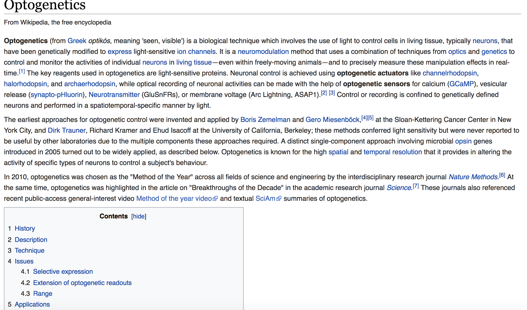
I was amused, but not surprised, to see that the page had gone from a skimpy one paragraph to a multiparagraph page with many subtopics. Overall, I think memento is a really useful tool and I’m surprised more people don’t use it!
-
Ralph and Niels, The Web as History
According to Ralph and Niels, although web as a new form of media embedding gigantic sources of knowledge and information, it remains almost untapped source for research even in the academic realm, researches on how exactly people are engaged with the web and the information it contains has yet not being fully studied. This book aims to make a start in this direction.
In this introduction part of the book, they started with the argument that the web is not a single entity as is commonly perceived in the English speaking culture, it is a series of clusters influenced by linguistic factors and policies of state and sites promoting shared interest such as commerce and personal relations. They also pointed out that the way people store and manage information with web is different from the way in which they keep diaries, photo albums and other collections of mementos.
On the scholar side, they spilled a lot of ink over introduction of the history of digital archive, which is a good knowledge to know but a little bit tedious. There’s one thing upon which they make a good point is that they call for sustainable collaborations to be created to ensure common standards, as well as better tools for researchers because currently the web archives and researcher communities are developing independently.
The authors also brought about possible future topics based on relation of the researchers and the web. One topic I found very interesting is that the shape of the web is constantly evolving, the form of the web will greatly influence the behavior of people in terms of extracting information from it.
Ralph and Niels intention of writing this book is good, but they didn’t give a clear definition of the archive web, is there an autonomous type of websites that could be called archive web or can I say the entire internet is a huge digital archive web because search engines such as google can help you reach almost every piece of archive in stored online and they are much more sophisticated than any other search tools embedded in those websites specific for digital archive.
Enter text in Markdown. Use the toolbar above, or click the ? button for formatting help.
-
Can the Internet be Archived?
Commentary
This article really spoke to me because I had just been thinking about the issue of link rot last weekend, as I wrote a term paper and added citations. The internet is amazing in that I can read one paper and then, for more details, I can google search any paper it cites and pull up a copy to read (unless there is a paywall). I made notes of the URLs at which I had found each paper I referenced so that, if I were to read my own paper again years in the future, I could bring up all of my sources. However as I did this I became worried - how do I know those links will still point to the same documents that they do now? The internet gives people the impression that they can have access to any information at any time, so we get lazy about properly storing hard copies of things. But this is dangerous, because this impression is just an illusion and pages are constantly being deleted and changed. I thought it was interesting that the article brought up how changing a page can be even worse than deleting it- with no version history, you may have no idea that it had actually changed since you last looked at it. I’m very glad to hear about the internet archiving projects that the article describes, but it seems that these projects have a long way to go in terms of usability and searchability. In this age, most of the world is excited of creating new things, “trying to get it to go” as Tim Berners-Lee says, but especially in the era of “fake news” it is high time more people focused on the issue of preserving knowledge.
-
Can the Internet Be Archived? - Commentary
I personally feel that we always think of “The Internet” as this large, monolithic entity that can’t be recorded or archived in any way, and yet, we always say that once something is on the internet, it can’t be deleted. Of course, those two beliefs clearly contradict one another. The essay’s recurring example of the blog post abou the downing of the airplane is a good example of why we need the archiving capabilites and how they can come in handy. But what if nobody had pressed the “archive button” in time? The blog post would have been lost forever, and so there are clearly large differences between publishing on the web and publishing in print. This essay does a good job of pointing out that the internet can in fact be archived, but never immediately and not all at once, so there are limitations.
I never knew that there was an Internet Archive recording almost everything on the public web, and the idea of doing so seems daunting, especially since there just so much information out there. I was fascinated by Kahle’s claim that the internet would weight 26,000 pounds, as that is a much more reasonable to think about than just the abstract idea of “the internet” or “the cloud.”
-
Assignment 8: The Web as History
The Web as History
##This article mainly discusses the role of the web in society and the dynamics between the web archives and the reasearchers. The extent of the impact of the web is very large and on global level. The examples in the text, including China,the 2014 shooting down of a passenger plane over the Ukraine during the war between Russians and Ukrainians,and UK Conservative Party reminds me of the phenomenon fake news during the last U.S. presidential election. I would argue that the web plays an important role in the spread and virality of fake news. The ability to share information globally on the web shifts the dynamics of information and readers. Not only you get the source of the information, now you know who share that information. The significance of the news can change dramatically if an important figure shares such a news globally.
Further, the web gives off this aura of a place of freedom of expression and a open source of information that is under the people’s control. We often don’t see the context of the web and its behind the scene. To a great extent,it is a platform of free expression and a great source of information. However, it is greatly influenced by the people at the top. For instance, facebook and twitter were suspected of blocking certain information about the presidential candidates during their campaign in order to endorse one over another. The worst part was that they are so powerful that they could discreetly narrate the stories as if they were the definite truth or the reality.
It is incredibly important to understand the context, culture and the history of the web in order to understand its biases. It also helps clarifying any confusion that the web is some alternative reality that holds the truth.
-
Archiving the Internet
“A lot of people do believe that if it’s on the Web it will stay on the Web” is a highly accurate statement that does not match how ephemeral the existence of content on the internet really is.
One of my friends google-searched an obituary of a favorite writer of hers for a research paper, and when she clicked the link that was supposed to take her to the piece, she was redirected to a web page about a big win for a random baseball team. This is an example of the “content drift” that the New Yorker piece talks about, and the only way to find the original web page was to call up the journalist who’s name was next to the article’s link; he ended up emailing her a PDF of the article. This entire process felt extremely outdated and cumbersome compared to the expected speed at which my friend thought she would be able to access a simple journal article on the web.
The issue of not being able to access the obituary of a writer feels like a nonissue this it’s such a specific uses case, but what if all of of the files we uploaded to google drive or dropbox disappear?
The solution of archiving the internet seems like a no-brainer, but it also seems impossible to compile and index every single piece of content on the internet. In 2013, “Google performed 2 million searches each minute and 72 hours worth of video was uploaded to YouTube within the space of 60 seconds.” And, in 2012, over 140,000 websites were created each day, which has probably increased dramatically since then. There is a vast amount of existing content before even figuring out which content is valuable enough to archive. Then, there’s the question of indexing relevant content.
-
The Cobweb
The Cobweb. Can the Internet be archived? by Jill Lepore (New Yorker, 2015)
Digital archiving and saving webpages from the internet is becoming increasingly important as the internet becomes increasingly important and intertwined in everyday life.
The most surprising thing that I found while reading Lepore’s article, was the lack of proper redundancy in internet archiving. While I had known about the Wayback Machine for a long time, I didn’t necessarily realize that that was the only archival tool for the internet–I also did not put together the importance of it being an “opt-out” service.
Sites like Perma.cc seem to be very important for academic and scholarly reasons, for the same reason that the Memex is important. However, it is an opt-in service. While that serves a good enough purpose, it mostly serves “ as the standard in legal, scientific, and scholarly citation.” As the example in Lepore’s article illustrates, sometimes it is necessary to have an opt-out service because it captures all of the going-ons in the internet.
I think the article frames mostly one advantage of having the Wayback Machine that is more related to the idea of catching the bad guy–with the record of the Russian social media site, the value of archiving the internet is easy to understand.
However, internet privacy and lack of record is something that is important as well. The Minitel is an example of a pre-internet system that was inherently private. When changes were made that compromised this privacy, there was immediate backlash.
-
Text as Data "Mini Project" Commentary
JSTOR TopicGraph
Folk Devils and Moral Panics: The Creation of the Mods and Rockers - JSTOR TopicGraph
Our group tried out JSTOR Labs’ “TopicGraph” Beta Version, which aims to help you “understand at a glance the topics covered in a book, then jump straight to pages about topics you’re researching.”
TopicGraph either provides a range of books from a multitude of academic disciplines for users to choose from, or allows users to upload a PDF of a document already in their possession. We uploaded a book by Stanley Cohen written in the 1960s, titled “Folk Devils and Moral Panics: The Creation of the Mods and Rockers.” For context, this book seeks to explain the vilifying stereotyping of certain groups of people. It highlights the phenomena of moral panics and how the media creates scapegoats out of these people, the folk devils, to shift the blame on them for crimes and social upheavals.
This is a helpful resource to understand the overarching topics within a book or paper at a glance, and allows users to actually dive into the pages of the book itself. The interface is easy to visually digest and navigate, and the extracted information accurately portrays the themes and vocabulary of the text we imported. That being said, this would be a great “first look” when deciding whether a source might be valuable in the scope of one’s research, getting a brief synopsis before reading the entire source, and even finding a quote that uses a specific and relevant term, but it in no way is a substitute for reading the actual material. It merely extracts information; it does not infer anything or make assumptions, but rather conveys the general “identity” of whatever source you uploaded. It would be interesting for JSTOR to take this tool further with machine learning/linguistics analysis by potentially attempting to interpret the tone of the writing, the arguments the author is making, and even the historical context behind the writing and publication of the source. These kinds of interpretations would elevate this tool from one that naively extracts information to a helpful tool that helps users understand the complexity and nature of the text they are attempting to learn about.
-
Assignment 8 Commentaries and Mini-Project
Alien Reading: Text Mining, Language Standardization, and the Humanities
This article takes a proceed with caution approach to using text mining software in the humanities. It points out that these softwares are a best fit model that was trained to scientific and news focused texts and fails on humanistic test data. Binder notes that many ignore the fact that these text mining tools can’t be separated from the circumstances of their creation when they are applied to non-standardized works. For example, when a software looks for topics and associates texts with topics, it ignores nuances associated with creative writing. These bag-of-words type assumptions, which ignore syntax, ignore the human aspect of writing and limit interpretability of humanities texts that prioritize aesthetics over pure information. I thought the conversation about how these models need to avoid overfitting but have accurate results was interesting given that there isn’t any ideal way to interpret certain works. Clearly the critical approach described is necessary, but I wonder if there are any other types of statistical method that would work other than this (seemingly) tree based model.
Text as Data: A Modest Proposal, JSTOR TopicGraph
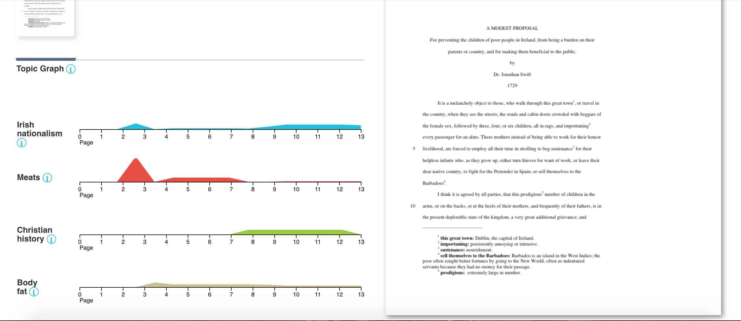
I tried out the TopicGraph for the mini project and decided to analyze A Modest Proposal by Jonathan Swift because I was interested in how the tool would work with a piece of satire, especially given its goals of enabling you to quickly understand the topics covering in texts
The tool is straightforward, allowing users to either choose from a selection of documents or upload a pdf version of their own. After uploading, it pretty quickly sends an email notifying you that the document is ready. You’re linked to an easy to read and well-structured website which lists phrases that occurred most frequently. It also allows you to go to individual pages, which I found particularly useful.
Some of the words/word strings it picked up were “Irish Nationalism” “Meats” “Christian History” and “Body Fat” which are definitely relevant but on their own don’t contribute much to understanding the text itself.
Ultimately, this tool isn’t one that can be used for a deep and involved analysis of a text, since it misses important contextual clues and priorities word count instead. That being said, it is a nice way to get a vague idea of what is going on in the text, and how the author is trying to get their point across.
-
Mini project-text mining
We explored both JSTOR TopicGraph and Voyant and compared their functionality below. Our testing article is The Public Sphere: An Encyclopedia Article by Jurgen Habermas. Before using those tools, we were expecting to extract the keywords or most frequently occuring words that imply overview of the article, and to understand network and logic among the extracted words.Both tools are pretty straightforward to use, but they display different features.
JSTOR TopicGraph allows us to compare the extracting information and articles horizontally. It extracts “topics” automatically and shows what topic are covered in this book. When clicking on graphic next to topic words, users are led directly to a page that discuss this topic. However, Topicgraph doesn’t display how the topics and their related terms are chosen. Users are not allowed to edit topics and related terms. The relationship and network among different topics are not analyzed either. http://voyant-tools.org/?corpus=eb5e4b4483871aa09c310d81c5bd51e1
VOYANT has more features in terms of analysing and visualizing the data. Besides the basic visualization of text frequency, there’s bubble diagram showing the relations among the key words; Filters are also provided for more accurate analysis;The number of text segment can also be customized, all these additional features provides more information and flexibility for the user to understand the text, making it more powerful than JSTOR in terms of data interpretation. https://labs.jstor.org/topicgraph/monograph/324348d0eab2692439be05e7217dae29
-
Assignment8
Alien Reading: Text Mining, Language Standardization, and the Humanities
In this article, Binder introduced LDA,a useful tool applying text mining technology for topic finding and stated the fact that LDA performed perticularly better when it was fed with scientific texts. The possible reason for this phenomenon, according to Binder is that the vocabularies of scientific texts correlate with their topics in a more uniform fashion than that of a poem or a prose, which accords with his argument that “there’s a congruity between text mining and the language standardization efforts”, both of these methods “tend to reinforce the ‘literal’ conceptions of language and meaning” and marginalize the “nonstandard linguistic conventions and modes of expression”. He further analysed the statistic nature of the tool that output only meanings with largest probabilities and ignored other meanings that valuable but with smaller probabilities. This marks the inherent limitation of topic modeling tool and other statistic analysis based tools in dealing with the existence of “non-literal” language which consists a significent part of a certain humanistic database.”If we are to adopt text-mining tools in humanistic research, we will need to take account of the assumptions they make about language and how those assumptions could serve ideological interests”.
It is interesting that Binder associated the newly emerged text mining technology with the language standardization effort dated back several centuries ago. This historical insight has profoundly demonstrated the efforts people are making to tackle information abstraction from large pools of database.The technology of text mining is still in its early year, despite the limitation, it works well in analysing and associating numerous amount of literature or achive, where the overall trend and feature of the database comes more important than details.
Enter text in Markdown. Use the toolbar above, or click the ? button for formatting help.
-
Assignment 8
Alien Reading: Text Mining, Language Standardization, and the Humanities
Enter text in Markdown. Use the toolbar above, or click the ? button for formatting help.
It’s clear that the current text-mining technologies is still limited and cannot read text the way humans do. The argument in the article is that there is little interaction between the scholars who apply these computational methods to literary history and those in media studies who critically analyze the history and culture from which this technology emerged. For instance, scholars who use text mining in literary and cultural history often do not consider the question of how the technologies they use might be influenced by the military and commercial contexts (from which they emerged). As mentioned in the article, a dialogue between media studies and text-mining should exist to allow scholars to engage with the linguistic technologies in a way that keeps their alienness in sight, foregrounding their biases, and focusing on the historical and cultural context of how computers read text.
If we critically examine the texts in which these methods are applied, we see that the kinds of text that these technologies parse share certain characteristics. They are primarily written in a standard dialect and orthography; they tend to privilege the informational over the aesthetic dimensions of language; and they primarily consist of prose. This is a very interesting point since these texts are not randomly selected to be read by parser. The technologies were designed for these specific kinds of texts. Some of these texts are the sorts of text that the military-industrial apparatus would have a clear interest in mining. In fact, the military was partially responsible for the birth of these technologies. Users of the text-mining technologies and even the general public are unlikely to know that fact. It’s scary to learn about all these powers behind the technologies that ultimately shift the entire society. It is more frightening that they are directly and indirectly influencing our lives and our children’s in various aspects without our awareness.
In addition to our experimentation with text-mining methods, we should also focus on research that situates them historically—both in the short term, looking at the institutional contexts from which they emerged, and in the long term, looking at how they relate to the histories of linguistic thought, philosophy, communication, and labor organization. I strongly think it is important that there is some openness about the behind-the-scene of these technologies. There should be someone to critically examine in the context and the drive behind these technologies and not just their applications and direct impact. Further, focusing on the research of the historical and cultural context of these technologies keep them in check (in term of biases) and help general public better understand them.
-
Assignment 8 Reading & Project
Binder - “Alien Reading: Text Mining, Language Standardization, and the Humanities”
I thought this reading was a very necessary examination of the text mining and other analyses being done on large quantities of text, and the implications that can arise by relying on them alone for analyses previously done by humans and their very human paradigms and language comprehension skills. One of the various approaches I thought was very interesting was when Lisa Marie Rhody uses LDA to produce topic models for poetry, she can’t use the resulting models in the same way that someone using LDA for more scientific documents might. However, that isn’t to say that the information is not useful. Rather than accurately determining what the poems are about, the topic model reveals how the poem is structured and possible traditions emerge. I thought this was very cool, and a good nod to the idea of using these models to “suggest” or “reveal” something about the text, rather than providing absolute analysis. I think this mindset is one to hold when using various computational text analysis methods. While continuing to read on, I wonder if there are text analysis methods that more successfully understand more complex forms of language, such as poetry and fiction. As I read on, I realized that Bogost agrees with me, as the text states “this approach would involve encountering text mining as an alien form of reading—alien both in the fact that it emerged from a discipline with very different concerns from our own and the fact that it is performed by a machine, the sort of nonhuman agent that Ian Bogost has sought to understand with his idea of alien phenomenology”. I also was pulled into Sturm and Turner’s idea of thinking of “computation as a ‘a caricature of thinking’”, and would definitely want to apply that ideology to other computational methods, like neural nets. But as this article concludes, we can’t use these caricatures for real understanding unless we also situate them with human research and analysis that looks at historical backgrounds of the text as well.
Mini Project: Text Mining & NLP
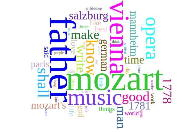
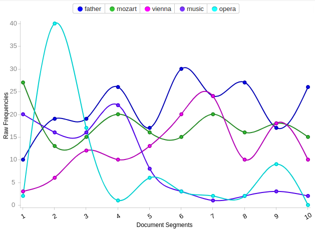
For this mini project, I decided to use Voyant to analyze the text I chose, mostly because it seemed more complex than the other tool I was exploring, Topic Graph. The text I chose to analyze was Mozart: The Man and the Artist, as Revealed in his own Words, by Friedrich Kerst (translated by Henry Edward Krehbiel), obtained off of Project Gutenberg. When I was pulling the document from the site, I was wondering if I should remove the project gutenberg text before the actual book text, but decided against it. After doing my initial analysis however, I decided to go and remove the project gutenberg text, as well as the urls that would continue to appear throughout the rest of the document. This turned out to be a smart move, as it gave me much more accurate results. Voyant revealed that the document had 32,688 total words and 4,714 unique word forms. It also revealed that the most frequently used words in the corpus were “father, mozart, vienna, music, and opera”. This makes sense, and also displayed in the word cloud that Voyant generates. I think this definitely gives a basic understanding of what the text is about, which is Mozart, his life, and his music. However, I think this information could have just as easily been understood from just reading the title. I guess the frequent words list reveals more that Mozart is specifically a musician who lived in Vienna. It also revealed that Mozart talks a lot about his father, which was unexpected. The trends graph was also very revealing, as it showed various trends of the main themes throughout the document. For example, the obvious trend of mozart stayed rather consistent throughout the entire document, but opera is heavily discussed in the first third of the book. His discussion of vienna and his father continuously dip and rise in an upward motion through the novel. Because this is a musical-themed text, I think it would be very interesting to develop a specific machine learning technique for scraping the musical themes and definitions Mozart uses, and extract his “musical intuition” and inspirations from the text. This technique could be translated to other musical texts as well.
-
Assignment 8 - "How We Read" Commentary
My first impression of this reading was that it cast a pretty ominous cloud on predicting the future of reading and critical interpretation. Seemingly, people are becoming lazy readers, and the argument is that technology is affecting the reading abilities of younger generations. This criticism is one I face in my academic/professional life – people want to see a design portfolio with more images and less text; obviously, it’s important to be able to story tell visually, but can images ever fully convey what we wish to communicate without the aid of words? Furthermore, when it comes to designing for mobile interfaces, designers understand that users do not read text. It’s a tough situation when a mobile app screen with both image and text ends up being too much text for young users (who ignore the text), and not enough text for older users (who wish there was more).
Yet, there are always criticisms when things change from the norm. Just because people are reading differently in a different age doesn’t mean it’s necessarily a downhill path for reading – reading can be taught in a way to account for the rise of technology and increase in new media and methods for digital reading. For example, I’ve been in classrooms where students were taught to read the page of a book line-by-line using their index finger to point as to not lose their place in the page. This technique was pretty specific to print reading, but new kinds of techniques can be created and taught in terms of digital reading; the rise of digital reading doesn’t have to mean the end to close reading. Maybe tools like a more robust version of the TopicGraph tool can help to augment digital reading environments with keyword searching, or can even can aid users in learning and understanding something through key word indexation. All hope is not necessarily lost :)
-
Alien Reading
Alien Reading:
In Jeffrey Binder’s text, Alien Reading: Text Mining, Language Standardization, and the Humanities, I found that Binder brings up a lot of points that I have been interested in regarding technology, algorithms, and their relation to cultural, social, and political contexts.
A key quote that I want to respond to in Binder’s essay is: “If, as scholars, we are to engage with these technologies on our own terms, then we will have to find a way of making their roles in humanistic research a matter of active concern. Experimenting with text-mining programs in English departments could serve as a safeguard against the possibility that we unknowingly absorb these tools into our practice without reflecting on the assumptions about language and knowledge that underlie them and considering the effects they could have on our work.”
Two notable example that relate to this idea of standardizing language and text mining come to mind: Facebook “Trending” algorithms and the Microsoft “teen Twitter bot.” Both participate in this kind of keyword-association-response, but have created problematic readings of text. With the Microsoft bot, it had to be taken down because the text and data that it was being trained on, rapidly too a turn for the worst and started spewing anti-Semitic tweets. While this is a more extreme example, in that the data was ripe for being corrupted, the Facebook algorithms also contributed to this idea that algorithms had the “last word” and did not require this humanistic safeguarding.
A final note that was interesting to me was the investigation of poetic language and figurative, and how text mining and standardization make it difficult for literary scholars to be a part of the same conversation that highly technical writers can engage in regarding computerized text. The generation of phrases like “dat master slave negro massa slaves white black dis dey” from MALLET is concerning because it does seem to erase, or even render nonsensical, non-white and non-“standard” (whatever that term may mean) language.
-
Alien Reading: Text Mining, Language Standardization, and the Humanities
I’ve been really interested in Natural Language Processing since high school so I’m familiar with many of it’s really cool applications in a really general sense(https://medium.com/@ianminoso/a-textual-analysis-of-harry-potter-by-an-amateur-data-analyst-6f02c09617e0). But reading this article was my first “formal” introduction to the subject and the technical terms associated with it. I agree with Binder that Topic Modeling (for example with MALLET) may not actually give an accurate representation of what a text is discussing, but I do think it’s useful for getting a very general sense of what a text is discussing. However, with poetry and other texts that depend on metaphor, the so called “bag of words” approach, which doesn’t even account for the relative position of words, let alone their syntax, may do the text a huge disservice. Moreover, it’s important to keep in mind that the nature of English grammar is such that improper syntax interpretation (or the lack thereof) can result in a meaning opposite to the intended one even when a text doesn’t contain metaphors. For example, the difference in meaning between “let’s eat, grampa” and “let’s eat grampa” is in a sense, a matter of life or death, but the only difference between the two sentences is the crucial placement of a comma. I think this emphasizes the importance of accounting for syntax and semantics in natural language processing algorithms, a project which many labs here at MIT (especially in the course 9 cognition labs) are working on.
-
Alien Reading Commentary
Alien Reading: Text Mining, Language Standardization, and the Humanities
Text Mining Mindfulness
Much of the field of natural language processing is focused on taking the “natural” representation of information and converting it into structured data, which computer scientists are more comfortable working with. Two summers ago, I worked at a social robotics startup called Jibo and spent a good portion of my summer working on an open-ended conversation handler based on work done with IBM Watson.
In order to do this, we ran a classic approach of using natural language understanding (NLU) to get structured data, used a dialog manager to build a structured output, and then used a natural language generator (NLG) to randomly convert the structured data into more natural sounding sentences. While this abstraction works really well for computer scientists (the intermediate structured step allows for easy storage and a model of the brain that we can understand), it definitely does not pass the Turing test (it is easy to tell that you aren’t having a conversation with a real human).
In this sense, I agree with Binder’s analysis that our current models of language do not address certain human-qualities of language, and I think that this is not a fundamental shortcoming of “topic modeling” or other approaches that will not be fixed in the future. We are still in the “early adopter” phase of widespread NLP, just like how lots of people doubted that people could communicate effectively without being face-to-face before technologies began enabling it the “right” way.
Alien Reading Approach
I only have one quick point here about the approach Binder suggests. Essentially, he just wants to make sure we approach these newly-enabled humanistic problems in a multidisciplinary fashion, and I just wanted to say that we want to make sure to preserve the processes that we’ve used for technology-free learning. We culturally forget how people “used to do things” rather quickly, and we just need to make sure to preserve it. This is just in case we are losing some quality of analysis that we won’t notice is missing in the short-term, but could be useful farther down the road. Analogy: People who forget to ride a bike when they learn how to drive, since they don’t see any benefits to biking short-term.
-
Reading Response Assignment 8
Commentary on Jeffrey M. Binder, “Alien Reading: Text Mining, Language Standardization, and the Humanities”
This article explained how text mining was transforming the humanities, but warns that the algorithms and statistical methods used for text mining behave very differently from humans. We should be careful about how they are designed and what aspects of the text they are capturing because it could reflect false or skewing assumptions. I can see a danger in people applying technical tools without understanding how they work and then drawing incorrect conclusions. I’m really curious about how the language processing algorithms work, given that I have taken a number of machine learning and statistical inference classes. Unlike many problems in machine learning, it does not appear that this problem can just be solved with a large enough quanitity of data. Longer texts could have more complex meanings, weaving together multiple different narratives, and it is difficult to establish “ground truths” to evaluate exactly how well a computational approach “understands” the text.
-
Assignment 8
Alien Reading Commentary
As someone who has had a decent amount of experience in natural language processing (I took 6.864 last year), I found the article pretty interesting overall, but there were some points that could have been improved upon. Particuarly, I agree with his argument that its important to separate the computer’s understanding of natural language with our own; however, there has been extensive progress in computer representation of language in recent years, especially with deep neural models. The author misrepresented a computer’s ability to produce a coherent sentence by choosing to include a piece generated from a Markov chain model, an algorithm which is nearly 30 years old, rather than including text generated from a more recent breakthrough.
While these tools aren’t perfect for studying humanities as they currently are (nor will they ever be), we may still use them as long as we make sure to note that as powerful as they are, they are also limited in many ways.
Working With Stanford NER
I chose to work with the Stanford NER by interfacing with it using Python nltk. It was overall pretty easy to get it working, it just required installing Python nltk and downloading the appropriated JAR files for the Stanford NER. I have reproduced the script below.
from nltk.tag.stanford import StanfordNERTagger

CLASSIFIER = `classifiers/english.all.3class.distsim.crf.ser.gz`
JAR_FILE = `stanford-ner.jar`

def extract_ner(filename):
    st = StanfordNERTagger(CLASSIFIER, JAR_FILE)
    file_text = ``
    with open(filename) as f:
        for line in f:
            file_text += line
        return st.tag(file_text.split())

if __name__ == `__main__`:
    ner = extract_ner(`ulysses.txt`)
    print(ner)
    for word, tag in ner:
        if tag != `O`:
            print(word, tag)
I tried the Stanford NER on a few poems (“Ulysses” by Tennyson, “Because I Could Not Stop for Death” by Dickenson) but the algorithm unfortunately could not find any named entities. When I tried it on Frederick Douglass’ essay “John Brown,” it performed much better, suggesting that the Stanford NER is unable to perform well on poetry, but excels at understanding prose.
-
Reading Responses
Katherine Hayles, “How We Read: Close, Hyper, Machine”
I agreed with all of Hayle’s points, but think she missed one key element of reading on a digital platform: the strategy of layout. For example, reading a text is easier to retain because the reader can recall the page section, location of the spread (L or R page), and their location in the book based on the fore-edge. That said, I appreciated all of the technical references she included to talk about the analogy between hyperattention : hyperreading :: deep attention : close reading. Describing hyperreading as multilocal context but context poor led to this notion, “The more the emphasis falls on pattern (as in machine reading), the more likely it is that context must be supplied from outside (by a human interpreter) to connect pattern with meaning” which provides a good platform for art and scholarly practice.
Jeffrey M. Binder, “Alien Reading: Text Mining, Language Standardization, and the Humanities”
I also really enjoyed this essay, through its technical trail of topic modeling –> latent semantic indexing (LSI) –> latent dirichlet allocation (LDA). Binder ends the essay with a call to action for how to engage with these simplistic interfaces with active engagement, questioning how it is used. He also includes several computational text-based artworks. I particularly liked the reference to deformance (modified versions of text to explore their autopoietic capabilities) and digital caricatures (thinking of computation as a caricature of thinking).
Text as Data Mini-Project
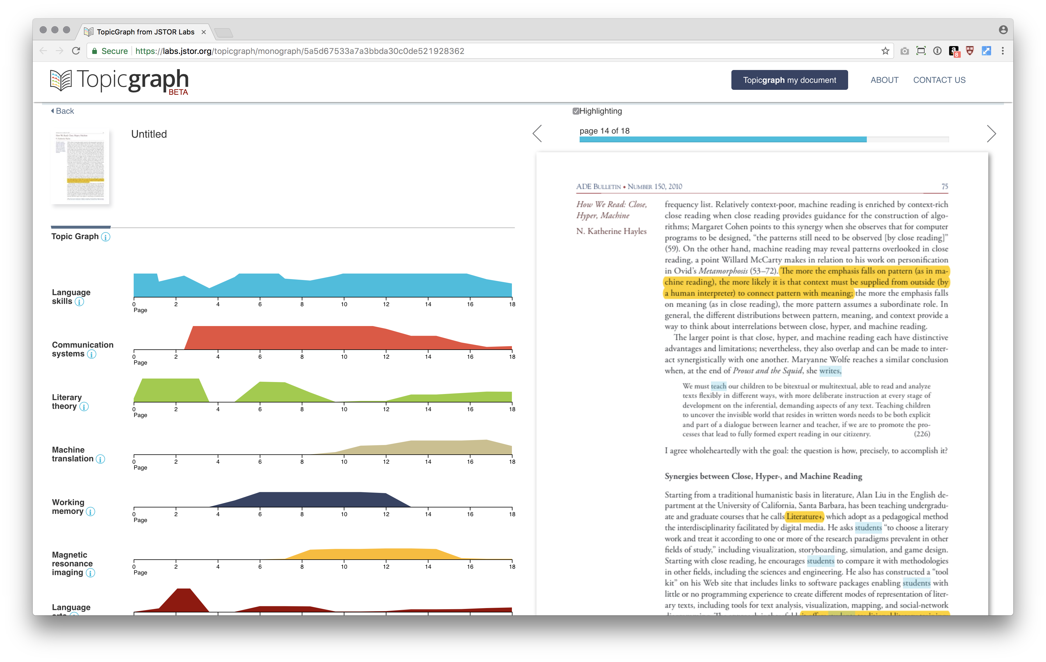
At a glance, it is quite simple to use JSTOR Lab’s TopicGraph to analyze Katherine Hayles’s “How We Read” t. By uploading the PDF, it took about 5 minutes to receive an email that the document was ready. The key phrases and topics are listed in order of frequency. According to this tool, Language Skills was the most relevant topic, used throughout the essay, while Machinery was the least. As you hover over the scales, you see the page number. Clicking leads to that section of the PDF, where you can see the terms (color-coded according to topic) highlighted in the text. This was very useful because you can begin to decipher which terms cause the NLP to assign the various topics. However, I wish this hover would include more context about the term (maybe a pull quote? Frequency of use?) rather than just revealing the page number. You can also click on the information icon next to each topic to see related terms, but this seemed as adequate as a thesaurus, rather than showing true relationships between other ideaologies. Overall, TopicGraph is very easy to use, intuitive and visually pleasing UI, and good at determining key ideas from the text.
-
Assignment 8
Alien Reading: Text Mining, Language Standardization, and the Humanities
In this article, the author tries to point out the gap between human and machine reading, and let us know the complexity debate between the accuracy of text mining tools and the fact that scholars already depend on generative models and other text-mining techniques. The whole argument is reasonable and logical. First of all, the author illustrates the process of machine reading method which is different from human reading and acknowledged that the significance and necessity of text-mining under such big data background. And then he differentiated the characteristics of science articles and poetry which shows the text-mining is more suitable for science articles. Then he suggested that goes further into a critique of the technology itself, engaging with text-mining tools as embodied, historically situated cultural productions that are potentially problematic. In order to minimize this problem, he argued that “supplement our experimentation with text-mining methods with research that situates them historically—both in the short term, looking at the institutional contexts from which they emerged, and in the long term, looking at how they relate to the histories of linguistic thought, philosophy, communication, and labor organization.”
The last part argument reminds me of the articles we read in several weeks ago. The content is that the time and space mapping has been over-simplified in GIS tool and some scholars have adopted this tool for their research for a longtime. It’s important to be wary of the limitation of our techniques and use critical perspective to adjust the expectation and result. Even though we are worried about the growing influence of these imperfect techniques in the twenty-first century, we should admit that the only way to improve this problem is to combine human thinking and machine learning rather than give up easily.
The “non-figurative” poetry debate part also let me think about our project as pop music automation. Just as Sarah mentioned before the lyrics generated from python is not so appealing and beautiful, that could be the difference between our human reading and machine reading.
How We Read: Close, Hyper, Machine
In the first part, the author illustrates the definition of close reading and points out the fact of close reading declining is just a result of trend transformation which isn’t equal to reading crisis. Also, the most important thing here is that the literature teaching should combine digital and print method together rather than separate them. The author argued that teaching should take place in the zone of proximal development and disciplinary shift to a broader sense of reading strategies and their interrelation should be addressed.
Then she explained the concept of hyperreadng which stimulates a new concern about media-induced state of distraction. And she also gave the answer to the distraction question that it lies in the relation of working memory to long-term memory. The small distractions involved with hypertext and Web reading increase the cognitive load on working memory and thereby reduce the amount of new material it can hold. She also used several recent experiments to show that the web reading gives pressure to brain.
Instead of using scientific analysis, the author believes that anecdotal evidence is more useful to understand the situation. She explored the interrelations between the components of an expanded repertoire of reading strategies that includes close, hyper, and machine reading, and found the overlaps between them are as revealing as the differences: Hyperreading overlaps with machine reading in identifying patterns. Then she realized that “close, hyper, and machine reading each have distinctive advantages and limitations; nevertheless, they also overlap and can be made to interact synergistically with one another.” Then she used several examples to show how to accomplish them.
The immediate case came into my mind is the way our digital humanities class organized. In each week’s assignment, we would read two or three articles and connect the concepts with practicing a small project. The assignment not only requires us to read the new concepts and interact with digital tools, but also allows us to think about how to tell a story in digital format and how to improve the experience. This case is very similar to the first example Literature+.
-
Kreps + Macalik Reading Commentaries
The two articles discuss how museums have changed in purpose and approach over time. However, the first article believes that curators should take a didactic approach when creating exhibits, whereas the other supports the idea of a museum as a space that encourages discussion. Although both acknowledge that museums have to adapt to changing social norms, these differing opinions mean that they interpret the role of the curator very differently.
One thing that the first article mentioned that I thought was very interesting was how artifacts come to be in museums; who deems them valuable enough? The arbitrariness of this and the principle of fixed relation is something that feeds into the concepts discussed in the second article. Both articles agree that objects have taken a backseat, but differ on who they believe is the one interpreting the object, and how clearly defined those interpretations are.
Generally speaking, I think that the type of museum influences what type of curation goes on inside, with art/history museums at one end and science museums at the other. This is not always the case, but is true to an extent, partly due museums being slow to consider diverse perspectives on the material being shown. Boston’s MFA and the V&A are examples of museum that focuses on teaching to a uniform and non-argumentative group of people. On the other hand, the DOX is thought provoking contemporary art museum whose purpose is to use are to challenge conventional perspectives. Science and Natural History Museums are interesting because they strike a balance between the two. They have blockbuster type exhibits like IMAX and self-directed teaching, yet are highly educations
-
Digital Curation 1
Digital Curation Site
Enter text in Markdown. Use the toolbar above, or click the ? button for formatting help.
http://cmsdigitalcuration.omeka.net/
We focused on the women of Mairas during this period of time by selecting photos that portray Mairas women. Through these photos, we only get snapshots of their lives and attempt to piece them the puzzle pieces together to understand the whole picture of their stories. We see their daily activities, their status, and their roles in the society. We get a sense that these women’s identities were tied/limited to home and family. We had to manually upload the images and titles so we weren’t able to link the dates, but it was really interesting to see the progressions of the portraits from groups of women to a single portraits, signifying to progression to valuing the individuality of women.
-
Curatorship
Curatorship as Social Practice
This article relates a lot to my work in human-machine interface because the psychology behind it is very similar to the “social” interactions described here. While objects in museums can only communicate outward to visitors, curators and computers alike can have two-way dialogue with repeat visitors and users via their exhibitions and interactions, respectively.
Continuing with the analogy, I agree with Kreps that curation does not have to be object- or people-focused. However, this new lens seems to be communication-focused in my mind. This being said, curatorship is much harder to usability test, and my engineering mindset would definitely frustrate me if I were a curator. While multi-disciplinary skills are common to both fields, they (obviously) differ in practice because quantifying an exhibit’s success is much harder. As I brought up last class, many museums lack concise mission statements because their role in society isn’t completely understood yet. While this makes mission-driven exhibits like storefronts and advertisements much clearer, they intend to affect all people the same (driving them towards consuming a particular good). Museum curators, on the other hand, don’t really want to over-design their exhibits for fear of polarizing discourse towards particular ideas.
The Museum as Discursive Space
Discursive space has become an extremely important topic over the past year due to social media’s newfound importance in our lives (especially our views). As museum attendance decreases, people flock to online exhibits like their Facebook News Feed, Snapchat Stories, or other “user-created” and “user-curated” social media sites.
While these exhibits are (often moreso) engaging than their museum counterparts due to their targeted nature, they more recently have attempted to minimize the polarized, politicized, discussion-fraught, and contradictory-view-surfacing qualities that these editors say are fundamental to curation. Why would they do this? Because their mission for the past few years has been to engage users as much as possible.
I particularly enjoyed this article’s discussion of this issue because it finds a happy medium between engagement and connecting (not connected) content. While museums can cater to the modern westerner’s lack of patience for one-way communication, they can also avoid the community-polarizing nature of social media that does not connect diverse visitors/users with contradictory views and opinions. The real question is, how much effort will it take to save us from our own opinions and those that match?
-
Curatorship Readings
Museum as Discursive Space
I found it particularly interesting how this article brought up power roles that are present in museum spaces between the “guests” and the “hosts,” which is not something that I’ve ever thought about. I think the traditional museum setup definitely has these power dynamics, where the hosts certainly are inviting visitors to see their collection and take away a specific message. That being said, I haven’t been to any museums that allow the user to “engage in a dialogue” as the article states. Most musuem experiences that I’ve had are pretty one-sided, though I could see how some museums of science fit into this description, as they tend to be much more engaging through their use of interaction rather than just showing.
-
Curatorship as Social Practice and The Museum as Discursive Space
I very much agree with Kreps’ proposal that curation is a form of social practice. I could really relate to the idea because I went to on a trip to the MFA for a class last fall on Islamic Archiceture and it was lead by the curator of the exhibit. At the time, I thought it was weird that the curator was guiding us through and explaining why she chose to display the pieces she did, but having read these two articles, it makes sense in reterospect. I also thought it was interesting that “curator” is derived from a latin word meaning “to take care of” and that using this definition, the term curator can be expanded to include other individuals such as spiritual leaders. In fact, I think it would be interesting to think of teachers as curators of knowledge, not just as creators of educational programs as Kreps described them because a very important aspect of teaching is to carefully choose topics that are appropriate for students of certain age groups and will acomplish certain goals. For example, if an elementary school teacher wanted to teach algebra, he/she would do so using materials catered to elementary school aged students, not high schoolers.
-
Curation readings
I find the definition, or rather descriptions and explanations, of curation in the Digital Humanities text quite helpful in summarizing what curation is, and the different aspects of curation, and could match them with elements in the other two readings; for reference, here are the parts I find helpful, “To curate is to filter, organize, craft, and, ultimately, care for a story” and “In the Digital Humanities, curation refers to a wide range of practices of organizing and re-presenting the cultural record of humankind in order to create value, impact, and quality”
In the excerpt of “Curatorship as Social Practice”, curation is discussed in both its museum context and the world at large, and the ‘filtering’ and ‘crafting’ aspects seem to be most dominant in that discussion. When curation is viewed as a social practice, the relationship between the curator — whether individuals or institutions — the objects curated, and the audience — individuals as well as society in general — is the main focus, and this is clearly reflected in the reading. The ‘filtering’ and ‘crafting’ are important, and, as the reading mentioned, can become points of contention, as they determine what stories are told, whose stories are told, and how the stories are told. Cultural institutions, and other settings of curation, are often tasked with housing, preserving, and representing collective memory, through artworks, cultural and historical artifacts; therefore it is naturally a communal and social environment.
Curation as a way of creating value and impact is also a key concept here, as museums become less ‘object oriented’ and more ‘people oriented’. The value and impact of exhibitions no longer lie, solely, in the splendor or novelty of the objects presented, but are much more personal and contextual, demanding relevance and design — much like user experience design, making curation much more social.
In the second reading, “The Museum as Discursive Space”, the filtering process and aspect of curation continues to be a focus of discussion. The filtering makes the museum setting “polarize[d] and politicize[d]”, “foster[ing] negotiation and debate”, and is, arguably, a defining feature of “critical curation”. The reading also talks about the need to create engaging experiences in museums, with the goal of creating meaning for and encouraging responses from visitors, or rather, users. The ways to achieve this, also a subject within the text, are undoubtedly related to how the curation is designed, with regards to its organization and presentation. These concepts and articulations/expressions can also be matched with and found in the Digital Humanities text quoted in the beginning.
Curation, though often referring to the work in museums, is not limited to those spaces; curation at the most individual level, browsing and selecting information from the internet for example, is at its core, essentially the same as curation done elsewhere, and in fact is affecting how people experience, and expect to experience, cultural exhibitions. At the same time, “curating” seems to have become a buzzword, used in numerous contexts and scenarios, and even when limited to the museum/cultural institution setting, covers a wide range of activities and has evolved through history. Thus it is helpful and important to keep some sort of definition or summary in mind, such as the ones quoted above, when thinking or discussing about curation.
-
Curation as Social Practice/ Museum as Discoursive Space
I will comment on the two articles along with several examples below:
As Christina Kreps mentioned, the increasing importance is placed on the educational role of the museum as a public institution. As we all noticed, social media has been a huge part of outreach and engagement as a tool of education. Take Los Angeles County Museum of Art as an example. LACMA has a collection including more than 130,000 objects dating from antiquity to the present. Curators snapped pictures, then coupled them with pithy one-liners for posting on Snapchat. For instance, the museum matched a photo of François Boucher’s 1742 canvas “Leda and the Swan” with the caption: “Stop looking at me, Swan,” from the ’90s film “Billy Madison.”
Social media managers in museums around the world have been reaching out to audiences via witty posts on all kinds of platforms. They’re delivering quirky, educated content to capture new audiences with innovative means. By using social media to seize and spread the imagination of younger audience, one museum can effectively take an educational role among audience.
As mentioned above, It is admitted that the new generation of museum users can take great advantage of social media, which somehow indicates that they can get their art preferences delivered instantly via social media and use technology for self-directed information-gathering. Thus the prospect of planning a trip to a museum can be daunting. What they expect is a new kind of museum experience. As pointed in Special Issue: Discursive Space, the new users expect to be empowered by museums to create an intriguing and meaningful experience by themselves. It is necessary to deliver an immersive experience that starts with the artistic object, performance, film or installation. Take Newseums as an example. The Newseum acquired eight segments of the monstrous walls and a three-story East German guard tower in 1993. Recently Newseum used virtual and augmented reality to model those historical objets and transport visitors to the streets where they originally were during the Cold War, allowing users to experience the divided city from the perspectives of suppressed Germans.
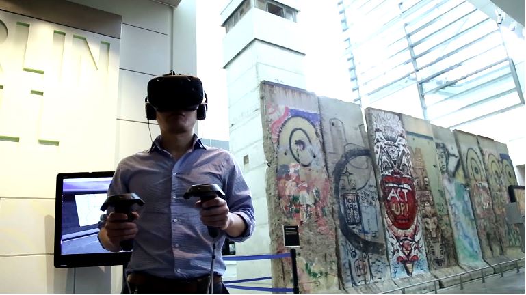
Although Those objects are important symbols of oppression and history, their identities might be gradually decontextualized as museum objects. By taking advantage of virtual reality technology, they are taken back to where they used to be and reconnected to their social context, which amplifying their social and cultural dimensions. Being placed in the original space virtually, the walls and guard tower are recontextualized again and create an immersive space for visitors. They are empowered to choose wherever they wander and whatever they get close look at.
As Jana Macalik articulate on discursive space, it should be a place of multiple, overlaid and sometimes conflicting voices – a place where historic dialogues can be rehearsed and reconfigured and where contemporary voices can be engaged and incorporated. A museum can be counted as a discursive space if it motivates people to be engaged with exchanging different opinions and shapes how they see things around them. The National Building Museum is a good instance. In 2015, the museum decided to Partner with Snarkitecture and hosted The BEACH. The visually compelling exhibit covered 10,000 square feet and included an “ocean” of nearly 1 million blue plastic balls and each translucent ball has a name of individual donors. This exhibition could give more people the experience of being wowed and transformed by what they encounter here, and see the world differently afterward, which enables the museum to be a container of thoughts and different voices.

-
Assignment7
Assignment7
Enter text in Markdown. Use the toolbar above, or click the ? button for formatting help.
##Curatorship as Social Practice Curating has been tranformed by shifts in the relationship among people, objects, and society. The work then should focus on the dynamics of this relation instead of either objects or people. For instance, social media has become an important platform for people to gain information around them. The relation between people and data connected by social media is very unique. It is constantly changing and more lax than other conventional kinds of relation. For example, videos, photos, posts, articles and news are the common media where people come in contact with information. However, the rise of memes, digital media, and new social media sites will change the way people receive and perceive information. Since social media has already become an important platform for museum to reach out to their audience and engage them with educational content, it is worth investigate in how people deal with information they receive via social media. It is not necessary to follow the trends on social media to deliver informations. Curating can be inventive and creative about their ways of presenting educational content on this digital platform.
##Introduction to Special Issue: Discursive Space Though I like that the essays of this issue seek to challenge the idea of the museum as solely a home for scholarly discourse or storytelling, I do think fundamentally the museum is for storytelling. Telling/passing down stories is human nature and culture. Among these stories, it is likely that they will spark contentious debates, social issues, and creative ideas. However, the museum should distinguish itself from theater or movies which also tell stories. Museum be design has the space to interact with users directly and more liberty to craft an experience that they want users to get out. Literature, theater, and certain kinds of visual art like photography are confined to one or two medium to tell stories. The museum is not confined to one medium to narrate its stories. In fact, it can combine old media with new ones such as social media and digital media to craft their narratives. This liberty is a blessing but also a curse since now there are more parameter to think about and more planning/designing decisions to make even after crafting the stories. Given that the museum has such a broad range of media to deliver their content, I would not try to fit museum into a particular box by defining detailed purposes of the museum. Its overarching purpose should be broad enough that would allow various options to tell stories and create learning and effective experiences.
-
Assignment 7
Museums were previously treated as exclusive spaces, for the elite, and often acted as a barrier to a conversation with the rest of the world. However, with time, these notions are changing as museums are being recognized as spaces for conversations that reflect reality rather than allusive and abstract ideas that are limited to the bourgeois. I think the change in term from visitor to user is significant because rather than just treating people as passerbys to the art of the museum, we acknowledge the dialogue and contribution to the artwork. I liked the idea that museums are a cultural space, and the emphasis on the give and take of the community to the museum rather than a one-sided receiving of information. I think that interactive artwork specially, and what we read about in the gallery one is the perfect example of this contribution of the people to the works of the museum, and how this makes the exhibitions even more fruitful. Krep’s take on the evolving role of the curator is more relevant, because as museums become more inclusive they must cater to different cultures, and incorporate elements from these as well as give back to the communities which becomes a responsibility of the curators of each exhibition.
This weekend I visited the arts festival Illuminus in downtown Boston, the contrast of this with the stoic halls of the Louvre is tremendous, to start with, the quiet, empty spaces and dominating walls were replaced by open-air bustling streets. Instead of paintings with multiple security sensors and surveillance, we could walk up to and interact with the art. I thought this is the perfect example of the transition that both articles bring to light and how they begin to involve communities and share interactively. Rather than selective information given to us in the form of labels we were free to interpret as we wished. This also highlighted the evolving role of the curator to cater to this new audience.
-
Assignment 6 Commentary
A New Post
Christina Kreps’ Curatorship as Social Practice and Jana Macalik’s The Museum as Discursive Space touch on similar ideas that I really agree with. The Museum as Discursive Space argues that people who go to museums should not be seen as visitors or guests, because this implies a power dynamic where the audience is passive and the museum is in control. Curatorship as Social Practice discusses the trend in which museums are less about objects and more about experiences. In this way, museums are moving towards providing an experience which people actively engage with rather than a static collection for people to look at in the way prescribed by the curators, with little freedom to draw their own conclusions.
I definitely feel that when one goes to a museum it’s rarely for a specific object but for an experience, and it reminded me of the reading on Gallery One - the gallery staff found that people rarely moved through the exhibit in the way the curators intended, but rather browsed around examining the things that caught their eye- in doing this they were crafting their own experience. I have really enjoyed museums with a more active approach to exhibitions, for instance the Launch Pad in the London Science Museum. This is the most popular section of the museum, and is filled with encapsulated science experiments and demonstrations, most of which people can participate in. Blocks which when put together form bridges, special mirrors which one can stand between to become part of optical illusions, and parabolic dishes which transmit whispers across the room are some examples. Nothing brings the science to life quite like the opportunity to take part in it and experience it first hand. The power is placed almost entirely in the hands of the visitors, with very minimal instruction and guidance from a few staff and explanatory plaques.
I believe that museums should move towards active experiences and away from collections. The ubiquity of collections is an outdated relic of the pre-internet era. If people want to see something, they can now look at photographs and videos online and get practically as good an idea of it as if they were looking at it through a glass display cabinet. The true value of a museum is provided by the tangible, immersive experience that it can provide, and I am excited to see this becoming an increasingly large part of museums worldwide.
-
Curation as Social Practice, and Museum as Discoursive Space
Recently, I have been increasingly interested in authorship through curation, which I think is something that is addressed in both articles. The role of the curator is an important point of discussion in both Kreps’s Curatorship as Social Practice and Macalik’s The Museum as Discursive Space.
In the second reading by Macalik, there is also an introduction of the museum visitor as the museum “user.” I think this is a positive evolution from curation as social practice, because it allows for people to really think about what the curator has done as work, just as a piece of art can be critiqued and be a source of discourse. Relating back to authorship-through-curatorship, I think that the role of the curator is really highlighted by Macalik.
–
Ai Weiwei: The Perfect Asian Artist for Lazy Western Curators

“Mysteriously, the Chinese authorities failed to bow to pressure from the staff of MoMA, Norman Rosenthal and the Serpentine Gallery team dancing in the style of a jaunty horse-rider. “
–
One big negative part of curatorship as social practice is highlighted by Kreps: “In Western museum culture, objects are stripped of their social attributes through decontextualization, a process by which objects are detached from some social whole and given new meanings as they are recontextualized within the culture of the museum.” One interesting criticism I had been reading involved the fetishization, and a kind of new-Orientalism, surrounding Ai Weiwei. Ai Weiwei, a famous Chinese dissident and artist, has become a sort of go-to artist for Western curators, almost to a point of removing Ai Weiwei’s meaning behind his work, and ascribing new, Western contexts. Most recently, I remember seeing a sort of retrospective of Ai Weiwei at the Brooklyn Museum, and there did seem to be a lot of removed contexts.
When curation becomes a social practice, the practices and implications of the curated exhibitions should be discussed. It becomes a “pedagogical opportunity,” in which the “users” of the museums can also engage in “negotiation and debate, polarize and politicize…”
Another interesting example is “The Enemy,” not as just a piece that created a kind of actual discursive space, but also thinking about motivations and work of the curator that brought “The Enemy” to the MIT Museum. That exhibition is refreshing– it combines a new and trending technology, with a uniquely MIT-esque artistic project, and centers immensely on the “user,” to encourage discourse not only about the medium, but also the content.
-
Assignment 7
CHRISTINA KREPS–Curatorship as Social Practice
According to Christina, the role of curators has been expanding significantly from merely caretakeer of the object to an educator, interpretor and designer of the exhibitions and experience of the visitors. It’s getting harder to clearly define what exactly a curator is, their work is also highly multi-faceted.
This changing role of curator is only part of a bigger shifting in the whole museum world during the past decades–the shifting significance from object-oriented space to visitor-oriented space. “The problem of decontextualization has been especially acute in the traditional object-centered museum in which objects and collections have served as the core around which all museum activities revolve.” In this sense, in the museum context, objects are presented to visitors, not simply as artifacts, but as objects embedded in cultural significance. If one of museums’ main tasks consists in the contextualization of objects in their cultural meanings, past and present, museums may be cast anew, theoretically, as spaces not simply responsible for the preservation of artifacts, but as spaces of education as well.
I agree with Christina’s insight of the changing role of curator and museum. Objects without any context are meaningless;Mere textual introductions of theme and metadata of the objects are far from enough to contextulize those objects and eventually too boring to raise visitors’ interests, let alone trigger further debates.This is where new media and digital tools can set foot in, but only rely on the careful curation.
MACALIK et al–Introduction to the Special Issue: Discursive Space
Although Christina didn’t give concrete example of how curation should work according to her theory,we can get a hint from her discussion about decontextualization of object that she is looking for proper design and storytelling to restore the lost context. The objects are used for stories, not that stories are used for objects. WHile Macalik et al propsed another approach where the role of a curator is less dominant, they should curate to create implicit and ambiguity to sparkle debate and negotiation among visitors rather than giving an explicit context and story. For me,Macalik’s approach makes sense in terms of enpowering more freedom and democracy to the pubilc, in this way more objectivity and less dictates from the curator can be provided.
Example–Berlin Jewish Museum
Among all the museums I’ve visited, the Berlin Jewish Museum is the most extrordinary one. The objects in the museum are no more than ordinary photographs,drawings, maps, but the experience of the building space re-contextualize these objects so well. The building space and elements arre closely related to the historical and social aspects of German-Jewish history. It was interesting that the objects hadn’t been moved into the building until several years later after the building was first opened to the public and made great success.Here the building itself serves as the grand object narrating the stories, the architect was at some point acting as a curator and proved that the traditional object centered museum space can be shifted towards an experience(visitor) centered fashion.
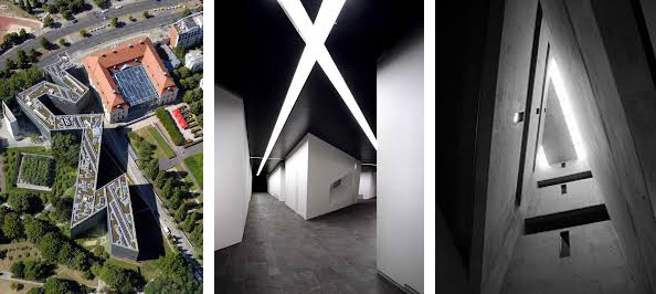
Enter text in Markdown. Use the toolbar above, or click the ? button for formatting help.
-
Assignment 7 - Social Curatorship in Museums
Jana Macalik: The Museum as Discursive Space
Reading the Introduction to the Special Issue: Discursive Space really brought to mind the power dynamics between museum visitor and museum. I liked how the article asked readers to think of a museum visitor instead as a museum user, which grants the visitor more leverage than a traditional visitor relationship with the museum. It reminded me of how eerie it can feel when visitors are instructed to quietly whisper when they enter a museum space, almost as a sign of respect to the building and the art it houses, even though its purpose is for the use of the public. I believe that museums exist in order to remember + educate, yet the means of educating have different effectiveness between generations. As technology advances, so do platforms for education; I don’t see an issue with museums presenting exhibits and leveraging the overall educational experience for its visitors/users by using relevant technology that sparks dialogue and social sharing. I mention using relevant technology because it’s important to use the tools of the present when educating; technology can promote accessibility, which museums should always strive for. There definitely is a balance that needs to be struck between display/education, but I believe it’s doable, and later I’ll be mentioning an example in this post that I think both effectively displayed art and educated museum users both inside and outside of the actual physical space.
Christina Kreps: Curatorship as Social Practice
The Curatorship as a Social Practice article called attention to the importance of curating and presenting museum exhibitions as close to the social contexts the items on display were created in. When I think of a “typical” and traditional museum, I picture an image of an oil painting inside an embellished frame; the painting is display against a white wall, and there’s either a card of text near it or text printed on the wall. This kind of object display removes social, temporal, and cultural identity from the painting by showcasing it in such a sanitized and identity-erasing way. The notion that “objects in museums only have value and meaning in relation to people” is important, and I agree that museums need to recognize the “interplay of objects, people, and societies, and expresses these relationships in social and cultural contexts.” The Davis Museum at Wellesley College recently did something that reminded of the contextualization of displayed objects. In response to the xenophobia of this administration’s refugee ban, the museum covered all art made by or donated by immigrants. The Davis Museum added a new sociocultural lens to the art by showcasing how 20% of all of the art in the museum was covered as part of this protest. Here’s an article that dives into this particular example: http://www.independent.co.uk/arts-entertainment/art/news/wellesley-college-davis-museum-immigrant-art-donald-trump-muslim-ban-immigration-a7587156.html
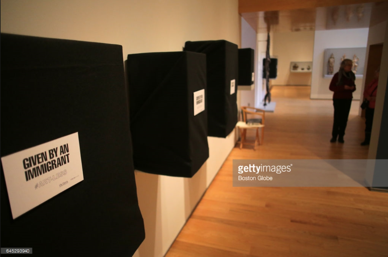
-
Assignment 6
In Christina Kreps’ article, she analyzed the concept of “Cash Cash” which illustrates the social and cultural characteristic of curating and museum. This character also brings out the debating balance between objects and people in the defining the museums. I think the way she tried to help readers understand the forming and changing of curators’ responsibilities is clear. And the extended explanation of curator seems fresh and inspiring: “If we return to this original meaning of a curator as a caretaker, then we can see how individuals or classes of people—such as priests, shamans, spiritual leaders, or royal functionaries—also have been curators. These people can possess specialized knowledge about certain kinds of objects and their care.” Because of the public character and education purpose for museums today, the uniqueness of appreciating objects in other small groups becomes attractive.
In Jana’s article, the main topic here is to define the difference between users(active) and visitors(welcome). Also, she took the new generation of museum users who use technology for self-directed information-gathering and cultural consumption as an example to illustrate how should we design a new museum experience. Obviously, she is more people-focus oriented and wanted to build different cultural environments for different users in the museum, while she also welcomed the debates in this public space.
I personally find that both approaches are acceptable and reasonable because under such a discovery period. Isabella Stewart Gardner museum is a good example for combing different approach. In the old part, it keeps the art pieces in the relevant settings and decorations to protect the historical aura. In the new part where Renzo Piano carefully designed, the museum uses some advanced technologies to help the visitors get more background information about its exhibitions. And the setting of the exhibition is different from the old part which gives the visitors diversified experience.
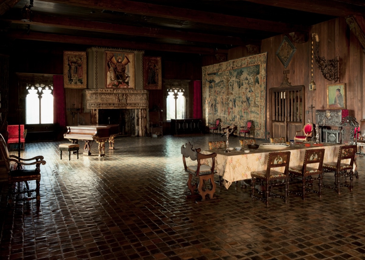
-
Assignment 6
Visit to The Enemy
This is the first time for me to experience a complete virtual reality exhibition. Some of the features shown during this experience did impressed me, but at some points it was still far from a pleasant journey. Below are the pros and cons of the exhibition. pros: 1 This exhibiton is promoting a concept of “Experiential Journalism”, which can provide the audience with “spatial immediacy” and the opportunity to “re-live” the encounters with the combatant.For an exhibition in forms of interviews, the VR technology does help engaging audience’s attention and interest in the content of interview. The combatants are nicely modeled with fine details where you can even see the blood streak in their eyes which are dynamically oriented towards you to add to more reality. This provides better sensing of the context and underlying attitudes, which can not be explicitly conveyed through descriptive texts and too flatly conducted through a 2D screen. 2 After talking with other visitors, one thing I found interesting was that I didn’t encounter with the combatants in the same order with other visitors,also the survey I did before I entered the exhibition hall influence my experience. Later I knew from the textual introduction of the exhibition that a new technology was employed here constantly analyse a visitor’body language and movement to provide unique experience for the visitor.This idea is something more close to the core idea of application of digital technology such as VR, which is to make customization more easily and at lower cost. Cons(questions): 1 Is it really worth the effort to put the entire exhibiton into the form of VR where what you see is no more than a conventional white cubic gallery space, simply putting charactors into 3d model form is not enough to provide fully immersive experience. We can see the effort on this when we get close to the photos on the wall, there are sounds related to the reality reflected by the photo, but since we already use VR here, wouldn’t it be better to reproduce the scene rather than simply playing the sound? 2 Should the interview questions be exactly the same for each combatant? 3 Although it’s said that new technology to collect the bahavior of visitors in the backstage, what exact aspects of experience is customized except for the mere change of order and light and shadows on the ground.
The Poetics of Augmented Space
After reading this article, it is a bit surprising to me that some space that we have commonly seen in daily life are actually forms of augmented space because I never thought in this way before. According to Manovich, the augmented space is never a purely technological term but an architectural one where the social and economical dimensions comes more important than the spatial form. He reinterpreted Michel Foucault’s metaphor of the Panopticon theory and argued that with the development of augmented space, the contemporary version of Panopticon should be an invisible surveillance network because every point of the aumented space can store information. This reminds me of one of the critics about the invasion of big data into people’s privacy, where other people can easily know almost everything about you without really get in touch with you.
Fortunately the reality of augmented space is not continuous but discrete, which is also pointed out by Manovich.This is an interesting fact that may add more dimension for designers to organizing spatial design, or using spatial design to control and filter information flowing in space.(reminds me of a visualization work by Luis Hernan, the visulization of wifi )

Transforming the Art Museum Experience: Gallery One
I think this is a successful example of combining digital technology with museum. What impressed me most is not the exact technology used here but the highly collaborative process during the development and implementation of the whole idea, also the comprehansive research about the behavior of the visitors. Great ways of involving general public into the exhibitions were shown here, but I was expecting more about how to integrate scholars with these interactive technologies which in my opinion a bit too entertaining. Enter text in Markdown. Use the toolbar above, or click the ? button for formatting help.
-
Poetics of Augmented Space & Gallery One
I thought it interesting how much broader Manovich’s interpretation of “Augmented” space/reality is than our current definition, which is mostly a smartphone centric/ Pokemon Go-esque experience. Though it fits the formal definition of augmented space as defined by Manovich, Gallery One would not be what most people think of when they picture “augmented reality” in present day. With the advent of the smartphone AR games/experiences, I think, by how Manovich describes augmented space, there should be a distinction between augmented space and augmented reality, rather than augmented reality being a subcategory of augmented space. In this distinction, Gallery One would be augmented space as Manovich describes, whereas our current day smartphone apps (Pokemon Go, snapchat, etc.) are augmented reality.
-
Poetics of Augmented Space and the Enemy Experience
Poetics of Augmented Space and the Enemy Experience
Enter text in Markdown. Use the toolbar above, or click the ? button for formatting help.
Spatial forms can provide people with experience by containing with rich and dynamic multimedia information. We augments the space by overlaying multimedia information onto the physical space. Some of the technologies that allow us to create augmented space is surveillance camera, mobile media, and electronic displays. For instance, surveillance camera extracts data from the space, whereas mobile media and electronic deliver processed data back into the space. The main questions of the article include "What is the phenomological experience in a new augmented space? What can be the new cultural applications of new computer- and network-enabled augmented spaces? What are the possible poetics and aesthetics of an augmented space?" The author suggests that we think about these questions by approaching the design of augmented space as an architectural problem. Since space not only has a spatial layer of information but also with a virtual layter of data. Janet Cardiff and Daniel Libeskind augmented their space with conventional technology. These examples show that this problem of augmented space is not new to architects. I would argue that that architects and designers have been dealing with this kind of problem for a long time. For example, museums have been augmented their space with more information using "low-tech" equipment such as electronic screens, games, and lightning. Similarly, theaters enhance audience's space by designing the lightning, sounds and stage sets to provide more information than the words of the play themselves in order to hopefully invoke certain emotions and experience. Augmented reality is fundamentally not new to people. Augmentation as a concept has been here for a while in different forms. However, with new technologies such as AI, AR, Tangible Interface, and Wearable Computers, some people may perceive augmentation of space as novel or solely confined by these technologies. Connection to the Enemy experience My experience with the Enemy was a mix of positive and negative experiences. Pros: The movements of the virtual figures are pretty close to natural human movement. Their movements are seamlessly integrated into the presentation that it was not awkard or distracting. Furthermore, it was a smart idea that there was not much movement to begin with so that would not create issues. Cons: It took me a while to accept the virtual figures as a representation of the real humans. The experience definitely requires suspension of disbelief. After hearing this first person, it was less distracting to listen the other ones since I had fully accepted the characters as real people telling true stories by then. The experience was not as interactive or immersing as expected. The audience basically listen to these virtual figures telling their stories. This kind of presentation can be done without the high-tech equipment. The content don't get transformed much through this kind of delivery. However, individuals may gain a new experience through the augmented space that would differ from face-time presentation. Gallery One: Works on the large scale but questionable when it comes to small-scale museum, These new high-tech features can be distracting instead of informative. It might change the mission of the museum. -
Erick on Augmenting Space
The Poetics of Augmenting Space
Manovich has a lot of ideas regarding augmented space, so I’ll focus on two parts in this commentary: the listed ways of augmenting space and his comment that cultural institutions usually lag behind business, military, and consumer focused institutions when it comes to adopting new forms of technology and media.
How to Augment Space
Since this article was from 2006, I found Manovich’s list of enabling technologies both entertaining and interesting. Since we’re reading it 11 years later, we can actually evaluate how many of his wishes came true! Initially, his visions seemed a little bit like 1984–focusing on pervasive surveillance recording and viewing, but his predictions after bullet point 4 are all well on their way to becoming true. Just to put these extraordinary insights into perspective, this article was published a year before the first iPhone and Amazon Kindle e-reader were even announced.
Manovich’s insights really balanced the tradeoffs between user experiences and business goals, just like the real world operates. He mentioned ubiquitous computing giving lots of data to corporations, but he also clarified that these technologies (wearable computers, smart objects, location services) can also augment users’ lives for the better. This perspective is probably the most important part of the article, as it can help us analyze the next 10 years of technological growth as well.
Why do Cultural Institutions Adopt after Everyone Else?
Towards the end of the article, Manovich states that “In a high-tech society, cultural institutions usually follow the technology industry. A new technology is developed for military, business, or consumer use, and after a while cultural institutions notice that some artists are experimenting with that technolgoy and so they start to incorporate it in their programming” (Manovich, 236). He then proceeds to question this framework, desiring a reversal in this situation.
While this is a completely valid desire, I highly question its feasibility for two main reasons. First, art galleries do a great job of connecting various ideas and thoughts in peoples’ mind, and cutting-edge technology does the opposite: forcing its way into users’ mental models of the world with newfound utility and aesthetic design. Before 2007, the form factor of an iPhone was meaningless to everyone, greatly prompting the “I can’t use a device without a keyboard” debate of 2007 and 2008. Second, developing these technologies is expensive, and research funding is really hard to acquire unless you are building something for big-money industries like consumer products, enterprise products, or military applications. While we might get some more user-centric technologies out of cultural institutions, they would be developed and adopted much slower than their corporate counterparts, in my opinion.
Transforming the Art Museum Experience: Gallery One
My first reaction on this article is to the pictures. Gallery One looks similar to an Apple store at first. Large glass panes and spread out interactive devices invite visitors into mini-narratives, creating an emotional connection between a digital medium and a human. In this commentary, I’ll focus on one of the pieces that intrigued me more.
The Collection Wall brings together many forms of art, and I would love to see how it trades off the needs of curious technologists and art enthusiasts alike. I know these aren’t completely distinct groups of people, but I’ll polarize these two labels for the sake of the commentary and assume the technologist would be much more interested in the interactive nature of the piece (being able to manipulate a 40-foot display would defnitely be fun), while the art enthusiast might not want to leave a particular piece of art until it has had a significant enough impact (or lack thereof) on their own thoughts. I particularly enjoyed the jukebox analogy since it makes the artwork seem much more alive, but it falls a bit short since its control seems to be much more distributed than a jukebox, since it is managed from a freely available app.
-
Augmented Spaces
I thought it was really interesting that Manovich wanted to redefine augmentation in terms of societies and cultures and history, instead of technology. This is because the first thought that comes to mind when I hear “augmentation” is something like Pokemon Go, where a “virtual reality” is overlaid onto actual reality using a phone app. In retrospect, this makes sense because before the technological age, things like paintings and statues were used to, for lack of a better word, “augment” different spaces. However, I found it confusing that instead of illustrating how augmentation doesn’t depend on technology, as he claimed in his introduction, Manovich goes on to explain how augmented reality followed the natural progression from 2D art to 3D art spaces which rathere than’creating an object that a viewer would look at…placed the viewer inside the object.” I think it would have been interesting for Manovich to instead explore the role of 3D art spaces alone in augmented reality throughout the course of history. After reading Manovich’s piece, which ended up focusing on the role of technology in virtual reality, it was really interesting to go through the interactive art gallery in the Cleveland Museum of Art and see the benefits of using interactive screens to enhance the user experience. I didn’t get a chance to go to “The Enemy” exhibit and the MIT Museum. But to offer some insight, I used to go to the Museum of Science almost weekly when I was younger, and it was really interesting to see the progression of their exhibits as they moved from classic exhibits to more interactive exhibits that used some aspects of augmented reality, but not completely. But to be honest, I never really enjoyed the newer exhibits as they felt fake to me and in between a truly immersive experience and just sticking a tablet in a exhibit.
-
Augmented space, Gallery One, and The Enemy
The two readings and the exhibition The Enemy present three different types and levels of technological integration. While Manovich defines “augmented space” as any “physical space overlaid with dynamically changing information, multimedia in form and localized for each user”, Gallery One fosters engagement and interaction with visitors directly through digital devices and tools, and also allowing visitors to create their own content. As for The Enemy, the entire experience is based on and relied on technology.
However, in some ways the exhibition doesn’t feel like an augmented space, as the VR is simulating a real exhibition space, the only exception being text, or an image, on a wall changing. There’s also the part near the end of the tour, where you walk to a mirror, and see yourself as one of the subjects/interviewees featured in the exhibition. Although, I am not completely sure what the purpose and intended effects were, and don’t think it really delivered, as it wasn’t made clear what the implications were, and perhaps also because it’s simulated, therefore lacking in impact.
When considering Manovich’s piece as a general theoretical framework and research/field overview, it provides many interesting and varied examples, including some that are not heavily reliant on technology, but this also makes it problematic to some extent in my view. The definition given, quoted above, seems very broad and rather vague; too many spaces and environments seem to fit the description, especially as they get more and more wireless, digital, and mobile-friendly in recent years, and inevitably in the future. It is somewhat understandable as the piece was published in 2006, before the launch and rise of smart-phones; we effectively live in a rather different world today.
On the other hand, Gallery One, to me, is a great example of utilizing technologies to add to the experience, that wouldn’t be possible otherwise. It really combines physical material, or spaces, and digital content, such as matching visitors’ pose or facial expressions with those found in artworks, providing additional information, through text, audio and video, upon scanning an item, and storing and creating tours for visitors. The app, which enhances visitors’ experience in the museum, also allows off-site engagement, extending the effects of the augmented space by delivering the information and experience outside of the actual space.
While The Enemy, and perhaps other uses of VR, almost doesn’t feel like an augmented space, as described, it does also enable users/visitors to have experiences otherwise impossible. Using various technologies, filming, scanning, modeling… etc., the exhibition recreates, or simulates, face-to-face interactions that become rather powerful deliveries of information and narratives, which had been, and still is mostly, confined to a single space, at a specific time.
I find both Gallery One and The Enemy to be very interesting projects/installments: Gallery One being a pioneering example in its field that is still being further developed, and The Enemy which will travel to other cities and hopefully inspire other VR exhibitions and developments. (Is it also a first?) I find this technology and approach valuable in that the environment visitors/users experience is created in the VR, in this case a pleasant sunlit gallery space, and that the exhibition can take place in any space, of certain dimensions or larger, and is also easier to transport and perhaps recreate. The article/report on Gallery One also describes the project development process, which is a great example for other cultural institutions, (mentioned in Manovich’s writing) and really intrigued me, having taken a course on project management last year at LSE.
-
Assignment 6
The experience of The Enemy is great. There are two things I appreciated: First is the way the designer want to keep the eye contact of the interviewee and the visitors(me). This emotional interaction can make up some part of the unreality pity. The second the part is the human behavior details included in the character model. Every time when I listened to the talk, I would focus on the hand gesture of the character and compare them to see the difference and real inner emotions. Some people may be nervous and some may be excited. Back to the assignment’s main task, in “The poetics of augmented space” article, the author mentioned this is a chance for architects to think about the relationship between the physical space and layering information. In my opinion, the organization of physical space is the same mission of arranging experience sequence. The task of architect is not only playing with physical material and construction, but also to be an experience designer. The reason why the author suggested architect should pay attention to this situation is that nowadays the role of architect has been simplified and separated. In the VR experience, I feel disappointed about the lose of material touching and gravity feeling. Which is to say, the fascinating part of real world still couldn’t be easily copied by VR. And also, when you put on the heavy devices, you lose the beautiful nature of freely involved in the world. In the “Transforming the Art Museum Experience: Gallery One”, I also appreciate the effort of providing a lot of innovated choices for visitors to interact with the museum. But here, I questioned that does it weaken the relationship of the displayed objects and humanity? Would people feel disappointed if they realize they couldn’t try all of the technologies? Are these technologies too directed and limited without open end experience? Should we build a free platform and experience environment rather than providing tons of Apps?
-
Assignment 6 - Virtual Reality + Augmented Spaces
Assignment 6 - Virtual Reality + Augmented Spaces (Transforming the Art Museum Experience: Gallery One, The Poetics of Augmented Space, and The Enemy VR Experience @ the MIT Museum)
Karim Ben Khelifa’s “The Enemy’ VR experience aims to highlight the humanity of the people roped into fighting on opposing sides in 3 major world conflicts; by calling attention to the individuals involved in these violent conflicts, the exhibit aims to draw out a sense of empathy form the user experiencing the installation. The 3D path and white gallery space, a style mentioned in Manovich’s “The Poetics of Augmented Space,” presented a blank canvas and therefore an unbiased space for us museum-goers to experience the thoughts and perspectives of the combatants we were hearing from.
We walked through 3 rendered rooms, one for each military conflict, and learned about the past of each person. First, we learned about a person as we looked at a photograph of them and were given a short summary of their past. Then, the individual that you were learning about from a still image would actually materialize into a 3D figure that walks over to you, looking you directly in the eyes, and starts talking to you. In this scenario, you learn about their dreams, happiest moments and their definitions for peace and violence through an interview-style manner.
Although it was slightly unclear as to how the exhibit chose which person you empathized the most with by the end of the exhibit (the staff mentioned pupil motion/dilation via the Oculus), I thought it as significantly valuable that you entered the 4th and last room to see yourself as that person in a rendered mirror. The “Gallery One” article mentions empowering visitors to browse freely and learn through a user-specific and “personalized profile driven by their interests,” which The Enemy did very well here. Once I was shown which combatant I supposedly empathized with the most, the Enemy of my subject spoke to me with a peaceful explanation as to what they wanted from my side in the conflict. It felt extremely personal and candidly real, which was a goal of Khelifa’s in creating this VR exhibit.
The museum workers told me that the technology in the oculus analyzed each museum goers’ empathy levels, but mentioned that it was not always accurate - we spoke about how in the future, the exhibit could evolve to use biometric sensors in order to make the experience more accurate for each user. Still, I felt like this was a great example of how VR can actually improve a museum experience by going past traditional teaching methodologies that do little to affectively alter a person’s opinion and biases on a matter.
-
Assignment 6 Manovich and Gallery One
I didn’t attend the exhibition, so I won’t be commenting on it here.
Lev Manovich’s text touched on a number of topics related to augmented space. I enjoyed the article, and though it was well structured it ocassionally seemed disconnected.
IT was interesting thinking about the topics he bring up in relation to the research paradigms presented early on. Context-aware computing in particular seems to dominate his thinking about augmented space and how it represents another complimentary dimension to life. I personally think that the distinction between customizable data, like cellphones, and public displays has gotten blurred with time. However, Venturi’s concept of architecture as iconography and the example of Catholic cathedrals made me wonder about how I look at public places like Times Square and how the architecture (without the screen) changes my impression of the space.
I am also curious about the relationship between this technological layer and the economy, which Manovich only hints at here and there in the article. The economics of all this is an important consideration. External factors must align to realize the promise of essentially everything that Manovich talks about, from galleries to brandscaping. As he mentions, the wonder of the internet fell victim to economic reality in the 1990s, and exhibits like The Enemy are paid-for.
The second reading focuses more on the response of consumer to Manovich’s augmented reality as it appears in Gallery One. Exhibits like the MicroTile Collection Wall attempt to transmit data with the goal of drawing in and retaining consumers. With the wall, the creators attempted to simultaneously condense and input information to provide another layer of understanding in a 2-D plane (or 3-D path). When we think about how to appeal to museum vistors who average at 6 minutes per exhibit, we want to keep up with the times while maintaining traditional architectural integrity- i.e. creating an iconographic and structurally logical exhibit.
-
Assignment 6 - Augmented Experiences
Reading 1: The Poetics of Augmented Space
When reading this, right off the bat I had issues with Manovich’s definition of a multimedia spatial form experience. I feel like the experiences one has with their everyday cell phone while in a space is different from interactive information experiences embedded into the space itself. This is an older article though (published in 2006), so I decided to accept the broad definition of an augmented experience and continued reading. I really like his stratification of augmentations as “data flows” in and out physical spaces. One question I wanted answered but didn’t get through this reading is how to actually have something have a “poetic essence”. Regarding the white cube vs. black box example, I feel like for every new augmented experience brought to the art realm, there are people who will see it as art, and there are people who won’t. I wonder if this is just always going to an initial road bump with any new technology used in the art world, or if this is something that can be resolved when an artist is creating their new work. I also wonder what Manovich would say about the modern day “Instagram ready” art museum exhibits, and the augmentation of them via visitors’ uses of social media. I really liked the quote “Going beyond the ‘surface as electronic screen paradigm’, architects now have the opportunity to think of the material architecture that most usually preoccupies them and the new immaterial architecture of information flows within the physical structure as a whole”. I think we still have a ways to go with doing just that though.
Reading 2: Transforming the Art Museum Experience: Gallery One
I thought this paper was amazing. As someone who has been always interested in technologically enhanced museum exhibits and events, but never really got to understand the decision making processes and tech specifications, this was a fun read. It was interesting seeing how this museum developed and used so many various augmented experiences to warp the typical museum visiting experience for visitors for all ages and expertise. I always felt like some exhibits just add technology to an old art piece to make it “interactive” without really thinking of novel way to achieve that. It typically just ends up being a digital screen with information visitors could have obtained in a static form instead.
-
Augmented and Virtual Reality Readings
The Enemy VR Experience
After visiting The Enemy, I realized that the VR experience is not yet fully developed. I thoroughly enjoyed the experience, but I think that the idea of VR exhibitions, or even AR exhibitions still have that sense of novelty, and it has not worn off yet.
Gallery One is described as a new way to view art with embedded technologies, like multi-touch screens, gamified interfaces, sensors, facial recognition, and augmented play. These new technologies and ways of interacting with art, seems to be a wonderful way to engage children into the world of art, as well as provide much more background and context to art for adults. Its goals seem to align really well with their execution, and their work is a really interesting case study for UI/UX designers.
The article discusses the ways that Gallery One is truly a case of human-centered design, and a great application of design in revolutionizing our experiences. They have a really strong goal, with specific audiences, and adapt their experiences to each individual. They also help the audience understand by engaging their audience with questions that guide their experience.
I feel like before visiting the exhibition at the MIT Museum, I felt like Gallery One could be the perfect museum exhibition. However, now that I am reflecting post-experience, I think there are probably some problems with Gallery One in real life.
During the exhibition, all I could think about was the technology. I thought about a lot of separate things, including 1) rendering of people and textures, 2) rendering of sky and light (it dimmed when clouds passed), 3) eye tracking, and 4) the other people and the real life interaction. Because of all these-not distractions, but rather, interesting and new implementations of technology, all of which I would was excited to analyze- I felt like the message was lost in the medium.
There were definitely a lot of __Poetics__ with the addition of VR. It seemed to be much more humanizing, and the movements of the people were so much more engaging than I think typical audio- and video- art showcases.
Overall, I think this is just the very first great implementation of VR, and soon, it will be standard for everyone in the world. However, for now, it is still very eerie to see VR-zombies:
-
Response to The Enemy and readings, assignment 6
I had always seen VR and AR as passively observable experiences, so it was interesting to read in The Poetics of Augmented Space about how it could also involve extracting information from space and using that information to deliver the experience. I was surprised to find that The Enemy did this too, by reading the body language of the audience and using that information to judge if they reacted differently to the different sides and finally to identify them with one of the people. I wish the exhibition would have explained more exactly how the body language was judged because I feel like for many people, simply leaning in to inspect details from the 3D models such as tattoos could be mistaken for body language. I think the fact that the models can’t see or respond to me warped my body language- I hold myself differently when I know I am being seen and am conveying nonverbal messages than when I am alone. The Poetics of Augmented Space also defines and explains the difference between VR and AR, and I actually didn’t see a particularly compelling reason why the Enemy needed to be VR rather than AR. The images on the walls could have been AR images projected onto real empty picture frames, and the 3D models could have just as easily walked around in a real museum as a fake VR museum. Maybe it was helpful not to be able to get distracted by other visitors to the museum, but I got quite distracted instead by the jarring effects when I move or turn and the world doesn’t quite move or turn in the same way I expect it to, or when I accidentally walked inside a fake wall. I found out that originally the VR experience was richer- viewers were transported into the territory of the people being interviewed (e.g. surrounded by rubble) but apparently the interesting background was too distracting and people would rather explore it than pay attention to the interviews. I thought Gallery One was really innovative, using an incredible range of different technologies such as Xbox Kinect and facial recognition algorithms. I think the framework of The Enemy would have been very much at home in Gallery One – it could be a good extension of the “create your own tour” feature, in which all the pieces of art chosen by a visitor can be arranged inside a virtual gallery for them and their friends to walk around, and/or interviews with the artists could be recreated in the same fashion as the Enemy, with models of them standing in front of their artwork.
-
Reading and Fieldtrip Response
The Enemy
I went into the The Enemy with hesitations, and left with the same skepticism towards VR, especially in an arts context. Some immediate pros and cons: To set the right expectations, I believe naming conventions surrounding VR / AR should focus on film terminology such as “screening” rather “experience” which is rather vague. It also puts the user in a mindset to wait in line, enter at a single time, and remain for the entire time. That said, a timed experience is a good way to keep the visitor in the space for 15 minutes to watch every soundbite and see every image. This does mean that if there are technical difficulties, everyone’s “experience” will be pushed back. This was true for mine, and we were running 30–45 minutes behind and a couple people left. Upon entering, I was disappointed by the skeuomorphism. Why use a gallery/theater motif? This seemed like a missed opportunity to have a more transportive experience. The content itself could have easily been a white cube exhibition. When characters beyond the frame first appeared, it felt surprising and finally met the initial expectation, but the interview format soon felt templated. However the eye contact and gesticulations from the characters were good cues for when we should come and go. I also couldn’t help but think of the sanitation issues — were they wiping these goggles down before and after each screening? Was the Occulus Rift a product of sexist engineering? Overall, I think a lot of work needs to be done for a successful VR experience to occur.
Transforming the Art Museum Experience
This text left me with several questions:
- Is gamifying the “engagement” a reductive approach?
- Let’s question the engagement we actually want. If it’s to pose and share, the visitor’s investment in the work might be as fleeting as the prompt.
- Were there examples of technology that is invisible until you need it? Maybe iBeacons or push notifications?
- In the comments, people are curious about how to implement this on a smaller scale. Is it exclusive? What are the affordable options?
- These interfaces are expensive and timely; how can you consider visitor engagement 2 years from now when these look outdated?
- Do the examples shown praise the technology rather than the art?
-
Reading Commentary
Edward Tufte, Envisioning Information, “Color and Information”
Tufte’s fundamental uses of color was a useful breakdown:
- to label (color as noun)
- to measure (color as quantity)
- to represent or imitate reality (color as representation)
- to enliven or decorate (color as beauty)
I agree with most of his comments, especially his belief that one should be able to defend one’s designs by providing reasons for choices against arbitrary taste preferences. However, some of his examples for “color clutter” displayed a very straight-laced view of beauty. It disregarded some of the more austere or dissonant examples, but arguably this is rather subjective and show an alternative version of beauty.
As for the examples, I especially enjoyed Oliver Byrne’s color diagrams from The Six Books of the Elements of Euclid. They were beautiful, simple, and legible.
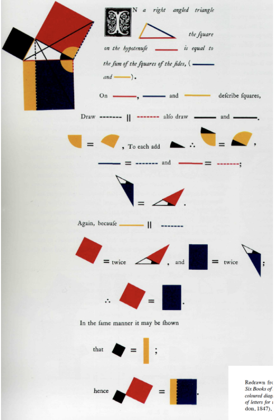
Edward Tufte, Envisioning Information, “Narratives of Time and Space”
Immediately after finishing Tufte’s chapter on Time and Space, I wondered how he might currently respond to this line, “At every screen are two powerful information-processing capabilities: human and computer. Yet all communication between the two must pass through low-res display.” With technological advancements, it is not quite easy to create dynamic, high resolution renderings of time and space. The larger question, I believe, is should we? With such an influx of data, what are ways to display this content without falling into the trap of large, swirling, nebulous displays that have become such a trope of the digital era.
In this modern age, how can we maintain some of the restraint used in some of the examples Tufte has shown. The reduction of Zorn’s Grammar of the Art of Dancing is also quite powerful because it closely mirrors the musical notations above. Immediately, it reminded me of Francesco Cangiullo’s Caffé-concerto. It would be interesting to reimagine these for the “high-resolution” age.
Stephen Few, The Chartjunk Debate
While I do agree with Few’s argument, I believe that his retort as well as Tufte’s “chartjunk” explanation are too loosely defined. From a design perspective, it is obvious that what Few describes as “embellishments” can become a distinctive element of graphs or charts. Some examples he has provided, such as Holmes’s Steel Dynamics poster, are meant to portray the concept graphically, rather than act as a legible graph.
Tufte notes that “chartjunk” does not involve artistic considerations and is used to describe the non-data or redundant elements in a graph (such as hash marks). Few’s suggestion to categorize the different types of chartjunk can create a framework for this “non-data”.
-
Envisioning Information + Chartjunk Commentaries
Envisioning Information: Color and Information The chapter described a coloring system to produce uniform and coherent images that were pleasing to the eye and discusses how color can add meaning to a visualization. It laid out a method for pairing colors, such as only placing bright colors in small amounts beside neutrals. Imhof’s four rules for designing cartographic maps are the basis of this somewhat rigid though generally effective set of procedures.
Since humans can distinguish between one million colors when placed side by side, there are many different variations of color schemes that can be used on a value scale. Tufts emphasizes many different types of information that can benefit from color, including maps, webpages, and, most interestingly to me, proofs. I often find that math is presented in a restrictive and constrained way, so I appreciated the example of Euclid’s proofs as a slight alternative to the ones we typically see.
Later on, the text discusses the drawbacks of color coding, namely that it affected by what surrounds it and its meaning can change with context. One way around these issues is to include redundant non color based information in diagram. Ultimately, though color does add to a visualization, I don’t think it’s easy to have a complicated image without any other information.
The Chartjunk Debate This article focuses on a debate between minimalists and embellishers started by Edward Tufte when he criticized a graphic created by Nigel Holmes. After Tufte published this critique, a debate that essentially centered on what type of graphics were most effective began. The arguments focus on the benefits of what Tufte calls chartjunk, a loosely defined term describing the inclusion of unnecessary and confusing information for artistic sake.
According to the author, a minimalist, more visually interesting graphics are specifically suited for portraying simple messages. Thus they have a different purpose than simple graphics. Additionally, Tufte’s position is too extreme, ignoring the usefulness of redundant information in improving understanding and recall by supporting the basic idea in charts.
Supporters of including chartjunk point to a study that was done to measure the effects of charjunk on comprehension and recall. The majority of this article was a takedown of this study. Its design is not generalizable but allows for causal inference. However, the graphics used in the study were highly flawed. The minimalist charts were far more simplistic and plain than what Tufte intended when he talked about avoiding chartjunk. Furthermore, the only embellished charts were created by Holmes. This lack of diverse and representative graphics severely restricted the reach of the study.
I agree that chartjunk can be useful, depending on the context. It can clarify a message and does increase recall, which is useful in cases such as popular journalism. Chartjunk that takes away from the message of a graphic isn’t worth including though. On the whole, I think it would be best to find a happy medium between minimalism and embellishment, and to adapt the chart to the audience.
-
Commentary
Color and Information
Tufte’s guiding principle for using color in displays is to “first do no harm.” I really like this because it emphasizes the idea that colors should only be used if they’re needed to make a point, not to make something look pretty at the risk of detracting from the information or even masking it. Tufte does explain that colors can make seemingly complicated things more understanble, as Oliver Byrne’s 1847 edition of Euclid’s Geometry did.
 My favorite example of this is when Tufte looks at the drawing for his proofs, particularly the Pythagorean theorem (which is my favorite proof of all time) which use shapes and colors instead of angle names. Byrne used primary colors and black which as Tufte said:
provides maximum
“differentiation (no four colors differ more). This yellow, broken with
orange, is darkened in value, sharpening the definition of its edge against
white paper; and the blue is relatively light (on a value scale of blues),
reinforcing its distance from black. In the diagrams, the least-used color
is black, and it is carefully avoided for large, solid elements — adding to
the overall coherence of the proofs by muting unnecessary contrasts.
Spacious leading of type assists integration of text and figure, and also
unifies the page by creating lines of type (instead of the solid masses
usually formed by bodies of straight text) similar in visual presence to
the geometric lines and shapes.”
My favorite example of this is when Tufte looks at the drawing for his proofs, particularly the Pythagorean theorem (which is my favorite proof of all time) which use shapes and colors instead of angle names. Byrne used primary colors and black which as Tufte said:
provides maximum
“differentiation (no four colors differ more). This yellow, broken with
orange, is darkened in value, sharpening the definition of its edge against
white paper; and the blue is relatively light (on a value scale of blues),
reinforcing its distance from black. In the diagrams, the least-used color
is black, and it is carefully avoided for large, solid elements — adding to
the overall coherence of the proofs by muting unnecessary contrasts.
Spacious leading of type assists integration of text and figure, and also
unifies the page by creating lines of type (instead of the solid masses
usually formed by bodies of straight text) similar in visual presence to
the geometric lines and shapes.”The Chartjunk Debate
It was interesting to read Few’s opinion of Tufte’s ideas immedietly after reading Tufte’s. I’d have to partially agree with Few because in some cases, Tufte’s definition of what is and isn’t chartjunk is too rigid. Sometimes, artistic flair can really bring meaning and attention to data.
-
Commentary on Tufte and Few
Edward Tufte: Envisioning Information
Layering and Separation
Tufte begins this chapter by stating the now well-established principle of confusion being the fault of the designer, not the user or the information itself. This chapter focuses on the confusions prompted by improper combinations of elements with the designer’s equation: “1+1=3 or more.” While this equation may trigger some negative feelings from MIT students in general, we can rephrase this as “chart complexity and confusion increases superlinearly with the number of components.”
I definitely agree with this sentiment, and looking back on projects I completed before my introduction to basic data visualization theory last spring, it definitely shows. Complication can be attractive to oblivious designers because it it the most obvious display of work. However, initial amounts of work cause a spike in complication, and real effort is displayed when the message is distilled to its simplest and most understandable form.
While this chapter thoroughly discussed a few proper and improper cases of layering and separation, the chapter (along with much of Tufte’s work) did not leave much room for interpretation or experimentation.
Stephen Few: The Chartjunk Debate
On the other hand, Few tackled the difficult task of appending to Tufte’s thoughts on “Chartjunk,” and he focused on the shortcomings of Tufte’s definition of the term. Having heard one other critic of Tufte’s rigid framework before, I agree much more with Few, and I love that his title invites more of a discussion. Additionally, his source citing also prompts questions about Tufte’s credibility (since at this point, his opinions carry a lot of weight). The data was also compelling, showing that all visualization recommendations have to be framed within a context, which Tufte’s arguments lack. While embellishments might be inappropriate and misleading in a straight-edged political article, they can definitely serve a purpose in certain kinds of educational or advertising materials, which strive for memorability over presenting exact facts.
Overall Commentary (Slight Tangent)
In addition to inspiring thought about data visualization and the “Chartjunk” debate itself, the contrast between these two pieces made me think about how writers affect the discussion surrounding a topic. Tufte’s writing style is very factual, which actually stifles some creative thought (although it does direct students’ opinions in a very valid direction). I actually prefered Few’s style more, in that it invites further discussion of the topic with completely reasonable levels of uncertainty (doesn’t feign objectivity).
-
Chartjunk Reading Commentary
I think this reading is very relevant today, because of the misrepresentation of data we often see in the news. As a designer I think that the term chartjunk can be understood several ways. It is obvious from the experiment in the text that the visual aids are helpful in understanding the message of the data, and are more impactful, however I feel that certian elements are necessary and some unnecessary. This is specially applicable to certain embellishments that hide the actual data being displayed, or tricks used to convince the layman of specific motives. For example, the area problem in statistics or when the x and y axes are not on the same scale, this can often dramatcize an event or emphasize the wrong message.
-
Assignment 5 Readings
Reading 1: Edward Tufte: Envisioning Information
The chapter I decided to read was “Layering and Separation”. In this chapter, Tufte discusses how the most important idea when layering various data together, is that the relationship between these layers is defined and there is “proportion and harmony”. I thought the idea of macro-annotation of data was very interesting, as there are some situations where there is simply too much data that needs to be displayed, and the annotations turn the data into an easily digestible “story”. When he’s discussing dark vs light grid lines in blank sheet music paper, he brings up the idea of “chartjunk”. Continuing further in the article, it seems that Tufte isn’t planning on focusing explicitly on the idea but diving into the concept of “1 + 1 = 3”, where extra unnecessary activity appears if you’re not careful how you structure organize the colors and thickness of various lines in your design. Overall, his argument is obviously “don’t clutter your information”, and that you can avoid this by being very deliberate with your lines.
Reading 2: Stephen Few: The Chartjunk Debate
Few starts out his argument by reminding us of the definition of chartjunk, which was important because it never came up in the section that I read. “According to Tufte, chartjunk consists of non-data and redundant data elements in a graph. It comes in various types: sometimes artistic decoration, but more often in the form of conventional graphical elements that are unnecessary in that they add no value”. Few is trying to argue that while the basic foundation of Tufte’s argument of chartjunk is sound, he believes that there are some useful cases for redundant embellishments and that they sometimes are even more helpful that just minimalist charts. He backs this up with a recent study done by the University of Saskatchewan. However he then proceeds to dive into the faults of the study. One that particularly stood out to me was that the plain graphs in the study were actually quite ugly, and went against many of the points Tufte brought up in the “Layering and Separation” chapter I read. He also narrowly tailors Tufte’s definition of chartjunk, to emphasize that nothing that supports the chart’s information is junk, which I think is quite important.
-
Assignment 5 - Reading Commentary
Color & Information by Edward Tufte
Tufte argues that it’s quite easy to add color into visualizations, but certain mistakes (color violations) can lead to incorrect understandings or and even strong visual aversions. He claims that color decisions have rules, guidelines, and limitations, meaning that it’s crucial for certain aesthetics to correctly use color to properly translate ideas and values. You can use color to express differences, distances, measurements, and many other aspects of information.
Tufte also goes on to say that color can, in fact, communicate multidimensionality in displaying complex information. This reminds me of our discussion over the time mapping visualizations, where we attempted to dissect what certain color saturation overlays meant - we felt that the use of color saturation in that example was to indicate information that was multidimensional and in-depth, but it was hard to decipher exactly what the value was.
This chapter was interesting because it highlighted how color is a powerful tool, but it’s extremely easy to make mistakes and generate misunderstandings when one uses color incorrectly. I feel like students are always learning about certain rules they can or cannot break in the realm of their studies, but color interpretations and the definition of good aesthetics are always involving, so I wonder how strictly enforced these rules can really be.
**The Chartjunk Debate by Stephen Few
Few’s main argument is that Edward Tufte’s encompassing term of chartjunk, used to describe extra and potentially necessary embellishments to data visualizations, is too loosely defined and too critical of visual elements in charts that meaningfully support a chart’s message.
I generally agree with Few’s more moderate take on chartjunk. I’ve come across many unappealing graph visualizations and even disastrous graph visualizations that could’ve meaningfully depicted data if they weren’t designed so poorly, but I still believe that when done correctly, visual embellishments help relay a chart’s point.
When people see graphs and other kinds of data visualizations, they assume that the data is totally unbiased and is purely factual. We’ve talked about this inaccurate portrayal many times in class - data visualizations always have a goal, relay a biased opinion, and take a stance on data. Adding embellishments can better highlight that someone has a specific goal in preseting data information. As Few wrote, right now, “no one graph can display the full story that lives in a set of data, but it should provide the richest view possible for understanding what matters,” but it’s difficult to create a standard classification that teaches exactly what kind of embellishments are bad/unhelpful.
-
Assignment 05 Commentary
The Chartjunk Debate
Key Arguments:
- Graphical embellishments can represent information redundantly in useful way.
- Nothing that supports the chart’s message in a meaningful way is junk.
- Graphical embellishments support the effectiveness of a data visualization in engaging the interest of the reader, drawing the reader’s attention to particular items and making the message more memorable.
I sometimes have the feeling that when visualizing the data through diagram drawing, no matter how reasonable the diagram I draw seems to me, it’s just my subjective thoughts. How can I know whether the audience can receive the information I try hard to express when presenting this to them? How can I make sure they grasp the same idea and feeling behind the drawing despite of their different experience and backgrounds with me? How can I balance between junk information and suitable decoration to attract people’s attention at their first glance but not to make them overwhelmed with redundant information. I don’t think there exists any rule or principle to guide any artist or designer on what graphical embellishment can support the effectiveness of a data visualization. But the principle is for sure that anything that does not deliver the message is considered to be chart junk.
Envisioning Information-Layering and Separation
Key Arguments:
- Confusion and clutter are failures of design
- The technique of layering and separation is reducing noise and enriching the content of displays.
- Layering and separation of date can be achieved by subtraction of weight.
This chapter reminds me of the readings on GIS, The importance and trend of layering date in an organized way might also explain how to build a successful GIS. A good example of GIS should separate different layers of data clearly, then bring up levels of information together and show their respective values to compare against the others without creating a mess. And Tufte talked about how Chinese and Japanese calligraphy take use of blank space in drawing. In my opinion, the enchanting part of traditional Chinese landscape painting lies in how the reduction of information (using blank space) can actually revoke more thoughts in audiences’ mind.
Envisioning Information-Color and Information
Key Arguments:
1.Color can be an useful and elementary tool to illustrate information. It is being used in information design to label, measure, represent or imitate reality and to enliven or decorate. 2.Resulting from colors’ properties of being subtle and exacting, and uncertainties that generates during the process of translating perceived color into data, the translations from color to information could be noisy and idiosyncratic. 3.Ambiguity or confusion in seeing a data display can be diminished by multiplicity and appropriate choice of design technique. 4.Colors and design are always on the move simultaneously.
This chapter is more focused on how color affect the convey of information aesthetically. Color is ideally a powerful tool to exaggerate the details and information in diagrams, but it can also diminish the simplicity and clearance of diagrams. Maybe that’s the reason why design students always use the “safe color palette”, which is to fill in the background with color in low saturation, and only highlight the most information in brighter color.( At least this is what I’m doing). And if this principle can’t save me out of the dilemma of how to match different colors, I might just reduce my color palette simply into black and white. Instead of using variation of colors that might cause ambiguity and misunderstanding, I would use different hatch patterns or line weights to reserve the information.
-
E. Tufte Envisioning Information - Layering and Separation
While the following chapter is specifically on color, (“Color and Information”) many examples in this chapter utilize color to create layers and differentiate information. A detail I found interesting was on the ascension and descension of letters, which I have noticed before with labels on diagrams and various visuals, but usually just regard as an ‘unfortunate circumstance’ that could only be fixed by capitalizing all letters, which is not always desirable for other reasons; however, Tufte’s example shows that this can probably often be fixed by a simple rethinking of the arrangement, and, as he said, little details like these can really affect the overall presentation and quality of the visual.
One of the main topics in this chapter is the use of space, with the ‘creation’ of negative space being a major point of discussion. This is definitely something designers should be aware of and utilize carefully. While Tufte seems to advocate for avoiding negative space, and provides examples on how to do that, I feel the contrast can be a strong visual component that strengthens or directs the viewer’s attention. This is probably exactly why the author suggests ways to eliminate these potential distractions, but I think there are instances and ways in which negative space can work for, and not against, the visual, though the designer should be careful, and focus on presenting the data, or conveying the message, in the best way possible.
This is ultimately the most important. What is the purpose and intent of the visual? What should be presented, and what should be emphasized? The design should be centered on these core questions, which, for example, would lead to the realization that borders, gridlines and other conventional graphical elements should assist and not obstruct the presentation of information. Design and form are not separate from function, rather, often shape or even dictate the quality of the product, and can disrupt the content when done poorly.
p.s. How come we don’t use annotation studio anymore, is there a specific reason? Although improvements can be made to the interface and platform, I find it quite helpful. Thank you.
-
S. Few The Chartjunk Debate
I generally agree with Tufte that chartjunk is not informative and can disrupt the delivery of information; a number of examples in his chapter “Layering and Separation” is about removing chartjunk, such as heavy borders and grid lines. However, I also agree with Few that ‘chartjunk’, in its broadest definition, or embellishments more generally, can be useful, albeit unnecessary. Aesthetics and visual design are important for data visualization. Embellishments can place emphasis, attract attention, and ‘humanize’ the data - making it more understandable and relatable by providing context or associations.
On Tufte’s comment that “chartjunk promoters imagine that numbers and details are boring, dull, and tedious, requiring ornament to enliven”, I think it is unfortunately often true. Even simplistic/minimalist graphs and visualizations in his book present data strategically - highlighting certain information, directing attention, avoiding unnecessary details and clutter, etc. It’s just that there are different approaches to achieving this, while Tufte advocates for and emphasize on the smart use of space, simple lines and shapes, and minimal/economic use of color, others prefer to incorporate images, graphics and drawings. The important thing is to use these elements appropriately, on a suitable subject, conveying the message to the intended audience, without distracting or distorting the information.
On the other hand, I generally agree with him that “if the numbers are boring, you’ve got the wrong numbers”. This seems like a good principle to keep in mind, helping statisticians and designers to evaluate whether the information is worth presenting. Nevertheless, I feel that choosing what to present, and what to leave out, and deciding how it is presented are essential and critical processes in creating any representation of data.
Few’s review of the study seem accurate and compelling to me. I agree with him in particular that the study “produced results that cannot be trusted, despite the fact that they are probably true”. I think it is reasonable to say that visuals that are more colorful and dynamic, hence the word “striking”, and provide context or associations are very often more memorable.
Few concludes that “chartjunk” is perhaps too loosely defined, and embellishments can be considered “data ink”. I would say that such embellishments are neither, not chartjunk because it isn’t obstructing the content or purpose of the visualization, nor “data ink” as they are not part of the actual data, but supporting features of the visualization. They engage viewers, direct attention, place emphasis and make the visual, and the information it contains, more memorable, which are all important for conveying the message and serving the purpose; however, these can only be achieved given the embellishments are not distracting or misrepresenting the data, of course.
-
Envisioning Information & The Chartjunk Debate
Envisioning Information: Color and Information
Tufte makes a strong case that color has the power to significantly affect the reading of visual information–both positively or negatively, depending on its usage. Lack of color may not adversely affect the information display, but bad usage of color can really inhibit one’s understanding of visual information.
He also proposes the use of color to display multidimensional information, due to its own inherit multidimensionality (color, hue, and saturation). The space of color isn’t at all linear, nor is the whole of color space spanned by the primary colors (red, green, blue in this case). This means that color space doesn’t behave like Euclidean 3-space, and mathematical operations cannot be performed as they would be there. The processing of 3-dimensional data also requires linearity, so in order to process color data, we must linearize the space of displayable colors (which doesn’t really make sense to do in the first place–there is no “right” way to do this).
The Chartjunk Debate
In this article, Few essentially takes a step back from the two sides of the debate about “chartjunk.” He brings up and questions recent study that found participants tended to remember charts and graphs that were better designed and a bit more embellished than relatively “plain” charts and graphs. I strongly agree with his questioning this study (which only had 20 college participants) as any evidence that one side of the debate is more correct, as their methodology for conducting it was clearly flawed. Additionally, he brings up a valid point that neither side of the debate should be correct–that is, charts should always strive to be well designed, and to “refrain from undermining the message by significantly distracting from it or misrepresenting it.”
I like his more neutral and common-sense position that takes a second to step back and not take a rigid side in this debate in the first place.
-
Assignment 5 Commentary
Layering and Seperation
In this chapter, Tufte introduced methods of using different colors, line weights, control of proportions to stress on significant information and filter ones that contributes nothing but distraction to the readers. For me these are good inputs because information charts,graphics and diagrams are inherently flat media, good designers should know how to add more dimensions to convey different levels of prominences.Unfortunately, most of the charts and tables we’re using today are designed in rigid formats that we are too used to but fails in improving readability.
Various ideas,figure and ground, interaction effects, 1 + 1 = 3 or more, layering and separation were talked about here. What impressed me most is the rethinking about the conventionally positive notion of 1+1=3 and regarded it as “a rare perfect failure” in reducing unnecessary noise and visual distraction.It appears to me that Tufte is seeking for minimum design of visual elements and rejecting to anything redundant for information conduction. However, diffrent people may have different opinions about what is redundant, in other words, the definiton of chartjunk still need to be further defined.
Color and Information
Tufte started this chapter by praising the example of Swiss mountain map and illustrated the rules from the Eduard Imhof as the base for discussion. Contrast examples were used to demonstrate the bad results if these rules are violated. He also went through some technical terms of how colors are described in computational system.
As a trained architecture design student, we have always been really cautious about using colors, not only out of the concern about the visual hamony of differrent colors,but also out of fear of damaging data clearence. That’s why I am interested in what Tufte’s opinion and approch of dealing with colors. An example in this chapter that I found really interesting is Oliver Byrne’s 1847 edition of Euclid’s Geometry The novel way of using colors to represent geometric objects gives the readers an intuitional graspe of what is happening, which makes the commonly tedious proving process easy and joyful.
Generally speaking, colors are more subtle and tricky compared to monochromatic lines and shapes because it’s so closely related to human perception, and it contributes more easily to 1+1=3 effect.
The Chartjunk Debate
In this article, Few highlighted the long lasting debate on chartjunk between two camps of scholars–plain graph supporters represented by Tufte and visual embelishment embracers represented by Holmes–and tried to reconcile the opposing situation between the two sides by re-examining an existing research on the effect of visual embelishment on comprehension and memorability of charts.
Few criticized on several shortcomings of the original research including the failure to differentiating various types of embelishment and insufficient samples. He stressed that the graphics used for testing in the research were too specifically tied to Holmes‘ style of well-designed embelishment, rendering the conclusion unconvincing. His arguments appears compelling to me, but he doesn’t give more precise demonstrations neither about what constitutes global visual embelishment graphics in spite of a few examples.
He also criticized on the loose definition of chartjunk defined by Tuftes and posed his own definition. Generally speaking, Few advocates to proper employment of graphic embelishment in terms of better engaging readers’ attention and memory to a degree of not distracting or mispresenting from the information.
Enter text in Markdown. Use the toolbar above, or click the ? button for formatting help.
-
Assignment5
In the layering and Separation chapter, Edward Tufte illustrated the “1+1=3 or more” theory in visual effects. He used different examples and comparison to show how effective layering of information can be achieved. For example, different colors, line weights, diagram shapes and arrangement of information layers can affect the relationships between layers. He also criticized some old maps didn’t differentiate information and suggested uneven information showed in Chinese and Japanese paintings could provide more meanings. While in my opinion, I would expect more discussions for this topic rather than using most of the words to criticize the dark or grey color which can better show the information.
In the Narratives of Space and Time chapter, the author showed the difficulty of narrowing space and time in diagram designs. He used the examples- satellites of Jupiter, flight maps, train schedules, and encoding of dancing notations to show the practice of narrative designs. And he also imagined that in the future, the technology could help realized the dynamic representation of human itinerary. Nowadays, this point has been achieved.
In the Chartjunk Debate, Stephen Few disagreed with Tufte’s understand of what qualifies as useful expressions of information. In Stephen’s view, some embellished information can provide more memorable effect to the audience. So it’s not a simple attempt to justify what is chartjunk, even though Stephen agreed with Tufte’s basic assessment. To make the argument more sound, he also conducted an experiment to testify his understanding. I think Stephen’s example is limited to one specific catergory by choosing dramatic drawings. While the other examples he showed with changing colors is not solid and powerful as the drawings.
-
Assignment 5 Commentary - Alyssa
##Color and Information: Edward Tufte, Envisioning Information This chapter had many beautiful ideas that I think were applicable to art and design in general, not just data visualization. A main point was not to overuse bright colors- most of the image should be muted, greyish colors, with a small amount of strong colors scattered in like islands in the sea so that they really pop out against the duller backdrop. I noticed this principle used frequently in character designs, such as a wolf with dark brown fur, but electric blue eyes and paw pads, and in the outfits of my friends - mostly grey or black clothes, but accessorized with bright red shoes and watch. I also loved the quote, more specifically relevant to data visualization, “to see is the forget the name of the thing one sees” - color should encode information as effortlessly and intuitively as possible, so one does not have to be constantly comparing a color to a key to work out what it means.
##The ChartJunk Debate This article introduces the debate between the idea that graphic representations of data should be minimalist with no embellishments, and the idea that artistic embellishments that do not convey additional relevant information are helpful for data visualizations, and explains why a past study that appeared to show embellished charts to be better was flawed. I personally think that embellished charts are harder to read, even though they are more memorable. It would be better to ensure memorability with well written captions than risk decreasing the interpretability of the chart.
-
Envisioning Information + Chartjunk
Envisioning Information - Tufte
Color and Information
While there are more than a million colors discernable by the trained colorist, only about 20,000 colors are typically perceivable, and only about a maximum of 20 to 30 colors are impactful when used in visualizations. In Color and Information, Tufte breaks down the use of color in envisioning data, and how color can be used most efficiently, fluently, and coherently.
He references Imhof’s rules rules that he refers to regarding color in maps:
- Use color on muted/neutral fields to highlight data, and also to achieve harmony.
- Large patches of color should be muted.
- Colors should be themed and sprinkled around a single background color to ensure unity.
Tufte breaks down the purpose of color in data visualizations as either to 1) label, 2) represent, 3) measure, or 4) quantify. In his example, he says color is used to label different objects (e.g. ground vs ocean), represents reality with accurate colors or shading, measures altitude with shades, and finally, increases the aesthetic value through the map.
He goes on to describe how color should be used in representing, what colors should be used, and the effects of using color. For example, his “grand strategy is to use colors found in nature” because they are more familiar and coherent– because they are “natural,” they are less “colorjunk.”
He also gets technical with colors, breaking them down to hue (what we think of as “color”), saturation (amount of gray), and value (brightness/intensity). Here, he also starts discussing the impact of perception and how colors interact with each other, referring to the work of Josef Albers.
Finally, he talks about the redundancy of “signals” and representation, becasue that helps reduce ambiguity and confusion. This is important because it can emphasize certain properties and delineate differences even more.
The Chartjunk Debate
Tufte calls non-data and repeated data elements “chartjunk,” and criticizes it for being harmful, uninformative, and mostly ornamentation. Stephen Few, however, defends this ornamentation and tries to reconcile both sides and arguments.
Through a study that examined “chartjunk” vs plain charts, examining recall and comprehension, there is a qualification of ornamentation. Through the study, it was discovered that the ornamented charts were about the same amount of legible as the plain ones, but participants had a much easier time remembering the embellished charts later.
However, there were issues that seemed to cloud the study’s conclusion that embellishments are actually fine– namely, the charts were actually very easy to understand and had simple messages to begin with, there was only a small set of values, and embellishments were created by a trained designer. Stephen Few then goes on to talk about the extreme embellishments that constitute chartjunk, and shows the amount of junk that can be put into charts is actually quite impressive.
The paper ultimately seems to point at the term “chartjunk” and how there needs to be a beter definition. It is not that there needs to be a completely minimal, precise representation, but rather, a more curated, designed version in order to engage the reader, draw attention, and make the information memorable.
-
Assignment4: Comments on Readings
Cartigraphies of Time: ##
Rosenberg and Grafton remind us that tracing time is pretty nascent. Also, the main form that represents time is simply line. And this form has not changed much over a long period of time. I find it intriguing how time and space are inseparatable. We cannot tell time without mentioning space. This makes space a fundamental and perpetual basis of our idea of time. Due to this strong connection between space and time, our way of representing time using line makes a lot sense and seems intrinsic. It will probably stick around for a long time.
Spatial Humanities: ##
The author analyzes the concept of space where all perspectives are dependent upon experiences unique to an individual , a community, or a period of time. He transitions into analyzing today’s concept of space. Space, today, is a medium for the development of culture, a product and determinant of change. He presents the debates on GIS. Supporters of GIS, such as quantitative geographers, value its capacity to manage large data sets and visualize the results of spaital analysis. They see this as a potential to solve spatial problems and make data visual intuitive interpretation. On the other hand, opponents of GIS believe that the software unfairly favors certain conceptualization of the world. Further, they see it as inadequate for understanding societal complexity since it represents and perpetuates a particular view of political, economic, and social power. I can see where both sides come from. One side is eager to utilize GIS’s potential while the other is more wary about its negative impact. GIS is an imperfect software used by imperfect users. It is a tool that can benefit society if used with good intention and moderation. Or it can be abused by those in power for personal gains. It is good that we have a debate on this tool to reevaluate its potential and set ethical constraints on its use. This debate further sparks the questions “What is knowledge?” and “How do we know if knowledge really exists when we see it?”
-
The Potential of Spatial Humanities
The text summarizes the history of GIS and the utilization of spatial mapping in humanitites, highlighting limits of the tool. I think it’s interesting to think of physical as well as metaphorical, social or cultural spaces at the same time. While they are quite different in nature, they definitely interact with each other, and it is meaningful that they are both called “spaces”. I find the conclusion very intriguing, with the vision of reimagining mapping and spatial knowledge, though it seems challenging and abstract, which might make it less likely for scholars to invest time and energy to develop it thoroughly.
-
Readings - Assignment #4
The Potential of Spatial Humanities
The argument which criticized GIS & positivism resonated and reminded me about Churchill’s (quite overused, sorry) quote that “history is written by the victors.” While history textbooks and historical information is taught and treated as fact, it always speaks the story of the oppressor/winner/power of the time while either silencing or erasing the other side of the story. This ties into Bodenhamer’s argument that GIS reflected the “influence of money and power” in its official representations of the world.
Still, it is important to have some kind of standard system like GIS, even if it might be flawed. It allows logical analyses of a breadth of data. It was even inspiring to read about the potential that GIS has for creating explorative interactive representations and to “create virtual worlds embodying what we know about time and place.” I looked at how GIS + VR are being used today, and learned that the city of Zurich uses a program called CityEngine to create scenes based on existing GIS data to compare urban planning scenarios for sustainable building, which seems like a really useful application of these technologies.
Cartographies of Time - Time in Print
I hadn’t fully pondered the complexity of timelines until the question was presented in this reading. Timelines are visually simple and easy to comprehend, but they are a key example of our continuous discussion about data curation. At what point is a timeline too simple and hides too much context + truth to be classified as meaningful? The quote: “In some cases, filling in an ideal timeline with more and better data only pushed it towards the absurd” reminds me of when I was tasked with an assignment to construct a timeline of the entire history of the Soviet Union. This task feels more absurd in retrospect because it might sound possible but realistically is, like Rosenberg and Grafton would say, pushing towards absurdity.
-
Erick's Assignment 4 Commentary
Reading 1: Cartographies of Time
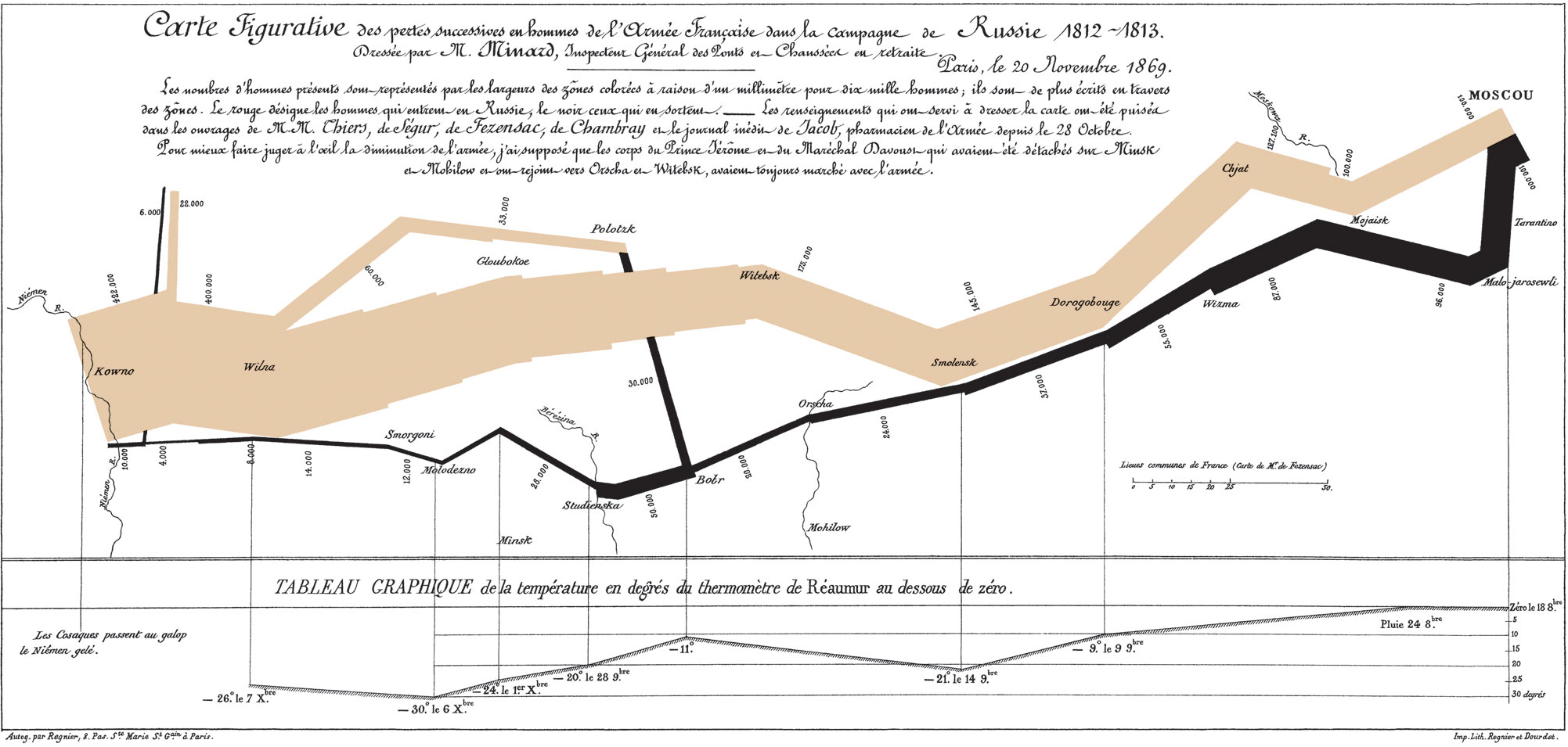 Having seen Minard’s war map before, having it explained made it even more apparent how brilliant of a visualization it is. I suppose the main value that it provides is in the instant data transfer that occurs by looking at it–it’s very clear how quickly Napoleon’s army shrank on the campaign. My new favorite part of this map is the space-centric approach to visualization, and making time fit the geographical data at the bottom since it’s much less relevant (especially at the time) than the geographical progress towards (and away from) Moscow.
Reading 2: The Potential of Spatial Humanities
Similar to Minard’s map, this piece challenges the importance of time in narrative. Bodenhamer puts emphasis on the limitations of spatial visualizations as they exist today, and I agree this is a part of the field that needs work.
-
Commentary
##Cartographies of Time
I really enjoyed the reading because it forced me to think critically about timelines, and how the idea of linearity presented itself. It is one of the patterns that we inherently recognize but have never questioned, and to imagine that once tables were the preferred method to record kingdoms.
##Analysis of Charles Minard: Russian Campaign of 1812

This is a beautiful visualization because it shows the effect of multiple factors on the march and highlights the diminishing size of the force through time, temperature by representing it geographically and directionally with their course of travel. This map highlights several things that make it a great spatial and temporal account of history. One of the main factors is the comparison that allows us to view the reducing size of the army on the march there and back on one sheet of paper. We can also simultaneously think about effects of geographic terrain, and the dropping temperature as contributions to survival rate. Although this was made years ago, I see similar trends in the info graphics that we experience today, where visual representation is complemented to minimal text to further emphasize a perspective.
-
Commentary : The Potential of Spatial Humanities
I really enjoyed reading Bodenhamer’s piece because it so elegantly illustrated the effects space can exert on people and society. The description of the landscapes in the introduction alone replayed the images of the actual history landscapes represent and how they are not only reflections of a time, but shape time (the American “Wild West”) and society. With this in mind, I agree with Bodenhamer’s claim that while useful for the quantative mappic of spatial data in urban planning and architecture, GIS hides the true emotion and complexities inherant in spatial data.
-
Commentary : Cartographies of Time
I thought it was really interesting how Rosenberg’s work compared to Bodenhamer’s. Rosenberg seems to demonstrate that spatial mapping can bring to life otherwise uninteresting data and Bodenhamer thought that technologies like GIS strip data of its inherent emotion. To consile these differences, I think that compared to just looking at a list of dates and events, spatial mapping can tell the story of a sequence of events but not so perfectly that they capture the stories of their time.
-
Cartographies of Time + Spatial Humanities
Cartographies of Time
Joseph Priestly’s simple, yet informative timeline (pictured above) explores the times that certain prominent scientists lived. The timeline lies on the top and bottom and shows a span of around 800 years with the scientists depicted as horizontal lines in the middle. This type of timeline is able to visually show when lives of the scientists overlapped, and thus how scientific progress of the time was related. However, as the authors note, its main shortcoming (and the shortcoming of any timeline of this sort) is that “historical narrative is not linear.”
Because it’s so simple, it surprises me that it was the first of its kind when it was published, and described as a “watershed” by Grafton and Rosenburg. I think this type of timeline would be great for showing interrelationships between contemporary scientists, but perhaps having additional information, such as which scientific discoveries occurred when, would greatly help this type of timeline.
The Potential of Spatial Humanities
The biggest advantage of GIS is its power for geographic analysis and ability to handle large amounts of geographical data (the likes of which hadn’t been achieved by that point). However, similar to the point made by Joanna Drucker, we cannot display the world objectively; instead, this technological design implicitly carries bias inherited from the priviliges of its designers. The shortcoming of GIS, and what critics of GIS mention, is that the technology isn’t able to handle the complexity of our modern world and appropriately display it.
-
Assignment 4
Time in Print
Analysis on two examples from the text:
01.Annals of St.Gall
This manuscript chronology with dates in the left column and events on the right depicts events in the Frankish kingdoms in a comparative concise chronological oder. Although this chronology gives no distinction between occurrences and human acts, and no differences among periods, the ambiguity of narratives still stores and displays the historical information in an objective way. Rather than just a tool to record and visualize the history, this chronology itself could be a component of history that figures a world in which “forces of disorder” is in an important place.
02.Charles Renouvier’s 1876 Uchronie
This diagram overlays and depicts the actual historical events and alternative paths that might have been if other historical choices had been taken. Although there should lie a relatively strong and tensive comparison between two types of events, between the real track and imaginative one, the difference between them is just displayed by uppercase and lowercase letters. Graphically the distinctions could be more emphasized by taking use of different colors, line types, or length weights.
The structure of this diagram also shares the same logic in the statement “If…Else…” in programing language. This logic metaphors a huge network beneath the real world and inspires audience in an imaginative way.
The Potential of Spatial Humanities
Advantages of GIS
01.Compared to a static paper map, GIS is able to interactively bring up other levels of information and show their respective values to compare against the others.
02.Through managing and visualizing qualitative spacial data, GIS effectively revokes several techniques used before (i.e. mapping, logical overlay etc ).
02.GIS is able to well solve corporate problems such as route logistics or market analysis. Chain company like IKEA and Walmart are taking advantage of GIS to analyze where to locate and how to optimize supply chain management.
Shortcomings of GIS
01.GIS technologies are of high costing. The issues they aim to address are complex and difficult to deal with.
02.Ambiguity and uncertainty of evidence and data are not favorable in GIS, which hinders the humanist to fully take advantage of the GIS technologies to some extent.
03.GIS is limited to understand social complexity and depict a more evocative world which is built on understanding of history and culture.
04.GIS is not able to produce knowledge.
-
Assignment 4 Readings
Cartographies of Time
Overall, I thought it was very interesting that the study of the timeline was more important than the study of history, at one point of time. I never thought of them as separate fields of study until reading this text. When reading about Eusebius’s chronological table, I was instantly drawn back to my timeline prototype, where I focused on viewing US & Iran events in parallel. I like the quote “chronology and geography were the two eyes of history: sources of precise, unquestionable information, which introduced order to the apparent chaos of events”. I believe this understanding of the two fields will be the basis of how we look at alternative ways to organize events in time and space, and work on our mapping project. Diving deeper into Minard’s infographic, I thought it was a shockingly modern design. I feel like infographics today using various web tech follow Minard’s style as well.
The Potential of Spatial Humanities
When reading this chapter, it seemed like one of the big shortcomings of GIS, especially in the context of humanities based research, is that it privileges quantitative data over qualitative data. It didn’t allow for fuzzy data, which can be detrimental to certain humanistic endeavours. For example, in the Moby Dick data, there’s data points that can’t be mapped to real geographic places. In it’s out of the box preparation, it focuses on the Western view of the world. I think one of the advantages of GIS is “moving history”. The text discusses how GIS could simply not work for many forms of humanities who rely on forms of “spaces” that don’t necessarily map to a Cartesian coordinate system. It also talks about how it did work somewhat for history and archeology, two fields that fall under this idea of “moving history”, where time based data is tied to physical locations and movement from one place to another. I thought the idea of combining GIS with other media in the form of “deep maps” was very interesting, and quite relatable to modern day digital humanities projects catering to various “senses”.
-
Assignment 4 - Digital Humanities Chapter 02
THE ANIMATED ARCHIVE
The digital Humanities offers new challenges and possibilities for institution of memory that archivists, librarians and curators can not simply enlarge but completely re-envision their communities, publics, and missions. The memory palaces will be bigger both from the standpoint of the physical territory and the corpora of information they harbor.
HUMANITIES GAMING
Although being considered by many humanities as frivolous, digital gaming demonstrates a capacity that could transform digital humanities pedagogy. The main reasons are two fold. The first is that game-world simulations are capable of functioning in real time with multiple participants no matter where they are. The second is that the audience nowadays is a generation of students who have grown up gaming. How to take the gamesmanship of humanities research as the basis for games of scholarship is the challenge this method faces.
-
Assignment 4 Commentaries
Reading 1: Cartographies of Time
Eusebius’s chronological tables provide a well-organized look at different events and when they occurred. They are formatted with parallel columns and are made specifically to be easy to reference. I think that Eusebius’ goals in creating this table are particularly interesting in how they informed his final result. Although there is room for improvement, the tables are overall easy to understand and reference. I find it surprising that this model went in and out of fashion and am curious about any other methods for delineating chronological distance that appeared in between these phases.
The description of how our perception of time has changed throughout the ages and how that has affected the way that we represent it and the emphasis we put on chronological display was interesting. Thinking about timelines as both recent and as a metaphor rather than the only way to represent time is something that challenges many common conceptions of time itself and is a reminder that data visualizations directly relate to one’s understanding of underlying concepts.
Reading 2: The Potential of Spatial Humanities
This article’s main ideas were similar to those in the Drucker article. The biggest disadvantage of GIS is that it ignores swathes of information that add context and perspective to the data portrayed. However, it has the potential to display large amounts of information in accessible formats, and can change as people discover new, more comprehensive, ways to show data. It is also more robust than the mapping methods that were previously available.
-
Assignment Four
Time in Print
I definitely saw timelines as simply bare-bones summaries of historic narratives, so I was surprised to read that chronology was among “the most revered of scholarly pursuits”. I thought it was interesting that they could be informing from a “meta” point of view- the ways in which chronologies selected and organized diverse pieces of historical information reflect the priorities and visions of the world at the time of writing. I was also surprised at how the modern form of the timeline is less than 250 years old.
Joseph Priestley’s Chart of Biography in 1765 was criticized because history is not linear- the reading claims that history branches off into subplots with comparisons going back and forth in time. But I thought this was an unfounded claim. Comparisons can be made by linking together different pieces of history, but that doesn’t invalidate the fact that all events happen in a strict sequence of time. I loved the nonlinear infographic technique used by Minard in his diagram showing the size and attrition of Hannibal’s armies, but this is still linear (if not straight).
The Potential of Spatial Humanities
Critics of GIS claim that it rests on positivist epistemology by assuming the existence of an objective reality that we can discover through scientific method, when in fact knowledge is contingent on the perspective of the observer. GIS doesn’t accept uncertainty, and favors official accounts - which are influenced by money and power), while using Western measures such as Euclidean geometry and Boolean logic. However, I don’t think these criticisms prevent GIS from being a valuable tool even if it can’t capture all of the subtleties and ambiguities of the world. Bodenhamer observes that the “quantitative revolution” has yet to enter the mainstream of humanities scholarship, and explains it by the fact that humanists are drawn to questions and evidence that cannot be reduced easily to zeroes and ones. However I believe that quantitative evidence will always provide valuable insight or at least context in some form or another, and it is high time for quantitative methods to be fully embraced in humanities.
-
Assignment 4
Reading 1: Cartographies of Time Daniel and Anthony spoke highly of ‘The Minard Map’which has been raised once before in one of the lectures about data visualization as a classic example, but only the way of displaying the points where Napoleon’s troops divide into subgroups by breaking out the main bar into branches was mentioned back then.Taking a closer look at this diagram, more interesting findings were discoverred this time.This statistic chart is more of a temporal-spatial diagram rather than a geographical map although the actual rivers are marked.These rivers do indicate the geography information of the event but more importantly, they mark significant changes in number of troops, which in a way indicates possible battles between French and Russian armies[Fig.1].
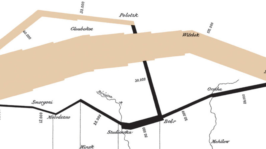 The points where the troop number changes also related to the temperature chart, and the diagram is also able to show the drastic loss in life from Napoleon’s decision in just a single corner of the diagram[Fig.2].
 I think what make this visualization so good is that it employs the geometries in a story telling fashion and unites temporal and spatial information with the geometry.
Reading 2: The Potential of Spatial Humanities Advantages of GIS: 1 Great capability to manipulate large data sets and visualize the result of spatial analysis. 2 Provide accurate and optimized solutions whose relevent calculations is beyond human capability. Disadvantages: 1 GIS employs a linear logic that is not adequate for understanding social complexity. 2 So heavily accurate data based that is not flexible to tackle ambiguity and uncertainty.
Reading for Graduate Students: Digital Humanities: Emerging Methods and Genres 1 Animated Archive The Digital Humanities offers new challenges and possibilities for institutions of memory such as archives, libraries, and museums.Users have better accessability to and interaction with the remains of the past. 2 Thick Mapping Thick maps are not meant to be static representations or accurate reflections of a physical reality; instead, they function as stacked representations in which one representation is linked or keyed to another.It has a dynamic, ever-changing environment,new data sets can be overlaid, new annotations can be added, new relationships among maps can be discovered, and, perhaps most importantly, missing voices can be returned to specific locations through “writerly” projects of memory that the participatory architecture of Web 2.0 applications has made possible.
Enter text in Markdown. Use the toolbar above, or click the ? button for formatting help.
-
Spatial + Temporal Representation
Cartographies of Time, Rosenberg & Grafton
 Marey, Muybridge, and Douglas
Photography, and more specifically, chronophotography, is examined by Rosenberg and Grafton as an instance of technology-enabled temporal representation. They point to three people who have used photography extensively in their work as a mode of representation, although their work has all been somewhat divergent. They point at Etienne-Jules Marey, Edward Muybridge, and Andrew Ellicott Douglas, and how temporal representation is a key issue in their work.
The idea of accurately depicting historical events, with context, temporal, and spatial axes is a difficult and informal; to further complicate this, objectivity is difficult to obtain. These three examples presented in the text show the impact of technology on representational and visual problems. There are three approaches in the work of Marey, Muybridge, and Douglas: an overlayed image, individual slides, and ironically, a static photo that also shows the greatest lapse of time.
Here, the three are addressing the representation of visual, bodily, and time-dependent data. In a simple, yet very understandable way, they have captured and shown how a bird flies, how a horse moves, and the aging of a tree. They reveal information that we wouldn’t have known, seen, or understood otherwise. Muybridge + Marey’s examination of bodily movements reveals, for example, ways the human and animal body contort in ways that are unexpected. The age of the tree, is almost the opposite of their work because it shows a “low speed” progression of time.
Doc Edgerton, from MIT
These examples show interesting ways in which technology can affect how we represent events. In the beginnings of photography, it was a very objective method of recording data that did not discriminate in what was recorded, as long as it was in front of the camera lens. This leads to work like Doc Edgerton’s, which did similar studies but on also inanimate objects and physical phenomena.
The Potential of Spatial Humanities, Bodenhamer
Shortcomings and Potentials of GIS
“GIS promises to re-invigorate our description of the world through its manipulation and visualization of vast quantities of data by means previously beyond the reach of most scholars… we again run the risk of portraying the world uncritically, this time with a veneer of legitimacy that is more difficult to detect or penetrate.”
GIS is a powerful tool that allows visualization of space and geography, but as with all technology and the extraction and resulting representation of data, I am interested in how GIS fails (in the eyes of Drucker) to sufficiently tell the story. Technology has a tendency to erase less priveleged points of view, and this idea is expressed in the text, as well.
With the politicalness of geography and maps, representing the data from more than one (i.e. Western) point of view is important. However, the existing implementations and uses of GIS are clearly useful, especially in urban planning, architecture, and the sciences.
-
Assignment 4
Time in Print Gerardus Mercator, astronomers, historians and cartographer, collected astronomical evidence-records of dated eclipses and other celestial events mentioned by ancient and medieval historians. By doing so, the historians and scholars could get better understanding of these recorded events in dates and hours, which provide more detailed information for research. The beauty of this method is that it can combines astronomy and geography information together to present a comparatively real setting. Joseph Priestely’s Chart of Biography in 1765 also gave us visual understanding of the peak when most famous historical figures were active( which is also useful and frequent used in today) and the general compare between each period. Even though it has the limitation in linear timeline format, but its clarity and power is valuable.
Spatial Humanities In this article, the author first analyzed the contemporary concept of space which based on time. And then he illustrated that space could give different countries different characters. And there are a lot of debates between GIS critics and defenders. The former criticized that the world could not be measured so precisely and GIS does not accept uncertainty. While the defenders think that although there might be different understanding about one object, the object itself is independently existed. Then the author talks about the development of GIS and its advantages as well as the limitations. The following part he demonstrates the definition of deep map and the great scenarios when GIS mapping could associated with other technologies perfectly in representing experience and history. In the final part, he thinks its our responsibility to pursue it. I appreciate the effort that the author tries to explaining the spatial idea from ontology and epistemology perspective. I find it is interesting because usually when we start touch a new software, we prefer to learn the different functions as soon as possible rather than trying to learn the deep intention and value of the software critically. After reading it, I might start to think what’s the limitation of the software and how can I improve it. For the final goal of the author, I think the idea is just similar to other digital humanity topics which pursue combining all the technologies together. In a word, representing past, now and future.
Emerging Methods
- Big Data: In order to deal with macro data sets and make it valuable for humans, we will have to design and employ new tools to analyze, visualize, map, and evaluate the deluge of data and cultural material that the digital age has unleashed: tasks that will require humanists to contend with text-mining tools, machine reading, and various kinds of algorithmic analyses.
- Game: Even though the reputation of Gaming is not as high as academia, the high user engagement in digital humanity could build a virtual learning environment for educational purpose.
-
Example Commentary
Here’s an insightful response to the assigned reading from Digital_Humanities - etc., etc. If you edit this post in Prose and click the Meta Data button, you’ll see it’s been given the Digital_Humanities tag. Other readings will show up as available tags too, as we get further along.
(By the way, here’s the url for the open access edition of the book: mitpress.mit.edu/books/digitalhumanities-0)