Moby Dick Mapping with Google Fusion
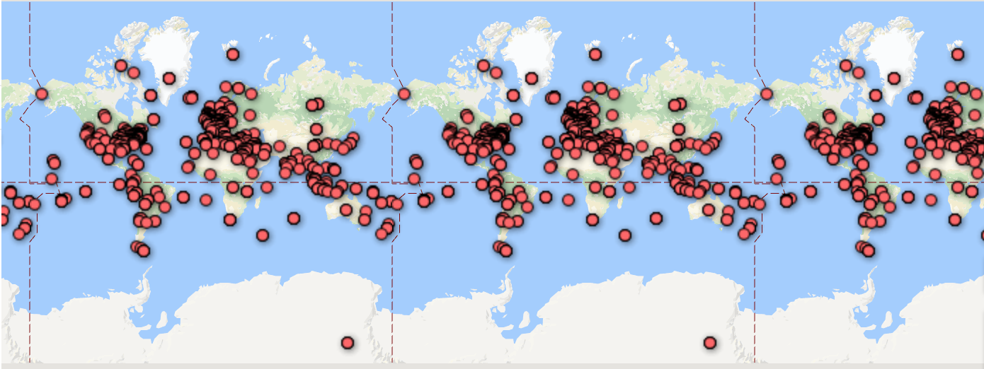
I found Google fusion kind of hard to use. I think it would greatly benefit from some improvements, such as clearer user interface and more customization capabilities that don’t require knowledge of HTML. The feature map was very cluttered:
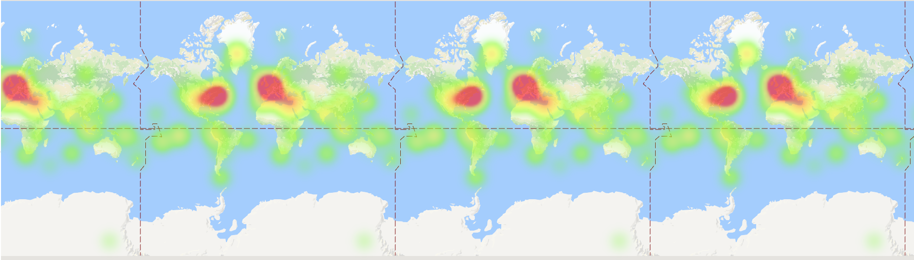
 I liked the heat map because it kind of gave a general overview of the point clusters: