Commentary
-
Assignment 22
Reading commentary for Mike Featherstone’s 2006 overview of the history and the nature of the “Archive”
In the reading, Mike Featherstone talks about the history and nature of the archive as a cultural institution. The archive could be traced back to ancient civilizations, where people used it to preserve and organize historical documents and records.
The article also explores the development of the modern archive, which emerged in the 19th and 20th centuries as a way of organizing and preserving cultural artifacts and documents. Mike argues that the archive not only played a key role in shaping our understanding of the past and our collective memory but also was used to exert power and control over history.
The concept of “archive fever” is also interesting, which refers to the desire to collect and preserve cultural artifacts and documents to preserve the past. There are deeper psychological and cultural motivations behind the desire. The author argues that this desire was driven by a sense of loss and a need to hold onto the past but also highlights the archive’s potential dangers, such as distortion and manipulation of history.
Reading commentary for Wolfgang Ernst’s “Dynamic Media Memories” in chapter 4 “Archives in Transition”.
This reading discusses the changing nature of the archive in the digital age. The author argues that the traditional concept of the archive as a static and fixed collection of documents and artifacts is no longer relevant, as the proliferation of digital media has led to a more dynamic and fluid understanding of memory.
Ernst points out that the digital archive is not simply a collection of digital documents but is also shaped by the technologies and processes that are used to create, access, and preserve these documents. He discusses software and algorithms’ role in shaping how we access and interpret digital information.
The author also touches on the concept of differential archives, which are self-learning and adaptable to their respective media formats, and the role of cognition in the creation of memory. Ernst also points out the importance of media-specific archival practices and the need to abandon the storage metaphor in favor of a model of memory as a network.
Reading commentary for chapter 3 “Underway to the Dual System” by Wolfgang Ernst.
The author discusses the concept of a digital archive and how it differs from classical archives. Traditional archives are based on storing physical items, such as documents or artifacts, and rely on classification systems to organize and access them. In contrast, digital archives are generated on demand and are accessed online through networked computers. Using agents and filters allows users to create and shape the content of the digital archive, making it a generative and participative form of archival reading. The author also discusses the challenges of archiving processual works, such as born-digital media art, and the need for art and archival language to be developed for these types of assignments. The digital archive operates at a micro-temporal level and relies on the archiving of source codes, rather than fixed data blocks, to regenerate new copies of algorithmic objects. The author also explores the mathematical basis of the digital archive and the potential for it to be used as a tool for memory production.
-
Assignment 22
Featherstone’s Archive Paper The bounds for what is considered an archive are widely expanding with the addition of internet storage mediums. It is to the degree that I didn’t even know that archives was a government defined entity, as Featherstone described it, as I thought it was just a means of organized storage. The transition of archives from physical to digital can be an active parallel to the transition of archives after smaller nations ceded archives to larger nations due to war. The same arguments, such as the rights to determine what remains in the archive as well as who has control over determining that, can be applied to the internet from physical archive debate. I did not know that archives were intrinsically political entities, originally utilized to categorize populational data. But it is no wonder as to why the debate on what information remains in an archive and what gets removed stemmed from a transition over to what type of information is contained within the archive. In terms of population data, one has no reason to debate whether to remove someone’s information from the registry in an archive.
Wolfgang Ernst Dynamic Media Memories The concept of an archive has drastically changed from a fixed storage entity to a constantly changing entity, due to the hardware used to write and store the information. This is an incredible insight, especially if someone is not familiar with the flaws of electronics, as devices change and break down over time. But with the logic he uses, although the paper is more durable than a single storage unit, it also breaks down over time, so does that mean the concept of archives has always been a constantly changed entity? Or is the concept of time by the user in play when someone identifies an object as fixed/stationary, and another defines it as changing? Archives become just a transfer of data through the advent of the internet? I don’t know how much I can agree with this notion. Although the speed at which one grabs data from storage is incredibly decreased, the process of searching for the data still exists nonetheless.
-
Assignment 20
Kirschenbaum, “So the Colors Cover the Wires” The interface is framed as the most crucial part when designing a product that requires end users to view with the commentary. This insight is especially pervasive as he is targeting regular digital humanities researchers attempting to abide by specific deadlines, targeting us specifically, to which they focus on data collection rather than the end product for the user. I remember coming across apps that I deemed unusable, because the interface was too old or unattractive, but I do not think I made the connection as to work it would take to customize an appealing interface. The commentary also displays irony, as most of the interfaces the writer deems as great interfaces, I would not show the same appreciation. This means that there is also a time aspect to developing interfaces, as the more advanced the technological age is, the more the need to be constantly upgraded within the design to appeal to the user persists.
-
Assignment 18
Hearst: What is Text Mining? Hearst makes a distinction between true text mining and current text mining, in which true text mining is able to discern unknown patterns and interpret context within articles, while current text mining is very similar to data mining, only garnering known facts about the article (frequency of words etc).
Contrast between Text Mining over 20 year span Text mining defined with Hearst: Untangling Text Data Mining was still frequency and pair based mining, in which algorithms only looked for specific words within the data and presented the information back to the user. Although this is conducted in texts, the level of sophistication that these algorithms employ was on the same level as data mining. There was little to no use within the humanities field, as it was still largely fact based. Looking at Binder’s article current day, the field of text mining has made incredible strides, as the algorithms are able to connect sentiments towards specific fields of text with a respectable accuracy. This new version of text mining now has the potential to be used for humanities analysis, and is also a step closer to interpreting the context of specific text without human intervention. It is interesting looking at the progress of the field over the course of decades, but I am still a little skeptical about whether text mining would be able to interpret context on the level of a person.
-
Reading responses to Featherstone & Ernst (Data Archives)
Reading responses to final course readings:
Featherstone’s overview on the nature of the archive
- Archives are for storage, but they are also for access.
- This text connects to our Memes of Resistance project, stating clearly that archives are also necessary for the documentation, and remembrance, of uneven power struggles and surveillance activities. But those who control the archives control the remembrance. That archives, as they were originally conceived, were to be kept secret is worth noting. Archives were also conceived of as playing a role in regulation and oversight of populations: “From the perspective of the emerging European nation-states as they became drawn together and then locked into a globalized power struggle, the construction of archives can be seen as furthering governmentality and the regulation of internal and colonial populations, as well as providing foreign policy information about the strategies and globalizing ambitions of rivals.” More nefariously, this led to an individuation process, whereby “people’s characteristics were observed, recorded and stored in the files,” which is perhaps most common today in oppressive regimes. However, this is exactly what’s happening over the Internet–many of our behaviors, including and perhaps especially our purchase behaviors, are known more by companies than by ourselves. The issue of classifying and selecting data is, in today’s case, extreme, as is the issue of data ownership, which did not originally exist in the case of many historical archives.
- I particularly enjoy the insight of “‘archive reason [as] a form of reason that is devoted to the detail’ (Osborne, 1999: 58). Yet it is clear that the archivist’s gaze depends upon an aesthetics of perception, a discriminating gaze, through which an event can be isolated out of the mass of detail and accorded significance.”
- Now I have to read “Funes, his memory.” This story sounds fantastic.
- I agree with Foucault’s formulation of the archive as archaeology, viewing it as a humanized accounting system in which discourses are created from given data.
Ernst’s “Dynamic Media Memories” | Chapter 4 in “Archives in Transition”
- It’s telling that German public broadcast services view archives as “production archives,” compelling us to recycle archived information and keep it in use.
- Digital archives are co-produced by users for their own purposes.
- The ability to memorize is now automatic for digital systems, but recall still requires resources.
- “The shift from emphatic cultural memory (which is oriented toward eternity) to intermediary media” implies a sort of “Eye of Sauron”–a shift in focus as cultural memory dissolves and intermediary interests take root. Perhaps time, today, seems to move faster because our memory is simply shorter, as we offload memory tasks to computational agents that curate information to us in ways that humans never would in a technology desert.
Ernst’s “Underway to the Dual System”
- This section expands upon observations of the last, integrating our understandings of generative data and memory manipulation through recall.
- Specificity of search and recall is paramount in the digital archive: “The digital archive has no intrinsic macrotemporal index, as the “year 2000” problem made clear. It operates at a microtemporal level instead.” Likewise, their existence emerges through recall functions: “Algorithmic objects are objects that always come into being anew and processually; they do not exist as fixed data blocks.”
- References becoming “self-aware” is a unique and curious concept. Hyperlinks allow us to embed and access data that we would never be able to embed and access in the “real world,” such that they take on new meaning and engagement capabilities. Paired with the fact that algorithms allow us to construct new data through faceted affordances, this paradigm makes for a novel way of creating, in a sense, our own custom views of reality. This is both worthwhile and dangerous, in the case of archives, since this customization can do away with important nuance, improperly focus on details that are context-dependent, and inauthentically allow individuals with archive control permissions to dictate the scope of public data access and, as a result, public knowledge and discourse channels.
-
Featherstone 2006 Joshua Mbogo
A New Post
Its was interseting to see how the way that digital and traditional archives were talked about. I think what stood out to me the most was the how digital archives have become more like data and more data has been recorded because the type of archive is decentralized. This decentralization is the opposite of the traditional archive which existed as a map or correlation of data that was put together by the librarian / archivist. The reason for a map is because users can’t just look up an archive they must have an understanding of how things are connected. This map allows for an understanding of the data but it also makes traditional archives more static than digital which can be mapped in many different ways because it can be filtered and represented in many different ways.
Enter text in Markdown. Use the toolbar above, or click the ? button for formatting help.
-
Reading Assignment 22 - Qingyu Cai
Mike Featherstone’s 2006 overview of the history and the nature of the “Archive” reminds me of the feature of data accessibility. There are inequalities in both data and archives, strongly affected by power and right. The questions of who makes the history and the extent to which there should be wider access to those who seek to search out counter-histories remind us of the correctness and origin of archives. Less powerful nations are also less potent in maintaining their own archives. For instance, nowadays, we can see that in some countries’ museums, some archives and preservations originated from other countries. How and why are they here instead of in their mother countries? Furthermore, some archives can also be destroyed for various reasons, such as wars, natural disasters, artificial damages, etc. The archive itself can not only be regarded as a form of documentation but also a process of history. It is critical to look into what is documented as the archive’s content, while it is another interesting story to view the change of the archive itself as the research object. The second takeaway from this week’s readings is about archiving media art. How to archive media art exists a series of questions worth discussing. The feature of media art determines the answer to the question of how to archive media art. Current solutions include objects, pictures, and artifacts, while electronic communication is based on time. The archive forms of media art cannot reflect in-time communication and resist archiving. Besides, some media arts are instantaneous art, and do they need archiving? So, the main questions for archiving media art include the archiving forms and the necessity of doing so.
-
Assignment 22- Sally Chen
1)“Archive” The article discussed the origins of Archive and how it has changed as digitalization has evolved. As mentioned in some of the earlier readings in the semester, there is a lot of discussions about how to archive website data or dynamic media data. Who has the right to organize the archive? Who will have access to read or edit these archive? What kind of media should be archived? Because the owners or the organizers of the archives have consciously or unconsciously included their bias to the archiving process, the history or reality reflected or represented by the archives will always be partial and subjective. Therefore, we should emphasize the diversity of archive creators. With different archives coming from people who look at the society from different perspectives, we are more likely to have a “whole” representation of reality.
2)“Dynamic Media Memories” Compared to traditional static media, the advantage of dynamic media is that it is more flexible for extraction and editing. One limitation of dynamic media is how people decide whether the data flowing through media memories should get an “end of flow” to storage and even archive. For example, in TV media, formal TV programs such as news are usually recorded for storage, while most of the TV time is for advertisements. Should it be recorded through video recording data like news reports even though they are actually repeating themselves? Or should they be stored through counting numbers? What would be lost during the media transformation?
3) “Underway to the Dual System” The author illustrated the differences between traditional archives and digital media archives in many ways, such as the separation of storage and presenting in digital archives, the essential components of archived media (language letters or 0/1), and so on. Digital archives are based on software for presentation, which links data in hardware (0/1) and media stimulus for human perceptions(image, sound, text, etc.). Therefore, digital archives are generally unstable for individual users because they do not own the hardware that store the archives and the software that access the archive data and transform the mathematic components to media forms, but only have access to the presented media formats. It will lead to some challenges for the users in terms of archive transfer or advanced data processing. And for digital archives, their authority is challenged because the people who control the software and hardware essentially have power to decide what data can be archived and how it can be archived (what algorithms are used to process the 0/1 to produce the desired media data).
-
Assignment 22 Comment_Elva Si
This week’s readings broaden my understanding of what “archives” mean. In the traditional sense, archives can help to discover historical records and truths that have been hidden or lost. Based upon what are archived and how they are stored, future generations may come up with a completely different interpretation of the past compared with the reality or they may be limited to search out counter-histories.
Since archives have weaker classifications and greater amounts of material that is boxed or shelved under chronological or general headings, they provide more space and depth for interpretations. From a humanistic perspective, we can raise the question of who makes the history and what is missing from the history based on the available archives. We can also find connections among various archives speading across the global, including but not limited to keywords, images, linkages between space and time etc. Possibly, we can find priceless records and icons that have a high degree of contingency.
Archives could also serve a function that I did not realize before. They could be places for creating and re-working memory. For our final project, we are thinking about including closed LGBTQ+ places and events in the map. For example, Shanghai Pride Parade, LGBTQ Film Festival, Eddy’s Bar (Gay Bar), Lucca 390 (Gay Bar). These places and events are shut down due to government regulations or COVID influences. The archive in this map can be a powerful tool to support future generations memorizing the places’ and events’ existence and/or re-create something similar in the near future.
-
Assignment 22 Comments
Archive
In Featherstone’s article, he touches on many different points. One of the main points that I took away is that historically, archives have been the basis of forming a nation, that with these archives, one can build an ‘imagined community.’ However, this raises the question of how much should we archive, which correlates with who can view these records.
The archive is not just a collection of the past, but it is through this collection that the user can discover more about themselves by identifying with history.
Archives In Transtion
Today, with the immediate transfer of data, any present moment instantly becomes a memory. This really changes the way we view the archive. Instead of the archive following a static, chronological order, it’s information can be taken in and out, allowing us to shift back and forth in time.
-
Assginment 21_Xiaofan
The research proposed an innovative approach – a generative system to rethinking the data visualization process. It argues that the visualization of cultural archives is objective and biased in its traditional research process, as the researcher might prioritize certain viewpoints based on the socio-cultural conditions at that time. The generative approach would bridge the gaps in the archive process; it would also democratize the ‘sole decision-making power of the archives in the formation of cultural heritage.’
The sets of matrixes the author developed are enlightening in that it offers new perspectives when users choose different parameter combinations to explore a topic. The layering of information allows users to investigate further and understand the relevance of a multitude of information that doesn’t necessarily share the same metric unit.
This research paper also provides insights and inspiration for our project, the Dutch art website. We could also develop the idea of layering to create an interface that allows for the combination of a variety of information, with the visual representation of these contents through different space configurations, homogenous ones, and variable-dependent ones.
-
Takeaways from Max Frischknecht: Participatory Image Archives - Qingyu Cai
The idea of generative design serves as a tool for designers to create designs for interfaces based on use case scenarios. The matrix created can help to serve as a design framework, allowing the analysis and synthesis of functions, features, and categories. Besides, the scenarios created can serve as interface design guides, letting designers know what users seek and can explore using this interface. The generative design idea and the matrix lay a solid foundation for the interface design of dynamic visualization, which gives us a hint and guidance for our final project. We can also create a matrix to analyze what flows we will make and for whom we design. Currently, we have three main views of the homepage and several sub-categories of a single work display. It is the potential to create a matrix for different personas to test the completeness of our design in terms of both functions and details.
-
Max Frischknecht’s writing on Digital Archives
The greatest take-away from this piece is that “the visualization of cultural collections… shouldn’t aim at reproducing and consolidating the hegemonic claims of archives, but rather invite the viewer to critically question what is being viewed and the circumstances of its creation.” In our project, where we evaluate memes of resistance deployed during the Russian Invasion of Ukraine, it’s important for us, as well as our audiences, to consider the position of these memes within culture, and to question them accordingly. Who created them? What were their intentions? Were the memes targeting someone or something, and what kind of effect were they trying to have on audiences (who, like ours, will be viewing them in similarly social environments)?
As Frischknecht argues, our data visualizations may be considered generative in some respects (they are also participatory, as designed), but they are significantly limited. We supply certain conditions (e.g., data) and ask a program to generate an illustration of those data for us. Then, we might place new restrictions on it (e.g., altered color schemes) to seek new ways of visualizing the information, but the system carries these tasks out based on its own design functionalities.
The author’s examples of visualization types based on intended emphasis (of space, as a map, and time, as a timeline) are particularly relevant to our work. The latter visualization may be helpful, for us, in showing how meme content changes over time across different subreddits when selecting for particular content facets (e.g., references to violence, references to politicians). We could also show concentration of meme facets at a single time point using a map.
-
Generative Design - Joshua Mbogo
A New Post
I think it is important to think about the importance of what you are trying to get out of the data and what you are actually trying to visualize. The article makes a distinction between visualizations that are trying to show data versus a process and how that might change how the data is represented and interpreted. This article continues to emphasize context and how it not only grounds a digital humanities project but idetinifies and controls the project to a significant degree.
Enter text in Markdown. Use the toolbar above, or click the ? button for formatting help.
-
Comments on Max Frischknecht (University of Bern) Thesis
The framework of Max Frischkent’s research on generative interfaces is enlightening in regards to questioning the objectivity of certain kinds of data, specifically archival data, which represents pieces of information that were selectively catered and chosen from a wider dataset. Just like what was previously discussed within prior works for DIgital Humanities, data is inherently objective structures that are selected subjectively to maintain an argument, and when presented in visualizations, add an extra layer of subjectivity as the data is framed in a particular way. To create an interface that allows the user to understand and interact with the process in analyzing data, provides an additional layer to the archives for individuals with no prior knowledge of the subject matter to actively participate with and analyze the data. By doing so, Max’s research contributes to a characteristic that is needed in most fields, even outside of DIgital Humanities, a need to lower the barrier of entry to understanding the origins of relevant data.
-
Assignment 21_Elva Si
The visualization of cultural collections, shouldn’t aim at reproducing and consolidating the hegemonic claims of archives, but rather invite the viewer to critically question what is being viewed and the circumstances of its creation.
Frischknecht brought up an unique and essential approach to consider archives in a humanistic setting. As data is capta, digital archives should be capta, of which could be recording of natural phenomena and/or subjective perspectives. I really like the idea of asking users to participate into archiving cultural heritage collections since it could reduce the “sole decision-making power of what should be archived. Inviting and incorporating people’s views and practices, especially those from cultural minority groups could benefit the collection of what would be passed to future generations. The matrix generator is effective and straightforward for users to identify the goals, aspects, concepts, and granularity for archives. I think we could create something similar in our interactive map to guide users contribute to the location/event information, as well as archiving past/closed places to record their memories or views.
-
Assignment 21- reading- Sally Chen
I think Generative Design can help generate the visualization that the user wants - by choosing different variants to limit the type of presented data and the way it is presented for the purpose of illustrating a problem or supporting a point of view, etc. This design framework is more effective when data types are abundant and “complete” as users can obtain outcomes in all combinations of variants. In addition to being able to quickly and easily acquire visualizations, I think another advantage of using the generative design is that it can facilitate users to explore previously unnoticed visualization models that may be valuable. For example, the Task classification in matrix 1 may facilitate designers to consider more tasks that users can do with the interface. Overall, as the demand for visualization of digital archives rises in academia and the mass, it is significantly meaningful to develop such a generative design. On the one hand, it can help scholars to explore and visualize archive data initially without long coding time. On the other hand, this design can be applied in exhibitions or museums which are facing the general public to present historical perspectives. Since our project is a map-based visualization, I think the design matrixes in the article can help us to figure out the way we want to present our data and what kinds of content should be primary and which ones are secondary during our brainstorming phase. The brainstorming process based on the design matrixes needs to consider how to integrate the different kinds of visualization into one interface in an effective and simple way while taking into account the user experience.
-
Assignment 21
Commentary on Max’s research
From what I gathered after reading Max’s research summary, through generative design we can continue to input a different number of design approaches, each with different values or requirements, until we find the most effective solution. In Max’s case, he hopes to find the best way to visualize data surrounding cultural characteristics through his matrices which give him different possibilites of visualization, and through visualizing this data, he can answer or create tools that help to answer questions of the past.
Relevance for our project
For our project, we are aiming to show how design of certain objects has played out over time. Our visualization type is our timeline, but there may be different visualization variants that more effectively answer questions on our topic.
-
So the Colors Cover the Wires - Joshua Mbogo
A New Post
I think a very interesting thing that is discussed is the meaning of interface. Many times people associate the word with a spatial construct but this writing touches how this doesn’t have to be the case. It highlights how often we work with interfaces in our daily lives with the example of doorknobs and house surfaces in general. In a broader sense this piece enlightens the reader of how everything in our reality is an interface from our own eyes to our ability to feel and interact with haptic devices. The goal of discussing these types of things is to improve and expand on the types of interfacese we use when building devices and experiences for users. Currently in the modern world we have become very familiar with Graphical User Interfaces (GUI) and very recently haptic interfaces but as we increasingly peer into the future and the discover the technologies that lye their we also begin to peer into new and exciting interfaces to interact with the modern world.
Enter text in Markdown. Use the toolbar above, or click the ? button for formatting help.
-
So the Colors Cover the Wires Commentary
comment on the aspects that have changed your understanding of interfaces, especially the GUI, and what kind of impact they might have on your final project.
I really liked what was discussed in the section titled “The Artist of the Beautiful.” I feel that naturally I’m more drawn to a more beautiful interface, but I also feel like I’ve alway appreciated art and design a lot, so I thought that this made sense. However, I learned that having a beautiful interface is so important for a software because its technology is so complex. Because we want to separate ourselves from the computer and what’s actually going on behind the scenes, having a beautiful interface is so important to do so.
-
So the Colors Cover the Wire - Assignment 20
If there is a lesson here for the digital humanities it is simply this: just as interface cannot – finally – be decoupled from functionality, neither can aesthetics be decoupled from interface.
I find this quote intriguing, as the two go hand in hand when it comes to user interface. However, which is more important? The functionality or the aesthetic part? I think one can argue that if one isn’t drawn to the interface aesthetically itself, then it’s not a good interface. Even though it’s functional, it might be harder for the user to navigate through it if it’s not organized neatly or doesn’t look good, making the app really “unbearable” to use. So at what point do you sacrifice functionality for aesthetics, or vice versa? Either way, it feels like you can’t have a good application user interface if you don’t have both.
User interface is especially important since our project is based on conveying informationthrough a timeline, so having an accesible and aesthetically pleasing interface is crucial. But like the above principle, we meed to maintain the functionality of our project. We are going to try to draft up ideas to find out the best way to convey information while making the app enjoyable to use.
-
Kirschenbaum's "So the Colors Cover the Wires"
There is a massive array of interface types, and we interact with many of them every day. The touchpad on a laptop, a remote control, a touch screen on our phones, are all interfaces, allowing us to interact with something “under the hood” that we could not interact with directly. Ultimately, however, the interface is an intermediary. It gets between us and the data we’re hoping to affect. In any given situation, there may be a dozen or more “layers” of what one could call an interface.
As illustrated in examples here (e.g., Nelson’s “the last machine with moving parts”), interfaces determine what can be done in the data world (as I’m calling it–the world in which the data sits and can be manipulated by users through interaction with an interface).
I haven’t before thought about the idea of “beauty,” specifically, in interface design. Elegance, simplicity, and clarity are what most come to mind when I consider the necessities of interface architecture. But beauty, and Gelernter’s “deep beauty,” seem particularly useful in distinguishing functional interface forms.
I also haven’t been exposed to the concept of a “contact surface,” but have done work previously examining book pages, and other physical textual surfaces, as interfaces. It’s true that these interfaces possess essential information experience capacities, not least of all because of the availability of additional tools (e.g., pens, pencils, paperclips) that allow us to augment the physical interface for our unique needs and, in some cases, in ways that go beyond the capacity of most digital tools for text analysis and annotation, in large part due to the limitations of digital interfaces for textual interaction.
Regarding our final project: there are several useful insights from this work. First, we can consider alternative interface schemes; we’ve been considering, primarily, a desktop interface, but what about a screen interface within a museum setting? What about an augmented reality interface that allows us to visualize memes in physical space as we see something different on a monitor, or in another physical space? Second, we can consider streamlined design elements (more “beautiful” designs) to enable cleaner user interactions (for now, our interface is a bit clunky, and burdened with too many features for too small a space, leaving it overly complex and burdensome for inexperienced users). Third, and considering archival interfaces: there are many other options for the presentation of “bulk” data, such as memes of resistance, that we can explore, including more search-based mechanisms and those that focus on a single display element “at a time”, rather than–as we are currently doing–flooding a single interface with too many different types of data.
-
Assignment 20
“So the Colors Cover the Wires”: Interface, Aesthetics, and Usability by Matthew G. Kirschenbaum
In the article, Kirschenbaum commented on how ‘the visual (and aural, or tactile and olfactory) elements on the page or screen function as integral aspects of the information experience rather than as afterthoughts to some “pre-existing bundle of functionality”.’ Kirschenbaum further points out that the debate on interface transparency mirrors the debate in literary studies over the nature of a book’s ‘contact surface’ and the role of its physical and material features in the production of the meaning of a text.
Aesthetic
The success of Apple is hinged heavily on its product design. While most software and websites have pragmatic or functional ends, Apple’s OS X interface encourages users to cultivate an aesthetic sensibility even in the most mundane corners of the desktop. The clean and minimalist interface only keeps what is necessary and reduces the complexity, making it distinct from other competing products.
Some questions to consider: How do we define an interface to be aesthetic? What kind of aesthetic are we pursuing in interface design? What role should aesthetics have in interface design? Should beauty in interface design play a complementary role in enhancing functionality? Or should it be the drive for developers to rethink the content and create new experiences for users to interact with it? How do we balance the competing demands of function and beauty?’ How will the design balance efficiency, ease of use, and user agency?
Usability
In the last section ‘Blake Archive for Humans’, the author also talked about the competing demands of humans and machines and how it is hard to strike a balance in interface design to meet various users’ needs. This also applies to our final project where our Dutch Art website design also has different interface design for various needs: a mindmap interface for users who want to explore more deeply the relationship between artworks; a gallery interface for users who just want to browse without specific aim; as well as a map-based interface for users who want to check nearby exhibits and locations for certain artworks.
Will the users who wish to engage more deeply be permitted to trace the wires to their source? Or will the interface enforce a clean line between who’s in and out, makers and users, producers and consumers? How will the concept of the user be inscribed or circumscribed in DH’s emergent design? How could we test if an interface is usable? To what extent should users to included in designing and building DH? How participatory and reflexive will that process be?
-
Comment on So the Colors Cover the Wires_Elva Si
The “secret” of interface design is to “make it go away.” – Nicholas Negroponte
Interface design always intrigues me because it could convey the functions and purposes of a product to general users in the most natural, effective yet inconspicuous way. I like how Matt discussed the misconceptions around GUI, which indicated many real-life stereotypes regarding UIUX design. For example, the more colorful, conspicuous, or complicated the GUI is, the less trustworthy it could be in contemporary academic settings. Matt also suggested that although GUI is often not given enough time and effort during the product development stage, it should be an integral part of design. Matt further raised questions like “what role should aesthetics have in interface design?”
Through this article, I learned about how a GUI should
- actively engage users to explore different functions rather than hiding certain tools from the interface.
- give users freedom to pull up and down a “curtain” to find all technical tools (previous/next, comparisons, enlargements, indexes, etc.) Users could arrange, label tools neatly according to their own preferences.
- ensure the main interface clean and simple.
This article provides many key characteristics to consider for our project. When we design the interface for the LGBTQ+ interactive map, we need to balance the ample information and the convinence and efficiency for navigation. We also want to ensure the aesthetic values of this map to encourage constant usage. What are some tools/functions we would love to provide to the users? What should be hidden behind the curtain while others are on the stages?
-
Assignment 20- interface reading- Sally Chen
“Bruce Tognazzini, who has had a distinguished career at Apple, celebrates a visible (as opposed to a merely graphical) interface: “A visible interface is a complete environment in which users can work comfortably, always aware of where they are, where they are going, and what objects are available to them along the way” (Tognazzini 1992: xiii). “
This paragraph is a good overview of some characteristics that a good interface should have, and one of the key points is showing what is available. For our queer map project, the main purpose of our interface is to allow users to quickly acquire up-to-date and detailed LGBTQ-related information. Therefore, we need to find the balance between offering as much detailed information as possible and creating the easiest pathway to a certain outcome (in my mind, it means providing the minimum necessary information for decision-making). For now, the minimum information we provide in the first interface includes the event/location type and location information. Since the final design has not yet been determined, if we were adding a listing feature into the interface, what kinds of basic information would help the user decide whether to click into the events/locations for more information? It needs to be further decided based on design experience and user insight.
-
Reading Assignment: The .textual Condition - Qingyu Cai
The born-digital data and texts are different in scale and complexity, posing enormous challenges for digital archivists and digital humanities researchers. As mentioned in the reading, accessibility to born-digital collections, for instance, is necessary for digital humanities researchers. Since the born-digital data is changing fast every day and even every second, it is essential for them to timely get access to the dataset. In the final project, we have two questions while trying to find collections of Dutch art in the US. The first is access to online digital collections, and the second is the continuously changing dataset of Dutch art collections in the US when new pieces are found, or new donors emerge. The digital dataset, compared to the non-digital one, should incorporate the technology to accustom the features of timely change. Besides, digital archivists and digital humanists both need hands-on retro-tech know-how. Utilizing the tools and technologies learned from the mini-projects in our final project is helpful. And the tools we have learned and used contain various aspects and functions, including web scraping, interactive mapping, data visualization, etc. Without a broader knowledge of tools and hands-on experiences, it is hard for digital humanists to apply theoretical methods into practices and realize the project. However, the emergence of new-generation technologies also brings a variety of complexities and challenges to archival frameworks. Since these technologies are also emerging, some might have limitations and bugs. So, it is also critical to gain the attention of technologists to help improve the stability and features of tools. All in all, we still need to have confidence that new technologies also bring new opportunities for research and experimentation, not just questions and problems.
-
Assignment 20-"So the Colors Cover the Wires"
“So the Colors Cover the Wires”: Interface, Aesthetics, and Usability by Matthew G. Kirschenbaum
This is a classic work that combines the senses of sight, sound and touch. The appearance of the CD Player and the exhaust fan are fused, and you pull the string that hangs down, and the music plays. This straightforward approach establishes a relationship between the designer and the product, and between the product and the user. This is Naoto Fukasawa’s well-known design concept “Without Thought”, which is to design according to the naturally existing user needs. The core of unconscious design is to translate people’s unconscious behavior and intuition into physical products that are visible to the naked eye, and to satisfy needs in the most natural and direct way, as if everything were undesigned. Returning to the origin of things and connecting the design behind the product with the positive use of the product is an extremely high design perspective and dimension. On a mobile app, every UI detail of the visual designer will serve to guide the user. The shading and color contrast of the buttons will tell the user where you want him to click. The typography and font size display of information and text will tell the user what you want him to focus on. This all happens naturally, without the user having to deliberately guess and trial and error, and automatically connects the visual language to the behavior when the interface is presented to them.
-
NLP Tools & Experiments
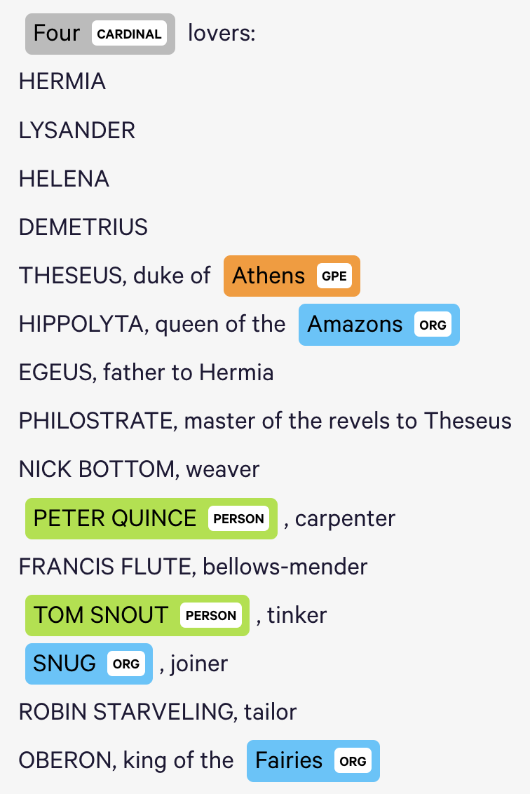
The Named Entity Visualizer provides helpful summaries of term classifications, but its classifications are often incorrect, and it does not appear that we can train its classifiers ourselves within this interface (perhaps we can do so within the larger tool). For example, it uses contemporary term associations to identify entity affilliations, and therefore believes that the textual reference to “Amazons” in this transcript of “A Midsummer Night’s Dream” refers to the organization rather than to a demographic group (see below). The tool also only allows for one entity affiliation for each word, although some words may naturally fall within multiple categories.
JSTOR Analyzer allows us to import text documents and identify topics and people based on prioritized terms whose weights we can adjust (from 1 to 5). Users can also add their own terms to identify the topics and people associated with them. In my case, I used a .txt file of A Midsummer Night’s Dream. JSTOR also provided literature (e.g., essays by Harold Bloom) related to the document I provided.
JSTOR topic graph was not available.
Voyant visualized frequent terms into a word cloud (I assume it has a list of stopwords, because words like “a” and “the” did not appear in the word cloud). Voyant provides a Reader tool that allows users to select individual terms and see the
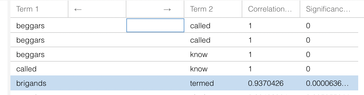
m in a concordance (otherwise, the concordance defaults to the most significant term in the corpus). Voyant returns descriptive counts (number of documents, words, unique word forms, vocabulary density, WPS, readability index, etc.). The readability index is particularly interesting to me. The word cloud can be modified to become a terms list, and links between words can be visualized (very interesting!). The TermsBerry tool allows single words to be visualized alongside words that co-occur with them (I’m not sure that the required distance between the words is for them to be considered co-occurring). URLs can be extracted to show particular views of concordances (as well as other data). Word correlations can also be shown in a bubble line or as a correlations chart that measures the significance of the correlation. The trends tool shows relative frequencies over time. Importantly, you can select a node in the chart and the Reader tool will show you that term at that place in the transcript (so, if a term frequency is increasing, you can then look at that frequency in context). Document terms can also be visualized in list-form.Summary All of these tools have strengths (I especially like the Voyant tool). But limitations are also present.
-
Experiments With Text Mining
displaCy Named Entity Visualizer
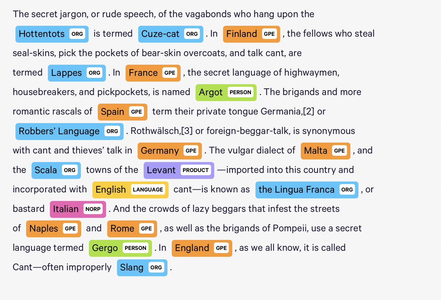
Using the displaCy Named Entity Visualizer, I selected an excerpt from The Slang Dictionary, by John Camden Hotten. I noticed that the tool was able to accurately identify words under categories such as location and geopolitical entity, but seemed to classify a lot of terms under organization, many of which were incorrect. It seemed to make classifications based on the context of the situation or the way the word was presented, even though many words with very different associations are presented in the same way.
JSTOR Text Analyzer
Using the same text as above, this tool gave me reccomendations for other readings based on terms that I’m assuming the tool thinks are most prevalent. Based off of what I had taken from the text, I think the tool did a really nice job at coming up with 5 terms that summarize its main ideas. I was also able to change the weight of each term, I guess if I thought that one or more terms expressed really important ideas in the text.
Voyant
The Voyant tool found which words were the most common in the text and displayed them in the form of a word cloud. This could be great for seeing commonalities between different texts. There was also a section titled correlations. This showed terms that were in some way connected to each other. I’m not sure if this was based on definition or if the tool was able to recognize that when one term was used, it shortly after made reference to the other term, but regardless shows how certain pieces of information can be linked to another
-
Mar1 Hearst: “What is Text Mining?” - joshua mbogo
A New Post
After reading the articles I think it is interesting to look at how Hearst explains the problem of text mining and overall natural langauge processing along with the limitations of the technology of the time. Keeping in mind that the first article read was published in 2003 the models they had could only process text for small phrases and had a very hard time comprehending full though forms in the text. I think this is a great reminder of the complexity of language and the human mind that comprehends and creates language. Additionally, it is interesting to note that unlike many forms of computer analysis that tries to find trends text mining is trying to find new information rather then parse for trends in exisiting data. The creation of new information also known as comprehension and understanding is a very human idea so to see it in computers is a very promising but frightening realization that scientists are continuing to develop. Text mining in this right was the forefront of computer inteligence and has continued to help scientist understand the artificial mind as we use it to understand our own. Enter text in Markdown. Use the toolbar above, or click the ? button for formatting help.
-
Comment on Text Mining / Natural Language Processing_Elva Si
I still remembered the very first class when we talked about identifying the same word being used across different editions of Shakespeare’s work over decades. Now I know such activity as the text mining approach. It could help humanists link extracted textual information from different written resources to form new facts or hypotheses. I think this is a powerful approach since it allows researchers, scholars, experts, and more to look beyond single resources, enable a comprehensive view, and discover new patterns. I like the example Hearst (2003) used regarding using text to form hypotheses about diseases. While doctors can only read a small set of literature in their particular field, it would be beneficial if text mining, this conputational technique to process texts over a much larger pool of literature, could be used to search across different medical fields and help generate new, potentially plausible medical hypothesis, alongside the doctors’ medical expertise. I can imagine the scope of impact if such approach could be widely utilized in the medical industry. I also believe in such approaches to produce large impact in more fields, including but not limited to academia, news report, history. Yet, , the text mining approach will also face several challenges. Out of all challenges, “information one need is often not recorded in textual form” is what I considered the most prominent one. In an increasingly digitalized world, important information will be documented beyond texts; in videos, podcasts, and spoken conversations. How could computitional techniques access and interpret these non-textual formats? How could technologies help people examine both textual and non-textual information altogether?
-
Comment on Raw Data Is an Oxymoron_Elva Si
Raw data, as Gitelman suggested, has “understandable appeal.” When people collect a large number of data, they feel empowered to compile, store, manipulate, transmit, and INTERPRET data to their own understanding. The raw data is straightforward, comprehensive to some extent, transparent and self-evident. It is difficult to ignore the beauty of raw data yet remember the interpretive base of the raw data . This article reminds me of the data collection process we are currently doing for the LGBTQ interactive map. For the first glance, it would be pretty impressive to observe the 170 survey responses being collected over just one week. Yet, we still need to remind ourselves constantly that our interpretation of the raw data could be subjective.
At the same time, I also enjoy reading Gitelman’s perspective on 1. the concept of “raw data” could be limited for different disciplines, especially the literacy and humanistic fields. 2. the concept of “raw data” fails to address the non-English world where data could be understood and interpreted differently.
-
Assignment 18
1.In your comments on GitHub, discuss how these text-mining approaches have become a standard in today’s computa1onal techniques in processing texts and the potential (and the shortcomings) that was expected but not necessarily been realized or superseded by novel/different approaches.
The three texts introduced the field of text data mining and how it could be implemented in real life. Text Data Mining is helpful in many fields, such as in bioscience, where scientists can extract patterns and deduct hypotheses about the disease from a combination of text fragments in biomedical literature titles. Moreover, text data mining could help us uncover social impact. As we can see from our classmate Daniel’s group’s approach– deriving trends in social attitudes about Russia/Ukrain issue by analyzing textual patterns from Twitter memes.
However, text data mining also has its own limitations: it couldn’t represent all the information and knowledge beyond the communication of texts. For example, many types of knowledge are conveyed through other media like graphics and sound. Text data mining couldn’t translate those forms of media, therefore, it might cause misunderstanding in interpreting specific topics that can only be fully comprehended through those media. Furthermore, text data mining couldn’t uncover the decisions and thought processes behind the door; the textual data is just a lower-level data identification and organization. It still depends heavily on human cognition to link different sources and form hypotheses based on the processes of textual data.
2.Read Lisa Gitelman’s (ed.) “Raw Data” Is an Oxymoron, Introduc1on (Cambridge, Mass, MIT-Press, 2013, 1-14) and comment on the often used concept of “raw data.” (text on Canvas)
There’s never anything about ‘raw’ data. All the data we are exposed to have already been ‘cooked’ – they have been processed and interpreted by different professionals in different disciplines through their own methods. All the data are not isolated; they are all contextualized and stored within a social-cultural context. For example, the language that records the data already contains the cultural construct that adds one more layer to the ‘original’ data.
The article also mentions the term data aggregation – the overlay of operations that renders data’s value also has impacts. The steps of different levels of obtaining the data sets, from data gathering to cleaning to analyzing, are all embedded with the researchers’ interpretations and assumptions and are relatively biased. For example, changing one filter in the algorithm model would produce different results. Maintaining the consistency of research methods to get stable data is crucial.
-
Assignment 18-Text mining reading
These articles are all based on western language systems, so I was curious about how it can work in Chinese. I am suprised to find that there are also very many uses of text mining based on Chinese. For example, the keyword composition of Chinese Tang poems and Song lyrics mapped by Zero E-lab research lab some time ago is very interesting, capturing all the high frequency or more trendy words of ancient poems. And the connection between each keyword is clearly shown by using the method of network analysis diagram, and even some readers are able to deduce some classic poems by themselves according to that network diagram. However, it is not so simple to deal with the subtext of ancient Chinese (literary), especially poetry, because single-word words account for more than 80% of the statistical information of ancient Chinese vocabulary, plus the fact that ancient Chinese has a great deal of meaning in small words, so the subtext technique for modern Chinese is often not applicable to it. In the analysis process, the results are only the “introduction” and “clues”, the most important thing is to rely on the human brain to analyze the results, with the help of the background/business knowledge and analytical models, from the surface of the text to its depths, to discover the deeper meaning that can not be grasped by the shallow reading, to explore its value.
-
Text Mining & Raw Data Readings
Notes on Text Mining Readings:
How these techniques have become standard:
- As defined by Marti Hearst (“the discovery by computer of new, previously unknown information, by automatically extracting information from different written resources”), text mining has certainly become a standard method of data extraction. His “linking together of extracted information” is reflected in the natural structural format of the extractions (e.g., JSON, CSV), which acts as a sort of dictionary to provide multiple levels of metadata.
- Hearst imagines text mining as primarily useful when we don’t know much about the information we’re planning to extract: but this is not always the case. Today, we often mine text about which we know very much, but whose specific details we don’t have in a manner conducive to our research. For example: one can go to a website and, depending on the situation, see the pertinent textual data there – but using the browser interface alone, and without text mining, this data can’t always be formatted in ways that allow for the desired analyses. Then again, Hearst wouldn’t purely call this “‘real’ text mining… that discovers new pieces of knowledge.”
- What Hearst earlier called text mining has now become an essential element of textual analysis within natural language processing. Today, “extraction” and “analysis” are sometimes combined within a single function, which leads to a blurring of the lines between these disparate tasks. In the example of topic modeling, for example, this process has been merged. Visualizations, and references to external libraries that allow any number of advanced functionalities, have also been incorporated within individual Python files. Topic modeling and other NLP methods also introduce far more advanced methods of organizing information into n-dimensional matrices that were not envisioned as components of text mining. Part of the job of text mining, after all, is to organize the text into discrete units that can be called upon when needed.
Potentials or shortcomings that were envisioned, but wasn’t realized, or were superseded:
- Text mining was envisioned as entirely separate from search tools. But it can still be used to conduct advanced searches of websites and web-based databases.
- Text mining was also envisioned as separate from (non-textual) data mining, but today, the same processes may be used for both, depending on the tool or combination of tools (e.g., API, Python, etc.).
- Some of what Hearst defines as text mining now falls under the umbrella of psycholinguistics (e.g., LIWC), although it performs similar functionality.
Notes on Raw Data Reading:
- As suggested in earlier readings – through which we learned that no data is “given” – here, we observe that no data is truly raw. All data is constructed and selected. All data is “cooked” to one degree or another.
- Here, we can see that depending on the discipline, data is cooked differently; it is extracted, shaped, and interpreted differently. Even data within fields can be cooked differently (as illustrated by the author’s example of varying versions of Milton poems).
- As the author notes, “data need us.” Data does not exist without human extraction, observation, analysis, composition. The fact that data, the plural of datum, is used more commonly also illustrates the widespread need for multiples in our data: not only does data need us, but we need data, and to accomplish all manner of tasks, we need as much data as we can get. That said, a unique distinction of Gitelman and Jackson’s is interesting to consider: “The singular datum is not the particular in relation to any universal (the elected individual in representative democracy, for example) and the plural data is not universal, not generalizable from the singular; it is an aggregation. The power within aggregation is relational, based on potential connections: network, not hierarchy.”
- Usability is also addressed in this chapter. Notably, data must be usable for the duration of a study, and for future researchers. This means that data must be “as raw as possible,” in a sense. Otherwise, it may be ideal for it to be annotated in such a way that its “original” can be extracted and used in a new context.
-
Reading Assignment: Text Mining/Natural Language Processing - Qingyu Cai
The three articles introduce the definition of text mining, its features, and different specific techniques. The most significant use of text mining nowadays is the search engine. When users type keywords in the search bar, the computer system uses text mining to collect related information. Furthermore, the current Google search not only includes the technique of text mining but also information in various formats, including images, videos, and shopping links. Text mining uses the topic-modeling to identify related texts, while image search utilizes AI technology to define elements and colors of pictures to collect similar images. Besides, text mining can also be used in customer service to gather consumer feedback and get to know their main pain points. By analyzing the keywords of customers’ feedback, the company can quickly learn what consumers are unsatisfied with to come up with instant solutions. Although letting consumers grade the service by rating can also showcase the level of satisfaction, companies still need more information about the reasons behind the rating. In terms of the shortcomings of text mining, just as mentioned in the reading named Alien Reading: Text Mining, Language Standardization, and the Humanities, computers are not able to account for the nuances of literary language due to the inability of sentiment. Computers can quite well understand scientific texts without much sentiment. However, in some types of literacy, words can not be interpreted without understanding the whole context. As a result, as mentioned in the reading called Untangling Text Data Mining, we do not need wholly artificial intelligent text analysis; rather, a mixture of computationally-driven and user-guided analysis may open the door to exciting new results.
-
Reading Assignment: Raw Data is an Oxymoron - Qingyu Cai
Raw data seems to be literally. As mentioned in the reading, the author says, at first glance, data are apparently before the fact: they are the starting point for what we know, who we are, and how we communicate. This shared sense of starting with data often leads to an unnoticed assumption that data are transparent, that information is self-evident, the fundamental stuff of truth itself. However, raw data depends on culture, not just itself. It is the culture that interprets and imagines the meaning of the data. Raw data is not a natural resource. Instead, it is generated, gathered, and interpreted by culture. Based on different usage, data can be “cooked” differently. As a result, raw data embeds assumptions. In order to learn and use raw data well, it is crucial to promote interdisciplinary research.
-
Assignment 18- data mining- Sally Chen
Data mining is the process of discovering patterns in data, and the main approaches include clustering, association, word cloud, etc. These methods are based on the results of human cognitive science research that has been conducted, and common human cognitive strategies are simulated by computer algorithms. I think the similarities between the algorithms and human cognitive strategies are the reason they stand out as the most commonly used methods- because the algorithms are more likely to come out with “human-like” insights and decisions. However, the results of data mining are necessarily different from the results of human thinking, especially when academia has not yet fully researched the psychological mechanisms of more complex psychological processes, e.g. common sense and creativity. One of the major advantages of data mining is that it helps to answer questions we did not know to ask, especially to obtain some insights that may be counter-intuitive or counter-conventional. In addition, the interpretation of the results and the decision-making process still require human involvement. For example, there are many parts of the text analysis process for large samples that need to be done manually, and these operations may indirectly affect the results of data mining. The biggest problem of data mining in humanities studies is that there is a fundamental difference between computer programs and human cognitive processes. Although computer programs are designed based on human cognitive strategies, they do not fully simulate human thought processes, which may lead to biased results. The most typical problem is that human analysis of “topics” is not based on the frequency analysis and combination of individual words, but also on the context in which the words occur, which is not taken into account in the frequency calculation by the computer. Other challenges include the accessibility of certain databases and the non-transparency of data mining algorithms. Some databases are not always accessible to scholars, so data mining analysis may be potentially biased within the scope of available data.
-
Assignment 18- raw data- Sally Chen
According to Wikipedia (https://en.wikipedia.org/wiki/Raw_data), raw data is considered a relative term, because even once raw data have been “cleaned” and processed by one team of researchers, another team may consider these processed data to be “raw data” for another stage of research. An example I can think of is the authors of individual experimental research and meta-analysis. For experimental researchers, the “raw data” is all the variable data they collected from subjects, and for the authors of meta-analysis. For experimental researchers, the “raw data” is all the variable data they collected from subjects, and for the authors of meta-analysis, the “raw data” is all the processed data provided by the experimental researchers. The concept of “Raw data” is useful while misleading. On the one hand, the concept emphasizes that the data are raw and unprocessed for the data user, and that future processing is based on raw data. This concept establishes that subsequent data interpretation and visualization are eventually based on this version of data. In addition, the concept of “raw data” is misleading. In addition to the relative nature of “raw”, another major problem is the assumptions that exist in data collection and management. As mentioned in the article Why Data is Never Raw (https://www.thenewatlantis.com/publications/why-data-is-never-raw): “as we’ve seen, even the initial collection of data already involves intentions, assumptions, and choices that amount to a kind of pre-processing”. The purpose of collecting and managing data is to make interpretations and inferences, which inherently determines the methodology of data collection, including what is measured, how it is measured, how it is collected, where it is collected from, and how it is recorded. With these limitations, the inferences we can make are inherently limited, and there is the problem of not fully reflecting on reality. This problem leads to a contradiction in the objectivity and absoluteness implied by the concept of “raw data”.
-
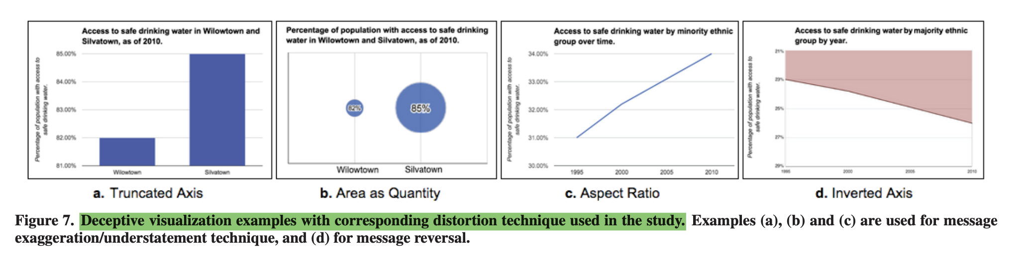
How to Lie with Data Visualization & How Deceptive are Deceptive Visualizations? An Empirical Analysis of Common Distortion Techniques
Concerning the two texts, it is interesting how deceptive figures can be when handling objective data and statistics. Although the two texts point out that figures should be made to elimitae message reversal and message exaggeration, some points of contention came to mind as to seeing these fake statistics. The first being that what seems like exaggeration is in actuality the true message. Sometimes statistics are made on the fly or on a whim, especially in the realm of sports, and the need to pooint out outliers is crucial to the audeince. For instance, a statistc that creates an average of 75% on a chart, needs to “embellish” viewing a 60% on the same chart - if you regularly have the axis out of a 100 then you would not necessarily see the outlier. The second point is who is the fault on when the message is viewed wrongly despite being given all the data. If the graph was presented without features, then the fault would objectively be on the graph maker, but if having all the labels and features, the person still makes an exaggeration then it is on the fault of the audience, and how short their attention span is. Unless what the writers are advising is to to present information as if the audience has no deductive reasoning skills, then that is another area of conversation.
-
Comments on readings about visualization deception
Ravi Parikh’s “How to Lie with Data Visualization”
- General Comments
- I’m surprised by the pie chart that doesn’t add up to 100%. This reminds me of some interesting chapters in “Storytelling with Data” by Cole Nussbaumer Knaflic about both 3D visualizations (how “warped” perspectives and focal points make some figure appear more relevant than they really are, and others less relevant) and pie charts (people tend to overweight different colors and slices in relation to one another, based on visual hierarchy, etc.).
- It seems that deceptive visualizations are being used commonly in very large-scale information reporting systems (e.g., Fox News, sports, business communications), and so we might consider that they are incentivized if they can lead to particular outcomes. How can we de-incentivize such visualizations, especially since there do not appear to be any strong legal boundaries to their propogation? - Most Deceptive Techniques
- Manipulating axes (y) to shape viewer’s opinions. There was a similar example recently with housing market pricing (I think in WSJ), but they tried to do the opposite (show that prices weren’t rising as much as they really were) by excessively inflating the y axis.
- Cumulative graphs: they’ll naturally make it seem like your numbers are going up because that’s how positive number cumulations work. Every new number added to the chart includes its predecessor, so the numbers have to go up, which warps how we view, for example, revenue growth.
Anshul Vikram Pandey’s “How Deceptive Are Deceptive Visualizations?”
- General Comments- I’m particularly interested in the authors’ classifications of deceptions as either message reversal (“what”) or message exaggeration/understatement (“how much”). These seem very useful metrics when looking, also, at other forms of visual communications that might not be seeking to communicate or translate data through scale (e.g., memes, videos). These two designations also, essentially, tell us the subject and the scale of a subject’s value(s), which seems to be a framework that could be applied widely.
- For their definition, I assume that “actual message” refers to the true numerical value or meaning, of data, rather than to a subjective interpretation of data: “[A deceptive visual is] a graphical depiction of information, designed with or without an intent to deceive, that may create a belief about the message and/or its components, which varies from the actual message”. - Most Deceptive Techniques
- For me, the inverted axis is the most upsetting visual deception technique mentioned here, because it uses our implicit assumptions, which are needed for ease of data access and interpretability, against us. There are few things within our everyday visual calculations that we might assume more readily than “up = more” and “down = less”, for example; this has even made its way into human gesture and body language.
-
Assignment 17
Data visualization is usually biased and coded with the author’s intent of what messages would like to be conveyed. Deception in data visualization happens on many levels, from how the reader reads the data to how they interpret data. Message exaggeration is apparent in our daily life, e.g., how Tim Cook presents Apple’s cumulative sales data without having a precise quantity scale for the y-axis. Depending on what unit the y-axis is, the visualization would be very different (billions of iPhone sales vs. hundreds of iPhone sales). The exaggerated graph misleads users to think iPhones sales are increasing because cumulative data is always increasing, but in reality, iPhone’s quarterly sales are decreasing. Message reversal is also confusing to inattentive readers (e.g. the Gun Death in Florida chart). The author takes advantage of readers’ habit to read from bottom to top and purposefully reversing the measurement to decrease the negative response to the data shown. As designers, when we visualize data, we must be careful with the methods and type of measurements we use to provide an unbiased data analysis. We must also consider readers’ digital literacy and familiarity with the data context.
-
Reading Assignment - Deceptive Visualizations: Qingyu Cai
I find the inverted axis as the most deceptive technique. Firstly, this technique ignores the convention, and readers won’t realize the trick without being reminded. The first time I read the short passage by Ravi Parikh, I was treated by the graph the author showed. Not until the author mentioned that the graph’s Y-axis was upside-down did I realize that I had misunderstood the chart reversely. Secondly, the impact of the convention is much more substantial than we have imagined because people accept it as always-correct principles, which is hard for people to change this mindset. For instance, even if readers realize that the Y-axis is upside-down, it’s still hard for us to accept this representation. Finally, the message created by the inverted axis is reversal instead of message exaggeration or understatement, which means that it totally changes the message’s meaning. As a result, readers would interpret the meaning wrong without noticing the axis.
-
How to Lie with Data Visualization - Joshua Mbogo
A New Post
Out of the list of ways to lie with data visualization almost all of them had a overlying theme. The main way to lie is to skew or misrepresent data through the use of poroptions and illogical graphs. When thinking about the Y-axis putting the y-axis in a scale that is not proper for the data being discuss will leave the data either showing an exaggerate or underwhelming result. Additionally, in some cases graphs must use a logarithmic scale and if the wrong log is used such a scneario can also occur. Another thing I noticed was using the wrong kind of data difference between actual and cumlative data will produce a false sense of increase if the user doesn’t properly digest the graph and its content. With a cumlative graph one must focus on the change of the slope and not the actual value of the slope will in a normal traditional graph looking at the specific values gives you information of how the data is change over the x-axis (which in the example presented in the article was time). Enter text in Markdown. Use the toolbar above, or click the ? button for formatting help.
-
Assignment 17- Sally Chen
1) The most common and deceptive representation is probably changing the y-axis. It also seems to have the advantage of magnifying significant effects or significant differences in academia and is considered a reasonable operation to make statistical graphs more “readable”. However, this can lead to some difficulties for researchers when making cross-study comparisons because the y-axis is not uniform. Compared with tables that provide direct numbers, charts can have a lot of space to do deceptive techniques.
2) I found the experimental study for deceptive visualization interesting. It analyzes common deceptive techniques and uses four samples to conduct a user study of the effects of 4 common deceptive techniques. From the results, it seems that the most deceptive is the aspect ratio in linear charts, followed by the truncated axis in bar charts and the area as quantity in bubble charts. From my personal point of view, bubble charts are the most confusing because of the relationship between radius and area, the difference between numbers can be magnified exponentially. In this study, the numbers represented by the bubbles were clearly placed in the center of the bubbles, and the visual focus was initially on the text rather than the area size of the bubbles. Thus, the deceptive nature of bubble charts may have been underestimated in this study - participants read the text first and had a priming of the actual differences, and thus would have biased their perception of the area size differences between the bubbles.
-
Assignment 17_Elva Si
Designers and communicators are using data visualization to arugue their desirable yet deceptive messages to the audience. I found the manipulation of the axis scale & orientation most deceptive. These deceptive graphs violate my perception of how the Y-axis should work. When the Y-axis does not start at 0 or when it shows inverted data, the audience could easily read the charts incorrectly. Even though the facts are not distorted in the graphs, the messages are exaggerated. For example, the axis-free histogram below shows a large knuckleball velocity gap between 2012 and 2013, yet the actual difference is just 2mph.

Meanwhile, it is interesting to get to know that among all message exaggeration/understatement techniques, the line chart is the one with the biggest effect, followed by the bars and then bubble, suggesting that these type of charts may have a more pronounced effect (Pandey et al, 2015). This finding reminds us to be extra careful when interpreting graphs created by others, especially the line charts.
-
Assignment 17 Commentary
How to Lie with Data Visualization
The way in which data is presented to us can completely change the way we interpret it and the message it is trying to send us. Certain representations of data can make for a more clear argument as well as a more skewed argument. While the data may be correct, the way that it’s presented can trick us into either beleiving something incorrect or only focusing on a very specific aspect.
How Deceptive are Deceptive Visualizations
This reading covers many of the same ideas that the blog post did, but in much more depth, and with confirmation of the ideas from the empirical study. I found the truncated and inverted axis techniques to be the most decieving to me. They are especially decieving if one is only looking at the image for a quick period of time. For example, with a truncated axis, one is unlikely to see whether or not the y axis minimum/maximums have been enlarged, and even if one does, it still raises the question of whether or not this change was done intentionally as a means of deception, intentionally to highlight some piece of information, or just unintentionally.
-
Reading Assignment - Visualizing Black America: Qingyu Cai
Du Bois gave a visual history lesson on the Atlantic slave trade through the drawings that he and his team prepared for the exhibition. The designs are unique and important in the sense of social justice. Below are the three plates I have chosen in his collections: Distribution of Negroes in the United States, Negro Population of Georgia by Counties, and Value of Land Owned by Georgia Negroes. In the Distribution of Negroes in the United States, the author combines numbers with geography by using various colors with obvious contrast to illustrate the distribution of the population density. And the same method applied to the Negro Population Drawing to indicate different numbers of the population in various counties and how they were distributed across Georgia. Both are pretty clean and simple, and color is the only feature emphasized in these two drawings to indicate the population distribution in a geographical form. The Value of Land Owned by Georgia Negroes drawing uses only one color. Instead, by visualizing the number of values, which are represented by money bags, through various sizes, the drawing vividly conveys the information of value increase.
-
Reading Assignment - Color and Information: Joshua Mbogo
Out of the four different ways that one can use color the one that resonated with me and I believe has the most use is color as a label. He uses the example of labeling different shapes in a mathematical explination of the pythagorem theorem as an example. When used correct colors as label reinforce existing ideas if that be for a mathematical problem or diagram. In the example mentioned one way the author used color was to group shapes of the same type together. Obviously shapes that are the same will look the same but when there area alot of measurements occuring in a diagram its nice to have congruent and similar shapes grouped together visually through color. It brings an extra demension of information and connection to any piece of work.
Enter text in Markdown. Use the toolbar above, or click the ? button for formatting help.
-
Johanna Drucker: Graphesis - Visual Forms of Knowledge Produc,on - mbogo
A New Post
In the reading Drucker discusses the multiple aspects of visual forms of knowledge and components that go into creating and presenting such information to a person. After reading what stood out to me the most is the importance of an interface that the user can understand. Drucker discusses how interfaces have changed the way we consume and use personal and business information in the modern world. Technically even before the advent of graphical user interfaces and tools like a mouse and keyboard to use them, all other mediums to consume information were interfaces but very primitive (newspaper, book, table of contents). However, in the modern age interface has taken a whole new meaning. Not only does this include what a person sees (shapes, colors, position / organization), this includes sounds (notification bells), and the shape of the interface (ipad, laptops, desktop, phone). Each of these aspects shaping where and how these different interfaces are used and what they are used for in our day to day lives. With this in mind I explored the plates “The Georgia Negro: A Social Study” created by W.E.B. Du Bois and three plates that stood out to me where “Ocuppation of Negores and Whites in Georgia”, “Age Distribution of Georgia Negores Compared With France”, and “Negro Teachers in Georgia Public Schools”. The first to diagrams use colors and the shape of the graphs to its advantage to show the difference between the two entities being compared to showing a discrepenacy between Negroes and Whites and Negroes and the French population respectively. I chose the the third plate because it is an example of how colors and shapes don’t always excentuate a specific piece of information but can actually act as a hinderence and take away from the overall message of a dataset.
Enter text in Markdown. Use the toolbar above, or click the ? button for formatting help.
-
Exploring the plates “The Georgia Negro: A Social Study”
After reading sections of the W.E.B Dubois biography of his artistic depictions of visualizing black america, it is interesting to me how much information is conveyed in such an easy to grasp way, especially considering the type of heavy information he is conveying. Commenting on the black experience during the 1800-1900s was considered taboo considering the recency of slavery, and he was able to do it in such an impactful way that the audience through time periods and relative lived experiences is able to garner a deep understanding of the situation. Of course, his maps and charts will never depict perfectly compared to having lived it. Nevertheless, Dubois broke a vital barrier that would have been challenging to do at his time, the barrier of skin-tone understanding.
In order to understand his informational depictions, I chose to analyze three line/bar graphs, as they, from my point of view, will further eliminate his potentially biased outlook into the black experience in America.

This graph depicts the Conjugal Condition of Black Americans around the 1900s. The individuals who were polled were either former slaves, or relatives of former slaves. WIthin this graph, Dubois portrays three key vital pieces of information: the status of the former slaves, the age-range, and the gender. It seems that from the information on the graph, men tended to either keep their marriages longer, or they tended to remarry more often than women did. I could also make the analysis that black men also died earlier and more frequently than their female counterparts at the same age, which is why more women were widowed. Either analysis is equally valid. The one central piece I would change about the graph is the color scheme, since it doesn’t show the font well.
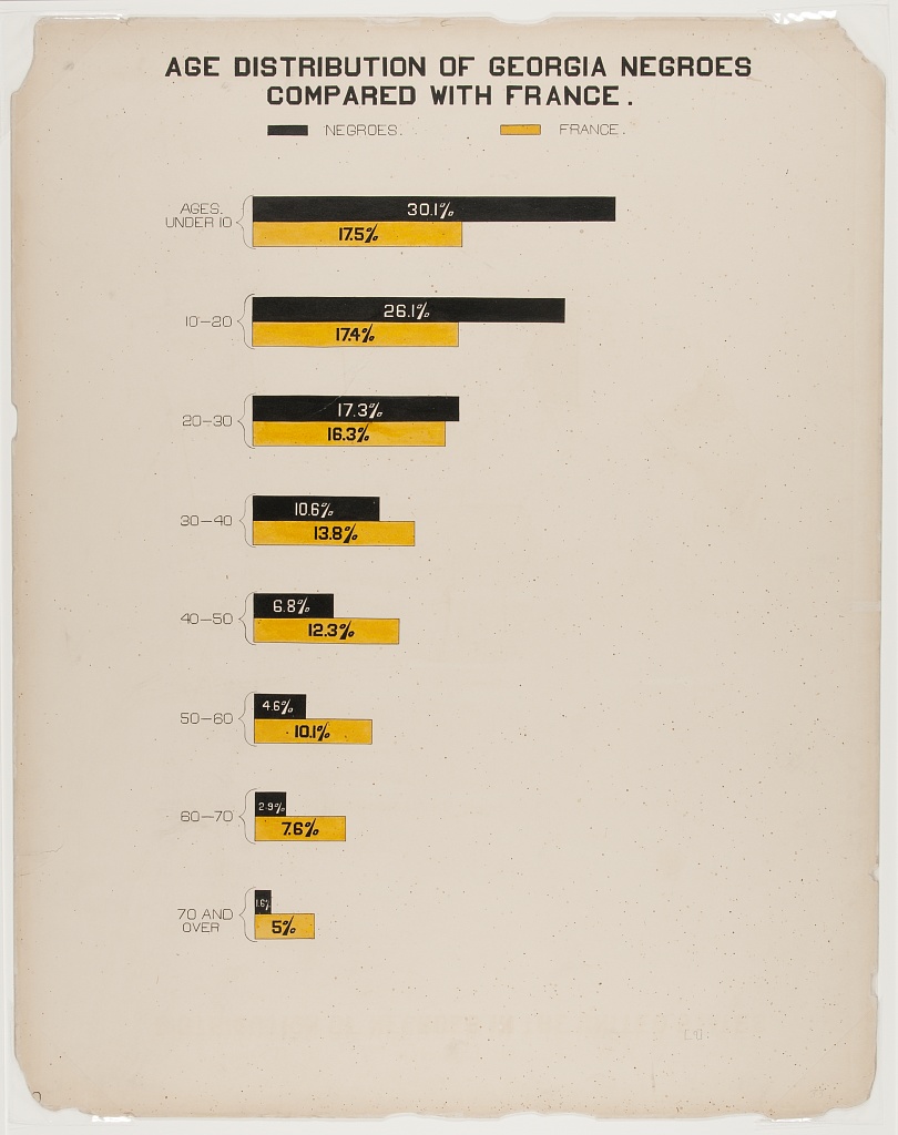
This graph depicts the age distribution of former slaves, as compared to France. The graph is shown as a percentage comparison with France. One could make two assumptions based off the information displayed. Either that the healthcare system, or treatment of older black people was better in France, than it was in the Americas, or specifically Georgia, or that more black folks had kids than they did in France, which are both equally plausible scenarios. The graph is simple and is easy to interpret, yet still depicts substantial information of the American Black Populace.
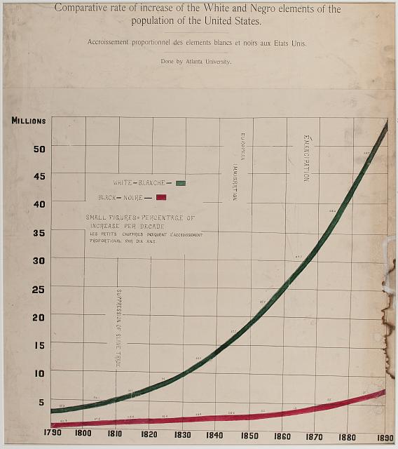
This graph of Dubois illustrates the increase in population between the two races in the United States. If all things remain equal, then there should be equivalent rises in population between the races. Dubois sends the message that effectively there is a version of population control in the black community, which might be due to a conglomerate of different reasons.
These three graphs in total display that the conditions for survival even after slavery, which I think was a central message of Dubois in the 1900s.
-
Drucker & W.E. DuBois
-
Drucker mentions the phrase “language of form” being a suggestion for a systematic approach to graphic expression as a means as well as an object of study. I find this to be optimal, as graphics are a very powerful form of communication. Graphics can help us break down information into a form that might be easier for some of us to understand (hence why some people call fhe,selves “visual learners” after all), and putting things into a visual format can help explain/justify information as well (the “means” she refers to).
-
She also mentions that “visualizations are always interpretations—data does not have an inherent visual form that merely gives rise to a graphic expression”. I never really thought anout this to be true until I heard of this. We are able to manipulate data into any form, as we have done before for example with timelines. You can input in data and express it in any form you’d like, there is no one “right” way to present it (although there might be more optimal, ideal ways - it all depends om the needs, but it visual graphics are always an interpretion of what comes to mind and there is never an exact translation of data to image form, it is how we perceive and interpret it that factors into the process of putting a visualization together.
-
-
Drucker & Visualizing W.E.B. Du Bois
Drucker response Learning to read graphical displays is itself a behavioral layer requisite to our understanding of contemporary displays–whereas, as Drucker shows, some much earlier displays were also generative in their knowledge (they showed us how connections were made, not just where they existed across nodes in a network). I agree with her summary statement later on: “We need to develop a domain of expertise focused on visual epistemology, knowledge production in graphical form in fields that have rarely relied on visual communication.” Her “language of form” seems an ideal route for contemporary data visualization, as it both communicates and justifies information (“a means as well as an object of study”).
W.E.B. Du Bois’ Data Portraits & “The Georgia Negro: A Social Study” “Here, both viewers of the infographics and black study participants in the US South come into view as legitimate co-producers of sociological knowledge.”

Most of Du Bois’ visualizations adhere well to Tufte’s first rule (relating to simplifying and centering the use of strong, bold colors), with the exception of his “Land owned by Negroes in Georgia, U.S.A. 1870-1900.” In this piece, a summary statement might help viewers better understand the patchwork of colors included in such close proximity to one another.
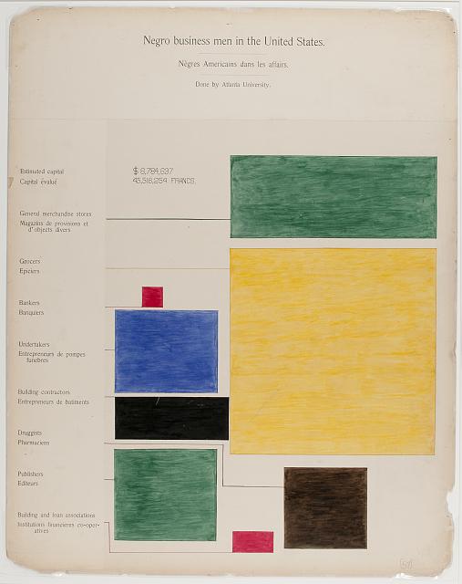
His “Negro Business Men in the United States” was particularly powerful, and subtle, in showing the distinct weighting of Black Americans’ professional roles post-enslavement. Using warm tones to draw our eyes to the largest (yellow; grocers) and smallest (red; bankers) respective roles, and splitting a second red segment at the bottom of the image to indicate the second-smallest role, also dealing with finances (employees of building and loan associations).
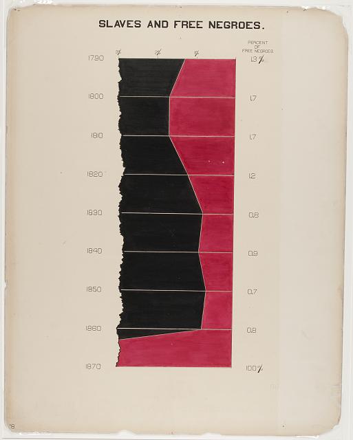
His “Slaves and Free Negroes,” like some of his other visualizations, seemed almost to be tempered such as to not arouse too much anger from what our second reading notes was a primarily white audiences at the exhibition. The visual could, for example, have shown the percentage out of 100, rather than out of 3. This also makes the image appear to communicate something that it doesn’t: for example, if you look at 1800-1810, you might even think that there were more free Black Americans than those enslaved. A further change could have been made: were the visualization stretched width-wise, rather than vertically, the difference between free and enslaved Black Americans would have appeared more clear (and stark); however, vertical stretching, and thus compression, of these differences makes them appear less stark. In any case, to me, this seems like an example of a case in which Du Bois intentionally “watered down” the visualization as to not cause a particular affective state in his audiences.
Here’s the same visualization, but out of 100% rather than 3%:

-
Assignment 16- plates analysis- Sally Chen
1) As the cover image, this visualization includes information about household and kitchen furniture owned by Georgia negros in a unique way. In terms of presentation, the visualization resembles a bar chart, with each column representing the data of a specific year. Compared to the vertical bar chart, this visual form can express the growth of value in a more spatially compacted way, and from my perspective, it is indicating the progress made during these years. In addition, the spiral structure provides a visual sense of an infinite loop, which conveys that the trend - the value will continue to increase.
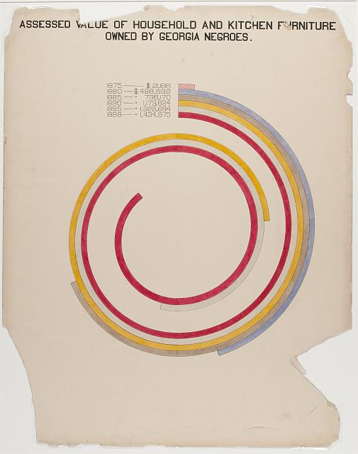
2) This visualization presents the number of negro properties in 2 cities of Georgia by interleaving two bar charts. The chart shows the change of property and owner number over time, and you can see that both owner and property have a tendency to grow over time. However, one of my questions is whether the intersection of the two bars has a specific meaning, or how to design the intersection to be informative.
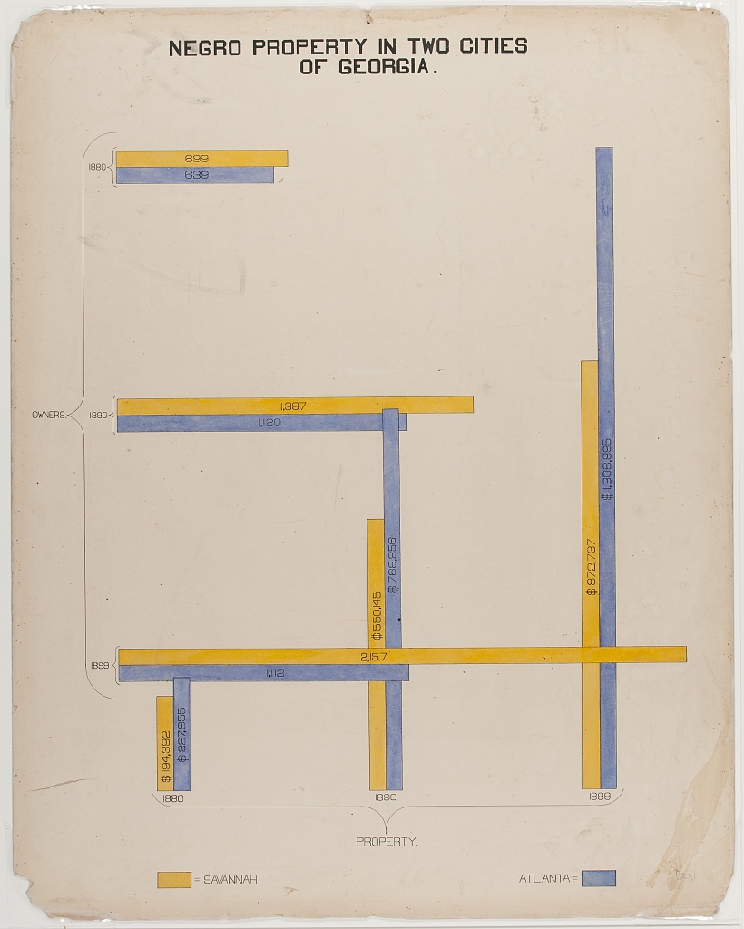
3) The map of Georgia divided by county is used to characterize land owned by negros, and I think the use of color for this visualization is interesting. By using different colors to highlight the outline of the county, instead of just using the outline alone to differentiate. One problem is that the color of the county does not correspond to the actual number, and counties having the same color does not mean that their numbers are in the same interval. This characteristic does not seem to be the same as contemporary data visualization. We prefer to think that regions of the same color have some degree of commonality or connection. At least in this chart, the designer did not label the specific meaning of the colors.
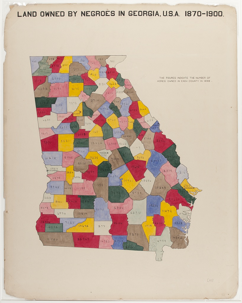
-
Assignment 16_Elva Si
Drucker discussed the importance of graphesis as a means and an object of study. It should not be a simple display of data and information. This article reminded me of Drucker’s other article Data as Capta where she also argued on the statistical representations of data as subjective interpretations. While it was challenging for me to accept the ambiguity of knowledge, the fundamentally interpreted condition on which data is constructed several classes ago, I become more comfortable to view graphic expressions as acts of interpretation or arguments. They can be ambiguous, inferencing, and of qualitative judgments, not just statements and presentations of facts.
W.E.B. Du Bois’s Data Portraits: Explore the plates “The Georgia Negro: A Social Study”
1.
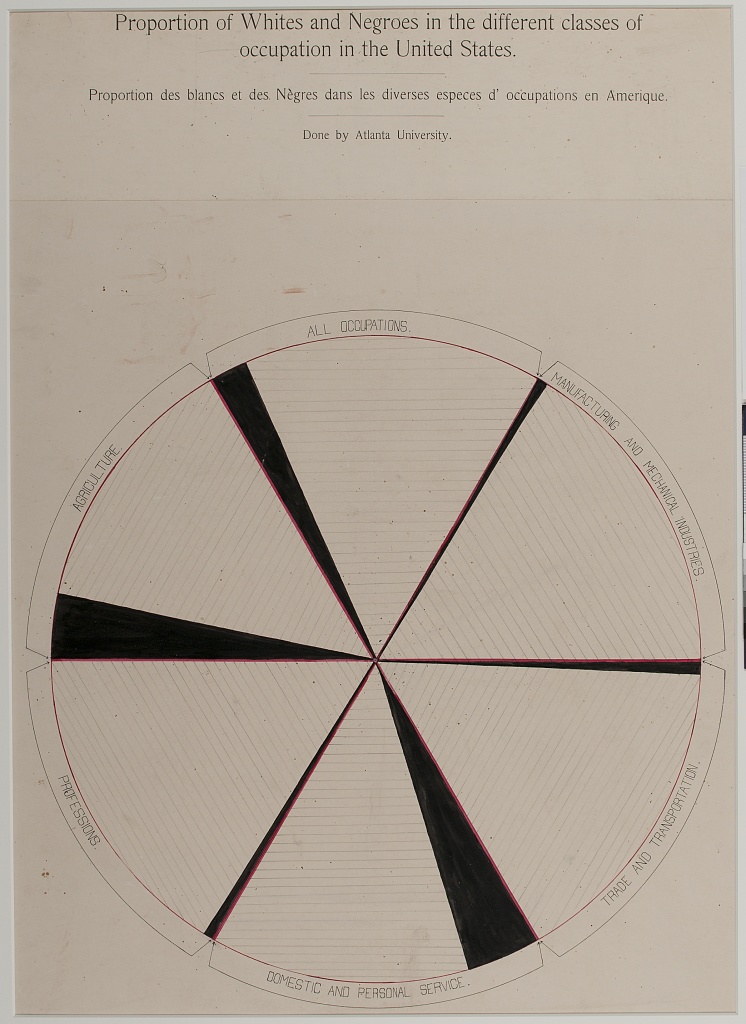 This plate is titled “Proportion of whites and Negroes in the different classes of occupation in the United States.” Bold red lines are used to separate different occupations and black areas are used to show proportions. While the Whites occupied most occupations among different sections, the Black community obtained more low-class occupations like agriculture, domestic and personal services and fewer high-class occupations like professions. I wonder what the horizontal lines within each section mean.
-
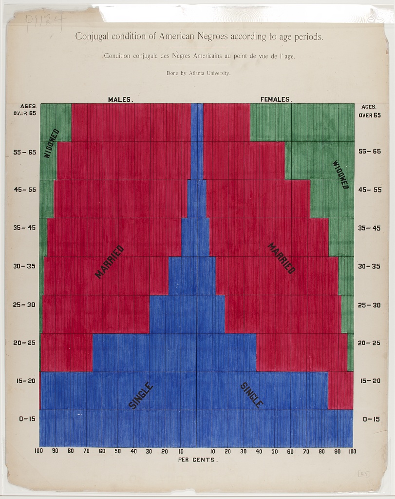 This plate is titled “Conjugal condition of American Negroes according to age periods.” It follows Tufte’s fourth rule of playing with two or more main colors in one image. Here, three strong colors (red, blue, and green) stay harmonious together. Du Bois maintained the unity by providing a desirable amount ofdisaggregation, interpretation, and reiteration within the image.The audience can easily tell single (blue), married (red), and widowed (green) within the male and female Black communities and of different age groups.
 -
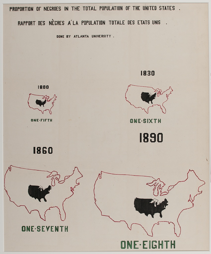 This plate is titled “Proportion of Negroes in the total population of the United States.” I like it a lot since it uses the same US map of different sizes to show how the Black population grew compared to the whole US population. With the same US map in a red line and a black area embedded, we can easily tell that the Black community became smaller and smaller comparatively. Yet, I wonder if the shape to represent the Black population has a particular meaning.
-
-
Reading Assignment - Graphesis - Visual Forms of Knowledge Production: Qingyu Cai
The author proposes the urgency of learning graphesis, the study of the visual production of knowledge in the current social environment due to the significant increase in using graphics as representations of knowledge. However, visual presentations represent personal interpretations too. They are humanistic forms of knowledge production and critical study of visuality from a humanistic perspective. Diagrams are powerful tools to produce and encode knowledge as interpretation. By using graphics, compared with mere texts, the authors can convey the arguments more powerfully, in which knowledge and opinions are displayed more directly. Visual forms can help illustrate the language of texts, which also helps to make the arguments stronger and more elusive. Besides, except for still graphics, dynamic images have been used to illustrate the points better, more comprehensively, and vividly. For instance, documented films have been integrated into exhibitions when artists want to showcase their making and thinking processes in detailly. Video is a way to incorporate words and visual forms together, which makes an argument by telling a story. As a result, it is also essential to study the dynamic ways of visual representations in today’s world in which technology and human behaviors have changed a lot.
-
Assignment 16
- Johanna Drucker: Graphesis - Visual Forms of Knowledge Production
In the reading, the author argues that visual representation is not just a pure display of information; it can also produce new knowledge and could be understood systematically through different structuring principles. The concept of “language of forms” could also be applied to some historical architectural drawings, where a systematic approach to graphic expression encoded a new form of knowledge. Vitruvius’s classical texts contain detailed drawings of architectural proportions, compositions, and classical orders. The visual system of how that information is presented becomes a form of language that inspires many later writings on the topic. It is through the graphical presentation people can understand and compare different features, styles, and decorations. Texts and numeric data itself alone wouldn’t support the comunciation of knowledge in this case.
2.W.E.B. Du Bois’s Data Portraits: Visualizing Black America Plate 24, 35 and 36 are very powerful in showing the life and progress of the African-American population in the US. The hand-drawn images using black and red convey unique aesthetics. It also makes a strong political statement through the statistical visualization charts about the African American population’s progress.
-
Assignment 16- Visual Forms of Knowledge Production- Sally Chen
One of the important points in the book is that our understanding and use of visual forms are based on experience. Because of our frequent exposure to certain visual forms, like bar graphs and flat maps, we can easily access the information in the images and explore them further. Individuals living in non-modern societies may be more limited in their ability to process and understand similar information.
New visual forms need to be designed based on the visual literacy owned by modern society individuals. For example, new visual forms that are similar to existing common forms may be more easily understood. For example, Figure 6 (Virtual globes prismmap uses the illusion of three-dimensional volume with mixed results) can be seen as a combination of a two-dimensional map and a bar chart, two visual patterns that are very common, and therefore it could be well understood by the viewer without a lot of additional explanation. In contrast, visual forms that make unique representations require some interpretation of the image to help the viewer understand the information.
For this reason, visual forms need to be designed with the characteristics of the audience in mind. If the message is conveyed to the mass, then easier-to-understand images may be more advantageous, as the masses may not take the time and energy to read the annotations of the visual form. In contrast, images for scholars are more tolerant of more creative and radical forms of visual expression, and more interested in exploring new perspectives on the expression of information and visual presentation.
-
Assignment 16 - Graphesis & W.E.B. Du
-
Visual Forms of Knowledge Production The message the authors of this article want to convey is that visuals do not only show us something, but also they are arguements in their own form, essentially the same as some textual arguements, only made of a different medium. The author introduces four terms, namely information graphics, graphical user interface, visual epistemology and languages of for visual, of which I am most interested in the graphical user interface. I think GUI is an intermediary to communicate information, the researcher conveys information to the public through the interface, and the public acquires knowledge through this single medium. However, it is a one-way communication process, where the recipient does not communicate his or her questions and feelings in real time, and it is difficult for the researcher to get feedback. Also interface needs to follow human related cognitive laws and habits, otherwise it will bring trouble to the user and thus affect the communication of information.
-
W.E.B. Du Bois’s Data Portraits: Visualizing Black America Du Bois’s thought is about the politics of visibility, by using clean lines, bright color, and a sparse style to visually convey the American color line to a European audience.
a. [A series of statistical charts illustrating the condition of the descendants of former African slaves now in residence in the United States of America] Distribution of Negroes in the United States. https://www.loc.gov/pictures/resource/ppmsca.33900/?co=anedub In this map, it used the America map as based with the states borders, and different colors to show the density of black people living every square mile. The usage of America map is a symbol of US government’s elitism as those who made the map in the first place. Then using the color black as the most dense, brown as the second, indicating the color of people by the color of darkness. The whiter on the map literally indicates the “whiter” the region is. b. [A series of statistical charts illustrating the condition of the descendants of former African slaves now in residence in the United States of America] Illiteracy of the American Negroes compared with that of other nations. https://www.loc.gov/pictures/resource/ppmsca.33909/?co=anedub In this diagram, the population of the illiterate descendants of former African slaves now in residence in different countries are listed by descending. The US is in color red and others in color green, as the 4th on the list. It uses simple color contrast and thin border lines to emphasize the volume which represents the population. c. [The Georgia Negro] Negro teachers in Georgia public schools. https://www.loc.gov/pictures/resource/ppmsca.33878/?co=anedub The diagram shows the number of African American teachers teaching in Georgia public schools in 1886,1889,1893 and 1897. By using different sizes and colors of circles, it represents different numbers of African American teachers. The larger the circle, the darker the circle, the more there were. Also, the number in each circle shows the exact number at that year in different contrast colors with the background.
-
-
Assignment 16 - Graphesis & Explore the Plates
Graphsis Introduction Takeaways
From Johanna Drucker’s introduction to her Graphesis, one of the main points that I took away was that there is a significant difference between what visualizations really are and what they are presented as. Visual forms of knowledge are always interpretations of the data they are representing. Data has to be interpreted in order for it to have a visual and graphical representation. The information graphics are ambiguous and hold qualitative judgement, even though this gets overshadowed by the idea that they are just a presentation of facts.
Explore the Plates
- The first plate of interest that I chose is titled “Conjugal Condition”. In the graphic, the marital status between different age groups of both german and black populations are compared. The usage of primary colors allow for maximum differentiation between the 3 different statuses of single, married, and widowed/divorced.
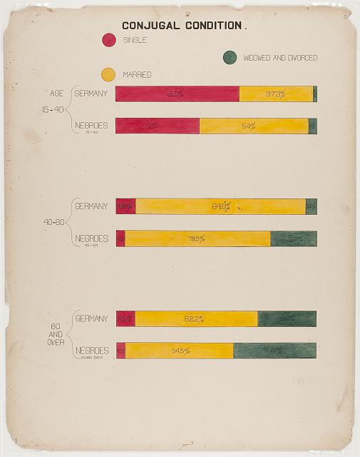
- The next plate that I chose to analayze is titled “Assessed value of household and kitchen furniture owned by Georgia Negroes.” This visual narrative very clearly shows how economic status of black populations began to advance post civil war, building a strong persuasive narrative against the idea that “the African had no history, no civilization..” and “their present existence is the same as it has always been..”
- For the last plate, I chose “Proportion of freemen and slaves among American Negroes.” Here, we can see that for some 70 years, in all of America, 86% or more of the black population were enslaved. To put narratives into scientific displays that are too striking to ignore makes for a powerful argument given that the main audience of these narratives was that of the “thinking world”.
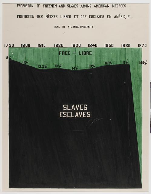
-
Tufte Color Reading

Tufte’s first rule states that
Pure, bright or very strong colors have loud, unbearable effects when they stand unrelieved over large areas adjacent to each other, but extraordinary effectscan be achieved when they are used sparingly on or between dull back- ground tones.
For my example I chose to pick out a map of Cerulean City from the first generation line of Pokemon games (on the gameboy!) As you can see, the green of the grass and the blue of the water the map clashes directly when placed next to each other (kind of represents the 1+1=3 effect discussed where these two elements intersect and create an unwanted distraction from what’s going on). In contrast, the squares, which represent landmark locations in the game, pop out because of the black square border used to mark out these locations on top of the muted cream path color, drawing attention to its importance.
-
Tufte Color Reading & Example(s)
Although I was also very interested in Tufte’s second and third rules, I chose Tufte’s first rule to examine here. This rule states that “pure, bright or very strong colors have loud, unbearable effects when they stand unrelieved over large areas adjacent to each other, but extraordinary effects can be achieved when they are used sparingly on or between dull background tones.”
In my example, I extracted a dataset from Reddit of posts referencing different locations in and around Ukraine (e.g., Kyiv) during the two weeks prior and following the start of the Russia-Ukraine conflict of 2022 (Feb 12 - Mar 12, 2022).
.png) This first image shows a bump chart distribution examining total upvotes on Reddit posts whose titles referenced any of 12 wartime locations (e.g., Kyiv) over the course of 4 weeks. The distribution shows upvotes from different subreddits where relevant content was extracted. In this example, the bump chart is shown in an “expanded” view in which distributions are stretched to fill available vertical space, creating massive and interlocking structures of interweaving strings that represent changes in upvote volume over time for each subreddit.
This first image shows a bump chart distribution examining total upvotes on Reddit posts whose titles referenced any of 12 wartime locations (e.g., Kyiv) over the course of 4 weeks. The distribution shows upvotes from different subreddits where relevant content was extracted. In this example, the bump chart is shown in an “expanded” view in which distributions are stretched to fill available vertical space, creating massive and interlocking structures of interweaving strings that represent changes in upvote volume over time for each subreddit..png) In this example, the same data is used, but rather than visualizing it in vetical expansion, no vertical alignment modifications are made. This allows the data to be seen much more clearly, and enables viewers to see which dates in fact were most relevant in the selected data.
In this example, the same data is used, but rather than visualizing it in vetical expansion, no vertical alignment modifications are made. This allows the data to be seen much more clearly, and enables viewers to see which dates in fact were most relevant in the selected data.In both cases, I applied a 5-point whitespace between streams (subreddits) to allow viewers to more easily distinguish between the differing streams. But in the first example, this whitespace does not appear to improve our ability to interpret the visualization.
-
Edward Tufte: Envisioning Information, Chapter 5: Color and Information Commentary
Coloring books are a constant reminder to children of the importance contour lines to delineate color regions, which is an important rule that Edward Tufte references at the end of the text. It creates a distinctive mark to the visualizer what sections of a piece are of a different space, or represent a different idea altogether. This feature, and an attachment to a childlike object, shows just how much of space characteristics that have been ingrained into our culture, that we as a people just naturally accept and interpret.
-
Reading Assignment - Color and Information: Qingyu Cai
This chapter tells us four rules of color in conveying information. The first rule is how to use a quiet background to help pure, bright, and strong colors stay harmonious in one picture and construct a theme successfully. The second rule indicates that the placing of light, bright colors mixed with white next to each other usually produces undesirable results, especially if the colors are used for large areas. The third rule is how large area backgrounds or base colors should do their work most quietly, allowing the smaller, bright areas to stand out most vividly if the former are muted, grayish or neutral. The fourth rule is about how to play with two or more main colors. Unity will be maintained if all colors of the main theme are scattered like islands in the background, providing a desirable amount of disaggregation, interpretation, and reiteration within the image.
This reading reminds me of the drawing by Alex Wall from OMA office, a world-renowned architecture firm. This drawing is for the Parc de la Villette competition in Paris in 1982-83. We can see bright colors scattered in different areas of the picture, which follows rule four. Besides, most of the background uses greyish colors like grey and greyish blue to serve as a quiet background so that brighter colors indicating main design elements can pop out.
-
Assignment 15
Third Rule
In Chapter 5, the third rule on using color for representing information talks about allowing the background of image to have more muted colors, allowing the smaller parts to stand out more. This allows for more differentiation between the message or information that needs to be shown and the information that is also included but whose meaning is not the central idea. Also, because the background tends to be the much larger area, if it were to have bright and strong colors, it would create an unpleasant experience for the viewer.
One example that illustrates this rule well is this map of Boston’s T system from 1967. The background colors are clearly much softer and more muted than the rest of the image, allowing the most important, but much smaller information, to really stand out. Even though the colors of the background are much more faint, it is still clear what they represent without them being so garish that it creates an unflattering or confusing effect.

-
Assignment 15
Fourth rule: If a picture is composed of two or more large, enclosed areas in different colors, the picture falls apart. Unity will be maintained, however, if the colors of one area are repeatedly intermingled in the other if the colors are interwoven carpet-fashion throughout the other.
This rule applies to the painting of Mondrian, where multiple colors are used to compose the whole picture, but with different proportions to emphasize red and blue colors, the image still gives a sense of balance. The color also has visual weight – with white and yellow being the lightest and darker colors like red and blue being the heaviest. A clear visual hierarchy is created by putting red and blue in the majority across the diagonal line and making the rest of the areas yellow.
Another example of how intermingled colors create unity can be seen from the USGS Geologic Map of North America. (Map link) As different colors encode different geological rock formations, the colorful map demonstrates the diverse and rich layers of geology within the North American region. Rule three also applies here with the background in muted grey colors to make the colors stand out.
Another interesting example: Summer Streets Smellmapping Astor Place, NYC by artist Kate McLean. (Map link)
-
Assignment 15- reading- Sally Chen
For our final project, rule 3 is a useful suggestion: “Large area background or base-colors should do their work most quietly, allowing the smaller, bright areas to stand out most vividly, if the former are muted, grayish or neutral. Large area background or base-colors should do their work most quietly, allowing the smaller, bright areas to stand out most vividly, if the former are muted, grayish or neutral.” Typically, the background color of a map is gray. In our visualization, we want to use different colors to indicate the gay-friendly index of the area, so the colors should be different at the macro level. When the user zooms in on the map to a certain degree, the whole interface will show the same color, and I think it will be better to keep the color consistent with the index to have a better expression of information. The color choice should be “quiet colors” rather than the relatively bright colors presented in the journey map in our first representation. I looked at Storymaps again, focusing on the color selection of maps and markers. As with many maps, the blank map is gray and white, which better reflects the location markers added by the user. There are a variety of ways to mark locations, while the interface allows the user to choose any color. One aspect that I think is worth learning is the color rendering of the area markers: non-transparent color outline + translucent area color. Thus the road or river texture can go through the marking area, helping the user to locate the relative position of the coordinates.
-
Assignment 15_Elva Si
First rule: Pure, bright or very strong colors have loud, unbearable effects when they stand unrelieved over large areas adjacent to each other, but extraordinary effects can be achieved when they are used sparingly on or between dull background tones
Third rule: Large area background or base-colors should do their work most quietly, allowing the smaller, bright areas to stand out most vividly, if the former are muted, grayish or neutral. For this very good reason, gray is regarded in painting to be one of the prettiest, most important and most versatile of colors. Strongly muted colors, mixed with gray, provide the best background for the colored theme. This philosophy applies equally to map design.
I found this chapter really interesting. Even simple colors can involve a simultaneous complexity of design issues. Sometimes, we may fail to realize the importance of coloring in the visualization yet we might find it disturbing and unpleasant when the color coherence is not achieved. The first and third rule would closely relate to our final project- the interactive map. It is essential to keep the background color quiet and muted, so that smaller, bright areas could be salient. Following this rule, we would design our map background greyish while use vivid colors to represent LGBTQ-friendly locations. Another sub-rule that I really like is to choose colors found in nature, especially those on the lighter side, such as blues, yellows to represent and illuminate information. The palette of colors should be familiar and coherent, creating a widely accepted and friendly atmosphere for our audience.
I looked back on QUEERING THE MAP, the community generated counter-mapping platform for digitally archiving LGBTQ2IA+ experience in relation to physical space. While I believe the map information could be helpful to the community, the visuals could be largely improved. Currently, the use of pure, bright, and very strong pink color as the background would significantly distract users’ attention. Meanwhile, the black pinpoints that are assembled closely to each other would be disturbing. Users may lose patience quickly when browsing the map. There are also areas of darker pink color and blue to represent higher latitudes and rivers yet all of them are not stand out enough from the strong background color.
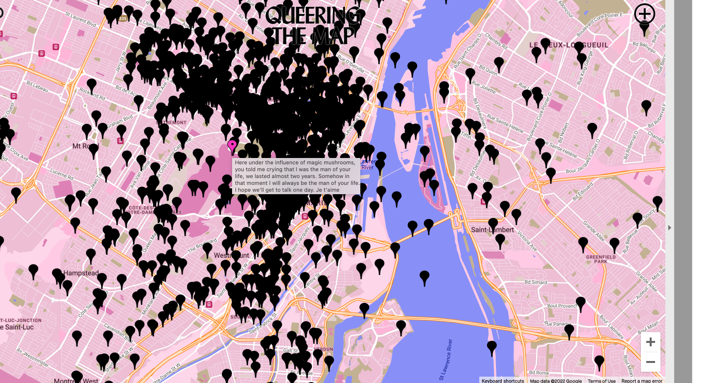
-
Spatial Humanities Commentary
In “The Potential of Spatial Humanities,” GIS is shown to be a very powerful tool that is able to visualize data within a spatial context. It is able to very accurately create a statistical analysis from quantitative data in ways that humanistic research methods cannot. However, by doing this, GIS falls behind in representing the world as more than just mapped locations. As stated in the reading, “It assumes that objects exist independently of the observer.” The world that GIS maps does not represent the community community of the location it is mapping, making it much less desirable for humanistic researchers.
This reading reminds me of an article I read (https://design.google/library/exploring-color-google-maps/) about a Google Maps project to minimize its color palette. A large struggle of theirs was found in trying to maintain the identity of the objects they were mapping even while making more objets look like one another because regions in certain places don’t look the same everywhere and have different emotional values to different communities.
-
Assignment 12- reading- Sally Chen
The use of GIS for Spatial Humanities is controversial. Although, for now, GIS seems to be considered a tool for spatial representation, the author also discuss in the article about the implications of using GIS for research methodology. There are potential epistemological assumptions that come with the use of specific tools and methods, such as the assumption that know the objective world through sound methods and data. If GIS can be more open and flexible about what can be represented in the system, then researchers might be able to reflect their philosophical thinking in ways such as using some layers to express possible biases in the data being used or some alternative explanation of what we have known.
-
Assignment 12_Reading_Elva Si
GIS (Geographic Information System) provides quantitative precise data to better understand the location information. It is a powerful tool for spatial visualization in many scientific projects. It could also be used to relate data of different formats based on their common location, at times for historians to bring spatial and archival evidence together while allowing readers to explore the evidence afresh.
Meanwhile, GIS is also experiencing many challenges. It is true that GIS is built upon a positivist epistemology where an objective reality exists and could only be discovered through scientific methods. No uncertainty or fuzziness was accepted. However, in a humanistic perspective, spatial spaces are not simply setting for historical action but are a significant product and determinant of change. They reflect the values and cultural codes present in the various political and social arrangements. This is what GIS is lacking. It too often simplifies its mapped results in ways that fail to reflect multiple voices, views, and memories of our past. It often ignores the influence of money and power although the space is often the significant product and determinant of change by the dominant economy and cultures.
-
Reading Assignment - The Potential of Spatial Humanities: Qingyu Cai
In this article, the author mentioned that only in two areas of the humanities - archaeology and history - did scholars begin to apply the new spatial technology and , in the process, discover its limits for their work. However, nowadays, I think more than these two areas have already used GIS as a tool because spatial and time visualization has been widely used in many projects and topics.
For instance, WUSTL’s Hypercities is an open-source, web-based platform for “going back in time” to analyze city spaces’ cultural, urban, and social layers. The studio brings together archival objects, maps, 3D models, academic books and articles, and community histories in an ever-growing, hypermedia context that allows for rich interaction, collaborative authorship, and participatory learning. The GIS is the fundamental tool to bring other materials together and helps visualize them in a unified space and timeline.
Besides, I also had some GIS experience while doing urban design and analysis projects. We usually use the GIS mapping tool to analyze the site’s history and critical spatial features before proposing design ideas. The GIS helps visualize the information directly in space and time dimensions. Besides, the quantitative data sets provided by the GIS help a lot in site analysis for coming up with certain decisive conclusions. For instance, we used GIS to extract land use and building type information to visually analyze the site’s programs, which helped propose which programs we should design. And we can also check the distribution of open spaces, parking lots, and the width of sidewalks.
-
Assignment 12_Spatial Humanities
The abbreviation “GIS” stands for “geographic information system,” and it refers to a system that can create, manage, analyze, and map different kinds of data. The Geographic Information System (GIS) links data to maps by combining location data (which specifies where things are) with various kinds of descriptive information (how things are at that location). This can serve as the foundation for mapping and analysis that can be used to the natural sciences as well as virtually every industry. Users of GIS gain a better understanding of patterns, linkages, and spatial surroundings through the usage of the tool. For example, Walgreens has more than 8,000 stores, and Esri has been assisting Walgreens in using location intelligence to share data and make more informed decisions. These decisions include everything from managing the merchandise that is stocked on the company’s shelves to selecting locations for new stores. Walgreens created WalMap, an advanced geographic information system, to investigate potential locations for additional stores. Because they have access to spatial information, their staff is able to use and share data on any device, at any time. However, the paper also claims that the GIS material does not explain how or why it emerged, and instead favors official representations of the world. This is a conclusion that was extremely troublesome due to the fact that this view mirrors the impact that money and power have.
-
Assignment 11
I found Mitchell’s argument on the relationship between language and spatial quality of time is interesting: ‘temporal language is contaminated by spatial figures, we speak of ‘long’ and ‘short’ times, of ‘before’ and ‘after’ – all implicit metaphors which depend upon a mental picture of time as a linear continuum…’ The perception of time and space also differs in various social and cultural contexts, e.g. some Mandarin dialect uses ‘up’ and ‘down’ which has a vertical dimension, to describe time as close and distant.
Various forms of visual organizations were developed to document events in relation to time. The cases in the article about chronological tables and matrix of kingdoms make me appreciate how data today could be translated automatically into different formats to coordinate users’ needs. For example, windows file explorer allows the user to view in ‘list,’ ‘large icon,’ ‘details,’ ‘tiles,’ and many other formats so that the user can sort and check files more conveniently.
Furthermore, the direction of writing also reflects people’s perception of time. For example, traditional Chinese books read from right to left, and each line begins from top to bottom, which is different from normal English readings.
-
Response to Daniel Rosenberg and Anthony Grafton, Cartographies of Time, Chapter 1: “Time in Print”
I was particularly interested in how this piece might apply to representations of narrative events, and how we might understand our own use of narrative visualizations (e.g., act structures, Freytag’s pyramid, Campbell’s Hero’s Journey, etc.) through these lenses. Some of my takeaways from this piece:
- Timelines are considered to have a low status as historical representations, but they are utterly important in contextualizing events and other representations of narratives.
- It makes sense that chronology was once revered when it was much harder to identify or gather evidence to support representations of event sequences. Today, so much has already been chronicled and represented temporally for us that in a sense, here, we stand on the shoulders of these materials without giving them much thought.
- I found the earlier clarification on the definition of historiography interesting: that it must “deal in real, rather than merely imaginary, events; and it is not enough that [it represents] events in its order of discourse according to the chronological framework in which they originally occurred. The events must be… revealed as possessing a structure, an order of meaning, that they do not possess as mere sequence.” In this definition, we also see that historiographies are traditionally narratives lacking in much context that would normally be considered characteristic of authorial perspective.
- Mitchell’s argument that all temporal language is contaminated by spatial figures is also interesting, indicating that our ways of thinking about time are relational in linear conception (e.g., before, after, etc.).
- Eusebius’ Chronicles appeared to be a particularly pertinent turning point in the development of a timeline, giving the timeline an indexical feel and greater utility, allowing for more annotation on the part of both authors and readers. It also allowed for easier comparisons and cross-comparisons between and among different fields of discrete data and data types.
- In Mercator’s example, an understanding of time also allowed for a more accurate representation of space–since he used astronomical data to support his cartographies.
- It’s interesting that the authors don’t touch more upon timelines as used in academic research–specifically, in the social sciences.
-
Reading Assignment - Time in Print: Qingyu Cai
The Time in Print chapter gives us an overview of how the representation of time has evolved in history starting from the mid-eleventh century. Accuracy of historical representation is not just about including more details. Instead, it is about showing the complex content of a real story while communicating the uniformity, directionality, and irreversibility of historical time.
I agree with what the author has mentioned toward the end of the chapter that Minard’s diagram looks more accurate in terms of the complexity that has been conveyed. The chart visualizes data about the army’s number and the temperature correspondingly, allowing readers to get information about both of them and try to find the relationship between them. Besides, the change in data shows the complexity of the actual war situation, which adds one more layer to tell the story. Its complexity reminds me of another reading about data as capta, which elaborates on the humanity of digital data. It is proposed that visualization of human data should include the human feeling or understanding of data, not just the number itself. The sense of humanity can also be understood as the layer of historical context. Visualizing the historical data should include how to tell a story regarding time. History texts are records of past stories in a human context, which is the same for charts.
-
Reading Assignment: Cartographies of Time
In the chapter Time in Print, it is initially revealed how large of a role that chronology once played, allowing us to better understand how time has been represented and what it has shown us about different periods of time. Today, chronologies are often thought of as “mere sequences” giving them little significance in our history, which the authors go into showing why this should not be true.
The authors emphasize the idea that “the passage of time is orderly and linear.” However, chronologies are not just mere sequences and should therefore have a more complex layer. The authors point out one of Joseph Priestly’s issues with the idea of linear time, which is that the historical narrative is not linear. I find this idea of the historical narrative not being linear interesting because it then raises the question of how linear time is and whether or not it should be presented in this way.
-
Comment on Time in Print_Elva Si
Alongside Edward Tufte’s article, Rosenberg and Grafton’s arguments widen my perception of time representations throughout history. This was my first time to realize that our idea of time is wrapped up with the implicit metaphors of time as a linear continuum. When we say ‘long’ and ‘short’ times, ‘intervals’ (literally, ‘space between’), ‘before’ and ‘after,’ time is a line where taking it apart is impossible. I appreciate the exploration to add more complex layers on top of the linear continuum. It is exciting to see diagrams that reflect the comparisons and contrasts of historical events and the irregular historical branches. I particularly like the diagram by Charles Renouvier, in which uppercase letters represent actual events, and lowercase letters events that did not happen from 1876. Such diagrams could help audience to see a much more comprehensive visual representation of the historical events.
-
Assignment 11_Time in print
This article describes the history of the birth of timelines and the development of some variants, and introduces the concept that time is not a “merely sequence”. This is similar to what I have read about the perception and description of time in the literature before. This article focuses on the timeline itself and its history, but does not describe and analyze much about the shape of modern timelines. This reminds me of the movie Arrival and Tenet in their related scenes. Suppose there is a plane and there is a worm on the plane, it can only crawl forward one kilometer after it is born in the plane before it dies, it can choose from an infinite number of paths, each different path does not overlap, for the worm, the path not taken ahead is unknown, the other paths not taken are also unknown, then for the worm each path is linear. Then the observer, appear, and you see all the paths of the worm on this plane in a higher dimension and all the corresponding endpoints of the paths. Then the bug will follow the observer’s navigation route to crawl forward, and foresee what things will be encountered in this path. We are like the observer when we are drawing or analyzing a timeline, because we have the knowledge of what happened. For the observer, time is non-linear and they can see in a higher dimension every human choice and the different results of different choices.
-
Assignment 11- reading- Sally Chen
From a contemporary perspective, the use of lines to represent time is almost intuitive, and this article provides a historical perspective on why such timelines eventually stand out from the various alternative representations. As more technologies emerge and evolve, the spatial and temporal information we can gather becomes more abundant, so there may be more creative temporal representations. Reviewing the less “practical” representations of the past can be helpful in designing temporal representations for the future as a possible path to deal with the limitations of timeline representation. I think the polar area diagram is a common temporal visualization that differs significantly from the traditional linear representation.(https://datavizcatalogue.com/methods/nightingale_rose_chart.html) As the data is represented around a fixed point, the time is visually more “cyclic” than the linear representation. It may help to represent information and ideas that have periodic patterns.
-
Space and Time reading comment
It’s crucial to understand what parameters are used to visualize/animate the data information and from which perspective. In the article, Galileo’s Jovilabes is a very enlightening mechanical instrument to demonstrate the movement of the Sun, Earth, and Jupiter. Different ways of representing the data would give users new insights and inspirations about the object.
The last page about the abstracted encodings of contemporary dance notations also reminds me of diagrams in architecture. The Manhattan transcript is a famous drawing by Bernard Tschumi about the overlay of movements, events, and space. The Transcripts aimed to offer a different reading of architecture in which space, movement, and events are independent yet stand in a new relation to one another so that the conventional components of the architecture are broken down and rebuilt along different axes.https://www.moma.org/collection/works/62
The article also indicates the importance of the users. Users with a data analysis background might prefer different visualization styles compared to users with a design background (who might emphasize more on color palettes, font, and the formatting).
-
Comments on Tufte's Narrative of Time and Space
In this chapter, Tufte discusses the ongoing process of taking data and narratives that include multi-dimensional components of space and time and putting them onto a flat representation. He discusses how this process has been done throughout the course of history, showing an early example of Galileo’s representations of Jupiter’s satellites. These representations must maintain spatial relationships, otherwise risking misinterpretation by the audience. This is where the practice of good design plays an important role. No matter the visual that is trying to be created, certain display techniques create a better representation, which Tufte notes as “small multiples, close text-figure integration, parallel sequences, details and panorama, and polyphony of layering and separation, data compression into content-focused dimensions, and avoidance of redundancy.”
-
Comments on Narratives of Time and Space_Elva Si
I found the section about translating dance movements into signs transcribed onto flatland pretty interesting. Tufts used several examples to help me reimagine how dance notation could be permanently perserved, something other than video recordings. Tufts also helped me realize the challenges beneath this visual-data translation, especially when we need to decompose many nearly universal yet invisible display techniques. It was eye-opening and aesthetic to witness the flowing and graceful lines embellished by disciplined gesture, the dynamic symmetry inherent to individual and group proceedings. It became more interesting when multiplied consecutive images and de-gridding graphs enhance the depiction of continuous, three-space movement.
After reading this chapter, a work by Gabrielle Lamb, The Choreography of CRISPR (2022) during my MIT Museum visit came into my mind. The artist translated gene movement (twisting, cutting, inserting, copying, repeating, palindromes, and cluster) into choreography. For example, the double helix is analogous to a dancer’s spiralling turn. It is interesting to see how visualizations of the four-dimensional reality of time and three-space could happen in many ways. As we want to translate gene movement into something more tangible and accessible, Lamb created the chroeography. While we want to document the chroeography in a textual format, we made another visualization onto the paper flatlands.
-
Assignment 10- comments- Sally Chen
Representation of time and space is complex, especially when considering that an individual’s perception of time and space is relative. Public transportation maps are a typical topic, and a large number of transportation maps in the past show what kind of representation is more practical, and which representation will make people feel confused. I associate it with the public transportation map of Boston and use the Red Line as an example. On the map, the distance from Kendall/MIT to Central is the same as the distance from Central to Harvard, but the distance perceived by riders is different - the time required for Kendall-Central is less than the time required for Central- Harvard. For the passengers, the absolute distance between stations does not matter- “distance” is perceived as “time taken for the travel”. I believe that in some public transportation systems, the use of the line length between stations to represent travel time may have been applied. If the pattern is extended to different subway lines and bus routes, and a “map” is generated that is significantly different from the absolute distance. Considering the frequency of public transportation (the function of waiting time) and the volume of people (which affects the likelihood of direct boarding), the map will have a pattern that varies throughout the time of a day.
-
Response to Mitchell Whitelaw, Towards Generous Interfaces for Archival Collections
##Response to Mitchell Whitelaw, Towards Generous Interfaces for Archival Collections
I agree with Whitelaw’s approach: if the interface is the user’s only representation of the collection, it needs to be generous in its expressive and accessible capacities. Search functions are important tools for funneling us towards artifacts, but it cannot constitute the entirety of an archive’s user engagement functions (as pointed out by others cited in this article, search carries central assumptions that must also be met, and it is often the end of the line for users of online museum archives, as described in the example of the UK National Archives collection). While necessary to have search functionalities, they should not be considered a prerequisite to our archive experience; rather, they should be a background component that enhances our experience. Once we have found what we are seeking, we should be able to easily identify further characteristics of the work’s creator(s), expand our “search” into the years or decades surrounding the artifact, and observe demographic and metadata that are pertinent to our view of the object(s) and period(s) (as shown in the example of the Collection of the National Gallery of Australia). In essence, the interface itself is a search function, but also an exhibition function. In examining the author’s principles and patterns, they align beautifully with the concepts of an immersive experience. They also remind us that of utmost importance is the quality of the representation of the object in view, including its visual quality as well as the context surrounding its creation and illustration.
-
Response to Chapter 6, Narratives of Space and Time, Edward Tufte
##Response to Chapter 6, Narratives of Space and Time, Edward Tufte
The author makes two essential points that stand out for me: that the myriad of different kinds of data (e.g., arrays of annotated numbers, information densities, type and image) makes for a challenging display in the flatlands of two dimensions; and that an audience of diverse viewers–some of whom might be considered subject experts (e.g., travel agents), while others are not–means that visualizations must be accessible to many people, with many different capacities for interpreting these visualizations, at once. In the example of Galileo’s representations of star positioning observations, anyone with a simple key can decode his descriptions. The same is true for the later visualization of moon positions in orbit (p.100). As the author suggests, these and other visualizations in this chapter are also useful in showing longitudinal, temporal data (making them narrative, since they transmit narratives of events in sequences). As a consequence of their visualizations, these narratives may showcase patterns that are multifunctional in nature, and that show in many ways. Here, it is important to provide adequate space for visual interpretation (as Tufte points out later in the example of the New York to New Haven travel table), with consideration for all elements of visual representation: size, typography, column separation. I appreciate the later example, as well, of Playfair’s “spill[ing] out” of outlying data, an approach I’ve seen recently in visualizing data that goes beyonds the bounds of the expected of “usual” (such as those representing scales of temperature change over the past century). The example of dance notations is particularly elegant in its representation of three-dimensions in a two-dimensional display, and in incorporating both text and image in a “unified” fashion (e.g., with text actually being “shaped” to represent bodily movements); this reminds me of a less-visually-complex “blocking” notations used by stage managers in theaters, where the staging of a show must be documented.
-
Response to Borgman, Chapter 7
##Response to Borgman, Chapter 7
This chapter brings up several issues key to the ethics of conducting digital humanities (and other forms of) research. Namely, we must consider where our data artifacts originate, who owned them (and who owns them now), how they are represented visually in online forms, who has access to them (and who should have access to them), and how these artifacts–which may be culturally sensitive in ways we do not anticipate–are represented and re-created in digital form. I mentioned most of my key responses in class, but to summarize: there are too many variables present in the reflection and representation of original cultural artifacts to simply publish them in new forms. We must take care to work with the very cultures where these artifacts originated, for both legal and ethical reasons. We must also take care to diligently reflect upon these artifacts, and their larger relationships with others, through both close and distant “readings,” where possible. In documenting them, we should also take care to make their components easily identifiable and interpretable to a wide range of audiences, if indeed their cultural confounds would allow them to be shared broadly. For example, some artifacts were never meant to be seen by those outside of a particular cultural setting, and the provenance of their originators or owners must be acknowledged and respected appropriately.
-
Reading Assignment - Envisioning Information (Ch. 6): Qingyu Cai
It is an interesting chapter in terms of envisioning space and time information. With vast amounts of drawings in different fields and at various times, the author gives us a vivid description and explanation about how designers have tried to visualize the space and time information in one flat paper, from satellites, schedules, and route maps, to dance movements.
I am super impressed by the development and improvement in terms of visualization and the thoughts behind those drawings. Among them, I am super interested in the transportation schedule drawings, which I have never seen before. If we recall what we see currently in train stations, bus stops, or airports, the schedules are just tables listing information on flight/bus/train number, departing time, and platform/gate. And if we check the digital interfaces on our phones or computers, they display similar information, including departing and arriving stops and times. Why don’t we visualize the information in such circumstances? From my perspective, visualization of information is more of a tool for explanation rather than representation. If people can convey the information clearly in texts without diagrams, they won’t use drawings. We don’t necessarily need visualization tools unless we need them. If we continue taking the schedules as an example, I will use the diagrams in other cases, for instance, comparing the transit time for different buses. As a result, I would argue that when visualizing information, it is crucial to leave the info only needed and never rely too much on diagrams.
-
Towards Generous Interfaces for Archival Collections Blog Post
After a brief overview of Whitelaws’ definition of Generous Interfaces, I have gained a new insight into the format of different search pages, and how some websites appeared more useful than others. Generosity, although an odd word to use for an agent or tool that inherently serves the user, is an accurate measurement to judge search engines. Breaking down her arguments into layman’s terms, an interface is considered generous if it makes evident the format,history, or overview of its data before the user enters a query to be searched. While analyzing the front page of Europena, Europe’s digital cultural heritage, I gained a fundamental understanding of what the possible data types were, as well as possible queries that would make sense given the format. The page contained the search bar, with a faceted theme that included possible categories within the dataset, as well as articles that are shown as example data that is depicted through the search engine. The overview of the page essentially acted as a guide to how to use it, which in theory, fits the definition of a generous search engine.
-
Comments on Generous Interfaces Reading
As we are moving more into a digital world, I appreciate Whitelaw’s thoughts on how our means of the digital experience should be more accessible. Whitelaw proposes a generous interface, as opposed to an interface that is entirely a “lookup” search, giving us a more “exploratory search”. With this, our data is given or shared and is very large. When our data is given to us, we don’t have to be experts on what we are looking for. Rather, we now have the opportunity to learn about a collection and develop a sense of context. This gives a better experience to those who are unfamiliar with a certain topic.
Even though our data collections now are very large, they don’t display the data in a compact form. This data is much easier to display in a general search interface, but can be resolved through facets that breakdown the information within a collection. Although more difficult of a task, it is worth the transition in order to create a better experience for all users, not just those wh oare already experts.
-
Assignment 8-reading-sally chen
In common interface design, designers usually pursue simplicity as the standard, which may not be appropriate in the context of digital collections. We are used to google’s home page being an empty picture, directly from the search box to start. For the digital archival collection website, it is necessary to consider how individuals can access various information, just like the experience of browsing a museum. Interface design needs to consider the balance of browsing and searching. Just like a person who chooses to go to an art museum - which means he has certain expectations of what he will see - he will see some artwork, specifically what genre it might be, or what theme it might have. In addition, the visiting experience is not only about the expected information but also about the “unintended” gain of information, such as other objects displayed in the same window with the “searched result”. In a digital archival collection, the interface designer needs to consider what factors to use as guides to help visitors find the “expected” works, and what can be displayed in the same window for generosity. In addition to the works that share commonalities, it is important to consider how to present a variety of different works through appropriate design so that the viewer can receive new information without the feeling of an “information explosion”. One possible way is randomly exposing all kinds of work in the collection to the audience. For example, designers can use a certain area of the initial page to display the names of some display objects, and the names will be changed every time the website is refreshed.
-
2022-10-05-assignment-8-reading-joshua-mbogo
A New Post
I think a very important point that the author made is making an interface that not only can allow users to be general in their search but also very specific if they need to be. Flexibility in speificity and granularity in a browser or search is the main challenge that search engine and interfaces must solve. For https://maid.moma.org they solved this problem by having different categories (ex. keyword, title, person, etc.). Because the domain of options is reduced only to a set of know images with these types of fields it is easier for this application to meet the vision that Mitchell Whitelaw had about digital interfaces a balance between control, generalization, and immerssion for the end goal of a satisifing query that helps the user gain knowledge and understanding about the problem they are trying to solve. Enter text in Markdown. Use the toolbar above, or click the ? button for formatting help.
-
Assignment 8_Generous Interfaces_Li
I find the article’s discussion of Generous Interfaces to be very intriguing; in fact, this is the first time I’ve heard of this concept. However, I did practice Generous Interfaces design to some extent while working on the project. Because the data is no longer restricted to academics, it is a significant part of my job as a designer to make information communication more straightforward. According to the article, the search function is extremely unfriendly to non-specialists and is both ineffective and time-consuming when we do not know the keywords. The most important aspect of the browse function, in my opinion, is that users are able to locate the categories, restrictions, etc. that they can select from on the browse page quickly and precisely. For instance, in the Prints and Printmaking Collection of the National Gallery of Australia project, there was an abundance of data, but I had to spend a considerable amount of time studying the system’s interface in order to effectively utilize the entire database. Consequently, I believe that in the process of data visualization, we should not only consider how best to record the data, but also design the user interface so that the entire database is intuitive.
-
Comment on Data Scholarship in the Humanities-Elva Si
I was intrigued by the idea of humanistic data focus on interpretation and reinterpretation. This is an idea that penetrates throughout our course. Drucker (2010) once mentioned that knowledge as interpretation. The apprehension of the phenomena of the physical, social, cultural world is through constructed and constitutive acts, not representations of pre-existing or self-evident information. Humanistic knowledge and data is so special that we cannot compare it directly with scentific data. It can be physical, digital, or digitized. It can have surrogate or complete content, static images or searchable representations. I like Borgman’s statement that “the Higg’s boson can be discovered only once, but Shakespare’s Hamlet can be reinterpreted repeatedly.”
A following point that attracted me is about source and resources, particularly about text conversion. Digitization of the entire documentation can provide new opportunities to study humanistic knowledge. I still remembered our discussion from the first few classes that we could use digital humanities to search for how a word is used through literature over time. I think the modern OCR technologies and crowdsourcing like CAPTCHA are clever and efficient tools to recognize and convert written text. With more and more searchable strings of letters spaces, punctuation, semantic information about words, phrases, headings, chapters, page breaks, personal names, places, quotations could provide us with so much richer analysis in the future.
-
Comments on Data Scholarship in the Humanities
The author touches a lot on the collection of sources for humanistic research. At one point, they discuss how the excavation of artifacts for this type of research can impact the original site too much, which brings in an ethical debate in this line of research. However, with digital documentation, we can capture these observations in a much less physically destructive way, giving a lot of importance to the world of Digital Humanities. Additionally in the discussion of sources, the author mentions the difficulty in determining what is and is not a potential source of data for humanities research, and even with so many objects that can be interepreted, each object individually can be interepreted in so many different ways. This is really what differs the humanities from the sciences and social sciences. There is a great deal of interpretation and further representation of a certain source depending on its context and on the goal of the collector.
-
Reading Assignment - Data Scholarship in the Humanities: Qingyu Cai
This chapter, called Data Scholarship in the Humanities, introduced different aspects of data and scholarship and the relationship, including research methods and practices, sources and resources, knowledge infrastructure, and external factors.
When talking about sources and resources, the author argues that it is challenging to set boundaries on what are and are not potential sources of data for humanities scholarship because almost anything can be used as evidence of human activities. Data can be physical and digital, digital and digitized, surrogates and complete content, static images and searchable representations, searchable strings, and enhanced content. Each data format has its meaning, and one should choose whichever fits the needs. Besides, thanks to the emerging technology, many skills have been created during the development process to help diversify the data format, which supports humanities research. For instance, digitized objects can protect the original file and allow researchers to look closely at the files without destroying them. They have more potential to be turned into different forms of representation. Besides, the digitized form can be accessed by several people simultaneously instead of waiting to see the original object one by one. Thanks to technology today, digital humanities bring more convenience and possibilities for researchers to analyze the objects, in other words, the data, in various forms.
Moreover, the author has also mentioned the uneven access to data, material collections, and digital objects, which means the existence of digital segregation. However, this kind of segregation doesn’t mean a bad thing. Data, especially human activities, tend to be personal and private regarding human rights. If there’s no limitation regarding who can access the data, it would be dangerous for those involved in the data set. We tend to believe that companies and institutions are more responsible and ethical in dealing with data, which is not necessarily true. But, there’s no other way to determine who can access the data in a better way.
-
Data Scholarship in the Humanities Blog Post Pt.1
Borgman suggests that the period at which certain works appear can make certain interpretations of the work more important, leading to more educated humanitarians. Since most literature were written primarily in multiple languages, those who were willing to gain the primary source, since differing translations come with biased interpretations, had the more credible ideas regarding certain works. In such a way, the well-reknowned humanists are more educated than certain sciences in a way, which is interesting. An interesting point arises within the article when discussing humanists and their access to humanistic works. Borgman addresses that due to economic disparity and property rights, only a certain handful have the ability to access and analyze specific works; this could very well give rise to certain humanistic interpretations of artistic pieces being dominant, since there is only a select few that are primary sources. Additionally, the more limited an artistic piece is, the more associated monetary value as it ages, so there is less incentive for owners to relinquish their property in favor of more interpretations of work.
-
Assignment 7_Xiaofan
In the article, it mentioned the concept of ‘Provenance.’ It is interesting how the same item can be understood in so many ways, which in turn affects its ownership and related history was understood. For example, there is still a debate going on about whether calligraphy was invented in China or Korea because there were historical items found in both countries that couldn’t verify their date of origin.
The ethics aspect of classical art and archeology is also concerning as access to archeological materials is a matter of local heritage that government would want to keep private until its own scholars develop research and understandings ready to be published. Archeological materials of economic or military value would be even more sensitive, as it will give the local government/country an advantage compared to the international communities. The authenticity of the data is also doubtable, as the data we can access now might already be filtered by the government, which only displays what they want people to see.
Furthermore, this article also made me realize how much investment in infrastructure is needed in order to maintain all the data and resources we are accessing today. A lot of information might be lost due to the difficulty of technical support and maintenance and lack of funding. The data and resources we can get access to today are also ‘filtered’ depending on if the monetary/educational value it could bring can cover the cost it takes to keep it.
-
Assignment 7-reading-Sally Chen
1.> “Digitization of objects and their representations has transformed research methods that rely on such comparisons. Texts, images, sounds, and other entities—or portions thereof—can be compared in ways never before possible, whether side by side on a screen or through computational modeling. “
I believe that an important task of scientific research is to draw patterns in things by collecting data, although this does not seem to be an aspect that is heavily emphasized in humanities research. One of the ways to draw patterns is to try to identify commonalities by comparing different data to see if things fit a certain pattern. The accessibility of the research object of humanities research can be a possible problem for hindering further development. This is one of the major problems of traditional humanities research that I realized from the article, and it is digitalization that has improved this situation. However, as will be discussed later, there are still problems with digitalization, such as property rights, that prevent researchers from acting on research objects in digital form.
2.> Whether something becomes a source or resource for data in the humanities may depend on its form, genre, origin, or degree of transformation from its original state.
For the digital age, whether big data or social media data (such as the Twitter or Facebook data we discussed in class) should be considered reliable sources of data or how it should be reasonably processed to be a reasonable source of data, maybe a question for future discussion in digital humanities. Algorithms make the process of generating and collecting big data not entirely derived from human intelligence. For traditional data sources, we may be able to account for transparency by documenting some “metadata” information, however, we need more solutions to clarify the source of big data to improve the rationality of their use in academic research.
-
Assignment 7_ Data Scholarship in the Humanities _ Li
The first important thought I have about data is that “size matters” and I also believe that access is crucial, as there are few archaeologists and anthropologists, and thus few data are collected. I believe that the primary purpose of digital data is to classify and organize the information, as well as to find the relevant pattern or use the data to support certain theories; however, if the collected data is insufficient, it will be unable to find the pattern and will impede the development of related disciplines. In my final project, I believe there are enough samples to generate data, but there is insufficient personnel for systematic research and collection, resulting in a small database; I also believe that in addition to size, accessibility is extremely important. Without access to the data, it is impossible for scholars to collect and analyze the data. Access to public data is particularly difficult in China due to government restrictions and a lack of relevant sharing platforms.
Regarding interpretation and reinterpretation is the second topic that intrigues me. In some disciplines, reinterpretation is even more valuable than raw data. The value of interpretation and reinterpretation varies across disciplines. The content of these reinterpretations, I believe, will become so-called raw data in the future, when scholars examine our thinking logic and thinking habits by analyzing the content of our current reinterpretations. With the exception of a few scientific guidelines, I think that the majority of the content of the reinterpretation is more interesting, although the scientific guidelines we have identified may not be the actual guidelines.
Finally, a discussion of provenance follows. The text examines the ownership of artifacts and the resulting disputes. In the Web3 era, I associate this with the ownership of NFTs. Currently, the purchaser of an NFT owns the token itself, which is a record of the rights to the underlying digital version of the work it corresponds to; therefore, when an NFT is transferred to another party, the underlying digital version of the work is also transferred. Nevertheless, it is obvious that the user’s rights to the NFT itself are more restricted. For instance, users cannot refer purchased NFTs to their own virtual coin wallets and cannot easily transfer them for a fee through the platform where they were purchased; therefore, does the NFT purchaser possess ownership rights to the NFT token itself?
-
Assignment 6_Xiaofan
The article elaborated on the possible impacts and implications the Big Data phenomenon might have on our life. Chapter 6 raises the question about the rights of accessibility to big data and points out the unevenness of the system:’ those inside social media company would have privileged access to different datasets.’ This unfairness and lack of regulation in accessibility data also make Big Data a powerful tool for political manipulations. For example, during the presidential elections, the huge amount of data generated through tweets and polls on social media was used by political strategists to derive insights and work out what message is best to target and engage the voters. Chapter 3 ‘big data are not always good data, ‘ calls attention to the authenticity and accuracy of big data and how uncertain data could lead to precarious outcomes. An example I thought of is how some Instagram influencers fake their way to online fame by buying fake followers. According to an influencer Bilton, “Bot followers are created by hackers and programmers who write code that scour the internet to steal countless random identities by pilfering people’s photos, names, and bios There are.” also substantial ethical problems involved as people’s photos are public on the internet that people can screenshot without asking for permission.
-
Response to Six Provocations for Big Data- Amanda Webb
I found this article quite interesting as a lot of my interest in the realm of digital humanities stems from social media and the networks which exist within it. Although there is substantial literature in the conversation of ethics and potential interpretations of publicly available social media data, due to the constantly evolving terrain, there aren’t universally accepted ethical guidelines regarding the use of data collected via social media. The article does raise a good point on the potential biases in the monetization of data and the employment of individuals from an affluent or academically privileged background. Two widely regarded practices of Human Subjects Research are informed consent and appropriately stated information that is considerate of the audience’s comprehension level. In the case of social media companies with majority employee demographics recruited from top universities, the issue of appropriate comprehension levels in privacy information becomes important to discuss. There are terms and conditions that must be agreed upon before joining nearly all social media platforms, but the language of this information is dense, lengthy, and full of legal or technical jargon that the average user cannot effectively comprehend. Even though all users of a platform have consented to a platform’s respective privacy terms, can it be comfortably decided if that consent was informed?
An example which ties in quite well to this reading is a study that was published this week on a five-year-long LinkedIn Social Experiment on the effect of “weak ties’’ as an avenue for employment. The platform ran “multiple large-scale randomized experiments’’ on the UI feature that suggests new connections. Using A/B testing, LinkedIn tested whether job opportunities were more commonly found from close or weak connections; conclusively, the aggregate data showed that the latter was more effective in creating job mobility. While it is common for social media platforms to use A/B testing to gauge consumer feedback on platform updates (which I personally have no qualms with), this experiment raises an ethical dilemma on the impact of the A/B testing on people’s livelihoods. Once there was any form of consensus regarding the efficacy of “weak ties” for job acquisition, the test group who continued to see strong ties recommended to them was put at a disadvantage for finding employment. However beneficial the findings of this study may be, the methods of research add to the ever-growing discourse surrounding ethical social media data analytics.
-
Reading Response to 6 Provocations
I am most taken with the author’s notes on the accessibility and equity of Big Data: “who gets access to it, how it is deployed, and to what ends,” which is contextualized by the fact that “an anthropologist working for Facebook or a sociologist working for Google will have access to data that the rest of the scholarly community will not.” This is complicated by the fact that “automated research changes the definition of knowledge, but nonetheless, data extraction, cleaning, and analysis tools must be made available to those outside of isolated academic and industry centers, especially if we wish our findings, our archives, and our work to represent broader cultural imperatives than our own. This is also, inherently, an issue of bias that reflects the methods applied within these contexts. As the author later states, “regardless of the size of a data set, it is subject to limitation and bias. Without those biases and limitations being understood and outlined, misinterpretation is the result.”
Joi Ito’s cited point that “Big Data is about exactly right now, with no historical context that is predictive” is also appreciated and noteworthy, especially as we continue to overvalue social media and other aggregate online data that only goes back, at most, several decades, with these data being filtered behind any number of black box processes that are not made clear to journalists, researchers, or community members who with to utilize these data.
I was particularly “excited” by the author’s claim that, “without taking into account the sample of a dataset, the size of the dataset is meaningless.” This is an enormous problem, frankly, in my own research group, where my colleagues use primarily large-scale social media datasets, but don’t take much care in how the data are collected, by whom, or even what keywords are used for text extraction (this last one, to me, seems particularly egregious). Our team also makes the “mistake” of comparing possible incomparable network data from different platforms. Then again we will always try to make connections where we can. But it is important to note the limitations of our approaches.
I was also in agreement with the author’s “claim” of the value of single-case design experiments: “research insights can be found at any level, including at very modest scales. In some cases, focusing just on a single individual can be extraordinarily valuable.” I’m interested in using potential single-case designs in my own research.
I also agree with the author’s later insight into how “the current ecosystem around Big Data creates a new kind of digital divide: the Big Data rich and the Big Data poor,” contextualized by Manovich’s writing of the three classes of people who access and utilize Big Data. MIT community members are particularly privileged to belong to the third class.
-
Comments on Six Provocations of Big Data
##Six Provocations of Big Data
In the section titled “Bigger Data are Not Always Better Data”, I agree with the authors’s points that just because a sample size is large doesn’t always mean that its representative data. I think that this point ties in well with previous readings as we have discussed big data being too large to work with due to its difficulty in filtering and interpreting. However, how can we ensure that our data sets are representative and not too fixed at the same time?
In the section titled “Just Because it is Accessible Doesn’t Make it Ethical”, if big data is so large and lacking in depth, then I question the author’s point on whether someone should be included as a part of a large aggregate of data. The researcher is not likely analyzing every data entry individually, so it’s interesting to see the author questioning “What does it mean for someone to be spotlighted or to be analyzed in a way the author never imagined?”
-
Comment on Six Provocations for Big Data-Elva Si
I mostly agree with Danah Boyd’s arguments for big data. In particular, I resonate a lot with the second argument: Claims to Objectivity and Accuracy are Misleading and the fifth argument: Just Because it is Accessible Doesn’t Make it Ethical.
There remains a mistaken belief that qualitative researchers are in the business of interpreting stories and quantitative researchers are in the business produce facts.
Quantitative research methods are so often deemed as “facts.” With more and more big data joining the party, the division between these two scientific methods may become wider. However, as Boyd mentioned, all researchers are interpreters of data. A model may be mathematically sound, an experiment may seem valid, but as soon as a researcher seeks to understand what it means, the process of interpretation has begun. We need to remind ourselves that data is primarily human-made. “Data-driven” doesn’t mean “unmistakably true.” We should get rid of the mindset of absolute control and universal truth of big data and, instead, embrace an understanding that big data is another form of subjectivity.
With Big Data emerging as a research field, little is understood about the ethical implications of the research being done. Should someone be included as a part of a large aggregate of data? What if someone’s ‘public’ blog post is taken out of context and analyzed in a way that the author never imagined?
While I am doing the database research for the final project, I was stunned by this argument. Many of my current project interests lay in areas like entertainment topics like TV production, social media (which bring up another question on data accessibility), which stopped me from keeping ethical issues in mind. But Boyd’s perspective brought up an important point that just because content is publicly accessible doesn’t mean that it was meant to be consumed by just anyone. There are definitely some csv. files that documents data of those vulnerable ones, those who don’t want to be included in the public data. We need to constantly ask ourselves about the ethics of their data collection, analysis, and publication.
-
Reading Assignment - Six Provocations for Data: Qingyu Cai
In this article, the author mentioned six provocations for data as a new layering of information emerging at that time. I agree with the point that limited access to big data creates new digital divides. It is the same as new technology. With the development of technology, those who are more adaptive to new technology can make it easier to understand and use. However, those who lack knowledge of information will lag behind and gradually become out-of-date in the sense of being segregated. It is also the case in big data time. To solve this problem for those who want to access the data but lack the technique, creating platforms and opportunities for people with different backgrounds to cooperate and communicate with each other will be critical. The new digital era has also begun in more complex and diverse fields, for instance, healthcare informatics and user interface design. And how to use and transform data, including collecting, analyzing, and visualizing, can be collaborative teamwork. When facing new technology, it doesn’t need to be individual work. Instead, it is crucial to have various knowledge inputs during the process in this field. Otherwise, the new digital divide would make human knowledge less valuable than technique.
Besides, I entirely agree with the point that big data doesn’t necessarily mean objectivity and accuracy. On the one hand, as mentioned in the paper, the data itself is not accurate and reliable. On the other hand, analyzing data relies on how the information is interpreted. And it is also the human being who interprets data, which means errors or subject decisions can exist. When dealing with the same data, different people can have various methods with different aims, which leads to different results.
-
Assignment 6- reading- Sally Chen
-
Automating Research Changes the Definition of Knowledge. “Numbers speak for themselves” can refer to data analysts’ subjective interpretations of big data, an inference about individual motivations from an outsider’s perspective based on behavioral data. Obviously, this is different from data in which individuals express their motivation directly. This kind of non-number data is at a disadvantage in the era of big data.
-
Claims to Objectivity and Accuracy are Misleading As we discussed on Monday, I agree with this point. In a culture where number is tied to objectivity and accuracy, big data is considered objective. Considering data to be capta to some degree, then the argument for the objectivity of big data is misleading. In addition, the interpretation of big data is also non-objective and contains the subjectivity of the analysts.
-
Bigger Data are Not Always Better Data The problem of representation- A large amount of data from a small number of people does not mean that the interpretation can be generalized to a wider population. The problem of transparency- Researchers do not actually have a clear understanding of how datasets are generated, especially due to the involvement of algorithms(which are black boxes) in big data.
-
Not All Data Are Equivalent Visualizations based on relational big data are not necessarily a true representation of the real network of relationships. In the case of social networks, for example, a family member may be less frequently connected online than many friends - it does not mean that the individual is closer to the friend. Perhaps it is just because he/she spends a lot of time with the family - they simply do not need to chat online for communication. In addition, the frequency of online communication simply cannot represent the quality of the conversation.
-
-
Assignment 6_ Big data_Li Zhou
The second argument “Claims to Objectivity and Accuracy are Misleading” intrigues me and reminds me of the previous article “data as capta”. The subjectivity of data collection has an impact on the final information and visual presentation. As stated in this paper, once the researcher begins to interpret the data, the data are infused with the researcher’s subjective ideas, and the data are no longer objective and accurate. In contrast to small-scale research data, it is simple for researchers to reach the conclusions they desire by subjectively emphasizing or ignoring particular aspects of such a large database. The consequences of these conclusions can be as large or as small as an advertisement not meeting your needs, as large as an entire anthropological study being misdirected, etc.
How to find a balance between the disadvantages and advantages of using big data is the key to the online world. I believe the recent emergence of blockchain offers a solution through a decentralized approach, where the problem of private information disappears when there is no central server collecting data. As a local example, whenever we click “accept cookies” on a website, we share our data information once. The digital marketing course has taught me how search engines like Google use cookies to obtain information from advertisers in order to deliver accurate advertisements to users. Big data is the foundation of all digital marketing, and it is a highly profitable industry. Consequently, if big data ceases to exist, our lives will also be filled with a great deal of inconveniencing, so my stance is to support the development of big data, but the monitoring must be strengthened.
-
Reading Assignment-grad-Sally Chen
-
U+G Data visualization presents information or ideas more directly, but humanities researchers also need to think about the logic or theoretical basis behind the use of visualization. Research on individual human beings or groups of human beings is essentially a way to collect partial information (capta) about society as a whole through different methods. The gap between the world as we perceive it and the information we record, and the gap between the original research material and the material after data visualization, can lead to differences between reality and data. Data Visualization is a powerful tool, yet humanities researchers need to be aware of its limitations and thus view the results of digital humanities more carefully.
-
G In the next chapters, the authors focus on the way temporal and spatial information is represented through visualization. The current visualization does not accurately reflect the temporal or spatial relationships presented in the data. From the temporal perspective, possible problems include the ambiguity of time data and the subjective perceptions of the length of time, etc. The timeline mainly used nowadays represents time with a precise point on a straight line. However, having precise temporal points is not what commonly happens in humanities research. The authors use figures to show the possibilities of visualizing temporality, which look more complex than the usual timeline, making them seem less “straightforward”. A possible improvement would be to show the different levels or categories of “y” axis information through user-interaction interfaces so that the observer can process the information within an acceptable range at one time. Similarly, in the section discussing visualization of space, the authors show some possible forms of visualization that do not look like the familiar “diagrams” or “maps”, but they do have the potential to represent more information. For example, the prevalence of a particular cultural phenomenon in a certain area often radiates to the surrounding areas. A spatially related representation like a “heat map” may be able to better represent the extent and intensity of the impact than by highlighting the central point on the map and marking all the administrative areas affected, incorporating as much information as possible. Developing better humanities visualization tools requires creativity and a good understanding of the disciplinary logic of humanities research. This includes an understanding of the nature of data, the methodology and logic of data processing, and the purpose of data visualization.
-
-
Drucker Article Data as Capta: Approaches to Graphical Display Blog Posts
Drucker examines a fundamental problem that audiences view statistical representations of data as objective fact, often forgetting the representation can be often filled with biases; Representations such as graphs, tables, and charts are also just observed interpretations of natural phenomena. I agree with this point of view, but this leads to another rabbit hole; the author is suggesting that statistical representations can no longer be considered objective pieces of evidence for arguments, or stepping stones to base other conclusions on. And if this is the case, theories concerning society cannot be formed. There must be some base level of trust within statistical representations in order to gain a fundamental understanding of societal structures.
-
Comments on Drucker's text
Humanities Approached to Graphical Display
In Johanna Drucker’s text, she discusses developing graphical displays that are rooted in interpretative activity. However, I disagree with this idea that our graphical expressions only make room for statistical analysis. While they may show quantitative data, such data can very well be interpreted in different ways, leaving one to wonder what the data is showing, what it can tell us about our past, what it can tell us about our future, why it has occured this way, and more.
I do agree that the graphical displays that we do have are not designed for a humanistic discussion, but I don’t beleive that such discussion cannot occur.
-
Comment on Humanities Approached to Graphical Display-Elva Si
This article significantly challenges my understanding of data visualization as it brings up a new humanistic approach to constructing and interpreting graphical displays. I consider data as intrinsically quantitative - self-evident, value-neutral, and observer-independent. While individuals may interpret a bar chart, a pie chart, or many other commonly known visualized data graphs in their way, the graphs usually communicate a concrete meaning that the author intended to convey. But, as Drucker mentioned, This belief excludes the possibilities of conceiving data as qualitative, co-dependently constituted. It is not easy for me, and maybe for most of us, to accept the ambiguity of knowledge, the fundamentally interpreted condition on which data is constructed. Data is capta.
But Drucker’s arguments are well supported. From a humanistic perspective, all metrics are metrics about something for some purpose. I like the example of counting the number of novels published in a given year. While data from a bar chart could indicate the number of novels published in a year, a humanistic graphical display could show a much more comprehensive story in relation to the time of writing, acquisition, editing, pre-press work, and the release. Alongside, the example of three people who have variations in perception waiting for a bus is also very interesting. I like the consideration of different variables in a context than a mere number/data. Here, space is a factor of X where fearfulness, anxiety, anticipation, distraction, or dalliance are variables.
Last but not least, Dr. John Snow’s chart tracing the source of epidemic outbreaks and geographical location reminds me of the data around COVID-19 we have observed over the past years. Yes, each dot represents life and none of these are identical. A single dot cannot express how each outbreak impacts an individual, their degrees of vulnerability, the impact of their illness, effect on the family and loved ones. We need to constantly remind ourselves that many demographic features could be layered into the map to create a more complex statistical view of the epidemic. I believe that this is the magic of a humanistic approach to graphical display.
-
Assignment 5_Data as Capta_Li Zhou
HUMANITIES APPROACHED TO GRAPHICAL DISPLAY
The text argues that because capta is actively “taken” while data is assumed to be “given,” “capta” is a more precise term than “data.” “The rhetorical nature of statistics is inevitable. I found the author’s example of Google Maps, an app that nearly all of us use daily but which is not as objective, realistic, or accurate as we believe, to be very interesting. According to the author, we require a new method that employs humanities principles to constitute capta and its display. This objective is extremely difficult to achieve, but I believe that people should first be aware of the distinction between capta and data, and then construct and specify relevant principles so that data does not exist and everything is capta.
Data as Capta
In the first part the authors use humanities principles for a deeper explanation and application of the traditional visual representation. The information should be referred to as capta rather than data because it is derived from the perspectives of various observers who, as in the Google Maps example I mentioned earlier, add their own subjective positions to the graphical representation. Specifically, the notion that scale divisions are not equal intrigues me the most. I am trained as an architect to think in terms of standard mapping patterns and modes of thought. The scale’s data corresponds to reality. Nevertheless, from the perspective of humanites, the mapping process should incorporate information other than physical distance, and the information included varies depending on the context. In addition to objective physical information, the overlap, discontinuity, and interruption of time and space partially express the factors influencing the expression of this graph. Despite the fact that the other factors considered are a manifestation of the observer’s subjectivity, it is a significant improvement for the viewer to comprehend the creator’s intent when viewing the graphics when they are created in this form.
The authors next interpret time and space further, organizing them into two similar formulas. time as a function of x (temporality= time (x));space as a function of x (spatiality= space(x) ). Time is no longer viewed as a constant, linear variable, but rather as a variable that is measured by emotion, by feeling. The Temporal Modeling project explains how emotions can influence the visual representation of time. I believe it is possible to begin with the standard mapping, consider the standard map to be one of the variables, and then add other variables by adding other dimensions, such as adding the y-axis to measure emotion, adding thickness to measure emotions, etc. In this context, TIME is not constant, but is TEMPORALITY.
From the designer’s perspective, we design a space to convey a message to the audience, but it also serves as a factor that influences how the audience feels about other things. This raises the question of whether a good space should minimize this influence. However, if this is the case, the architect’s identity is completely eradicated. For the time being, it is sufficient that we are aware of such a spatial variable, and it may be more important to recognize this than to eliminate it in order to achieve a particular objective.
-
Reading Assignment - Data as Capta: Qingyu Cai
This article named data as capta arouses both my interest and reflection as a designer and newcomer to the field of digital humanities.
The title data as capta has the power to let readers read through the paper with a question about what capta is. Capta is different from data because it is qualitative and co-dependently constituted, which allows us to shift from certainty to ambiguity. As a designer, I am much more attracted by the examples with diagrams from the author. Different graphs show us expressions of data and capta way of visualization, which are powerfully distinct from one another. I would say without reading this article; I would be the one who visualizes the data with assumptions, which are all self-evident. We are envisioning the data, not capta. And why we do this because we haven’t brought any humanities thought into this visualization process, which, however, contains many assumptions based on what diagrams we have seen before. These diagrams look scientific and logical, but without humanities. I am impressed by the vivid example the author mentioned toward the end of this paper. He compared three different people’s moods while waiting for the bus. Time is a great example to showcase the difference between rationality and emotionality.
While looking forward to the final project, I found it rather exciting to visualize the data. However, I question how to make sure that the visualization of capta reflects reality. To be specific, the time difference between different people exists. Still, my question is how to quantify such a difference because human feeling is not something that can be easily transferred based on one standard dimension. It remains a question for us but also leaves possibilities.
-
Comments on "Data as Capta"
##Drucker’s Data as Capta
**Humanities Approaches to Graphical Display
The observation itself, which is what we’re visualizing, is not the same as the phenomena itself. We’re measuring our observations of a phenomena, not the phenomena itself. We need to remember this, and not think that we are measuring objective data. Regarding the author’s claim that, “at best, we need to take on the challenge of developing graphical expressions rooted in and appropriate to interpretative activity,” I don’t see it as a problem. However, we need to visualize the data while making clear, verbally, that the measurements are of observations. In a way similar to how self-report surveys are based in individual perspective and perception, so are these measurements.
In this chapter, the author seems to be thinking that the social sciences claim universal transparency, which I find problematic. There is always an element of perception, and an element of uncertainty, even in what’s reported as fact. In my experience, at least, social scientists are careful to make clear that these are observations made with certain limitations. As the author later points out: “Social scientists may divide between realist and constructivist foundations for their research, but none are naïve when it comes to the rhetorical character of statistics.” To take this in another direction: it is for readers to read (for example, the limitations section of the paper - although admittedly it is carefully concealed) and know that what they’re reading is biased, one way or the other, as perhaps all methods somehow are, since they are carried out by humans. “
I take issue with this quote: “To reiterate what I said above, the sheer power of the graphical display of “information visualization” (and its novelty within a humanities community newly enthralled with the toys of data mining and display) seems to have produced a momentary blindness among practitioners who.” If I understand her correctly, I can’t disagree more. All academic discussion, all description, is purely illustrative, and cannot be seen “as reality.” I’m deeply frustrated by the author’s apparent claims that data visualization, in itself, claims to represent objective reality, or that we as practitioners view it as such. It is, in all cases, for audiences to be wary. The onus cannot be on scholars to make readers realize that perception is perception, and that illustration is not reality. I also strongly disagree with her assertion that “quantitative approaches… operate on claims of certainty.” If they do so, to any degree, then so do humanists: but we all, in our academic and industry silos, are more or less blind to the ways in which those in other fields understand and describe their own epistemologies. In other words: even statisticians are wary of taking statistics at face value.
I do agree, however, with her claim, that the “authority of humanistic knowledge in a culture increasingly beset by claims of quantitative approaches” is, as perceived, at stake. But we shouldn’t forget that the social and behavioral sciences, while rather “new” as independent fields of inquiry, have used qualitative approaches for as long as they have existed. What makes the humanities “feel” loose, to me, is that the humanities study the creations of humans–their illustrations of their experiences (paintings, novels, great works of art, etc.), and so there is this idea, albeit an issue, that they are too abstract to have an impact on (for example) public policy. But how do we change this status quoue? If anything, I don’t yet see how the use of quantitative visualization methods in the humanities jeapordizes their credibility – although I understand her fear that, to some, this might seem to accept a shortcoming of humanistic inquiry. I will use a hammer to build a house because it is the right tool for the job–not as a depiction of my own inability to hammer a nail with my bare hand. The humanities are limited in their methods. So are the social sciences. So are the hard sciences. Anyway: that’s my diatribe.
I accept that “humanistic methods are counter to the idea of reliably repeatable experiments or standard metrics that assume observer independent phenomena,” but I also believe that they don’t have to be. And while all things are connected and relative, there are, always, variables that exist in one place and are not subject to the direct conditions of another, except at atomic scales at which their mention is unnecessary. However, I agree that, “by definition, a humanistic approach is centered in the experiential, subjective conditions of interpretation.” I also agree that “we need to conceive of every metric “as a factor of X,” where X is a point of view, agenda, assumption, presumption, or simply a convention.”
I enjoyed her visualization of “hours as a function of time pressures,” and I believe this is an apt point. Really, too, we could relabel the x axis so we aren’t looking at hours, but behaviors, because the hours themselves may not be appropriate delineations if we’re talking about functions of time pressure. For example, maybe your train is at 6:45, and once you’re on your train your time pressure diminishes significantly until about 8:25am, 5 minutes before your next meeting. In any case, she makes a fair observation.
In general, I find her visualizations interesting and worth mentioning. I don’t find her thoughts on graphic displays to be unique to the digital humanities, and I find the real issue to be scholarly publishers of quantitative (or mixed-methods) content, who could scoff at the notion of presenting information in these ways. That’s a problem, to me, because these visualization approaches have merit, especially as they relate to psychological factors of perception. However, some of these approaches make “comparing results” across studies by different scholars almost impossible, and so they are, almost, selfish and overly individualistic, since cross-comparison is incredibly important when using science in public policy.
**Time as Temporality
I like the notion of “temporality [equaling] time as a factor of X where X is any variable (anxiety, foreshadowing, regret, reconsideration, narration, etc.).” I also see a lot of value in her sequential representations of event sequences, which could be applied in narratology and elsewhere where we have (very ineffective) linear models of events. In general, I’d like to do a separate analysis of these representations and explore the kinds of uses they’d have in my work. I also think that, in general, her recommended approaches are sound; in some cases, I imagine that her applications could be accompanied by a sort of “legend” that can help translate the findings into the terms used by other scientists “for comparison,” although this would not always function.
**Space as Spatiality
This chapter is also interesting, and with a similar point, but noting the added challenge of translating affect into spatial perceptions. As the author points out: “When we shift from modeling experience to find graphical expressions for the representation of experience, the complexity of the problem increases.” This causes a problem for both spatial and temporal capta. But furthermore, “modeling the temporal relations among documents about temporal experience (imagine letters, emails, text messages, or diary entries from these various bus riders, only some of which is date stamped), gives rise to yet further ambiguities and complexities.” In the cases of these descriptions, Drucker’s illustrations are maybe best applied in single-case design studies of individual experiences. What further happens, for example, when we try contextualizing these days across people with different perceptions, different observer-dependencies? That seems to be an essential limitation of the proposed approaches. Her example of a sailing ship, for example, and its perspectives warping, would be difficult to visualize or represent for multiple ships.
**Conclusions regarding this larger reading
In the current culture war waged between the sciences and humanities, I fear that the present work, in its contemptuousness, seems to me to be adding fuel to the fire unnecessarily while making sweeping assumptions about the sciences just as she feels (and I agree) many scientists make sweeping assumptions about humanists. Overall, I disagree with much that Drucker has to say about the nature of data and, in general, about how the sciences function. But I do think her ideas are very much worth wrestling with, especially in their potential to result in what I might call “a subjectivity statement” in published literature, similar to what has become a tradition of a “statement of limitations.” I don’t think that scientists, for the most part, see their work as objective or their illustrations as sheer truth. But maybe all authors should release subjectivity statements alongside their work to make clear that the work is subjective, and to describe what and how this may have manifested in that particular paper or study. This seems reasonable to me. As a final note: I also find her contribution of observer-dependency essential to the representation of any data, or capta.
-
Comment on Miriam Posner: Humanities Data: A Necessary Contradiction- Elva Si
Miriam Posner: Humanities Data: A Necessary Contradiction , June 25, 2015, Miriam Posner’s Blog
“That’s why digital humanities is so challenging and fun, because you’re always holding in your head this tension between the power of computation and the inadequacy of data.”
I think have a better understanding of “digital humanities.” I used to consider it as a glorified concept of which humanists adopted to accommodate the increasingly digitalized world. But now I see digital humanities as an necessary and effective approach to connect “data” (mostly texts) from the past and the present. It provides humanists more opportunities to dive into and understand the data with creative transformations and interpretations. Miriam raised an important and interesting point on how data is viewed differently by humanists, compared with science, social science scholars. Like she suggested, we are not extracting features from films or literature to analyze them. We are trying to dive into it and understand it from within.
-
Reading Assignment - Humanities Data: A Necessary Contradiction: Qingyu Cai
The article called Humanities Data: A Necessary Contradiction points out how humanists think about data and how that’s different from how other people, for instance, scientists and social scientists, think about it. After reading through the whole passage and recalling what I have learned about digital humanities, I somehow found another definition of this subject. Before, I regarded digital and humanities as two distinct aspects of content and focus. The contradiction between these two subjects made it more interesting, innovative, and exciting. However, now I prefer to regard digital humanities as a tool for connecting and communicating. Data management helps to keep and digitize past information, which enables more people to use and play with it. Besides, ways to organize, manage and visualize data can further help express the data to let more people know about it, understand, and develop more contributions. So, digital humanities workers’ roles are translators and managers responsible for storing data, presenting, and managing.
-
Reading Assignment - Big?Smart?Clean?Messy?Data in the Humanities: Qingyu Cai
In the article called Big?Smart?Clean?Messy?Data in the Humanities gives us a basic introduction to data in the humanities in a well-structured way. Data in the humanities currently include both smart and big data, which have different features and uses. However, what the author proposes at the end of the article is the idea of big smart data, which combines big and smart data with the techniques of automation and crowdsourcing. The reason why we currently only have separate big data and smart data is due to the limitation in technology. However, finding the focus area and taking a closer look at this area requires big and smart data, which is crucial in digital humanities.
Towards the end of this article, the author mentions the idea of machine learning, which from my perspective, is a key to generating big smart data. Nowadays, we have been using machine learning in all aspects of fields. For instance, in architecture design, machine learning has been proposed to generate residential floor plans automatically by manually inputting key parameters. As a result, designers can choose from those generated layouts, which I suppose can be called big smart data, and decide which options are better. Though not widely used in this field, designers somehow have seen great potential in what machine learning and data can support us in design. However, I would suggest this process of using data by machine learning still relies much on manual input and intervention. It should be a back-and-forth process between humans and machines. Otherwise, machines will replace humans someday, which is entirely contrary to the essence of design.
-
Reading Assignment-4-grad-Sally-Chen
Christof Schöch: “Big? Smart? Clean? Messy? Data in the HumaniLes,”
This article is about the characteristics of data encountered in Humanities research today and what kind of data we want for better research in the future. It introduces what smart data and big data are, and thus draws out their advantages and limitations. While big data can satisfy our need to cover a large range of text or research data, it smoothes out many of the detailed features of specific data- which is not expected by researchers. Similarly, smart data is more advantageous in highlighting features of single data because it has annotation and other forms of content processed by human intelligence. As we cannot create a large amount of smart data efficiently, our existing smart data is necessarily small-sized and selected- which kind of contradicts the methodology of humanities research. By proposing the concept of big smart data, the authors want to answer the question of where the data that Humanities wants should come from and what characteristics it should have: the data should come from a wide range, covering a large amount of content, but at the same time the data should also have a certain structure and be processed by human cognition (e.g., classification, labeling, etc.).
Humanities Data: A Necessary Contradiction
I think an important viewpoint of this article is that data in Humanities has different characteristics compared with experimental data, and it needs to be processed due to a different methodology. These differences can be seen in multiple aspects: the source of the data, whether the data tend to be more precise or ambiguous, how data is organized, and the need for data network building. Interdisciplinary communication between humanities and other fields helps humanities research to gain more methodological support. I was impressed by the last paragraph: number or text alone cannot fully represent reality, and we need to be mindful of the nature of these data. In addition to analyzing data directly, what digital humanities want is methods that can create different ways for scholars to observe or “perceive” what is included in data to generate insights.
-
Comment on Readings (Schöch & Posner)
Comments
Comments on Christof Schöch: Big? Smart? Clean? Messy? Data in the Humanities
While the data is not always fully representative of the original source, it is usually representative enough that we can draw very clear and accurate assumptions. For example, when studying the text of an 18th century novel, the fact that our data takes the form of a digital document hardly interrupts our ability to analyze the text. Similarly, I understand Drucker’s pretense of capta, but I don’t quite see this as distinct from data except in name—data are always gathered and, for the most part, oriented by goals (we choose to collect certain data and not certain other data, for example). It’s all subjective. However, I respect the notion that data, as we often consider it, is thought to be objective, while it is really a subjective collection of data “of interest” to us for particular reasons. In this sense, I am more in the camp of Trevor Owens, mentioned here, who sees data as manufactured and “mobilized as evidence in support of an argument.”
I very much agree with and see the promise of the author’s distinction between big data and smart data. In sense-making, there is also the distinction between think data and thin data, which similarly distinguishes, essentially, between “how deep” the data goes and “how voluminous” the data is. I take small issue with the author’s label, here, of “smart data,” since the data itself isn’t intelligent, although I’m not sure what a more appropriate term might be for this (and I do understand her point).
I am curious about the author’s “tagging” system, described about half-way through the article, and how this differs from well-known approaches of annotating large bodies of textual data. For example, NVivo is a tool that is used to annotate and draw connections between and among many documents within a single corpus (or within a single document, video, audio clip, survey, etc.). In cases like this, I have performed a lot of annotation that has never needed to fit within the confines of a TEI encoding structure, and so it allows data of widely varying structures to be read, even though the data might take drastically different forms. In this case, I wonder whether the author would call this smart or big data.
In reading the author’s comments on the current state of digitization of human cultural records, I am astonished, and dismayed, at just how little of our historical cultural records are digitized, and to consider that those records that have been digitized were done so for very particular reasons—and we therefore have little in the ways of an objective record. Of note: I am particularly fond of the idea, mentioned near the end of this paper, of (automated) crowdsourcing to create richer, larger, and smarter datasets, especially when potentially combined with engagement and motivation approaches (e.g., gamification).
Comments on Miriam Posner: Humanities Data: A Necessary Contradiction
The key point here, for me, is that humanists have different ways of knowing when compared against social scientists or “hard” scientists. I deeply appreciate the author’s example of early silent film and conventions of melodrama, which makes clear this difference; I’ve also struggled over the years to explain to colleagues from other disciplines why the “data” I’m presenting is valid or trustworthy, and this effectively encapsulates that notion of an alternate way of knowing. This sentence stands out: “With a source, like a film or a work of literature, you’re not extracting features in order to analyze them; you’re trying to dive into it, like a pool, and understand it from within.” This notion of reproducible results is also interesting, and I believe true. I’ve thought recently about what it means to “validate” our results in the humanities, as social scientists must do. I’m still uncertain of what this would mean.
I chuckled at mention of the “historical dataset” of images all named by their dates with a seemingly random number at the end. During our last class, our group was speaking about this very situation: that computers organize information in ways that are easy for computers to locate and arrange, but not so for humans. When we think of a photographed memory, and try going through out phone’s memory to locate that picture, we are scrolling for shapes—colors—anything other than a numerical sequence to identify the original. In any case, this was a curious association with reference to the author’s nearby statement: “So humanists — even those who aren’t digital humanists — desperately need some help managing their stuff.”
The notion of nontraditional datasets is also touched on here, and of particular interest to me (i.e., the example of a student who studied the frames that were made to frame paintings during the 17th and 18th centuries). As noted here: “So it’s quantitative evidence that seems to show something, but it’s the scholar’s knowledge of the surrounding debates and historiography that give this data any meaning.”
The author goes on to list numerous limitations of the digital humanities that need to be overcome. Among them, I am drawn to this issue of data modeling, which requires that our data is clean and in a consistent format. To me, filling in the blanks between different data formats may require more subjective interpretation in data preparation. Otherwise, I am most interested here in constructing and using nontraditional datasets in new ways (a non-humanistic example, from elsewhere, would be the NSF study showing that nighttime light (as viewed from space) can prove to be an effective measure of economic activity). In summary, the article brings up several notable issues in the digital humanities relating to the data we use, where it comes from, how it’s formatted, and how we can then utilize it creatively.
-
Comment on Big? Smart? Clean? Messy? Data in the Humanities- Elva Si
Christof Schöch: Big? Smart? Clean? Messy? Data in the Humanities
This is a very powerful article as it introduces us to both smart and big data, which seemingly have opposing characteristics, advantages, and limitations, and proposes a new future concept that could be empowering and enlightening.
I used to work a lot with smart data in my former company when I built and constantly revised the metadata base for character representations in our digital textbooks. I experienced something similar as Schöch mentioned in his article. I added descriptions to hundreds of texts, added tags,revising the tagging systems and modifying the tags regularly. However, several questions remained: how to come up with a tagging system at the first place? How to keep the tagging system consistent and comprehensive as it would cover hundreds or thousands of humanistic texts? How could others who later use the tags understand the original intentions of creating such tags?
Another point that I would echo with Schöch is the challenge of generating smart data. It is time-consuming and does not scale well. It can only be partially automated, but ultimately smart data depends on manual work by real people. Classifying descriptions in their context according to formal, semantic and narratologic categories is not something computers can do just yet. I like the idea of machine learning yet still wonder if and how it could come into reality.
According to Vannevar Bush, “it may be well to mention one such possibility, not to prophesy but merely to suggest, for prophecy based on extension of the known has substance, while prophecy founded on the unknown is only a doubly involved guess.” As people have already extensively investigated smart data and big data, it is worth imagining the possibility of smart big data. I hope to one day see a sufficient amount of data to enable quantitative methods of inquiry and a level of precision to enable scholars’ relevant features of humanistic objects of inquiry.
-
Assignment 4 Reading Comments
Big? Smart? Clean? Messy? Data in the Humanities
Schöch discusses what data is and how it can be in a form of either smart data and big data. Smart data is on a much smaller scale, more explicit, and structured. However, due to this, creating smart data requires a large amount of manual work in order to classify content, which is why smart data is on a much smaller scale. Big data, on the other hand, is large in volume, constantly being generated, and heterogenous in variety. Because thousands of entries are being analyzed at once, its difficult to take the greatest possible advantage of the data set. With this, schoch proposes that we need bigger smart data or smarter big data to compensate for the losses of both sides, prompting us to need to find new methods of dealing with the data we currently have.
-
Assignment 4_2 readings comment_Li
1. Comments on “Big? Smart? Clean? Messy? Data in the Humanities”
The concepts of “big data” and “smart data” proposed by Christof Schoch fascinate me. Automatic annotation and crowdsourcing are the two ways to combine them, although I believe that annotation should come after crowdsourcing. Our OpenRefine practice relied heavily on crowdsourcing, and as a result, we learned that small bugs can be extremely frustrating. Only after eliminating all bugs can we annotate between each other. As discussed in class, annotation involves machine learning, which results in artificial intelligence. The most intuitive annotation, or the simplest way for people to transmit information, is to imitate the human thought process; therefore, AI is essential. When the day comes, big data and smart data are identical.
2. Comments on “Humanities Data: A Necessary Contradiction”
It appears that one of the difficulties in Digital Humanities is the asymmetrical communication of information between technologists and traditional humanities scholars. Their various interpretations of “data” are. Personally, I believe that traditional researchers’ pride prevents them from adopting the digital method. On the one hand, they are eager for the digital aspect to assist them with “crowdsourcing,” but on the other, they believe it is difficult to collect “data” elements such as emotion and sensation. The later aspect is the primary impediment at present.
-
OpenRefine Blog_Li Zhou
The experience with OpenRefine was new to me, I had never used a similar way of modifying data. From the text facet you can see how quickly and heavily spelling errors are corrected, even a space bar can affect the results. I didn’t fully understand the logic of create project at the beginning, just how to use text facet to correct small errors. I hope to understand the whole logic of how OpenRefine work and maximize the utilization in the class.
-
Assignment 2_Li Zhou
Sorry for the delay of submitting. Just figured out how to publish.
DISTANT / CLOSE, MACRO / MICRO, SURFACE / DEPTH##
The article’s perspective on using large-scale assertion to study humanities reminds me of the urban design process. In Digital Humanities, everyone is a “designer” or “observer,” and the top-down observation method is used to challenge traditional humanities research. However, in the process from close to distant, we should also avoid the problem caused by artificial categorization and other actions mentioned in this week’s class, such as when we categorize raw data, for example, with the intention of presenting the data better, but in actual fact it leads to some problems, such as the fact that some data cannot be classified in any category or can be classified under multiple categories, and the principle and focus of categorization changing over time. The principles and focus of classification can shift over time, as can the names of the categories. Consequently, it is crucial to preserve the objectivity of the original data.
LOCATIVE INVESTIGATION AND THICK MAPPING
The terms “Data landscapes” and “Digital Cultural Mapping” intrigue me. For the former, I believe that the term landscapes is very expressive of the independent and interconnected data layers, and it is also navigable. Combining it with the “DISTANT / CLOSE, MACRO / MICRO, and SURFACE / DEPTH” section I mentioned earlier, it is a database of macro and micro data, such as large cities and countries, as well as personal addresses, habits, social networks, etc. Consequently, I believe that the cultural reference of “Digital Cultural Mapping” is the data from traditional humanities research, which is the social network of an individual ’s life that expands to form the cultural system of a family, a community, a country, or even the entire world. As a system that can be modified and added to at any time, digital maps are not only a way to record and organize, but also a way for individuals to create a new social footprint by reading and participating in the content modified and added by others, which is recorded by digital maps as well, and that, forms a self-looping system.
-
SP Reading Assignment - Digital_Humanities - Emerging Methods and Genres
The Animated Archive
The Animated Archive discusses augmented ways to expand the traditional library of archives. This is important for Digital Humanities as it goes beyond a printed to digital text format and focuses on ways to archive information based on a user-centered approach that takes on many diffeent scenarios for the many different use-scenarios
Humanities Gaming
Humanities Gaming describes a form of digital engagement in which users are directly placed into the learning environment, which holds significance in digital humanities by providing a new and very different way for the user to engage with media of the past, and also by creating a more empathetic medium for the user to engage with. A medium such as this also helps to better understand the entire human record since we can directly experience scenarios that may be hard to interpet through just text and artifacts.
-
SP Reading Assignment 2- Digital Humanities - Emerging Methods and Genres by Omozusi Guobadia
Scale: The Law of Large Numbers
A. It is an interesting conundrum that is brought as we transition from traditional humanities to digital humanities; as the author suggests, there is abundantly more humanitarian works to sift through and analyze. The law of large numbers usually yields a better, unbiased understanding of the hypothesis as the data goes towards the true mean, or rather in the case of humanitarian research the “objective” truth. B. With the advent of more and more texts/articles, digital humanities research becomes similar to scientific research, as the analysis of the data is impossible to do by human minds; In this case, leaning towards machine learning algorithms for further analysis is crucial to understand the testimonies on a macro scale. But the question then becomes, how are these machine learning algorithms trained to avoid making biased conclusions when given a large sample of objective data? I personally believe that even with the more traditional analysis with printed media, there was still bias hidden within the researchers; but the scale at which machines can lead to biased conclusions is nothing short of alarming.
Distributed Knowledge Production and Performative Access
A. The way the author describes the knowledge production being a collaborative process among many generations is extremely similar to how the author of Short Guide to Digital Humanities refers to what Big Humanities research; The ability to develop a collective consciousness that not only analyzes the humanitarian work in question, but also does various different jobs to illustrate that analysis in everyday technological tools for the broader audience to view and contribute to. The quote “Distributed knowledge production means that a single person cannot possibly conceive of and carry out all facets of a project” perfectly summarizes this point. But is this an inherent truth concerning digital humanities, that was not characteristic of traditional humanities, in which researchers of the printed world worked in solitude to analyze bodies of text? I wouldn’t go so far as to call this characteristic dishonest but it might be the case that this way of collaborative engagement evolved as a result of digital media. B. Similarly, the author illustrates that performative access illustrates the ability for the audience to engage with the knowledge/content curated through multiple digital platforms. Through the digital age, the author asserts that the information overload will have a way of uniting multiple audiences together, forming an almost collective, intelligent reader capable of making analyses over the revised work. The author suggests that the act of viewing the living body of work is itself a performance, which I don’t know how much I agree with the notion that reading and writing a body of work are in the same category; if, however, the knowledge is somehow proven to be interpreted and absorbed by the reader, one can then have the conversation that the acts are somewhat identical.
Written by Omozusi Guobadia
-
Scale and Cultural Analytics - Daniel Kessler
1. Scale: The Law of Large Numbers I am particularly interested in the means by which we can aggregate and assess large bodies of humanistic data at-scale. As mentioned in this section, “the humanities have historically been the province of close analysis of limited data sets,” but with larger datasets becoming more widely accessible, we can now ask new questions of our data, looking at large-scale trends and themes (narrative-form data, in which I am most fascinated, now also takes new forms in tweets, video game recordings, and other content that is shared in any number of peer-to-peer forums). Furthermore, I am primarily interested in theories that can be proven, and it can be challenging to prove the generalizability of a theory when your dataset is limited, perhaps especially in the humanities. “The Law of Large Numbers” introduces another unique aspect of this problem: what does an experiment look like in the humanities? How can we test humanistic research artefacts and subjects, such that we have quantitative findings that can be clearly proven or disproven? In social science experiments, we often try to evaluate whether a human being will behave differently when their environments or contexts are altered just so. But to test the means by which variables in the equation of a humanistic artefact affect its “outcomes,” would we not have to fabricate new artefacts which do, or don’t, include specific components, and observe the differences in their effects? In any case, and as this section makes clear, new research and design paradigms, and expectations, are required when analyzing humanistic data at scale, and in doing so, we can ask and answer new kinds of questions that tell us more about the “behaviors” of such subjects, so to speak, on the scale of societies and civilizations and across large periods of time.
2. Cultural Analytics, Aggregation, and Data-Mining Data mining and aggregation, in this case, appear to encompass an initial stage of data acquisition and cleaning (and filtering, through applying unique parameters, to pre-select only data that contain variables useful to our inquiry). The displaying of these data can make clear relationships that wouldn’t be able to be seen without its visualization—making this an important step in the analysis of these data, and in a sense making this a part of formal data analysis although it is also a part of data collection. But the “final” stage in this process, cultural analytics, is particularly interesting in that it uses computational tools (e.g., topic modeling, term frequency analysis) in ways that are not traditionally used in humanistic content. Of note, and as mentioned here, the benefit of these approaches is not that they are large-scale, but that they are large-scale and can be combined with “close reading” approaches to gain a more holistic view of the content being studied. Some observations will only be made when content is evaluated at-scale, while others will naturally be observed (more subjectively) in close analysis. These processes are made synergistic through the acquisition and cleaning of structured data that observes both patterns and individual cases of interest.
-
Reading Assignment - Digital_Humanities - Chapter 2: Qingyu Cai
The form of digital media has dramatically changed compared with print time due to the influence of new contexts and environments. In such a context, various forms have emerged to collaboratively construct digital humanities practices by integrating different skills and knowledge. Among them, these two methods, distant/close, macro/micro, surface/depth, and database documentaries, are what I would like to talk about.
distant/close, macro/micro, surface/depth
This method is about the importance of both close and distant reading in digital humanities practices. Close reading, as the traditional way of humanities, allows for detailed capture of textual evidence, references, word choices, semantics, and registers. In contrast, distance reading can allow researchers to detect large-scale trends, patterns, and relationships. These two scales of reading methods can help dig out different findings, which can be used for different purposes and somehow complement each other. Current technologies in digital humanities allow researchers to work in both ways when necessary. More importantly, regardless of macro or micro reading, it is crucial to situate the data in differential geographies to compare and deeply dive into more relationships and new findings.
database documentaries
The multilinear character of database documentaries allows for variable experience and user activation, creating a new experience for users. The fluidity of information leads to various forms of presentation and interaction. For instance, in today’s museums or exhibitions, visitors can interact with data in front of a screen to check what they are interested in. However, back in mere humanities time, audiences could just read static paper materials, sometimes even feeling bored. The creation of database documentaries opens up new possibilities for people to digest and learn documents, which helps more people to understand and spread the culture.
-
Reading Assignment - Digital_Humanities - Chapter 1 (Graduates): Elva Si
### Visualization and Data Design Data visualization could be a powerful tool to process digital humanities information. If well used, data visualization can make persuasive visual arguments and allow some new trends or information to emerge. However, before being widely used among digital humanists, we need to ensure everyone has visual literacy: they can understand, analyze, evaluate, and create visualized data using bar and pie charts, diagrams, trees, and grids. Another interesting feature on visualization is the use of experiential visualization. It is enlightening to see how we can visualize not only quantitative data but also qualitative data. The pictorial convention of visual representations can engage people in an immersive environment and experience past incidents much more closely. ### Humanities Gaming Humanities gaming will have a significant impact on digital humanities. Digital games can embed a robust archival set of humanistic knowledge into visual games, where competence, fun, and engagement remain. Games can be a great source to immerse in a simulated, mostly historical, context and to ignite enthusiasm to learn more. When students play digital humanistic games, they can explore information through playing and make mistakes at no expense. Moreover, digital humanistic games would guarantee the ubiquity of networks and mobile connectivity so that everyone around the globe would be able to access the humanistic content and connect with others who share similar interests. -
Reading Assignment - Digital_Humanities - Chapter 1 (Graduates): Xiaofan Ye
The last chapter is very inspiring, “Generative Humanities as the New Core.” It talks about how the digital environment offers expanded possibilities for exploring multiple approaches to what constitutes knowledge and what methods qualify as valid for its production. It echoes to me how digital technologies have made education accessible in so many various media and forms that we never imagined before. For example, in the past, I would never associate learning with playing games or watching videos. However, there are many new forms of learning through interactive games and videos that teach kids about traditional subjects of Math and Science. They are not just more engaging and for kids to generate motivation and passion, but also more effective through sound and videos for kids to understand. Learning and playing games have been integrated to create new practices in education. Furthermore, digital technologies also made education more accessible. People don’t need to attend Ivy League to listen to great lectures; many great courses from universities are available to learn on platforms like Coursera. People with skills can also exchange and share on platforms like Skillshare to maximize learning experiences. Moreover, digital environments also generate new ways of perceiving the world. For example, Teamlab’s digital art creates immersive visual and acoustic experiences and redefines the relationship between people and the world, making us rethink ourselves and nature through art.
Another chapter that strikes me a lot is about the value of failure in the digital humanities process, “ Building on a key aspect of design innovation, Digital Humanities must have, and even encourages, failures.” This contrasts with other subjects like Science and Art, which pursues perfection or accuracy. Digital Humanities’s encouragement of failure emphasizes the iterative and testing process and doesn’t let go of any great idea that seems impossible. It reminds me of Theranos’ fraud case in Silicon Valley; although a failure, digital technologies also bring out biotechnology’s convenient future. Furthermore, some startups are testing AI-related medical devices that allow patients to diagnose their illnesses at home, transforming the healthcare experience to be more convenient, accessible, and delivered seamlessly.
-
Reading Assignment - Digital_Humanities - Chapter 1 (Graduates): Qingyu Cai
Chapter one of this book introduces digital humanities as a new field but still emphasizes the importance of humanities. As a designer with experience in spatial and interface design, I am attracted by the part where the author elaborates on the importance of design as an intellectual method in digital humanities. It seems that design serves as a tool to manage the team, shape the arguments, and express the contents in this team project-based process. And such key roles are actually what designers have learned while receiving training. Design is not just a noun but also a verb. We learn not only how to create a design but also design. However, without teamwork with people from diverse backgrounds, we will never know the power of design. And this is what digital humanities has taught us in its process.
Besides, design is essential to this field due to the same ideation process of doing a project. It is common in design projects to do prototyping and versioning, make progress, and find new problems by testing failures, which is also vital for digital humanities. The role of designers can be to help the team assist in these processes regarding skill sets and spiritual support. They know how prototyping works, and more importantly, they see the beauty of failure. The iteration process might seem endless for non-designers, but designers take it for granted because it is what they have kept doing for their entire careers. As mentioned in the chapter, each design opens up new problems and - productively - creates new questions. It is the feature of design to find problems and develop solutions.
By reading this chapter, I would feel expected to explore the digital humanities projects and see what I can contribute to the team as a designer.
-
Reading Assignment - Digital_Humanities - Chapter 1 (Graduates): Lai Zhou
What immediately stands out to me is the part: “1970s, digital as a way of extending the toolkits of traditional scholarship and opening up archives and databases to wider audiences of users.”
At the beginning of the 1970s, when digital became a way to enable database access. I believe the most fundamental way to comprehend digital is to consider its origins, when it began as a tool for material, such as databases and archives. People utilized it to acquire information more readily, rapidly, and precisely. As an UX designer, this reminds me of the information architecture portion of the design process, which is the fundamental information architecture of the entire production and aids designers and users in easily understanding and gaining access to the required information. Like the original birth principle, digital is now inseparable from content, so I was inspired that, especially as a designer, we should pay more attention to context, research, and data in addition to digital form design, such as fancy animation and cool graphical interface.
The second relates to the relationship and complementarity between visual, screen, and text. Now that screens have totally taken over our lives, visuals play an essential role in digital humanities. Vision has become not simply a presentation tool but also a method of thinking due to the intersection of technology and humanities. This reminds me of what we frequently hear about design thinking, in which designers observe their surroundings with a critical eye in order to improve design; however, as audience, we are also influenced by the way designers express themselves, as visuals at this point include the process of constructing and communicating ideas. As stated in the text, “design can be also seen as a kind of editing”, the visual expression, reconstruction, and hierarchy are based on transmitting the original basic neutral data and the process of developing and explaining the unique idea in the process of establishing the visual system.
-
Reading Assignment - Digital_Humanities - Chapter 1 (Graduates): Elva Si
-
The subject of humanities already offers significant importance to people’s life. We can learn about critical insights, creative designs, speculative imagination, and methods of comparative, historically informed study through the studies. These skillsets help us introspect and claim our positioning in a turbulent world. The subject of digital humanities expands upon this concept, aiming to address and engage subjects across media, language, location, and history. It bridges the gap between traditional humanities (e.g. print) and the intensively digitalized environment.
-
From scalable databases to information visualizations, from video lectures to multiuser virtual platforms, digital humanities welcome different kinds of platforms and media. It is enlightening to see how visuals interact, complement, enhance the textual words. The digital humanists also keep an open mind to transform texts into data and visual designs, implement iterative experiments and consider failure as a form of progression.
-
-
Reading Assignment - D_H Short Guide (Undergraduates & Graduates): Raphael Halff
Burdick et al. presents digital humanities as collaborative and interdisciplinary modes of scholarship best suited to our current age of digitally-based (as opposed to paper-based) knowledge dissemination. These are methods and tools that can augment and influence our ways of doing research, building archives, and presenting results. The short guide presents digital humanities as a promising, powerful, boundary-crossing field but does not suggest ways of thinking about projects that might benefit from a digital humanities approach, and how, beyond the question of funding, a small, simple, individual project might be developed into a large, complex, collaborative one.
-
Reading Assignment - D_H Short Guide (Undergraduates & Graduates): Omozusi Guobadia
Digital Humanities Fundamentals
What is Digital Humanities? What defines the Digital Humanities now? What isn’t the Digital Humanities?
These three questions direct the main points of digital humanities by illustrating elucidating the modes which are a form of the definition, as well challenging ideas that misrepresent the concept. The author asserts that Digital Humanities is a cumulative concept, in which it doesn’t just include the purely digital and computerized version of information, but builds on the forms of communication before the dominance of the digital era. Not only this, but the author as well identifies that Digital Humanities has also fundamentally changed due to the advent of social media, which introduced a brand new form of social interaction that is purely impersonal. This is much less an opinion and more so a baseline definition to stand on his assertions. Although, what is more opinionated concerns the definitions of what isn’t Digital Humanities. The author gives a vague example in the form of an experiment that utilizes the “digital tools for the purpose of humanistic research…” I assert that if Digital Humanities is truly a culmination of what has been directed and issued from the past, which should also be in essence the culmination of humanistic research, then isn’t being able to use modern-day tools to analyze the humanistic research, similarly to using the human intellect to analyze literary pieces, classify as Digital Humanities? Despite this the author rejects the option to do so, but as well accepts the transformation of the Humanities as a whole.
Where does Digital Humanities come from?
Within this response, the author addresses the true roots to Digital Humanities, as the first utilization of computers to directly analyze humanitarian works, which is a direct contradiction to the characterization to what the author said previously as to what comprises Digital Humanities.
How do the Web and other networks affect the Digital Humanities? What is ahead for Digital Humanities? What is particularly interesting is what the author identifies as some of the plausible transitions the concept has taken or will take. The author asserts that “a new generation of Digital Humanities work that was less text-centered and more design-driven” will prosper. We can already see evidence of this in the transfer from digital books, towards more of a movie/tv show culture. Youtube content creators and actors have become some of the biggest names in pop culture, while book authors and traditional artists have fallen into the background. It is generally easier to become more immersed within video content rather than text-based content, so I agree that this transition will be more impactful with the advent of more immersive content, such as virtual/augmented reality.The Project As Basic Unit
Why projects? It is an intriguing concept to identify both the objective and actionable modes of the word “project,” especially since the context to which the concept is utilized is generally the noun. For the word, to also signal as an construction or idea that will be created/conceived within the future, almost asserts that a “failed” project, or a project that is never completed, is not truly a project at all. Or rather a project is not truly a project until it has reached its completed or proposed state. Who is involved in Digital Humanities projects? How are Digital Humanities projects organized? The traditional individuals involved and the ways in which Digital Humanities projects are organized are entirely replicable in everyday projects. What is the difference between Digital Humanities projects and Big Humanities projects? Seemingly the only difference between Digital Humanities and Big Humanities projects is the scale between these projects, with Big Humanities projects being projected across many generations and exactly the opposite for normal Digital Humanities projects. How is the Digital Humanities continuous with the traditional forms of research and teaching in the humanities? How is the Digital Humanities discontinuous with traditional forms of research and teaching in the humanities? The author addresses some of the similarities and differences between traditional and digital humanities research. Seemingly the main deviation from traditional forms of research is the type of knowledge the mode is willing to preserve, which is inherently just the form of media it is on. But is this really a key difference to point out? I could argue as well that Aristotle created a division between written and oral research, since it is by definition a new mode of communication as well. How does the Digital Humanities function in the print-plus era? The key assertion made by the author here is the single-layered perspective brought by the print era, which is entirely different from the multi-layered perspective brought by the digital era, through filters, revisions, and instant access to differing source materials. Clear evidence of this is the Bible, in which multiple revisions and interpretations of the document exist for the average person in the modern day, while pre-digital humanities era, the average person will only be guaranteed one version of the religious text. How are Digital Humanities projects funded and sustained? What are the prevailing crediting and attribution conventions and authorship models for Digital Humanities projects? Very similar to traditional forms of authorship and funding.
-
Reading Assignment - D_H Short Guide (Undergraduates & Graduates): Lai Zhou
Digital humanities is defined in a variety of ways, and this article discusses the benefits and pitfalls of linking digital and humanities. I feel that the potential for improving traditional humanities study is immense, but that the interaction between digital and humanities represents the greatest obstacle. In my opinion, the relationship between technology and humanities should not be one of dependence, but rather one of mutual integration, from content to text to design. Our current reliance on electronic devices might easily mislead us into believing that digital is merely a tool, when in fact digital has its own system and design logic. How to apply this logic to the study and presentation of humanities is, in my opinion, the essence of digital humanities and where researchers and designers may truly shine.
As a project-based discipline, digital humanities requires the participation and assistance of various parties in addition to the traditional parts of humanities research. During the research era, it is vital to go beyond textual comprehension and integrate vast quantities of data in order to combine all aspects of knowledge. This entire study and production process is characterized by learning by making and doing. In addition, individuals, institutions, and companies must collaborate to support funding during the incubation stage and deliver the ultimate findings.
Integration of many aspects, disciplines, and functions, in my opinion, is the essence of digital humanities. In the future, I anticipate the development of more structured collaborative application models that genuinely integrate digital’s own logic and extend beyond content.
-
Reading Assignment - D_H Short Guide (Undergraduates & Graduates): Elva Si
Digital Humanities emphasize implementing transmedia designs to expand the range of humanistic knowledge, using graphical methods of knowledge organization, and building transferrable tools, environments, and platforms for scholars’ collaboration. The emerging subject has many advantages. For example, it expands the scope, quality, and visibility of humanistic research. However, it is worth noting that the mere use of digital tools for humanistic research and communication is not DH. Digital Humanities allows for toggling back and forth between multiple views of the same materials. Unlike the traditional humanities in which print products can only be reissued in a new edition to be revised, digital knowledge can be revised at a rapid pace.
-
Reading Assignment - Digital_Humanities - Chapter 1 (Graduates): Sally Chen
The first aspect that strikes me is that digital humanities is trying to be open and accessible to the mass crowd. Serious academia used to be limited to communication among scholars, but it was difficult to reach the vast majority. Through more diverse forms of media, digital humanities is trying to disseminate content to the mass crowd. Textual analysis is boring and incomprehensible to most people, while multimedia formats like graphs and videos are more accessible and comprehensible to the masses. I think the difference indicates a shift from humanities to digital humanities.
Secondly, I think the collaborative research pattern is also a significant factor that shows the transition. While past humanities research has tended to focus more on the subjective interpretation of the material by professionals, digital humanities projects tend to involve more members, demonstrating the importance of teamwork and collaboration. This can be a good thing or a bad thing. The good side is that the project members’ expertise in each area maximizes the value of the project. However, the possible disadvantage is that the subjectivity of humanities research is weakened by compromises within the team. The project may turn it into a mere use of digital tools to present humanities research materials or simple and objective analysis of data, rather than using digital tools to generate perspectives on humanities topics.
-
Reading Assignment - Digital_Humanities - Chapter 1 (Graduates): Lu Jing
In this first chapter, the discussion about what should and should not be changed when facing the transition of humanities into digital humanities struck me as fundamental. The author proclaims the preservation of humanities values based on the reasoning that what is not preserved would be out crowded by commercial and professional interests in the digital space. In the author’s view, promoting the digital existence of humanities thinking, as defined by its traditional values, is at the core of digital humanists’ works. However, the author did not argue against establishing new methods of humanities inquiry or innovative knowledge models but acknowledged them as essential components of digital humanities.
Through the use of a historical analogy, the author brought my attention to the progression from the Renaissance print era to the subdivided 16th-19th century academia, during which the transmission of humanities knowledge to a vast degree moved from a state of liberation to one that is specialized. How digital humanists address the balance between quantity and quality, attention span and depth of understanding, and consistency and adaptation in the processing, delivery, and presentation of humanities knowledge is a provocative question that I would strive to understand through participation in this course.
The author seems to possess a “liberation” view similar to the Renaissance era as she addresses the contrast between humanities and digital humanities. The reading suggested attention to the “iterative, mutable and expansive nature of digital media,” a culture of “shared digital reputation”, and a belief of” no single and centred view” in the digital space. The author subsequently voiced that in the face of this digital reality, we should pay attention to the considerations of pedagogy. These are keen reminders that digital humanists are not only advocates of humanities values but also are designers and educators for humanities knowledge.
-
Reading Assignment - Digital_Humanities - Chapter 1 (Graduates): Kaiyue Zhao
The “Humanities to Digital Humanities” chapter focuses on the theme of traditional humanities with modern computational methods. As a field, the discipline has several thousand years of history behind it, while the Internet is only a few decades old. I agree with the idea that humanities are radically transforming as the Internet continues to dominate. As a species, humans are undergoing a radical transformation with innovative technology, so it makes sense that the field of humanities reflects such a change.
I also agree with the distinction between the older focus on humanism to the newer focus of humanities. The difference between humanism, humanities, and now digital humanities does a good job of presenting growth in how the topic has evolved over time and how it is still evolving. Yet, digital humanities are not a reinvention of an old concept, it is an extension of an old idea, brought to life with new technology.
One idea I disagree with this is the notion that intellectual challenges will be the main driver of digital humanities going forward. We need to acknowledge some of the technical challenges present in the complexity of new technology and the ease of international communication. For example, an American student studying humanities will have a different language and cultural viewpoint compared to a Chinese student. The digital age has made it possible for both to work together, but each side will look at humanity from a different perspective. Barriers in language and personal philosophies have always been an issue, but finding ways to effectively overcome such barriers is a challenge we should not overlook.
-
Reading Assignment - Digital_Humanities - Chapter 1 (Graduates): Daniel Kessler
Rather than occurring as a singular exodus into digital workflows and environments, the digital humanities evolved iteratively and experimentally, over a period of decades, alongside the novel availability of computational resources capable of streamlining and improving these workflows in numerous ways. As described in this chapter, nearly all of the technological evolutions in digital humanities began somewhere else—whether emerging from the games and entertainment industries, the World Wide Web, or GIS technologies—while these technologies were used to supplement and enhance, rather than supplant, more traditional humanistic approaches (e.g., textual analysis). Here, we might consider the digital humanities to be the work of very skilled collage artists. Notably, the humanities traditionally welcome subjective approaches to scholarship, making humanistic scholarship the ideal breeding ground for unified theories of interdisciplinarity in studying human experience through the documentation and analysis of manmade artefacts within digital spaces. The digital humanities may also appear to be an interesting case study for observing how new “standards” emerge within a field of study, because they draw their standards and conditions from other fields as well as from the humanities themselves.
Another significant aspect of the transition from the humanities to digital humanities is the topical and methodological transition from the textual (visual) to the multisensory, while still requiring an ever-evolving understanding of “visual literacy” (20). While most of the subjects and manifestations of digital humanities projects remain visual (words, images, videos and animations, graphical interfaces), others, such as music and recorded audio, are decidedly not. Of course, the humanities have been interested in music as an artefact of human experience for centuries—but the co-mingling of text, images, and audio within single artefacts, today, makes for a particularly interesting and novel area in which to apply humanities-based scholarship, including the integrated field of design, as well as the study of the relationships between these various and distinct sensory modalities. Computation, processing, and network infrastructures have been essential to the success of such scholarly adaptations, and have also brought about significant changes in how humanistic scholarship can be accomplished (e.g., footnoting, indexing).
-
Reading Assignment - D_H Short Guide (Undergraduates & Graduates): Xiaofan Ye
The first chapter provides a brief introduction to digital humanities and clarifies what is and what is not digital humanities. Digital humanities contain new methods of scholarship and institutional units for collaborative, cross-disciplinary research, teaching, and publication. Some questions related to the topic include how digital technologies could reshape and redefine traditional skills and practices in research and storytelling. Digital humanities are not just about the mere use of digital tools for the purpose of humanistic research; it extends beyond that and contains a broad definition and contains huge fields of research areas, such as humanities, archaeology, multimedia, and computational design. The concept of the web and connected network also enriches and diversifies the application of digital humanities and brings more possibilities and challenges.
The second chapter introduces more details about digital humanities in practice: the project as a basic unit. Generally, digital humanities projects involve many diverse circles of researchers, from students to faculty members to community partners. It also involves partnerships with different stakeholders, such as museums, libraries, and archives. The diverse resource pool offers valuable expert knowledge from other fields and rich ideations from various parties. Digital humanities re-embeds the traditional models of research and teaching with multimedia platforms and new engagements with both individuals and groups. The funding process usually requires support structures from multiple stakeholders, such as school organizations, private foundations, public agencies, and industry partners.
-
Reading Assignment - D_H Short Guide (Undergraduates & Graduates): Sally Chen
The first chapter focused on the definition of Digital Humanities, or what the field encompasses. During the first Lecture activity, I got the idea that digital humanities is a relatively new concept with no unified definition. I liked the way this chapter helped readers understand the definition by demonstrating “What is” and “What is not”. After the first session, my definition of digital humanities focused on digital tools and humanities research, specifically, conducting humanities research using digital tools. This chapter made me realize that it is actually a much more intertwined and complex combination. The chapter also gave a short overview of the development of digital humanities, a field that is tightly integrated with the development of computers.
Chapter 2 focused on the characteristics of a digital humanities research project, such as who is involved, what size the projects usually are, and what are the differences between digital humanities research and traditional humanities research. The chapter emphasized the importance of teamwork and collaboration in research. Because digital humanities is a very interdisciplinary field, the outcomes of the project will be better if each member is able to maximize his or her own area of expertise and skills.
-
Reading Assignment - D_H Short Guide (Undergraduates & Graduates): Qingyu Cai
This final section is a detailed introduction to digital humanities as a new field. I entirely agree with the two aspects the author has mentioned. The first one is about the definition of digital humanities. The author said that this field is defined by the opportunities and challenges that arise from the conjunction of the term digital with the term of humanities to form a new collective singular. And I entirely agree with this definition because I find that digital and humanities are two opposite terms based on their thinking mode, origin, and methodology. When these two terms are combined, the relationship makes up the essential part of this new field. The key points of the relationship are how these two terms influence each other, how these two interact, and how new challenges and opportunities emerge.
The second aspect the author clarified in the topic of the project as a basic unit emphasizes the importance of teamwork and collaboration. The feature of the project base determines a different research and teaching method from traditional forms in humanities. Since its focus is on the relationship between digital and humanities, it requires knowledge in diverse fields, which means that expertise in different areas should work together. And in this process, teamwork requires collaboration in learning, skill sets, and working styles. However, here comes a question. The project as a new way to research the new field requires both theoretical and practical knowledge, which sounds like a process of learning by doing. I am not sure when this new field develops and becomes more mature, will this project-based form change to other ones? And will there be more and more expertise in digital humanities, which means that teamwork will not be as necessary as it is now?
-
Reading Assignment - D_H Short Guide (Undergraduates & Graduates): Lu Jing
This reading first attempted to define digital humanities as a “collaborative, trans-disciplinary, and computationally engaged” practice, diverting from views that suggest digital humanities as a digital “remapping” of humanities practices. Instead, emphasis is placed on devising new boundaries, expanding impact, and developing innovative inquiry and knowledge production in the digital print-plus era for humanities knowledge.
Most interestingly, the author suggests that digital humanities be used as a means of training for future humanists through project-based learning. The author underlines the use of projects in digital humanities in the second section of this reading, touching upon the topics of team structure, partnering organization, funding, and authorship. Digital humanities are then highlighted as an “augmented model of pedagogy” by the author, taking on the framing as educators.
The author highlighted a third point regarding integrating visual, audio, and other multimedia elements with textual content in the “new generation of Digital Humanities.” A design-based approach is necessary for humanists to utilize a myriad of digital functions adeptly. The author discussed augmented features of the “digital print-plus” era, such as multiple views, fluid scale shifts, interweaved datasets, and coexistence of multiple pathways and versioning, et cetera, in the processing and presentation of information. What was mesmerizing is how the author suggests works in digital humanities be viewed as having “lives” - supported by rapid refreshes and going through “remixing” or splitting with no definite completion point. I believe such an ecological view would be instrumental in guiding the designs of fluid approaches to digital humanities projects.
-
Reading Assignment - D_H Short Guide (Undergraduates & Graduates): Kaiyue Zhao
“A Short Guide to Digital Humanities” highlights the distinction between what encompasses traditional humanity studies and digital humanities. One thing I agree with is the theme of collaboration. Sharing information is essential to increasing a collective understanding of the world around us, but one advantage of any digital study is the ability for instant communication and detailed analysis. A researcher in New York can talk with a researcher in Tokyo with a few emails. It is possible to carbon date stone age weapons or to analyze the paint compositions on renaissance works of art. As computational power increases, it will be interesting to see what we can learn.
Another theme I agree with is the personalization seen with digital humanities. Traditionally, a scientist, philosopher, or student would practice humanities in a controlled environment like a library or a university. This remains true with digital humanities, but research is now possible at home. I can work on a project without leaving my room, using store-bought computational power, and collaborate with a partner across the planet. The potential to learn is greater than ever before.
One thing I did not agree was the explanation of when digital humanities diverged from the main branch of humanities as a practice. The reading focuses on early work from 1949 with advances in the 1980s and the growth of the personal computer. However, I wanted to know more about how earlier technology could have influenced digital humanities. After all, earlier analog computers came before 1949, and inventions such as the telegraph allowed people to communicate instantaneously across great distances. These earlier inventions may have contributed heavily to the digital revolution and changes to the field of humanities. I feel the reading should give them more of a focus.
-
Reading Assignment - D_H Short Guide (Undergraduates & Graduates): Daniel Kessler
These chapters make clear that the digital humanities, rather than being a singular method or field of study in itself, represent a porous and ever-changing integration (and collaboration) of methods. Most important is the present notion of creating tools that can ethically and effectively document, preserve, and gain new insight into the cultural record, with the support of diverse forms of public knowledge being essential to work in this area. When considering the new digitization of historical cultural records, for example, we must identify those for whom these resources are made available, evaluate the validity of these sources, and ensure that scholars from varying disciplines can make interesting and unique use of them in specific contexts.
These chapters also make clear numerous obstacles that still exist in the digital humanities, and which may be representative of larger issues within the academic sphere. Diverse research perspectives among peer reviewers, publication channels, and academic institutions limits the reach of digital humanities work, as it does in any other field, but with the added understanding that digital humanities work is often much more diverse. Therefore, we must at every stage make certain to clearly document and describe the cross-utility of our research methods and findings, ensuring that our data and approaches are considered valid to a wide range of scholars in varying disciplines. These restrictions, to me, should really be placed on any research in any discipline. After all, as we have learned from the past several decades of interdisciplinary research, findings from almost any field can prove fruitful, interesting, and applicable to research in almost any other field; and yet, scholarly research is rarely made for a wide or universal audience for global access, understanding, and utility. Rather, research today is more often made accessible, and interpretable, only to those who already exist within that particular field of study: psychology research is written to be read by other psychology researchers, findings from biological papers are presented to be interpretable to other biologists, and so on. These chapters make clear the cross-utility intended by digital humanities research, which requires rigorous experimentation that takes into accounts the multiple languages, so to speak, of different forms of knowledge emerging from different fields, methods, and academic values that may find a unified place in discourse within the digital humanities. Likewise, we must make clear individual scholarly contributions within such projects, whose means and methods are likely to vary widely in form and function (e.g., literature review vs. programming work), acknowledging that crediting practices within the digital humanities are constantly in flux.
There are many other concepts touched upon in these chapters. Among them, it is prudent to note: (1) that the contemporary digital world makes necessary new forms of scholarly research evaluating human experience; (2) that digital humanities projects tend to provide numerous practical research benefits (e.g., cost-sharing between groups or institutions); and (2) the conceptual expansion of the classroom to include the project space (e.g., the museum space, library collections). To me, digital humanities represents an exciting frontier, and argument, for the dissolving of “party lines,” so to speak, that have traditionally disrupted interdisciplinary and holistic approaches to studying human experience. Rather than limiting our understanding of our research subjects by notions of field-specific validation methods, the digital humanities appear to provide opportunities, within the logical confounds of combined research methodologies, for novel insights drawn from experimentation and iteration between and among diverse fields.
-
Example Commentary
Here’s an insightful response to the assigned reading from Digital_Humanities - etc., etc. If you edit this post in Prose and click the Meta Data button, you’ll see it’s been given the Digital_Humanities tag. Other readings will show up as available tags too, as we get further along.
(By the way, here’s the url for the open access edition of the book: mitpress.mit.edu/books/digitalhumanities-0)