Reading Assignment - Color and Information: Qingyu Cai
This chapter tells us four rules of color in conveying information. The first rule is how to use a quiet background to help pure, bright, and strong colors stay harmonious in one picture and construct a theme successfully. The second rule indicates that the placing of light, bright colors mixed with white next to each other usually produces undesirable results, especially if the colors are used for large areas. The third rule is how large area backgrounds or base colors should do their work most quietly, allowing the smaller, bright areas to stand out most vividly if the former are muted, grayish or neutral. The fourth rule is about how to play with two or more main colors. Unity will be maintained if all colors of the main theme are scattered like islands in the background, providing a desirable amount of disaggregation, interpretation, and reiteration within the image.
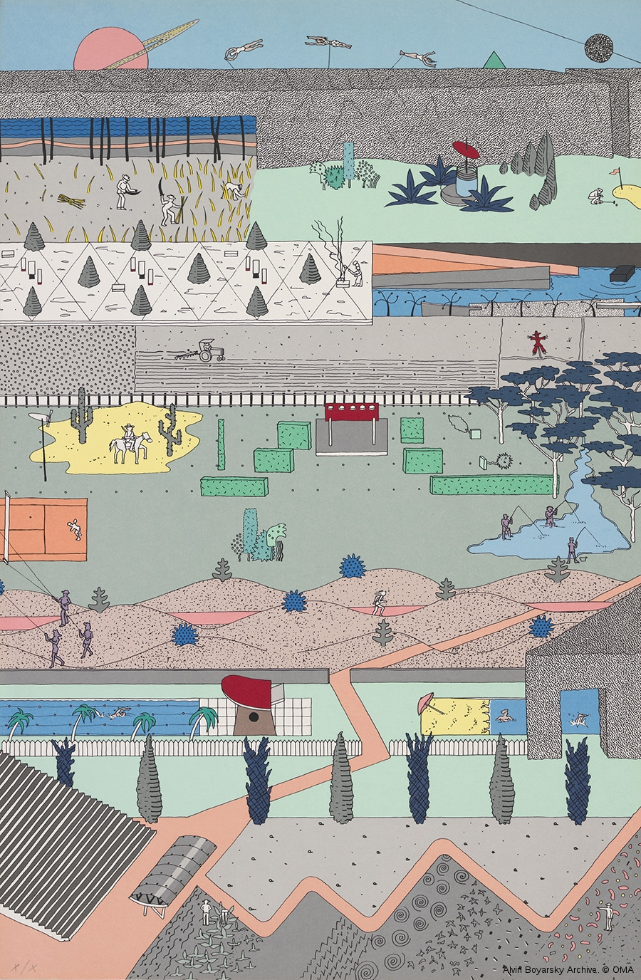
This reading reminds me of the drawing by Alex Wall from OMA office, a world-renowned architecture firm. This drawing is for the Parc de la Villette competition in Paris in 1982-83. We can see bright colors scattered in different areas of the picture, which follows rule four. Besides, most of the background uses greyish colors like grey and greyish blue to serve as a quiet background so that brighter colors indicating main design elements can pop out.