Drucker & Visualizing W.E.B. Du Bois
Drucker response Learning to read graphical displays is itself a behavioral layer requisite to our understanding of contemporary displays–whereas, as Drucker shows, some much earlier displays were also generative in their knowledge (they showed us how connections were made, not just where they existed across nodes in a network). I agree with her summary statement later on: “We need to develop a domain of expertise focused on visual epistemology, knowledge production in graphical form in fields that have rarely relied on visual communication.” Her “language of form” seems an ideal route for contemporary data visualization, as it both communicates and justifies information (“a means as well as an object of study”).
W.E.B. Du Bois’ Data Portraits & “The Georgia Negro: A Social Study” “Here, both viewers of the infographics and black study participants in the US South come into view as legitimate co-producers of sociological knowledge.”
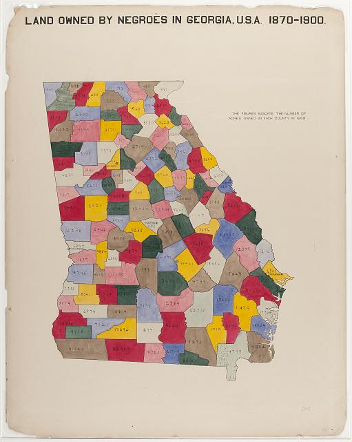
Most of Du Bois’ visualizations adhere well to Tufte’s first rule (relating to simplifying and centering the use of strong, bold colors), with the exception of his “Land owned by Negroes in Georgia, U.S.A. 1870-1900.” In this piece, a summary statement might help viewers better understand the patchwork of colors included in such close proximity to one another.
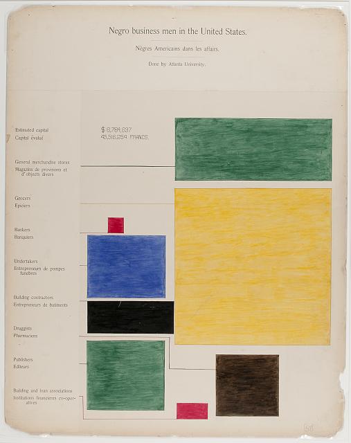
His “Negro Business Men in the United States” was particularly powerful, and subtle, in showing the distinct weighting of Black Americans’ professional roles post-enslavement. Using warm tones to draw our eyes to the largest (yellow; grocers) and smallest (red; bankers) respective roles, and splitting a second red segment at the bottom of the image to indicate the second-smallest role, also dealing with finances (employees of building and loan associations).
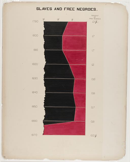
His “Slaves and Free Negroes,” like some of his other visualizations, seemed almost to be tempered such as to not arouse too much anger from what our second reading notes was a primarily white audiences at the exhibition. The visual could, for example, have shown the percentage out of 100, rather than out of 3. This also makes the image appear to communicate something that it doesn’t: for example, if you look at 1800-1810, you might even think that there were more free Black Americans than those enslaved. A further change could have been made: were the visualization stretched width-wise, rather than vertically, the difference between free and enslaved Black Americans would have appeared more clear (and stark); however, vertical stretching, and thus compression, of these differences makes them appear less stark. In any case, to me, this seems like an example of a case in which Du Bois intentionally “watered down” the visualization as to not cause a particular affective state in his audiences.
Here’s the same visualization, but out of 100% rather than 3%: