Assignment 16_Elva Si
Drucker discussed the importance of graphesis as a means and an object of study. It should not be a simple display of data and information. This article reminded me of Drucker’s other article Data as Capta where she also argued on the statistical representations of data as subjective interpretations. While it was challenging for me to accept the ambiguity of knowledge, the fundamentally interpreted condition on which data is constructed several classes ago, I become more comfortable to view graphic expressions as acts of interpretation or arguments. They can be ambiguous, inferencing, and of qualitative judgments, not just statements and presentations of facts.
W.E.B. Du Bois’s Data Portraits: Explore the plates “The Georgia Negro: A Social Study”
1.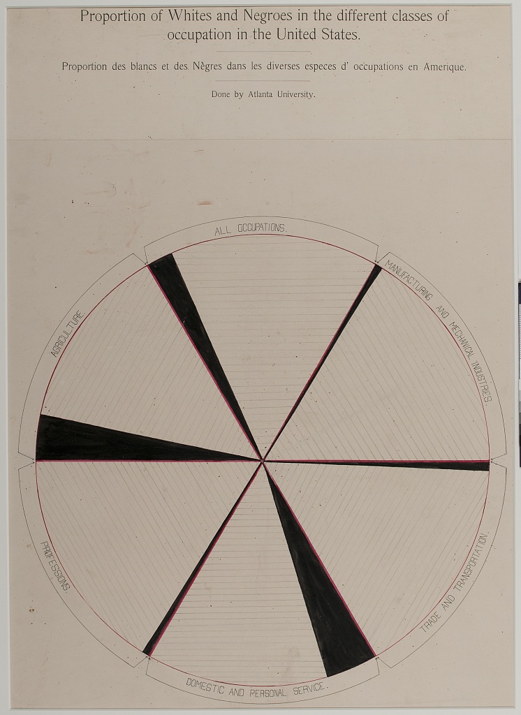 This plate is titled “Proportion of whites and Negroes in the different classes of occupation in the United States.” Bold red lines are used to separate different occupations and black areas are used to show proportions. While the Whites occupied most occupations among different sections, the Black community obtained more low-class occupations like agriculture, domestic and personal services and fewer high-class occupations like professions. I wonder what the horizontal lines within each section mean.
-
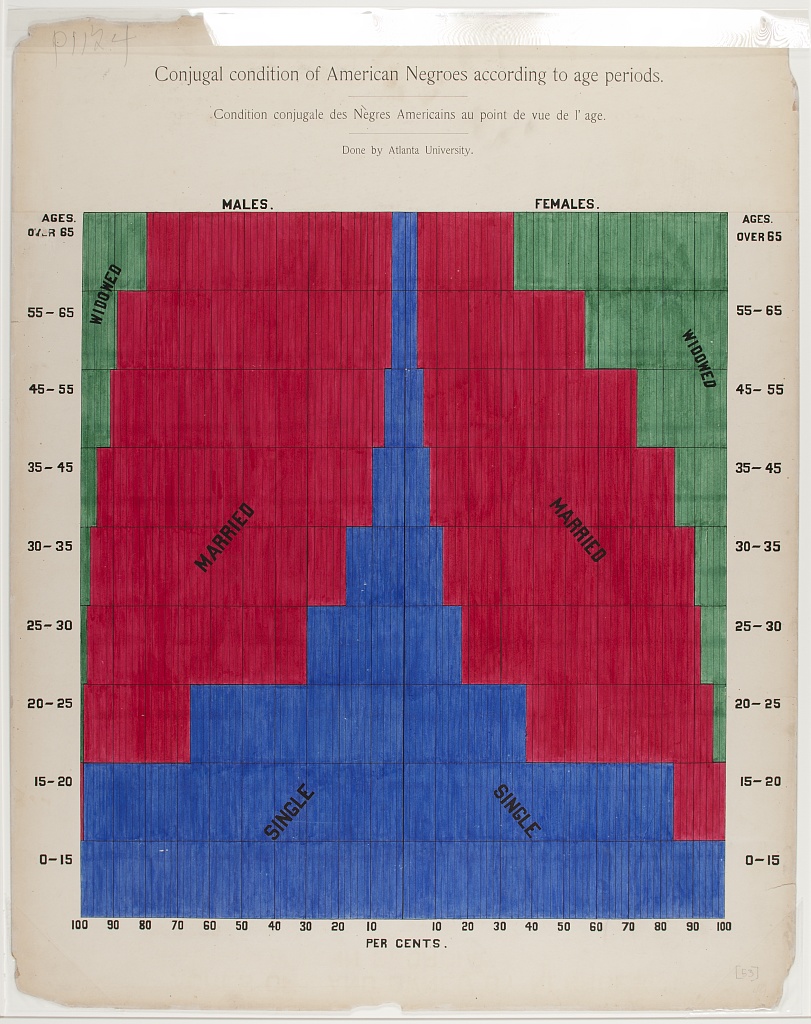 This plate is titled “Conjugal condition of American Negroes according to age periods.” It follows Tufte’s fourth rule of playing with two or more main colors in one image. Here, three strong colors (red, blue, and green) stay harmonious together. Du Bois maintained the unity by providing a desirable amount ofdisaggregation, interpretation, and reiteration within the image.The audience can easily tell single (blue), married (red), and widowed (green) within the male and female Black communities and of different age groups.
 -
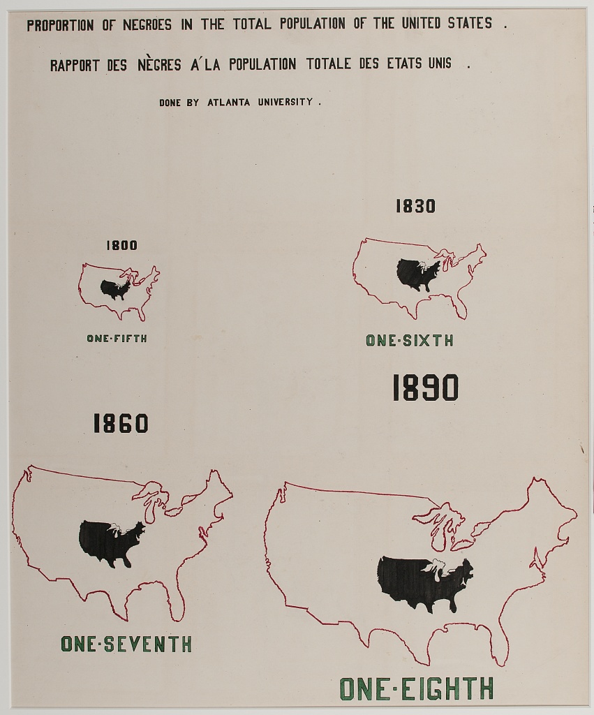 This plate is titled “Proportion of Negroes in the total population of the United States.” I like it a lot since it uses the same US map of different sizes to show how the Black population grew compared to the whole US population. With the same US map in a red line and a black area embedded, we can easily tell that the Black community became smaller and smaller comparatively. Yet, I wonder if the shape to represent the Black population has a particular meaning.