Assignment 16- plates analysis- Sally Chen
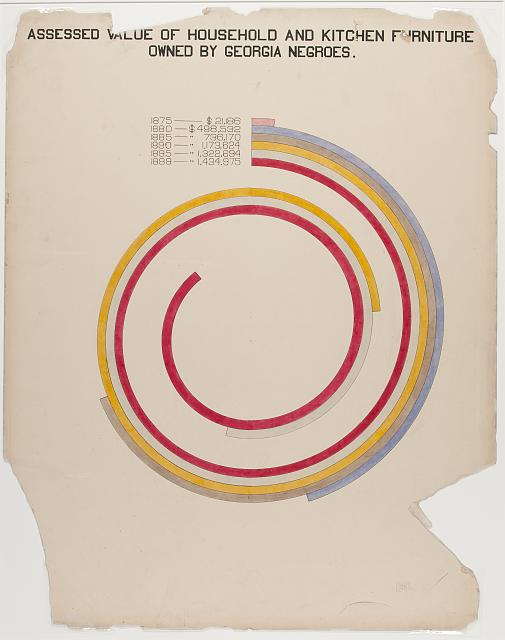
1) As the cover image, this visualization includes information about household and kitchen furniture owned by Georgia negros in a unique way. In terms of presentation, the visualization resembles a bar chart, with each column representing the data of a specific year. Compared to the vertical bar chart, this visual form can express the growth of value in a more spatially compacted way, and from my perspective, it is indicating the progress made during these years. In addition, the spiral structure provides a visual sense of an infinite loop, which conveys that the trend - the value will continue to increase.
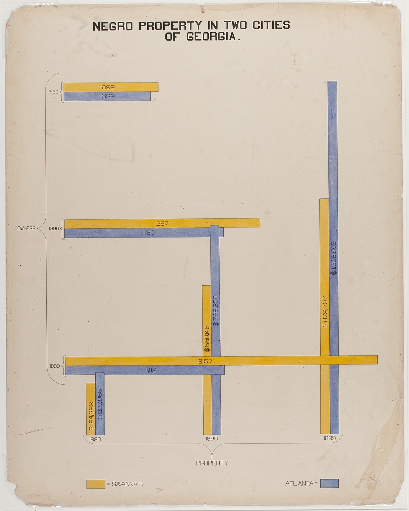
2) This visualization presents the number of negro properties in 2 cities of Georgia by interleaving two bar charts. The chart shows the change of property and owner number over time, and you can see that both owner and property have a tendency to grow over time. However, one of my questions is whether the intersection of the two bars has a specific meaning, or how to design the intersection to be informative.
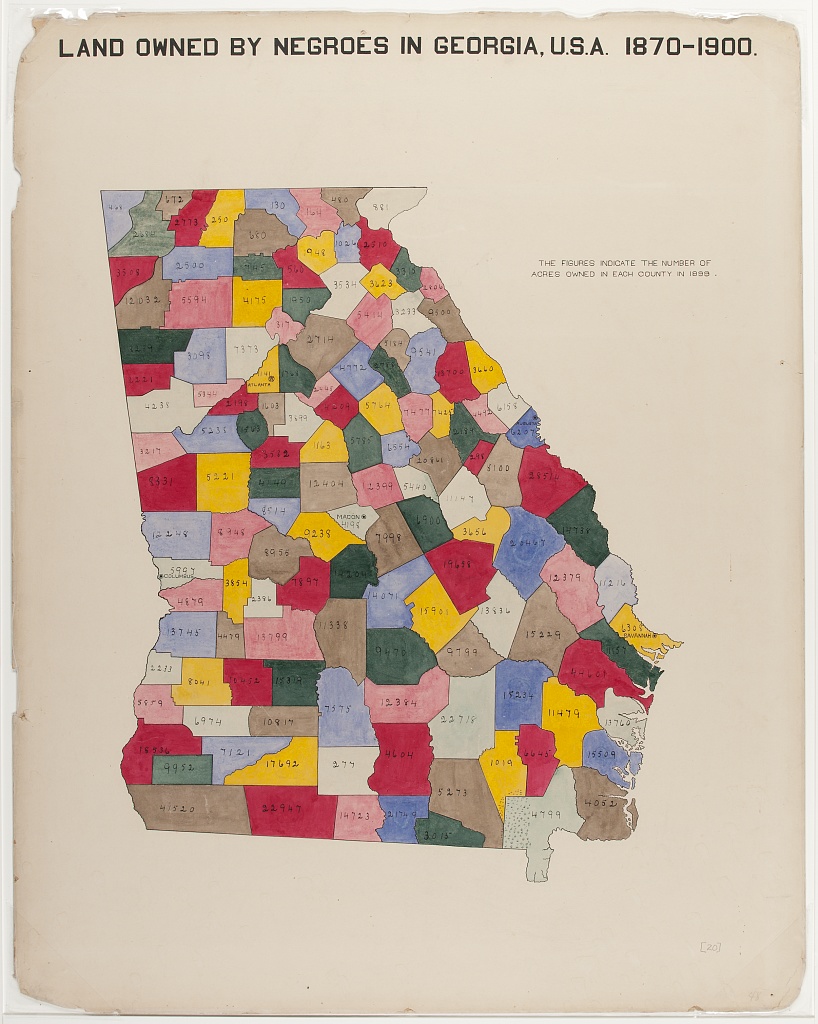
3) The map of Georgia divided by county is used to characterize land owned by negros, and I think the use of color for this visualization is interesting. By using different colors to highlight the outline of the county, instead of just using the outline alone to differentiate. One problem is that the color of the county does not correspond to the actual number, and counties having the same color does not mean that their numbers are in the same interval. This characteristic does not seem to be the same as contemporary data visualization. We prefer to think that regions of the same color have some degree of commonality or connection. At least in this chart, the designer did not label the specific meaning of the colors.