Assignment 15_Elva Si
First rule: Pure, bright or very strong colors have loud, unbearable effects when they stand unrelieved over large areas adjacent to each other, but extraordinary effects can be achieved when they are used sparingly on or between dull background tones
Third rule: Large area background or base-colors should do their work most quietly, allowing the smaller, bright areas to stand out most vividly, if the former are muted, grayish or neutral. For this very good reason, gray is regarded in painting to be one of the prettiest, most important and most versatile of colors. Strongly muted colors, mixed with gray, provide the best background for the colored theme. This philosophy applies equally to map design.
I found this chapter really interesting. Even simple colors can involve a simultaneous complexity of design issues. Sometimes, we may fail to realize the importance of coloring in the visualization yet we might find it disturbing and unpleasant when the color coherence is not achieved. The first and third rule would closely relate to our final project- the interactive map. It is essential to keep the background color quiet and muted, so that smaller, bright areas could be salient. Following this rule, we would design our map background greyish while use vivid colors to represent LGBTQ-friendly locations. Another sub-rule that I really like is to choose colors found in nature, especially those on the lighter side, such as blues, yellows to represent and illuminate information. The palette of colors should be familiar and coherent, creating a widely accepted and friendly atmosphere for our audience.
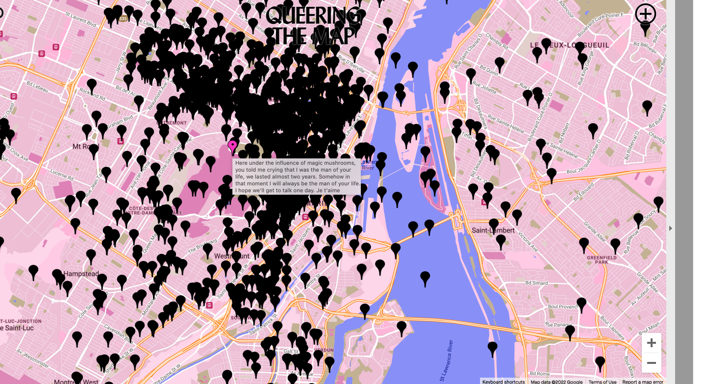
I looked back on QUEERING THE MAP, the community generated counter-mapping platform for digitally archiving LGBTQ2IA+ experience in relation to physical space. While I believe the map information could be helpful to the community, the visuals could be largely improved. Currently, the use of pure, bright, and very strong pink color as the background would significantly distract users’ attention. Meanwhile, the black pinpoints that are assembled closely to each other would be disturbing. Users may lose patience quickly when browsing the map. There are also areas of darker pink color and blue to represent higher latitudes and rivers yet all of them are not stand out enough from the strong background color.