Assignment 16 - Graphesis & Explore the Plates
Graphsis Introduction Takeaways
From Johanna Drucker’s introduction to her Graphesis, one of the main points that I took away was that there is a significant difference between what visualizations really are and what they are presented as. Visual forms of knowledge are always interpretations of the data they are representing. Data has to be interpreted in order for it to have a visual and graphical representation. The information graphics are ambiguous and hold qualitative judgement, even though this gets overshadowed by the idea that they are just a presentation of facts.
Explore the Plates
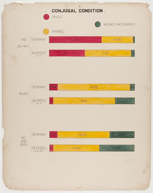
- The first plate of interest that I chose is titled “Conjugal Condition”. In the graphic, the marital status between different age groups of both german and black populations are compared. The usage of primary colors allow for maximum differentiation between the 3 different statuses of single, married, and widowed/divorced.
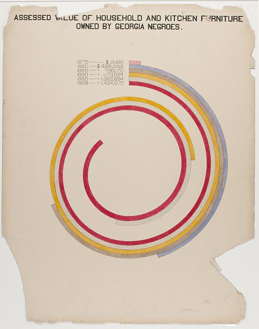
- The next plate that I chose to analayze is titled “Assessed value of household and kitchen furniture owned by Georgia Negroes.” This visual narrative very clearly shows how economic status of black populations began to advance post civil war, building a strong persuasive narrative against the idea that “the African had no history, no civilization..” and “their present existence is the same as it has always been..”
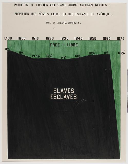
- For the last plate, I chose “Proportion of freemen and slaves among American Negroes.” Here, we can see that for some 70 years, in all of America, 86% or more of the black population were enslaved. To put narratives into scientific displays that are too striking to ignore makes for a powerful argument given that the main audience of these narratives was that of the “thinking world”.