NLP Tools & Experiments
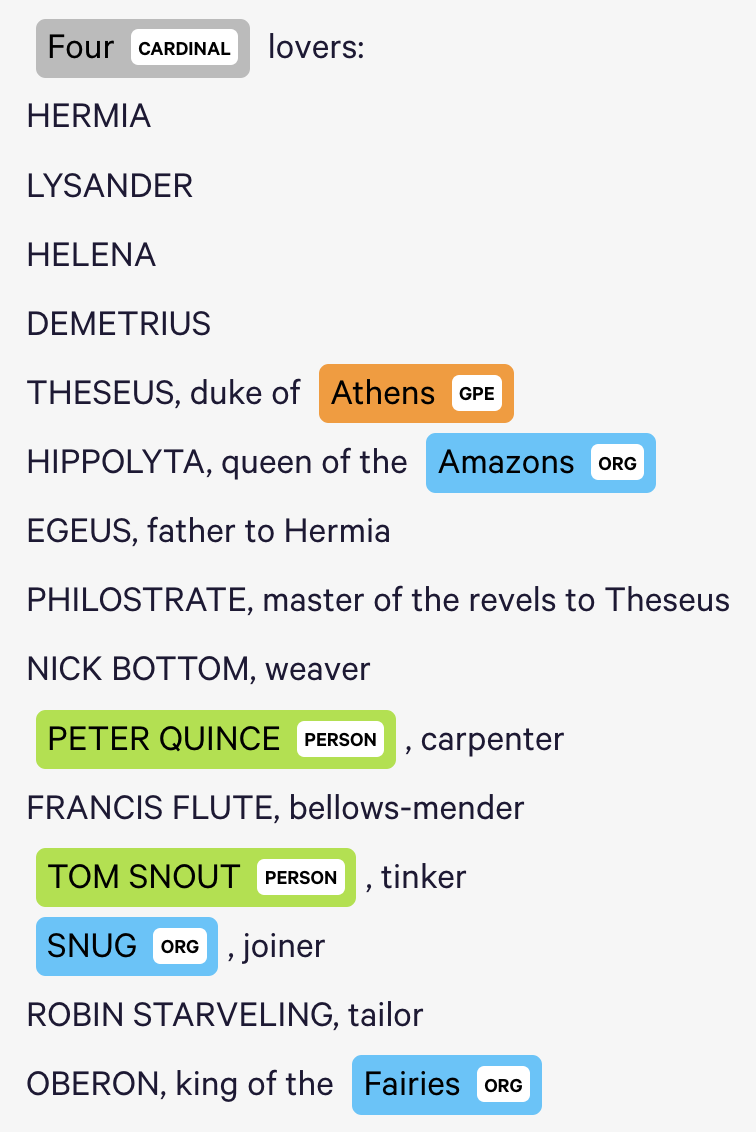
The Named Entity Visualizer provides helpful summaries of term classifications, but its classifications are often incorrect, and it does not appear that we can train its classifiers ourselves within this interface (perhaps we can do so within the larger tool). For example, it uses contemporary term associations to identify entity affilliations, and therefore believes that the textual reference to “Amazons” in this transcript of “A Midsummer Night’s Dream” refers to the organization rather than to a demographic group (see below). The tool also only allows for one entity affiliation for each word, although some words may naturally fall within multiple categories.
JSTOR Analyzer allows us to import text documents and identify topics and people based on prioritized terms whose weights we can adjust (from 1 to 5). Users can also add their own terms to identify the topics and people associated with them. In my case, I used a .txt file of A Midsummer Night’s Dream. JSTOR also provided literature (e.g., essays by Harold Bloom) related to the document I provided.
JSTOR topic graph was not available.
Voyant visualized frequent terms into a word cloud (I assume it has a list of stopwords, because words like “a” and “the” did not appear in the word cloud). Voyant provides a Reader tool that allows users to select individual terms and see the
m in a concordance (otherwise, the concordance defaults to the most significant term in the corpus). Voyant returns descriptive counts (number of documents, words, unique word forms, vocabulary density, WPS, readability index, etc.). The readability index is particularly interesting to me. The word cloud can be modified to become a terms list, and links between words can be visualized (very interesting!). The TermsBerry tool allows single words to be visualized alongside words that co-occur with them (I’m not sure that the required distance between the words is for them to be considered co-occurring). URLs can be extracted to show particular views of concordances (as well as other data). Word correlations can also be shown in a bubble line or as a correlations chart that measures the significance of the correlation. The trends tool shows relative frequencies over time. Importantly, you can select a node in the chart and the Reader tool will show you that term at that place in the transcript (so, if a term frequency is increasing, you can then look at that frequency in context). Document terms can also be visualized in list-form.
Summary All of these tools have strengths (I especially like the Voyant tool). But limitations are also present.