Project Updates
-
MiniProject: Mapping, Space, and Time
##Mini Project:
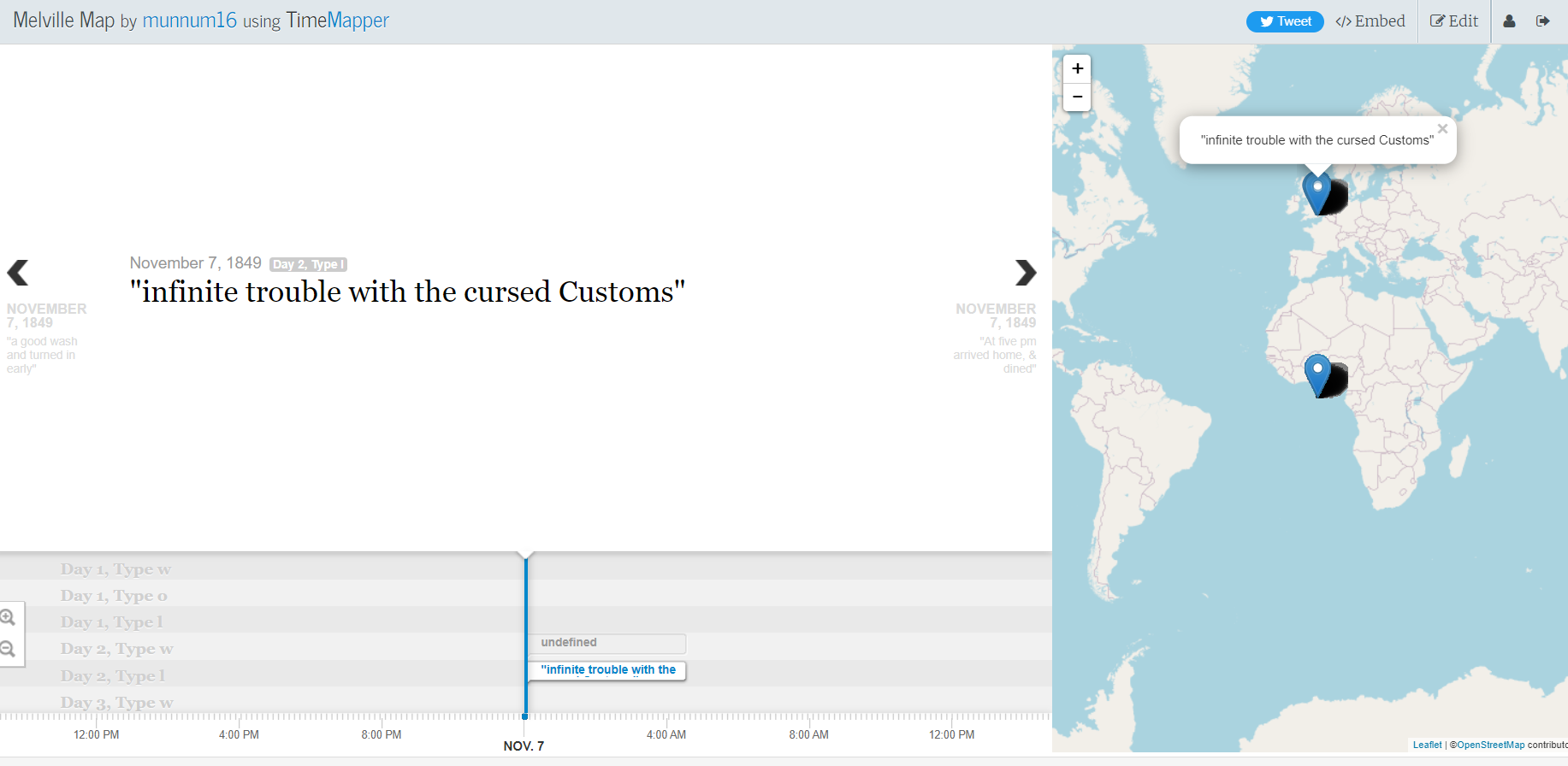
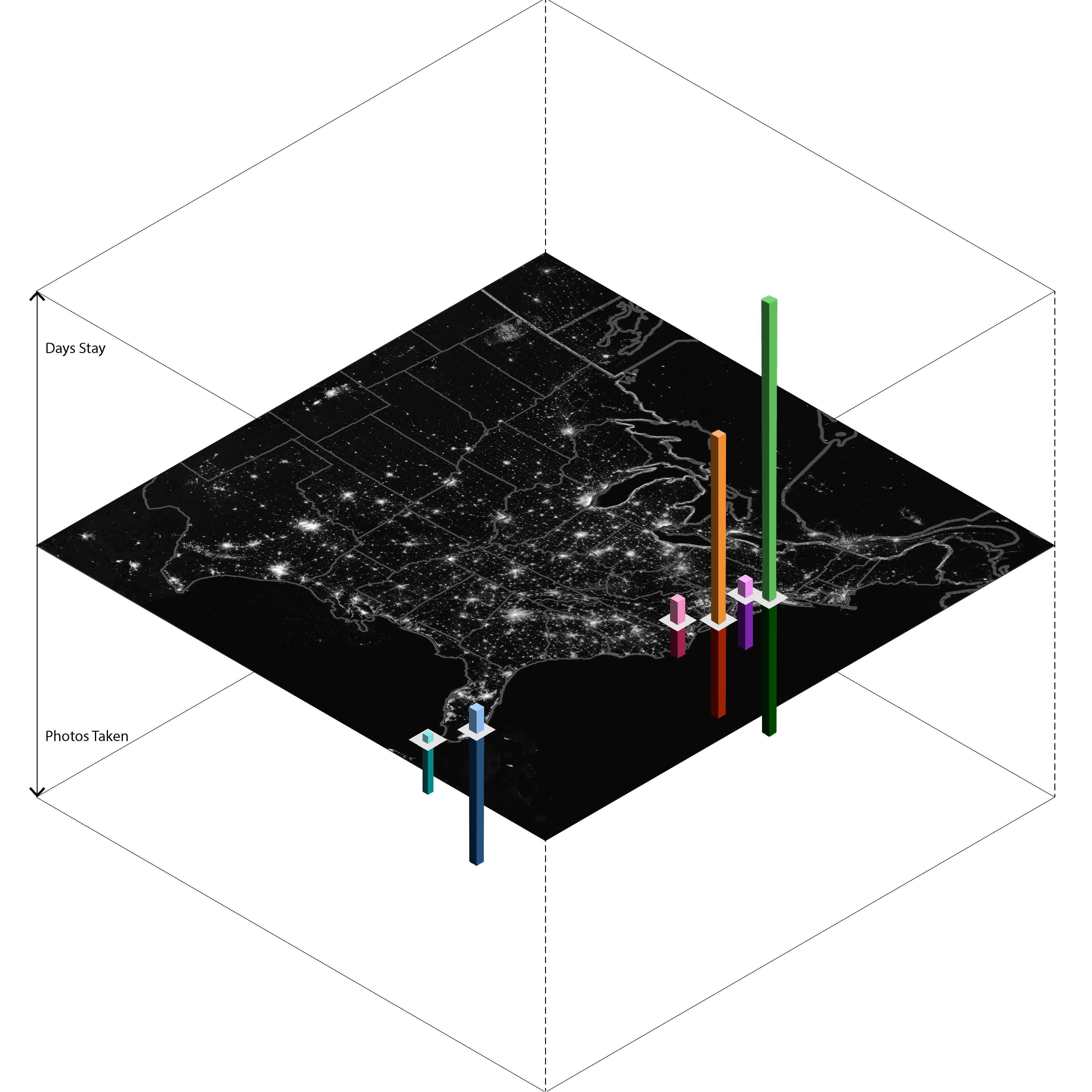
For the mini-project, I created a time map of Melville’s Journey in time mapper. The interface was surprisingly easy to use, but you needed to get the right tabs and format for the google sheet in order to have a smooth transition. I wasn’t able to add other tabs like suggested, and I needed to filter through the Melville Data in order to not have any undefined points on the map, or points that did not translate. For the data itself, there were spots that did not include any text or details about the journey, so they are characterized as undefined on the map. A sample of the project is shown below.
-
Final Project Paper_Dutch Art in the US
-
Final Design Paper
-
Final Design Paper_Up Queers in China
-
DH Final Paper: Memes of Resistance Project
-
Assignment 19
Text Analyzer: Used the Named Entity Recognizer from Stanford NLP for the Romeo and Juliet text, and saw that it recognized so many people’s names as organizations, even Romeo. It as well wasn’t able to perceive the dates as dates, granted that some of the dates were in short form (e.g. Jul 2). So the greatest downfall of this interface is that it is still unable to perceive the context of specific stories, even though it was able to correctly identify some names. It was an interesting project and I am curious as to how much they have improved since the website. I also utilized the voyager website on the Romeo and Juliet text, and it was interesting seeing the most frequent words pop up on the screen. Romeo was the most frequent word, but that might just be because he has the most lines, and the text did not filter out the names of the people speaking during a scene. It is also interesting to see that the Montogue name is not spoken as much as the Capulet name in the text.
-
Project Update
Link to Presentation: Presentation Slides
Link to Figma:Figma Link
Link to Anima: Anima Demo Link
-
Dutch Art Project Update
Link to Presentation: Presentation Slides
Link to Figma:Figma Link
Link to Anima: Anima Demo Link
-
Sophia and Luna Final Drafts
Link to paper
Link to presentation slides
Airtable link
Figma link
-
Queer map project slides and paper
Slides: https://docs.google.com/presentation/d/1Q4nsm7grjhnjIiaZmkmxa1X9whv4wX64/edit?usp=sharing&ouid=117298558950549233846&rtpof=true&sd=true
Design Paper: https://docs.google.com/document/d/1IxIDm1DB-eKgD9E1C6uJVuhgbk7vUVWTfLqYPKqyLec/edit
-
Presentation link for Memes of Resistance project
https://docs.google.com/presentation/d/17coMHcsxqx2gU_h1egcjeP-8LV073BqjHheT_3VPbSY/edit#slide=id.g17185ba50b9_0_28
-
Final paper draft: Danny, Josh, Mozi
Final paper draft: https://docs.google.com/document/d/1VxLg-lbI0KmdoYyIWQVjopzKOHTru-P5e4EudmpCaKA/edit
-
Assignment 12 mini project - Joshua Mbogo
My visualization shows how time feels distored when running. The dialation of time can be seen with how it feels to run each 0.5 mile. In reality they should be spaced out equally across the timeline but subjectively it feels like the beginning and end 0.5 miles feel shorter while the middle 0.5 mile from 2.5 mile to 3.0 mile is the longest. I attribute this to the amount of precieved stress and fatigue the body is going through at these different distances which makes it easy for the mind to focus on the pain and how it may be precieved to be happeninng longer. This effect is well documented in psychology and in the readings we have read throughout the semester so far. For the subjective observer time is not only stretches and compress in a linear sense but also can get overlayed ontop of itself if a person thinks and feels the emotions of the future or past in a present moment. https://docs.google.com/drawings/d/1vEcrNXuO4ACreSuG5EUy4grZhjll-lB9JHEnCeYk5so/edit?usp=sharing
-
Project Updates Slides- Sally, Elva, Li
https://docs.google.com/presentation/d/1Qx7SL2wi5xcUNdJTL4VEVY1M8TjPpc4dRP4hO84icvA/edit?usp=sharing
-
Project Update - Dec.5th - Qingyu & Xiaofan
Process Presentation File: https://docs.google.com/presentation/d/16HRbfjXndFEBWST6S36iihWAmVXS_q6ie-3yAM3SPqA/edit?usp=sharing
Final Prensentation Draft: https://docs.google.com/presentation/d/1QVQmO-ZozkIZKYWphkSx2X6DABg1ezqWGMwVuj_wwx4/edit?usp=sharing
Figma Link: https://www.figma.com/file/ZnZ3I5R659PDqU9IlSU2f8/Prototype?node-id=102%3A406&t=KX79w2SfIsXEnVdF-1
-
Russia-Ukraine project Figma Link
https://www.figma.com/file/Vql3iNbiJJRhIeUzcnW2ry/Russia-Ukraine-Memes-Project_DH?node-id=0%3A1&t=RkBlpImMR6poteIv-1
-
1130 Project Update
Up Queers in China: An Interactive Map for LGBTQ+ Community in China Figma: https://www.figma.com/file/F3m8swnhN0ITw6FhiYkpff/Website?t=OGUYrvCk94S9vJYS-1 Shanghai LGBTQ location & event Database: https://docs.google.com/spreadsheets/d/1IqvmAZub3uSL8DuIEeuJulhEHfc0Mpsok0aEh4lVgfU/edit?usp=sharing
-
Sophia & Luna 11/23 Update
Project Update Link
-
Project Update - Qingyu Cai & Xiaofan Ye
https://www.figma.com/file/ZnZ3I5R659PDqU9IlSU2f8/Prototype?node-id=24%3A2&t=9Im620qquvMvYjLl-1
-
Project Update (Danny's portion)
My tasks for this project have been progressing as planned this week. I have worked on literature reviews (Russian propoganda and social media; annotation schemes of Internet memes) to better understand (a) how to capture memes that reflect the views and beliefs of pro-Russia actors on Reddit; and (b) improve our coding scheme. I have been updating our codebook and will be creating a coding sheet once another member of our team completes their task for this week. I’ve also updated our dataset to capture pro-Russian memes and created a dictionary classifying extraction and other terms for further analysis. More details to be provided during our presentation and can be found in our slides for this week:https://docs.google.com/presentation/d/1t4JbvLfTVsPYCnLLnA46DNEtu402_IQB62P–47Iwdg/edit#slide=id.g18f2a88eda6_0_0
-
Luna and Sophia Project Update 11/16/22
This week, we made more of a working prototype based on our designs from last week. We still are unsure as to how to easily collect data and make the necessary connections as to have enough data points that we can include in our prototype. However, this shows the basic idea of what we would like to create.
-
Assignment 19
Experimenting with text-mining software
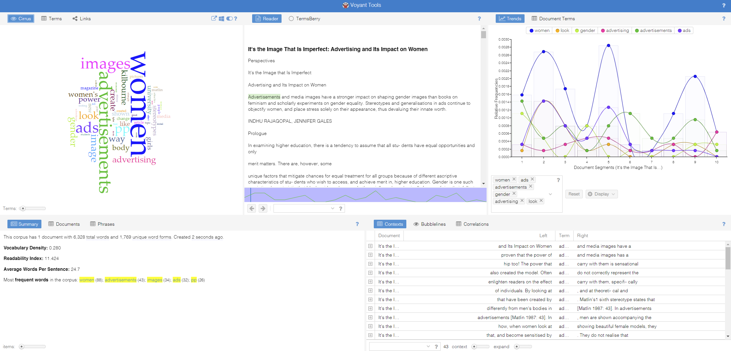
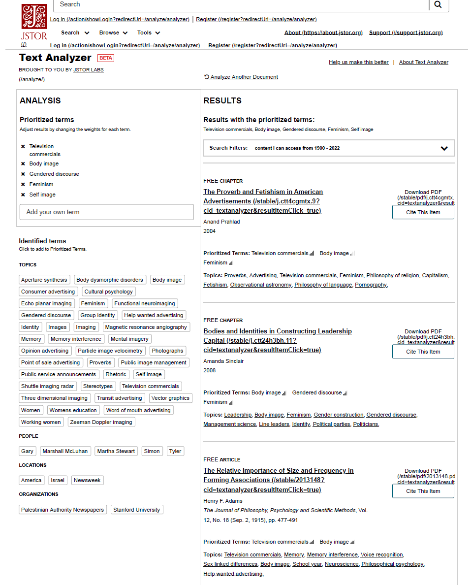
The article I am experimenting with text-mining tools is a research paper: ‘It’s the Image That Is Imperfect: Advertising and Its Impact on Women’ written by Indhu Rajagopal and Jennifer Gales in 2002.
Voyant Tools: It’s efficient in generating and visualizing the main repetitive terms of a given text, which are ‘women’ and ‘advertising.’ However, these terms are already apparent in the text’s title, which doesn’t offer the user any deeper insights into the text. Another feature of the Voyant Tools is to count the number of times certain words repeated themselves and extract the pattern into different forms of displays (area, column, line, stacked bar). This feature is helpful if the given text is an unorganized data set (such as comments by people on Twitter), and it can immediately present the hottest keywords and trends in those texts and vividly create dynamic diagrams to show the data. However, as my experimented text is a research paper, in which single-segmented keywords like ‘look’, ‘women’, ‘way’, and ‘girls’ doesn’t provide a better understanding of the text.
JStor Text Analyzer: It effectively analyzes the research paper and offers more profound insights into the research topic; it also has a recommendation feature that presents the user with related articles. The keywords it gave are ‘television commercials’ instead of ‘ads’ in the previous analyzer tool; the more detailed term lets the user know what type of ads the research paper focuses on and would narrow down the research scope. Furthermore, the key terms it generated are phrases instead of words, which is more focused and effective for researchers. Moreover, the user can adjust the search result by changing the weights of each term. Therefore, the JStor analyzer is much more productive in assisting the research process, while Voyant Tools is more powerful in organizing and visualization of random data sets.
-
Weekly Project Updates Slides_Russia-Ukraine Project
https://docs.google.com/presentation/d/1t4JbvLfTVsPYCnLLnA46DNEtu402_IQB62P–47Iwdg/edit#slide=id.g187bddb3039_0_20
-
2022-10-17-web-scraping-exercise-joshua-mbogo
##Web Scraping Exercise
It was interesting using the Octoparse webscraper for two main reasons. First because the whole concept of the application was to use it without typing any code a lot of the project felt like learning how to use Octoparse rather than the the implications and usefulness of webscrapping itself. Second thing that was interesting was the type of data that it was able to scrape from Europeana, for example headers and titles on the home page. Enter text in Markdown. Use the toolbar above, or click the ? button for formatting help.
-
Russia-Ukraine Conflict Project Slides_11-2-22
-
Personal Time Experience
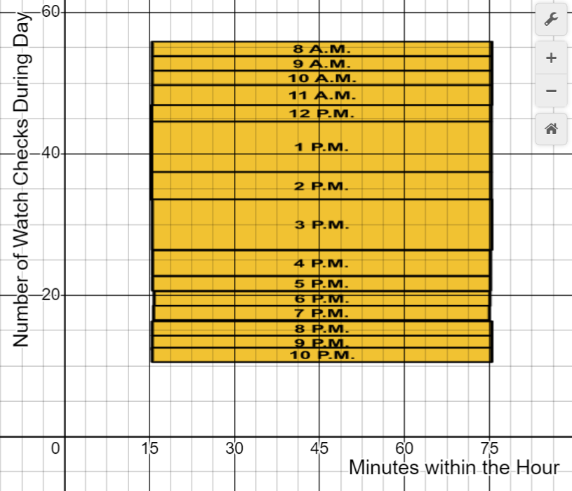
In order to illustrate the difference between my perception of time and the objective time shift, I aimed to see how many times I checked my watched during each hour of the day. The day in question was Thursday, October 27th. The more times I checked my watch during an hour, I analyzed as time seemingly slowing down since I had consciously kept track of seconds/minutes passing a specific time. Time effectively slowing downn, this represents a shift in the perception of what an hour truly represents in a day.
-
Memes of Resistance Presentation
-
timeline
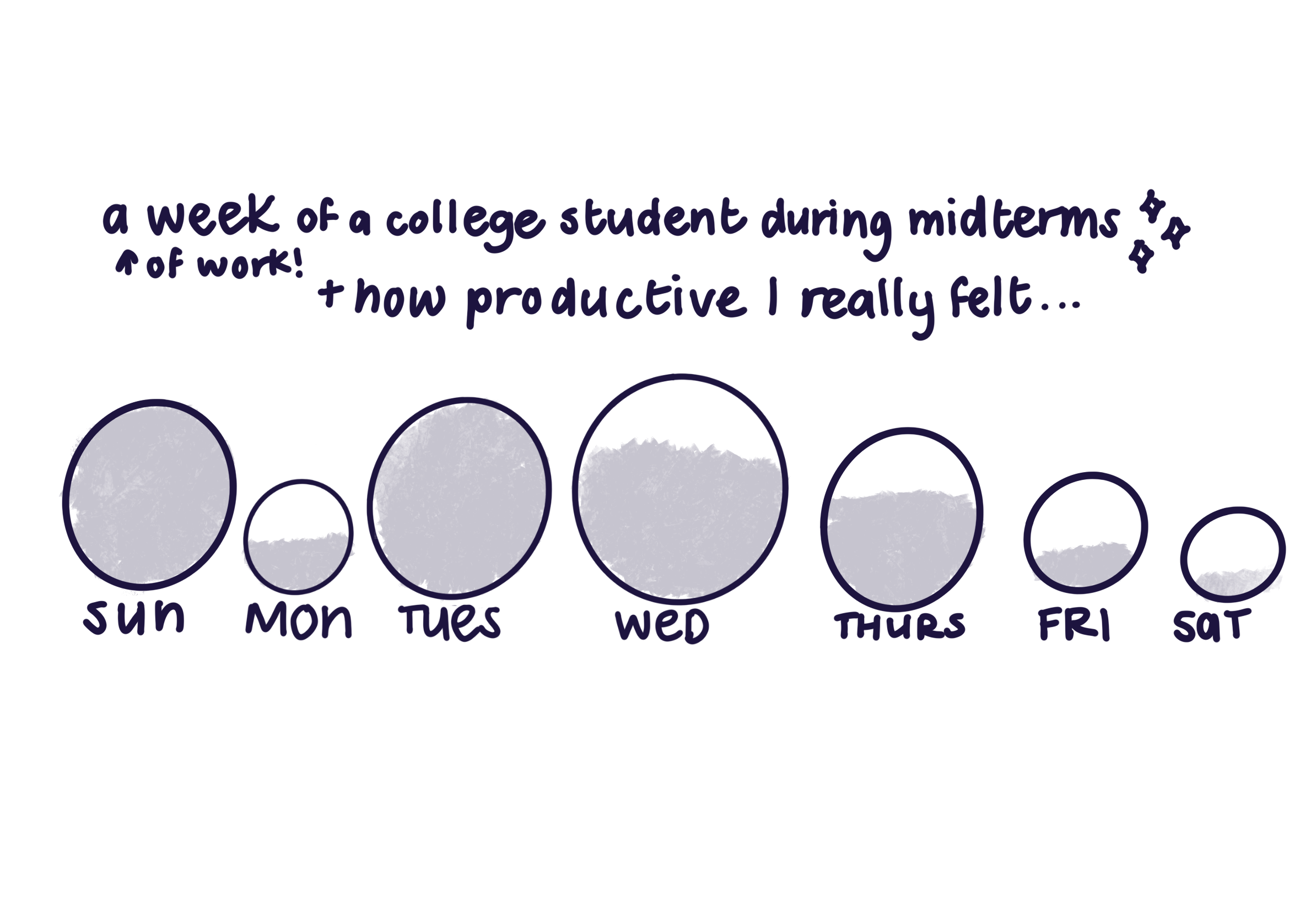
for my timeline i decided to represent how my midterms week went as represented by little bubbles. the bigger the bubble is means there was more work i planned out to do that day, and similarly if there’s a smaller bubble, it means i planned out less work in comparison to other days. i measured this relative to how productive i was feeling as a result of how much work i planned out to do, and how much work i was really able to get done. this is represented by how much i filled in the bubbles. the more filled it is means i felt really productive taht day, and any less shows that i felt like i was lacking a bit. or more than a bit. undergrad is hard as you can see :]
-
Palladio Experience
I used Palladio to analyze Melville’s travels in London. I was not able to successfully do so, however, due to my limitations of understanding how to use the software. I was able to get some points on the map visualization tool but the timeline and the facet display wasn’t really working despite my best attempts to clean up the data and make it work. This is probably user error on my end I think.
In an attempt to try and understand how Palladio works though, I decided to try out the sample data set Palladio provided.
Some observations from using Palladio:
- can visualize spatial data in the map using seperate layers, very useful for distinguishing diff data types !!
- ^^ you can also switch up the tile types. it can range in complexity, from just simple land to even laying out streets.
- the timeline feature is very neat! you can switch up what you want the timeline to graph. it has a grouping by dimension tool so you can display your data in a diff category (for example, if you choose location, it will break the dataup into a particular location.. i don’t know if i can explain that right but it’s easier to understand if you actually play around with the tool ;) )
- i like the facets feature. it basically shows a particular “facet” of the data based on what you choose, this is really helpful if you only want to see a specific subset of your data. you can also select multiple dimensions and it will take that into consideration and display it accordingly.
I checked out storymap JS, and it is really limited compared to Palladio, notreally as dimensional and complex in displaying spatial data compared to Palladio pretty straightforward (you can put in coordinates and it affixes it to a map to display).
-
My experience with Palladio and other tools
Palladio
For my time using Palladio, I imported the data set on Ibn Jubayr’s travels in the middle east. Some of the data was difficult to interpret, such as the number corresponding to each bag, so when trying to visualize the data, I was unsure how to make use of that column. Palladio was also unable to initially visualize the latitude and longitude columns, so I ued open refine to clean up this data and join the columns together into one coordinates column. Once this was fixed, Palladio was able to make nice maps of such coordinates. There were a nice range of the types of displays for each map, and one can even add in their own background for the map. This gives you the option to create a map that shows more of the meaning behind your data, since certain locations are better represented in a different way depending on ones feelings towards the location or its historical significance. However, because my dataset did not include more data whose values were specific places, I was unable to tke advantage of the point to point feature on the map, which would have allowed me to visualize which points were connected, and with the tooltip label I could have added the dates that these connections took place, allowing me to create visualizations across both time and space. With the graphs feature, given the information in the data set, I was able to create a representation across time and space. I was able to show the dates in which certain travels took place, and the places that were visited within each time frame. Because the data types were not limited to Latitude-Longitude values, it felt much easier to visualize the data I was given in the graphs tab. Other features included the table and gallery features, both of which made the data much easier to digest given it was being interpreted on a much smaller scale, but for the gallery feature specifically, I couldn’t take full advantage of it due to a lot of missing images.
I think for the specific data set I was analyzing, it would be nice to have a visualization that maps the coordinate locations of Ibn’s travles, much like Palladio did, but there could be a way to show how these points follow one another, and with the option to show the text associated with each location, to give it more cultural connotation. This could have potentially created a visualization across time, space, and text.
TimelineJS
I used the data set on Melville’s travels in London to test out the capabilities of TimelineJS. The process to import the data was very easy, but it was not too complex in its abilities to show all of the data on my spreadsheet. It kind of did what you would image, which is just make a timeline. It showed the date in which events took place, and displayed the text that corresponded with the date. It seems this tool is best for showing temporal and textual/narrative relationships.
-
Mini-project_Ibn Jubayr Travels For Archnet - Layer Cake
http://timemapper.okfnlabs.org/anon/89zm12-mini-project_ibn-jubayr-travels-for-archnet-layer-cake
-
Assignment 14_Mini Project
Our group continues to use the spatial, temporal and textual data of the erotic enjoyment history. We tried to use Palladio yet found it difficult to display data in the system, highly possible due to the mismatch of the data format.While year, month, day are usually lined up to represent time, there are so many formats to represent locations - coordinates, names, etc, and it is relatively hard to change from one form to the other. Therefore, we prefer to choose tools that can support coordinate system for visualization. Out of all the tools being provided, StoryMaps by ArcGIS suits our need the most. We have the flexible to organize events into a timeline, give narration to each event, and posit the events to different locations.
Please see below for our final project: ANALYSIS OF HUMAN EROTIC ENJOYMENT HISTORY
-
Palladio & Other Time-Space Visualizations Response
Palladio can be used to visualize events over time relating to a particular subject. For example, I used it to display pit bull attacks in the United States over the past year as well as Melville’s travels in London. I was more successful using a Palladio sample dataset showing births, deaths, and arrival points of 72 notable historical persons (e.g., artists, aristocrats). There was a lot of missing data, however, although there were fields created for these data (e.g., pictures, gender). In the other datasets I tested, longitude and latitude data were provided, but in two different cells; they had to be combined into a single cell to be read by Palladio. I had trouble using OpenRefine to correct this (some longitudes also ended with commas, while others didn’t, presenting a data cleaning challenge - since the commas were needed before cell merging; I couldn’t add commas to all cells without first removing commas from the ones that included them). Apart from data cleaning issues, Palladio was a very interesting tool that allowed for several graphical and map visualizations. Facets could also be used to visualize only particular subsets of data (e.g., only persons who were born in particular cities). I found the timeline tool particularly useful, because Palladio will read and concatenate duplicate dates within the same column, interpreting them as multiple events on the same date, and counting them as such – rather than (e.g., as Excel does) displaying them as one event occurring on the same date.
All of the other tools I used were interesting and provided unique data visualization opportunities, but with significant restrictions. For example, space in these tools can only really be viewed “from above” (perspective is fixed in space, even if the location or event isn’t). StoryMap JS has the same downsides, essentially, as the Timeline JS tool from the same creators. The ArcGIS StoryMaps tool is particularly powerful, but complex. Many different media (e.g., images, video, audio) can be associated with the provided data. All of these tools can be used to construct narrative displays. Time and space can, in all of these tools, be displayed simultaneously – but they are each designed to show these connections in very particular ways.
-
Final Project Work Update - Qingyu Cai & Xiaofan Ye
Below is the link to our presentation on Oct.24th, 2022. https://docs.google.com/presentation/d/16HRbfjXndFEBWST6S36iihWAmVXS_q6ie-3yAM3SPqA/edit?usp=sharing
-
Assignment 13- Mini-project: Timemapper
Teammate: Li Zhou, Sally Chen, Elva Si
We used Timemapper to create our timemap about human erotic enjoyment history. Here is the link: https://timemapper.okfnlabs.org/li64142885/li#0 The information we collected is made into an excel: https://docs.google.com/spreadsheets/d/17472XkUOruevNuTzSX8oKMBCGG3VOOfD/edit?usp=sharing&ouid=109079801498486152137&rtpof=true&sd=true
The difficulties we have is:
- The image is not showing. We tried attaching URL and also the image itself in the excel, but it is not working either way.
- It can’t show the events happened in B.C. It just ignored everything happened before then.
-
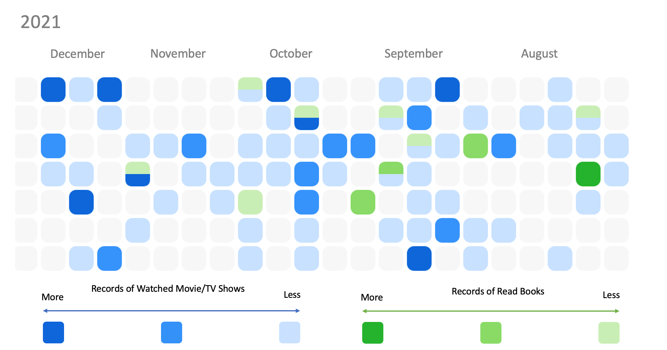
Mini-Project: Personal Time Experience_Elva Si
I tried to represent my media consumption (movies/TV shows/books) over the last two quarters of Year 2021. Each cell represents a day and if a cell is filled with a particular color, it indicates my consumption. The dark the color, the more consumption I had in one day. With this graph, I came to realize how my time is distributed through a day, a month, and a year, especially how the time interacts with my frequency and intensity of consumption. It can also tell my spare time versus busy season towards the end of a year.
-
Timeline Test
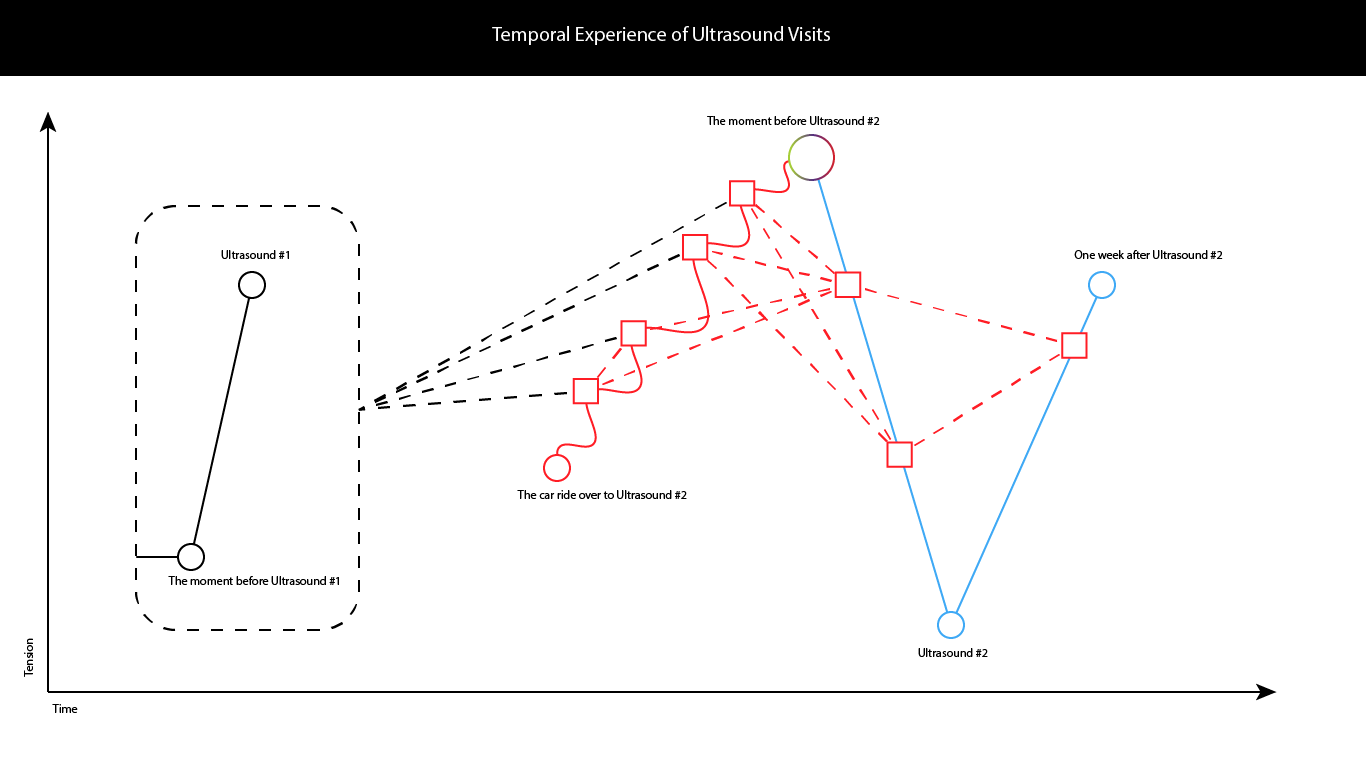
The image above illustrates my experiences of our first ultrasound, 6 months ago, when we learned that we were having a miscariage, as compared with our newest experience last week (with a different pregnancy), learning that our child was healthy. The first pregnancy was filled with stress, and our experience with the second was affected deeply by our experience with the first. During the car ride over to the second ultrasound, my wife kept squeezing my hand, and each time I would start thinking about our experience with the first ultrasound. Once we learned that our baby was healthy, in Ultrasound 2, I was filled with a myriad of emotions. Tension reduced, but then increased once we both realized how much work there was to do. The recent experiences “out of time” informed the subsequent experiences “out of time” in reference to the first ultrasound.
-
Project Presentation Slides
Slides for Luna and Sophia’s Accessorbility Project
https://docs.google.com/presentation/d/1-MvYAAQAMlU8WXOnyByIepBsx-h-ANiVgWf3vKGK_xM/edit?usp=sharing
-
Presentation 1- Q-index map
Q-index map: visualization of LGBTQ+ friendly index and related locations and events in mainland China
https://docs.google.com/presentation/d/16S8a5wtbheHL29i7X5TOo-4JMEdYpm2D88hmcSYr6uA/edit?usp=sharing
-
Mini Project: Personal Time Experience
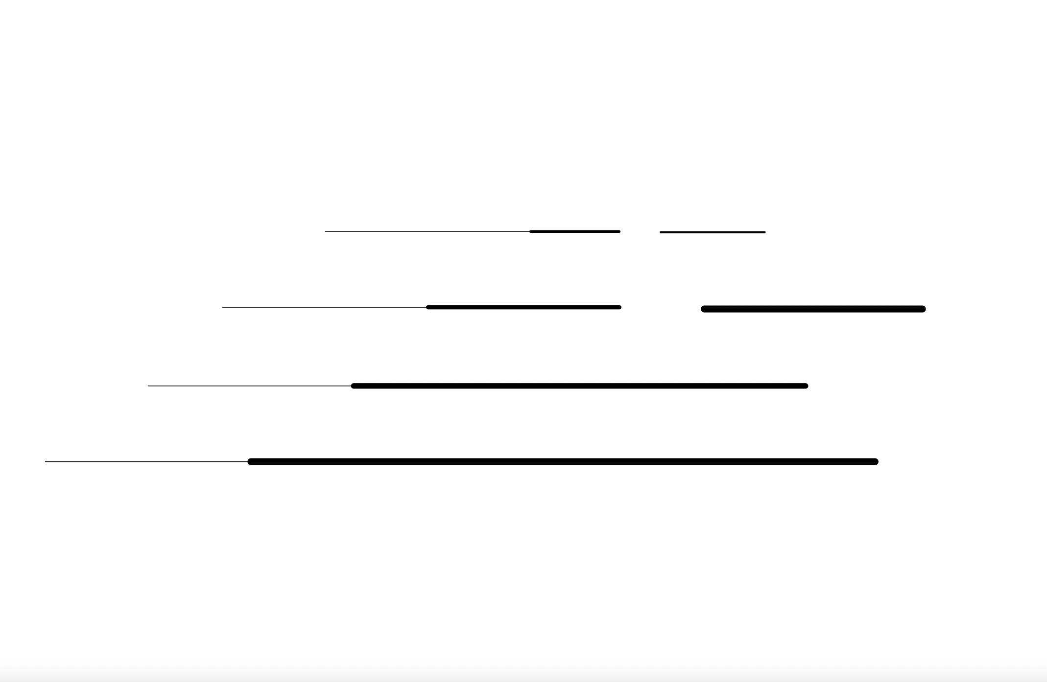
For my time/space representation I was inspired by my experience at the Head of the Charles Regatta. Although a certain number of boats may be racing against each other at the same time, they do not all start together. It may look like one boat is far ahead of another when actually it just started ealier, making it look like its ahead of time. Additionally, not all boats are going to move at the same speed. The thicker lines represent a faster speed, making a faster time. When this happens, boats may eventually become staggered during the race, which becomes a concern as there are too many boats in too small of an area. To prevent any crashes, some boats may have to yield, stopping their time and putting it in irregular, inconsistent intervals.
-
Mini-Project: Personal Time Experience - Qingyu Cai
-
David Bodenhamer’s “The Potential of Spatial Humanities”
David Bodenhamer’s “The Potential of Spatial Humanities”
Take-away advantages and disadvantages of GIS:
- We no longer see space as limitless, the world as filled with available “wild” spaces for us to tame and make ours. The development of GIS allows us to observe and reflect on the relationships between different kinds of spaces, however, in new ways.
- GIS allows us to see the world in a layered fashion – we can view just the borders between nations, just the cities, just the roads, just the forests, just the oceans, or we can see all of it simultaneously or as unique combinations of layers to examine particular interactions in space and over particular timescales.
- One of John Pickles’ arguments against GIS was that GIS isn’t capable of understanding societal complexity. But it’s not the tool itself that is problematic, but the people who use it, and who don’t consider cultural dimensions, or those that can’t be seen using the tool. Like with other visualizations of data discussed in prior readings, we see, here, a push-back against technologies that visualize the world in quantitative ways that might be considered, by some, to be objective measures of reality. But I don’t see it as problematic that some features of our worlds are, in fact, objective: “there is a river there; it goes for 12 miles before a steep basin; after the basin there is a small town where the people specialize in crafting wagons.” If it’s a tool that allows us to see the world in new ways, I don’t believe it introduces any true risk into the world that was not there before. Like any tool, it can be used for good and it can be used for evil. But I don’t believe its caustic uses outweigh its beneficial ones.
- In the humanities, spaces can also be imagined, metaphorical, or transient. They can exist for just one person at just one time, or for many people at many times but within the same geographic space. The concept of space, in the humanities, is in part challenged by the existence of GIS technologies that may “claim” objectivity. I see this as a shortcoming of GIS, but only insofar as GIS was not designed to observe or represent non-literal or non-physical spaces.
- GIS technologies provide particular benefits for archaeologists, for whom the objectivity of GPS was particularly important to their examination of human histories and experiences. The same was true for historians. Perhaps it was those humanists who were most concerned with imagined spaces, imagined events, or individualized perceptions of space and time, took the greatest issue with GIS. But even if these scholars did want to use GIS, they might be prevented by doing so simply because of the costs of these tools.
- The use of Deep Maps seems particularly interesting and useful, and as a complex compromise and improvement, since they are “structurally open” and “genuinely multimedia and multilayered,” such that they are non-authoritative and integrative of multiple viewpoints and perspectives–which seems to me to be the primary theoretical issue with the use of GIS in the humanities.
- I am a fan of the central thesis of this piece, as I see it, which also embodies the key benefits of these technologies: that “a humanities GIS-facilitated understanding of society and culture may ultimately make its contribution in this way, by embracing a new, reflexive epistemology that integrates the multiple voices, views, and memories of our past, allowing them to be seen and examined at various scales; by creating the simultaneous context that we accept as real but unobtainable by words alone; by reducing the distance between the observer and the observed; by permitting the past to be as dynamic and contingent as the present.”
-
assignment 12_timeline
-
Assignment 12- timeline- Sally Chen
I wanted to represent the work I have done in the past two years related to the graduate application - it turned out to be almost everything that has been done. In general, I have listed some factors that affect the outcome of the application, and in each row, I have short word “labels” to indicate what I did during certain periods. The color of each block represents my perceived workload (red- high, yellow- moderate, blue- low, gray- nearly none). I adjusted the width of each column (time) to correspond to the workload size - representing my perceived length of time. If I wanted to make it more detailed, I would improve the visualization of the workload. For example, use a baseline width to represent the total workload I can generally afford, and use different colors and widths for tasks. When the total workload exceeds the baseline at a certain time, the visualization can show that I am already overloaded.

-
Assignment 12- timeline
This timeline describes my experience at a symphony performance. At the beginning, I was super focused and attracted to the music then I get tired, time seemed “normal” for me. Then I got distracted, losing focus due to some reasons, then time felt quite short. Suddenly, some high notes of the music attracted me agian and agai. Later I felt boring, thinking else where again, and time felt passing fast. When it came to an end, I focused back to the piece and the ending section of the music.
-
Webscraping with Octoparse
Webscraping Activity
For this activity, I used Octoparse to srape data off of of the MIT Museum’s website. One helpful feature was that Octoparse will auto-detect the webpage’s data for you and then create a workflow to extract more data based on this. However, I found it difficult to extract more specific data because when I would click on a piece in a collection, I continued to get the error “Application error: a client-side exception has occurred”, which I was not sure about. One other difficulty I had with Octoparse was that I could not find a back button when I was in browse mode, meaning I had to redo my set of tasks or restart again whenever I got an error message. Although Octoparse and similar services seems very helpful in webscraping, collecting such metadata seems like a very difficult process.
-
Web Scraping Activity_Elva Si
I used Octoparse to scrap data from Harvard Art Museum Chinese collection (https://harvardartmuseums.org/collections?culture%5B%5D=Chinese). It was pretty cool to see the software scrapping artworks’ titles, URLs, images, date, and classification in seconds. However, Octoparse seemed to stop extracting data when people need to click the “load more” button to reveal more collections. Therefore, I only got 48 sets of data scrapped while there should be 5,663 works available in the museum collection. While the museum website could not show all results on one page, I wonder if I could tell the software to scrap all data with automatic scrolling.
Of the 48 sets of data being scrapped, the exported data was already pretty clean on the Octoparse end. I could use Open Refine to further clean up the data with text facet, knowing how many items of a particular classification (calligraphy, drawing, ritual implements, sculpture, textile arts, vessels, etc.) are available in the museum collection.
-
Octoparse data scraping
Octoparse data scraping
I used the Octoparse software to derive data about Dutch Art from the Harvard Art Museum Collection website. It’s efficient to sort out art collections with detailed information related to each item’s title, image URL, artwork, and author (https://harvardartmuseums.org/collections?q=dutch+art). The data could also be downloaded in various formats: EXCL, CSV, and JSON. However, it only filters limited data that appeared on the page, which is restricted to 48 items per page. As the user needs to click on ‘load more to see more collections related to the search, the Octoparse software doesn’t have the function to allow users to click while scraping the data. Furthermore, there’s also limited input for each URL per line.
-
Assignment 10- web scraping- Sally Chen
I use parsehub for web scraping and from my experience, it is a very easy-to-use and effective tool. The first-time tutorials provide detailed steps so that beginners can follow the process. I chose the Institute of Contemporary Art Boston collection(https://www.icaboston.org/collection) to work with. On the browse page, each work displays basic data including image, name, and artist name. When clicked, detailed information about the work shows up, including the year, work type, and size. I followed the tutorial to try to get as much data as possible, and the results seemed to be satisfactory. Since the structure of the web page is relatively simple and the relative positions of the various types of metadata are almost fixed, further processing of the data will be easier. One of the advantages of web scraping is that it can quickly retrieve the information contained in the web pages and assemble them into an excel archive, which is very helpful for some preliminary and basic analysis. The collection of social media information through web scraping is a good example. However, a major limitation is that this method can only extract information on the surface of the web, mainly in the form of text and images. Therefore, if more metadata or information about the web page itself is wanted, web scraping is of limited help.
-
Web Scraping Exercise
##Web Scraping Exercise
The web scraping process is particularly interesting as a tool of data acquisition, but it carries unique limitations, like the API, and particularly for those without a strong background in programming (like myself). I used Parsehub, whose interface is fairly straight-forward, and where it was simple to actually extract visible information from a collections page. However, the data you can access must be data that the provider has made available, and seemingly visible, on their website (if I am understanding correctly). At least for me, metadata is incredibly hard to extract.
-
Web Scraping Activity - Qingyu Cai
I downloaded the Octoparse for web scraping the website of THE RIJKSMUSEUM’s painting collections about the landscape. At first, I failed to export all the image data from the website. After searching for tutorials on the website, I found some solutions in terms of general settings before exporting the data, for instance, increasing the time out to ensure enough time to go to the webpage. Besides, if the target website won’t load data other than those you see before you scroll, it has opted for a lazy loading strategy. We need to tell Octoparse to scroll down the page after loading it. These are some solutions I have tried to export the data. However, I still found that there were still six images missing on this webpage. The exported CSV files are pretty clean and seldom need to be cleaned up. And I am not sure if it is one of the advantages of Octoparse. Besides, Octoparse allows users to clean up and organize the data directly on its application even before exporting.
-
Working with API_Elva Si
I used Harvard Art Museum API documentation to extract the color API [Color API]. (https://api.harvardartmuseums.org/color?apikey=69dff82d-b6eb-4a76-a9c0-1f54e877b0b9&size=60) When I visited Harvard Art Museum earlier, I observed the researchers’ dedication in studying ancient pigments and modern substitutions. Therefore, I am interested in how Harvard Art Museum documents its color collection.
Via the API data extraction, I can see 147 color records. Each color is documented by color id, name, and hex (e.g. 8a2be2). However, I failed to find out how these colors are represented through the museum collection and when the colors were created. I believe it would be interesting to identify if certain colors were frequently used in artwork of a particular time period or art genre.
-
Assignment 9 Observations
Working with Harvard Art Museum’s API
I have never extracted data via an API before, or worked with an API, so the whole process was a little challenging for me. I tried looking through the code of the common cultures and viewing it as an array, but was unsure as to how to create the histogram. The other project with the timeline of bronze pieces was easier to work with. The timeline could be modified by making the years that had multiple bronze pieces larger/longer in order to represent this. Right now, a year that only has one piece is given the same weight as a year with more.
-
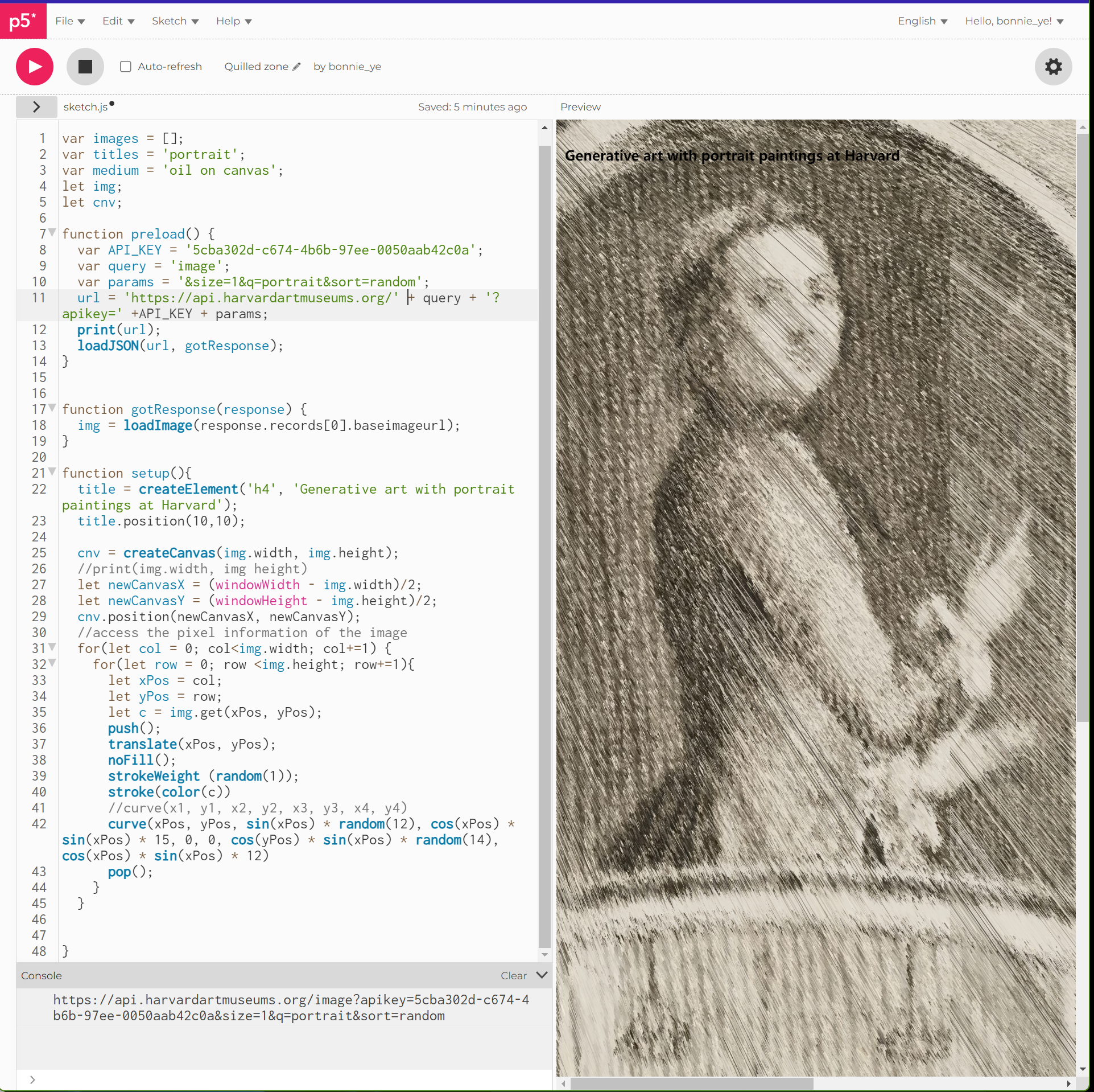
Assignment 9 _API data visualization
Creating generative art using randomized portrait paintings at Harvard
The exercise aims to create generative art piece with random paintings from the Harvard Art Museum website. https://editor.p5js.org/bonnie_ye/full/eSEIz5tgp
-
Self-study_ Working With Data - Qingyu Cai
It is my first time using API and P5 to extract and visualize data, so it is somewhat challenging but full of fun. I successfully tried to extract the data of the ten oldest Dutch works at the Harvard Art Museum. Still, I failed in visualizing the data due to the coding mistake of undefined length for Dutch records, which I had no idea about what went wrong. This process of extracting and trying to visualize the data set reminds me of the article called data as capta. First, the question lies in how to change the data into capta, which means how to find the ambiguity in this data set. Then, how to visualize the capta by using tools such as P5 is another question. Can computers help to visualize the data in a human way? Or do we have to give the diagrams traits of humanities manually? And how should we decide the standard of making changes since this process is totally based on our decision? Based on those questions, I think it’s essential to display the data and capta simultaneously, and point out the aim of capta visualization. Any humanity input should be based on this aim, and the explanation can help the audience capture the meaning while deciding whether such ambiguity makes sense. Besides, the audience can also develop innovative ideas in translating and visualization.
Data of the ten oldest Dutch works at the Harvard Art Museum: https://api.harvardartmuseums.org/Object?apikey=4c685e81-5d9a-40fe-9086-89107471f3d4&size=10&culture=Dutch&sort=datebegin&sortorder=asc
-
Assignment 9-Sally Chen
I have made some small changes to the instruction sample for the visualization of the collection of silk products in the Harvard Art Museum. The use of silk in the fabric can reflect the development of the textile industry in various regions. Moreover, the importation/exportation of silk products implies communication between civilizations. In addition, the styles and colors of the decorative patterns on the fabric can be deeply linked to the local textile industry and culture. Therefore, it is of remarkable significance to study the collection of silk products. In visualization, I adapted the timeline to characterize all the collections, and it can be observed from the list of the oldest ten collections that the museum has relatively few collections between 100BCE and 1000CE, and most of the collections are from the European region after 1200CE. If data visualization is to be complicated, a map corresponding to the collected regions can be considered for representation.
Visualization: https://editor.p5js.org/ssssschenn/full/mI7i5ZOZD
-
Memes of Resistance (project summary)
Memes of Resistance
- Problem: Memes are increasingly becoming recognized as tools for social and political resistance, and increasing evidence suggests their efficacy as methods of protest. However, little is known about the potentially unique narrative constructions of these memes (e.g., the stories and experiences they communicate). Furthermore, available studies are severely limited in that they often utilize only image memes, ignoring other short-form video communications (also memes) whose narratives may be more comprehensive. Little is also known about the relationship between the original meme creators and the meme distributors of these memes.
- Research Questions: Through data analysis, we may identify how the stories told in these memes differ in their content, themes, affective and linguistic approaches, and views of the “other”. What are the most effective methods of communication employed by these memes? What is the relationship between meme creators and distributors? How does the original distributor impact the chain of distribution (e.g., does someone with a greater follower count lead to more sharing)?
- Data Sources: Data will be extracted from Reddit using an AWS API. These data will include: (1) meme images, videos, and associated text (including emoji and hashtags); (2) post titles and text; (2) associated metadata (depending on the platform, these will include any combination of access link, community name, likes, upvotes/downvotes, viewer count, etc.); and comments and their associated metadata. Memes will also be transcribed such that their written content (e.g., image text and video subtitles) is available for computational analysis. Annotation: Qualitative coding will be conducted on these memes to extract qualitative themes, while computational analysis may be used to extract additional textual themes at-scale. Automated annotation may be performed using LIWC, empath, or similar tools.
- Audience: Our audience includes social scientists, politicians, and political activists.
- Inspirations: Numerous recent studies evaluate the concept of resistance memes, but none appear to evaluate the narrative construction of these forms of discourse (Pavlović, 2016; Silvestri, 2018; Klein, 2020; Soh, 2020).
- Skills needed: Web programming and website design; NLP; data visualization.
-
Final Project: Retelling History through archival documents
Retelling the History of the German Occupation in Prague during WWII
Problem Statement/Research Question: How can Digital Humanities methods offer previously unknown insights into the history of the German occupation in Prague during World War II (1941-1945), especially through the use of hardly consulted administrative docments?
Data Sources: Thousands of digitized documents containing more than 4000 cases of offences against the war economy. Data from many of the documents has already been extracted and added to a searchable database. Challenge: data in two languages: Czech and German. Additional related law documents have been digitized.
Audience: Historians, history students.
Inspirations: One possible example: the US-Iran Relations Project (https://us-iran.mit.edu)
Skills needed: Database, UI/UX design, metadata, NLP (NER, topic modelling, etc.)
Note: This project is part of a newly funded collaboration with the Czech Academy of Science.
-
Final Project: Dutch Art Across the US
Representing Dutch Art collections across the US
Problem Statement/Research Question: Dutch Art collections exist at many museums, large and small, in private collections and at other sites in the US. However, it is currently impossible to obtain a comprehensive overview of, let alone digital access to all holdings of Dutch art in the US. How can we create an innovative online collection of Dutch art in the US?
Data Sources: There are a number of online collections but they all provide different structures of metadata, image versions of the art work, and access policies. Some information only exists on comouters at Museums and collections and is not yet accessible on the Internet. Here’s a list of some collections:
RID – National Institute for Art History in The Hague, Netherlands. As an example. https://rkd.nl/nl/explore/images This began as photo documentation.
MFA https://collections.mfa.org/collections
National Gallery https://www.nga.gov/collection.html
Met https://www.metmuseum.org/art/the-collection
Philadelphia https://philamuseum.org/collection
Harvard Art Museums https://harvardartmuseums.org/collections
Detroit https://dia.org/collection
Getty https://www.getty.edu/art/
Cleveland https://www.clevelandart.org/art/collection/search
Worcester https://worcester.emuseum.com/collections
LACMA https://collections.lacma.org/
**Audience: ** Art historians, scholars of dutch art, art students, museum curators, donors, interested general audience
Inspirations: THE RIJKSMUSEUM in Amsterdam, arguably one of the best art museum websites: https://www.rijksmuseum.nl/en
Skills needed: Compuational skills: Web scraping, API access, database, JavaScript, CSS, etc. Design Skills: innovative UI/UX, data representation, visialization, focus on user interaction Data Skills: research, metadata & cleanup
Note: This project is part of a collaboration with the Museum of Fine Arts, Boston.
-
Research Idea- Amanda Webb
A.) How do the social media networks created by influencers interact with those same influencers, and how does the information being presented by both parties influence the other?
B.) Most of the data here can be pulled from twitter, which I think sources more than enough examples of the influencer-to-community interactions that are necessary to study this question. Individual privacy is a concern here, but if the research sticks to strictly public interactions and trending keywords, the anonymity of all subjects, sans the influencers themselves, can be maintained.
C.) I believe that there is a wide spectrum of audiences that could benefit from a visual representation of these networks. Not only could it help influential community members to visualize their outreach, but it could possibly lend itself to allowing members of communities with misinformation problems to self-reflect on the implicit biases within their echo chambers. Aside from that, this could be useful information for academics in the media studies field.
D.) The MIT Election Lab, where I spent the summer as a research assistant, has done a study on twitter responses to republican figureheads. They looked at how the engagement levels varied between personnel, and how current events, trending conversations, and general publicity impacted the negativity seen by these politicians. I think there is a lot of good practices to look at here involving the collecting and use of twitter data, and how it applies to active engagement with political actors.
E.) I think I possess most of the data collection skills needed to complete this, but the biggest challenge here would be learning how to create a map of the networks. I have some experience in basic graphical data representation, but still need to gain some skills in the design and execution of creating this hypothetical map.
-
Project Ideas
Project Idea: Global Map of Connections at MIT Problem Statement/Research Question: What problem or research question is your project trying to address? How connected as a populous is the MIT campus? Does social media really portray an accurate representation of connections in real time? Data Sources: What is the data that you will be using for your project and how will it be obtained?. Any challenges with your data that you are aware of? Going through Instagram/Facebook/Linkedin followers of people who sign up for the survey. It is not going to be a complete map of the MIT population, there are possibly going to be gaps within the representation. Audience:Who is the intended audience for your project? General public, scholars, students (field/level), etc. Students who are curious about how connected the campus is. Inspirations: What are similar projects that could be used as an inspiration. The paper Six Provocations for Data questioned what comprised a social network. SocNetV - Social Network Analysis and Visualization Software. Skills needed: What are the skill sets needed to develop a digital prototype for your project? Programming, design, research, etc. mySQL coding experience, HTML Design experience
Project Idea: Metamorphosis of Job Market after Digitalization Problem Statement/Research Question: What problem or research question is your project trying to address? How has the job landscape changed within the last 20 years due to social media? Data Sources: What is the data that you will be using for your project and how will it be obtained?. Any challenges with your data that you are aware of? Going through census bureaus and various other websites that highlight the job landscape, and aggregating the data to create an accurate representation of the change. Audience:Who is the intended audience for your project? General public, scholars, students (field/level), etc. People interested in the trajectory of the job market and how it closely follows the digital landscape. Inspirations: What are similar projects that could be used as an inspiration. Do not currently have inspirations in mind. Skills needed: What are the skill sets needed to develop a digital prototype for your project? Programming, design, research, etc. mySQL coding experience, HTML Design experience
-
Pitch_Xiaofan
Idea 1. Workforce Gender inequality
a. Problem Statement/Research Question The research aims to address the gender inequality women faced in the workforce across different industries and countries during the past 20 years. Through data visualization, it will be an interactive Html and iPhone application to present gender unfairness, raise awareness and encourage more female participation in the workforce. (For this course, the study will focus on datasets in the united states/China.)
Potential research questions: Which industry has the most significant gender gap Which country/region has the worst situation Which ethnicity and age group is facing it possible criteria: minimum wage, loan requirements, working hours, training opportunities, overtime pay, maternity leave, PTO, firms with female leadership, etc
b. Data Sources: International Labor Organization Key Indicators of the Labour Market
c. Audience: Girls’ parents, female employees, employers, HRs, NGOs, the general public
d. Inspirations: https://www.nytimes.com/interactive/2014/04/24/upshot/facebook-baseball-map.html5,36.789,-95.506
e. Skills needed: Programming(javascript, HTML, python), design (web design, app design), GIS
Idea 2. Plastic Surgery & beauty standards
a. Problem Statement/Research Question The research aims to understand the attitudes and perception changes towards plastic Surgery across countries during the past 20 years.
Potential research questions: Which body part for Surgery is most popular among patients gender distribution change among patients which country performed most plastic surgeries possible criteria: gender, body parts, cost, and number of surgeries, etc
b. Data Sources: https://www.plasticsurgery.org/news/plastic-surgery-statistics
c. Audience: people who want to have plastic surgeries, doctors and surgeons, the general public
d. Inspirations: https://vividmaps.com/most-searched-plastic-surgery/ https://www.caliper.com/featured-maps/maptitude-plastic-surgeons-county-map.html
e. Skills needed: Programming(javascript, HTML, python), design (web design, app design), GIS
-
Initial Project
Interactive Map of Dissemination by Ethnic Group in the U.S
Problem Statement/Research Question? How and when have certain ethnic groups traveled throughout the history of America Data Sources: Data gathered by the Census Bureau on population and population by race. While this will tell me population by year, it may not directly tell me the direction certain groups were travelling in. It may also be hard to gather such data for the earlier years in America’s history. Intended Audience: This project can be useful for the general public due to its representation of everyone, but scholars/students interested in race/migration and human geography may find a greater affinity for the project. Inspirations: U.S Census Bureau’s Census Flows Mapper: https://flowsmapper.geo.census.gov/map.html Interactive Human Migration Map by the California Academy of Sciences: http://legacy.calacademy.org/human-odyssey/map/ Skills Needed: Programming in js, html, css, web design, analyzing research, gis
-
Final Project Pitch-Elva Si-Sally Chen
Problem Statement/Research Question - What problem or research question is your project trying to address?
Women are often underrepresented or misrepresented in mass media. We want to focus on one type of text-based data (Scripts, Lyrics, Comic books, or Literature, depending on what we could access) and investigate how women’s portrayals have changed over time. Based on the database, we will focus on one specific aspect for the project and ask specific questions like: Do authors mention particular body images/traits more for men than for women? Are women described using different adjectives than those attributed to men?
Data Sources: What is the data that you will be using for your project and how will it be obtained?. Any challenges with your data that you are aware of?
We are planning to query RapidAPI or other forms of API to extract data, and we are focusing on the keywords in the text regarding females, women, etc.
Some database that we already found are:
Audience: Who is the intended audience for your project? General public, scholars, students (field/level), etc. The general public who is interested in knowing more about how genders are represented in mass media could take a peak at our project. Gender inequality is a social issue that the mass has been talking about, we want to provide some insights through an “easy-to-read” article that includes our perspectives and interactive data visualizations of our project.
Scholars in Media Studies could further use our data and visualization to generate further questions. Connected with similar research projects, e.g. projects focusing on other aspects of representations of women in society, researchers may find some common perspectives.
Inspirations: What are similar projects that could be used as an inspiration.
- Women in Headlines
- Film Dialogue from 2,000 screenplays, Broken Down by Gender and Age
- The physical traits that definemen & women in literature
Skills needed: What are the skill sets needed to develop a digital prototype for your project? Programming, design, research, etc.
- Data extraction (APIs)
- Web Design
- Visualization tools
-
Project Pitch(es)
Idea #1: Memes of Resistance: Stories from the Russia-Ukraine Conflict Problem Statement / Research Question:
- Problem: Members of polarized social groups often exist in isolated online communities where content that reinforces their views is posted and content that challenges their views may be removed by community moderators due to variations in forum rules. Furthermore, these communities are subject to confirmation and conformity bias and may constitute echo chambers where stories and experiences from perceived “others” are not shared. Tool: This project demonstrates a digital archive for aggregating stories from “different sides” of a social conflict and making those stories visible and accessible in a shared environment. This
- Research Question: Through data analysis, we may identify how the stories told in these polarized communities differ in their content, themes, affective and linguistic approaches, and views of the “other”?
- Data Sources: Data will be extracted from social media platforms including Reddit, Twitter, and Facebook, obtained through available APIs. These data (1) meme images, videos, and associated text (including emoji and hashtags); (2) post titles and text; (2) associated metadata (depending on the platform, these will include any combination of access link, community name, likes, upvotes/downvotes, viewer count, etc.); comments and their associated metadata. Memes will also be transcribed such that their written content (e.g., image text and video subtitles) is available for computational analysis.
- Annotation: Annotations will be made on these memes to extract qualitative themes, while computational analysis may be used to extract additional textual themes at-scale. Automated annotation may be performed using LIWC, empath, or similar tools.
- Technical Challenges: There are technical challenges in data extraction on Facebook in particular, but extracting data from Reddit and Twitter is simpler using available API.
- Audience: The intended audience for this project includes individuals who are polarized on the basis of socio-political issues relevant to the subject matter (e.g., Russian and Ukrainian citizens) as well as policymakers and government agencies, for whom an understanding of the individual experiences inherent in the subject matter may inform policy action.
- Inspirations: This project was not inspired by any particular project. As I was browsing Reddit in the weeks following the start of Ukrainian evacuations a few months back, I noticed that I was seeing a lot of empathetic content showing the experiences of Ukrainian refugees, but I was not being exposed to content showing the experiences and perspectives of Russians. When I looked briefly into content from “the other side,” I was shocked at the immediate and easily observable differences in affective language use, imagery, and themes.
- Skills needed: Web programming; data visualization; possibly social media data “scraping” (e.g., APIs). I can contribute design, NLP, research, and writing skills to this project.
Idea #2: “In A Word” - An Interactive Digital “Monograph”
- Problem Statement/Research Question: What can we learn about a single word by analyzing its past and present usage across a wide range of data sources? To begin to answer this question, we will create an interactive digital monograph examining available data including the use of a single word of interest (e.g., “climate”) over a time period that includes the entire historical record, as available.
- Data Sources: Data from this project will be drawn from any combination of publicly available sources including social media platforms, news reporting archives, congressional and presidential speech archives, literature and philosophy archives (e.g., Project Gutenberg), song lyric archives, video archives, and so on. Most of these data can be easily downloaded through open source tools online, but some will require APIs (e.g., social media data). I am also not sure how to extract subtitle or “spoken” data from videos using available video streaming platforms.
- Audience: Linguists and other speech-language professionals may explore the use of a word over time and throughout widely varying social and cultural contexts.
- Inspirations: I considered this idea initially when watching a talk from my advisor on the topic of “the birth of a word.” In that case, he was studying how his child began to learn the word for “water” following his birth. In this case, I begun to think about whether there have been any exhaustive studies or projects examining a single word throughout many varied contexts.
- Skills needed: Web programming; data visualization; data extraction (APIs) and manipulation.
-
Final Project Pitches (initial) - Qingyu Cai
This initial idea for the final project is based on a map visualization. It serves as an interactive interface to alert pedestrians, especially when it comes to frequent road accidents. This project can serve as an added-on feature to Google Maps, or it can be a separate pedestrian-friendly map app.
a. Problem Statement/Research Question - What problem or research question is your project trying to address? New York City has been implementing The New York City Pedestrian Safety Study & Action Plan to improve pedestrian safety using data. However, there’s no project related to mapping visualization based on Apps for pedestrians to use when moving around the street. And that is why this project aims to use data to support this plan and help pedestrians to navigate more safely in the city.
b. Data Sources: What is the data that you will be using for your project and how will it be obtained?. Any challenges with your data that you are aware of? https://opendata.cityofnewyork.us/ https://data.cityofnewyork.us/Public-Safety/Motor-Vehicle-Collisions-Person/f55k-p6yu The information on the NYC government website is super helpful, but the question is how to visualize the number of cases by transforming them into different levels of alerts. Besides, there will be other elements affecting pedestrian safety. Will it be enough just to visualize the accident cases, or do we need to combine additional information?
c. Audience: Who is the intended audience for your project? General public, scholars, students (field/level), etc. the general public, pedestrians in NYC
d. Inspirations: What are similar projects that could be used as an inspiration. Displacement Alert Map | ANHD
e. Skills needed: What are the skill sets needed to develop a digital prototype for your project? Programming, design, research, etc. GIS or other mapping-related visualization tools, the interface design
-
Final Project Initial Idea _ Li
a. Problem Statement/Research Question The aim of this project is to provide gay visitors to the new city with information about indexes of queer-friendly and schedules about local queer events. As queer visitors do not know the local culture in a new city and do not know how much of their identity they should reveal, the queer friendly index is provided. Besides, for those who wish to participate in local queer events in China, there is no official and visible notification, but rather an underground, small-group exchange of information. In order to facilitate the exchange, local queers can also utilize this application and contribute to the expansion of the overall database.
b. Data Sources: By collecting queer friendly locations in each block or district in a city, we create our own queer friendly index system based on the Healthcare Equality Index from Human Rights Campaign. Also, users can help collecting later data. The challenge is to get information
c. Audience: Queer visitors and local queers in China
d. Inspirations: China Social Media: Weibo(Chinese Twitter), WeChat; Current Queer related app: Spartacus Gay Guide https://spartacus.gayguide.travel/; Queer Index report: Healthcare Equality Index https://www.hrc.org/resources/healthcare-equality-index
e. Skills needed: Research and maybe interview with queers to find out their needs; Programing for the app
d. Potential lunching cities: Chengdu, Shanghai or Hong Kong
-
Initial Project Idea
Idea #1
Content: An interactive map of the dissemination of different ethnic groups within the United States. The map would show movement from the birth of America to present day. Audience: Students and scholars interested in human geography, as well as minority groups interested in how those alike have migrated across time within the U.S Technology: Desktop Application Core Question: What does the migration of the past tell us about certain groups and their respective upbringings, and what does it tell us about what the future of migration may look like across the country?
-
Project Initial Idea_Li Zhou
Final Project
-
Content: a travel map for queers in China
-
Audience: queer tourists coming from other cities and local queers
-
Technology: a mobile app
-
Data: By creating queer friendly index based on the Healthcare Equality Index from Human Rights Campaign (not sure)
-
Core questions: In order to provide gay visitors to the new city with an index of queer-friendly businesses and information about local queer events, an index of queer-friendly businesses will be compiled. Since people do not know the local culture in a new city and do not know how much of their identity they should reveal, the queer friendly index was created. Besides, for those who wish to participate in local events in China, there is no official and visible notification, but rather an underground, small-group exchange of information. In order to facilitate the exchange, local queers can also utilize this application and contribute to the expansion of the overall database.
-
-
Project ideas-Assignment 5-Sally-Chen
While I’m thinking about what I wanted to do for my final project, I searched some online resources for interesting humanities projects. I got fascinated by the website The Pudding (https://pudding.cool). It’s a website that uses digital humanities techniques to comment on today’s culture, I think it provides good examples of what digital humanities is and I appreciate how the projects can be used to make impacts on current social issues. In my mind, the final project can be something like one of the pudding “stories”. I’m interested in analyzing social media data of underrepresented groups (e.g, women, people with disabilities).
-
Final Project Idea-Elva Si
Idea 1: As Sally recommended the website The Pudding to me, I was obsessed with playing around different digital publications the authors made. In particular, I enjoyed The BIG [CENSORED] THEORY. The authors used an interactive display to illustrate a humanistic question about censorship in China. While the author watched the first 100 episodes of Big Bang Theory side-by-side, manually documented the plot differents, and categorized the differences into seven groups, I wonder if it could be done in a more effective way? Something like “smart big data”?
So my first idea is to analyze gender representations in Chinese TV dramas from 2000s-2020s. I want to investigate how female characters (including gender identities, relationships, sexual orientations, body images, personalities, etc.) are portrayed in Chinese dramas over the past twenty years. I also want to visualize the data in a humanistic approach where different dimensions of data could be identified. I want to represent and interpret many demographic features in my visuals to create a more complex statistical view of females in Chinese TV dramas.
Idea 2: I want to visualize the COVID cases from 2020-2022 in China. Over the past years, I have seen a lot of reported COVID cases in China and read through tens of graphs that indicated the inflection and death rates by days, provinces, and age groups.
I was moved by Dr. John Snow’s chart tracing the source of epidemic outbreaks and geographical location. Although I merely care for the number of case increases, I want to remind myself that the number represents life and none of these are identical. There are much more to explore, including how each outbreak impacts an individual, their degrees of vulnerability, the impact of their illness, effect on the family and loved ones.
-
Project Ideas
Project Ideas
Idea 1: “Memes of Evacuation” • Idea: A project examining stories told in meme-form (brief social media posts, images, etc.) by and about evacuees from Ukraine during the Ukraine-Russia conflict. o Content: Digital archive of the memes themselves with associated metadata (e.g., viewers, likes, comments, etc.), with each meme given its own “profile”. NLP approaches will be conducted to extract topic (e.g., LDA), linguistic, semantic, and affect features (e.g., Empath, LIWC), whose results will be included in these profile pages. There may be a lot of unique ways we can visualize results from these analyses and themes extracted from the memes themselves. o Audience: Social and political scholars; social media experts; anyone interested in better understanding the impact of the Ukraine-Russia conflict from the perspective of those forced to evacuate their homes; school groups. o Technology: In addition to NLP, I’m not sure what technologies would be used to create the digital archive itself. o Core Question: What can we learn about the experiences of those involved through the memes created and shared during this conflict?
Idea 2: “In a Word” • Idea: Analyze the usage of a single word across a large corpus of multiple platforms, contexts, situations, to see how a word lives today. Create a simple, clean, and replicable process that can be used to study individual words in other contexts. I’d be interested in a word with particular social interest at this time in history, such as “climate.” o Content: It could have a primarily digital presentation (e.g., website) or a scholarly paper. A website could be used to visualize different ways the word has been used, and changed, over a long period of time. This could include etymologies, timelines, comparison of usage across media types and contexts, and any other visualizations or representations that my teammates find interesting. o Audience: Linguists; artists; educators o Technology: Website, various visualization tools. o Core Question: What can we learn about a single word, and the topics associated with it, by exploring it intensely?
-
Final Project Ideas - Qingyu Cai
There’re, in total, two initial ideas for the final project.
The first is to use the interactive experience to improve the museum visit experience. For instance, we can incorporate the AR technique into our visiting App to help assist understanding. While identifying one piece of work, the screen can tell you the name of it, a brief introduction, resources, etc. Besides, visitors are more than welcome to save it in a personal account if a particular piece of work inspires them.
The second idea is to establish an online learning platform to inspire children’s interest in history and culture. With interactive experience inserted, this web-based learning platform can include different forms of learning such as video and audio, a game that allows playing with data, etc.
-
Data Exploration on 19th Century American Children's Book Trade Directory - Elva Si
19th Century American Children’s Book Trade Directory
The database contains 5962 entries documenting the activity of individuals and firms involved in the manufacture and distribution of childrens books in the United States chiefly between 1821 and 1876. It reflects the dynamic growth of childrens book production in the major publishing centers of New York (1803), Boston (1137), and Philadelphia (878). From this database, we can see an American childrens literature industry that are coming of age in the midst of stunning technological advances, sweeping social change, and great economic upheaval.
-
Blog Post Regarding Police Surveillance Tools
In terms of the state distribution that sponsors police surveillance devices, California, New Jersey, and Michigan overwhelmingly have the most amount of accounted surveillance devices. The major technology of choice for California, Michigan, and New Jersey are the Automated License Reader, Facial Recognition Software, and Body Worn Cameras respectively. It is interesting how different states have more popular technology in terms of police surveillance, which could also contribute to the varying crimes/crime rates that appear in certain areas. Although the primary surveillance system of choice is Body Worn Cameras.
What I found interesting are the amount of devices that have unknown vendors for the technology: it comprises the majority of surveillance devices. Maybe it’s due to the fact that the technology is so outdated, that the brands who made these original devices have gone bankrupt.
In terms of who used these technologies, and where they are being utilized. The primary utilizers are the police, and the primary jurisdiction is a municipal district. Since most of the devices are body worn cameras, it is no surprise that the primary use is when police officers are on duty.
-
Assignment 4 Data Assignment
Nixon White House Recordings
I used openRefine to study the Nixon tapes file, which had over 22,000 rows of entries, making it a little difficult to filter down to a set of data that was easy to digest without feeling like I was losing important information, which I feel lines up with Schoch’s concerns on big data in today’s reading. There were also filters that I wish were on openRefine, such as the length of each recording, but I don’t think this is an issue with openRefine but rather one with the data in the file.
-
Data Exploration and Cleanup with OpenRefine – US Deaths in Jails Data: Qingyu Cai
For this project assignment, I chose the data on US deaths in jails and focused on New York cases. I spent some time reviewing the data in OpenRefine and came up with the following questions for this data set. First, I don’t know where we can find the information for each shorthand word in this data set. For instance, what does DA, H, M, O, and S stand for in terms of cause_short information? I think there should be a note for this digitized data set so that people can read the information correctly.
Secondly, regarding the cause details of the deaths, blanks create two different name facets because of OpenRefine’s feature of being unable to identify the blank at the end of a word or phrase as useless input information. Besides, one should be careful with capital and small letters while inputting information. Moreover, there are some obvious occasions where two phrases indicate the same meaning but are written in different words. For instance, natural and natural causes are the same.
Finally, I have a question about how to control the detailed level of information for digitizing data. For instance, for death reasons, hanging by a bed sheet, hanging by cloth around his neck attached to a pipe on the upper wall, and hanging are three terms mentioned in the data set in three different detailed levels. It would be a waste just to omit the details. So, I would suggest adding one more category for death reasons and combining the three mentioned above as one category of hanging.
-
3-Data Assignment-grad-Sally-Chen
The data is about women shot during the Colombian independence war(1812-1820), including names, places and dates of death of women who supported Colombia’s independence process. The data structure is simple: the six columns represent the first name, last name, place, year, month and day. No clustering was made during the cleanup process. The top 2 years of most women shot are 1816 & 1817, probably because they have most conflicts during the years or other reasons. Further analysis can be done on the place data, for example, visualize what area has more incidents on the map.
-
09-19-OpenRefine Blog-Elva Si
Open Refine is an easy-to-use software for data clean-up and exploration. With the imported csv.documents, the software could quickly categorize data using “genre-facet-text facet.” It is much easier than the Excel sheet to sort and track the data. The data duplicates were usually caused by minor typo like a extra space, which could be easily fixed.
Through the plays.csv exploration, I can tell that comedy was the most popular form of play at Comedie-francaise while the Bourgeois tragedy was the least popular. The registers.csv is a little bit more challenging to explore because we need to sort numerial facets (e.g. weekdays/register number) using the text facet. Therefore, if I want to investigate days that have register number below or equal to 10, I need to scroll the list and click data sets 1-10 to filter the exact data. It would be better if we could cluster the data by a particular pattern (e.g. register number below 10, 10-100, 100-200, above 200) in an earlier stage. I also want to cross-examine the data to see if weekday/weekend or seasons have an impact on the register number.
Some of my interesting findings are:
- Register number was above 200 in Jan and Feb.
- 91 days have a register number below or equal to 10 people. The register number may not be affected by weekday/weekend because the data was evenly distributed through Monday-Sunday.
- Yet, the register number was affected by seasons. April was off-season because it had low register number in general. The first day of May, June, July, August, September, and October were also dull days because they all had the lowest register number-1.
-
SP Data Exploration and Cleanup with OpenRefine – Comédie-Française Data
Insights on Comédie-Française data
From both the plays.csv and registers.csv files I am able to see what genre of plays were shown at the Comédie-Française, who the author of the plays were, how many acts the plays had, what day of the week the play was put on, and more. From the information that I have seen, I noticed that comédie and tragédie were the most common genres and the most common author of plays put on was Florent Carton. I also noted that the most common day for a play to be put on was Monday, which I found really interesting, and I am unsure as to why this is the case.
As for my experience with OpenRefine, I found it helpful to be able to view items by category, especially with such a large set of information. Errors that messed with the organization of data seemed to be from spelling and usage of spaces, but once the error is realized, it is easy to fix by choosing to make a specific change to all identical rows. One issue that I found was that some of the titles of certain categories get cut off because they are too long and I could not find a way to be able to view the full title. There may be a way, but it was not obvious to me.
-
09-19-OpenRefine blog entry-graduate-Sally-Chen
OpenRefine is a very easy-to-use software to learn the basic functions and conduct data cleanup in a relatively short time. Some minor errors, such as spaces or capital cases, may cause bias in categorization. Therefore it is very important to perform data cleaning before further analysis. However, I don’t seem to find a way to export CSV data from OpenRefine project, so one may need to export to an excel document first and then convert it to CSV form. Simple explorations of the two data files showed that comédie is the most popular drama genre, and by simply setting the filter, I can see the most popular authors or show titles under a certain genre. If researchers can convert the text of the revenue records into numbers, they can see the characteristics of the data more intuitively and facilitate further data analysis and visualization.
-
Data Exploration and Cleanup with OpenRefine – Comédie-Française Data: Qingyu Cai
The two OpenRefine files show digitized information about the original manuscript of a theatre record. These two data files include information about the performances/plays, such as author, title, genre, number of acts, style, with or without prologue, when they are on in the theatre, how popular they are, and irregular receipts name.
With OpenRefine, one can easily find the listed categories as key information about each play. Besides, one can use these listed categories to see clustered information. However, errors would occur when there is redundant space when typing. So, people who digitize the information should be careful with this and use filters to double-check to ensure the information’s correctness.
-
Imaginary Project (Part 1) - From Document to Digital Resource: Lu Jing
This cashbook records Laban Morey Wheaton’s daily personal expenditure from 1851-1854. It is unclear from the presentation of this cash book if the record is complete. Although the document title has indicated it belongs to Laban Morey Wheaton, there is no signature in the document to validate this claim. Expert reviews or technical identifications of writers might have been conducted for this record. Information regarding its discovery and identification could assist further understanding of the document’s origin.
A few Boston city tax payment records in this cashbook indicate that the writer might have resided in Boston at the time of writing. On Oct 31 of 1854, $105 was paid to the city of Boston. Relating this record to the role of Laban Morey Wheaton as the founder of Wheaton College at Norton, Massachusetts, this cash book might have been written in the Boston or Norton area. However, corroboration with the cashbook’s history of discovery would be beneficial in validating this claim.
We could infer a variety of information from this document. For example, one use of this record, as mentioned by Marion B. Gebbie Archies at Wheaton College, is to research the “ [Wheaton family’s] support to Wheaton Female Seminary” (Wheaton College, n.d.) Another use could be to investigate the spending patterns of affluent families in the mid-19th century to aid in researching economic shifts in the local area. Finally, we could also explore the records such as tax payments or ordinary spending on household items such as a hat to aid studies of 19th-century governance, the historical patterns of inflation, or genealogy for a specifc social class.
This document contains unintelligible handwritten entries. A typed copy would help in exploring further uses of these entries. Some missing pieces of history could be re-discovered by connecting the expenditures with events that happened within and beyond the Wheaton’s family’s circle.
-
Imaginary Project (Part 1) - From Document to Digital Resource: Sally Chen
This document is Wheaton Family Financial Records, which was written by Laban Morey Wheaton. It recorded the Wheatons’ cash expended during the period from October 1851 to September 1854. Laban Morey Wheaton is believed to be related to Wheaton College (Norton, Massachusetts), “Upon his death in 1865, Laban Morey was regarded as an upstanding citizen of Norton, one who served his town, his county, and his state. remembered for his loving regard for his wife, his commitment to Wheaton Female Seminary’s success, and his numerous contributions to Norton.” (Recourse: https://wheatoncollege.edu/about-wheaton-college/history-mission/founding/the-wheaton-family/laban-morey-wheaton/)
The expense record is recorded in a unified format, with the year in the upper left corner, the dates on the left, the items of expense in the middle, and the numbers of expenses on the right. This record can show the family’s expenses in all aspects of life. Compared with long paragraphs of text, the cashbook can better reflect the format and style of recording expenses of the family, which is easier to process and more visually organized. I think that the author’s family background and historical context of 19-century Massachusetts will help me to further analyze the text, for example, analyzing the topic of whether there are some factors that influenced the family’s consumption levels and styles.
-
Imaginary Project (Part 1) - From Document to Digital Resource: Qingyu Cai
The second file is a ledger to document money expended, with date, use, and amount. But I am not sure who wrote this document and for whom it was written. However, based on my own experience and the use of the money, this document should be just for self-review or for family. For instance, it mentioned buying milk and spending money on lunch. Based on the time the money expended, this document was written from October 1851 to the beginning of September 1854. From this document, we can learn about the prices at that time, for instance, the meal price in Boston based on the detailed documentation. Besides, we can also learn about one kind of lifestyle at that time. However, it would be helpful to know more about the author and his/her background, for instance, occupation, income level, race, etc.
-
Imaginary Project (Part 1) - From Document to Digital Resource: Omozusi Guobadia
I. What is the purpose of this document/these documents? A. The purpose of this document is to maintain track of money spent by various of Labon Morey’s acquaintances at specific dates of the year.
II. Who wrote it and for whom? A. I believe that Labon Morey wrote this document for himself and his associates.
III. Where and when was it written? A. It was written between the years of 1851-1854
IV. What can you find out from this document that you might not learn otherwise? A. The precise fiat money amounts expended by specific associates of Labon Morey, as well as the specific dates.
V. What kind of additional information would help you better understand this document? A. The precise context, specifically the resources, as to what these expenses were spent on. B. Since this money was fiat money, which was money that its cost was determined directly by the governing authority, information on rapid inflation and deflation during the time could be beneficial in determining the specific expense report. C. Roles, Titles, and Relationship to Labon Morey could be beneficial in general to learning the types of people the author conducted business with.
VI. Summary A. Between the years of 1851-1854, Labon Morey Wheaton kept an expense report of associates he conducted deals with. This document includes the dates of the transactions, the name of the personnel involved, the amount of money expended in terms of dollars and cents.
-
Imaginary Project (Part 1) - From Document to Digital Resource - Khalid Ajran
I picked Laban Morey Wheaton’s ledger. This ledger seems to be a log of all sorts of expenses that Wheaton paid, as evidenced by the ledger format and one of the pages being labelled “Amount expended $”. Wheaton wrote it for himself, to keep track of his spendings, and manage if he needs to spend less or is on good footing. The pages are dated from 1837 to 1854 (from age 41 to 58). I’m not sure I can make out when it was written from the document, but from further reading it looks like Wheaton was a citizen of Norton, so that’s likely where it was written.
I can find out from this document examples of the day-to-day expenses of someone in the mid-19th-century. especially those in the same social class as Wheaton: things like “butler”, “wife when going to boston”, “bible cause”, and lots of payments directly to other people.
Additional information that would help clarify the document would be 1 - details of the direct payments made to other people, and why he was paying them, and 2 - clearer handwriting :I I can read only some of it
P.S. My favorite entry is one on the third page for 1000 dollars, simply labeled, “Damn this day”.
-
Imaginary Project (Part 1) - From Document to Digital Resource: Joshua Mbogo
I chose to look through the British War Diaries and as I looked through them it seems that the purpose of the documents was to keep track of events and whereabouts of a particular person or group of people. Alot of the entries are short responses for example “arrived” and “departed’’. Accompanying these short responses are columns where an individual can right the place, date, and hour on the left margin of the document that allow individuals reading know how long they stayed at a place or when a certain action was committed. The time range that this specific diary covers is approximately May of 1916 to September of the same year. Due to the objectiveness of the responses, it seems that this document is meant to track the movements of troops and without it military personnels would otherwise not know where their troops are and therefore be unable to find specific groups or people in case of an emergency. Unlike a typical diary, this diary had no anecdotal statements or subjective statements, for this reason, I would say the intended audience is not loved ones but rather military officials. One thing I feel this document is missing is a page which clearly states who is writing this document because right now based on the diary entries I am assuming it is someone who is in command of a group of military personnel and must document their whereabouts and actions.
-
Imaginary Project (Part 1) - From Document to Digital Resource: Daniel Kessler
The purpose of this document was to track purchases made by Laban Morey Wheaton between October 4th, 1851 and September 9th, 1854. The document itself does not provide mention of its author, although we may assume that Wheaton himself authored the document for his own bookkeeping needs (we might further review the document for potential references to an external bookkeeper in order to verify this assumption). Based on frequent textual refences to “Boston,” it may be assumed that the document was created in or around the Boston area. The formatting for this book is consistent, with each page having five vertical lines, at slightly varying intervals, to delineate sections specified for month and year, date, textual description of purchase, dollar amounts, and cent amounts. Purchase summaries in this document include the names of people as well as the names of organizations, entities, and products, with occasional additional details (e.g., the number of eggs purchased). Based on the wide variety in expenditure types included in this book, we might assume that this book is a complete, or near-complete, record of Wheaton’s purchases made during the present timeframe (e.g., without bias for inclusion or exclusion of certain kinds of expenditures). This document appears to have been written using a variety of writing instruments (e.g., different stroke widths, varying use of ink or pencil) and in a variety of locations and situations, possibly as and where such expenditures were made.