Exploring the plates “The Georgia Negro: A Social Study”
After reading sections of the W.E.B Dubois biography of his artistic depictions of visualizing black america, it is interesting to me how much information is conveyed in such an easy to grasp way, especially considering the type of heavy information he is conveying. Commenting on the black experience during the 1800-1900s was considered taboo considering the recency of slavery, and he was able to do it in such an impactful way that the audience through time periods and relative lived experiences is able to garner a deep understanding of the situation. Of course, his maps and charts will never depict perfectly compared to having lived it. Nevertheless, Dubois broke a vital barrier that would have been challenging to do at his time, the barrier of skin-tone understanding.
In order to understand his informational depictions, I chose to analyze three line/bar graphs, as they, from my point of view, will further eliminate his potentially biased outlook into the black experience in America.
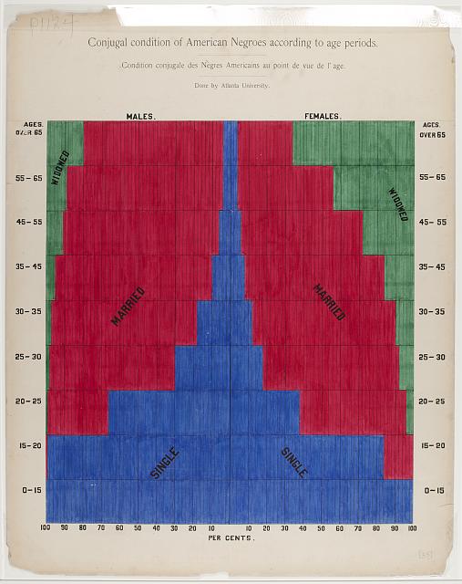
This graph depicts the Conjugal Condition of Black Americans around the 1900s. The individuals who were polled were either former slaves, or relatives of former slaves. WIthin this graph, Dubois portrays three key vital pieces of information: the status of the former slaves, the age-range, and the gender. It seems that from the information on the graph, men tended to either keep their marriages longer, or they tended to remarry more often than women did. I could also make the analysis that black men also died earlier and more frequently than their female counterparts at the same age, which is why more women were widowed. Either analysis is equally valid. The one central piece I would change about the graph is the color scheme, since it doesn’t show the font well.
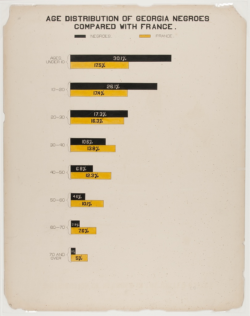
This graph depicts the age distribution of former slaves, as compared to France. The graph is shown as a percentage comparison with France. One could make two assumptions based off the information displayed. Either that the healthcare system, or treatment of older black people was better in France, than it was in the Americas, or specifically Georgia, or that more black folks had kids than they did in France, which are both equally plausible scenarios. The graph is simple and is easy to interpret, yet still depicts substantial information of the American Black Populace.
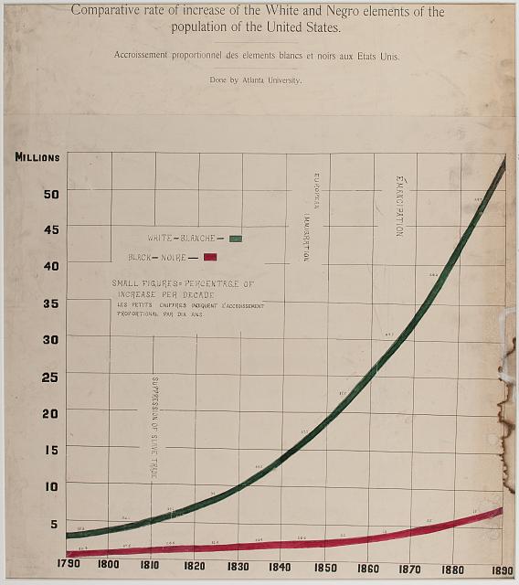
This graph of Dubois illustrates the increase in population between the two races in the United States. If all things remain equal, then there should be equivalent rises in population between the races. Dubois sends the message that effectively there is a version of population control in the black community, which might be due to a conglomerate of different reasons.
These three graphs in total display that the conditions for survival even after slavery, which I think was a central message of Dubois in the 1900s.