Space and Time reading comment
It’s crucial to understand what parameters are used to visualize/animate the data information and from which perspective. In the article, Galileo’s Jovilabes is a very enlightening mechanical instrument to demonstrate the movement of the Sun, Earth, and Jupiter. Different ways of representing the data would give users new insights and inspirations about the object.
The last page about the abstracted encodings of contemporary dance notations also reminds me of diagrams in architecture. The Manhattan transcript is a famous drawing by Bernard Tschumi about the overlay of movements, events, and space. The Transcripts aimed to offer a different reading of architecture in which space, movement, and events are independent yet stand in a new relation to one another so that the conventional components of the architecture are broken down and rebuilt along different axes.https://www.moma.org/collection/works/62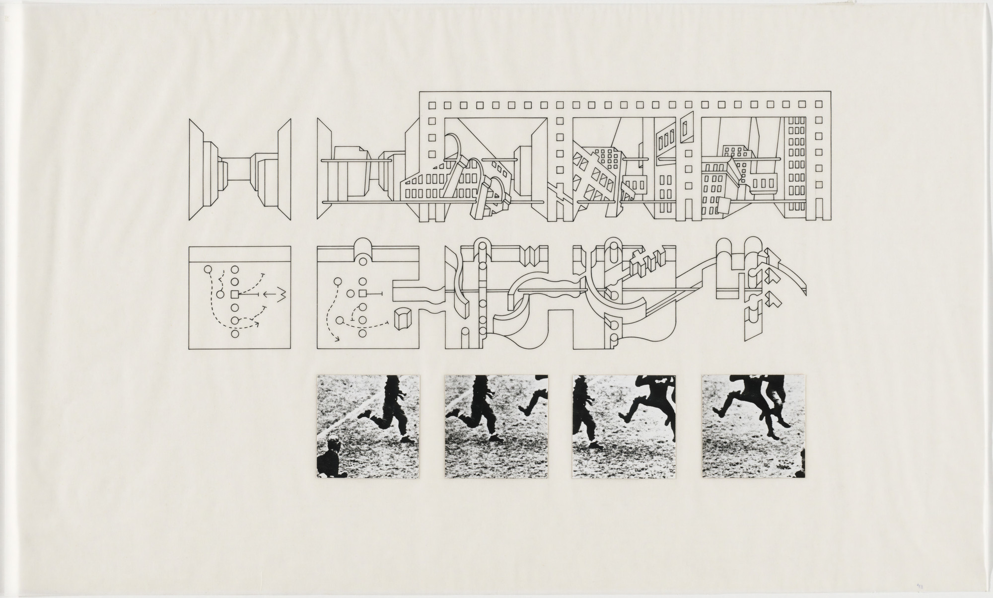
The article also indicates the importance of the users. Users with a data analysis background might prefer different visualization styles compared to users with a design background (who might emphasize more on color palettes, font, and the formatting).