Assignment 17- Sally Chen
1) The most common and deceptive representation is probably changing the y-axis. It also seems to have the advantage of magnifying significant effects or significant differences in academia and is considered a reasonable operation to make statistical graphs more “readable”. However, this can lead to some difficulties for researchers when making cross-study comparisons because the y-axis is not uniform. Compared with tables that provide direct numbers, charts can have a lot of space to do deceptive techniques.
2)
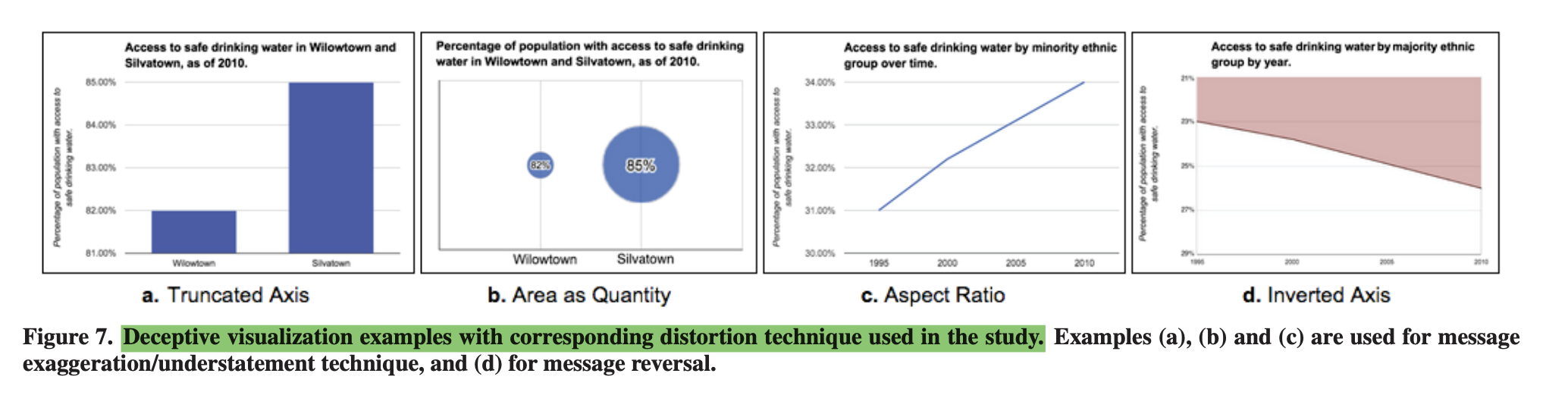
I found the experimental study for deceptive visualization interesting. It analyzes common deceptive techniques and uses four samples to conduct a user study of the effects of 4 common deceptive techniques. From the results, it seems that the most deceptive is the aspect ratio in linear charts, followed by the truncated axis in bar charts and the area as quantity in bubble charts. From my personal point of view, bubble charts are the most confusing because of the relationship between radius and area, the difference between numbers can be magnified exponentially. In this study, the numbers represented by the bubbles were clearly placed in the center of the bubbles, and the visual focus was initially on the text rather than the area size of the bubbles. Thus, the deceptive nature of bubble charts may have been underestimated in this study - participants read the text first and had a priming of the actual differences, and thus would have biased their perception of the area size differences between the bubbles.