Assignment 15- reading- Sally Chen
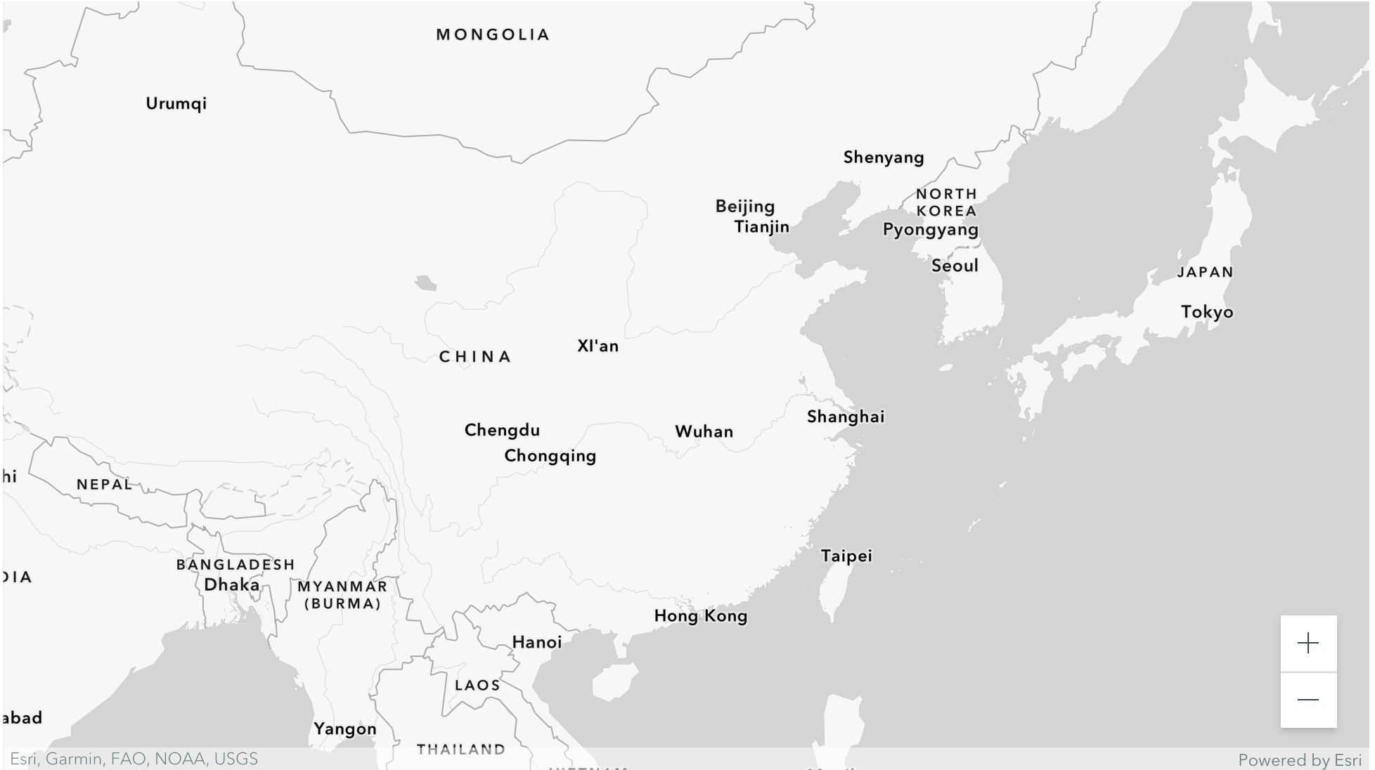
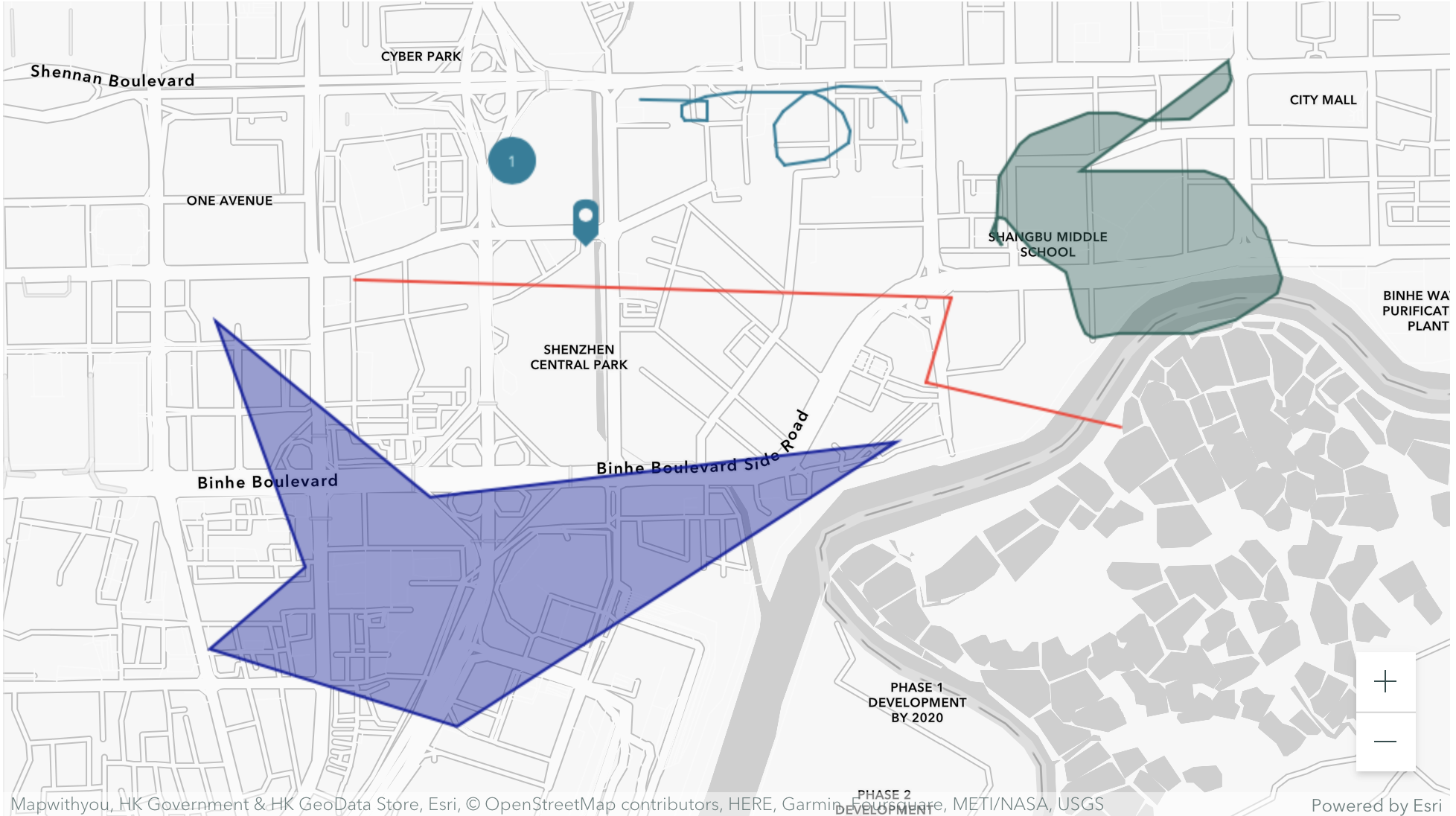
For our final project, rule 3 is a useful suggestion: “Large area background or base-colors should do their work most quietly, allowing the smaller, bright areas to stand out most vividly, if the former are muted, grayish or neutral. Large area background or base-colors should do their work most quietly, allowing the smaller, bright areas to stand out most vividly, if the former are muted, grayish or neutral.” Typically, the background color of a map is gray. In our visualization, we want to use different colors to indicate the gay-friendly index of the area, so the colors should be different at the macro level. When the user zooms in on the map to a certain degree, the whole interface will show the same color, and I think it will be better to keep the color consistent with the index to have a better expression of information. The color choice should be “quiet colors” rather than the relatively bright colors presented in the journey map in our first representation. I looked at Storymaps again, focusing on the color selection of maps and markers. As with many maps, the blank map is gray and white, which better reflects the location markers added by the user. There are a variety of ways to mark locations, while the interface allows the user to choose any color. One aspect that I think is worth learning is the color rendering of the area markers: non-transparent color outline + translucent area color. Thus the road or river texture can go through the marking area, helping the user to locate the relative position of the coordinates.