Project Updates
-
CRTR Final Writeup
CRTR Final Writeup
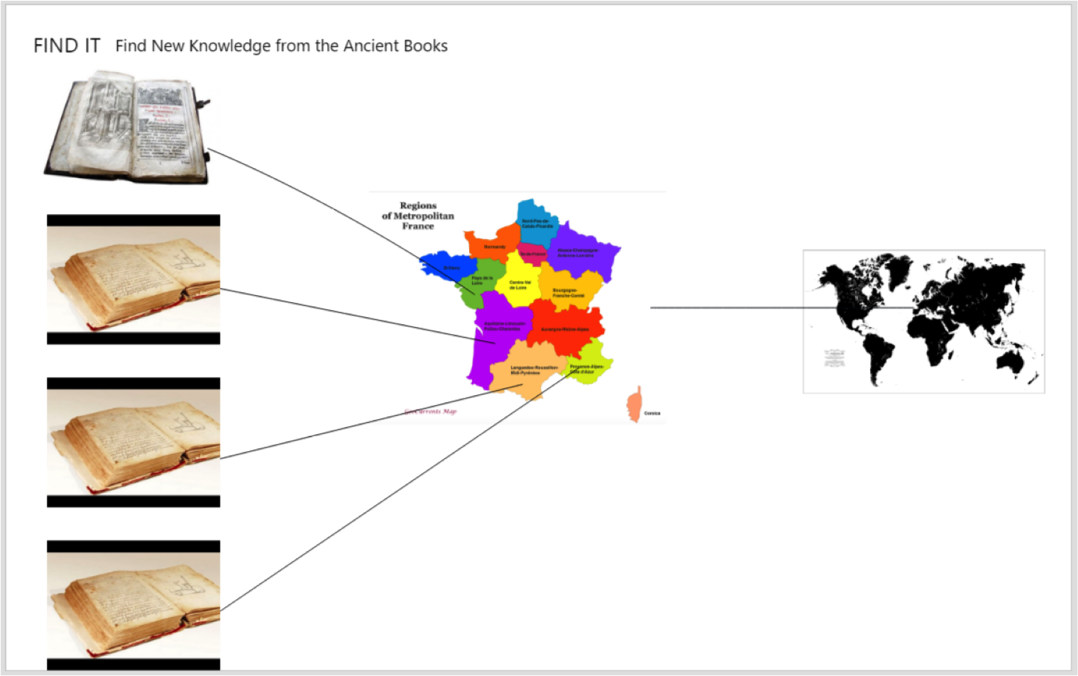
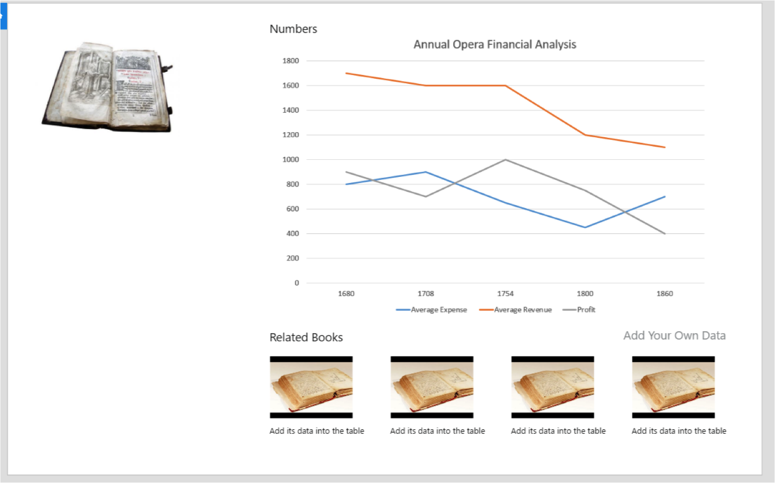
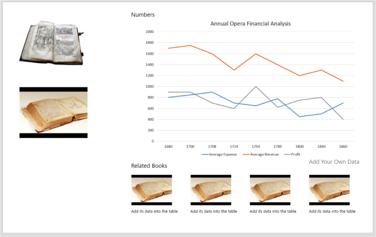
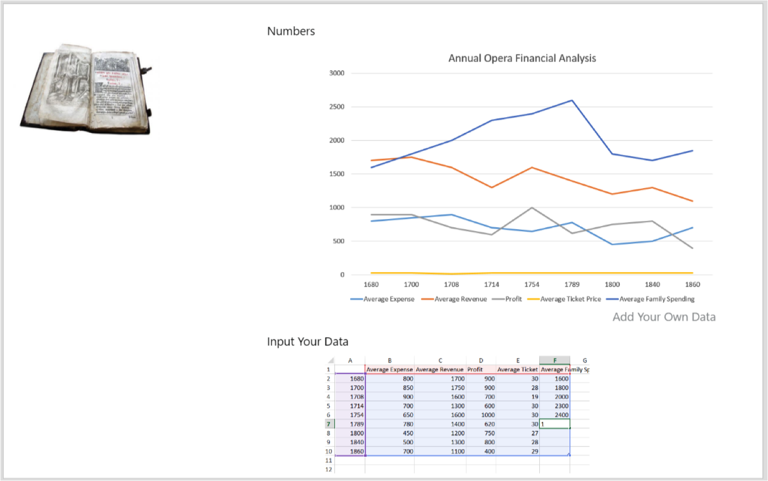
The code is available at github.com/peterldowns/crtr. A demo is running here. Our full report is online here.
-
pentathlon-design-doc
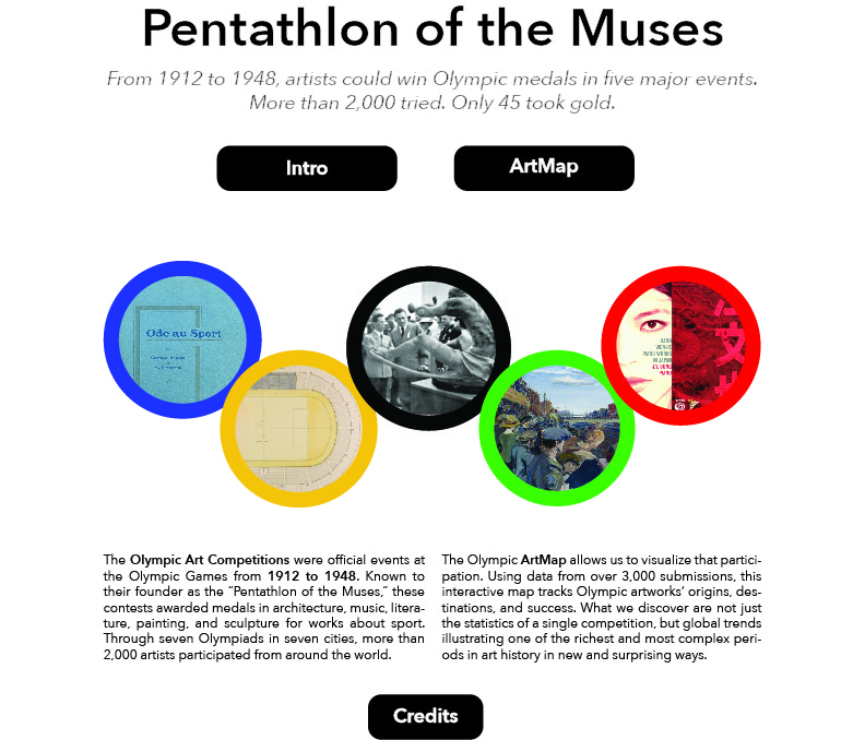
Pentathlon of the Muses: Final Project Design Document
WEBSITE: http://104.197.121.200/
 !
!Team Members
Thatcher Chamberlin (jthatch@mit.edu). Thatcher is a sophomore studying Physics at MIT. He also has a background in computer programming and web design, having built a number of websites using technologies similar to those used in this project. His role in the project was to help with the design of the project’s map functionality and the website backend.
Kelsey DeJesus-Banos (kcdejesusbanos@g.harvard.edu). Kelsey is a 1st-year Master of Electrical Engineering at Harvard mainly focusing on Computer Graphics. Having mainly worked with software before, she has dedicated herself to the programming and technical portions of the project working both on the front- and back-end of the website.
Miles Osgood (mosgood@fas.harvard.edu). Miles is a 4th-year PhD student in English at Harvard. The data for this project comes from research on his dissertation, “Olympism: The Olympic Art Competitions and Athletic Modernism.” The dissertation as a whole considers the interest in sport among modern artists and writers in the early twentieth-century, by way of the 1912-1948 Olympic contests; this DH project focuses mostly on the Olympic half, as a way to visualize forms of international circulation and competition in the arts in this period.
Ece Turnator (turnator@mit.edu). Ece is a Humanities and Digital Scholarship Librarian at MIT.
Yuchuan Zhang (yzhang4@gsd.harvard.edu).Yuchuan is a 1st-year Master of Architecture in Urban Design Student at Harvard. As a student with the design background, she mainly gives advice and sketches for the layout of the website and for data visualization. Also, she cares about the user experience in designing the ArtMap.
Concept Overview
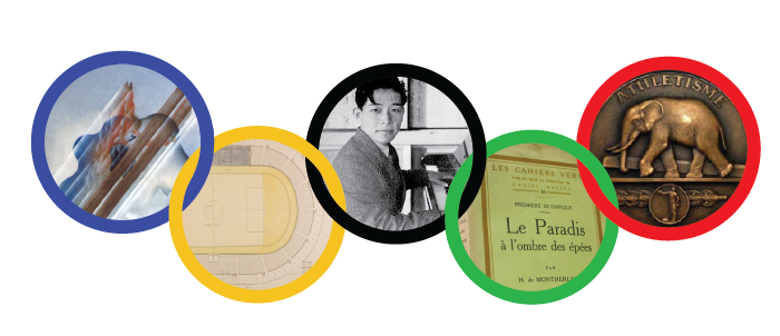
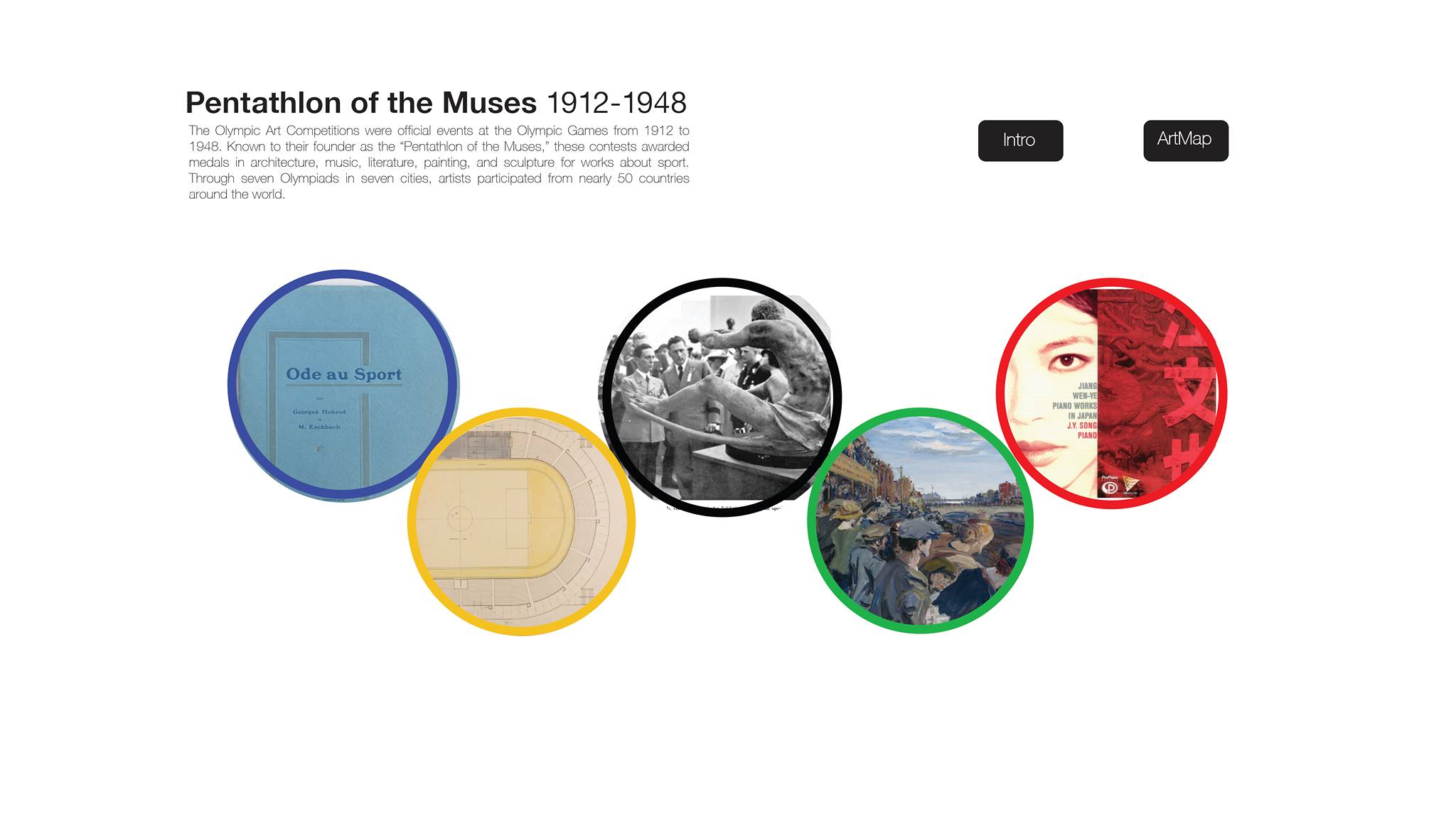
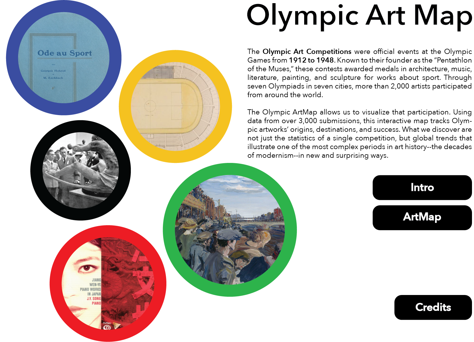
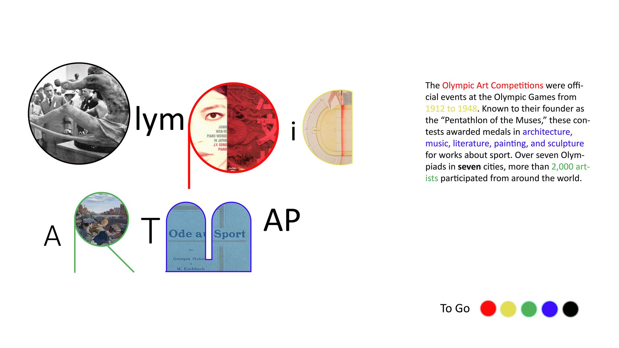
The Olympic Art Competitions were official contests at the Olympic Games that lasted from 1912 to 1948, founded by the father of the modern Olympics, Pierre de Coubertin. Artists could win medals for their countries in five events–architecture, literature, music, painting, and sculpture–a “Pentathlon of the Muses.” Many of the medal-winning artworks have survived, and existing online articles or books focus on these successful entries. These medal-winners account for only about 150 of more than 3,000 entries, however. Looking at the medal-winners alone obscures the stylistic breadth and the global reach of these competitions. Most victors competed for European countries or the U.S., but artists submitted from nearly 50 countries around the world. Meanwhile, due to conservative Olympic aesthetics and rear-guard juries, the most notable competitors and innovative artworks are buried among the losers.
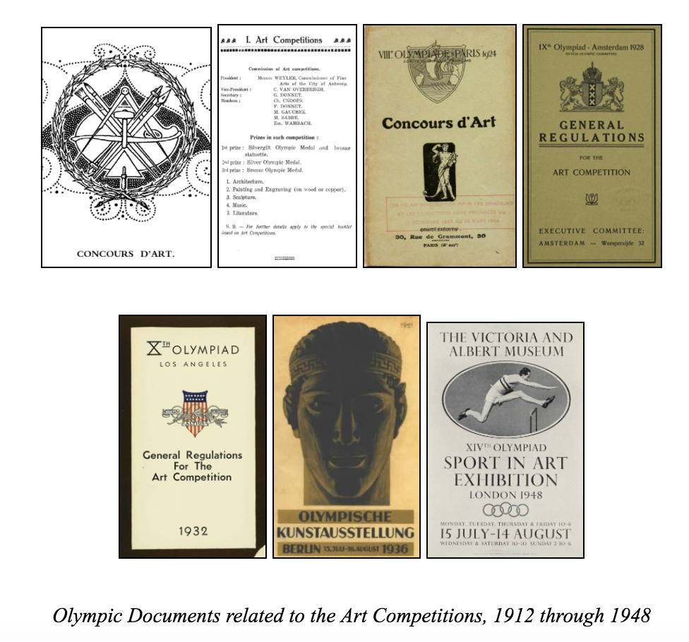
Olympic Documents related to the Art Competitions, 1912 through 1948
Our website attempts, then, to provide a different account of the competitions, using equally complete metadata from all entries and allowing users not only to consider the contests’ hierarchies, but also to think about its geographical, temporal, and cultural range. The pedagogical goal of this site is not only to introduce users to these long-forgotten Olympic events, but to use this particular contest as a new way of visualizing the global art market in the early twentieth-century–a period of significant political change and aesthetic innovation.
As such, the tour that introduces the site guides the visitor through a diverse array of Olympic submissions, from all art-forms and all Olympic years, starting with the literature gold medal won by Coubertin himself before turning to outsider artworks that represent IOC dissidents, modernist styles, avant-garde schools, Latin American and Asian traditions, and politicized medal selections. The main feature of the site, the ArtMap, allows users to filter data according to their own preferences–not just according to winning results. The resulting maps trace the movements of artists and artworks from their homelands to urban workshops and eventually to the cosmopolitan meeting-grounds where these seven Olympiads took place. Users can click through links to learn about individual artists and artworks, but just as importantly, they can see world-wide artistic trends at a glance.
We imagine the audience for this site being twofold. First, scholars of early-twentieth-century history and culture should find that this site poses new questions for their fields and provides tangible data for what might otherwise be nebulous areas of inquiry. Literary studies in this period, for instance, have turned to an interest in theorizing and studying “global modernisms,” which often involves re-thinking conventional aesthetic principles and periods associated with European modernism. The ArtMap, by allowing users to navigate time and space and by promoting artists not usually included in the modernist canon, does some of that same intellectual labor with thousands of concrete artworks. Second, non-academic users who may have personal interests in the arts or the Olympics will be invited to act as researchers in this buried treasure-trove of modern art and Olympic history, capable of making discoveries in their own right. The website tour and the artworks of the Olympic Art Competitions make the various styles of modern art more accessible to sports fans, and tell the evolving story of the Olympic revival to art enthusiasts.
Background Research
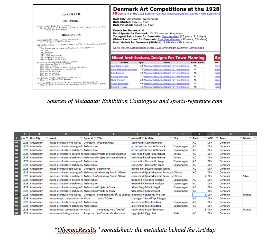
Primary-source research on the Olympic Art Competitions comes from three main sources: Richard Stanton’s foundational self-published monograph, The Forgotten Olympic Art Competitions (2000); the archives of the Olympic Studies Centre in Lausanne; and the online database sports-reference.com. Over the course of about a year and a half of research, with help from librarians and colleagues with coding skills, Miles has compiled and cross-checked a spreadsheet with metadata about all of the Olympic art entries, alongside contextual information about the competitions and the artists involved.
The ArtMap we’ve designed is mostly primary-source driven, and the tour largely makes use of general knowledge about twentieth-century history, Olympic history, and modernist studies. Still, to fully understand the possibilities for our site and its content, there has been some use for some secondary literature: biographies of artists, critical accounts of art history and sports history, scholarly texts on twentieth-century culture, etc. We’ve included some of these texts along with our primary sources in the bibliography.
In the field of Digital Humanities scholarship, Jane Macalik, John Fraser, and Kelly McKinley’s editorial statement on “Discursive Space” has had special influence on this project, as may be apparent in our use of the terms “visitor” and “user.” Our site is not without conventional curatorial structures designed for “visitors”–this is the function of the chronological, introductory tour, after all–but the central application, the ArtMap, is intended to “share power” between the collection and its users by inviting unforeseen insights (see Macalik et al., 3). In the interest of time, we have had to prioritize certain works by seeking out their images first, so in that sense we have not abnegated our role as knowledgeable curators, but the material in the ArtMap is presented as evenly as possible. We might also define the two dimensions of the website–the tour and the ArtMap–according to Lev Manovich’s “narrative” and “database” from The Language of New Media. As Manovich describes, though, these categories are not completely distinct (234). This is a hybrid site, and each half is hybrid in its own way: the narrative of the tour refers as much as possible to the place of individual artworks in the larger database; and users can click on individual entries in the ArtMap database to see short narrative biographies.
Project Development
Roles: As our team members have diverse backgrounds, we assigned tasks based on everyone’s strengths and interests. Thatcher and Kelsey are our technical experts in programming; they built the website and its functions. Miles, who proposed the concept of visualizing the Olympic Art Competition as part of his greater research, provided introductory background to the competitions and prepared the metadata, while also taking an active role in consulting on the website design and creating or curating images as needed. Yuchuan, a design student, oversaw the general visualization principles of the ArtMap and user interaction overall. She gave advice and sketches for the layout of the site. Ece, a digital humanities librarian and instructor, helped compile metadata and gave feedback on the project along the way.
Development steps
Design Proposal:
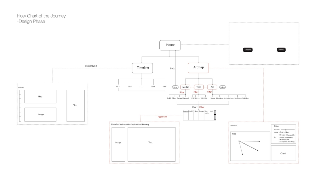
The proposal is based on two aims. First: to combine various information like images, maps, texts and even sounds together to make it clear and easy for users to read, process, and learn. Second: to make the journey an interactive process for better user experience.
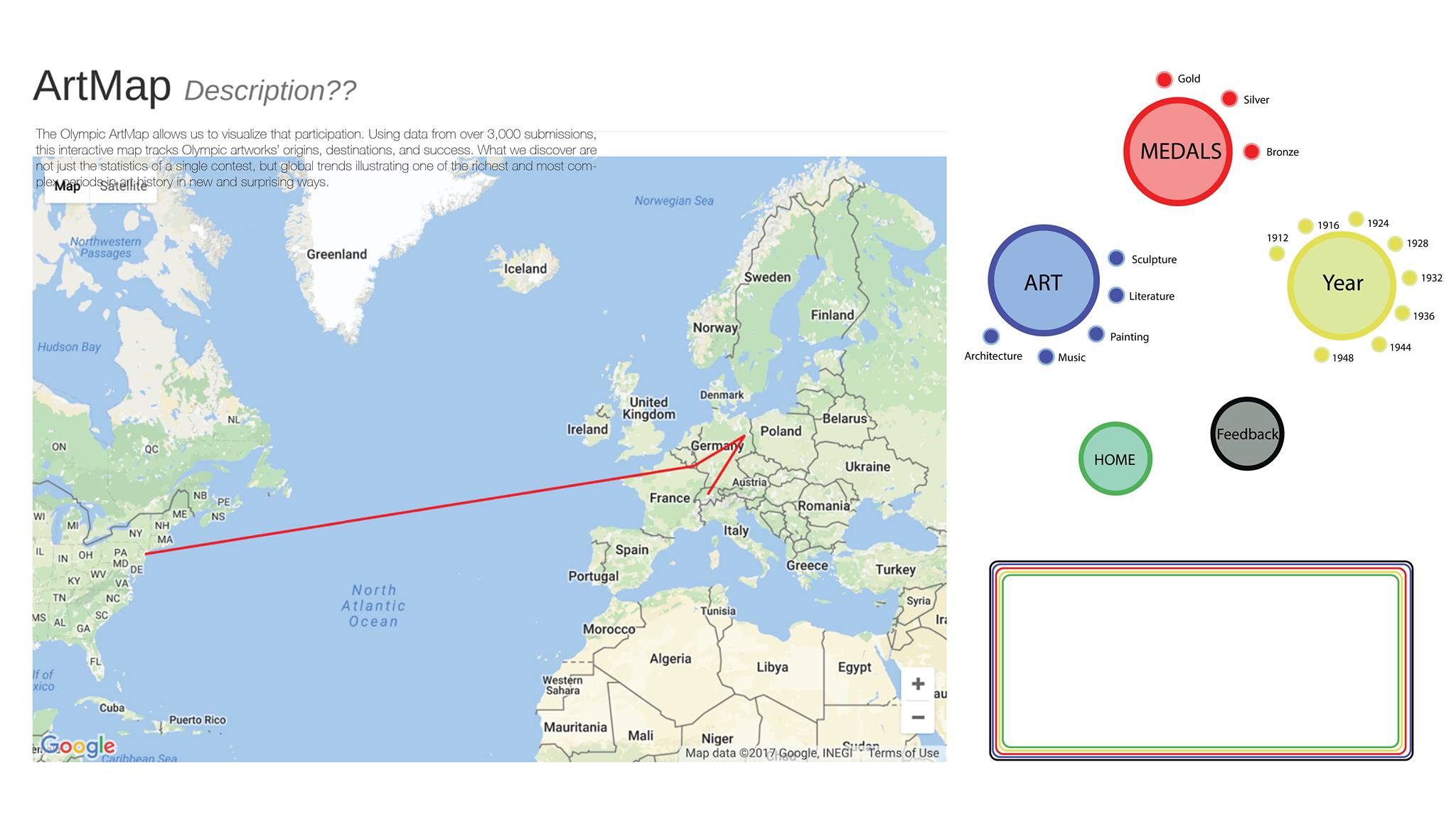
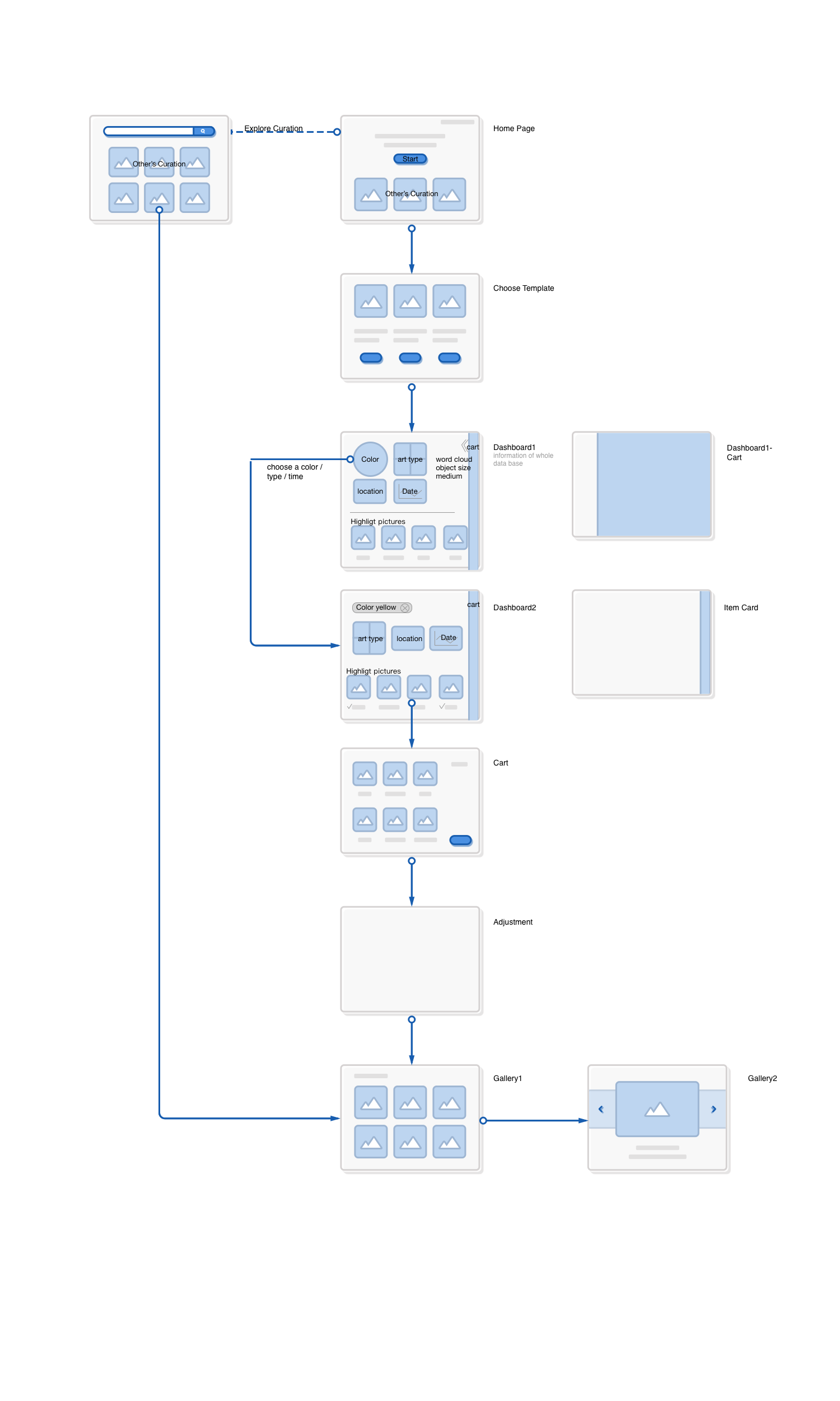
The flow-chart shows the proposed journey for users. The homepage contains two main entrances, the Timeline page and the ArtMap. In the Timeline section, we have selected introductory artworks and narratives for each year. The actual “timeline” is a sequence of dates running down the left side of the page that allows the visitor to control the sequence, but we expect visitors to proceed chronologically. The Artmap section is the main feature of our website. There, users can filter information, selecting narrow databases within the 3,000 art pieces and the 2,000 artists. Whereas the Timeline guides visitors, the ArtMap allows users to be in control, based on their interests. The three filtering criteria that users can adjust are year, art-form, and result (medal, honorable mention, loss). The diagram above captures how these different filters can cooperate. The map occupies the left side of the page and a chart is created in the bottom-right corner based on the filtering commands. Links in this chart allow users to see the metadata associated with particular artists and artworks. As such, users are invited to explore the “OlympicResults” data not only through multiple levels of filtering, but also by drilling down into the details of particular instances that the map may evoke only in general terms.
Data cleaning and preparation:
The Database used for the project was stored and maintained using PHP and MYSQL. MySQL is a database that uses structured query language to access and filter the data. PHP is a useful tool that handles the administration of MySQL over the web. Maintaining the database as such allowed for an efficient way to transfer and access the data between the various group members working on the project.
Website Improvement (Prospects)
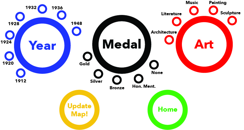
The iconic five Olympic rings appear on our home page as an indication of the official status of these art competitions over seven Olympiads. The rings, then, are a foundational design cue at the start of the user’s journey. In order to continue this connection with the identity of the Olympic Games, we created prospective designs for the ArtMap’s filter that also evoke the Olympic rings. The future design, as we envision it, will will use red, green, blue, yellow, and black rings to build a more close relationship with Olympic iconography. Expanding on some of our experiments in the Timeline section, we would also like for the text designating these filters to serve a second function: years, art-forms, and perhaps even different medals could be linked to pop-ups, which could give users a quick glimpse of the significance of certain categories within the site. Eventually, we’d like to build connections between pages, so that users can jump from the data of the ArtMap to the stories of the Timeline, and vice versa, according to their searches.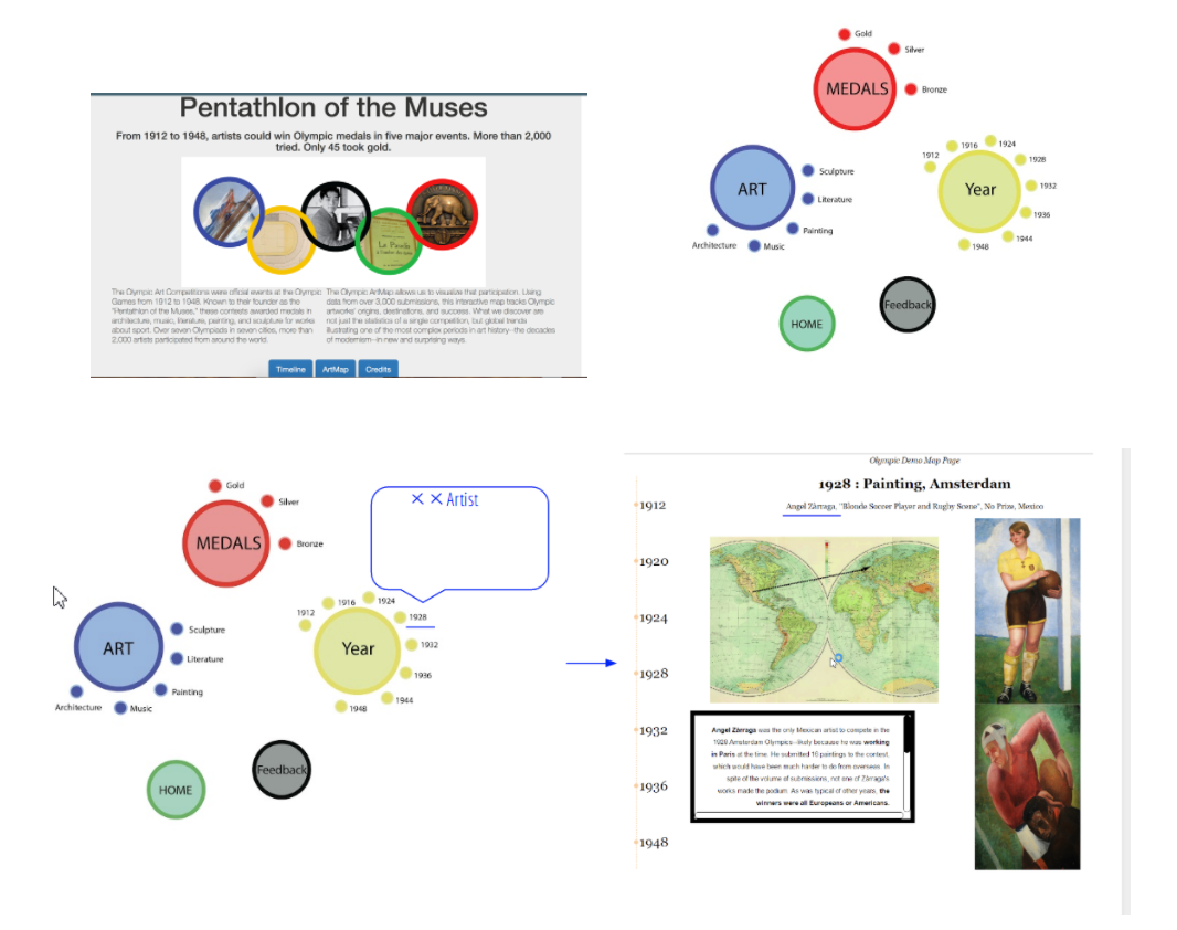
Challenges
One major problem we faced with our design choices is the notoriously strict IOC policy concerning use of Olympic logos (see “Editorial Use of the Olympic Properties by Media Organizations”). A published and public-facing version of this site would probably have to clear all use of the Olympic rings by the US National Olympic Committee, if not the IOC. Walking the fine line between designs that used the five interlocking rings too closely and designs that were too different from the Olympic logo to be recognizable was an ongoing challenge. For this prototype, we followed our colleagues’ suggestions and moved closer to the look of the official rings, but a later version of this site might not have this liberty. Relatedly, we do not have rights to any photos of Olympic artworks and we may not have rights to the biographical text compiled by sports-reference.com. Sports-reference takes the attitude that most of its information is factual, and therefore not subject to copyright, but this would seem to apply more to the statistics than to the bios, which required greater creative effort on their part.
Other design choices were motivated by feasibility rather than legality. In accordance with a home-page design that linked the artistic “Pentathlon” to the five Olympic rings, we considered having five filters in our ArtMap that would also be ring-based. Our final design still incorporates a version of that idea, but five separate filters seemed excessive. We decided to focus on Year, Art, and Medal, because other metadata was less of a priority (or, in the case of “National Team,” easy to distinguish in the visualization). Over time, we also thought about the constraints and possibilities of hyperreading, in response to N. Katherine Hayles’s “How We Read: Close, Hyper, Machine.” We decided to cut down longer paragraphs in the Tour section and distribute this information via other interactive modules: mini informational pop-up windows associated with Olympic years and art-forms. We also decided that users would find it least distracting to have detailed metadata on specific artists and artworks appear in a separate tab, rather than in the ArtMap interface.
Enabling Technologies
ArtMap Page
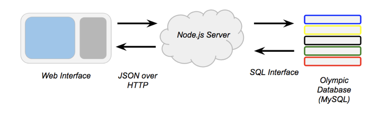
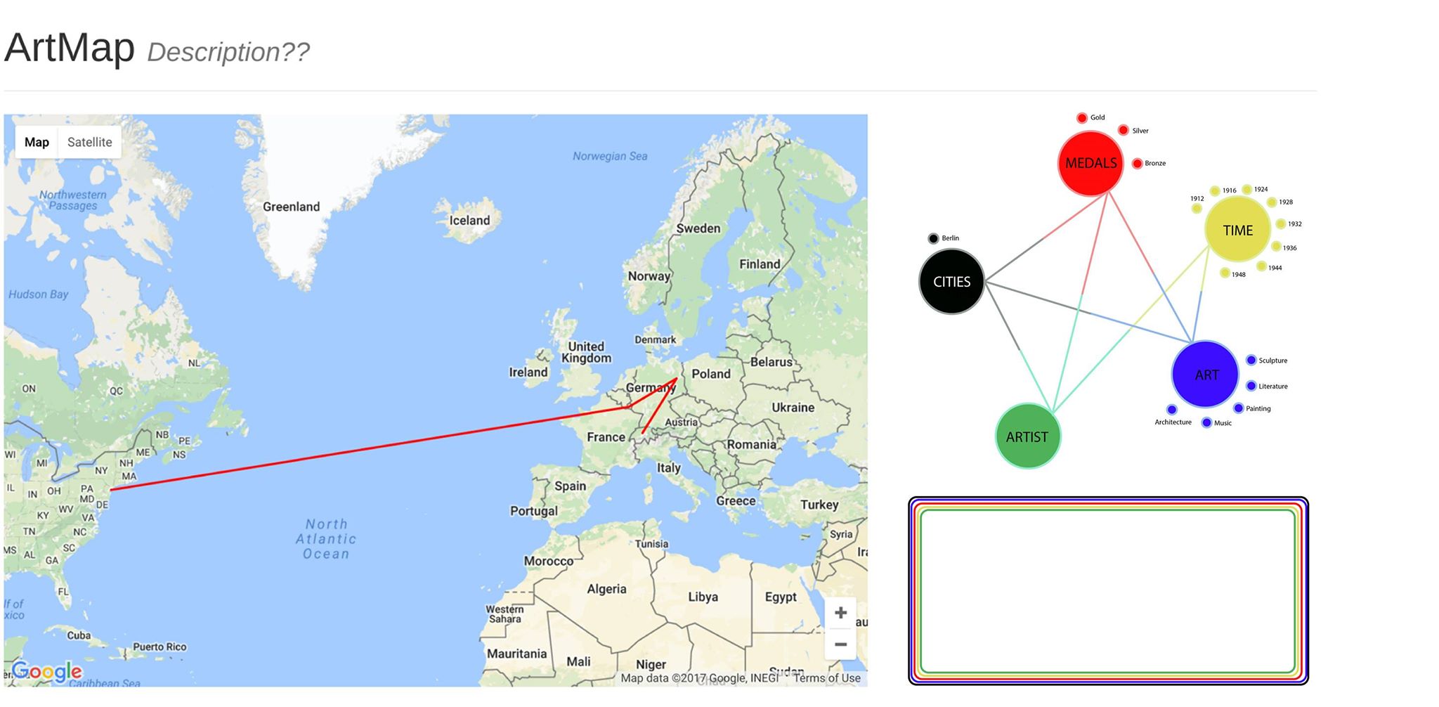
The ArtMap within the Pentathlon of the Muses website is an interactive web app that displays information stored in a relational database. The site runs off of a Node.js server which serves web pages and facilitates the flow of information between the user and a MySQL database. SQL, or structured query language, databases allow for complex searches large, connected datasets. MySQL allows for a more selective and dynamic form of interaction than a spreadsheet or other static file. The information from the database is displayed on the user’s screen through a combination of HTML, CSS, and JavaScript. Text information is displayed by using JavaScript to rewrite elements of the page and spatial information is displayed by use of the Google Maps JS API, which allow us to draw markers, windows, and lines on a responsive world map.
MySQL
Our database is arguably the heart of the project. As mentioned above, MySQL is a commonly used database that supports structured query language. SQL lets us access and filter the wealth of information compiled by our team in numerous interesting ways.
Google Maps
The Google Maps API provided a familiar and easy-to-use interface to present our spatial information to users. The API also provided many methods that made drawing markers, lines, and information windows on the map very easy.
Node.js
Node is a commonly used server framework. It allowed us to make a server that presents HTTP endpoints that provide data to the webpage. By using several of the many available Node.js packages available online, we were able to write a server codebase that is small is relatively easy to understand. This will help future developers continue the project.
Home, Credits, and Timeline Page
All three of these pages rely mainly on Html, CSS, and Javascript to display information to the user. They are interlinked with each other and with the Artmap through the use of buttons which allows the user to navigate from one page to the other. The information and forms displayed to the page was made possible through the use of Html. CSS was used to enhance the visuals and design styling of the page. Javascript allowed for more of the object oriented feature of the website such as the timeline activity embedded on the Timeline page.Journey Map
User trajectories on the “Pentathlon of the Muses” website would depend on users’ familiarity with the Olympic Art Competitions and other existing Digital Humanities projects. A new user who already had some knowledge of the contests and some experience with other interactive DH sites would be able to click on the “ArtMap” button immediately from the landing page and navigate the ArtMap without much difficulty: the filters, the data, and the representations on the map are all fairly intuitive. The only likely point of confusion would be the difference between lines going from working-city to national-team and those going from national-team to host-city. Even then, by looking at the Legend, as well as the metadata and perhaps a few of the entries in detail, the user would still be able to work out the meaning of these different lines fairly quickly–since, in a given year, all lines proceeding from national-teams to host cities would form an apparent nexus.
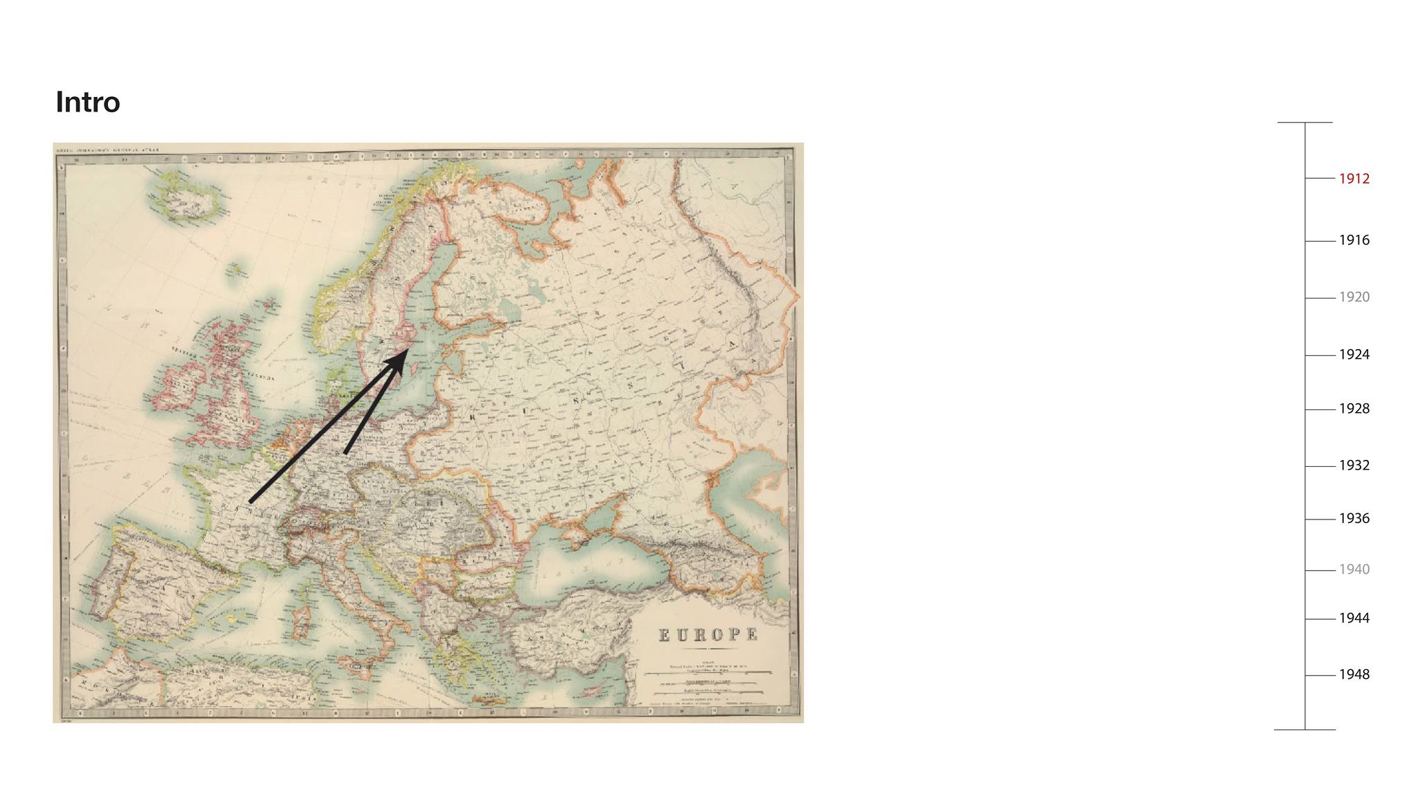
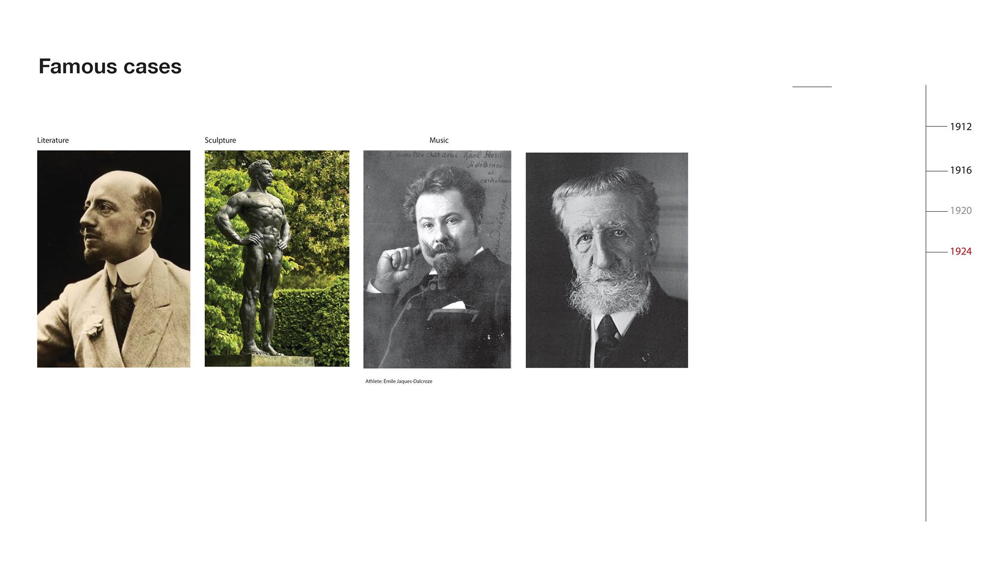
For users less familiar with either the Olympic Art Competitions or the interactive possibilities of sites like ours, the Timeline tour will be the main point of entry. The guided Timeline takes unfamiliar visitors through stories from all of the relevant Olympic years (1912-1948) and through example artworks the five competing art-forms to give basic background on the contests and the ArtMap. Each stage of the Timeline contains an image, some explanatory text, and a historical map, as preparation for the artworks, data, and geographical visualizations of the ArtMap. The image represents one important submission from the given Olympic year; the text introduces details concerning the significance of that submission, the historical context, and certain trends in the contests; and the map gives a preview of how different kinds of submissions’ circulation will be represented in the ArtMap (even though we’ve used historical maps within the Timeline section). We expect visitors in the tour to proceed chronologically, but each entry is self-contained and amenable to more aleatory browsing. The Timeline design also represents canceled Olympic years so that visitors can perceive these at a glance–rather than jumping from 1912 to 1920 or 1936 to 1948 according to even gradations.
Once in the ArtMap, users are free to move in all kinds of directions. By changing the filters, they are in control of the submissions they perceive in the geography and metadata panels. Rather than cluttering an already crowded ArtMap page with art-images and artist-biographies, we’ve decided to have the metadata rows link to new browser tabs: if a user clicks on an artist name in the metadata panel, he/she will be able to learn more about the artist in a separate page. We expect that savvy browser-users will open multiple artist pages in new tabs at a time while looking at a single configuration of the map, waiting to look at these artist pages until they’re sure that they’ve found all the interesting submissions within a given set of filtered results.
Research Discoveries
Already, within a few days of the ArtMap’s full functionality, the possibilities for research into the art competitions and the modernist period are becoming apparent. Of course, the ArtMap will always be a first step in a humanistic process, rather than an end in itself: the visualizations point to intriguing trends and exceptions, and the site allows the user to learn more about relevant artists and submissions quickly, but the subsequent art-historical work of contextualization and interpretation remains vital. Still, here are a few examples of early-stage insights provided by the ArtMap. We had assumed that sculptures would not travel as widely as paintings or other artworks, due to the constraints of shipping and handling; but the ArtMap indicates that the difference is not so significant. In 1928 and 1948, a few countries do send painting submissions without sculpture submissions, but the numbers of paintings are too low to be meaningful. Meanwhile, in 1924 and 1936, almost all participating countries submit both kinds of artworks, and filtering out sculptures makes as much of an impact on the web of ArtMap lines as filtering out paintings. When the 1928 Amsterdam Games lifted restrictions on languages for the literature competitions, literary submissions multiplied in Europe but vanished in other continents. This may have to do mostly with the general composition of participating countries in 1928, though. Host cities seem to have used the “Honorable Mention” prize to make their results more global–particularly in 1932 and 1948. Berlin, on the other hand, spread “Honorable Mentions” to central European entries in 1936. Great Britain and the USA had the most artists submitting as expatriates. But whereas expatriate Americans did not bother joining the Los Angeles Games, London 1948 saw British submission from all over the world. Latin American participation in 1932 was quite varied but not voluminous. Uruguay had the most submissions with five. This is probably because artists representing these countries found out about the contests in the USA or Europe, according to the orange lines.
Future Directions
The functionality of the ArtMap is nearly complete. Among the small revisions or extensions we envision, the most enticing would be to re-introduce other filters: allowing users to see which artists were operating outside their national boundaries, to perceive tiers of success on the map without recourse to the medals filter, to isolate particularly notable competitors, or to distinguish linked entries for which we have images from those for which we don’t. Even in a later version of the site, though, we would most likely hide these tools under a setting for “Advanced Options,” rather than clutter the filters panel in the ArtMap. We might also consider ways to present the contest results and other notable submissions in modules outside of the ArtMap–perhaps by letting users see winning artworks on a podium for different years and categories, with apparent snubs recorded underneath.
As mentioned above, working out our rights as an educational site for the use of Olympic-inspired logos and art images is a high priority. Play with Olympic designs is mostly superficial, though it does serve a purpose insofar as it reminds users that these were actual Olympic events, for which the awards were actual Olympic medals. Meanwhile, collection and inclusion of art images from exhibition catalogues, museum galleries, and private websites could add a lot to the valuable content of the ArtMap. Even though many of these images are available by means of a quick Google search, we don’t expect visitors to look up many submissions on their own; it’s much easier for them to understand and compare artworks if those images are readily visible within the site.
The Question & Answer session from our final presentation meeting was quite instructive. The audience suggested some possible enhancements to our filters: for example, allowing for the simultaneous selection of multiple Olympic years (perhaps to see how one artist’s contributions or one nation’s contributions changed over time) or (as mentioned above) allowing users to sort submissions by those with available images. We discussed the possibilities and problems inherent in prioritizing famous artists and their submissions–a feature we had experimented with as potential filter but decided to abandon as too subjective and interpretive on our part. Still, the conversation made us reconsider: we need to find a way to convince users that the art competitions are sufficiently exciting not just from an Olympic perspective, but from a modern art-history perspective; and that may involve putting modernist or avant-garde competitors like Robert Graves, George Grosz, and Walter Gropius more in the foreground.
Finally, there are several unrealized ambitions for the design of the site. We didn’t have time to design the entire site according to a consistent, bespoke aesthetic–even though there are glimpses of what that aesthetic would be in our home-page and tour pages. We wanted to use Olympic ring imagery for our filters, for instance, but there wasn’t enough time to incorporate this idea. More pertinent to the content: since the political world maps change significantly over the course of these 36 years (during which time world wars transformed national boundaries and several colonial states achieved independence), the contemporary Google Map underlying the ArtMap is not representative of the globe as the artists of these Olympic years would have known it. We experimented with using maps from oldmapsonline.org for the Timeline pages, and we know that it’s possible to overlay these maps on Google’s for the ArtMap, but we have yet to complete this stage of the project.
Another topic that arose during the presentation meeting was the purposes this site could serve beyond this particular data. Originally, Thatcher’s pitch for a “WarpMap” would have been based on news articles–another form of rankable international data. At the end of the project, though, our audience agreed that this current form of the “ArtMap” was better suited to other art-related projects: the lines and the webs they create could easily represent the provenance of objects in museum collections or the trajectories of specific artworks across exhibitions.
Immediate Future
Since Miles plans to continue to polish this site over the summer and to publish it soon afterward, Thatcher and Kelsey are producing a “Read-Me” file so that he and future collaborators can build on the functionality already in place, improve the database with images and recovered metadata, and introduce some of the temporarily abandoned design plans. The first step will be to make the design in the Timeline match the rest of the site; then we’ll have a full prototype to show to possible partners, like Harvard’s metaLAB. With or without them, Miles will buy a domain name and put the working version of the site online within a few months. Our plan for this site always went beyond the confines of the class project, so we look forward to a day not far from now when it will become a real online resource for researchers, Olympic fans, and curious web-surfers looking to become amateur art historians.
Works Cited & Acknowledgments
Olympic Reports, Exhibition Catalogues, and Official Documents (chronological)
The Olympic Games of Stocholm: Official Report. Ed. Erik Bergvall. Trans. Edward Adams-Ray. Stockholm: Whalström & Widstrand, 1912.
Olympic Games Antwerp 1920: Official Report. Brussels: Belgium Olympic Committee, 1957.
Les Jeux de la VIIIe Olympiade: Paris 1924: Rapport Officiel. Ed. M. A. Avé. Paris: Librairie de France, 1924.
Exposition et Concours d’Art: VIIIe Olympiade. Alexandre Millerand. Paris: Comité exécutif, c. 1924. The Ninth Olympiad: Amsterdam 1928: Official Report. Ed. G. Van Rossem. Trans. Sydney W. Fleming. Amsterdam: J.H. De Bussy, 1928.
Concours et exposition d’art olympique: IXe Olympiade Amsterdam, 1928. Amsterdam: 1928.
The Games of the Xth Olympiad: Los Angeles, 1932: Official Report. Ed. Francis Granger Browne. Los Angeles: Xth Olympiade Committee of the Games of Los Angeles, 1933.
Catalogue of Competition and Exhibition of Art: Xth Olympiad Los Angeles 1932. Exposition Parl, Los Angeles: Los Angeles Museum, 1932.
The XIth Olympic Games: Berlin, 1936: Official Report: Volume II. Berlin: Wilhelm Limpert, 1936. Olympischer Kunstwettberwerb: Katalog der Olmypischen Kunstausstellung in Halle VI des Ausstellungsgeländes am Kaiserdamm. Berlin: 1936.
The Official Report of the Organising Committee for the XIV Olympiad. London: The Organising Committee for the XIV Olympiad, 1948.
Catalogue of the XIVth Olympiad Sport in Art Exhibition: London 1948: Held at the Victoria and Albert Museum. Cambridge: Chadwyck-Healey, 1977.
“Editorial Use of the Olympic Properties by Media Organizations.” Olympic.org. International Olympic Committee. 2016. Accessed May 12, 2017. Web.
Secondary Sources
“Art Competitions.” sports-reference.com/olympics/. Accessed January 7, 2017. Web.
Hayles, Katherine N. “How We Read: Close, Hyper, Machine.” ADE Bulletin 15 (2010): 62-79.
Macalik, Jana et al. “Introduction to the Special Issue: Discursive Space.” Curator: The Museum Journal 58.1 (Jan 2015): 1-3.
Manovich, Lev. The Language of New Media. Cambridge: MIT Press, 2000.
Stanton, Richard. The Forgotten Olympic Art Competitions : The Story of the Olympic Art Competitions of the 20th Century. Victoria: Trafford, 2000. Print.
Acknowledgments
We would like to thank Prof. Kurt Fendt and our classmates for their invaluable feedback over the course of this project. We also thank Derek Miller and Jacqueline Basu for helping to acquire and organize the Olympic arts metadata.
Most of the metadata comes from sports-reference.com. We’ve cross-referenced this metadata with information in Olympic reports and exhibition catalogues, making slight corrections and additions, and (most importantly) we’ve manually added artists’ home cities based on the addresses they supplied to the competition organizers. Sports-reference.com generously encourages use of its data as factual information outside of copyright, but we still want to acknowledge its collection efforts and its artist biographies, without which this project wouldn’t be possible.
-
pentathlon-presentation
Olympic Team Final Presentation
https://docs.google.com/presentation/d/1v6zxvjYk0dN77a2Yt6x3oXiEsHZttbmRoKBVLloyn90/edit?usp=sharing
Enter text in Markdown. Use the toolbar above, or click the ? button for formatting help.
-
crtr final review
https://docs.google.com/presentation/d/1ONSnvE00hP27QpBt_Jv2qAu3HLJkP-4Q7V5bm89DOzQ/edit?usp=sharing
-
https://drive.google.com/open?id=0B_mpXtZwY9SRMWlRRXJvaFc5cFE http://www.harvardartmuseums.org/collections/object/293243?position=22 https://github.com/peterldowns/crtr/blob/master/art/models.py
 https://drive.google.com/open?id=0BwjQhpQsSYtMal95eVpHRHBmd0E
 -
olympic-update-5-10
Olympic Team Update
Here are the outlines for our final paper and presentation:
https://docs.google.com/document/d/1sizu3uxsoWsJ8NQyqeIJY-D-eWkwtQ8ZWZ347TGAiJw/edit?usp=sharing
https://docs.google.com/presentation/d/1v6zxvjYk0dN77a2Yt6x3oXiEsHZttbmRoKBVLloyn90/edit?usp=sharing
Enter text in Markdown. Use the toolbar above, or click the ? button for formatting help.
-
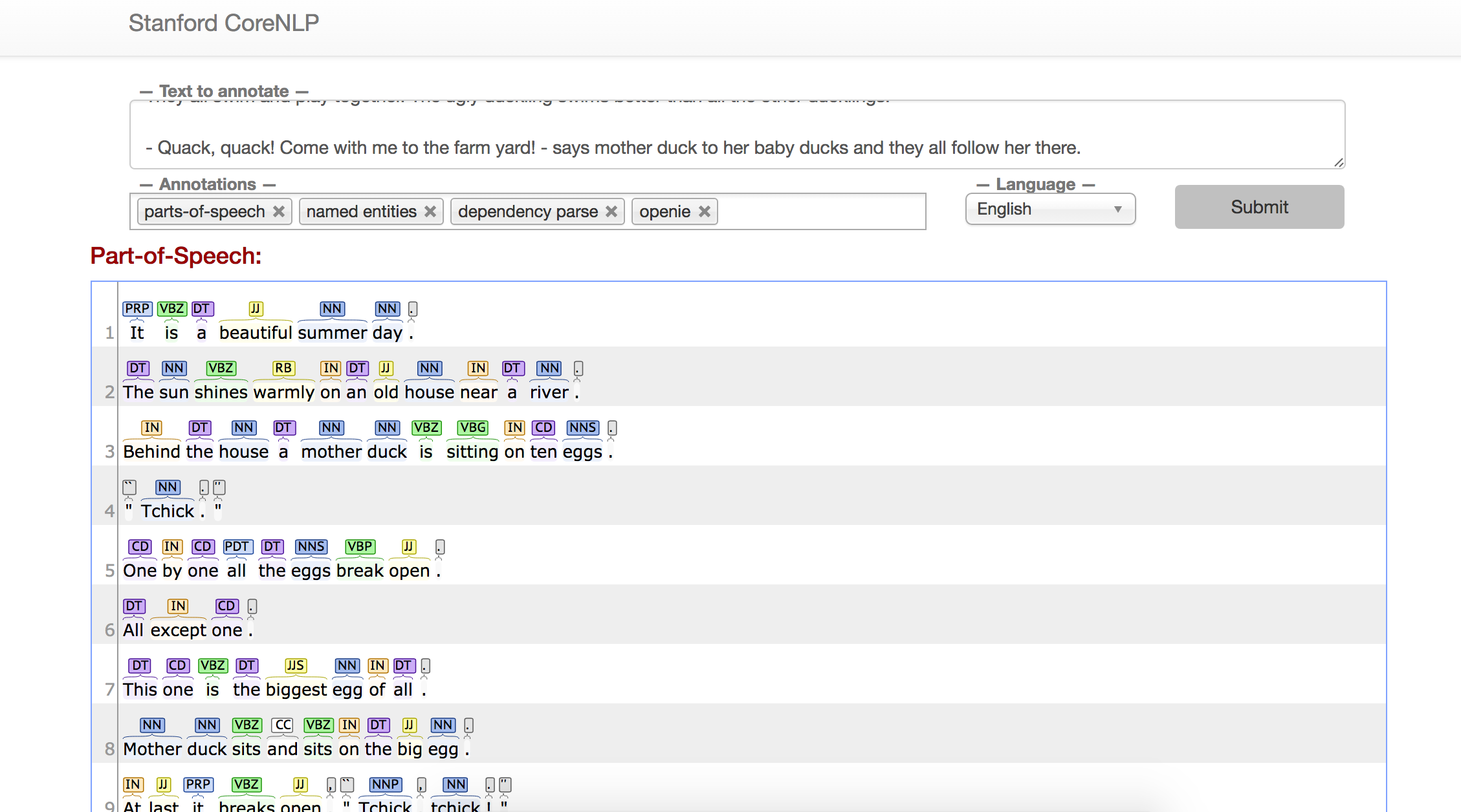
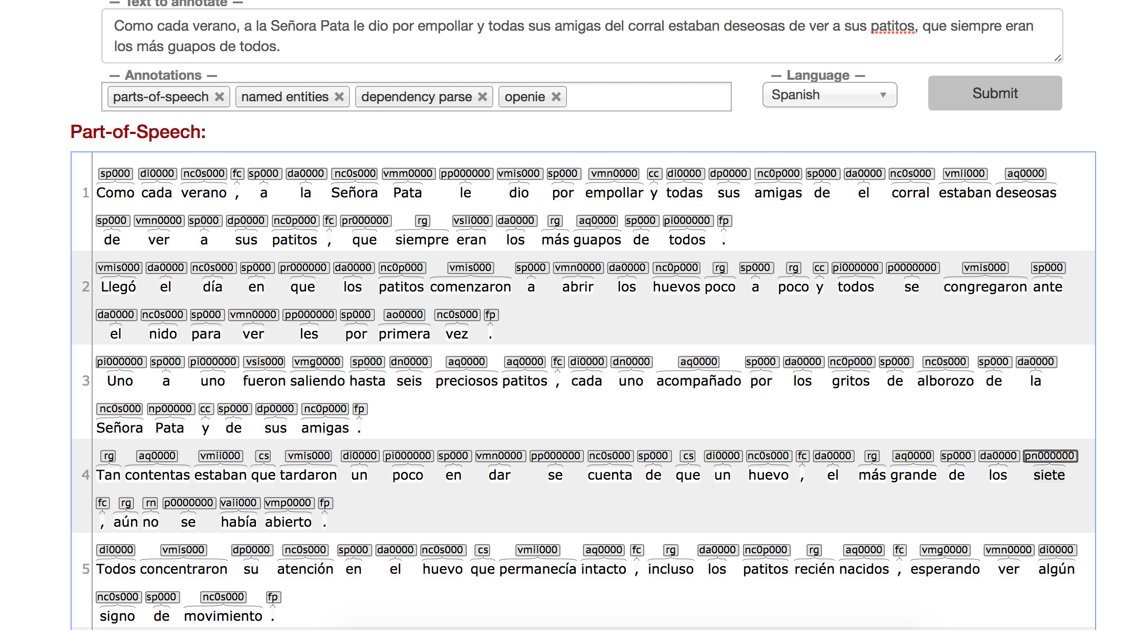
Stanford NER: Ugly Duckling Text
So I used the tool on a piece of the “Ugly Duckling” story for both English and Spanish. It seemed to do quite a good job at point out things like dependencies, parts of speech, and entities. I actually found it interesting when comparing the same text from two different languages because then it helped me realize how different the languages are from each other especially in their grammar and sentence structures.
I am still a bit confused as to why we are doing this or why we would need this. However, like I said before I feel it would be interesting especially when using it with another language. It really gives a broader idea of how that things are structured and connected in that language which then maybe could be useful as insight into the text.
This image shows the parts of speech and dependencies for the English language version of the text.
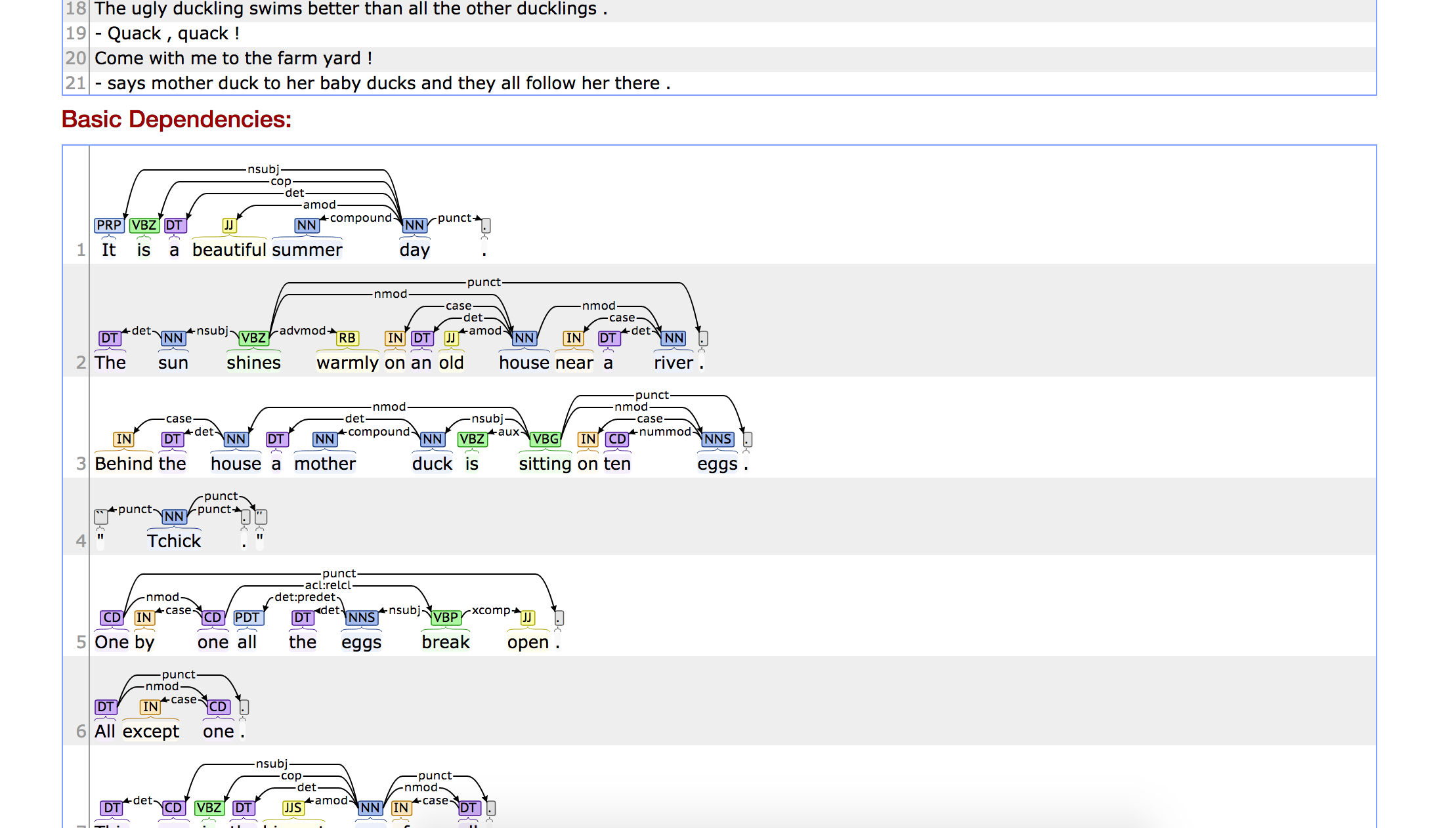
This image shows parts of speech and the dependencies for the Spanish language version of the text.
-
olympic-update-may3
Olympic ArtMap Project Update: May 3
Metadata (Ece and Miles): We’ve continued to comb through the exhibition catalogues to add city information for entries. We’ve now completed 1924, 1928, 1932, and 1936. 1948 is all that remains, and we’ll be done with that shortly. We’ve also got more complete data for Famous Cases, URLs for images of entries, and Entries linked to the Demo Pages.
Static Content for Demos (Miles): Following discussion last week, I’ve added a few artworks/stories to the Demo side of the site, so that there’s now at least one entry/story per Olympic year. There are 8 pages altogether. I’ve also used some historical, public-domain maps from oldmapsonline.org and I’ve added dashed lines or arrows to them to illustrate the trajectories of various artworks. These images will accompany the text
Design for Landing Page (Miles and Yuchuan): In response to the class’s suggestion, we’ve attempted to make the use of the Olympic rings more obvious, while avoiding a design that treads on IOC copyright. Miles put together an initial concept, and Yuchuan cleaned up the look and reformatted it for screen size.
Design for Demo Pages (Yuchuan and Kelsey): The Demo Page needs four elements…
-
A timeline
-
The content text that goes with each date
-
An image of the artwork.
-
The static map image that goes with the content
We’ve been playing with how to combine these features. Originally, the design was going to mimic the ArtMap design, but we might free ourselves from that model to be able to bring out the content text and image.
Possible Design for Famous Cases Page (Yuchuan): Last week, we tested out the idea of having a filter for particularly famous artists. It became clear in the class discussion that this label “fame” is hard to defend/justify, so for now we’ve removed the filter, but we’re still thinking about ways we might incorporate this element of the metadata for interested users. Here’s a possible side-page concept for looking at famous artists and entries.
Design for ArtMap Filters (Yuchuan): The lines from the previous filter design have been removed, and the ring outlines have been accentuated to make a clearer reference to the Olympic Logo. We’ve downsized from our one-time concept of five filters (for five rings) and we’ve moved to three main filters: Art-Form, Medal, and Year. The two remaining rings offer the user the chance to return to the home page or to submit feedback.
SKETCH:
FULL:
ArtMap Functionality (Thatcher and Kelsey): We’ve got a demo running now. It doesn’t yet incorporate 100% of the features and designs we’ve envisioned, but it’s functional and we can start improving it from here. Here’s how it works right now: you select a year and get a list of countries that competed and their medal. From there you can click each country and a listing of it’s entries and artists and which pieces won medals. From there you can click on each piece and go to a new tab where you see more info about it. You can also click on artist names and go to pages with more info on them. Here’s what the map page looks like now:
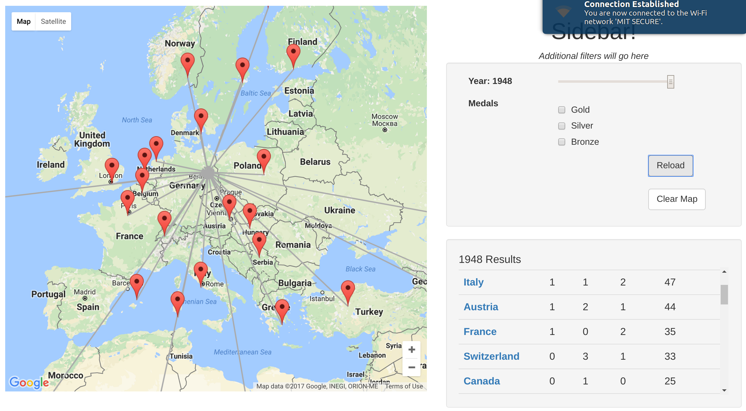
The bottom-right panel can also show a list of a country’s entries in a given year’s games:
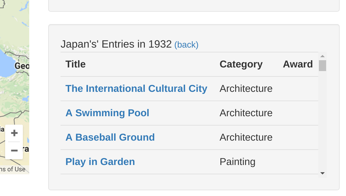
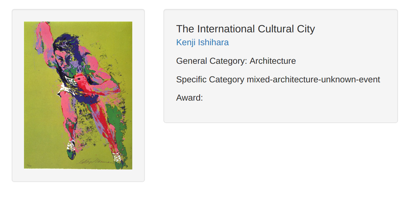
Click any of the pieces’ titles leads to a custom generated page with more metadata about the piece. The information displayed is incomplete right now, but will be very detailed in the future:
-
-
CRTR Project update may 03
-
olympicmap-update-4-26
Olympic ArtMap Project Update, 4/26/17
Content
-
Ece and Miles have been working on supplementary metadata. We now have columns to designate artists as famous/non-famous, to link images to submission data via URLs, and to associate artworks with the city they were submitted from. These are in varying degrees of completion–we’ll continue to fill out the information over the next week.
-
Miles and Yuchuan have been working on the landing page and “Intro”/”Demo” content. The first page of the site will give the user some basic information and illustrations concerning the art competitions. An “Intro” page will guide the user through the Mapping app while taking her through 5 representative artworks: generally covering different Olympic years, art-forms, styles, and contextual stories. Miles has selected the artworks and written the background paragraphs; Yuchuan has come up with designs for the landing and intro pages.
Design
Possible landing page elements below
-
Yuchuan has designed a prototype version of the filter categories and buttons for the main ArtMap app. (Yuchuan: Yeah, for the landing page, I tried to combine text with images to provide attractions for people to read, just a very short intro for the art competition. And when they click the “to go” button, they will see the mapping page. We tried to use five colors, same as Olympic, since it is an odd number, I tried to layout them more in a free way, and the lines shows some links between each category and indicate there maybe some overlapped information.)
-
Thatcher created the frames for the site layout.
Coding
-
Kelsey used MySQL and PHP to import the three database files needed for the website
-
Thatcher: I made a simple version of the web page we talked about last week. Right now it displays a map and draws arrows based on art and artist data. I formatted a small amount of test data by hand because we haven’t integrated the database yet, but my hand-entered data is close to the same structure as the entries in the database, so integration should be very approachable.
-
-
CRTR Update: 4/26
As we decided last week, this first week of worth has focused mainly on larger-scale design. On that front the team has made progress both on the proposed UX of the project and on background research and planning of the implementation.
Backend
- Github repository to contain the code.
- A fair amount of research into the potential implementation. Results here. Although we considered using Javascript on both the backend and the frontend, there is much less of an existing ecosystem for machine learning techniques in Javascript. Given our team’s equal familiarity and experience with Javascript and Python, and the availability of open source Python code to meet our system’s goals, we’ll be using a Python backend and a Javascript frontend.
Frontend
We thought hard about the user experience and the desired functionality, and came up with a first draft of the UX:
-
Olympic ArtMap Presentation
Olympic ArtMap Presentation
https://docs.google.com/presentation/d/1kvE8nh4kbeRgYWwqXDRU8mVKVC7_M2_IXAsxKZCo3NA/edit?usp=sharing
Enter text in Markdown. Use the toolbar above, or click the ? button for formatting help.
-
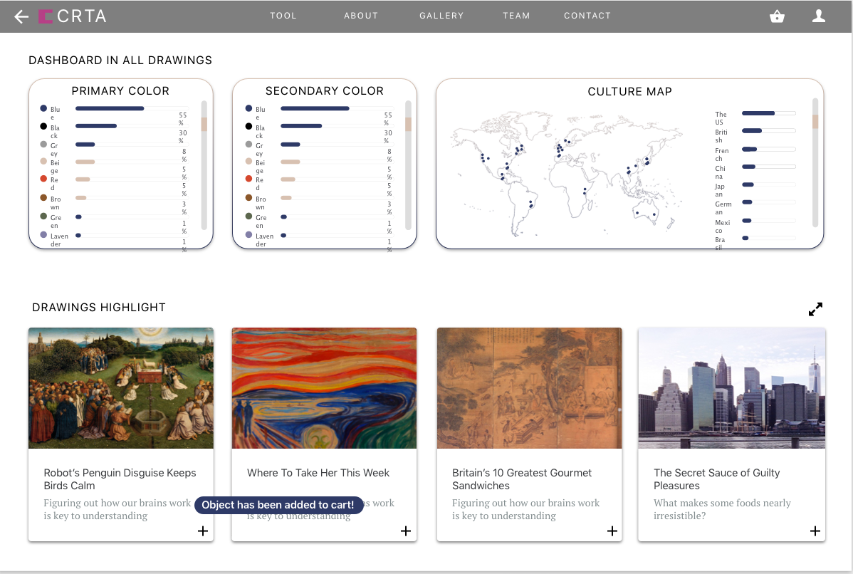
CRTR: A Social Curation Tool for Museums
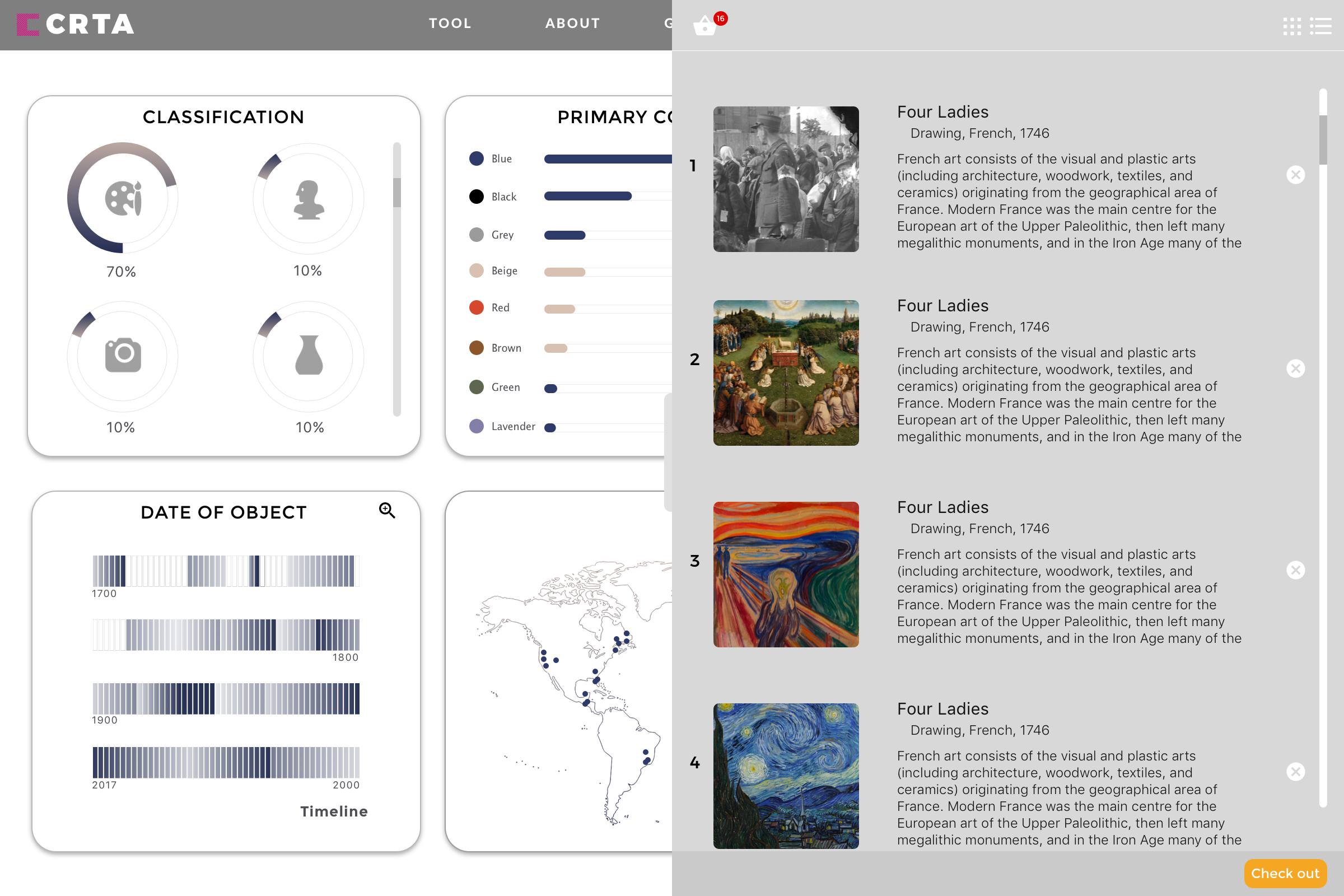
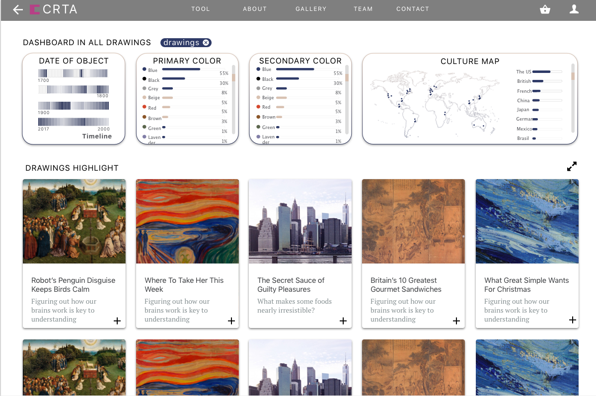
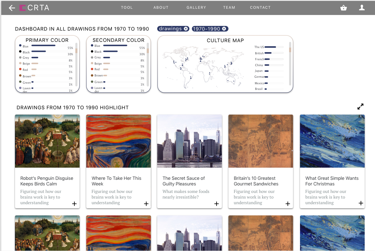
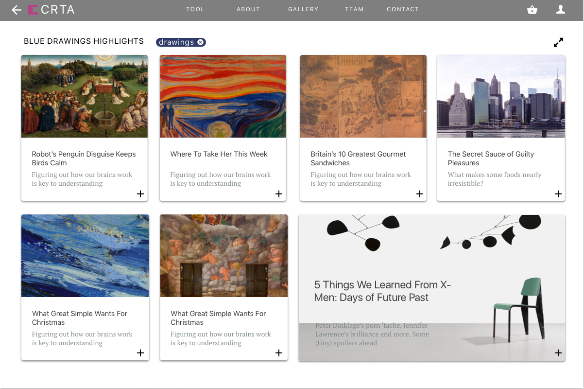
Museums have a problem: it’s hard to get young people interested and engaged with their collections. And they can only show so many exhibitions at once, meaning most of their work goes unshown and hidden from the public eye most of the time. We propose CRTR, a social curation tool, that allows anyone to view a museum’s full body of work and from it curate their own collections. This will allow young people to experience more of the museum’s art, and provide valuable inspiration to the museum when it comes time to curate new shows – by looking at the collections created in CRTR, they can better understand the public’s interests. By using these collections to gauge public interest, they can curate their own, more engaging, shows.
CRTR is a curation tool with a strong focus on just that: curating. Existing tools like Omeka are hard to use and are lacking the powerful searching, filtering, and tagging tools necessary to actually curate a collection from a much larger group of possibilities. CRTR will focus on solving these problems by automatically extracting metadata from images and providing intelligent suggestions using machine learning techniques, all wrapped in a UI focused specifically on curation, rather than presentation. Curated collections can be shown to the public, and we will provide simple social tools for commenting and liking, further incentivizing public engagement. The public response to the different collections can be used by the museum to gauge the public interest.
We have two target audiences. One is museums, specifically their public outreach department: CRTR is a tool for them to better understand the public. The second is the public: CRTR is a tool for them to better understand the power and beauty of the art in their museums.
You may view our full presentation here.
-
olympic-map-preliminary-plan
Olympic Map Team Preliminary Plan
We’ve decided to combine aspects of the Olympic Art Competitions project, the Warpmap, and some curated images. Our plan is to create an interactive world map that represents the span of the Olympic contests, using metadata in spreadsheets that we already have and some new metadata that we’ll need to input. For now, our concept is that we’ll use the Warpmap to visualize the tiers of success for certain Olympic entries (gold, silver, bronze, honorable mention, nothing, “hors concours” [i.e. for display only, not in contest]). When a user selects a certain city or submission, she’d be able to see an image or a text passage from that submission. So, while we’re not doing a gallery curation system like the other class group, we’ll still make use of some of the visuals and literature that Miles has stored up.
Need/question: We’re pitching this partly as a specific visualization for the Olympic Art Competitions, but also as a tool that could theoretically be applied to other mapping data. For example, to take Thatcher’s original pitch as a model, one could imagine ranking news articles from specific cities according to gold, silver, and bronze levels of importance, based on clicks or shares or being front-page, etc. This is a tool that teaches us, for now, about the global arts scene in the twentieth century by means of one particular worldwide contest; and in the future, it could be a tool for visualizing different kinds of tiered information that’s geographically specific.
Approach: After adding new metadata from the Olympic exhibition catalogues by typing in cities for participating artists, we’ll have all the material we need to begin coding, designing, and presenting. Miles will be able to generate a lot of the text- and image-content of our eventual site, with descriptions and contextualization. Yuchuan will be our point-person for design and aesthetics. Kelsey and Thatcher can divide up or collaborate on the coding aspects. And Ece should be able to help us with questions of how best to present this archive and its details.
Intended audience: Insofar as this prototype is Olympics-focused, we expect our audience to be twofold: first, academics interested in modern art and literature, who will recognize certain names and styles and stories while finding new, interesting inquiries on the twentieth century’s globalized art world; second, a public that is generally interested in the Olympics and may not know that they used to have art contests, for whom this will be an introduction.
-
Hidden Charles – A location-based AR app
In the 1600s, Boston consisted mostly of small islands and the Charles River emptied into a wide delta. As this map of 1775 shows, most areas that we walk on today were either water or swamp land. I later centuries, more and more swamp and water areas were filled in and built upon. The MIT campus that we know today only became a landfill in the early 20th century. For most people the former topography of Cambridge and Boston is hardly known and largely hidden. What if we could create a location-aware mobile app that could alert us every time we cross the former border of the Charles or stepped into the water form one of the former islands of Boston? Settings for different centuries would bring about different alerts, historical maps could be pulled up, overlaid with a contemporary map, historical photos, and other relevant documents could be available to provide historical depth to the Cambridge and Boston neighborhoods. An app for tourists and residents alike with the option of leaving comments, stories, and notes tied to a location. And maybe, the app could look into the future as well, when the sea levels have risen due to global warming and parts of Boston and Cambridge will be under water again …
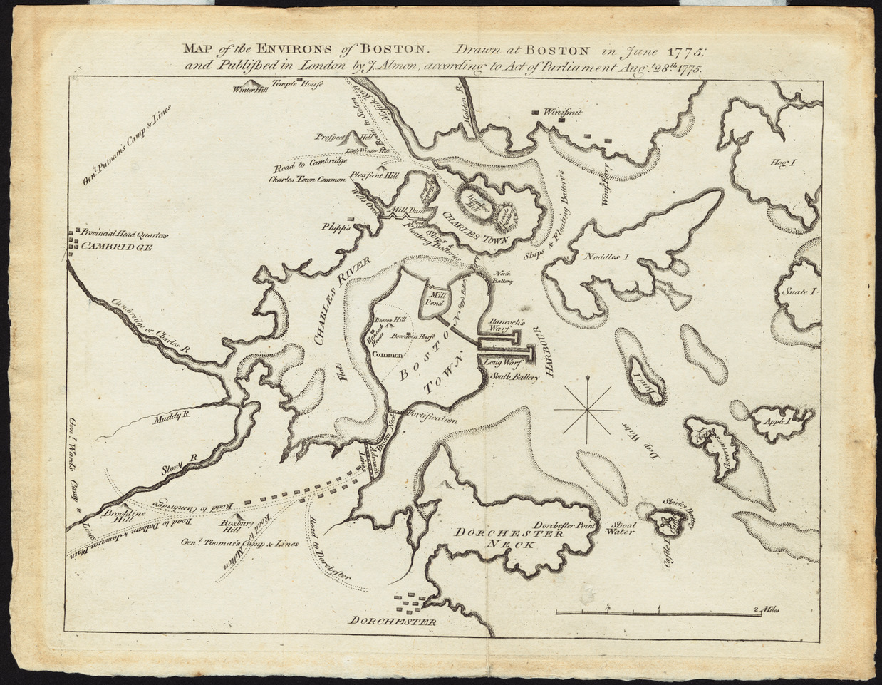
The public libraries in Boston and Cambridge have countless old maps and other documents and mobile AR apps are available as well.
Maybe a project for those interested in history, maps, location-based apps, etc.
-
Bauhaus 1919 - 2019 – A GSD project?
The year 2019 marks the 100th anniversary of the Bauhaus, founded by Walter Gropius in 1919 in Weimar; Germany. In 1934, Walter Gropius left Germany and eventually settled in New England in 1937. In 1938, he built the famous “Gropius House” in Lincoln, Mass. for his own family, encompassing the core architectural qualities of the Bauhaus: simplicity, economy, and aesthetic beauty. The house was declared a National Landmark in 2000. Gropius later moved to Cambridge to teach at the Harvard Graduate School of Design for 15 years. In 1946, Gropius founded the young architects’ association, The Architects’ Collaborative (TAC) in Cambridge, MA.
Challenge: How can we appropriately communicate the core ideas of Bauhaus design, architecture, and urban design to today´s audience? An archive, a website, a game, a virtual reality application, an augmented reality mobile app, or a combination of all? What are the core ideas for engaging prospective users with the product? Is the focus on topics, core Bauhaus ideas, or the user experience?
Lots of material, lots of ideas and an exciting opportunity for our GSD students to collaborate with each other and with others in the class to develop an innovative approach that deals with an architecture and design icon. The Goethe-Institute, the German cultural center is already interested.
-
miles-project-brainstorm
Synthesizing Group Projects
Lots of the pitches from last Wednesday seemed great, and in most cases they probably already work as stand-alone projects. Most important, I think, is that the tool/visualization aspect is often really well thought through–whether it’s putting together different forms of text analysis for more productive and comprehensive results or enhancing the social experience of the museum visit with location-based conversations and VR (just to take a few examples). It made me realize that, although my site idea combines some basic visualization possibilities explored in existing software in previous weeks, I don’t have something radically new to offer in terms of design and interactivity.
In the interest of getting a prototype of a project done within the next month, what I do have to offer, I think, is an existing database with lots of different dimensions. What I might suggest, then, is that some of you could find it interesting to use this database to test out the more experimental features of your digital humanities programs.
Some examples of possible syntheses:
-
Thatcher: The tricky first step of the Warpmap project as it stands would be scraping the NYT for date and site info and then attempting to measure the relative importance of different events. With the Olympics data, we could create a Warpmap that looks at submission origins over different Games, and we could weigh “importance” according to results (i.e. gold, silver, bronze, honorable mention, loss).
-
Pojiang: Perhaps you already have a dataset in mind for the architectural CVs. If not, the Olympics dataset has lots of different sortable dimensions that could fit into the axes that you put in your Github demo: e.g. year, nation, artform, topic… (And, for what it’s worth, architecture is one of the five art forms in the “Pentathlon of the Muses”!) We’d probably create charts or globes based on a given Olympiad or a given artform rather than a single artist, since single artists rarely submitted more than a few artworks, but the colorful columns and maps you envisioned would still suit the data nicely.
-
Kelsey / Xinwen: One thing I’d really like to be able to do with all my images of the Olympic Painting, Sculpture, and Architecture contests is create a virtual gallery/museum in which a user could sort and traverse artworks in different ways: for example, you could start with the Berlin 1936 Olympics and then create a room for Italian artworks within those Games, or you could (at the click of a mouse) reconfigure your rooms such that you’re looking at all artworks relating to track and field for that Games. We could even model this experience on what the actual Olympic galleries looked like, based on photos I have from the Olympic records. Since I already have a database, this might be easier than trying to start from scratch with the MFA or another existing institution.
-
Peter: If I’m able to get some Olympic text scans OCR’ed in the next month, I’d be really interested in running the text through whatever synthetic text analysis tool you come up with! I realize this is more of an application of your project than an actual collaboration from the start, so this may not qualify as a true group project–but anyway, it’s still on my mind, as I think some great comparative results might arise.
Apologies that this leaves out a few classmates–I couldn’t come up with syntheses for every project, and I couldn’t always remember the different pitches that well. And in any case: if you want to pursue your original vision without resorting to my oddball Olympics data, more power to you. But if any of these ideas seem tempting to you, let me know!
Enter text in Markdown. Use the toolbar above, or click the ? button for formatting help.
-
-
Two ideas poping up
Idea 1 Improvement It is a theme focused project. I recalled the day when I was in the world trade center looking at the scared faces of people, also Ross showed how Jewish people suffered from genocide. I would like to do a collection,which could be a congregated source, of how people suffer from disasters whether natural or human made one. Previously, I have mentioned several branches like people’s reaction, international reaction and how city is transformed before and after. Now I would like to focus on one point, on people’s reaction. Maybe the refugees and the international voices. We may put them together to compare. You could then zoom in to a specific country to see.
Approach: It could be timeline based or space based, for the past disasters, we could look for old newspapers to grab information. For the most recent ones which maybe easier to do, we could use the platform of Facebook or twitter to filter keywords.
There are a lot of cases done by grabbing information by python and it could be used in our project. If there could be very brief people’s talk video, it would be better. In addition, there should be an overall map first, then zoom in , then rolling images and also hypertext for these images.
idea 2: It is called searching history visualization. I was inspired by my using difficulties of google search history and a website that is introduced as follows. While using the specific website( I forget the name and will upload as long as I found it) , there is an example but I could not find it now but will upload as long as I find it. It records the key words from what you have searched and shown on the interface, while you close one window, it is recorded. The more frequently you search the bigger it is.
Images could be another way to help record. Image is always more direct than a long name link and may leave a more strong impression on us.
Since the difference of sources of information, it depends on each kind of source with a specific format. A specific sequence of information could help a lot while filtering information and records.
Approach: Design a useful format for each kind of source and try to use programming to filter different sources into each category. The most frequently clicked ones could also be recorded and shown bigger in your searching history.
Needs: Design an interface and also choose a proper platform to take practice. A specific one like library system maybe better than the general searching system Google.
Enter text in Markdown. Use the toolbar above, or click the ? button for formatting help.
-
pitch: object recognition
Problem: I first came up with the idea for this project while working on the “Maurais” project for this class. For that project I was trying to go through a bunch of photos and find the ones that had people in it. I only had to go through approximately 300 photos and it took a while so I can only imagine how much time it takes for someone like a curator to go through a lot more than that. Therefore, I think it would be cool so somehow find a way to use object recogntion which can sort the photos itself and pick out the ones you need based on what you’re looking for.
Approach:
Object recognition is widely known in today’s world and used a lot. Therefore, I would imagine the implementation itself would not be so complicated.
I think it would be best however, not to have this be a project of its own but rather to implement this idea into someone else’s project where it could be put to good use. If you want an idea of how object recognition works then the link below shows a good representationt of it:
Audience: Mainly targeting visitors to places such as Museums as well as curators who might find it useful
Skills Needed: -software -when implemented into an actual project then skills such as design, organization, and creativity will be needed
-
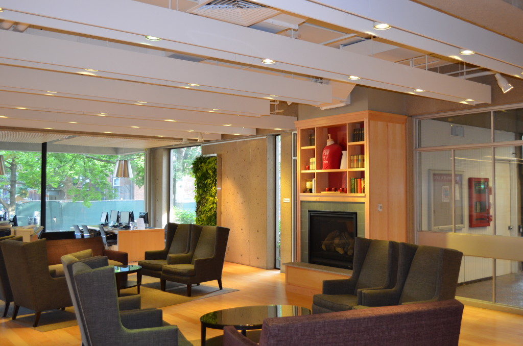
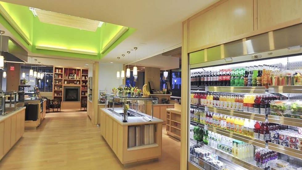
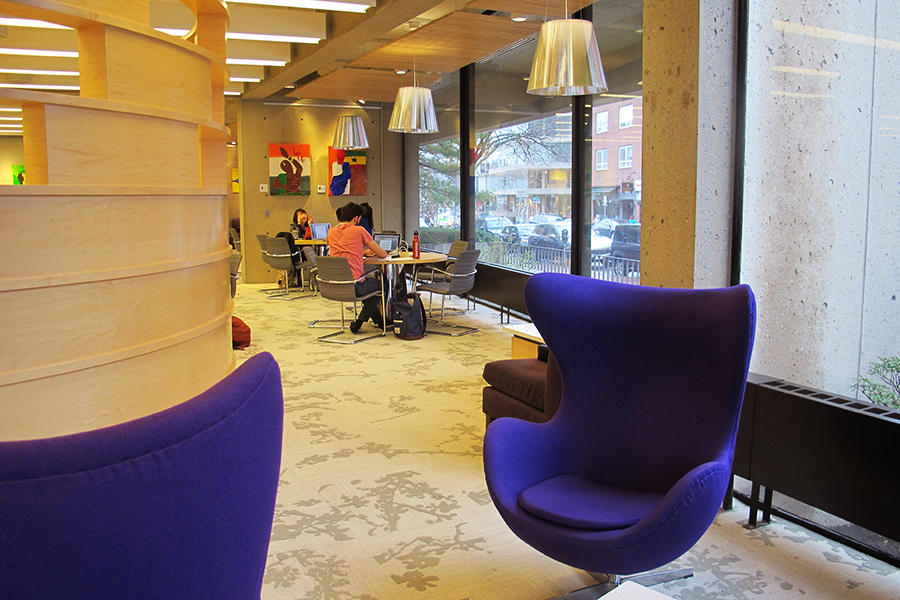
Study Space: Harvard library
One of my favorite places to study is at “Gutman Library” at Harvard University. I guess it all really depends on the individual and their studying preferences but for me what I love most about this library is the way it’s designed.
The thing I like the most about this library is the windows and the open space. Especially on a really beautiful day, a lot of natural light just flows into the room which really puts me into a good mood whilst studying. The artificial lighting which brightens up the space as well is not too overpowering but rather subtle. If you notice they seem sort of dimmed down. I like this because it gives the room that warm, comfort feel. I think they especially tried to give that feeling with in the area that has a fireplace and comfortable chairs around it. The color scheme also lends itself to that in that there are more of warmer tones in the area but not so much in a way where it dampens the mood. It’s probably the contrast with vibrant colors, like the lime green color in the cafe, that make it seem bright and cheery as well.
On the first floor of the library there is a cafe with seating areas on one side and a study space with a fireplace on the other. On the second floor, is a quiet study area. So depending on my mood or what I’m working on that will determine which floor I’m studying on. Usually, I’m doing more work that requires me to be more focused so I’ll usually be upstairs. However, even when I’m upstairs and it’s all quiet I like the fact that there are windows. Just looking outside at the small street with people walking or at the trees just calms me. One thing I don’t enjoy is that I wish there were more study spots in the library. It can get fairly crowded and it’s not a huge library. Especially on the first floor around lunch time when everybody is there to eat or chat with friends. So a lot of the spaces are taken. It doesn’t help that there are a lot of those individual purple chairs like you see in the photo. Although they are nice, they also take up space so that means less chairs for people to sit in to study. I think it would also be nice to have some whiteboards that students can use. More rooms for groups to study in would be awesome as well.
Overall though, I really like the environment of this library. I feel like it’s a great place to study whether it be you want a quiet area to really focus in or a cafe-like area where groups can get together and study over coffee and snacks.
-
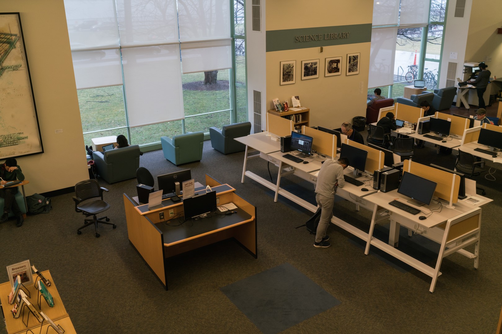
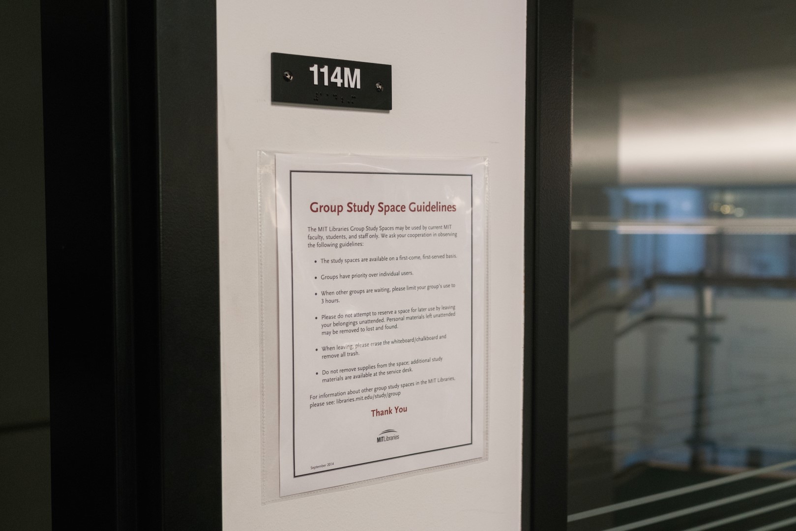
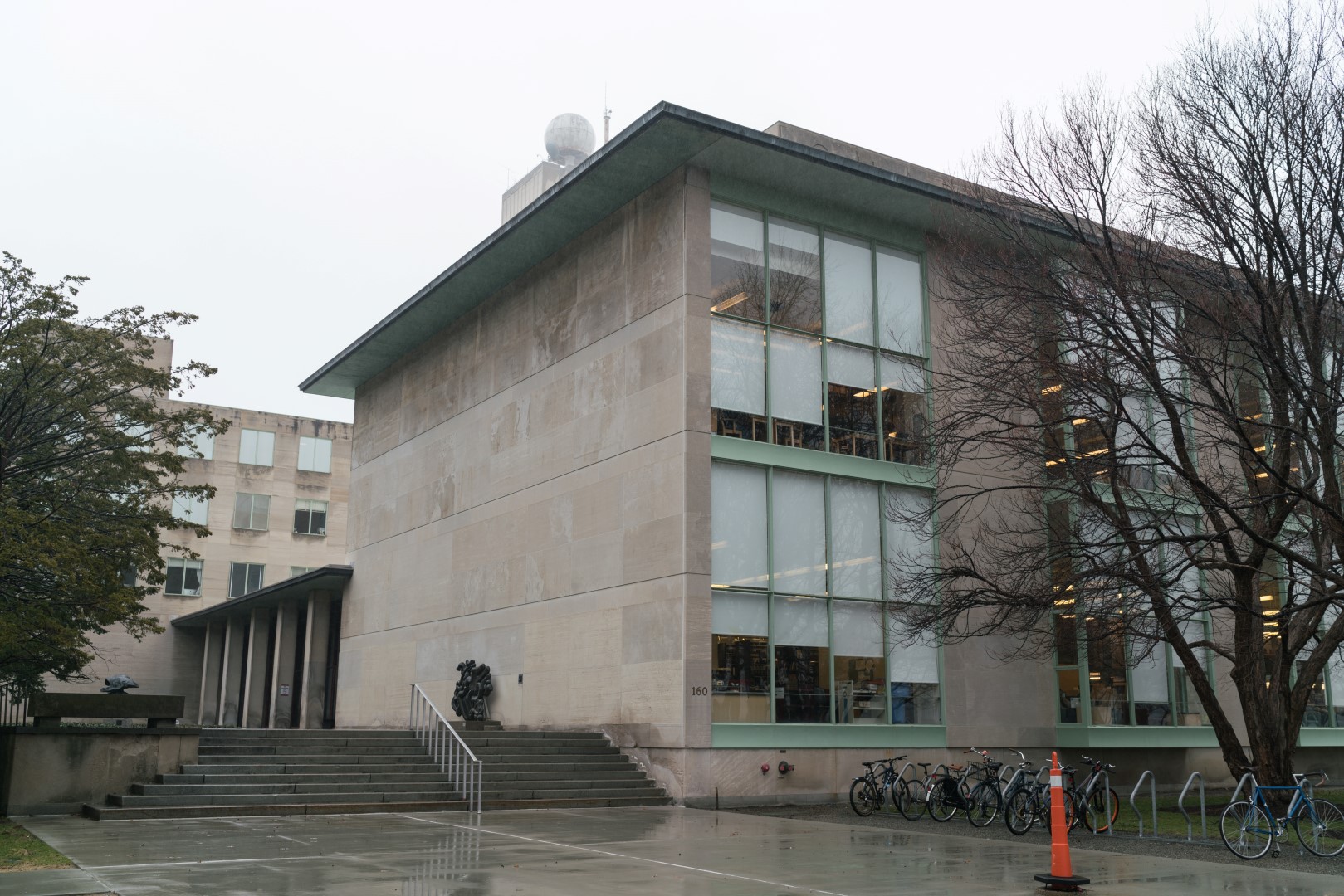
Space Ethnography: Hayden and Barker Libraries
I chose to examine two MIT libraries for the Ethnographies of Public Spaces project. The two different in their uses and atmospheres despite both being part of the same library system.
Barker Library is well isolated from commonly traveled routes around the Institute. Situated just beneath the Great Dome, one has to take stairs or and elevator up five levels to reach it. Barker is extremely quiet. It used mostly by students as a place to do work and is often completely full. Due to its open floor plan and high, domed ceiling, any sound made is very noticeable, so everyone in the library is very quiet. Little technology is found in the library, but nearly all students use laptops at tables in the space.
Hayden library, on the other hand, is a bit less silent and studious. Besides studying, students are often found sleeping, meeting in a conference room, or using the many scanners and printers. The scanners are an excellent addition to the library space – any book or document can be easily scanned and saved to flash drive or emailed for later reading. Due to its more varied design, with two levels and several divided areas of desks, talking feel more permissible in Hayden Library than in Barker, so some people can be found talking in low voices as opposed to Barker’s complete silence. Hayden also has large windows overlooking the Charles River, inviting users of the space to sit and observe the river as well as look at books. Hayden is also more accessible, located on the ground floor of a building not too far from commonly-used academic buildings and dorms.
I forgot to take pictures of these space while I was observing them, but I invite the reader to visit these two libraries and see the differences between them.
-
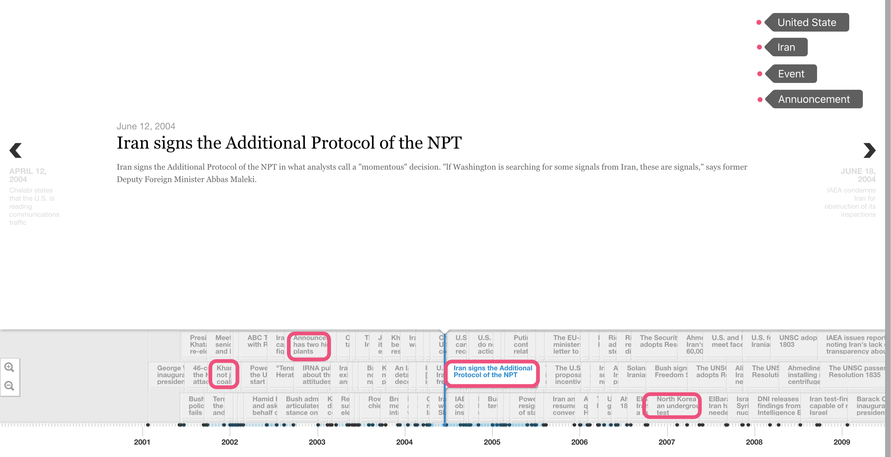
Project Pitch: Warpmap
Problem
There are so many news stories today that it is hard to keep track of what is going on. There are a great many stories unfolding at each moment all over the world and it can be difficult to see how they fit together.
Approach
This project seeks to create a new kind of world map that is warped by events. It will consist of two systems: the first will aggregate news stories from a variety of high-quality international news sources and the second will use the location of each story to slighty deform an image of a map of the world such that locations with many stories appear larger. The project will also remember history, so a user can move through time and see how the map warps differently. This will give a smooth, continuous, clear graphical representation of where the media’s focus lies each day.
Additional functionality may include the ability to filter by themes, like political, entertainment, or scientific news stories.
Audience
The audience is for researchers trying to see what parts of the world were considered noteworthy over time. Trends may emerge as different regions become more or less relevant to the news and grow or shrink over time. I think this project may also be of interest to the general public as a way to better understand all the important events going on around the world.
Skills Needed
- Curation: which news outlets are chosen as sources for the project?
- Design: how can we design a map that looks good even under deformation, and how should we design the method of deformation to be the most useful?
- Programming: how do we extract location from news articles, and how do we draw this deformed map on a computer?
-
Project Pitch: New platform for achitects
Problem
Famous architects design buildings that are treasures to humans. But only a few of us can have a chance to fully get to know them. What is more, even the most famous noted architect just use text and images (even video is rare) to show their works online. The value and knowledge behind one famous architect like I. M. Pei is enormous. What if we could figure a way to better integrate architects career and works to offer a new perspective for the world to better understand the power of architecture?
Approach
This project tries to design an interactive online system that can clearly exhibit architect’s work or research and provide a platform where reader could freely choose different data categories to make comparative study. There will be 2 dimensions of the project: time and location. The previous studies including US-Iran Project and Melville Project, they all dealt with 4 elements: time, location, text and image. But for an architect’s career mapping, it is more challenging because 2 reasons: the first will be the difficulty of representing 3D projects in a way that is other than 2D pictures. The other one is within every project, there would be also a timeline showing how and when architect got involved in the design.
Audience
The potential audience includes researchers, students, artists, visitors and so on. This project would be a great tool for researchers who is interested in the architect, or specific projects or studies done by the architect. It is also welcome to whoever needs detail info. and encouraging everyone to participate in editing contents and leaving comments.
Skills Needed
1.Design: Design methods to represent 3D experience and 2 kind of timeline in one project? 2.Implementation: Front-end and back-end web development skill.
-
Pitch - Virtual Curation
-
Harvard art museum
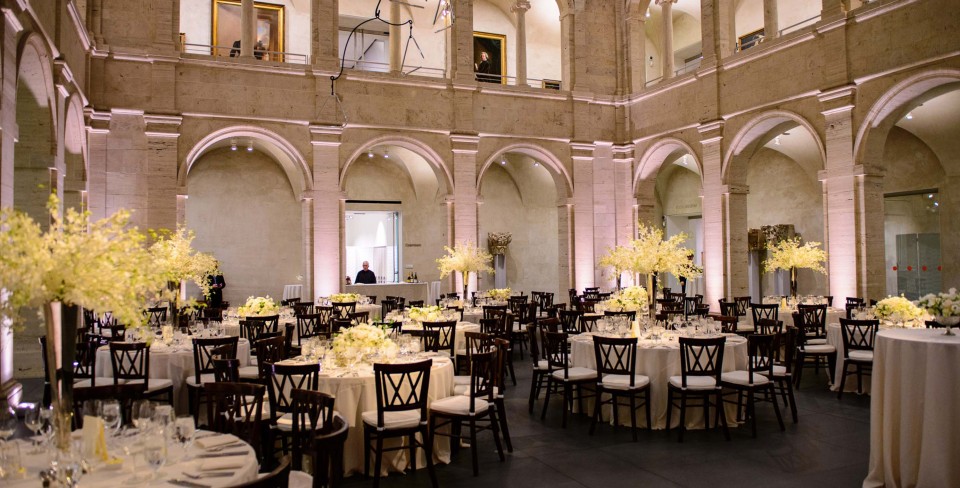
The place I visited during this week is Harvard art museum. Most of the visitors, to my knowledge, is the Harvard visitors and Harvard students (It is free for Harvard students). It is a very traditional museum that only technologies that used in the institution is the audio tour guide. However, the website is well made to help people browse the collections in advance or for the review. They even selected several hotspots to help people to plan their tour and know what to expect.

Like other museum, it has its own coffee shop. We sometimes would visit the café with no intention to see the exhibition because they made great coffee there. We even held a group meeting their once to get away from our studio for a moment.
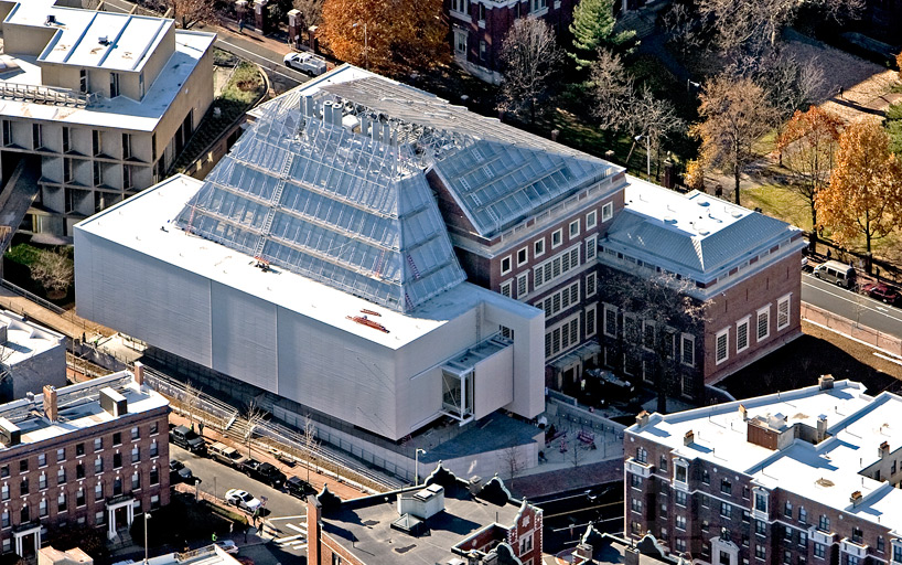
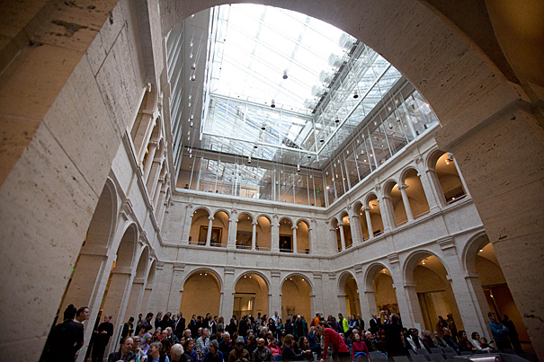
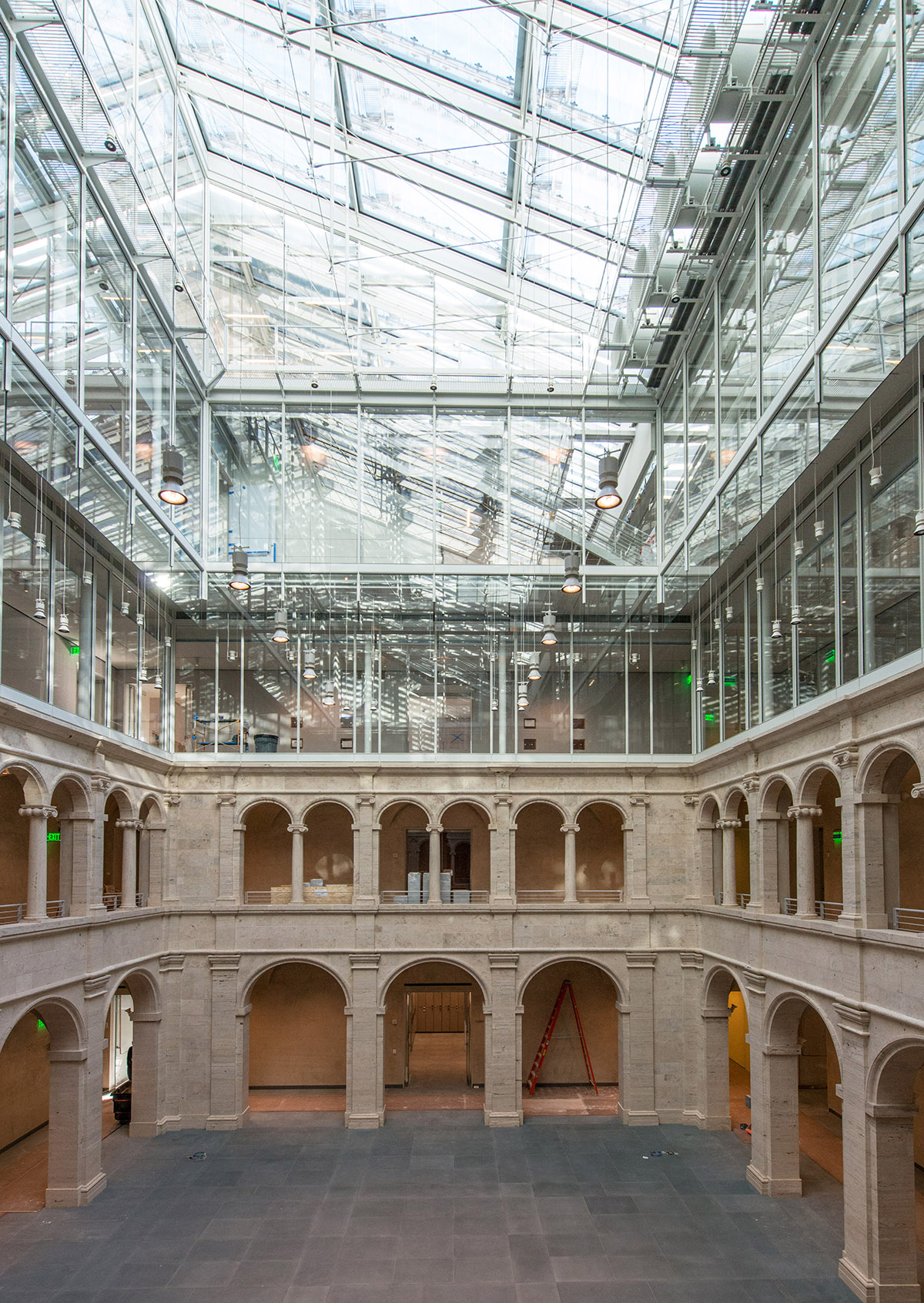
The biggest highlight in the Harvard art museum, except for its profound collections, would be its built environment. It was expanded and renovated by Renzo Piano, who is a master in museum architecture. Looking from outside, one side of this museum (the side near Harvard yard) is old school architecture, while the other side is modern. For the interior, it’s also the combination of tradition and modern. As we can see in the picture, the first and second floor is colonnade and the upper floors are replaced by modern material – glass and steel, repeating the rhythm of colonnade.
-
Whistle: A Modular Textual Analysis Tool
Problem Statement
Various different tools exist to analyze a text (document) as a single work or a group of texts (corpus) and the relations between them. Some well known examples are Voyant and Tesserae. These tools use computational techniques to augment humanistic research of texts. But they’re limited in that they’re not designed to work together; the analysis that Tesserae performs is not available to any tools in the Voyant suite, for example. I propose the construction of Whistle, a modular software tool that allows for many types of computational analyses, and then makes those results available to many different types of visual display. This facilitates the separation of analysis components and visualization components, which will lead to more composable and re-usable tools in the field of textual analysis, and ultimately provide humanists with better digital research aids.
Approach
The end result will be a web-based application for text analysis. It will allow users to manage texts and group them into corpuses, and offer a variety of tools that can operate on those texts and/or corpuses. We will focus on the creation of a single analysis tool (using fastText to output word vectors) and visual display thereof (finding similar phrases across documents, similar to Tesserae). But the system will be engineered in such a way that other tools can be added (both analytical and visual), and given sufficient time/resources, we would like to add those, too.
Audience
There are two audiences. One is toolmakers and software engineers who are interested in creating novel textual analysis tools. The second is humanistic researchers who would like to use these tools without having to understand the details of their implementation.
Skills Needed
- Software engineering: this project will most likely be written in Javascript from front-to-back, for development ease and speed, although analysis tools may be written in or use tools written in other languages.
- UI/UX design: many digital humanities tools suffer from difficult-to-use interfaces. Ideally our end result will buck the trend.
-
The Perils of Omeka
The Perils of Omeka
With so many photos to pick from, there were many possible narratives. We decided to try to tell a story involving women: in the public realm, of different classes, in relationship to public space. We narrowed our focus to show all of the way that women subvert the idea of “nobility”, through action, dress, or role. You can view the Omeka collection here.
As you may be able to tell from our final result, we had lots of troubel using Omeka to this end. I have rarely used less-friendly software. The curation process went something like this:
-
Browse the photo
.jpgfiles, and assemble a collection of files by copying the relevant images into a separate folder. Omeka fails to provide any tools for performing this act of curation, only listing and displaying previously-curated images. -
Create a new
.csvfile containing only the metadata relevant to these photos, by searching through the full data set for one row at a time. -
Write code to convert the
.csvfile encoding fromWINDOWS 1252toUTF-8so that Omeka would properly render non-US characters with accents. -
Manually upload images for each of the items that Omeka was able to import from the
.csvfile. -
Repeat all of these steps because we changed our curation concept to the one described above. Give up halfway through because it’s a waste of time.
Omeka does a terrible job of generating interesting, useful, websites. It is impossible to dictate the order of the items in the display of a collection. There is no full-screen image viewer. The output website is bland and difficult to theme. The importing options are rigid and badly explained. All in all although we felt that curation is worth practicing and an interesting academic and practical subject, Omeka was a bad tool to use given the difficulty involved.
-
-
miles-pitch
Final Project Pitch: Olympic Artistic Statistics
This pitch refines some of the general ideas I presented a few weeks ago when introducing my research on the Olympic Art Competitions. As I mentioned then, I would be happy to steer this project in different directions based on whatever interests there might be among other teammates who would want to join me, but for now, I’ve worked out the following proposal for a connected game and website.
The problem that I propose to address is the following: why were certain works or artists successful in the Olympic Art Competitions? I want to pose this question not only to my research team, but also to others learning about the competitions for the first time.
Approach
As such, I want to draw a general audience into the database of the site by way of a game of our own: a quiz that acts as the invitation to the more informational pieces of the site. Users will see a set of artworks from a given year and guess which ones won gold, silver, bronze, or nothing. Players will get scored based on how well they did and then get to see the real results.
The home page, then, of the non-gaming site, will be a podium page, allowing visitors to see the winners for different years and categories. To learn more about why these particular works might have been successful, we’ll construct pages that isolate certain variables…
- A Map page. This interactive heat map will show who competed and who succeeded when different nations were hosting the Olympic Games. It will also be able to show where the judges came from, in different years.

- A Works page. Using statistics from my scrape, this page will chart the importance of certain topics and styles (sports depicted; nationalist vs. internationalist themes; classical vs. modern forms; etc.) for the content of individual works

- An Artists page. Using analysis of the text of the “Bios” provided for most of the artists on sports-reference.com, this page will try to determine trends among the winners and losers—before and after they chose to compete in the Olympics.
One challenge of this project that I should mention is that, while I have scans, photos, and downloads of many Olympic art submissions, I do not have explicit permissions to use any of them. I would have to learn a bit more about fair-use rules to see what would be publishable online.
Audience
In my dissertation, I’m approaching these Olympic Art Competitions from an interest in modernism, and I’m orienting my work toward other modernists. Here, though, I’d prefer to create a website that’s inviting for any enthusiast of art history, the Olympics, or sports: I’m imagining a general audience, from those who know a little about the arts of the early twentieth-century to those simply interested in an odd curiosity of the early Olympic Games.
Skills Needed
The necessary skills for this project would include web design with a few simple interactive features, quiz-game programming (for the first step of the project), some mapping (in keeping with the projects we’ve done already), possible basic text-analysis for trends and correlations (for the Bios section), and a good design sense for displaying art images (for the game and the Podium page in particular).
Enter text in Markdown. Use the toolbar above, or click the ? button for formatting help.
-
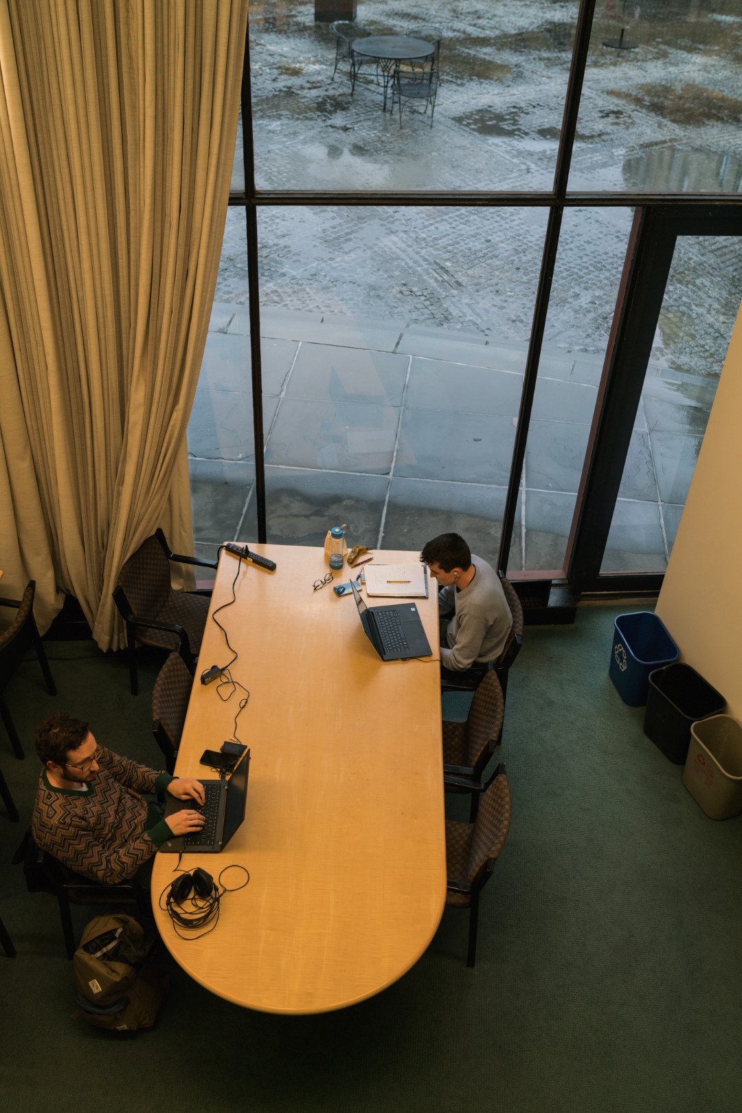
An Ethnography of the MIT Libraries
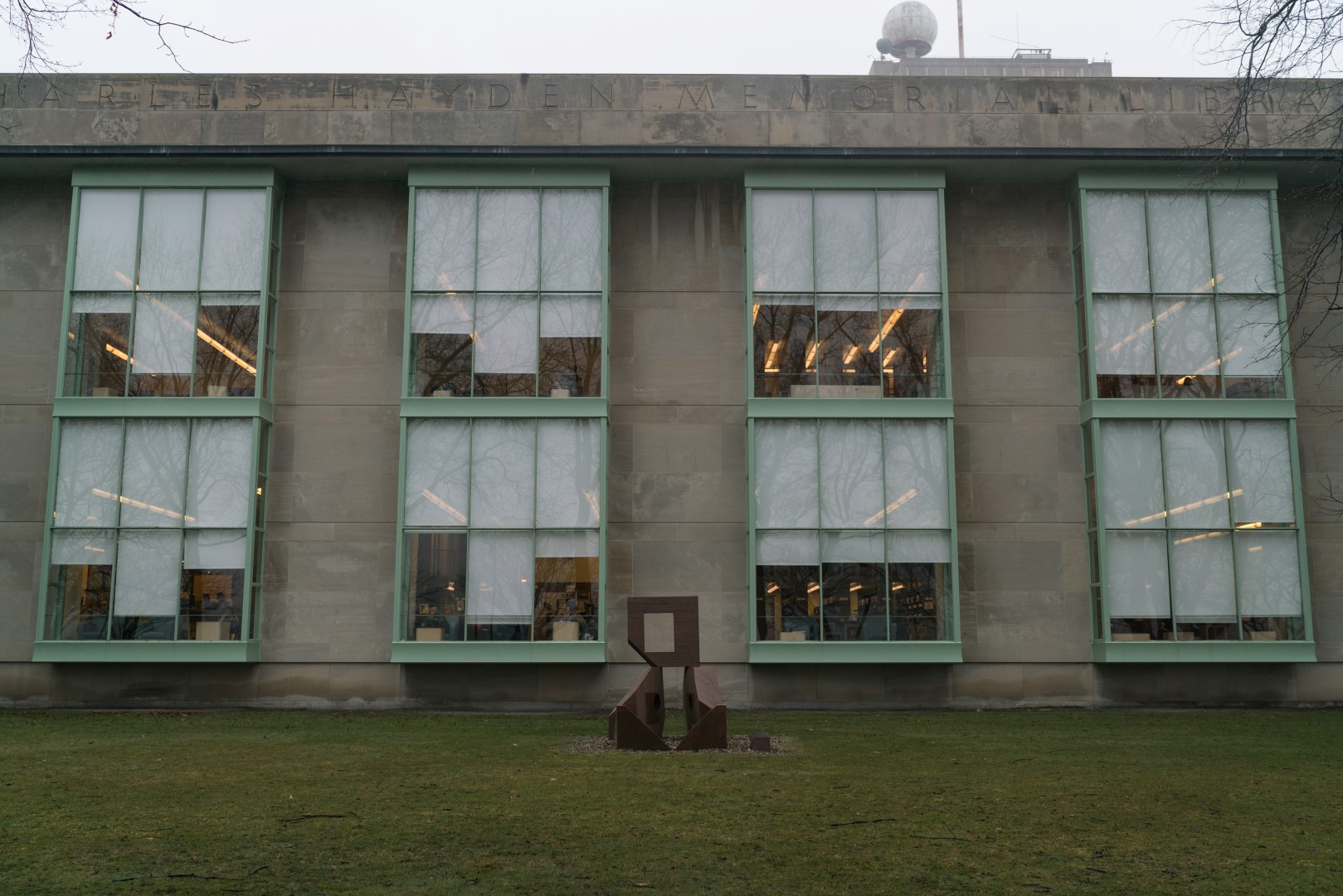
An Ethnography of the MIT Libraries
I chose to explor two of MIT’s libraries, the Lewis Music Library and the Hayden Library. This is not all of the libraries that MIT has to offer, but they represent the range: Lewis is specifically targeted to music and has resources to that effect, whereas Hayden is much larger and serves many different purposes.
Technologies
- Large TV displays behind the checkout counter announcing events.
- Question-and-Answer easels with markers to collect community feedback.
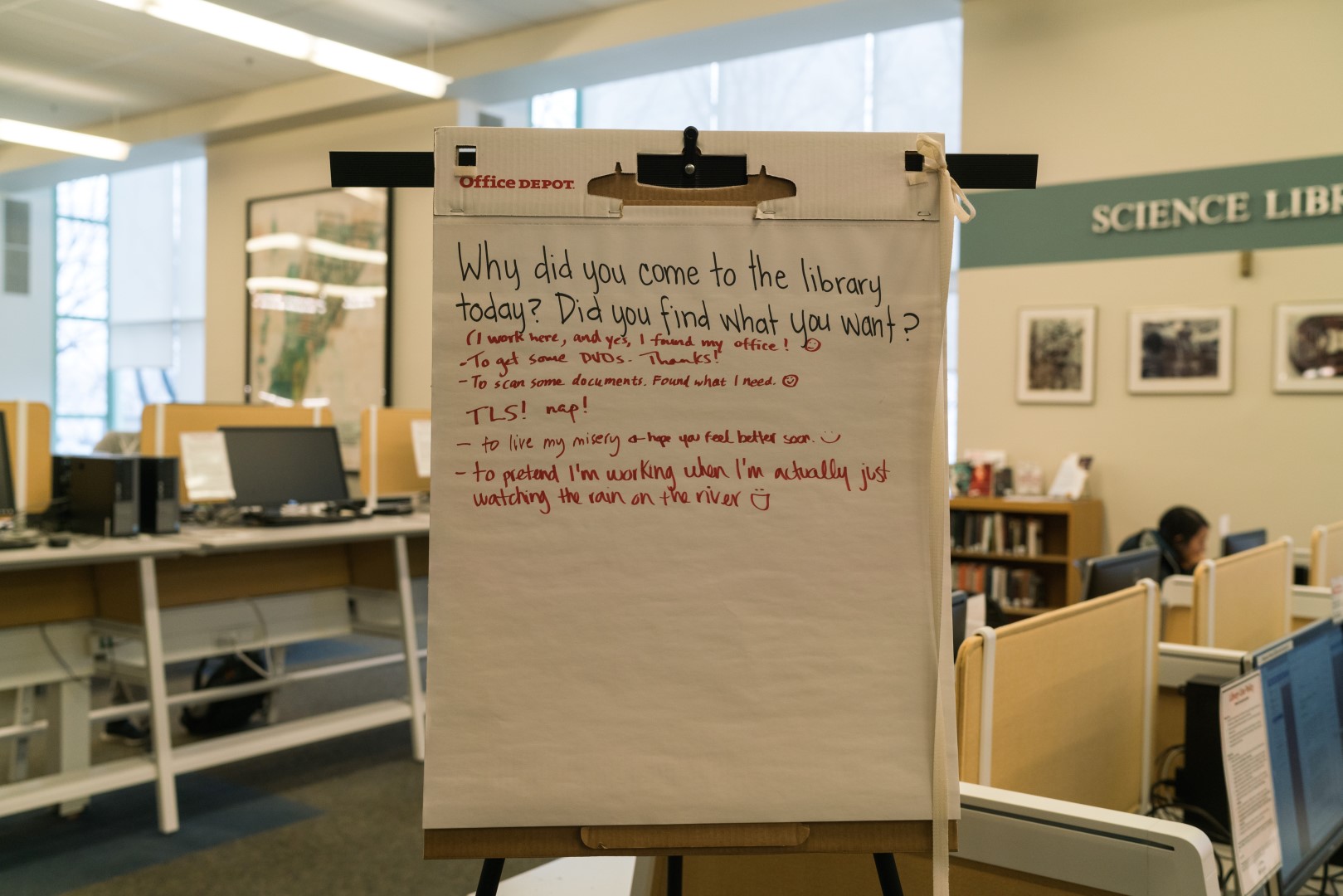
- Computers that can be used to search the collection as well as behave as Athena workstations.
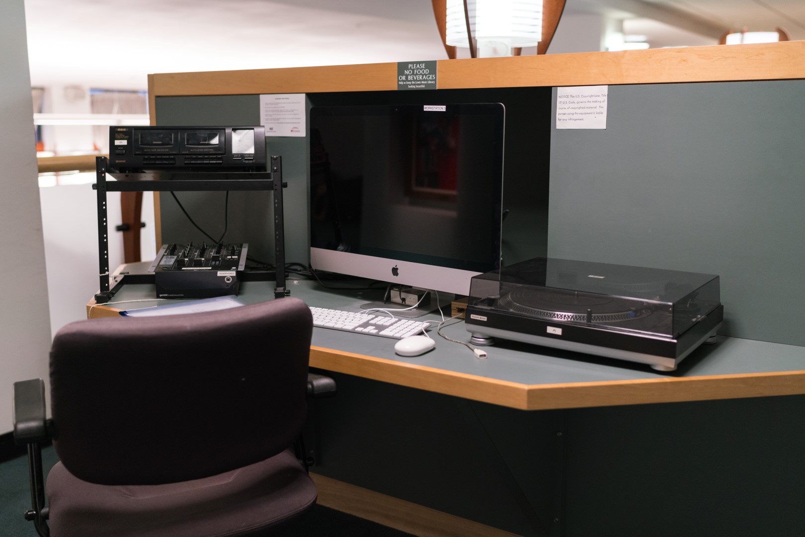
- Computers for listening to and recording audio media.
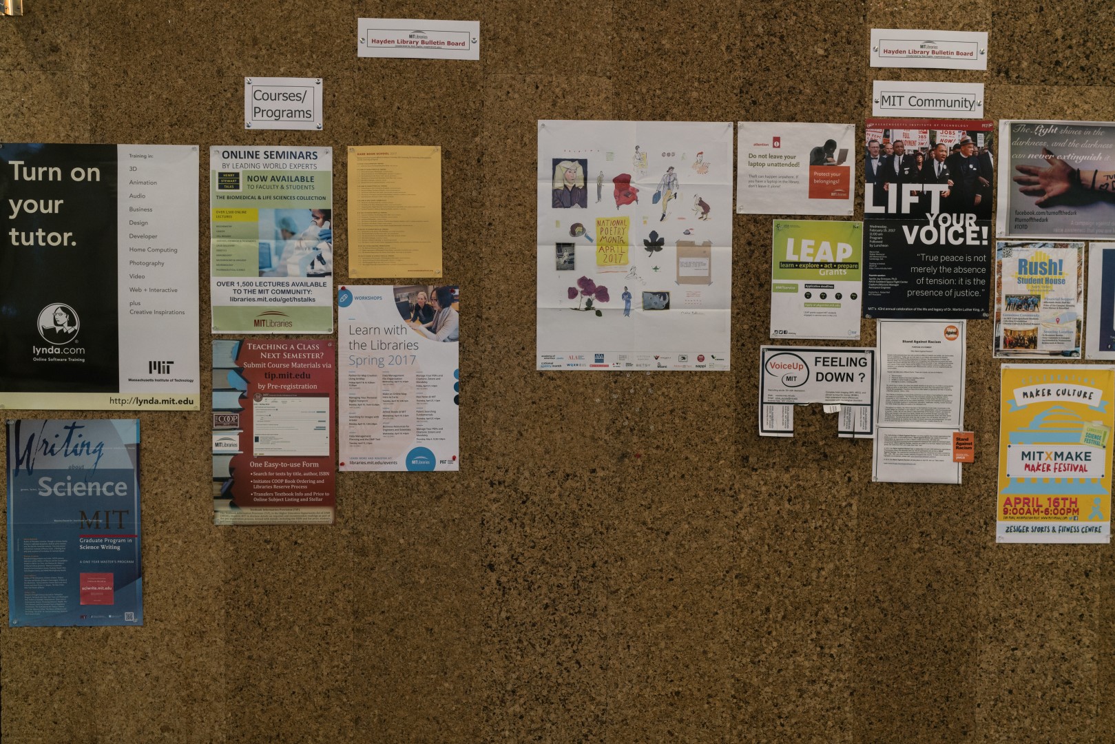
- Corkboards announcing community events, courses, and programs.
Use of Space
Although not this trip, I often see students napping in the various libraries. And I believe that enough people use them as meeting spaces for group work that the group work rooms were created and dedicated to that purpose. In the upper floors of Hayden, bookshelves have been dismantled but reading desks remain. Most visitors seemed to be using digital resources.
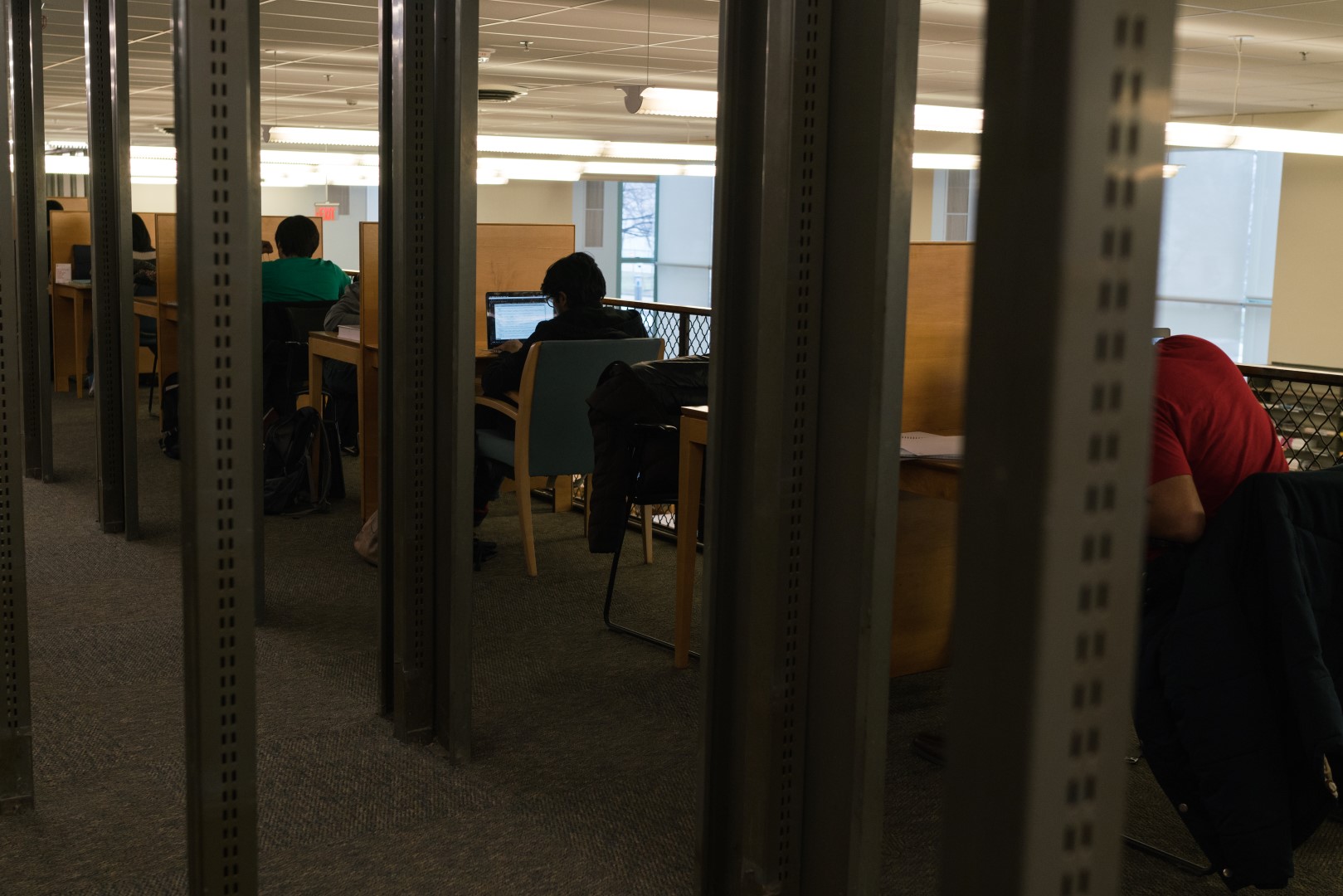
The overall impression that I have of the spaces is of quiet concentration. There is very little intentional noise, and the spaces feel welcoming. Many students visit the libraries in an effort to inspire themselves to get work done – the environment feels dedicated to that purpose. The flipside of this is an implicit/explicit discouragement of social interaction in the main areas. But, the libraries hold open community events and have dedicated spaces for group work.
Demographics
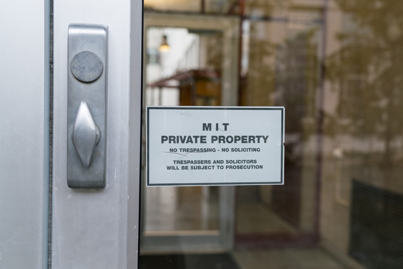
Mostly students. I saw one professor in the Lewis music library, and a few adults in Hayden who may have been students or professors, I couldn’t tell. Everyone seemed to be affiliated with MIT. Although the libraries have no admission or identity check at the entrances, those entrances do not advertise themselves to the public.
Lewis has a entrances to a courtyard and hallway inside an MIT Building. The exterior entrances to those buildings do not advertise its presence.
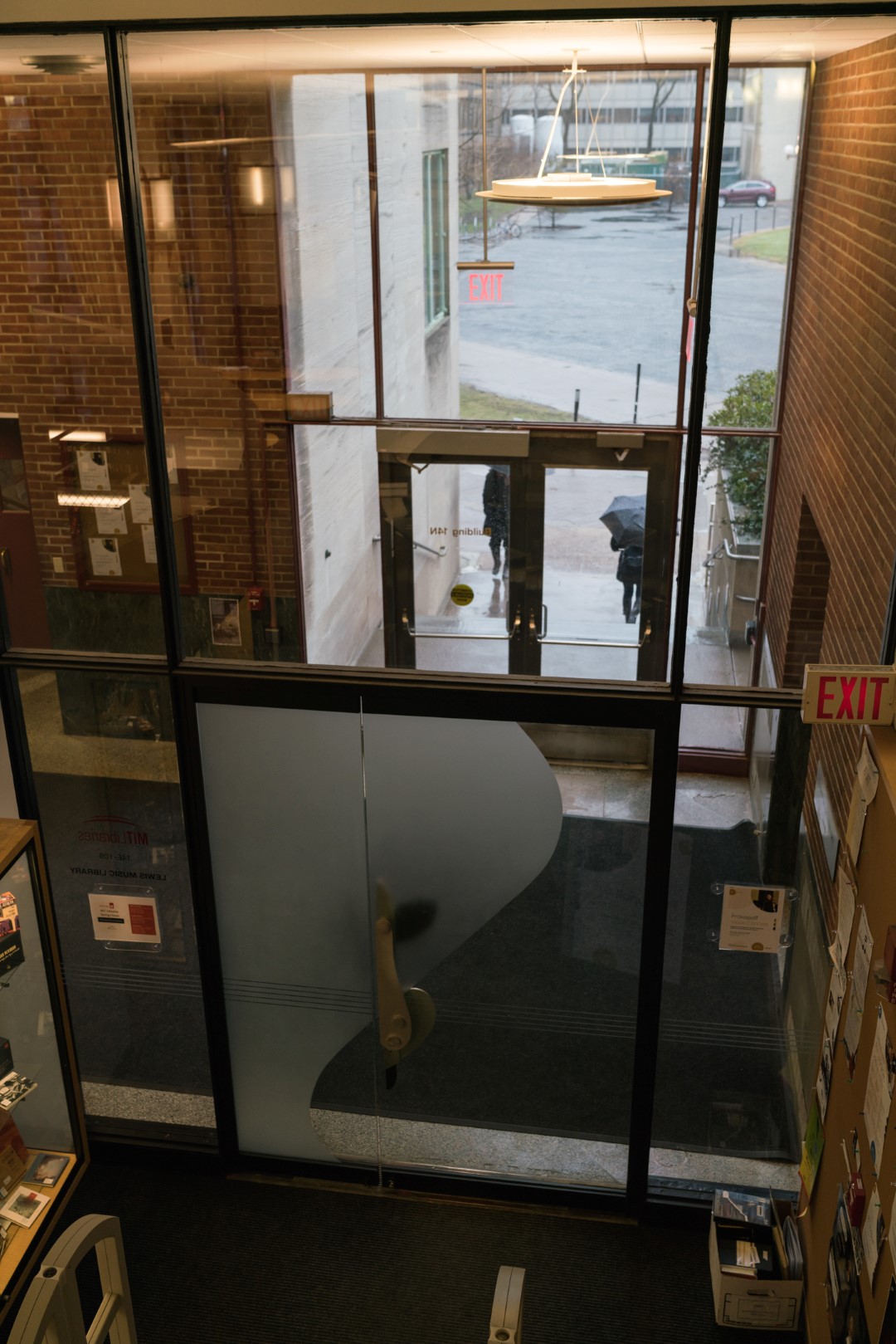
Hayden has an entrance from the same MIT building that holds Lewis, as well as a publically accessible entrance from the river drive. But this is not an easy entrance to use for members of the public in general, as there is little parking to be found, and it is not a common area. In addition, although the library name is visible, it’s hard to read and so it’s not clear that it’s open.
Indeed, the main doors discourage “trespassing”, although MIT does allow anyone to walk in to its buildings during the day.
-
Topic: Platform for playing
The Museum of Science is located as a bridge across the Charles River which enjoys the view from both side. It could be regarded as the paradise for families especially those with children under 10. Everywhere is full of activities and interactions are not only between participants and objects but also participants with participants, for children like to join children’s play.
The three wings each have specific topic and installations are arranged comparatively free (image 1) compared to formal galleries like the MFA. There is no fixed route and no concept of showroom. Corridors are enlarged from time to time for installations and devices. Games(image 2) are the main way to show and attract children. You may touch the screen for further information of the milk-way or go up and down stairs again and again in order to hear the sound of the stairs (image 3). The sound stair is really interesting for the space component is a part of the display of scientific knowledge. There is also live animal feeding room (image 4). The kitchen is open and you can see the staff busy preparing lunch for the animals. Audio explanation and Augmented Reality like the 4D theater also provide multiple experiences for children.
The museum is a successful case for the space itself could be seen as a platform for play. All the devices are toys. Technology helps to build various ways of playing and experience. It is user centered and experience concentrated.
There is some unexpected “parking lot” of the trolleys and some parents may take them as portable storage boxes. It is really interesting to see them as a show of various trolleys (image 5).
 image 1
 image 2
 image 3
 image 4
 image 5
Enter text in Markdown. Use the toolbar above, or click the ? button for formatting help.
-
Kelsey, Thatcher, and Yuchuan's Marais Exhibition: Time and Class in Marais
Our approach to making this collection was to find a subset of the available photos that told a compelling story. The hardest part of this project was deciding on what our focus would be. We eventually settled on displaying pictures of people in the neighborhood over the 17th, 18th, and 19th centuries with a focus on class.
We wanted to explore how the social class distribution of Marais changed over time and how members of class were displayed. We hope with this approach that a narrative will emerge as the pictures of members of the lower, upper, and bourgeois class are viewed with the progression of the centuries in mind. The original collection had a great deal of engravings and portraits depicting people in France and the Marais area of various classes and over many years, so we have good coverage over all the people we wanted to display.
Our exhibition can be found here.
-
Yuchuan, Thatcher, Miles, Xinwen 3.22
Proposal
We think it would be a great idea to sort all the locations not only by time, but by the activity and space type. Thus we can have a clear vision about what Melville is doing. And a heat map to show the frequent visit area.
Step1: Sorting out the location by activity: Arts, Church, Eating, Errands, Literary, Meeting, Passing Through, Sightseeing, Stop, Vehicle. Sorting out the location by space: Bookstore, Birdge, Church, Court, Gallery, Hill, Park, Parks, Square, Station, Theater.
Step2: Making map based on the category and Assigning every activity/space type different colors.
Step3: Making a heat map
https://tangocharlie.carto.com/viz/ad5bb59a-0e5f-11e7-a7e6-0e3ff518bd15/public_map
-
Assignment 5: Visualizing Time, Space, and Narrative
Proposal
Based on the mockups, data, and our own interests, we propose to visualize Melville’s travels in London. We’d like to show his routes through the city in a way that allows the viewer to understand where Melville travelled: which neighborhoods, which roads, which landmarks. The viewer should be able to pick out which days they’d like displayed on the map at once.
As a potential augmentation of this idea, although subject to time and technical constraints, we’d like to also dynamically show a histogram of how frequently each location was visited. This would be updated based on the days selected.
Process
After exploring the two datasets (of Ibn Jubayr’s travels in the Middle East, and Melville’s travels in London) we brainstormed a few different ideas. Based on the nature of the data, we’re certain we want to incorporate a map as the main visualization element. The way the map functions will be different for different goals.
Some raw ideas based on the data:
- Ibn Jubayr:
- Calculate the speed of travel, particularly between major cities, and visualize the routes based on the speed (faster = easier, slower = more difficult)
- Calculate a “similarity” relationship between all of the places based on the text associated with each entry
- Melville:
- Use a heatmap to show which places, roads might have been visited most frequently
- Create a “cast” of the people Melville met with, and show where they interacted, filterable by character
- Visualize how far Melville traveled each day based on modern-day walking routes between these places
- Explore which days were similar in terms of destinations and order thereof, to try to see if Melville kept to any sort of routine or routines.
Some ideas with mockups:
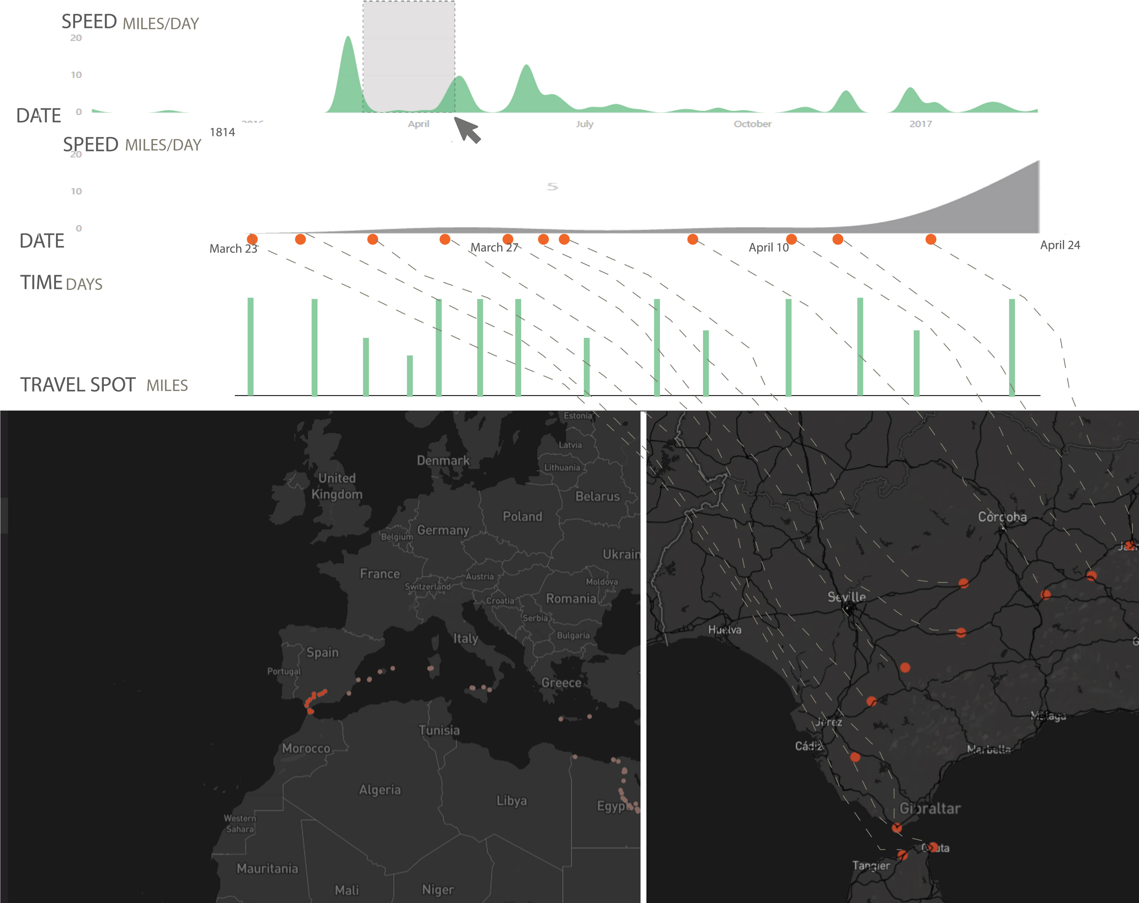
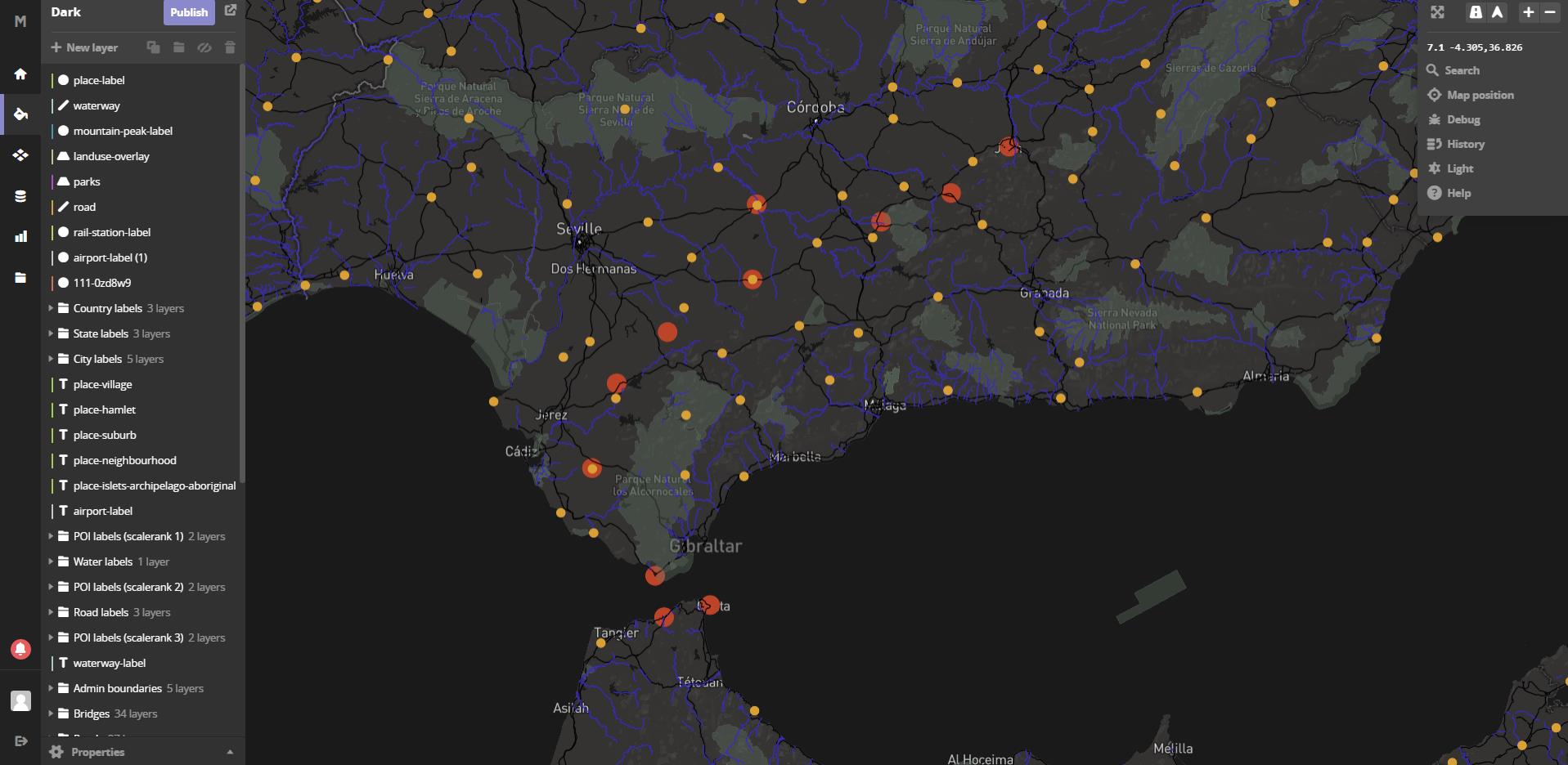
- The relationship between the present major road, waterway, and travel spots, to their location in antiquity. Maybe limited to those near current major roads.
- The relationship between thhe present-day village locations and the travel spot. Maybe Ibn Jubayr stayed nearby the town, or in a particular neighborhood in the town. Although we’re not sure the coordinate data is that precise, and may just code to the center of each town.
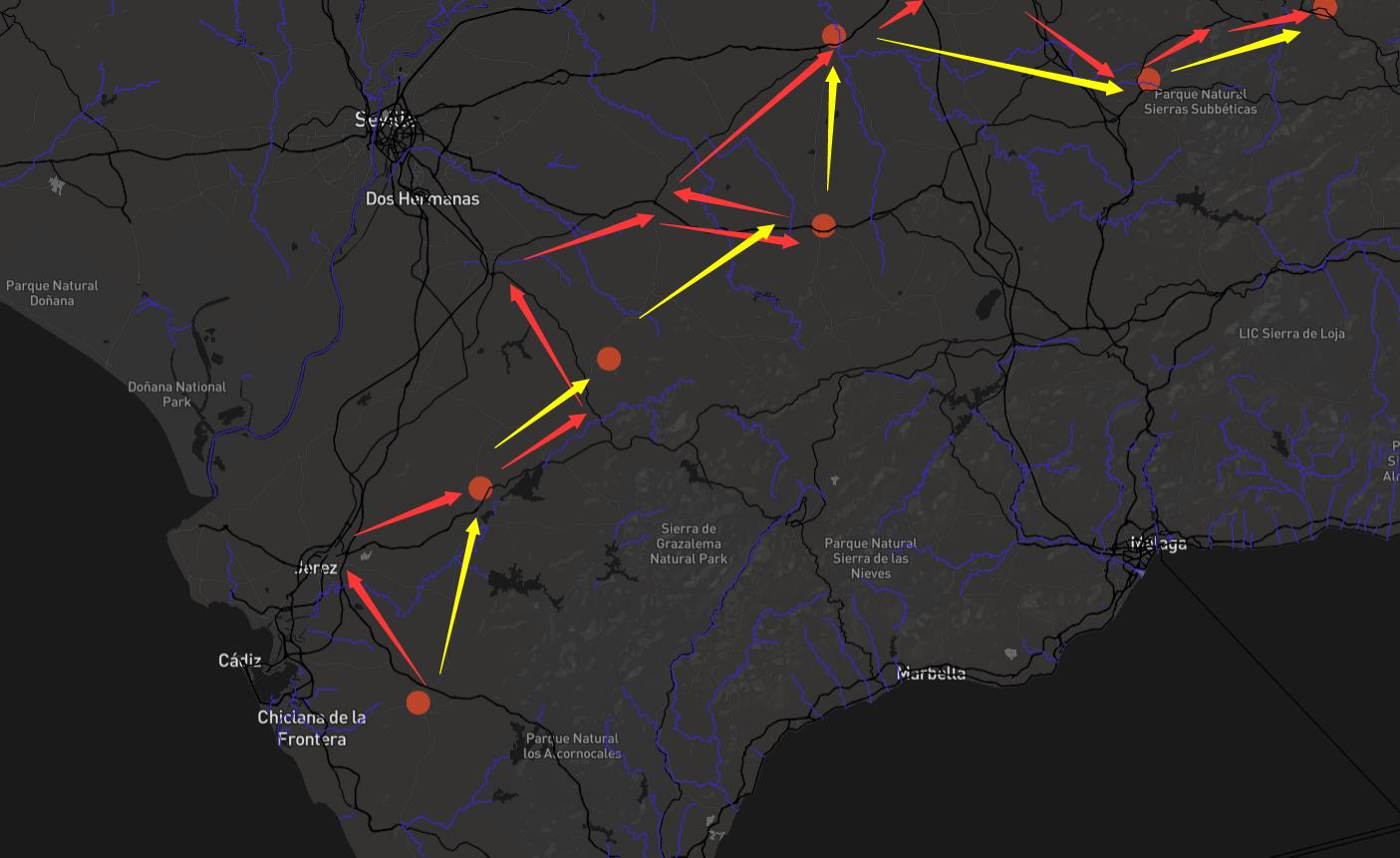
- Comparing the relationship between travel time then and now, based on estimated routes between the cities using today’s technologies. We can see if Jubayr’s rout is along the present major roads or a more direct way. How long would his trip take today?
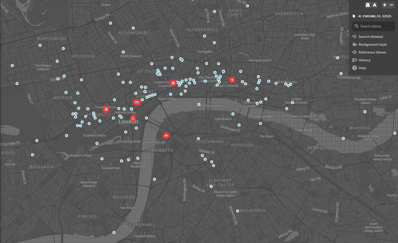
- If we can filter the entries to only include those for landmarks, we can see which landmarks Melville visited and how frequently.
- If we can filter the travel spots based on date, we could see his travel schedule (and an estimated quickest-route based on today’s roads) to see his travel schedule. How far would he have walked every day?
- if we can find the years that certain places were built or destroyed, we could highlight places he visited that no longer (or still) exist.
Technologies
- For maps, we will use some combination of Google Maps, Mapzen, and/or Leaflet for displaying points and routes. Both Mapzen and Google Maps have APIs for calculating routes between places using modern-day roads.
- For filtering and search of points, we will use custom javascript.
- Potentially, we will use one of the timeline tools we’ve discussed in class to allow a user to select ranges of dates or events, if necessary.
- Ibn Jubayr:
-
Miles+Thatcher+Yuchuan+Xinwen
Mapping Melville
We started by converting the csv data into material suited for TimeMapper in Google Sheets. As we knew from the US-Iran assignment, TimeMapper has some basic limitations (e.g. inability to differentiate different kinds of events), but for this assignment it posed different problems. TimeMapper zooms out pretty wide in space and time by default, so it doesn’t suit urban mapping too well; all points are marked in uniform fashion, so it’s impossible to differentiate different walking routes at a glance; and events happening on the same day cannot be distinguished according to a more precise chronological sequence, so events end up stacked on top of one another in the timeline.
http://imgur.com/LWbGE3N http://timemapper.okfnlabs.org/anon/rvtb7n-melvilleinlondon1-fortimemapperxlsx#2
Dining Place in London (mapbox) https://api.mapbox.com/styles/v1/ida021/cj0bfvkgl00242smczznj7kw2.html?title=true&access_token=pk.eyJ1IjoiaWRhMDIxIiwiYSI6ImNpeWt1MTFsYzAwMXoyd25yeGxrdmp6ZzAifQ.oqwV5oqH9qs-OYqKl4U_aA#13.2/51.5105/-0.1145
After filtering all the dining place in that excel, I found out his favorite restaurangt is Adelphi Theatre, Strand. He has been there 8 times. And second favorite one is St. James’s Square (2 times).
Here’s a CartoDB map that shows his first 10 tens in London by color.
-
Fusion Table Commentary
MobyDick Fusion Table Commentary
[I was unable to load this onto Github last week (3/8) and I forgot to send it to Josh along with my images / URLs. Here’s the commentary I wrote on the assignment.]
This is a really neat program and procedure. I could imagine myself using it for my Olympic artist addresses, among other things. To reflect on the limitations: it does seem as though the visualization options are a little limited for now, I suppose. Even if I had the coding skills to overlay a different map, it would be useful to be able to customize the points / heatmap-circles as well. Even allowing for varied colors with a key would be useful, to distinguish (in this case) different kinds of geographical references. And there isn’t an obvious way to alter the mapping choices made by the Google GIS. This is a particular map projection with particular biases, and it would be hard to imagine attempting the variations, corrections, or subjective distortions imagined by Bodenhamer’s “postmodern scholarship,” however much these might be useful inflections for conveying the experience of the novel or other experiences particular to Melville and his era.
Enter text in Markdown. Use the toolbar above, or click the ? button for formatting help.
-
Tufte – Envisioning Information – Color and Information
Tufte’s Envisioning Information is by far the most beautiful text I’ve had to read so far this semester. It certainly establishes authorial credibility. When it comes to color, he promotes the following ideas:
- Use no more than 20-30 different colors when encoding abstract information. Beyond that it is too difficult to distinguish individual colors.
- Color can be used:
- To label (color as a noun)
- To measure (color as a quantity)
- To represent or imitate reality (color as representative)
- To enliven or decorate (color as aesthetic improvement)
- All colors live in 3-space: hue, saturation, and value
- Color can improve information density
- Look to nature for inspiration for color choices
In particular, I payed attention to his commentary on digital displays compared to the screen:
Noise is costly, since computer displays are low-resolution devices, working at extremely thin data densities, 1/10 to 1/1000 of a map or book page. This reflects the essential dilemma of a computer display: at every screen are two powerful information-processing capabilities, human and computer. Yet all communication between the two must pass through the low resolution, narrow-band video display terminal, which chokes off fast, precise, and complex communication. Color can improve the information”
In my experience the interface bandwidth is much more limited by the tools we use to interact with the computer (keyboard, mouse, touch pad), but I understand his point. Even large screens don’t feel like they’re large enough compared to books, and I think it comes down to density – we can easily bring a sheet of paper closer or further away to change the amount of information we’re receiving, but the equivalent gestures on a computer are non-existent, or technically challenging. Even with the advent of high-density, large-format displays (I have two 3840x2160 pixel displays on my desk, one at 32” and one at 28” in diagonal) it’s much easier to read on paper.
But on the other hand, some kinds of visualization are enabled by digital interfaces that aren’t as easy to understand or are simply impossible when represented on paper. Any kind of interaction, for example, particularly panning and scrolling through a 2d or 3d space. And even zooming, which I mentioned above, can work better in digital, as long as there is no constraint that all of the zoomed-subject be visible at once.
I’m excited to learn more about the kinds of interactions we can take advantage of with digital representations. The space is very much still unexplored. While we explore it, we will do well to remember another of Tufte’s recommendations:
“Above all, do no harm”
-
Play with fushion tables-filter information
My focus on filtering information.
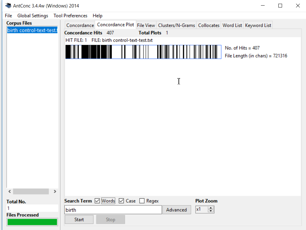 Fusion Table is a Location based map, easy to start for beginners. The locations are all recorded as points. The heat map could show the density of points.
 Based on all the locations, I wonder if it could filter data for specific locations. I choose the latitude as my way to filter data. For one specific number, it is easy to do and will calculate the total number for you.
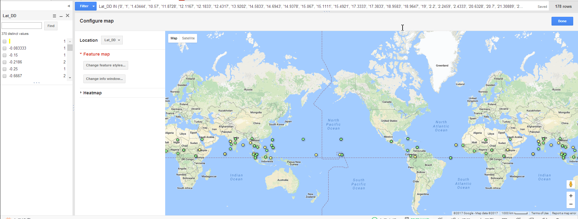 But when I would like to select a range, it is not so convenient. I tried to select the locations between the equator and the Tropic of Cancer. I need to choose them one by one by hand from the left column.
 For further filter, I tried to change feature styles and use the buckets and take year as a way to further differentiate tha data.
It has achieved two-step selection by now but they are all fixed data. Time could not play its role in presenting the sequence from the earliest to the latest. I hope that the points could appear dynamically from the earliest to the latest.
Enter text in Markdown. Use the toolbar above, or click the ? button for formatting help.
-
Moby Dick Fusion Table
(link in case the embed above doesn’t work)
I found Google Fusion Tables to be a rather limiting tool. On the one hand it handles a large amount of data well. Other similar web apps I’ve used in the past become very slow when dealing with datasets of locations numbering over one thousand. On the other, Fusion Tables offers little in terms of customization.
Other programs, like CartoDB offer many different map types. Besides the feature map and heat map that FusionTables offers, CartoDB offers clustering-type maps with a variety of visual differences as well as the ability to filter through time. In this case, for example, it would be nice to have a slider to select a certain range of pages or sequences in the book and show just the locations referenced in that range. Fusion Tables does not offer that as an option while CartoDB does.
Fusion Tables also fails to let you interact much with data besides just location. There is an option to change what image is placed on each location based on a binning mechanism (which I used in my project above), but you are limited to ten bins and you can only change the color and shape of the feature markers. CartoDB exposes a full PostgreSQL query interface that allows the user to make complex relations between any and all fields in the spreadsheet and the different parameters (size, shape, color) of feature markers. I like having the ability to define these kinds of relationships because they allow me to show more information. In Fusion Tables, I have to click each feature to see its exact page, while in CartoDB I could set the color of each marker to be in some way proportional to its page number. Alternatively, I could place bigger markers on the locations that are featured heavily in the book, like Nantucket, by counting the occurence of each location using a SQL query.
I think CartoDB is a much more powerful option for this project.
-
Miles' FusionTable project

More here
-
Playing with Fusion Table
My work isn’t embeddable or linkable, because Google Maps
is trash andwon’t let you use it on a real website without an API key. But it looks really pretty!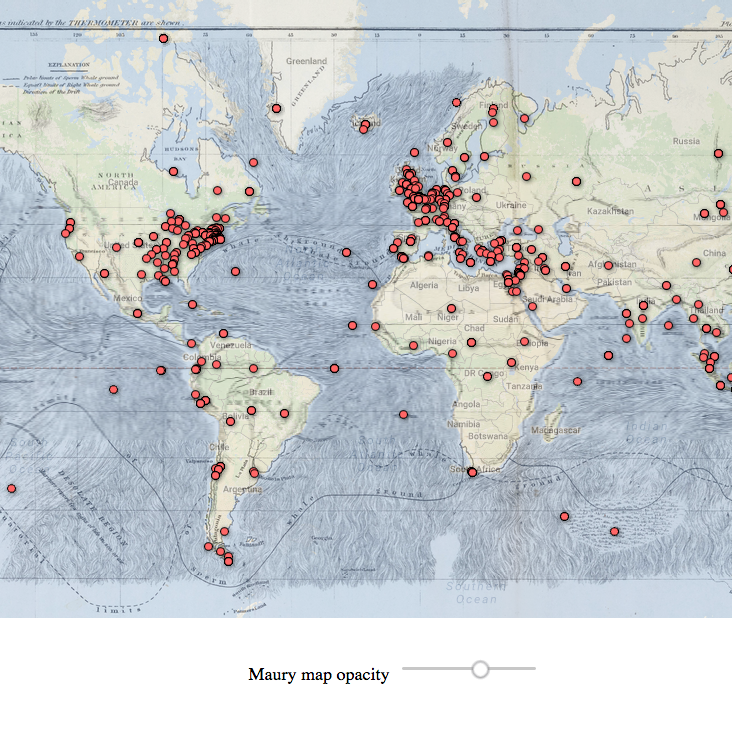
You can download the raw HTML of this page and open it on your local computer to see the final product.
Fusion Table was pretty good for a web-based spreadsheet viewer in that it handled many rows without crashing. With the guidelines I was able to complete all of the required tasks but without them I would have been lost entirely.
Having worked with Google Maps in the past for custom data visualization, it’s pretty much the default game in town – the other major competitor being Mapbox, which doesn’t provide as many features. So although it’s not as good as an experience as I’d like, it’s the one to which I’ll return in the future.
-
Assignment 4 - Xinwen
As an open source map, google fusion table is not as strong as Arc Map since Arc Map have way more tool box and customized setting. Also, its user interface is not as good as Mapbox, which is also a open source map platform because Mapbox could provide a great amount of existing style and allows you to design your own style.
map link: https://www.google.com/fusiontables/DataSource?docid=1edhGSArphJQJOKVoAm-EDKpu9MzdEfxFiNYCMPAf
As for this specific map, it would be nice to show the sequence of location in term of the page number of these location.(yellow stands for the earliest)
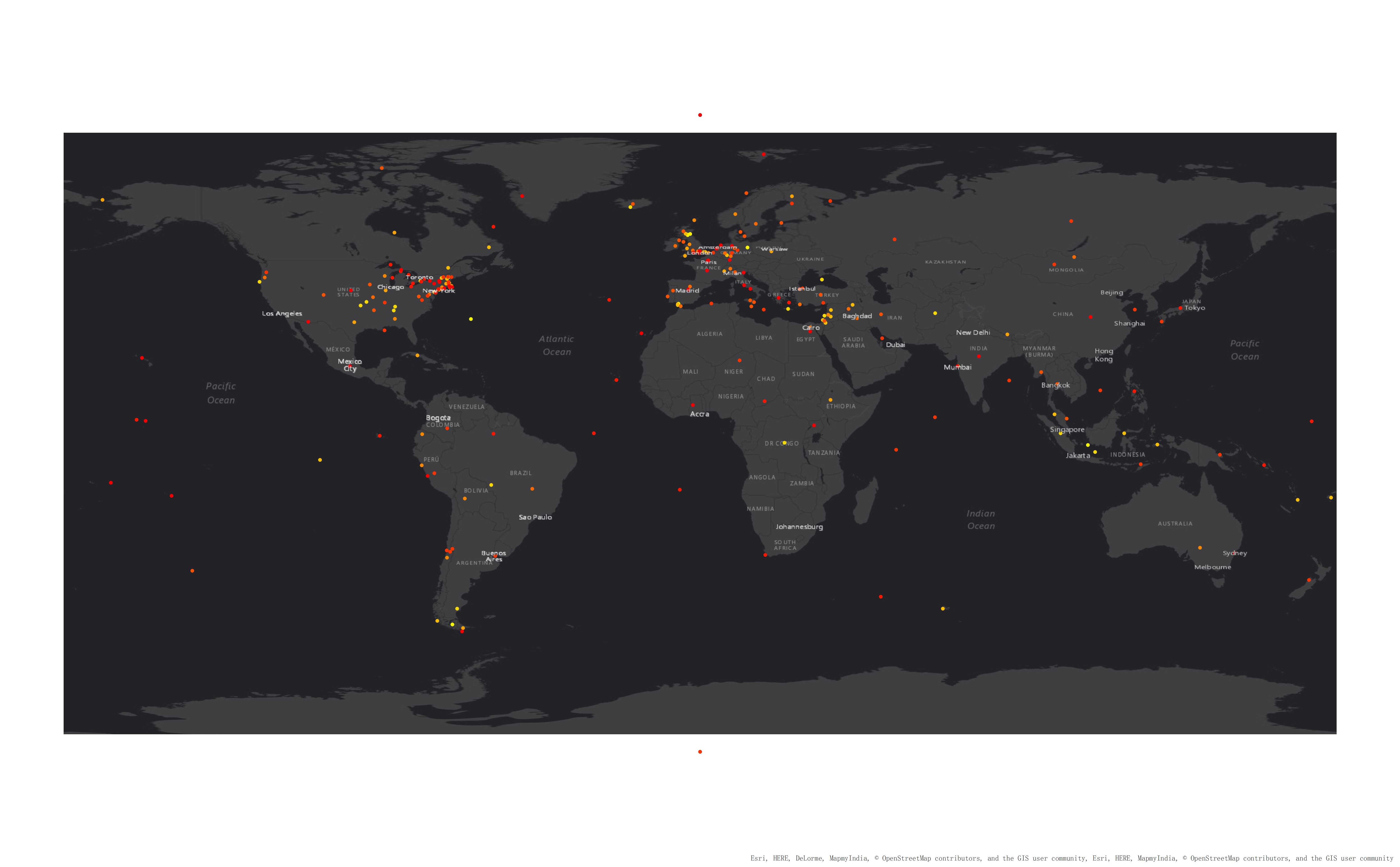
After adding the sequence of these location, this map is still not user friendly index. Therefore, in my design, once you click one location, it will show related pages and context. It will definitely save the researchers a lot of time to find the corresponding text.
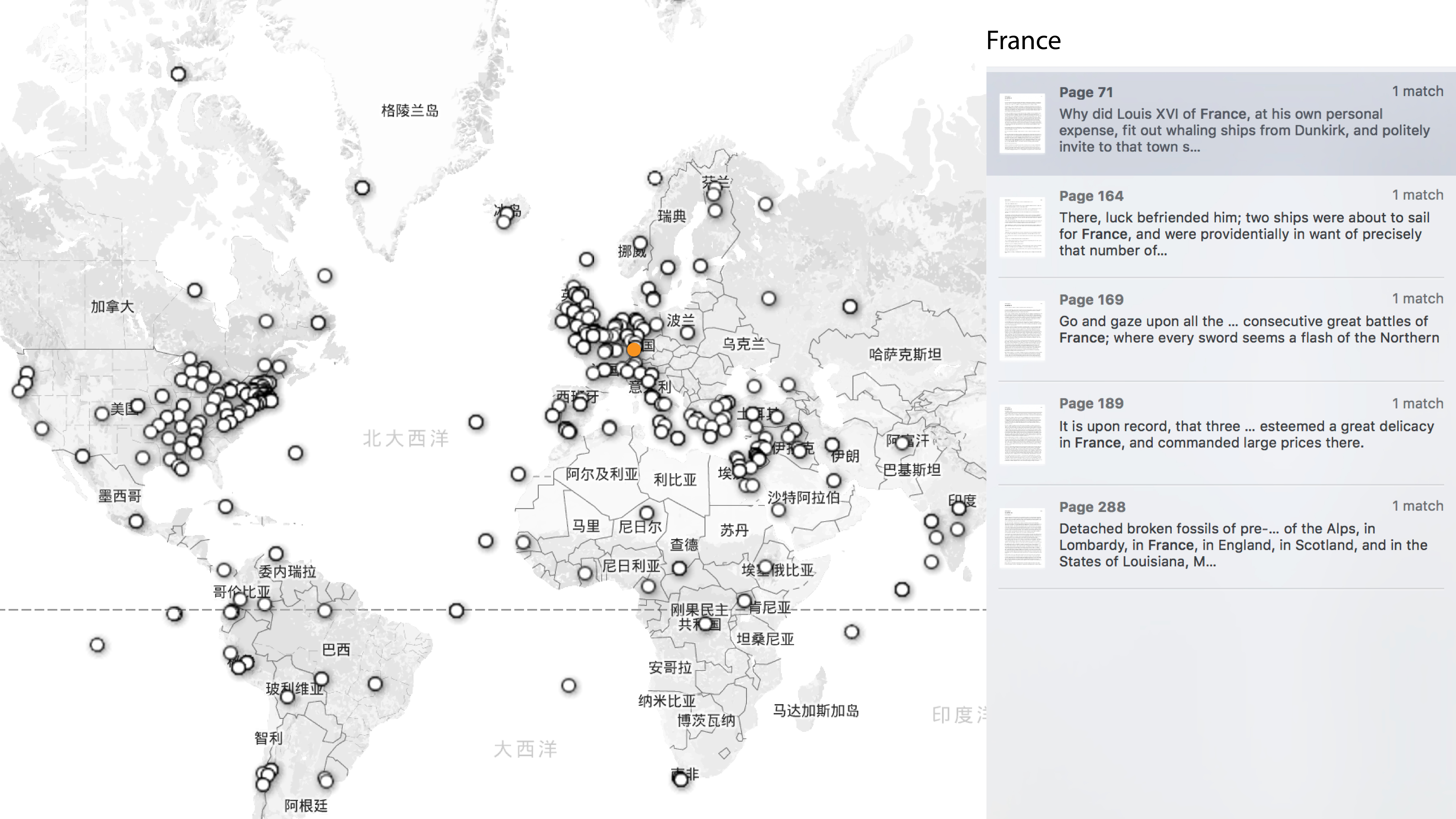
-
Moby-Dick Project

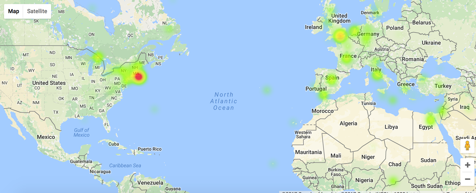
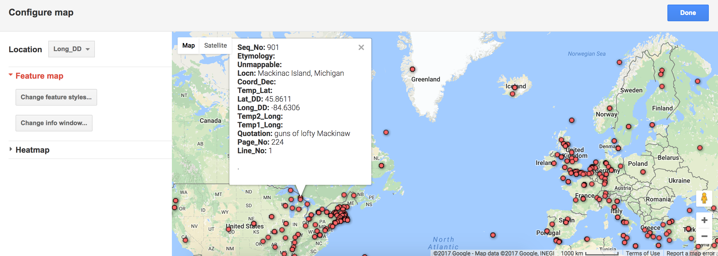
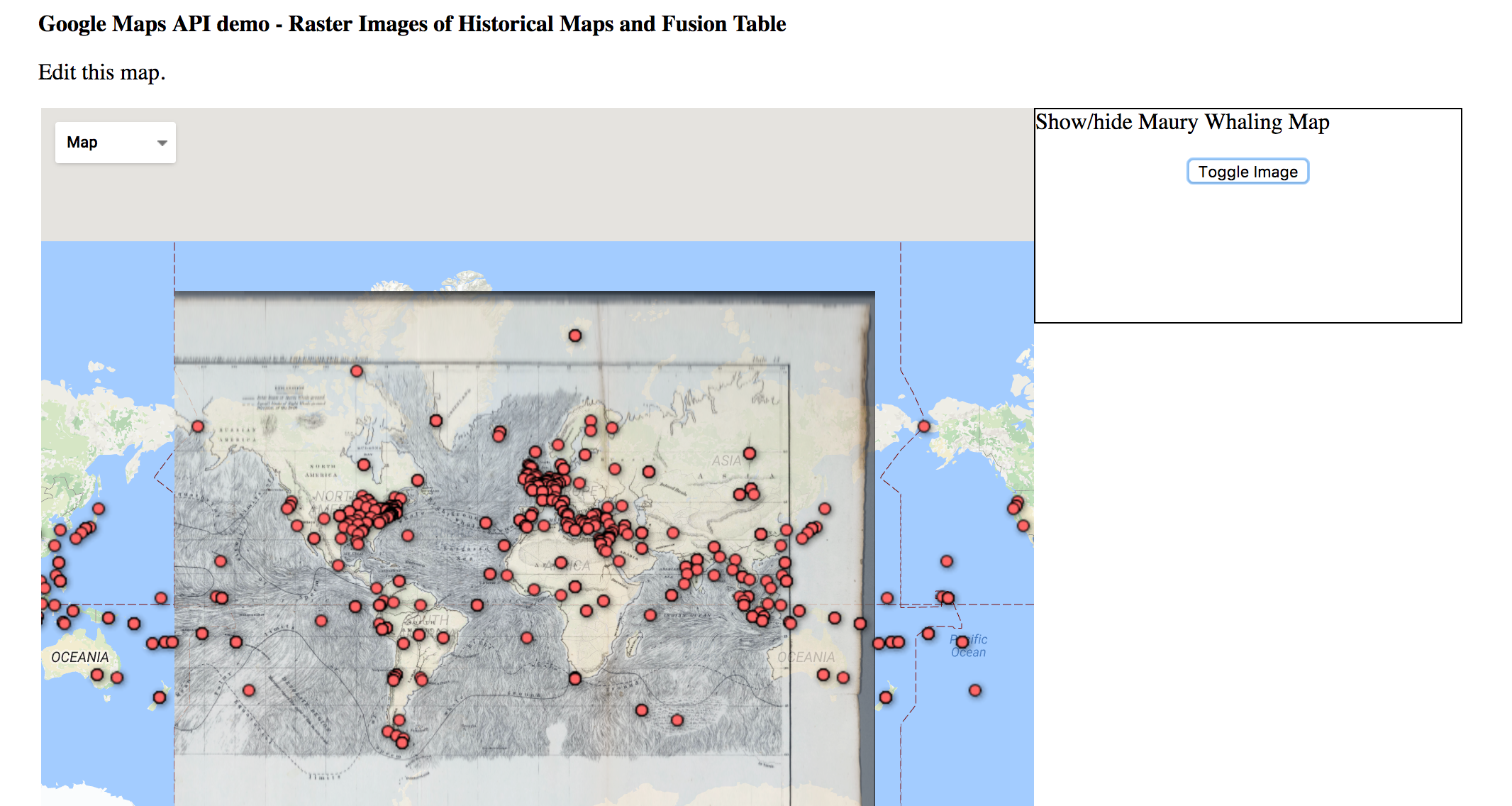
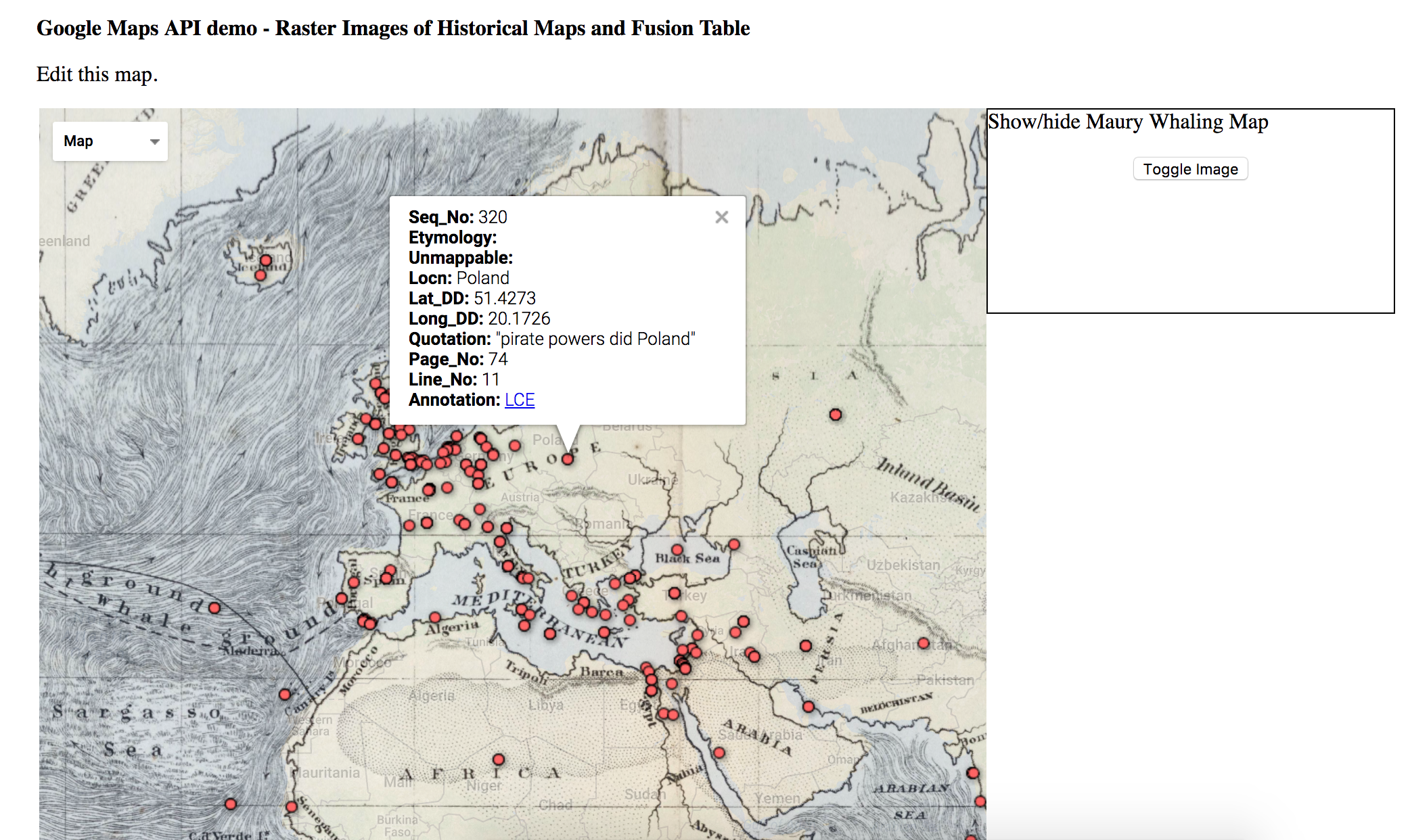
For this project, I got to use Google Fusion Tables and work with location data extracted from Melville’s novel “Moby-Dick”. I personally thought the data was easy to work with and abGoogle Fusion Tables made for a nice and organized way to display all of the data. It was also really helpful that there was a guideline on how to use import the data into Google Fusion Tables. In the end, once everything was set up, I could play around with the parameters and with the map to look at the different locations and information from the book. I really liked how it was all presented in a map and how all I had to do was click on the various points on the map and detailed information about that one speficic location would pop up or I could look at the heat map and play around with the radius. I could even play around with another file that had the “Maury Whaling Map” overlay the original world map.
Potential limitations would be the fact that the everytime I choose a new point on the map, the detailed information of the old point goes away. It would be useful if it would stay open unless I exit it myself that way if I wanted to compare two locations for some reason then I would not have to be swiching back and forth to see the information. Also I think it would be cool to have a list with all of the locations on the side, somewhat like a side bar menu, where the user can simply click on a location from there and on the map the detailed information at that specific location would pop up.
-
Miles Images from Wks 3-4
Miles’s previous assignments, uploaded without embedded images
http://i.imgur.com/1KY8pRz.png
http://i.imgur.com/xXy3mnP.png
http://imgur.com/a/SCIqm
http://imgur.com/a/5QJw2
Time Mapper
Pros
- Scrolling, moving forward and back, clicking on new items: all very intuitive
- Duration of events highlighted in bottom bar, allowing user to quickly see other event-points occurring within a different event-span
Cons
- Vertical organization of events in timeline conveys no information: missed opportunity
- Size of tabs with event titles in timeline have no relation to event duration
- No visual indicator of relative information: for example, “Iran hands over 16 captured al-Qaeda fighters to the Saudis” is dated June 1 - June 30, 2002, but the act is not confirmed until August. There should be some way to note who had the information when.
Proposed Alternative Design
- Gradient boxes refer to specific durations
- Green, yellow, orange, and red colors indicate relative levels of peace or hostility implied or initiated by a given event
- Events originating in the US, Iran, or elsewhere are indicated in different rows
- Events recognized at different times in different places are indicated with stars and arrows
- Icons associated with certain events are included next to the title at the top of the page to clarify color and placement information in the timeline
Enter text in Markdown. Use the toolbar above, or click the ? button for formatting help.
-
Yuchuan's comment on AS WE THINK
Visualization is a way to bridge communication. It is great progress in humanity that cultural analysis may be visualized commonly.
The question is how to choose suitable tools to express ideas or be more poetic, how to design the way data is presented. We have timeline to show simple events and dates as a daily record of activities. Also we have Excel to insert huge amount of information like population in different countries and compare. Also ,we have rawgraphs to be taken a a model to insert data and build relationship between different groups of data. All these are quick ways based on several models.
However, in my eye, for the deep cultural analysis, which is more influenced by background events and social factors, we need customized data and in my eye this is designing the data. How they are shown and which factors are taking the lead and how different dimensions could be associated. We have GIS tool to support mapping but extracting the data is what truly matters. We may study the transformation of land cover and thus we need to extract the changing area and make sure what aspects we define the word “transformation”.
Visualization provides possibilities to convey ideas more directly but also ask for the ability to extract data and establish the customized data set.
Enter text in Markdown. Use the toolbar above, or click the ? button for formatting help.
-
Chamberlin Mini-Project
(not sure if this is the right place to put this, but here it is)
##Mini-Project: Representing Time
I chose to examine the Breve web app. I found it to be not at all suited to the task of displaying the information in the US-Iran Missed Opportunities information. Each event is presented in the exact same way - as a small slice of time which each parameter (dates, title, description, location, etc) printed out next to a slice which it is clicked.
One huge improvement here would be for the app to make each event start on its start date and end on its end date. I’m not sure why that’s not a feature. The app offers very few options on how to display the data. The only way information is shown in the timeline is as text which can be read when each event is selected. There is no visual indication that some events are longer than other, occur in difference places, or are more significant.
One thing I would like to add would be a zoom-type feature. There are over 500 rows in the spreadsheet I used and there are also three others. If each event is given its own space on the visualization, it will be hard to interpret what’s going on. Instead, I think a good approach would be to give the view the ability to zoom out from the collection of events and see broader trends. One way to do this would be to cluster events as you zoom out and label them with the most common keywords shared in a set of events. For example, zooming out over late 2003 would cause the many events in the time to merge into one box with the words “nuclear”, “IAEA”, and “Khatami”. This would give the viewer a higher-level view of the situation by showing the themes and major players over a period. Understanding will come more quickly when the visualization shows that nuclear matters were being discussed in this period instead of just showing the forty events that occurred in that time and waiting for the viewer to synthesize the events into a more complete picture.
Another nice addition would be a visual indication of the source. In this data set there is a finite number of sources. I would like to have a way to assign them each a color so that I could tell, for example, which sources came from within the US and which came from Iran and which came from foreign observers not involved in the events.
I think the sliding timeline with multiple stacked rows is a good base concept, but it needs to be extended to effectively present this information. The zoom feature is the most important improvement, but the ability to change the display style as a function of the event’s parameters be nice as well.
-
Xinwen-Week3
I started with basic timeline as the link below shown. And I found too much information is involved. When the information flooded, it is very hard to get anything.
Then my focus lied into the bottom sector of this graph. The density of event really draw my attention. I started to thinking about what could possibly be the reason of the difference in density. Then I draw other reference into conversation, such as the president of two country and the secretary of state.
Comments on the timeline tool
The user interface of this java tool is simple and clean. The time line mapping is clear as well. However, there are still few things that I would change if I’m responsible to redesign it.
-
Sometimes the timeline itself is not evident and telling enough. It could be better if more attribute and statistics of the timeline could be added, such as the event density.
-
It wound be better if other reference could be add and cross-examined together with the main time line. Or this could be solved if we can create several timeline as the same time.
-
-
Representing Time, Pojiang Nie
Timemapper
-
Experimenting with Timelines
For this project, I wanted to try out the the Knight Lab’s TimelineJS tool for building interactive timelines. I’m normally more attracted to programming-heavy tools, but the point of htis class is partly to explore building tools for non-programmers: perfect.
Well, until I realized that the format the data came in didn’t match the format that TimelineJS requires. Immediately I dropped into IPython. Using Pandas, I read in the original data (in a .xlsx file that I cannot otherwise open locally because my linux computer does not run Excel,) and wrote a short script to convert it into the appropriate format. The tricky part was really the date formats, everything else was a 1-1 mapping. For instance, I had to change a “Title” column to a “Headline” column – simple.
Then, I output the data into a properly formatted
.csvfile and uploaded it to the Google Sheets spreadsheet that TimelineJS uses.And that’s it. Done! Very few other options are given. Prose won’t allow me to embed an iframe, so you can view the final result here.
The biggest shortcoming I encountered is the lack of control over the display. If you look at the result, the events are crammed together and nearly unreadable. No events are given more visual weight than any other, so it’s hard as an observer to understand what’s worth reading and what isn’t.
Moreover, this is a complicated timeline involving many different entities. It would be nice to be able to filter hte timeline by events involving specific characters in the action (George Bush, Ahmedinejad, etc.), as well as specific places or types of event (meeting, declaration, etc.)
It would also be useful to be able to group events into specific sub-narratives, and have the main timeline show these narratives at first instead of every little sub-event. Then, as the user explores deeper, can dig in and expand these narratives to get at the particular events.
Most importantly, I think the timeline should work vertically, rather than horizontally. The web is designed for documents that scroll vertically, and then the browser itself can be used to scroll around. Plus, this would easier allow for parallel timelines to be displayed.
Thinking back to Drucker’s work, it might be nice to have multiple timelines overlayed; different commentary for the same events, from different perspectives. It would emphasize the humanity behind these events, and the fact that the descriptions are not just “facts” but interpretations thereof.
-
Asst3-Kelsey
For this project, we had to take data from the “US-Iran-Missed Opportunity” data set and experiment with a timelie tool. For this assignment, I settled on using Timeline Mapper as a way to represent the chronological set of events which occured. My original motivation for using this tool was because of the geographical map it contains. I thought it would be cool if there were pin points on the map which the user could click on to see the certain events which occured in that location. However, I guess you would need some kind of location data for that so Timeline Mapper was only able to display a timeline with all of the events. I was happy with the timeline itself though. I thought it was really nice, clean, and well organized. On the bottom you can see all of the events in the timeline and when you click on an event then the detailed information from it pop into the bigger window above. This makes it easy to understand and use. On the other hand, I feel like the data in the timeline at the bottom could be better organized. For example, I suggest maybe putting it into groups according to year and when the user clicks on a certain year-group then it will lead them to all of the events which occured that year. I think this just makes for a more simple method to search the data than having all of the information overlap and cluster together.
Below you can find an image of the timeline generated from the data:
-
Assignment 2 Project
The purpose of the project was to use the data sets from the Comedie Francaise project and represent the data using two visualization tools discussed in lecture. For my assignment, I decided to the use the “people” data set and represent it using the tools Raw Graphs and Breve.
With Raw Graphs my main interest was to see if I could represent the different genders involved as actors/actresses in the Comedie Francaise plays at the time. I ended up deciding to display the genders as clusters which relatively showed the amount of people of a specific gender working there at the time. The image of this can be seen below:
The visualization itself is not the best way to intrepret the data, however it achieved my main purpose of trying to figure out the amount of people of a specific gender. Looking at the image, you can see that there is almost an equal portion of gentlemen (monsieur) and young ladies (mademoiselle). On the other hand, there are very few older women (madame) and citizens (citoyens). Simply by looking at the clusters, you can see that even though there are more males in the theatre there are still a considerable amount of young ladies. This could be due to different factors such as maybe young females in the the french theatres were used at the time to bring a larger crowd to see the plays, especially to bring in a lot of bachelors. Perhaps it could be that young females were more readily available as young men had to serve in war as soldiers or had other duties at the time. In the end, there could be a lot of contributing factors as to why this was the case. Despite the fact that the visualization allowed me to grasp a better understanding on this matter I still feel that it lacks in a lot of other areas. I think that as far as portraying other information such as seeing how the gender population in the theatre changed with respect to time/events that occured or how did it compare according to the plays performed at the theatre or maybe according to the season. There are still a lot of unanswered questions and better ways to visualize the data but this was useful in giving an overall view and for raising new questions on the topic.
The next visualization tool used was Breve. Breve is a great tool as it allows one to see discrepencies, errors, detailed information, source types, and much more within the data sets. The image of the visualization can be seen below:
As you can see in the image, most of the information within this data set is fairly consistent and fully given. However, there are also missing information such as first and last names which were not recorded. I don’t really know why that is to be honest nor do I have any suggestions for it. However, it does raise certain questions like How come only some of the names were recorded? Did it have something to do with how famous they were in the theatre? Maybe those with names were “regulars” at the theatre and performed many shows. Although Breve does not give much a creative visual representation of the data, I think it’s a great tool to just simply plug data sets into and analyze the results to see what questions can be answered or what questions arise. With Raw Graphs, I went in knowing what it is I wanted to see from the data set but with Breve, I did not have a specific question in mind or I was not looking for anything specific. I simply just put in the data and looked at the results to find patterns or discrepencies.
-
Comédie Française Assignment, Week 2, Xinwen
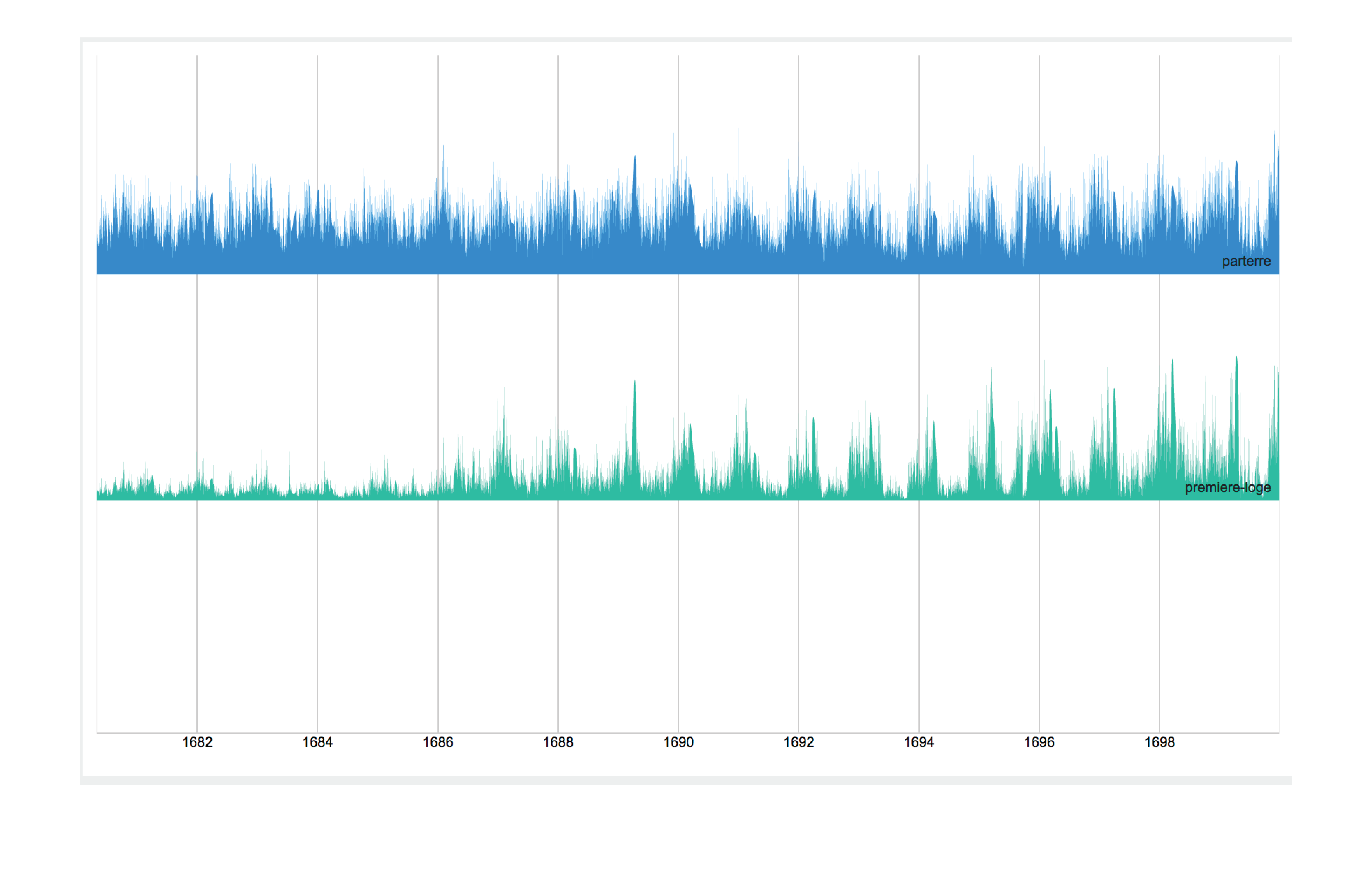
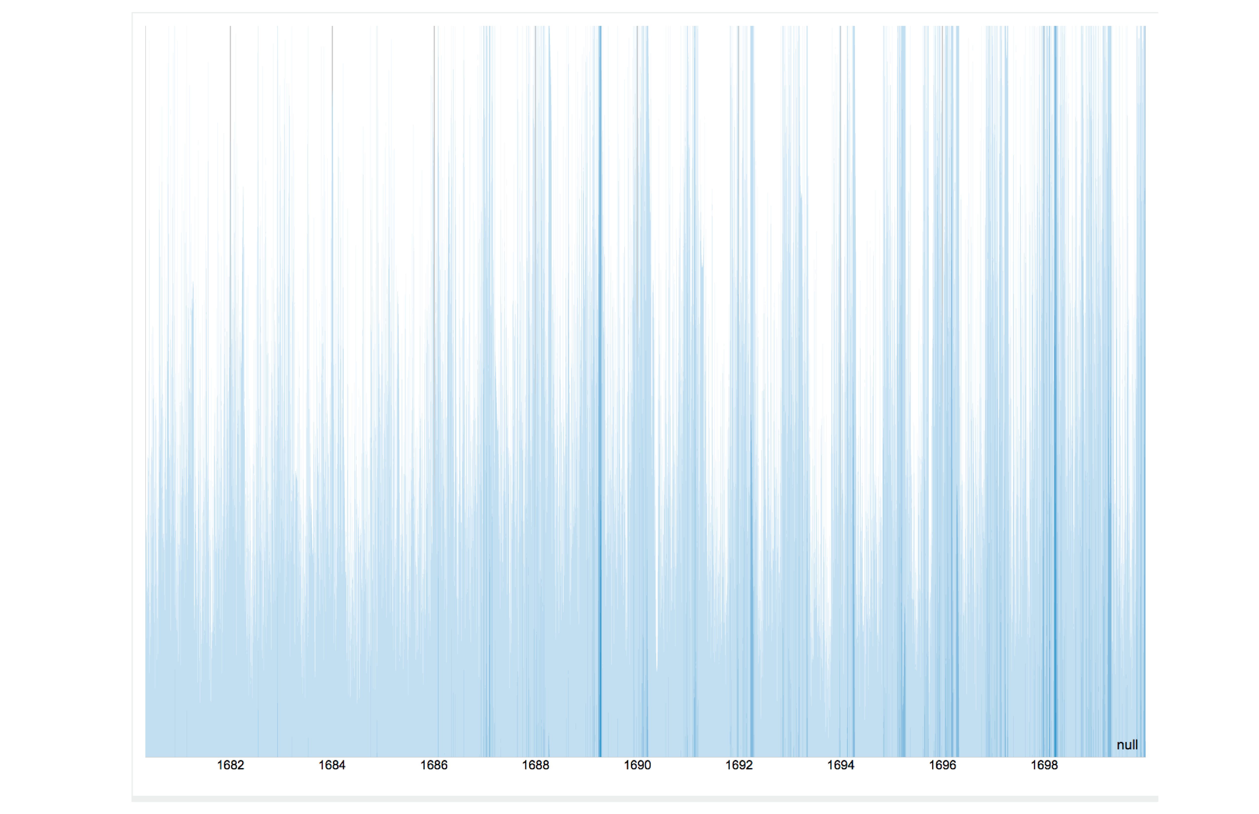
-
Miles & Ece CFRP (Wk 2)
Comédie Française Assignment, Week 2
Miles Osgood and Ece Turnator
The data from the various years of the Comédie Française record books, with their mixture of type and handwriting, defies OCR capabilities, so it’ll have to be entered manually. Even though we see pretty large variations in data format from year to year, we expect there would be certain consistencies within given seasons, so we’ll create different spreadsheet tabs for different sets of years that use the same accounting layout. Since we’re dealing with revenue and expenses, Excel seems like appropriate software to use. For the sake of other scholars, we’d try to be as comprehensive as possible in our inclusion of information, including extra columns to make note of miscellany and marginalia. Some extra columns will include codes so as to be able to do some comparative work among different years: e.g. 1L for “Premières Loges” tickets or equivalent.
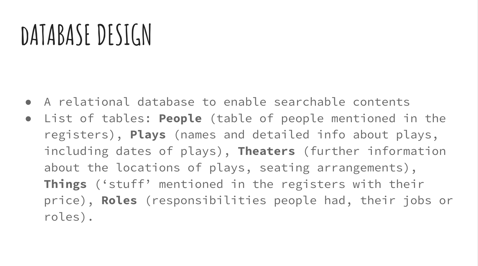
We’ve envisioned a different form of presentation for the public-facing dimension of this project. We expect that this audience would consist largely of students, teachers, and academics, but not ones necessarily working on the same period and the same problems. Using the data in the spreadsheet above and the codes to make certain variables consistent over the years, we plan to present an interactive theatre seating map on a website that shows attendance statistics in a visual format. Users will be able to use a slider to move through various years and seasons, and the seating chart will update with different sections lit up (depending on the layout of the theatre for that season) and different color concentrations depending on price and density of ticket sales. Users will be able to hover cursors over various theatre sections to see the actual figures. This should make the data more exciting to lay viewers, but it will also help researchers get a quick sense of certain trends or anomalies before following up in the details of the spreadsheet.
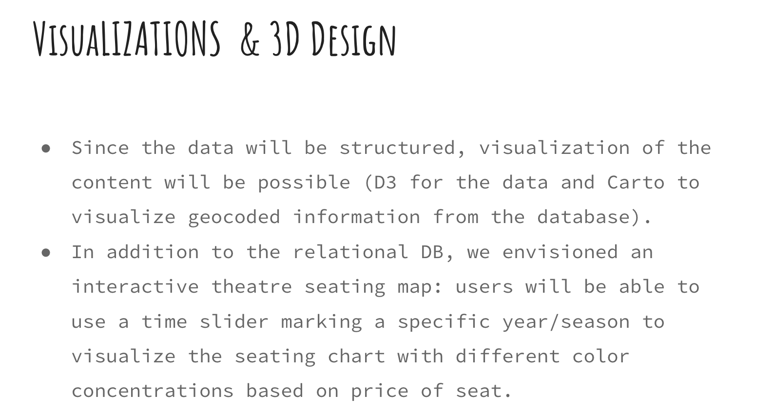
The motivating research question behind both the scholarly and the general-audience dimensions of this project is this: what was the relative importance of the repertoire or the year in the varying demographic composition of Comédie Française audiences over this span? We hope to see, for instance, whether demographic shifts occur gradually and predictably over the course of certain decades in line with what we’d expect from French Enlightenment-era history or whether other factors—the plays selected, for instance, or perhaps the layout of the theatre—are more important. As such, over time, we’d add more information to the website about relevant historical events or dramaturgical/literary background pertaining to the selected season.
Slides: https://docs.google.com/presentation/d/1qzDbC0cCZGca1_C2bnI7G-hACUuLX8AYa-WbPrBvl5I/edit#slide=id.p
Enter text in Markdown. Use the toolbar above, or click the ? button for formatting help.
-
Assignment 1: CFRP
The CFRP dataset is seemingly well-structured (all ticket sales were recorded using a template), extensive (100s of years), and interesting (the breakdown of sales by seat type and the accounting system used should allow for many different questions to be answered.) We think that that professional/academic researchers and history lovers would be interested in digging in further. Below is a deatiled analysis of how we would prepare this dataset for visualization such that this audience would be able to better understand this data.
Slides
Click here to view as a presentation.
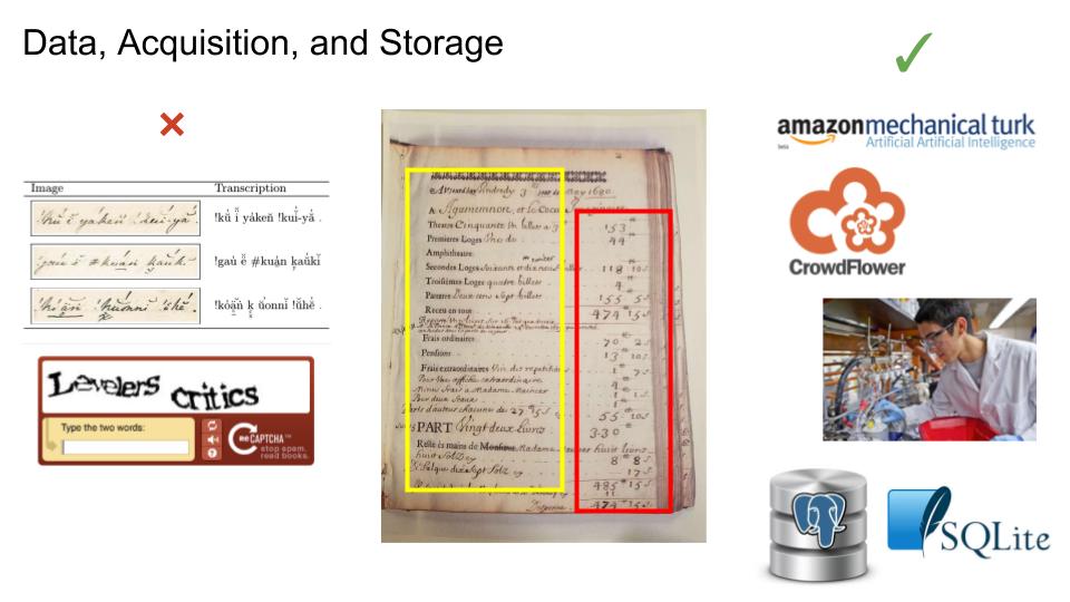
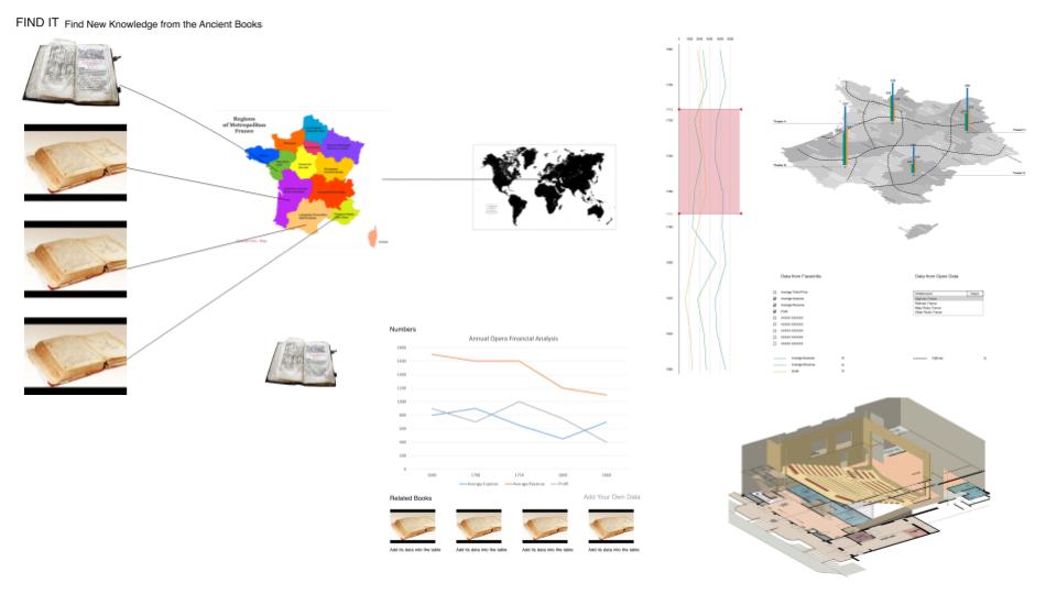
Data acquisition and storage
Despite the rough structure described above, the ticket sales records are still difficult to convert to a meaningful digital form. We would scan each page with a high-resolution camera, and store them as digital images, and extract the following information from each page:
- The file name of the image of the page
- The book from which the page came
- The page number in the book
- The data extracted from the page:
- Date
- Names of the plays performed
- Income - number of tickets sold at each price point - name/description of that price point (e.g., Ampitheatre) - price of that ticket - total income from this type of ticket - total number of sales of this type of ticket
- Expenses
- Total
- By category - By subcategory (if available)
We would also extract the following information from each book:
- Name of the theater whose sales are recorded in the book
- Any known GIS data about that theater
- The font or typeface of the template
Acquisition
How to do this? Despite being templated, each book has a different template, so we’ve designed the schema to reflect the superset of all the data made available in the books. But because of the data format in each page (handwriting, in cursive, from multiple different authors, as well as punctuation, numerals, and written numbers) it is unlikely that existing Optical Character Recognition programs will be able to extract usable data. There is some structure, so it’s feasible to use that to write a little form that can be filled in for each page in each book. But how to get someone to fill in this data?
One option is to build out a system similar to CAPTCHA and get website owners to install it. We can make humans transcribe our data as part of verifying that they are real people to other sites on the internet. But this would be difficult because it’s hard to build out that kind of system, and orthogonal to the research goals.
A more feasible option is to use a service like Crowdflower or Mechanical Turk and pay people a small amount of money to transcribe the data. Or, we could hire undergraduate researchers, and even better, pay them in credit hours!
Storage
We would store the data in a relational database like Postgres or Sqlite because they’re reliable and it’s easy to implement a reliable schema in them. Additionally, it would be easy to convert this representation into other representations if the need were to arise. The image files themselves would be stored in a large directory tree, with files named according to
{bookNumber}/{bookNumber}-{pageNumber}.jpg. The reason to create a separate folder for each book is that computers can have trouble listing large numbers of files. The reason to still include thebookNumberin each file name is to ensure that each name is unique, making it easier to reference a specific file.Target audience
We envision academic and professional researchers as our primary interested audience, although we think that maybe history lovers could also be interested. We think it’s unlikely that the general public will have a particular interest in this data set. Here are two example profiles:
Social Custom Researcher
Holli is 34 years old and works as a researcher studying social customs in France.
Key Characteristics:
- Familiar with using online sources to get access to information and data.
- Only has basic data processing skills, often finding it hard to collate data and visualize them outside of using a tool like Excel.
Goals:
- Getting the information faster and more conveniently than having to read through the pages herself
- Getting help in terms of data processing and data visualization
History Lover
Stan is a 22 year undergraduate student who loves history.
Key Characteristics:
- Interested in history since primary school
- Loving browsing fun facts about history on the internet.
Goals:
- Learning something new and having fun.
Questions, answers, and tools
Given the data that we will store in a machine-readable form, and the target audience of academic/professional researchers and history lovers, we think that it would be feasible to build a tool to answer questions in the following general categories:
- Social custom
- Economics of theatre in France
- Historical theatre culture
- Handwriting, fonts, and typewriter
For instance, some specific questions that we think could be answered:
- What kind of seats were most popular…
- Over time?
- Per each play?
- How much money did a specific play net the theatre company?
- Over time, what were the theatre company’s…
- Profits
- Revenues
- Expenses
- What kinds of expenses did the company have?
- How did these change over time?
- What fonts were used?
- How did this change over time?
The tool to do this would be an online graphing tool, as shown below. We would also allow people to download the raw dataset – this would be most useful to the academic/professional researchers, although our tool is designed to answer the questions that we think they’d be most interested in.
Prototype