Asst3-Kelsey
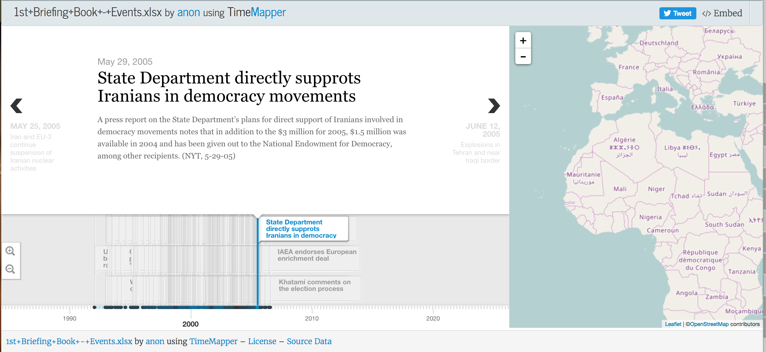
For this project, we had to take data from the “US-Iran-Missed Opportunity” data set and experiment with a timelie tool. For this assignment, I settled on using Timeline Mapper as a way to represent the chronological set of events which occured. My original motivation for using this tool was because of the geographical map it contains. I thought it would be cool if there were pin points on the map which the user could click on to see the certain events which occured in that location. However, I guess you would need some kind of location data for that so Timeline Mapper was only able to display a timeline with all of the events. I was happy with the timeline itself though. I thought it was really nice, clean, and well organized. On the bottom you can see all of the events in the timeline and when you click on an event then the detailed information from it pop into the bigger window above. This makes it easy to understand and use. On the other hand, I feel like the data in the timeline at the bottom could be better organized. For example, I suggest maybe putting it into groups according to year and when the user clicks on a certain year-group then it will lead them to all of the events which occured that year. I think this just makes for a more simple method to search the data than having all of the information overlap and cluster together.
Below you can find an image of the timeline generated from the data: