pentathlon-design-doc
Pentathlon of the Muses: Final Project Design Document
WEBSITE: http://104.197.121.200/
 !
!
Team Members
Thatcher Chamberlin (jthatch@mit.edu). Thatcher is a sophomore studying Physics at MIT. He also has a background in computer programming and web design, having built a number of websites using technologies similar to those used in this project. His role in the project was to help with the design of the project’s map functionality and the website backend.
Kelsey DeJesus-Banos (kcdejesusbanos@g.harvard.edu). Kelsey is a 1st-year Master of Electrical Engineering at Harvard mainly focusing on Computer Graphics. Having mainly worked with software before, she has dedicated herself to the programming and technical portions of the project working both on the front- and back-end of the website.
Miles Osgood (mosgood@fas.harvard.edu). Miles is a 4th-year PhD student in English at Harvard. The data for this project comes from research on his dissertation, “Olympism: The Olympic Art Competitions and Athletic Modernism.” The dissertation as a whole considers the interest in sport among modern artists and writers in the early twentieth-century, by way of the 1912-1948 Olympic contests; this DH project focuses mostly on the Olympic half, as a way to visualize forms of international circulation and competition in the arts in this period.
Ece Turnator (turnator@mit.edu). Ece is a Humanities and Digital Scholarship Librarian at MIT.
Yuchuan Zhang (yzhang4@gsd.harvard.edu).Yuchuan is a 1st-year Master of Architecture in Urban Design Student at Harvard. As a student with the design background, she mainly gives advice and sketches for the layout of the website and for data visualization. Also, she cares about the user experience in designing the ArtMap.
Concept Overview
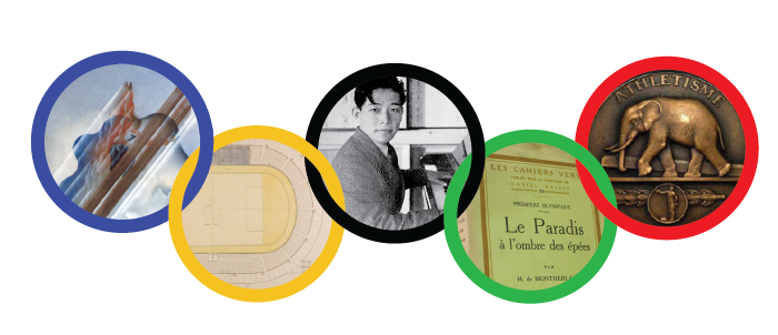
The Olympic Art Competitions were official contests at the Olympic Games that lasted from 1912 to 1948, founded by the father of the modern Olympics, Pierre de Coubertin. Artists could win medals for their countries in five events–architecture, literature, music, painting, and sculpture–a “Pentathlon of the Muses.” Many of the medal-winning artworks have survived, and existing online articles or books focus on these successful entries. These medal-winners account for only about 150 of more than 3,000 entries, however. Looking at the medal-winners alone obscures the stylistic breadth and the global reach of these competitions. Most victors competed for European countries or the U.S., but artists submitted from nearly 50 countries around the world. Meanwhile, due to conservative Olympic aesthetics and rear-guard juries, the most notable competitors and innovative artworks are buried among the losers.
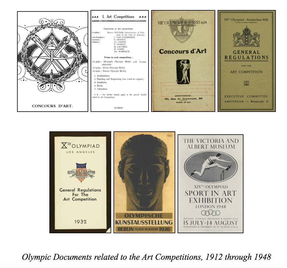
Olympic Documents related to the Art Competitions, 1912 through 1948
Our website attempts, then, to provide a different account of the competitions, using equally complete metadata from all entries and allowing users not only to consider the contests’ hierarchies, but also to think about its geographical, temporal, and cultural range. The pedagogical goal of this site is not only to introduce users to these long-forgotten Olympic events, but to use this particular contest as a new way of visualizing the global art market in the early twentieth-century–a period of significant political change and aesthetic innovation.
As such, the tour that introduces the site guides the visitor through a diverse array of Olympic submissions, from all art-forms and all Olympic years, starting with the literature gold medal won by Coubertin himself before turning to outsider artworks that represent IOC dissidents, modernist styles, avant-garde schools, Latin American and Asian traditions, and politicized medal selections. The main feature of the site, the ArtMap, allows users to filter data according to their own preferences–not just according to winning results. The resulting maps trace the movements of artists and artworks from their homelands to urban workshops and eventually to the cosmopolitan meeting-grounds where these seven Olympiads took place. Users can click through links to learn about individual artists and artworks, but just as importantly, they can see world-wide artistic trends at a glance.
We imagine the audience for this site being twofold. First, scholars of early-twentieth-century history and culture should find that this site poses new questions for their fields and provides tangible data for what might otherwise be nebulous areas of inquiry. Literary studies in this period, for instance, have turned to an interest in theorizing and studying “global modernisms,” which often involves re-thinking conventional aesthetic principles and periods associated with European modernism. The ArtMap, by allowing users to navigate time and space and by promoting artists not usually included in the modernist canon, does some of that same intellectual labor with thousands of concrete artworks. Second, non-academic users who may have personal interests in the arts or the Olympics will be invited to act as researchers in this buried treasure-trove of modern art and Olympic history, capable of making discoveries in their own right. The website tour and the artworks of the Olympic Art Competitions make the various styles of modern art more accessible to sports fans, and tell the evolving story of the Olympic revival to art enthusiasts.
Background Research
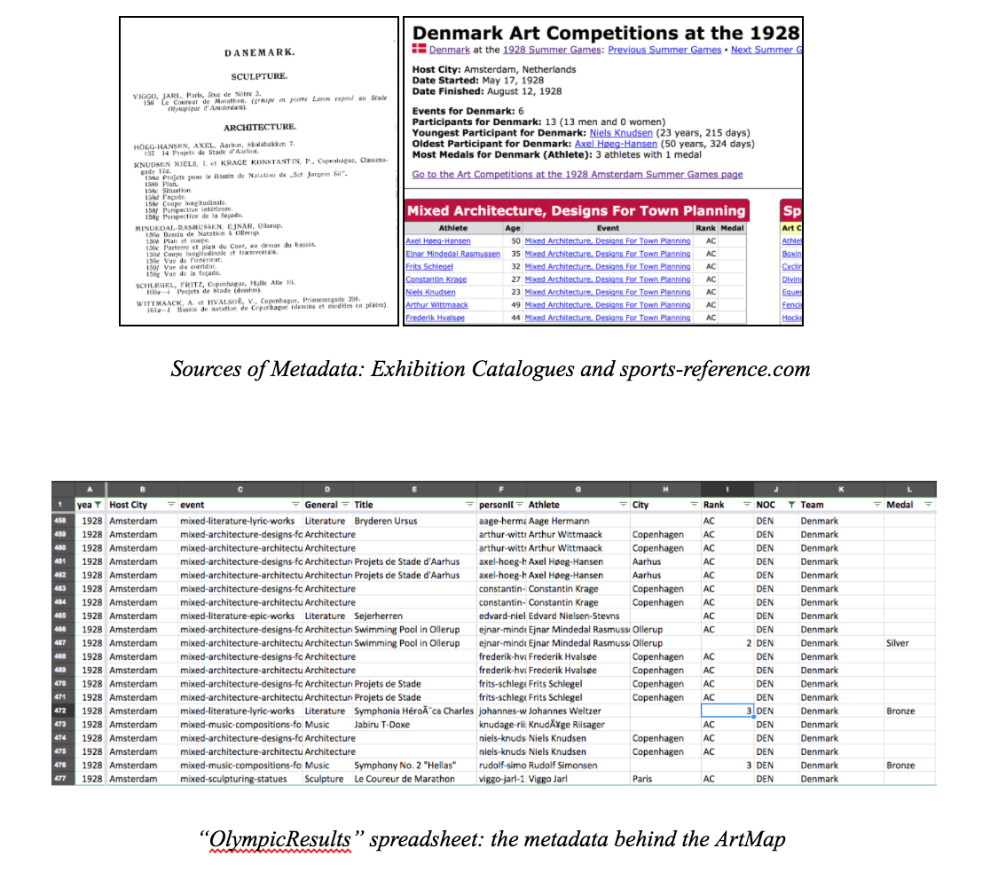
Primary-source research on the Olympic Art Competitions comes from three main sources: Richard Stanton’s foundational self-published monograph, The Forgotten Olympic Art Competitions (2000); the archives of the Olympic Studies Centre in Lausanne; and the online database sports-reference.com. Over the course of about a year and a half of research, with help from librarians and colleagues with coding skills, Miles has compiled and cross-checked a spreadsheet with metadata about all of the Olympic art entries, alongside contextual information about the competitions and the artists involved.
The ArtMap we’ve designed is mostly primary-source driven, and the tour largely makes use of general knowledge about twentieth-century history, Olympic history, and modernist studies. Still, to fully understand the possibilities for our site and its content, there has been some use for some secondary literature: biographies of artists, critical accounts of art history and sports history, scholarly texts on twentieth-century culture, etc. We’ve included some of these texts along with our primary sources in the bibliography.
In the field of Digital Humanities scholarship, Jane Macalik, John Fraser, and Kelly McKinley’s editorial statement on “Discursive Space” has had special influence on this project, as may be apparent in our use of the terms “visitor” and “user.” Our site is not without conventional curatorial structures designed for “visitors”–this is the function of the chronological, introductory tour, after all–but the central application, the ArtMap, is intended to “share power” between the collection and its users by inviting unforeseen insights (see Macalik et al., 3). In the interest of time, we have had to prioritize certain works by seeking out their images first, so in that sense we have not abnegated our role as knowledgeable curators, but the material in the ArtMap is presented as evenly as possible. We might also define the two dimensions of the website–the tour and the ArtMap–according to Lev Manovich’s “narrative” and “database” from The Language of New Media. As Manovich describes, though, these categories are not completely distinct (234). This is a hybrid site, and each half is hybrid in its own way: the narrative of the tour refers as much as possible to the place of individual artworks in the larger database; and users can click on individual entries in the ArtMap database to see short narrative biographies.
Project Development
Roles: As our team members have diverse backgrounds, we assigned tasks based on everyone’s strengths and interests. Thatcher and Kelsey are our technical experts in programming; they built the website and its functions. Miles, who proposed the concept of visualizing the Olympic Art Competition as part of his greater research, provided introductory background to the competitions and prepared the metadata, while also taking an active role in consulting on the website design and creating or curating images as needed. Yuchuan, a design student, oversaw the general visualization principles of the ArtMap and user interaction overall. She gave advice and sketches for the layout of the site. Ece, a digital humanities librarian and instructor, helped compile metadata and gave feedback on the project along the way.
Development steps
Design Proposal:
The proposal is based on two aims. First: to combine various information like images, maps, texts and even sounds together to make it clear and easy for users to read, process, and learn. Second: to make the journey an interactive process for better user experience.
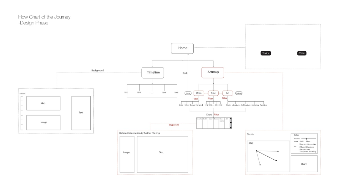
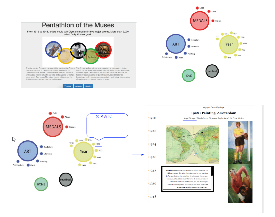
The flow-chart shows the proposed journey for users. The homepage contains two main entrances, the Timeline page and the ArtMap. In the Timeline section, we have selected introductory artworks and narratives for each year. The actual “timeline” is a sequence of dates running down the left side of the page that allows the visitor to control the sequence, but we expect visitors to proceed chronologically. The Artmap section is the main feature of our website. There, users can filter information, selecting narrow databases within the 3,000 art pieces and the 2,000 artists. Whereas the Timeline guides visitors, the ArtMap allows users to be in control, based on their interests. The three filtering criteria that users can adjust are year, art-form, and result (medal, honorable mention, loss). The diagram above captures how these different filters can cooperate. The map occupies the left side of the page and a chart is created in the bottom-right corner based on the filtering commands. Links in this chart allow users to see the metadata associated with particular artists and artworks. As such, users are invited to explore the “OlympicResults” data not only through multiple levels of filtering, but also by drilling down into the details of particular instances that the map may evoke only in general terms.
Data cleaning and preparation:
The Database used for the project was stored and maintained using PHP and MYSQL. MySQL is a database that uses structured query language to access and filter the data. PHP is a useful tool that handles the administration of MySQL over the web. Maintaining the database as such allowed for an efficient way to transfer and access the data between the various group members working on the project.
Website Improvement (Prospects)
The iconic five Olympic rings appear on our home page as an indication of the official status of these art competitions over seven Olympiads. The rings, then, are a foundational design cue at the start of the user’s journey. In order to continue this connection with the identity of the Olympic Games, we created prospective designs for the ArtMap’s filter that also evoke the Olympic rings. The future design, as we envision it, will will use red, green, blue, yellow, and black rings to build a more close relationship with Olympic iconography. Expanding on some of our experiments in the Timeline section, we would also like for the text designating these filters to serve a second function: years, art-forms, and perhaps even different medals could be linked to pop-ups, which could give users a quick glimpse of the significance of certain categories within the site. Eventually, we’d like to build connections between pages, so that users can jump from the data of the ArtMap to the stories of the Timeline, and vice versa, according to their searches.
Challenges
One major problem we faced with our design choices is the notoriously strict IOC policy concerning use of Olympic logos (see “Editorial Use of the Olympic Properties by Media Organizations”). A published and public-facing version of this site would probably have to clear all use of the Olympic rings by the US National Olympic Committee, if not the IOC. Walking the fine line between designs that used the five interlocking rings too closely and designs that were too different from the Olympic logo to be recognizable was an ongoing challenge. For this prototype, we followed our colleagues’ suggestions and moved closer to the look of the official rings, but a later version of this site might not have this liberty. Relatedly, we do not have rights to any photos of Olympic artworks and we may not have rights to the biographical text compiled by sports-reference.com. Sports-reference takes the attitude that most of its information is factual, and therefore not subject to copyright, but this would seem to apply more to the statistics than to the bios, which required greater creative effort on their part.
Other design choices were motivated by feasibility rather than legality. In accordance with a home-page design that linked the artistic “Pentathlon” to the five Olympic rings, we considered having five filters in our ArtMap that would also be ring-based. Our final design still incorporates a version of that idea, but five separate filters seemed excessive. We decided to focus on Year, Art, and Medal, because other metadata was less of a priority (or, in the case of “National Team,” easy to distinguish in the visualization). Over time, we also thought about the constraints and possibilities of hyperreading, in response to N. Katherine Hayles’s “How We Read: Close, Hyper, Machine.” We decided to cut down longer paragraphs in the Tour section and distribute this information via other interactive modules: mini informational pop-up windows associated with Olympic years and art-forms. We also decided that users would find it least distracting to have detailed metadata on specific artists and artworks appear in a separate tab, rather than in the ArtMap interface.
Enabling Technologies
ArtMap Page
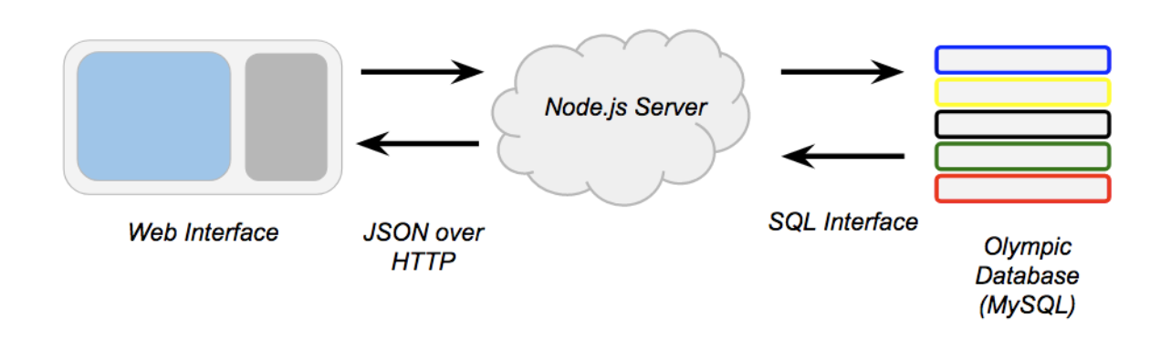
The ArtMap within the Pentathlon of the Muses website is an interactive web app that displays information stored in a relational database. The site runs off of a Node.js server which serves web pages and facilitates the flow of information between the user and a MySQL database. SQL, or structured query language, databases allow for complex searches large, connected datasets. MySQL allows for a more selective and dynamic form of interaction than a spreadsheet or other static file. The information from the database is displayed on the user’s screen through a combination of HTML, CSS, and JavaScript. Text information is displayed by using JavaScript to rewrite elements of the page and spatial information is displayed by use of the Google Maps JS API, which allow us to draw markers, windows, and lines on a responsive world map.
MySQL
Our database is arguably the heart of the project. As mentioned above, MySQL is a commonly used database that supports structured query language. SQL lets us access and filter the wealth of information compiled by our team in numerous interesting ways.
Google Maps
The Google Maps API provided a familiar and easy-to-use interface to present our spatial information to users. The API also provided many methods that made drawing markers, lines, and information windows on the map very easy.
Node.js
Node is a commonly used server framework. It allowed us to make a server that presents HTTP endpoints that provide data to the webpage. By using several of the many available Node.js packages available online, we were able to write a server codebase that is small is relatively easy to understand. This will help future developers continue the project.
Home, Credits, and Timeline Page
All three of these pages rely mainly on Html, CSS, and Javascript to display information to the user. They are interlinked with each other and with the Artmap through the use of buttons which allows the user to navigate from one page to the other. The information and forms displayed to the page was made possible through the use of Html. CSS was used to enhance the visuals and design styling of the page. Javascript allowed for more of the object oriented feature of the website such as the timeline activity embedded on the Timeline page.
Journey Map
User trajectories on the “Pentathlon of the Muses” website would depend on users’ familiarity with the Olympic Art Competitions and other existing Digital Humanities projects. A new user who already had some knowledge of the contests and some experience with other interactive DH sites would be able to click on the “ArtMap” button immediately from the landing page and navigate the ArtMap without much difficulty: the filters, the data, and the representations on the map are all fairly intuitive. The only likely point of confusion would be the difference between lines going from working-city to national-team and those going from national-team to host-city. Even then, by looking at the Legend, as well as the metadata and perhaps a few of the entries in detail, the user would still be able to work out the meaning of these different lines fairly quickly–since, in a given year, all lines proceeding from national-teams to host cities would form an apparent nexus.
For users less familiar with either the Olympic Art Competitions or the interactive possibilities of sites like ours, the Timeline tour will be the main point of entry. The guided Timeline takes unfamiliar visitors through stories from all of the relevant Olympic years (1912-1948) and through example artworks the five competing art-forms to give basic background on the contests and the ArtMap. Each stage of the Timeline contains an image, some explanatory text, and a historical map, as preparation for the artworks, data, and geographical visualizations of the ArtMap. The image represents one important submission from the given Olympic year; the text introduces details concerning the significance of that submission, the historical context, and certain trends in the contests; and the map gives a preview of how different kinds of submissions’ circulation will be represented in the ArtMap (even though we’ve used historical maps within the Timeline section). We expect visitors in the tour to proceed chronologically, but each entry is self-contained and amenable to more aleatory browsing. The Timeline design also represents canceled Olympic years so that visitors can perceive these at a glance–rather than jumping from 1912 to 1920 or 1936 to 1948 according to even gradations.
Once in the ArtMap, users are free to move in all kinds of directions. By changing the filters, they are in control of the submissions they perceive in the geography and metadata panels. Rather than cluttering an already crowded ArtMap page with art-images and artist-biographies, we’ve decided to have the metadata rows link to new browser tabs: if a user clicks on an artist name in the metadata panel, he/she will be able to learn more about the artist in a separate page. We expect that savvy browser-users will open multiple artist pages in new tabs at a time while looking at a single configuration of the map, waiting to look at these artist pages until they’re sure that they’ve found all the interesting submissions within a given set of filtered results.
Research Discoveries
Already, within a few days of the ArtMap’s full functionality, the possibilities for research into the art competitions and the modernist period are becoming apparent. Of course, the ArtMap will always be a first step in a humanistic process, rather than an end in itself: the visualizations point to intriguing trends and exceptions, and the site allows the user to learn more about relevant artists and submissions quickly, but the subsequent art-historical work of contextualization and interpretation remains vital. Still, here are a few examples of early-stage insights provided by the ArtMap. We had assumed that sculptures would not travel as widely as paintings or other artworks, due to the constraints of shipping and handling; but the ArtMap indicates that the difference is not so significant. In 1928 and 1948, a few countries do send painting submissions without sculpture submissions, but the numbers of paintings are too low to be meaningful. Meanwhile, in 1924 and 1936, almost all participating countries submit both kinds of artworks, and filtering out sculptures makes as much of an impact on the web of ArtMap lines as filtering out paintings. When the 1928 Amsterdam Games lifted restrictions on languages for the literature competitions, literary submissions multiplied in Europe but vanished in other continents. This may have to do mostly with the general composition of participating countries in 1928, though. Host cities seem to have used the “Honorable Mention” prize to make their results more global–particularly in 1932 and 1948. Berlin, on the other hand, spread “Honorable Mentions” to central European entries in 1936. Great Britain and the USA had the most artists submitting as expatriates. But whereas expatriate Americans did not bother joining the Los Angeles Games, London 1948 saw British submission from all over the world. Latin American participation in 1932 was quite varied but not voluminous. Uruguay had the most submissions with five. This is probably because artists representing these countries found out about the contests in the USA or Europe, according to the orange lines.
Future Directions
The functionality of the ArtMap is nearly complete. Among the small revisions or extensions we envision, the most enticing would be to re-introduce other filters: allowing users to see which artists were operating outside their national boundaries, to perceive tiers of success on the map without recourse to the medals filter, to isolate particularly notable competitors, or to distinguish linked entries for which we have images from those for which we don’t. Even in a later version of the site, though, we would most likely hide these tools under a setting for “Advanced Options,” rather than clutter the filters panel in the ArtMap. We might also consider ways to present the contest results and other notable submissions in modules outside of the ArtMap–perhaps by letting users see winning artworks on a podium for different years and categories, with apparent snubs recorded underneath.
As mentioned above, working out our rights as an educational site for the use of Olympic-inspired logos and art images is a high priority. Play with Olympic designs is mostly superficial, though it does serve a purpose insofar as it reminds users that these were actual Olympic events, for which the awards were actual Olympic medals. Meanwhile, collection and inclusion of art images from exhibition catalogues, museum galleries, and private websites could add a lot to the valuable content of the ArtMap. Even though many of these images are available by means of a quick Google search, we don’t expect visitors to look up many submissions on their own; it’s much easier for them to understand and compare artworks if those images are readily visible within the site.
The Question & Answer session from our final presentation meeting was quite instructive. The audience suggested some possible enhancements to our filters: for example, allowing for the simultaneous selection of multiple Olympic years (perhaps to see how one artist’s contributions or one nation’s contributions changed over time) or (as mentioned above) allowing users to sort submissions by those with available images. We discussed the possibilities and problems inherent in prioritizing famous artists and their submissions–a feature we had experimented with as potential filter but decided to abandon as too subjective and interpretive on our part. Still, the conversation made us reconsider: we need to find a way to convince users that the art competitions are sufficiently exciting not just from an Olympic perspective, but from a modern art-history perspective; and that may involve putting modernist or avant-garde competitors like Robert Graves, George Grosz, and Walter Gropius more in the foreground.
Finally, there are several unrealized ambitions for the design of the site. We didn’t have time to design the entire site according to a consistent, bespoke aesthetic–even though there are glimpses of what that aesthetic would be in our home-page and tour pages. We wanted to use Olympic ring imagery for our filters, for instance, but there wasn’t enough time to incorporate this idea. More pertinent to the content: since the political world maps change significantly over the course of these 36 years (during which time world wars transformed national boundaries and several colonial states achieved independence), the contemporary Google Map underlying the ArtMap is not representative of the globe as the artists of these Olympic years would have known it. We experimented with using maps from oldmapsonline.org for the Timeline pages, and we know that it’s possible to overlay these maps on Google’s for the ArtMap, but we have yet to complete this stage of the project.
Another topic that arose during the presentation meeting was the purposes this site could serve beyond this particular data. Originally, Thatcher’s pitch for a “WarpMap” would have been based on news articles–another form of rankable international data. At the end of the project, though, our audience agreed that this current form of the “ArtMap” was better suited to other art-related projects: the lines and the webs they create could easily represent the provenance of objects in museum collections or the trajectories of specific artworks across exhibitions.
Immediate Future
Since Miles plans to continue to polish this site over the summer and to publish it soon afterward, Thatcher and Kelsey are producing a “Read-Me” file so that he and future collaborators can build on the functionality already in place, improve the database with images and recovered metadata, and introduce some of the temporarily abandoned design plans. The first step will be to make the design in the Timeline match the rest of the site; then we’ll have a full prototype to show to possible partners, like Harvard’s metaLAB. With or without them, Miles will buy a domain name and put the working version of the site online within a few months. Our plan for this site always went beyond the confines of the class project, so we look forward to a day not far from now when it will become a real online resource for researchers, Olympic fans, and curious web-surfers looking to become amateur art historians.
Works Cited & Acknowledgments
Olympic Reports, Exhibition Catalogues, and Official Documents (chronological)
The Olympic Games of Stocholm: Official Report. Ed. Erik Bergvall. Trans. Edward Adams-Ray. Stockholm: Whalström & Widstrand, 1912.
Olympic Games Antwerp 1920: Official Report. Brussels: Belgium Olympic Committee, 1957.
Les Jeux de la VIIIe Olympiade: Paris 1924: Rapport Officiel. Ed. M. A. Avé. Paris: Librairie de France, 1924.
Exposition et Concours d’Art: VIIIe Olympiade. Alexandre Millerand. Paris: Comité exécutif, c. 1924. The Ninth Olympiad: Amsterdam 1928: Official Report. Ed. G. Van Rossem. Trans. Sydney W. Fleming. Amsterdam: J.H. De Bussy, 1928.
Concours et exposition d’art olympique: IXe Olympiade Amsterdam, 1928. Amsterdam: 1928.
The Games of the Xth Olympiad: Los Angeles, 1932: Official Report. Ed. Francis Granger Browne. Los Angeles: Xth Olympiade Committee of the Games of Los Angeles, 1933.
Catalogue of Competition and Exhibition of Art: Xth Olympiad Los Angeles 1932. Exposition Parl, Los Angeles: Los Angeles Museum, 1932.
The XIth Olympic Games: Berlin, 1936: Official Report: Volume II. Berlin: Wilhelm Limpert, 1936. Olympischer Kunstwettberwerb: Katalog der Olmypischen Kunstausstellung in Halle VI des Ausstellungsgeländes am Kaiserdamm. Berlin: 1936.
The Official Report of the Organising Committee for the XIV Olympiad. London: The Organising Committee for the XIV Olympiad, 1948.
Catalogue of the XIVth Olympiad Sport in Art Exhibition: London 1948: Held at the Victoria and Albert Museum. Cambridge: Chadwyck-Healey, 1977.
“Editorial Use of the Olympic Properties by Media Organizations.” Olympic.org. International Olympic Committee. 2016. Accessed May 12, 2017. Web.
Secondary Sources
“Art Competitions.” sports-reference.com/olympics/. Accessed January 7, 2017. Web.
Hayles, Katherine N. “How We Read: Close, Hyper, Machine.” ADE Bulletin 15 (2010): 62-79.
Macalik, Jana et al. “Introduction to the Special Issue: Discursive Space.” Curator: The Museum Journal 58.1 (Jan 2015): 1-3.
Manovich, Lev. The Language of New Media. Cambridge: MIT Press, 2000.
Stanton, Richard. The Forgotten Olympic Art Competitions : The Story of the Olympic Art Competitions of the 20th Century. Victoria: Trafford, 2000. Print.
Acknowledgments
We would like to thank Prof. Kurt Fendt and our classmates for their invaluable feedback over the course of this project. We also thank Derek Miller and Jacqueline Basu for helping to acquire and organize the Olympic arts metadata.
Most of the metadata comes from sports-reference.com. We’ve cross-referenced this metadata with information in Olympic reports and exhibition catalogues, making slight corrections and additions, and (most importantly) we’ve manually added artists’ home cities based on the addresses they supplied to the competition organizers. Sports-reference.com generously encourages use of its data as factual information outside of copyright, but we still want to acknowledge its collection efforts and its artist biographies, without which this project wouldn’t be possible.