Assignment 2 Project
The purpose of the project was to use the data sets from the Comedie Francaise project and represent the data using two visualization tools discussed in lecture. For my assignment, I decided to the use the “people” data set and represent it using the tools Raw Graphs and Breve.
With Raw Graphs my main interest was to see if I could represent the different genders involved as actors/actresses in the Comedie Francaise plays at the time. I ended up deciding to display the genders as clusters which relatively showed the amount of people of a specific gender working there at the time. The image of this can be seen below:
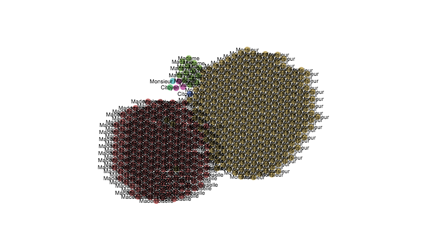
The visualization itself is not the best way to intrepret the data, however it achieved my main purpose of trying to figure out the amount of people of a specific gender. Looking at the image, you can see that there is almost an equal portion of gentlemen (monsieur) and young ladies (mademoiselle). On the other hand, there are very few older women (madame) and citizens (citoyens). Simply by looking at the clusters, you can see that even though there are more males in the theatre there are still a considerable amount of young ladies. This could be due to different factors such as maybe young females in the the french theatres were used at the time to bring a larger crowd to see the plays, especially to bring in a lot of bachelors. Perhaps it could be that young females were more readily available as young men had to serve in war as soldiers or had other duties at the time. In the end, there could be a lot of contributing factors as to why this was the case. Despite the fact that the visualization allowed me to grasp a better understanding on this matter I still feel that it lacks in a lot of other areas. I think that as far as portraying other information such as seeing how the gender population in the theatre changed with respect to time/events that occured or how did it compare according to the plays performed at the theatre or maybe according to the season. There are still a lot of unanswered questions and better ways to visualize the data but this was useful in giving an overall view and for raising new questions on the topic.
The next visualization tool used was Breve. Breve is a great tool as it allows one to see discrepencies, errors, detailed information, source types, and much more within the data sets. The image of the visualization can be seen below:
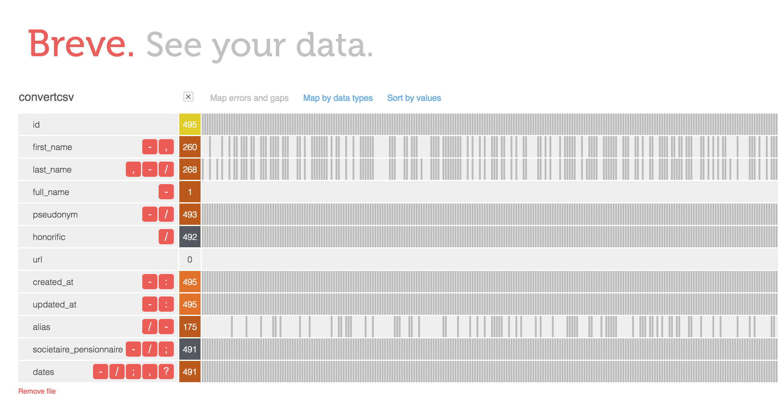
As you can see in the image, most of the information within this data set is fairly consistent and fully given. However, there are also missing information such as first and last names which were not recorded. I don’t really know why that is to be honest nor do I have any suggestions for it. However, it does raise certain questions like How come only some of the names were recorded? Did it have something to do with how famous they were in the theatre? Maybe those with names were “regulars” at the theatre and performed many shows. Although Breve does not give much a creative visual representation of the data, I think it’s a great tool to just simply plug data sets into and analyze the results to see what questions can be answered or what questions arise. With Raw Graphs, I went in knowing what it is I wanted to see from the data set but with Breve, I did not have a specific question in mind or I was not looking for anything specific. I simply just put in the data and looked at the results to find patterns or discrepencies.