Commentary
-
Stanford ner
The most difficult part is the preparing stage. Since my computer does not have java, I tried to download it and I spent sometime figuring out how to run. The classifier command actually has finished coding to filter and select information. I just copy and paste texts from the annotation studio and the result is quite accurate. However, it is more like purly information selection and the interface is never designed in my eye. But the potential is for my understanding, it all depends how you carry out coding. If the coding aims at calculate key words, then the programmer just writes a certain coding sentences. The possibility is unlimited. But for me, this stage is more like scanning and general reading. The annotation studio is more for deep learning. Only if you are familiar with the content could you select by comments and broaden your horizon for more resources. Enter text in Markdown. Use the toolbar above, or click the ? button for formatting help.
-
miles-NER
Named Entity Recognition assignment
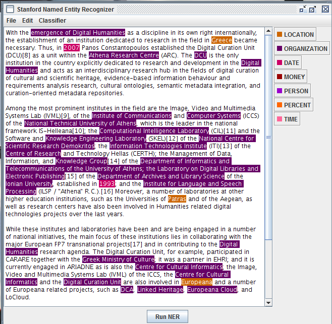
I tried out a few of the Europe-DH texts in NER (Netherlands, Spain) and found that it worked pretty well: apart from missing a few organization acronyms and location abbreviations or variants (e.g. “U.S.” or “Italian”), it does capture and categorize most of the entity types that it promises. From a visualization perspective, though, it’s a little limited: there doesn’t seem to be an easy way to have the tool display certain entity-types in isolation or clusters of entities that are close to each other.
I wouldn’t say that I would be able to get a “basic understanding” of these articles merely by looking at the highlighted text. At best, I’d get a quick glance at different kinds of DH projects underway in these various countries, associated with particular organizers and cities.
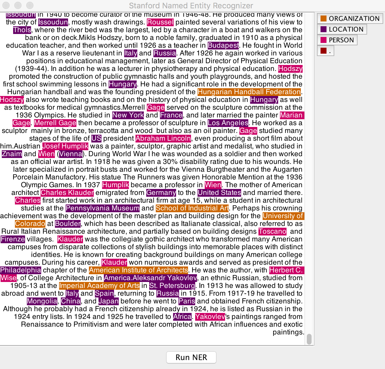
When I entered the text from our Olympic Artist bios, to see what NER could contribute to our project, I found it similarly effective at delivering on its stated objectives but it left me wanting more. I wonder whether another form of interactivity for a program like this could be to allow users to define their own parameters for different kinds of entities and assign those new entities their own names and colors. In the Olympic Bios example, it would be especially great to get the NER to recognize terms relating to artistic periods and movements: terms (toward the bottom of the image above) like “gothic,” “Renaissance,” “Primitivism,” “African influences.” At the very least, I could imagine programming–or letting users add a function–to capture words that end in “-ism.”
That said, in this case, the tagging of organizational names (different Academies and Schools) could provide similar insights about artistic affiliations and styles.
Enter text in Markdown. Use the toolbar above, or click the ? button for formatting help.
-
Stanford NER Review
 The Stanford NER demonstration GUI in action
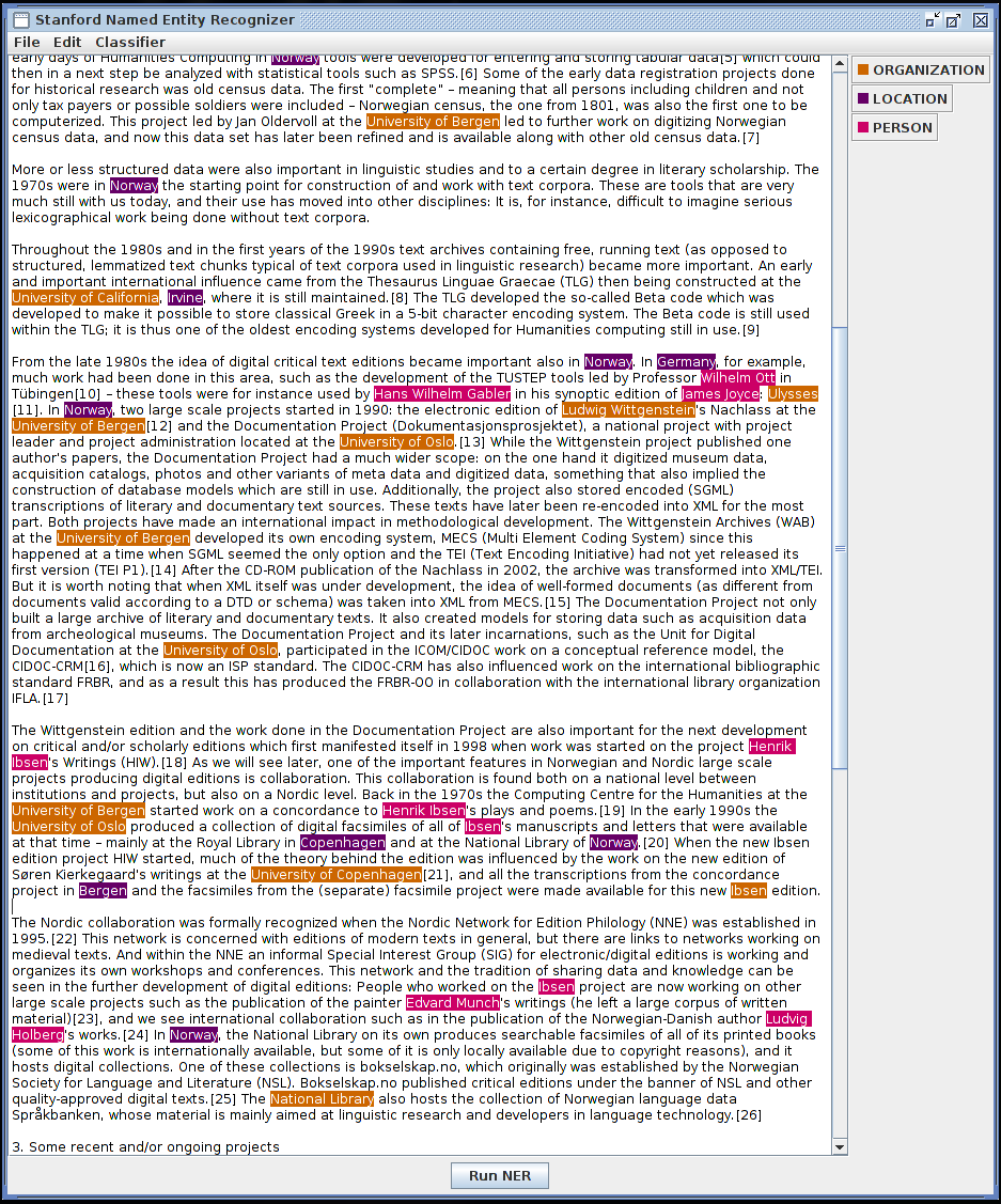
Overall, this software works fine. It is able to recognize most of the title-cased words in the text I chose to analyze (about DH in Norway) and correctly identify them as an Organization, Location, or Person. It did mistakenly recognize “Social Sciences” as an organization, yet correctly failed to recognize “Humanities”. I could critique the user interface but expectations are set appropriately by having to download a zip file and run the GUI with a
.shscript. More interesting is the software, which I was fairly easily able to run within the Python Natural Language Toolkit, a standard for text processing. Other than having to upgrade to Java 8, this was a painless process.As for its utility: somewhat useful. The user interface is the biggest detriment here, as I cannot increase the text size or change font, which means that it’s not very helpful for doing a full reading. But I can get a basic understanding of the organizations involved (UC Irvine, University of Oslo, University of Bergen) and some of the people (Wilhelm Ott, Hans Wilhelm Gabler) at a glance. If I were developing software with this tool, I would try to automatically link these entities to more descriptions / information about them – maybe the relevant section of a Wikipedia page, for example. It would also be fantastic from a usability standpoint if this were incorporated into a better reading tool, such as the browser on which I originally accessed the text, maybe in the form of a browser plugin.
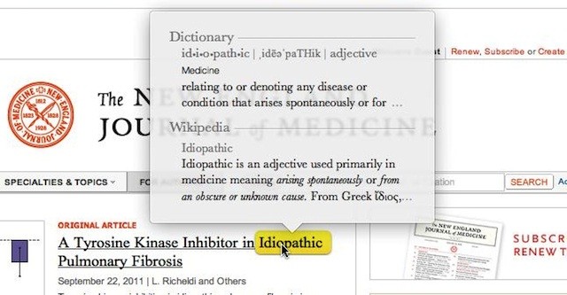
While hyperreading the same text, it was immediately obvious that the computer could be aiding me in my work of linking this document to others. It would have also been nice if it could provide background blurbs around the different entities it recognized, much in the same way that macOS allows for the automatic definition / lookup of words:
I did not find the NER particularly useful for close reading of a single document, but if it were to enable links between multiple related documents (say, in a single corpus) I would find it nice to be able to jump to related ideas or references in all of the documents in the corpus any time they’re mentioned.
-
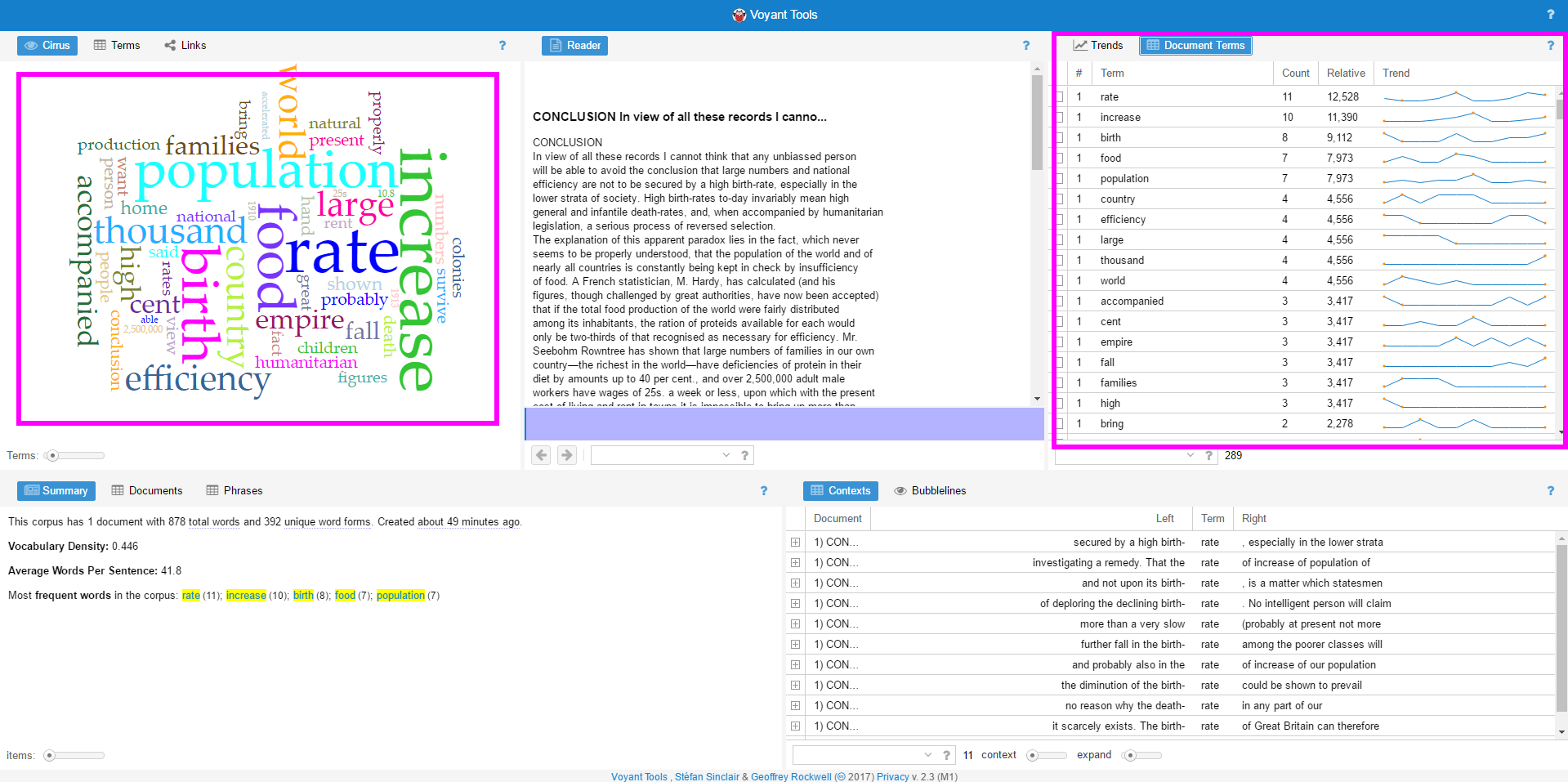
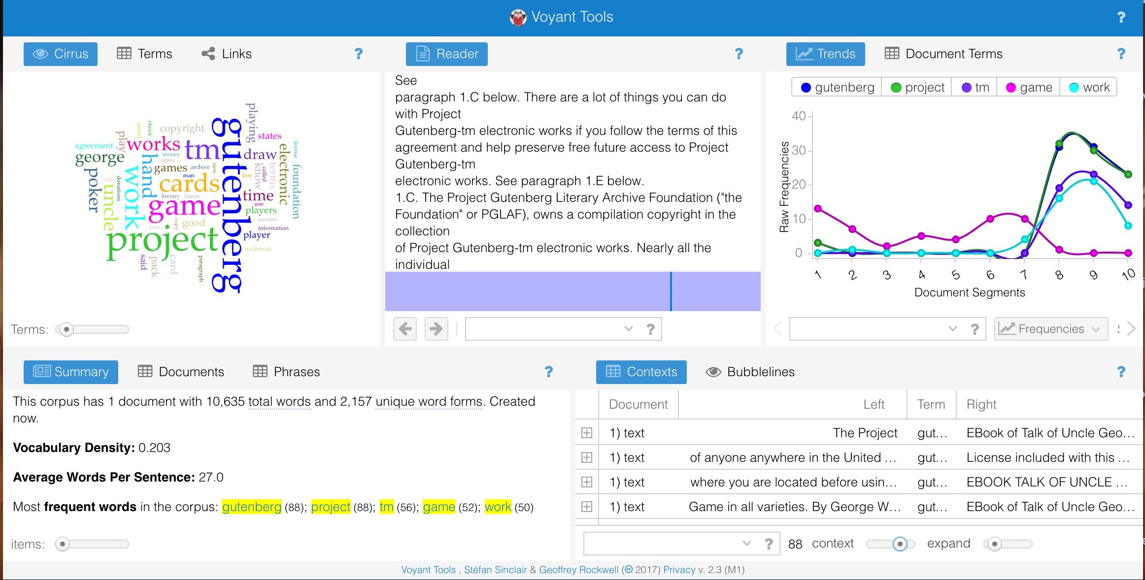
Voyant+Antconc tool User test—Yuchuan
The book is “The Case for Birth Control—A supplementary Brief and Statement of Facts”
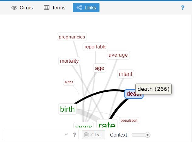
The two tools could both provide search based on key words. However the layout is quite different which directly influences user experience. I prefer Voyant which is more direct and beautiful. It manages to juxtapose information. It allows all the information windows showing up at the same time. You could see the original text in the middle with other 4 dashboards around. All the dashboards change simultaneously.
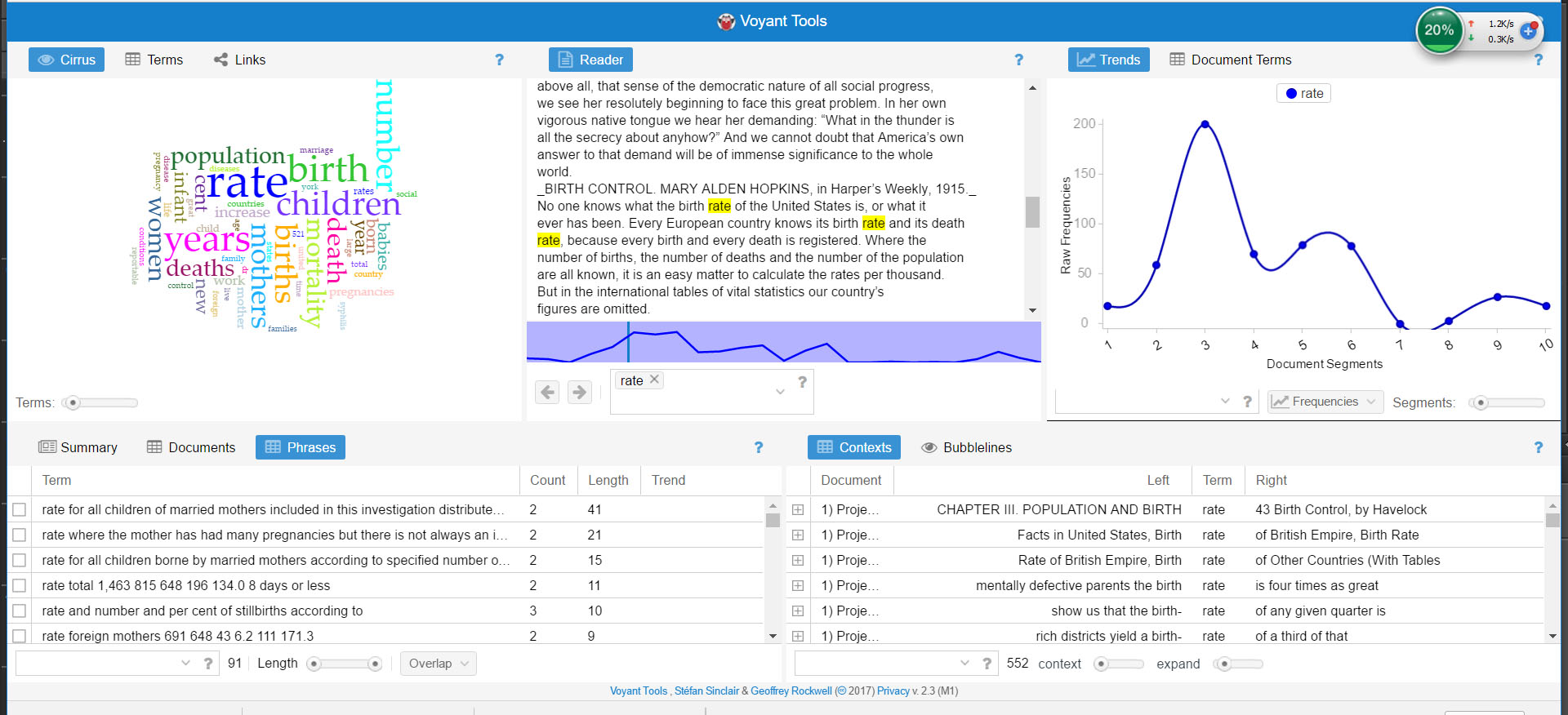 The most frequent words are rate, birth, years and children. If you click “rate”, it will provide you with its appearance in each segment of the article based on the trend curve. Also, you will get the phrases and the location of each “rate”. It is very clear and you could quickly get a picture of the main idea of the article. The links of each key word is also important for further study.
Also, I would prefer examples for further study and supporting argument.I prefer the way of story telling which includes visual pleasure and content support. If it is possible to recognize names and places of examples, then it maybe more easier for readers to enjoy it rather than only a tool.
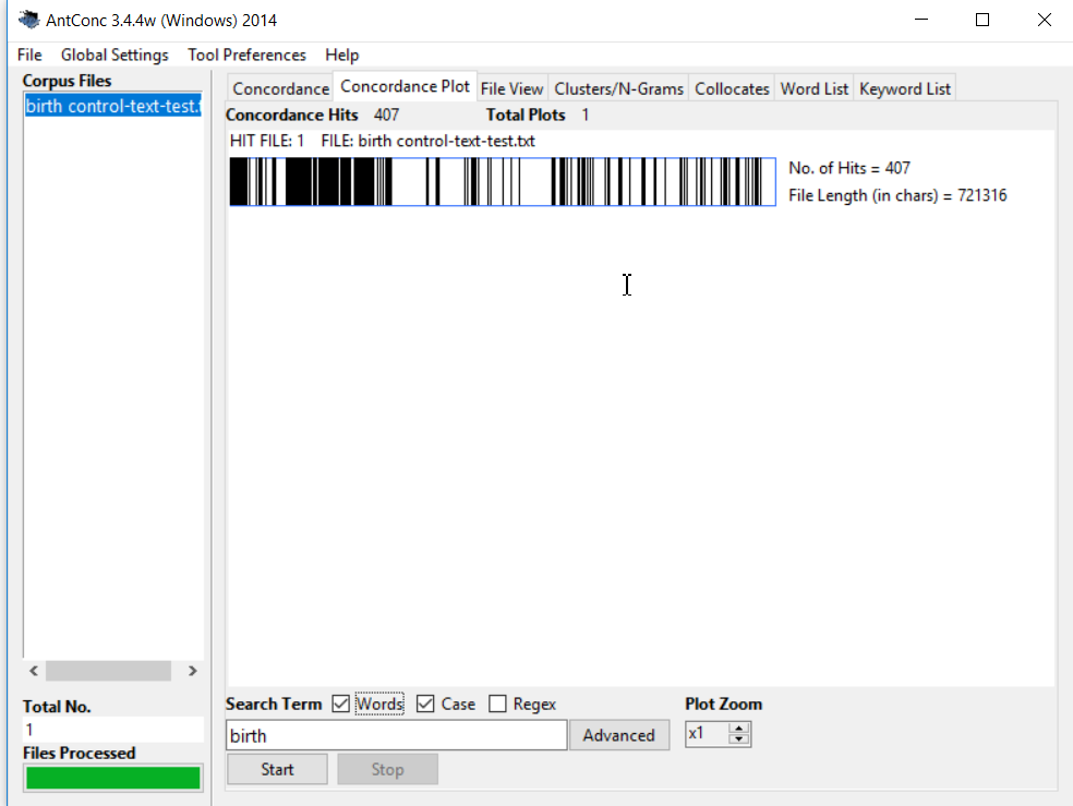
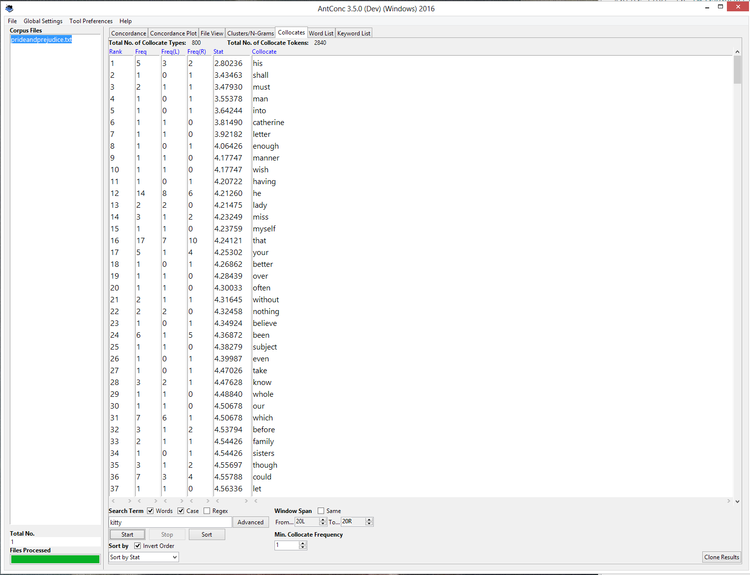
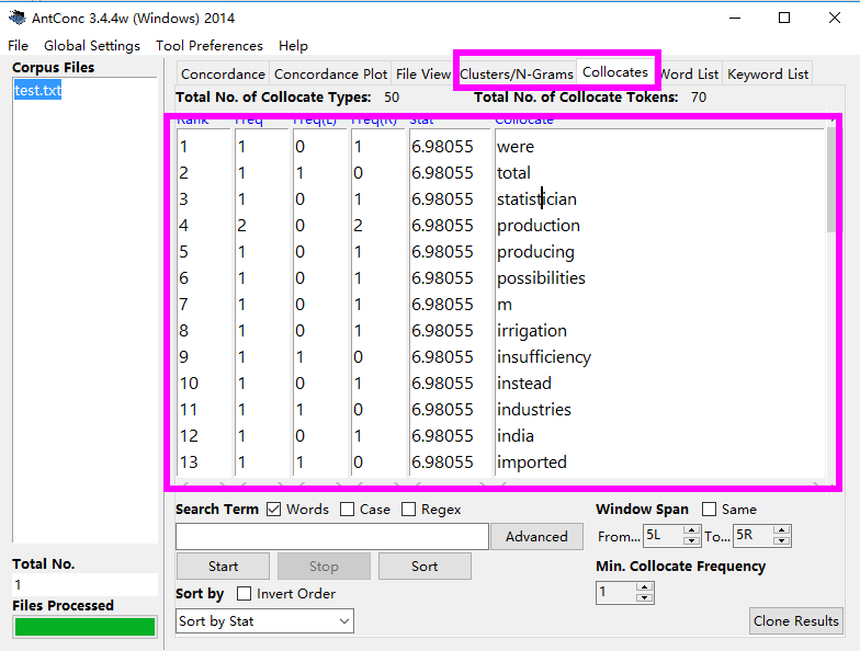
Antconc is really hard to use. It more like a linear way of doing things rather than multi-functional way.You need to change windows by clicking each button of the top column. Voyant tried to mak text analysis more visualized, but Antconc is text at all. Also it needs the file to be in a certain format, however voyant could be used by copy and paste.
Enter text in Markdown. Use the toolbar above, or click the ? button for formatting help.
-
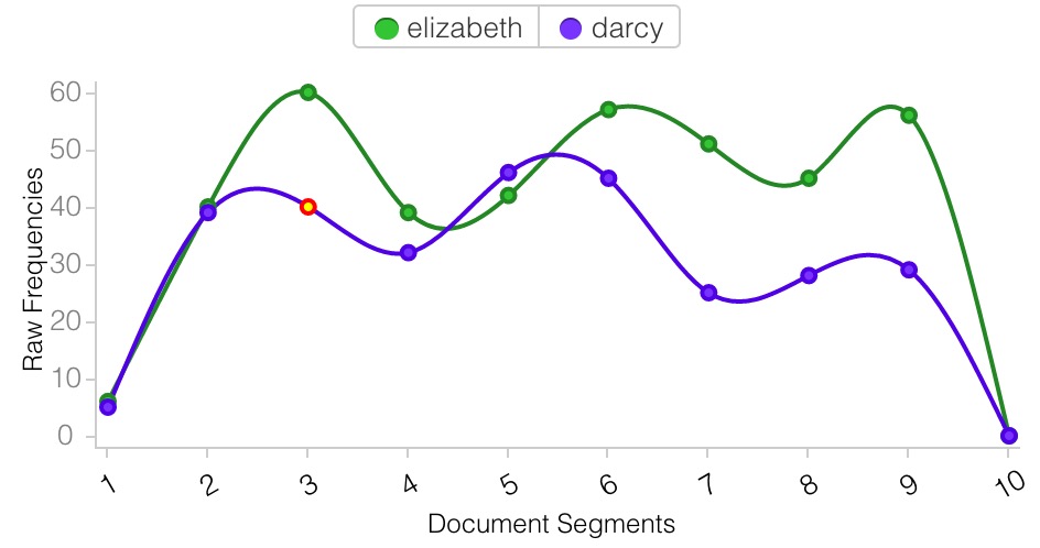
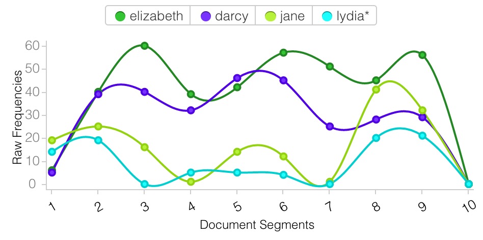
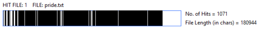
Voyant and Antconc
Text: “Pride and Prejudice”
Fun facts research: where the prefix go? When I load the full text of “Pride and Prejudice”, the interface of Voyant seems like this.
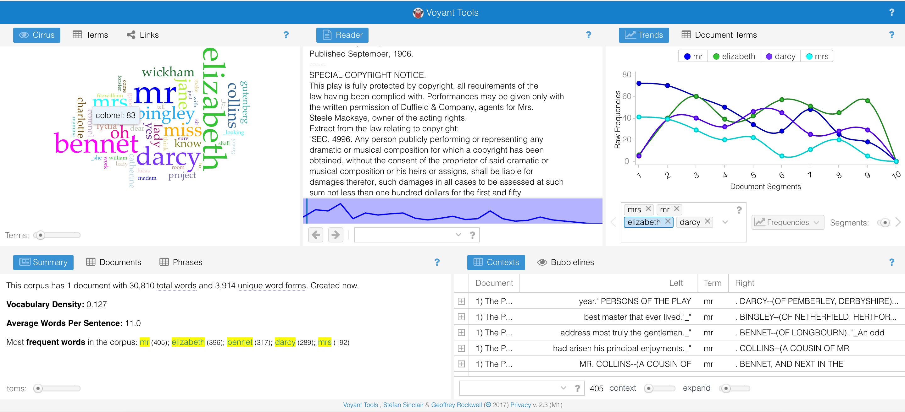
It draws my attention that the frequency of the word “mr” and “mrs” drops down rapidly when it comes to end of the book. However, the use of lead’s name “Elizabeth” and “Darcy” is not rising that much. Then I add more names into the charts. It seems like teh prefix is taken place by names when readers “get to know” charaters.
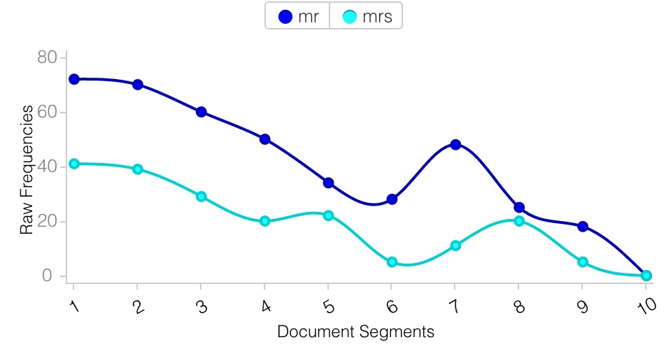
I tried the similar research on the Antconc. It does not seem like that nice and easy to do the same thing. I have to search each word seperatly if I would like to compare them, however, it is easier in Antconc to combine the word together. Sometimes it is not clear when lines mix with each other.

Voyant obviously has better user interface and friendly user experience. It predicts the needs of user and reflect them in the interaction details.
-
Voyant and AntConc Compared
Voyant and AntConc both analyze text in mostly the same way but display their results very differently. Voyant uses for an colorful, interactive, and flexible model of panels which allows for the display of a great amount of information about the text all on one screen. AntConc opts to use a system of tabs, so the user can only see one type of analysis of the text at a time.
Here is Voyant’s multi-panel design:
And here is AntConc’s tabbed design:
I think Voyant’s design is more conducive to the discovery of patterns in the text. Word counts, frequencies, distributions, and concordances are all visible at the same time, as well as color charts, giving more opportunities to find interesting structure in the text.
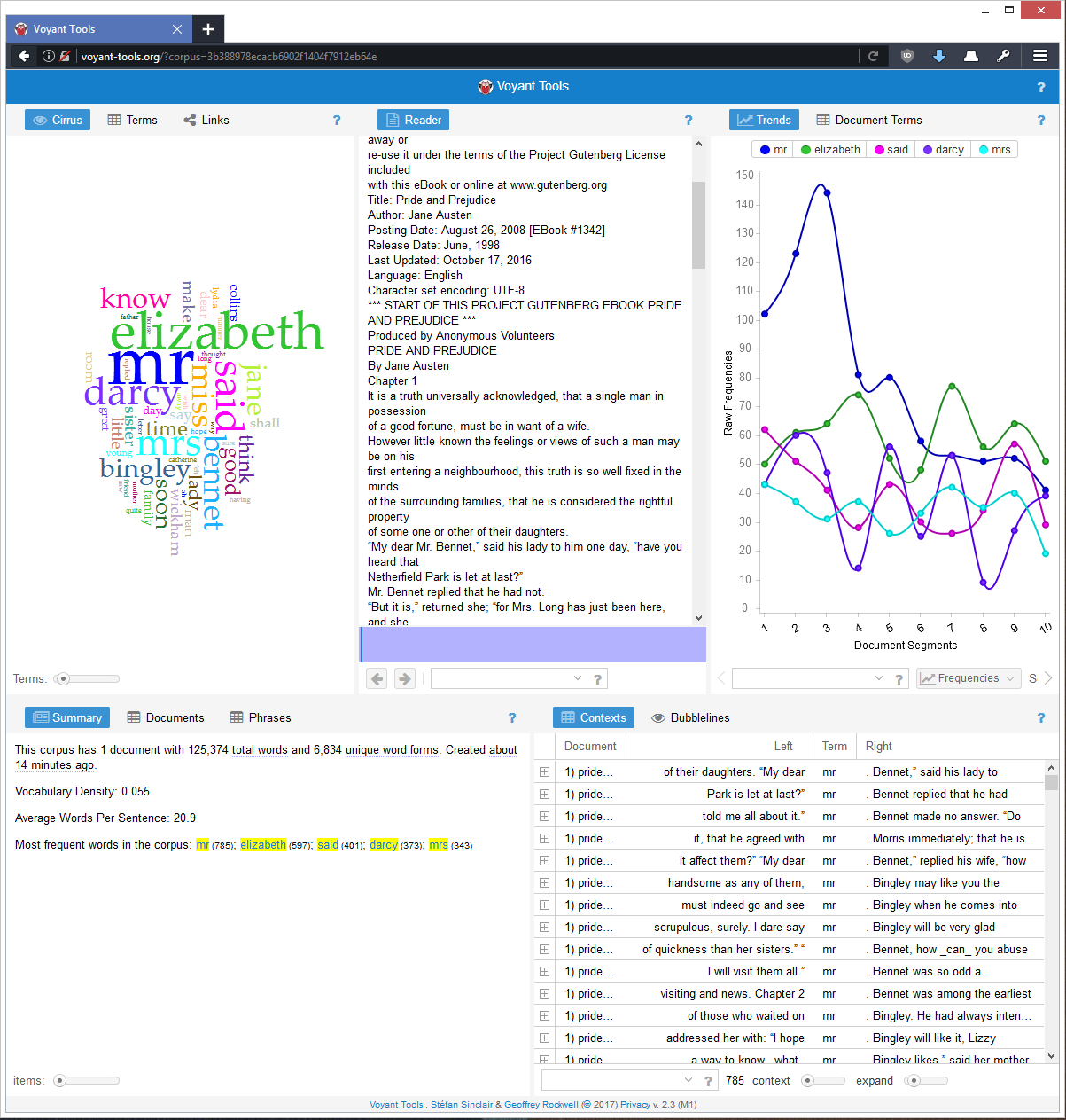
Voyant also automatically analyzes the whole text, which turns out to be a very useful feature. In AntConc, you only receive results onces you’ve searched for a term. Without even a word frequency count like Voyant gives, you might not know which words to analyze with concordance or other measures. Because of this, I think AntConc is more suited to a researcher trying to answer a specfic question about a text they are already familiar with. I analyzed Heart of Darkness - anyone who has read the book would know that ‘river’ and ‘Kurtz’ would be interesting terms to look at. If I wanted to know about references to the river in Heart of Darkness, AntConc could give me that. If you didn’t know what terms to search for, AntConc would not be very illuminating and Voyant would be a better option.
That said AntConc’s user experience is terrible, at least on my computer. All the information is displayed in text, which is jumbled and overwritten by other elements on the page at times. In the picture below, the words ‘rank’, ‘frequency’, and ‘range’(?) are all partially obscured:
AntConc’s display tabs also have a lot of wasted space, as seen in the first picture above from AntConc. The chart shown in the image, which is the most important part of that tab, is much smaller than the space it could fill, and the remaining space is just white screen. I think AntConc was built by someone who was mostly concerned about the functionality of the program and added a minimal graphical interface on top as almost an afterthought.
Voyant is definitely the better program of the two. It is visually appealing, gives a comprehensive overview of the text in addition to word-specific results, and gives a lot of information all in one place.
-
miles-textanalysis
Texts as Data: Ulysses and Digital Analysis
Predictably, I chose James Joyce’s Ulysses for my test-runs on Voyant and AntConc.
Starting with Voyant, I was surprised to find certain terms in the Word Cloud. (I’ve come around to the general course opinion that Word Clouds don’t really mean much design-wise, but at least this one is a quick and clean visualization of frequency.)
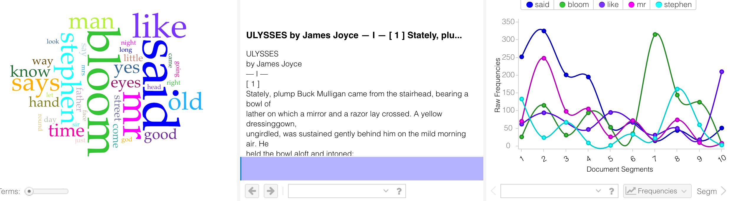
In spite of the fact that Joyce uses dashes instead of quotation marks for his dialogue (or maybe because of this choice), “said” is the biggest word here. A few notable clusters: “eyes” and “look” (especially interesting considering Joyce’s growing blindness during composition); “day,” “time,” “night” (appropriate for the novel of a single day); and “way,” “going,” “came,” “round” (befitting character movements through the city).
In the chart depicting frequency over document segments, the most interesting spike is the rise in “Bloom” in segments 7-8. The reader follows Bloom through most of the novel, but we begin to see him more from other characters’ perspectives in the cluster of episodes “Sirens,” “Cyclops,” “Nausicaa,” “Oxen of the Sun”… I expect most of the spike is due to “Circe,” in which the word “Bloom” precedes each of his lines–as the chapter is in the style of a play.
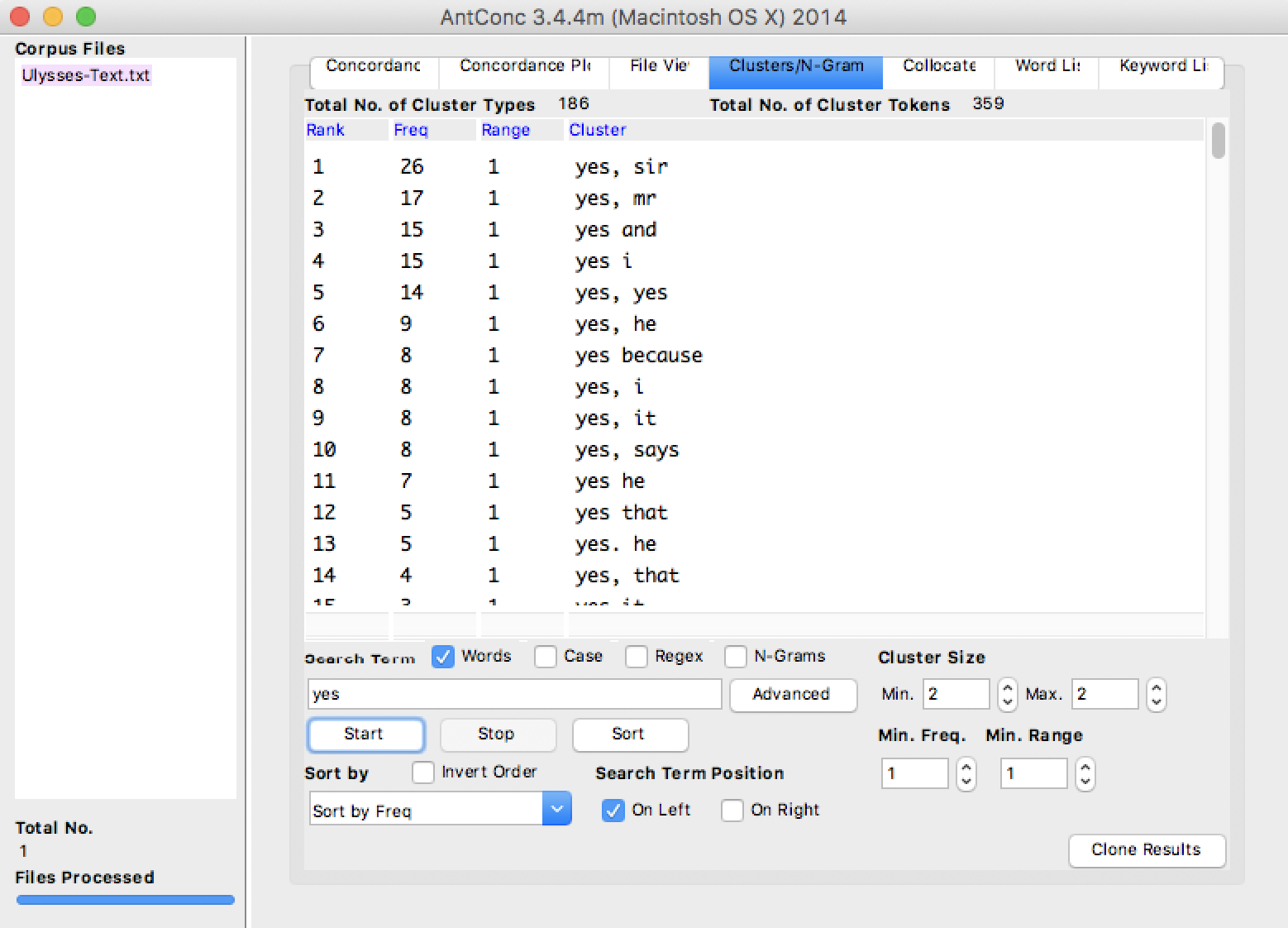
Noting the prominence of “yes”–maybe the most famous word in Ulysses–I focused on that term in AntConc.
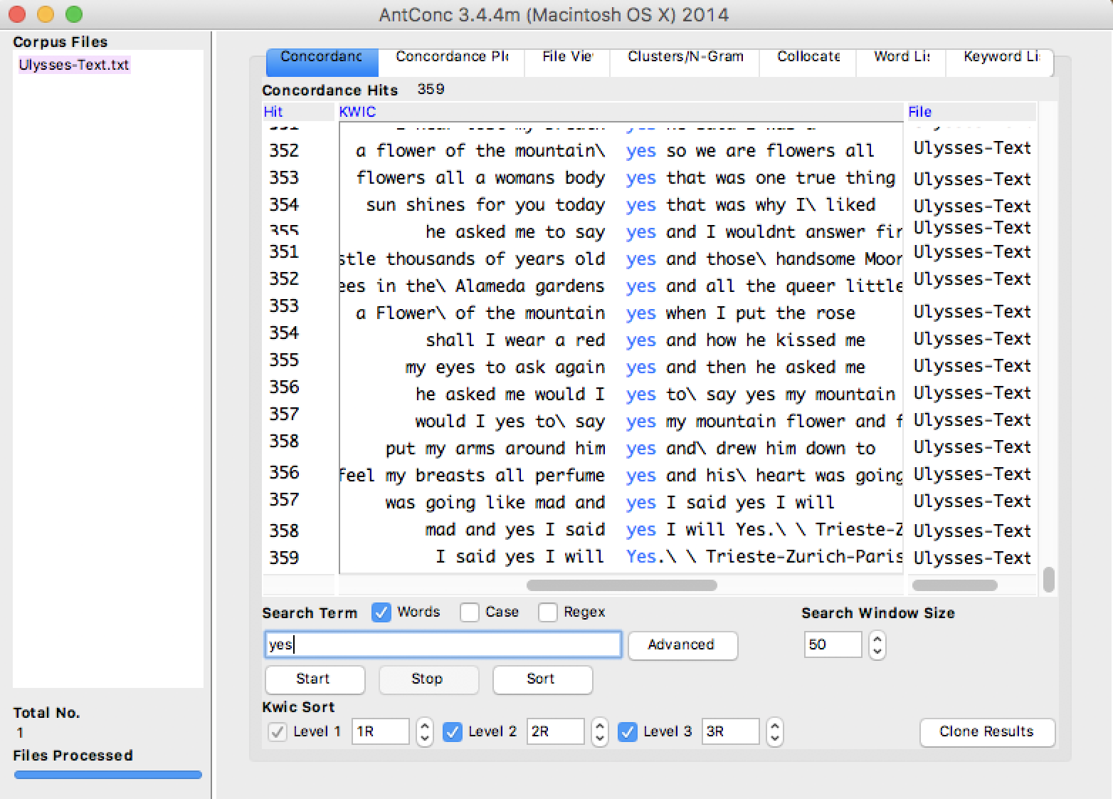
Above, we see the best-known uses of “yes,” in the final episode. “Yes” is often beside “and,” as a form of punctuation or conjunction. But these are not the only uses.
Since Molly’s “yes and” combinations occur in just one of 18 episodes, the majority are actually in bits of dialogue. This, combined with the prevalence of “said” noted in Voyant, makes me realize just how prominent interpersonal conversation is in a novel that’s purportedly an exhibition of stream-of-consciousness.
One last “yes” observation:
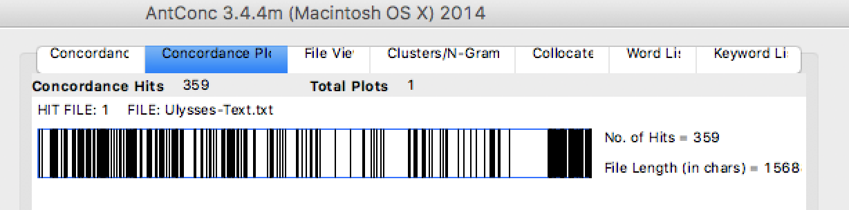
I was really surprised to see the blank space preceding episode 18, toward the end of this chart. After all, episode 17, “Ithaca,” is written in question-and-answer format. One would expect, then, to see a few more yes-es. But when I checked the concordance tab again, there were only three.
In general, I found AntConc more fine-grained in its analysis and more generative of interpretive ideas. But I may not have played around enough with Voyant to see all of its potential. AntConc, perhaps, could use more engaging graphics, but given the gimmicky nature of some of Voyant’s visualizations, maybe a simple presentation mode is actually more effective.
-
miles-hayles
Comments on Hayles, “How We Read”
The three concepts
-
Close reading. A defining skill for literary studies that has helped literature departments justify their existence to university administrations, that has led to the development of “symptomatic reading” (i.e. when reading between the lines isn’t enough, read against the text), and that may now be losing favor among a new critical generation of “surface readers” and a new young generation of screen readers. Insofar as close reading has led critics to advance their ideologies against the goals of the text, it’s getting to be a tired method; but insofar as close reading can still encourage analysis of affect or cultural importance, it may remain vital.
-
Hyper reading. Reading skills (and, possibly, weaknesses) developed co-dependently with the rise of computer screens and web pages. Hyper readers are good at moving quickly among varied information and processing salient details in longer pages quickly by skimming (often, it seems, in an “F” formation), but they are less good at sustained concentration or catching all the information available. As studies continue to describe hyper-reading practices with more and more accuracy (in spite of Hayles’s justifiable reservations about fMRI studies), creators of digital content often adapt their material to hyper readers, which cements behaviors further.
-
Machine reading. Hayles makes the provocative argument that humans and machines do not read differently enough to warrant the assumption that the two forms have nothing to do with each other. Rather, drawing on classroom experiences and scholarship by Moretti and others, “How We Read” proposes that the relationship is dynamic and interactive: humans teach computers what to be interested in, and computers show humans patterns and questions they may not have anticipated.
Just this morning, I told my World Literature students one of my favorite maxims (which I may have invented or may have stolen from somewhere–I can’t remember): “close readers are close writers.” My belief in continuing to teach close reading, even if it’s sometimes considered passé, is that it makes students better at expressing their own ideas, since they begin to apply the same analytical tools to their own diction, tone, style, syntax, figurative language, etc. So I’m specifically curious as to what writing benefits Hayles imagines arising out of teaching these other kinds of reading. Certainly, I can believe that by practicing hyper reading and machine reading, we become more effective at writing digital content in a way that our readers will capture in turn–but at a more fundamental level, can it teach good habits of word choice, argumentation, or description?
Enter text in Markdown. Use the toolbar above, or click the ? button for formatting help.
-
-
Kathryn Hayles and Reading
It took me awhile to understand what Hayles was talking about as I read her piece on close, hyper, and machine reading. It was definitely targeted to people with a working definition of close reading because the piece never gives a clear answer on what that is. The best definition I can come up with is “reading, with close attention paid to literary techniques and concepts”. Close reading involves thinking about and looking for themes, intent, and rhetorial devices in the text. The definitions Hayles quotes are laughably nebulous. One “more specific” definition she gives is “a modern academic practice with an inaugural moment, a period of development, and now perhaps a period of decline.” This says absolutely nothing about what close reading is. The same could be said about Mendelian genetics or many, many other practices, but they aren’t close reading. I don’t know why Hayles included this confusing and unhelpful definitions.
Hyperreading is better defined in the text, since it is a term that Hayles helped create. Hyperreading is the type of reading we do online. It may involve links, multiple pages, navigation menus, and other web-type elements. It involves scanning and skimming techniques and is more interested in getting the gist of a document of set of documents than a close-reading-style analysis.
Machine reading, as Hayles describes it, seems to be more about word counting and concordances than other types of reading. In the five years since this piece was written, machine summaries have become much more powerful tools in analyzing text. I can see a machine-read summary being a very useful thing to have while reading a long text, just to keep things in context. Things like word vectors, thought vectors, and sentence vectors are also interesting in that they allow computers to cluster these abstract objects into a Euclidean space where more traditional numerical methods can be applied to text results. I would be very interested in seeing Hayles’ thoughts on more recent machine reading developments.
I found some of Hayles’ arguments and examples to be a bit tenuous. At one point she writes on the important of anecdotal evidences, calling it “perhaps the most valuable” tool for analyzing the trends in reading techniques. She writes, “We make daily observations that either confirm or disconfirm … scientific literature.” While this may be partly true, it is also almost the definition of confirmation bias. If a person has an idea in mind about how people might read and trust their own observations over those of well-crafted studies, they are at great risk of just reaffirming their own opinions. Another time, Hayles describes how two sisters, one literate and one not, apparently think differently because of their literacy levels. This is really interesting, but Hayles uses it in an argument that print reading skills lead to high-level cognitive abilities when compared to hyper reading. The use of this example is incorrect here because while there is clearly an effect of literacy on thought in the story, there is no suggestion that the same effects wouldn’t come from hyper reading literacy. This paper had some really interesting points but I kind of distrust it because of how it was at times very vague and at other times used what I feel were dubious supports to its arguments.
-
downs-voyant-antconc-review
I chose to explore Jane Austen’s Pride and Prejudice in Voyant and AntConc. Although AntConc is desktop based and Voyant is an online suite of tools, both calculate more or less the same metrics: word lists and counts, keywords, n-grams, concordance.
I am not a humanistic researcher; it was hard to understand exactly which questions I might be asking that these tools would be answering. I found the clustering tool to be interesting in that it revealed to me which characters were mentioned nearby each other. But you would also be able to tell this from reading the book, and it would give you a much better idea of how the characters interact with each other.
The Voant suite seemed less useful to me because I could not export data to analyze with my own tools, like I could with AntConc. I’d say they’re more or less equivalently useless.
What I’d like to see is an interface focused more on common questions that researchers have, or at least better guidelines on how to use these tools to answer those questions. In that respect, the documentation PDF that comes with AntConc is much better than the online documentation tat is available for Voyant. Also, the interface of AntConc, while less flashy, is easier to understand.
-
Reading in $CURRENT_YEAR
In Kathryn Hayle’s How We Read: Close, Hyper, Machine, Hayles creates a framework for analyzing reading under the three titular paradigms. She summarizes existing scholarly work related to these forms of reading, and how they affect each other and the humans who perform them. She concludes that they are best used in conjunction with one another, and that they each have their own advantages and disadvantages – surprise, surprise.
Close reading, Hayles argues, takes many different forms, but in general involves a human analyzing a single text. Hyper reading is “reader-directed, screen-based, computer-assisted reading”, involving many different works linked together, between which the reader regularly jumps. Machine reading, in contrast to hyper reading, is primarily performed by a computer with “human assistance.” Hayles presents the three in this order, which could be also be described as most human-dependent to least, or of smallest context to largest.
My personal experience is in accordance with Hayles’ final recommendation (that students be taught to read in each of these ways, for they’re complementary) but I take some issue with a few of the arguments on which she relies to make this point. I have found hypertext an invaluable improvement over the text I read on paper. Importantly, hypertext can be used in many ways, but Hayles never formalizes exactly which form her “hyperreading” takes, or the form that it takes in any of the studies she cites in arguing that it reduces reader comprehension. Following every hyperlink in a text as it’s encountered would certainly be distracting and negatively influence my understanding of a text. But opening them in background tabs for later reading to further challenge and enhance my understanding of the primary text feels essential to how I read in 2017. It’s equivalent to practices engaged in by scholars from the beginning of the printed word. And it certainly doesn’t detract from the experience of reading.
Hayles also acknowledges that skimming, filtering, searching, “pecking”, fragmenting, juxtaposing, and scanning, are not only essential to understanding large amounts of information, but have been usefully employed by scholars as long as they’ve been available (see the Ferris wheel of books invented in the Renaissance.) These are all hyperreading techniques, but they’re useful in other contexts. Hayles points out that they’re a different form of reading altogether – that’s exactly right, and how they seem to be employed by me and my contemporaries. These hyperreading techniques allow us to understand what’s important to read closely. Hayles acknowledges this towards her conclusion.
Hayles also mischaracterizes machine reading as having the least context available – “limited to a few words or eliminated altogether, as in a word-frequency list.” But a computer doesn’t read a word-frequency list, it creates it. A human reads it. During the reading process, the human-created algorithms that Hayles calls a computer have every single work it analyzes available as a context: much larger than a single work or a few hyperlinked works.
Hayle and I arrived at the same conclusion, through different methods. When she suggests that “literary studies teaches literacies across a range of media forms, including print and digital, and focuses on interpretation and analysis of patterns, meaning, and context through close, hyper-, and machien reading practices” I’m right there with her. But when she suggests that engaging in hyper-reading negatively influences one’s ability to engage in close reading, I cannot agree. We engage in these practices for different purposes, and it’s misrepresentative to analyze them on the goals of each other. They’re best used together, as a suite of tools, to give scholars the best available understanding of the work they aim to analyze.
-
Comparison of Voyant and AntConc
I picked the ebook named The Case for Birth Control by Margaret Sanger, and chose one of the conclusion part to analyze. My conclusion is that Voyant is way more better for me than AntConc in terms of understanding the text efficiently and comprehensively. First of all, Voyant is an online tool which supports more import formats than Antconc does. It also can auto detect multi-languages. Who would refuse such an open tool?
Secondly, the UI of Voyant result page is well organized. The word cloud on the top left is quite helpful if you could combine the top right interactive chart. While AntConc is still using the old fashion UI in terms of limited colors, compact text/tags… It is obviously better to have a dashboard page like Voyant, allowing user to compare various result elements while they can also easily direct to specific word or sentences. (Putting the text view on the center of the dashboard is essential )
Thirdly, the trend/frequency visualization of Voyant is very straightforward while AntConc is more rational. But the advantage of the latter its analysis of clusters and collocates.
-
Comment on reading
Is the hyper reading and machine reading everything to digital reading? Hyper reading and machine reading are definitely digital savvy compare to close reading. However, it is definitely not the only reading solution in the digital era. Hyper reading gives structures to the text, preventing too much information loaded in one page. Also, it is a way to respond to F shape reading habit. Besides, interactive element is added into the equation. Hopefully, it might increase the interest level of readers. One of the biggest problem for hyper reading is that too much engagement is required. When readers don’t have the motivation to click the hyperlink, this reading method is not useful at all. As for the machine reading, it is more concentrate on text analysis rather than meaning. For example, users can easily figure out the word frequency and its comparison by using some machine reading tools. However, it is a challenge task for the tools to understand the text and do further analysis for users. With the progress achieved in natural language processing, I believe more intelligent tool would come into being someday.
-
Reading Commentary: How We Read
Text: “How We Read: Close, Hyper, Machine”
In this text, Kathryn Hales goes over the three main methods of reading which are: close, hyper, and machine. Close reading is paying attention to the small and important details in the text in order to analyze it. Hyper reading is more of a digital-based method where the reader uses technology like the computer to read a text and therefore tend to fall upon the act of reading quickly through it by just scanning or skimming over it. Machine reading is using technology and literary skills in order to find certain patterns or to analyze the text using both traditional and modern methods. For example, like using word clouds and frequency based word counts to aid in coming up with a perspective on the text.
Kathryn however mentions how it is imporant to have a good balance of all of these methods in order to achieve improvements in reading and analysis of texts. In this case, I agree with her. Whilst sometimes I think one method may be better, I think it all depends on what it is you’re trying to achieve and what it is you’re trying to analyze. For example, using digital medium to parse through texts and show things like frequency of a specific word within the text might prove useful in the sense that the author of the text put that word in there so many times for a particular reason. Often at times though, if you are simply reading through the text, this might be something that could be easily overlooked. At the same time, skimming and scanning through a bunch of different texts allows readers to have access to a lot more content and information upon which they can use. One good example of this is when one is doing research. Often at times, this involves searching Google to try to find pages which contain relevant information. But in order to find what’s relevant usually the student will search and skim so many webpages. Then once a webpage is found which proves to significant to the research topic then they will read more in-depth on that specific information. So you see here a combination of hyper reading and close reading. Still though, I do not think I know which one is better. I am merely going by what I’ve found most efficient and what I see others do around me. However I wonder if people in the older days were able to think in a more substantial way because of the fact that they read a lot and had to analyze things themselves whereas today we have programs which help us analyze and look for patterns in texts or we have Google which ranks which pages are relevant. In the end though, I feel like the two periods of time cannot be compared. I think that although things have been made easier for us in a sense, it has also given us access to a whole new world of information and therefore has allowed us to really expand our minds to think in a different way.
-
Reading Commentary: Text as Data
For this assignment we had to use two textual analysis tools on a piece of text of our choice. I chose the text: Talk of Uncle George to his Nephew about Draw Poker
The two textual analysis tools are as follows: -Voyant: which deals with digital texts -AntConc: deals with concordancing and text analysis
**Voyant: **
Voyant really tells you a lot about the keywords themselves which are in the text. For example you can see from the picture above that the words “Gutenberg”, “Game”, “Poker”, and “Money” are some of the most frequent words in the text. In this case that would make sense since the text is about the discussion of a poker game.
**AntConc: **
AntConc shows you things like word frequencies and concordances of words within the text.
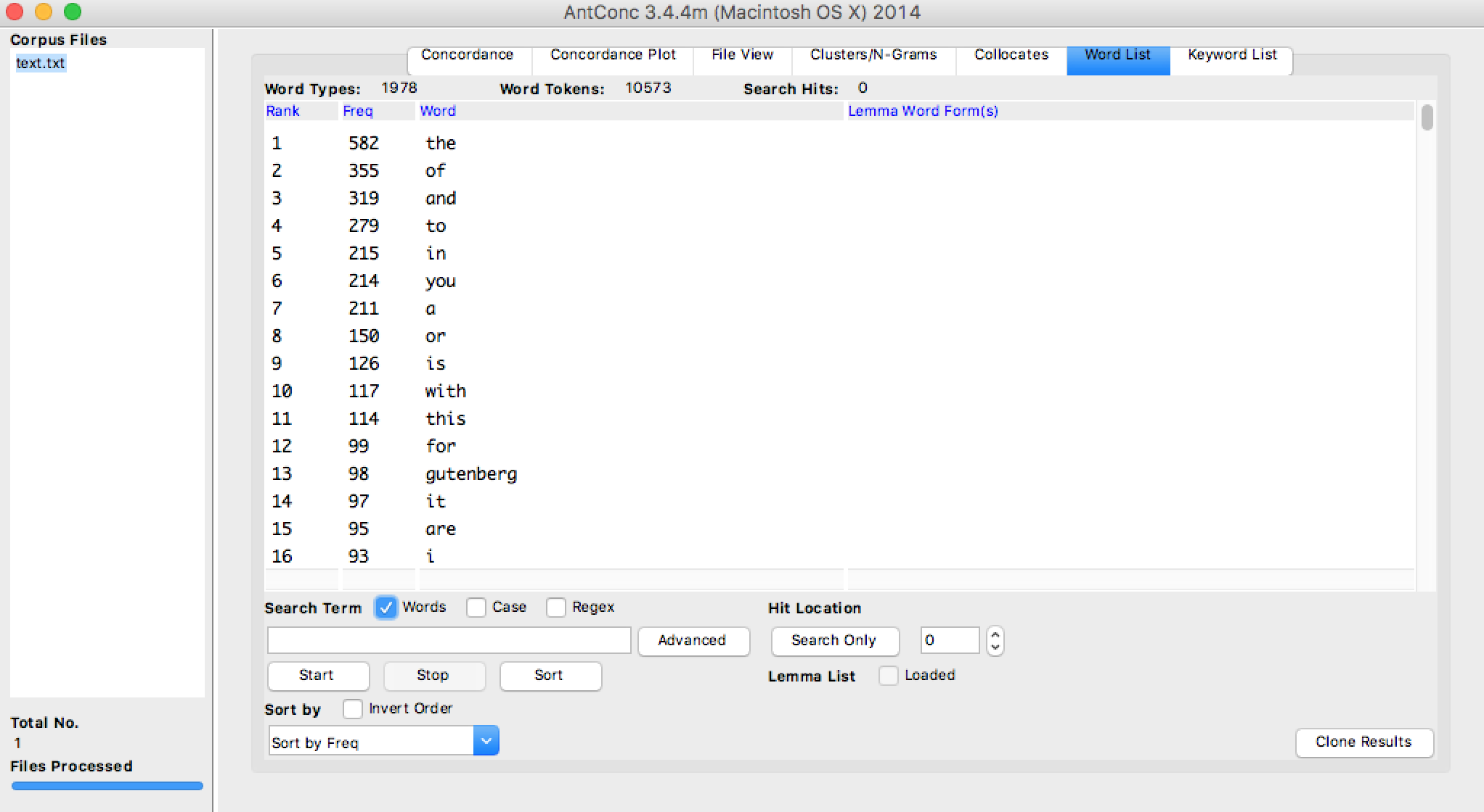
In the picture above you can see things like ranking of the words according to their frequency in the text. Alot of the words are not significant keywords but still sometimes important keywords will show up like “gutenberg” which is ranked 13th place.
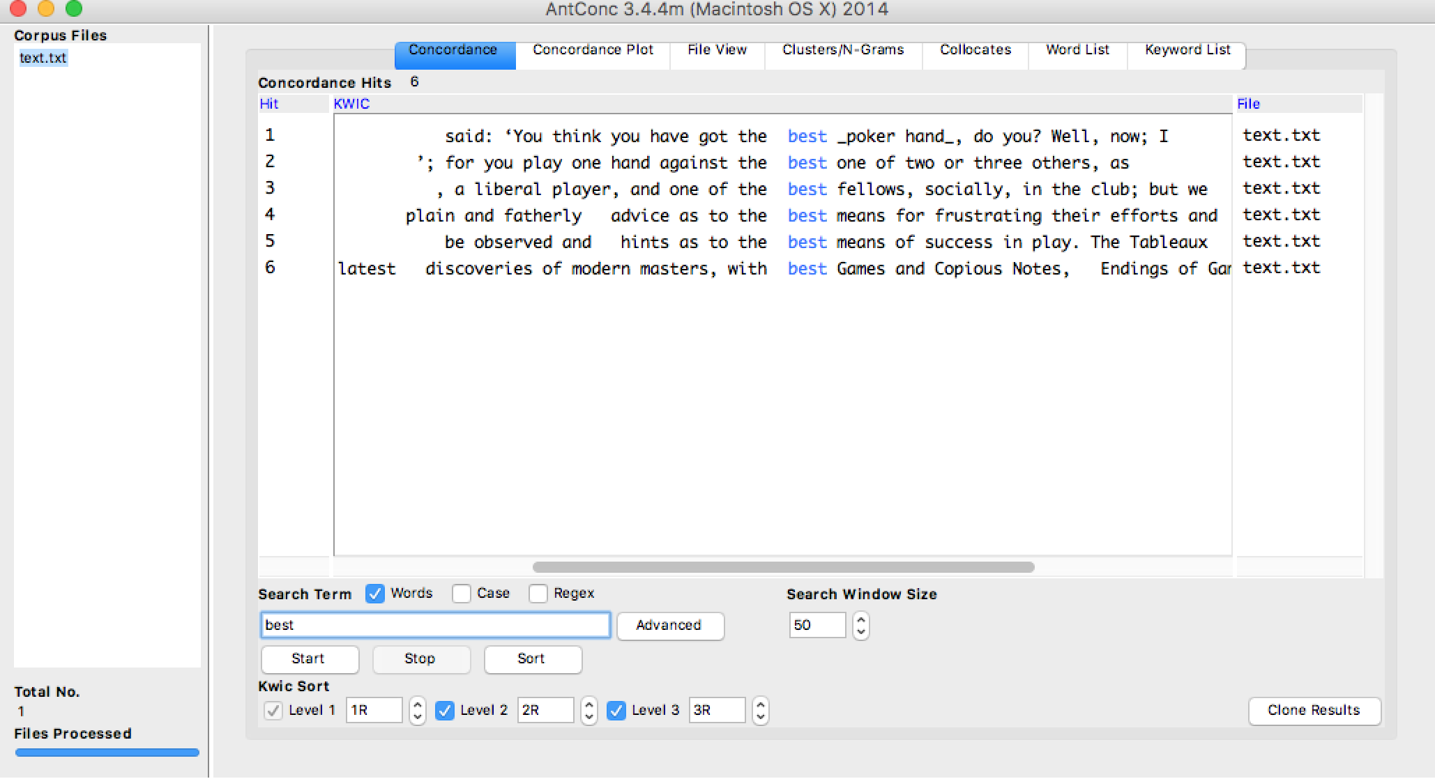
The picture above shows concordances for the word “best”. As seen in the passages that are attached to the word, best usually refers to the quality of something in the poker game like for example having the best poker hand.
I personally like Voyant better. Maybe it’s because I don’t really know how to use AntConc and found it more difficult to play around with. I feel like Voyant just overall is visually more appealing. It has nice colors and is well laid out which made everything that much easier for me to read. Also I feel like the data in Voyant can easily be viewed on the one page whereas for AntConc I have to keep scrolling down to see the other results. Another analysis I would find really useful is the idea of portraying main ideas or main themes.
-
Comments on “How we read: Close, Hyper, Machine”
Kathryn Hayles proposed very powerful ideas in the article. In our era of digital information , there is an obvious gap between instructions and available skills. Digital reading is a trend however we are taught by traditional literal teaching for close reading.
She has proposed a lot of examples how researchers are testing new ways of information convey combining close reading(mainly refer to traditional literature), hypertext and machine reading.
The F type of reading website is really interesting and I totally agree with her idea that the main point of hypertext may not only for comprehension but for enrichment. It is a fact that the explosion of information may make people distracted and hard to grab gist. But for students, if they are doing research work, it is more based on their own topic and idea, they have already got an idea and the search for hyperlinks may surely broaden their research then the linear way of reading. What they need is enrichment for their own subjective idea. We need better design to reduce distraction. Maybe the hyperlinks may appear in a specific column instead of poping out after each sentence.
The Facebook tragedy of Remeo and Juliet is a great trial. It is a great way to grab information, interact with people. It makes the master piece more close and vivid. But part of the highlight of it is its words and descriptions which is definitely not shown.
For me, it is more important that you have an idea and you may use the platform of digital materials and the tools like Wordle to help you think and analyze things, to communicate for inspiration. Traditional close reading in a quiet place, without the aim of grabing information is still important which is not only a way of enjoying literature but an attitude for the slow and non-aim life.
Enter text in Markdown. Use the toolbar above, or click the ? button for formatting help.
-
Manovich and Unexpected Developments
Manovich’s predictions on augmented space are impressively prescient. Even more than ten years ago, he was able to anticipate how deeply digital information would permeate modern life. However, I think there are two key developments that he did not expect or account for: privacy and convenience.
Manovich writes a lot about how, in the future, any space might become an augmented space. This augmented space could involve a flow of information from the physical space to the digital or from the digital to the physical space, or both. However, despite having had the technology to make a such a space possible for years now, we do not them in practice. The main reason for the lack of augmented spaces, I believe, is peoples’ privacy concerns. To a certain extent, we do have such personalized, augmented spaces today in the form of online advertisements. If our favorite websites are considered spaces, then they are often augmented with ads targeted to us specifically. We interact with different pages online, and these ads change to match our actions. We interact with the digital space, and it adapts in a loop like Manovich’s augmented physical space. People often find this unsettling though. Seeing advertisements based on your thoughts and activities is strange - it implies a monitoring that people find unnerving. Manovich’s augmented spaces also involve such surveillance to be effective. Now, a physical space augmented in ways that aren’t advertisements by people who aren’t ad agencies might be less off-putting than targeted ads online, but they will always involve a computer monitoring your every move. I think this aversion to being monitored is a big reason we don’t see more augmented spaces today. Cameras are cheap today and computer vision has gotten quite good, so we could implement augmented spaces, but ultimately people don’t want to be observed by machines.
Manovich also failed to realize how convenient modern phones are. The advantage of a phone application is that the interface is almost standard - everyone learns how to operate the menus, settings, and functionalities of their specific phone after a while. Switching interfaces - either on a phone or computer - is surprisingly irritating. I can imagine that walking around augmented spaces, each of which might have their own rules of interaction and methods of deliverying information, could be confusing and frustrating. On the other hand, it is very easy to call up or receive information on one’s phone because we all know exactly how to use them. An effective augmented space would have to have a standard design. Since phones are so ubiquitous and useful, though, there is little incentive to spend the time and resources necessary to create an augmented space when our phones are already so effective and familiar.
-
miles-manovich
Lev Manovich - Commentary
I really admired the elegance and insight of Manovich’s reading of Vertov’s “Man with a Movie Camera”–which I hadn’t expected to be the culminating point of this chapter. The argument makes me consider a number of other works of the period as narrative-database hybrids. I’m teaching Borges’s Ficciones to some undergraduates this week, and it strikes me that he’s often pushing his short stories to the opposite side of this divide from where the content would take them: stories about narrative literature often get the database treatment (catalogues of works by the fictional Pierre Menard and Herbert Quain), whereas stories about databases get the narrative treatment (tales of discovery and history involving the encyclopedia of “Tlön” or the “Library of Babel”). I’m not as convinced that we can find such hybridity in Cervantes, Swift, or Homer (Manovich 234), except in brief catalogue or meta-narrative moments; but in general I’m taken by the idea that the contest between database and narrative has been perennial. I only wonder, however: does this dichotomy neglect other forms of expression and recording, like lyric, which is neither narrative nor data-driven and yet continues to exert a strong force in our culture (perhaps not in poetry, but at least in music)?
We’re used to museums providing certain narratives in the way we move through them: e.g. movements through art-historical time, from object to context, or from passive learning to applied learning. To the extent that they have a database structure, it’s usually of a higher order; we can choose different sections or galleries, but once we’ve chosen, we’re guided through a micronarrative. To change the usual experience of a museum in the way that Vertov changed the usual experience of film, it would be interesting to flip this model: i.e. to have a museum where visitors follow a narrative path overall, but where each section is completely open to open wandering about in database-like collections. (Though I worry that maybe I’ve just described IKEA.)
Enter text in Markdown. Use the toolbar above, or click the ? button for formatting help.
-
Personal Lenses
Personal Lenses
In The Poetics of Augmented Space, Lev Manovich describes the effects and methods of the augmentation of space, which he defines as “overlaying dynamic data over the physical space.” There is no question of whether or not we should do this; as he describes, it is already happening. When we access the internet on our cellphones, or view a video display in an airport or museum, or enjoy our house’s intelligently-adjusted temperature: these are interactions with an augmented space. The four basic dimensions we’re used to interacting with are no longer special, just an arbitrary subset of those available to the visitor of an augmented space.
As Manovich describes, modernist architecture tends towards the blank and the white; intentionally unnoticeable spaces that give priority to the other dimensions. When we’re more able to augment our lives with video overlays (“Augmented Reality”) our buildings and public spaces will be ready. Rather than embracing Venturi’s concretization of a particular interpretation of culture, we should embrace the idea that each of us views the world with a particular lens. We certainly do; our technology already enables us to do so; why not should we bring our desktop themes and browser customizations into the real world?
My world is already heavily augmented, some by technology created by others, some by technology created by myself and for myself. I welcome a world that says less by default and allows for greater customization by the individual. Manovich paints a beautiful picture of a dizzying number of planes of existence, all simultaneously everywhere and nowhere, contained in the augmented space. Instead of visiting a technology in a particular location (our desks, our pockets) mobile technology will allow us to augment every space in which we live or pass through.
-
Comments on Lev's article
The article gave great overview about augmented space and augmented reality. First, it introduced the concept and idea about augmented space, and used a lot of real project to demonstrate what we can do with this new concept. However, as far as I’m concerned, insights are lacked in the article that it failed to discover the revolutionary possibilities of augmented space. In other word, he failed to answer the question raised by himself:
“What is the phenomenal experience of being in a new augmented space? What can be the new cultural applications of new computer and network enabled augmented spaces? What are possible poetics and aesthetics of an augmented space? “
First, the technology mentioned in the article is not cutting-edge and I understand that it is because this article is written in 2002. The technology that could be used in augmented space has changed drastically. Second, he seems like confined himself into thinking that it is an architectural problem. Most of the examples he gave is the project done by architects. At my perspective, architect always view technology as a tool rather than the subject. Architects sometimes would emphasis too much on the philosophy they want to present and some opportunities might be neglected. Cases and thinking from all disciplinary should be taken into consideration. Also, Lev is paying too much attention on physical surfaces and I do think augmented space do not necessarily rely on the physical surfaces(walls). Third, the other senses such as hearing and touch seem like missing here. (except for Janet Cardiff case) I would like to address that all the senses are indispensable in augmented spaces. Forth, the interaction element is totally missing in the article, which is the phenomenal difference between augmented space and physical space. Technology enables the motion of space to react and incorporate human’s motion.
Last but not the least, I would like to share a project which is not a traditional augmented space project – “Soundaffects”
It changes the way how you perceive the city, the built environment, light, temperature, and weather by using the sound elements of space. Our experience largely depends on what we see. However, I always thought other perceptions is crucial as well, maybe way more important than we thought.
-
1 : 1 scale experience-Yuchuan
Reading: The poetics of augmented space
Augment reality is seen as a conceptual issue which adds information that is directly related to the user’s immediate physical space. Fresco Painter and display designers both share the feature of overlapping layers. Compared to Virtual Reality, it is more comprehensive information exchange and response. Survelliance, electronic displays and cell-phones are all devices for technical support. Since space experience could not be replaced, AR is more potential for museums in my eye. How could 1:1 scale experience be overlapped by data and how could data strengthen spatial experience? The two examples of Cardiff and Libeskind are interesting. Janet Cardiff “audio walk” shows a new data-space over the existing architecture. It could be copied by museums based on a specific route. There is no high demand for tech and cost. Daniel Libeskind took use of the existing data-space to drive a new architecture. I keep a conservative opinion whether the visitors may find or experience it or it just sits on a map as a symbol.
However, the two examples have their limitations as they are not 3D in all aspects. Cardiff is mainly about 3d route and Libeskind is more like projection of 2d image. The problem of discontinuity could not be neglected. I like the idea that the arrival of AR was paralleled by the development of a similar concept of space by installation artists. Immersive 3d experience that goes beyond a surface like the shopping mall’s screens are what we are pursuing now. There is 1:1 scale model in architectural gallery for living experience which could be seen as more involved and participatory experiment. Also, tech could be mixed use like multiple sensors for sound and even reading facial expression, and intelligent devices like Alexa and cell-phones. The ideas of selling thrilling experience and audio-visual, all-aspect stimulation like what Prada did are truly good lessons for museums. It should be more participant-centered and interaction-based.
Enter text in Markdown. Use the toolbar above, or click the ? button for formatting help.
-
kelsey-curation-comment
**Readings: ** -Introduction ot the Special Issue: Discursive Space -Curatorship as Social Practice
Both of the articles pretty much talk about the fact that over time museums have changed to adapt to the needs and wants of the people rather than focus on the collections themselves. This then means that the role of a “curator” within a musuem is constantly redefined. Curators are now forced to not only think about the collections and objects themselves but also the people and their experiences in the museum. The articles then seem to sum up with the idea that the best thing to do is bridge this gap between museum goers and the collections themselves.
Before reading these papers, I did not even know what a curator was or yet alone what really goes on behind the scenes of a museum. I have been to museums before but never really a full in-depth knowledge of the artworks or pieces found there. However, for someone like me with no prior knowledge whatsoever it’s interetsing to see how much I can learn in a musuem about the different objects. But, I’ve found that bridging the gap is very important. In my opinion, I don’t think it would be completely right to have a museum focus on just the objects or to focus on just the people. The reason why I say this is because in focusing on one particular thing I feel would then limit how much information you would actually get across. For example, if the museum focused on simply an object, then what about someone unexperienced like me who walks into the museum and sees the object. Yes, there may be a description but what I want to know is how does the object relate to everything else in the museum? What kind of representation does it give for its time?
On the other hand, let’s say the museum focused on just the people and had to be cautious about what the objects themselves were saying. Well, then that would take away fromt the true value of the object. The object itself has a story which needs to be told hence one of the reasons why it’s been passed down and displayed. So I think it’s important to try and not distort the true story by worrying about the opinions of the people.
I think this kind of relates to the discussion last class where we talked about how embellishments on a chart can be overwhelming and actually redirect the users focus from the true point of the chart. Same goes with musuems. For me, it’s important to find that balance…that point where the user can be entertained and enjoy their experience but at the same time where it doesn’t take away from the real story that the collection is trying to portray.
-
Disavowing Authorship or Stronger Identity?
It seems like there are two things that Macalik, Frasers, McKinley are expecting for curators. The first would be discursive curation - losing the full control of exhibition and letting visitors explore content to their own willing. The second thing is augmenting the interaction and creating immersive experience. I have to point out that sometimes this two could be the different aspect of one curation, however, sometimes immersive experience means stronger identity and authorship. Because the behavior of visitors is fully anticipated and designed by curator. Especially for AR and VR project in museum, their job is to react according to the audience’s reaction, thus they have to anticipate every possible behavior that audience have and sometimes lead them to experience.
Example for first condition: Eric Ellingsen from demark

Example for second condition: Tellart museum project
-
miles-curation-commentary
Curatorial Expertise
In a few of our previous weeks’ Commentary posts, I took sides with positions held by Drucker and Bodenhamer that public scholarship ought to provide for audience agency, in a consciously interactive or postmodern form of scholarship. This struck me as a useful innovation in DH. But I want to try to play devil’s advocate here a bit, now, and argue against the user-driven museum experiences observed in Macalik et al. The “Discursive Space” assumes (in a postmodern vein) that visitors’ interpretations may be just as valid or useful as the work of curatorial experts. I’m skeptical that visitors enter museums with the expectation that “they want their own identities and interests to be acknowledged” (3); and even if they do, I’m skeptical of the notion that this should be a curator’s priority. In this particular climate of politics, culture, and information, it seems risky to undermine expertise any more than we already have. We can certainly think about museological practices critically and thoughfully, as Kreps suggests, but I don’t know that we must therefore deconstruct or relativize the whole enterprise. To be fair, excessive spectacle or excessive guidance that infantilize the visitor are certainly not productive; but arrangements and narratives can still fall under the purview of the museum rather than bending to the promise of interactivity.
A case study to consider might be the Collector’s Room in an art museum. The Harvard Art Museum devotes entire wings to particular collections and collectors (a common practice at university museums, which get interior name-labels in line with university buildings), but one sees this practice world-famous museums like the Orsay as well. As a museum user, one might rebel against this kind of room (as I have, I admit) for several reasons: the display seems object- rather than context-oriented (see Kreps), user-experienced apparently has no power against donor-demands, etc. But the collection room provides a different kind of experience than the chronological or thematic rules that might be more user-friendly: a visitor in such a room experiences two levels of artistic appreciation and discernment, the collector’s and the museum’s. The personal relationship with the objects is not the user’s own, but he/she can perhaps learn to identify with the expertise of the original users who put this assembly together.
On the subject of personal responses to art museums in particular, I’ll finish by linking a YouTube video that’s been kicking around the Internet this week: John Hughes’s director’s commentary on the Art Institute of Chicago montage in “Ferris Bueller’s Day Off.” (https://www.youtube.com/watch?v=p89gBjHB2Gs) Here we see users forced to adapt to the curation (even combatively, even “discursively”), but Hughes builds a resonance between artwork and visitor nevertheless.
Enter text in Markdown. Use the toolbar above, or click the ? button for formatting help.
-
Curation is Necessarily Discursive
These two readings at first seem to dbeate the role of the museum. Is it to educate, or to tell stories, as they primarily used to be? Or do they “foster negotiation and debate, polarize and politicize space, and invite discussion fraught with contradictory views?” (Macalik, Fraser, McKinley).
It seems impossible to define a spectrum with these as the contradictory ends. To listen to a story is to discuss it, at the very least with one’s inner self. Likewise, we negotiate with all information we process: does it match our previous knowledge? If not, what does it teach us? Can we trust it? This process of question and answer occurs during any learning. Given the roles of the museum (and its curators) and ourselves in society, this is necessarily a politicized debate. So the idea that museums need to change something about the way they behave to foster this kind of response seems trivially false to me.
As Kreps sums up, “curating is situated in particular cultural contexts and is thus a cultural artifact in itself.” Maybe curators have changed their self-awareness, and incorporated new technologies intot heir exhibits. Macalik, Fraser, and McKinley call for “the creation of memorable and immersive museum experiences” – most good museums have had that down for a while, even without requiring visitors (“users”, in modern parlance) to download an application or engage with a Tweet.
I do understand and appreciate the recommendation that museums allow visitors to make use of the exhibits ffor purposes of their own. This speaks towards less rigid storytelling, and more a process of assembling the bricks of narrative from which visitors can build their own houses. And the curatoriatorial field’s increased focus on awareness of audience, tone, and culture is certainly laudable. But I fail to believe in the world where curators did not recognize the power of their roles. Both of these analyses seem to be responses to a mythical world where curators, well, curated, without thinking at all of the message being sent to the audience.
I don’t like to go to museums much, so I’m not the right person to comment on the changed role of the curator based on personal experience. But I can’t imagine feeling restricted by a particular narrative given the companionship of my smartphone.
-
Museum to be an urban life generator
In my opinion, that Macalik, Fraser and Mckinley proposed discursive space for museums is trying to transform the traditional visitor identity to users. The participants could be self-directed to explore and be part of the space. The two articles are similar in this point. I agree with Philip’s idea that curatorial work is a form of social practice that predicated on a fixed relation between material objects and the human environment. Kreps emphasized re-contextualization within the culture of the museum. Social and cultural dimensions should not be neglected. Museums should be more responsive to the needs and interests of the diverse changing cultures. Its space should be adjustable for various of exhibits at least. The museum space should take the responsibility to create interaction with people.
The role of museum is going to the be more and more like a Plaza like the Sony Center. It has the potential to be an urban life generator which is related to their daily life and social activities could happen. Of course, new technologies have helped to achieve this goal.
There are few good examples that may be learned from.
The route of the exhibitions could be more free like wandering in city. MFA once had an exhibition of Megacities Asia which is compose of different installations like Forever Bicycles by Ai Weiwei. It is in the main resting hall of the museum and all the other installations are arranged freely and you may guide yourself to some and just neglect some.
The other thing is that today’s museums all have gathering space like the Harvard Art Museum. It is truly a good social space for idea exchange and meeting people just like the city square. Also, 3D auditorium is another choice based on the fact that virtual reality is hard to overall realized.
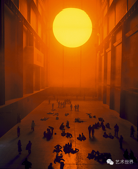
The space itself could be a part of the exhibition is the trend that we are pursuing. The Tate museum once displayed the weather project of Olafur Eliasson. The participants, like actors, are moving and talking, just like daily life in London, talking about the weather once meeting someone. He is exploring ideas of experience, mediation and representation.
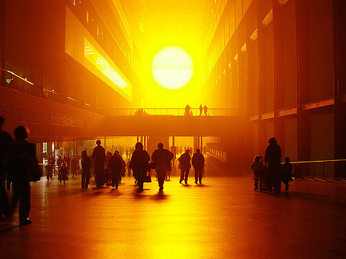 Olafur Eliasson
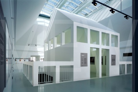
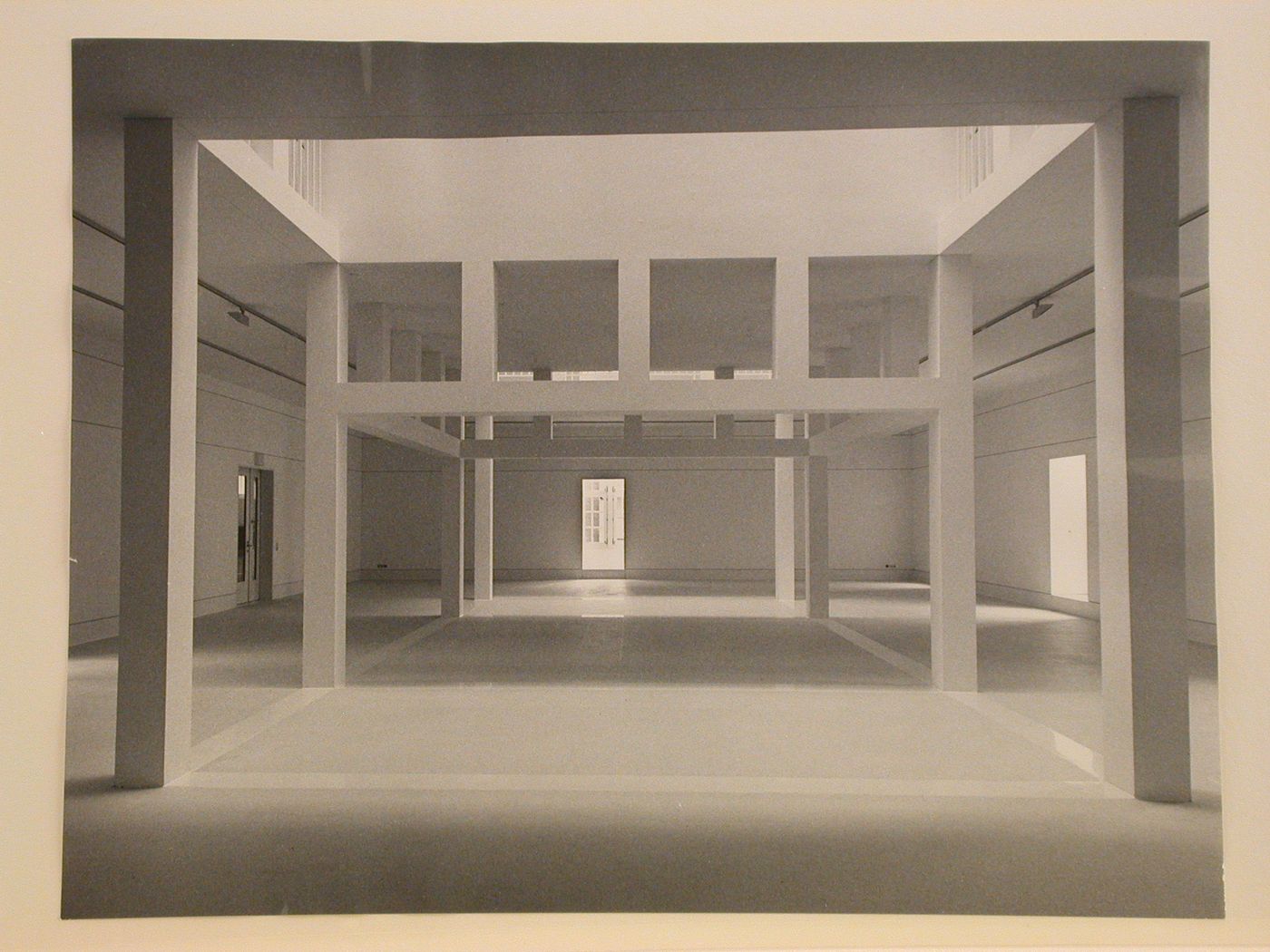
Another good case is the German architecture museum in Frankfurt. It is an interesting case in which the main show room is a modern house. The renovation kept the old facade but arranged new building inside. The exhibits were arranged in the bottom floor of the new house. It is a kind of family exhibition which truly shorten the distance between the pedagogical museum to visitors but as participants. The new modern house also convey the idea of transformation in cultures and society.
Enter text in Markdown. Use the toolbar above, or click the ? button for formatting help.
-
xinwen‘ comment (unfinished)
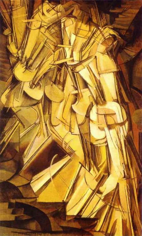
Nude Descending a Staircase, No. 2
-
The ChartJunk Debate
The ChartJunk Debate starts off with this heated argument between Tufte and Holmes about the chart “Diamonds were a Girl’s Best Friend.” Tufte, in this case, disliking the unncessary overload of visualization and the failure to even represent the data correctly. Holmes, on the other hand, being of the opinion that design and interest are what attract the readers. The debate then really being between embellishments (or “ChartJunk” as it was coined) and minimalist.
The debate paper then goes on to show examples of embellished and just plain charts as well show their pros and cons for each types. After having read this debate, I am of the opinion that I think it’s important to know which design to use for certain data sets. It’s also important to have that balance between embellishments and minimalism. Obviously even minimalistic charts can go wrong as they showed in the chart below where there is now reference line for zero.
Or charts which are too embellished with too many aesthetics may not only be distracting but they can also be confusing to read if there is just too much going on. One example would be like the chart below where it’s difficult to tell exactly what the chart is supposed to represent or it’s also hard to see all of the data.
In any case, this paper describes how important it is to really understand the data and make sure to apply a good design which will enhance the message from the data to the user but in a way where it doesn’t come across as overwhelming.
-
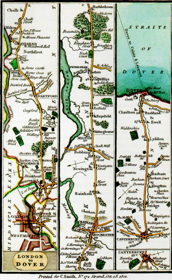
Narratives of Space and Time
I thought the Narratives of Space and Time was an interesting read. I especially liked how it included a lot of chart as references of the variety of ways space and time can be portrayed.
In this chapter, the author is trying to show how others in history have gone from “four-variable narrations of space and time onto flatland” (pg. 97). In order to do so two familiar designs are combined which are map and time-series. In order to introduce the topic, the author starts out with the Galileo’s “Starry Messenger” record observations of Jupiter’s moons then from there builds its way up into more complex designs like the road plans from London to Dover:
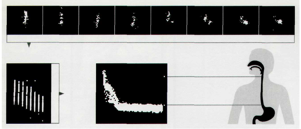
or the Esophagus timetable:
In any case, my favorite was actually the records of dance movements as seen below:
I believe these are extracts from the score Cachucha. I never really thought about portraying dance movements in such a way. I would think it especially difficult to portray them alongside the score since I expected it to be all cluttered and difficult to read. However, looking at the image above, you can see that it is not that bad at all. Most of the movements are fairly simple to make out and are evenly distributed enough to not make it seem overwhelming.
All of the graphs overall were really interesting. Some had finer details while others portrayed a simplified timetable like picture. In the end though, looking through the different charts made me realize how important it is in choosing designs to portray certain things in an attracting way. For example, it seems like time tables work well for railway station scheduling or if you wanted to be more creative you could use a chart like the one below for an airplane schedule.
There are so many ideas and designs which you can do and I think what the author is also trying to get at here by putting all of these different examples is that it also matters what it is you’re trying to portray.
-
Miles Chartjunk Commentary
On chart visualizations and chartjunk
Tufte, “Color and Information”
With progress in computer technology and increased familiarity among users since this 1990 edition, it seems worth revisiting Tufte’s opening claim for this chapter that any number of colors over 20-30 produces negative returns. We’re now used to attributing number values to hues (in the RGB24 system, for example), so it makes sense to create visualizations that associate color values directly with data values. Color can serve as very precise indicator of measurement, if a range of data is made to fit 256 shades, for instance. Tufte gestures at this in his analysis of Ware and Beatty’s work on p. 88, though the paragraph on color’s “multidimensional quality” stops short of saying whether viewers could parse these clusters easily or not. My hunch is that these clusters worked fairly well in the 90s (an “obvious improvement over black-only dots,” as Tufte says), but also that they’d work even better now: partly because we’d improve the visualization with higher resolution and more precise customization, and partly because viewers are now so much more acquainted with these computer-based gradations.
Few “The Chartjunk Debate”
The poles of the debate are represented by Tufte (who promotes a minimalist approach to chart design) and Holmes (an advocate of artistic, metaphorical additions to emphasize meaning, and Tufte’s victim in the “Diamonds” critique). Few and Bateman et al. fall somewhere in between: Few is sympathetic to Tufte, but wants to define chartjunk a little more precisely as anything that does not contribute at all to chart information; Bateman et al. concluded from their small study that chartjunk didn’t contribute to comprehension but contributed slightly to memorability. The lesson I take from Few’s middle road, perhaps primed by my reading and commentary on Tufte above, is oriented around color: the striking feature of Tufte’s improved charts is that they make use of 1-2 simple colors to make charts more engaging while not making them overwhelming (that is, between the dull simplicity of the study charts and the chaos of the Powerpoint/Excel creation… but definitely closer to the dull end). Bar charts are a particular favorite of Few’s, it seems, and there’s no attempt to respond to the kinds of attacks Drucker made on bar charts; but, even if Few’s basic formats and 1-2 accent colors don’t account for humanistic ambiguities, that’s not the task at hand. They’re undeniably clearer and friendlier.
Enter text in Markdown. Use the toolbar above, or click the ? button for formatting help.
-
Color and Information+The Chartjunk Debate
Based on the fact that human eyes are super sensitive to color variations, it has been a simple and straightforward way to tie color to information, very similar to painting, which is to “put the right color in the right place”. Fundamental uses of color in information design are to label, to measure, to represent or imitate reality, and to enliven or decorate. The combination of different colors is also very important in visualizing information. A good example is Daniel Burnham’s architectural drawing - 1909 Plan of Chicago. It has strong and vivid color spots standing out from a light muted field as background. Even dull mathematical equations and geometry of Euclid’s can be visualized by adding colors to the basic geometry elements, and thus giving readers different ways of approaching and relinking to the dull equations. With color, the information resolution of a computer screen can also be improved. A large quiet background with few spotted bright areas can give interwoven, harmonious, and balanced visualization. Also, color coding of quantity is very sensitive to its context, so that using a right and comfortable visual palette for labels can minimize the distracting and ambiguities in reading.
Chartjunk has non-data and redundant data elements in a graph, it is not informative and can sometimes be harmful. However, embellishment can sometimes provide a better memory and understanding as envisioning information. A study was designed to test the comprehension and recall between chartjunk and plain (minimalist) graphs. The result is that the people’s accuracy and recall after two-to-three-week gap was better. Embellished charts could be more successful when they are attractive, entertaining, and also accurately focusing on the simple point directly, due to the fact that embellishments can also play a role in communicating message and visualizing information. Although sometimes embellishment can mean nothing and doesn’t add any further information compared to a plain graph. But most of the time, plain charts are designed in confusing ways, such as linear graph or pie chart; but a simple bar can display the same data in a way that is way more straightforward and visually pleasing. In conclusion, whether a chart is has chartjunk or not depends directly on whether embellishments support the data or distract readers from receiving and recognizing the data.
Enter text in Markdown. Use the toolbar above, or click the ? button for formatting help.
-
Narratives of Time and Space Comments
The “Narratives of Time and Space” section of Tufte’s Envisioning Information contains an excellent selection of charts that show both good and bad patterns in chart design. All the charts were concerned with showing information about events associated with a specific time or place or both. Examples include train schedules and the locations of Jupiter’s four inner moons. The main takeaway from the section is that a good chart design make a clear and intuitive relation between the location of information on the page and the location of that same information in space and time.
One chat I particularly like was this “corkscrew chart” showing the relative positions of Jupiter’s moons over time:
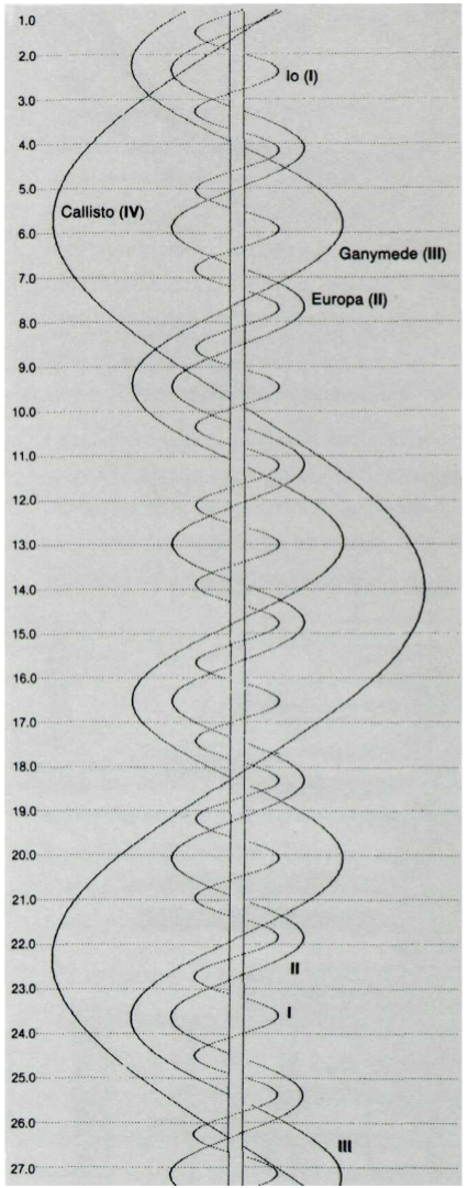 Since the time of Galileo, astronomers used charts like this to plot their observations of Jupiter’s moons each night. Each moon would be drawn as a point on a horizonatal line representing a certain night. The key innovation though, which appararently didn’t come until centuries after Galileo, was to interpolate the smooth curves seen in the chart above. With that addition, the chart became at once nicer to look at, more clear, and more useful. The interpolated curves actually allowed the distant moons to serve as a world-wide synchronized clock, which was of great use to maritime navigators. I thought this chart was incredibly elegant. It shows so clearly how one should expect the moons to weave back and forth over time. I also appreciated how useful it became with the addition of the curved lines.
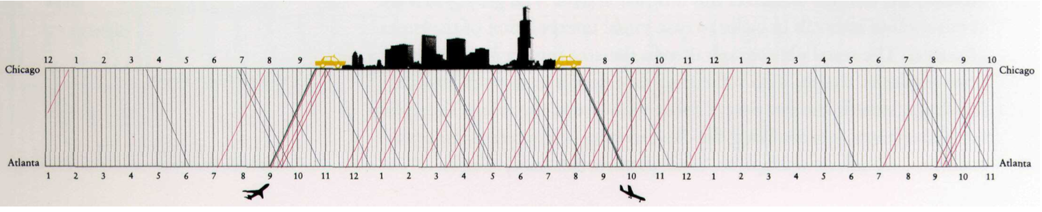
Another chart that had an excellent match between location the page and location in time and space is this Chinese railway map.
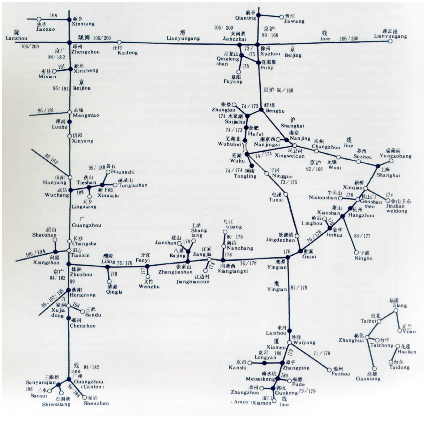
This map preserves both spatial and temporal relationships between the stops on this particular rail line. Although Tufte admits the chart has some aesthetic flaws, he commends it for its graphical organization. According to Tufte,
the full spatial relationships of towns, [are] patterns usually reduced to a witless alphabetical ordering in a conventional typographical index
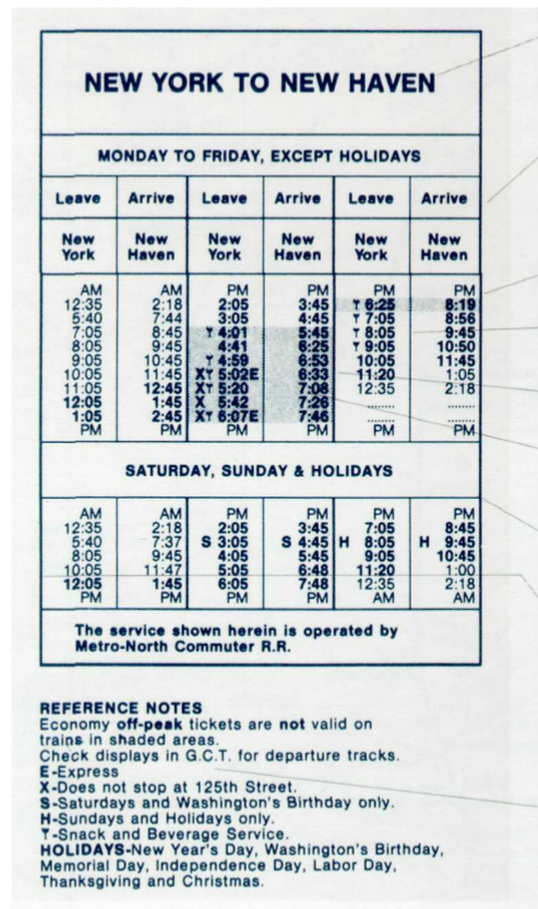
This map, however, encodes in its design the real shape and timing of the actual railway. The match between image and reality makes it so much more clear to the audience, unlike this old New York to New Haven schedule, which lies closer to the witless alphabetical ordering side of the chart spectrum. Its dense arrangement, extraneous lines and whitespace, and general clutter make it much harder to understand even after some examination.
These three charts best exemplify Tufte’s thoughts on charts of space and time. I would really recommend even just looking through the section because there are some fantastic images in there with more types of information and even more creative designs.
-
What counts as Chartjunk? Does it matter?
In The Chartjunk Debate, Stephen Few weights in on an aesthetic question concerning the design of charts, graphs, and other data visualizations: is there room to incorporate more artistic elements that don’t have as much importance with regards to information transfer?
Few claims that the debate springs from Edward Tufte’s comments in Envisioning Information, where he railed against the practice of including elements in a visualization that don’t directly and uniquely further the goals of the author. In other words, no unnecessary repetition, and certainly no visual elements that detract from the readers’ ability to understand the author’s message. As an example, Tufte criticizes Nigel Holmes’ graph of the price of a diamond over time:
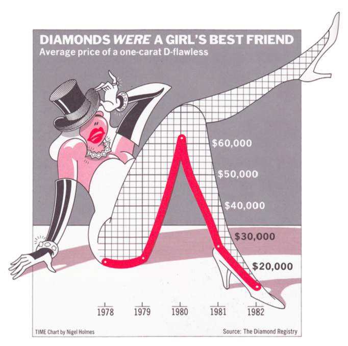
Beyond the question of taste, Tufte claims that Diamond’s chart fails to serve its purpose because it doesn’t adjust the numbers for inflation. So more than a failure of aesthetics, it’s a failure of visual communication of a particular point, and the aesthetics happen to distract from that failing, which makes him dislike the aesthetics.
Of course, none of this made Holmes particularly happy. Hence the birth of the “chartjunk” debate – Tufte on the side of minimalism, Holmes on the side of entertainment. But as a question of aesthetics more than anything else, there were no firm answers.
Enter a study produced by Scott Bateman, Regan L. Mandryk, Carl Gutwin, Aaron Genest, David McDine, and Christopher Brooks of the University of Saskatchewan: “Useful Junk? The Effects of Visual Embellishment on Comprehension and Memorability of Charts”. In it they claim to test the impact of chart junk, and find that embellishments can help make a chart’s core message easier to understand after some time has passed since it was last viewed, although it has no impact on a viewer’s immediate interpretation thereof.
Few’s critique points out that this study only tested charts against 20 different undergraduate students, used particularly well-designed charts (by Nigel Holmes, natch) that might not actually fall into a stricter definition of “chartjunk”, and used particularly badly-designed charts as examples of “not-chartjunk”. After looking at the charts used in the study, Few arrives to the conclusion that as long as an element of the chart serves to accurately and effectively communicate the author’s message, it should not be considered “chartjunk” – even if it is an embellishment.
Rather than debate the specific definition of “chartjunk”, which seems endless and political, I think academics in this field would be better served by advancing the idea that user studies should be performed on the visualizations that they produce. A/B testing and user experience testing is de rigueur in the software world from which I come, and serves to help authors better communicate their messages by helping them understand the weaknesses in their methods of presentation. Rather than dictate certain stylistic choices as globally off limits, why not advocate for a process of discovering the best stylistic choices for a given situation?
-
Chamberlin Chartjunk Debate
Stephen Few’s paper on the chartjunk debate comes to the conclusion that some embellishment is probably good to have depending on the situation and provided the embellishment is not distacting or excessive. This is a solid compromise between the two sides of the debate. One side argues that charts should add flair to make them more interesting and engaging for their audience, while the other argues against any embellishment at all, advocating the use of the minimal amount of ink required to clearly convey the information presented.
The bulk of the Few’s discussion of the debate centers around a study on the embellishment of charts. The study seems to support embellished graphs on the surface and is commonly used to defend the arguments of the embellishment camp. However, there are some significant flaws in the study and misinterpretations of its conclusions. One flaw is its low sample size. This jumped out at me the moment I first read “twenty participants”. I think this is far too low a sample size to make any strong conclusion, especially when it appears the test would be easily adapted to more test subjects. Another problem was that the embellished charts were not excessively embellished and may not have been consider true “chartjunk” by some. Furthermore, the the unembellished charts were poorly designed and used illustration schemes that reduced their ease of understanding.
I thought the study’s distinction between comprehension and recall was interesting and important. I hadn’t thought of it before, but a graph that’s clearly understood but immediately forgotten is in some ways worse that one that’s hard to understand. In a situation where a designer is using a graph to make a point or persuade someone of something, a memorable embellished graph is important. In a context like a scientific paper, emphasis should be put on clarity since the chart’s purpose to show information without bias, not convince the reader of a certain conclusion.
It was certainly interesting to see how this study fits into the chartjunk debate. It is apparently used quite often but does not stand up to rigorous standards.
-
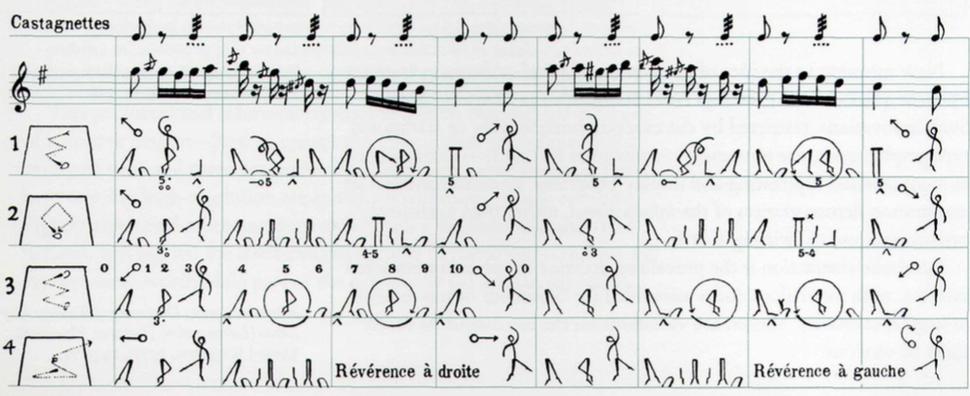
Time goes more specific to Event-Time in print
Time in my eye is a general container that everything happens continuously. Events is more like a selection of time where with specific aim or interest, specific points or period of time are taken for records. It has details and layers of information that could be read as a story.
Timeline could be seen as a concept that people tried to draw time. It is a concept and has little to do with technological constraints although technology truly changes the tools of mapping time. So the discussion here does not relate to when certain methods are used but more for the thinking and concept behind. Annals is an example which the left and right column refers to time and what happened at that time. There is no category or distinction. The chronographic table is similar in principle and as Rosenberg said although research techniques and the exploration of many new forms, representations of time mostly continued to look very much as they had a millennium earlier.
What is truly an advance is the information selection and complexity in the time mapping. And this is what I call Event.
An example is the time mapping with category like the case of Gerardus Mercator. He collected astronomical evidence and use eclipses and other celestial events to record time. The measuring units no longer goes as day by day but as a cycle. Also in the Chart of Biography, life cycle of one famous figure is taken as one unit.
Another example is dealing with the not linear historical narratives and complexity. Minard’s famous diagram of Russian campaign 1812-1813 could be seen as a paradigm to deal with complicated information of what factors influence the reduction of soldiers on the way. This kind of thinking trying to combine geography, climate and number of population on one map could be seen as a great progress in recording an event.
The graphics of historical representation is more about ideas and concepts.
Enter text in Markdown. Use the toolbar above, or click the ? button for formatting help.
-
Potential of Spatial Humanities Commentary
This essay seems to be somewhat misguided. Most of the essay is spent lamenting the fact that modern GIS software cannot adequately capture the intricacies of the information of value to humanists and that its Western, Euclidean reliance upon the gridded map is at odds with less geometric ideas of space, like those of Native Americans. This is not surprising. GIS is a tool developed, as the paper states, for climate, hydrology, and topology - all fields which are chiefly concerned with numbers.
Despite what I saw as a misplaced complaint about GIS at the beginning, the paper does have some interesting points. One notable part of the essay echoed Drucker’s comments on visualiztion. Bodenhamer writes that GIS “assume[s] an objective reality”, that it purports to display an image of the information in question in a way that is indisputable. For data like elevations and temperatures, this is a very reasonable assumption. However, for data in the humanities that necessarily require interpretation, a GIS-style visualization might present only one interpretation of the underlying information. Bodenhamer says that when humanists use GIS without considering this, they “run the risk of portraying the world uncritically, this time with a veneer of legitimacy that is more difficult to detect”. The GIS format can not only bias the audience’s opinions, but also make the presented interpretation seem more correct which is likely not a desired effect.
Bodenhamer’s best topic in the essay was “how do we as humanists make GIS do what it was not intended to do, namely, represent the world as culture and not simply mapped locations?”. This question acknowledges all of GIS’s flaws listed earlier in the essay and asks how to work around them. This is the important part of the paper - not the problems with GIS, but the proposed solution. Bodenhamer’s solution of the deep map is an interesing one. It reminds me a lot of Vannevar Bush’s memex: a multilayered linked set of documents that contribute to an idea. However the deep map sounds like a map covered in letters and photographs and other documents, so it might be better to forgo the map altogether and just have collection of the documents indexed by location.
-
Comments on The Potential of Spatial Humanities
From Bodenhamer’s view, GIS has more disadvantages than its positive side. I strongly agree with that as a user of GIS. It is a fact that it is a useful tool that could overlap layers of information together such as population, income and family structure as long as you get the official database. It could show them on a flat world map that visualizes the spatial analysis. However, the limitations also appear. It is good at spatial issue but for humanists, time is an important element, it has difficulty in managing time and prefers spatial questions. Archaeologists have used GIS and computer animations to reconstruct the Roman Forum by creating a 3D world that allows users to walk through buildings. It could provide a space experience but we still could not know how to make space, place and memory dynamic and vital with them. Memory as an identity for humanists, which seeks for continuity and relationship could not be realized by GIS. Moreover, for the users, it is more like a fact teller rather than a knowledge producer. Historians create framework for their study rather than addressing research problems. For urban designers, it is more like the first step to study a phenomenon and help to lead to a research question thanks to the large database. However, the map does not have depth and always simplify results.
But we could see the potential of cooperation with other techniques like multimedia and gaming tools to construct deep maps that could give a rich visual environment throughout time. Bodenhamer has imagined a kind of humanities GIS-facilitated understanding of society and culture. It promises a view that has a dynamic representation of memory and place, that is visual and experiential, and qualitative and quantitative. This kind of way of thinking is what truly matters to humanists and also a demand for tools.
Enter text in Markdown. Use the toolbar above, or click the ? button for formatting help.
-
Comments by PojiangNie
Comment on Cartographies of Time
Before talking about ways to represent time, it crucial to understand the meaning of representation. How do you choose a perfect way to represent is always related to what story/argument you want to tell/build. Base on this, we could understand that good way of representing time is not equal to high technology. Although the arise of animation did significantly improve it, people back in old time had figured out creative idea to depict what happened when time passed. One important criteria for representing time is whether it could show an overview of all the events, but also show enough info about every item in the representation. In my eye The chart A Chart of Biography is a good representative. The sparse area on the left side and the dense part on the right clearly indicate in which period scientist and scientific activity is active. Also observer could easily zoom in each of the scientist to see how long did he/she live and during which period according to the length of line and the time colum. Another important aspect is time scale. Limited to the size of a chart of drawing, it is usually hard to perceive the scale of time. In the case of Manuscript timeline, observer could clear identify which part the fragment of timeline on the left is located in. Also information adjacent to it could give you a sense of overview, which perfectly fit the rule I mentioned above. Extensive and relevant information are also crucial for reader to understand a timeline chart. In the case of Charles Joseph Minard. This is a perfect case in terms of telling a story in the form of timeline. But it is also hard to read for it has many extra info that is impossible to understand until reader closely read the legend.
Comment on Spatial Humanities
Bodenhamer addressed the importance of finding a new way to represent space in humanities “… space…has assumed a more interesting and active role in how we understand history and culture.” GIS has the capacity of making those statistical data visual and appeal to readers in ways more powerful than words do. Archaeology and history are the first two subjects that As GIS provided a new way for Archaeologist and historian to recreate past landscapes and cityscapes, we as urban design students also can visualizing various urban built environment bay combining different data layers. But for humanities, GIS is still considered as a tool for research in limited area for it is hard to represent time and memory in GIS. “GIS employs a limited linear logic that is not adequate for understanding societal complexity, and as a consequence, it represents and perpetuates a particular view of political, economic, and social power.” Another disadvantage is that GIS is built on a positivist epistemology, while humanities is not measure or acknowledged precisely but “always contingent upon the perspective of the observer.” The last but not the least, humanists need to spend a lot of time to learn GIS before using it, which is difficult for them because they are not trained in this way. However, Bodenhamer still believed GIS has its potential to be fuse with humanities. Although” We have not enabled our understanding of culture to be as dynamic as the act of creating culture itself”, new technology could be applied to make history and memory dynamic and vital, as the author mentioned the case of reconstructing the Roman Forum visual reality. The concept of deep maps may have chance to be realized in the future and despite many limits GIS has, it is a good start.
-
Comment Xinwen
Reading 1 comments: Form follows function
Look through the evolution of interpretation of time, the form of timeline graph follows the intention at most of time, ranging from the linear metaphor to other illustrative elements. On one hand, As the dimension of our understanding to time is increasingly growing, the form of the timeline changed in correspondence. In the case of cross section of giant sequoia, the form emerged from the intention of representation in objective ways. Some design principles are applied to the timeline as well to achieve more understandable and clear graph such as the priority of events. On the other hand, new forms of timeline would help us to get new views on events. For example, the matrix form facilitated the scholar’s understanding of the many intersecting trajectories of history Sometimes the form would go off the path, as mentioned in the article that “In the late eighteenth century, when the timeline began to flourish in Europe, sophisticated technologies of printing and engraving had long been available, as had techniques for geometrical plotting and projection far more complex than were necessary for such simple diagrams”. However, the direction would be readdressed eventually
Reading 2 comments: Is spatial humanities equal to GIS?
“Space are not simply the setting for historical action but are a significant product and determinant of change. They are not passive stings but the medium for the development of culture”. This demonstrated the necessity of spatial humanities is not only a technique or a tool, but a research perspective and the built environment is not only ‘a setting’. And GIS, as a strong geo-spatial research system, is growing rapidly and trying to cover more and more aspects of spatial humanities, such as the visual and experiential deep map. Even though the GIS could provide 3D even immersive experience, there are still few things missing in it. The first would be memory, as mentioned in the article that “Memory is essential for our identity, whether as individuals or as a society, but it remains troublesome as evidence because it always is informed by what has happened in the interim between an event and the act of recall.” The dynamic memory is hard to be preserved in GIS. Second, the fourth dimension – Time, is usually non-existence in GIS, the change through time is an essential attribute for built environment as well. The last but not the lease, “GIS is a powerful tool in the management and analysis of evidence, contributing primarily by locating historical and cultural exegesis more explicitly in space and time. It aids but does not replace expert narrative: it finds pat- terns, facilitates comparisons, enhances perspective, and illustrates data, among other benefits, but its results ultimately find expression primarily in the vetted forms accepted by our disciplines.”
-
Thatcher's Commentary on "Time in Print"
This was a really interesting discussion of the timeline and how we think about time itself. The first part (half, maybe) of the piece seemed to be about how time is closely related to other concepts. I found the author’s comparison of how we think about time and space surprising but true: we tend to use the same words to describe both. Distances in space can be long and so can intervals in time. In fact it is very difficult to take about time in such a way that could not also apply to movement along a line in space. This quote by W.J.T. Mitchell stood out to me in the text
“we literally cannot ‘tell time without the mediation of space”
I found this connection surprising because I generally think of time and space as separate concepts, at least in everyday life. However the article’s discussion of time has me convinced that we think about time only in terms of space. I would be very interested to see whether this persists across all languages and cultures. Perhaps this effect is not present in all languages, or perhaps it is a core aspect of how humans think of time.
This piece’s views on the Annals of St. Gall were also interesting. On the one hand, you can see the lack and variation in type of information in the chronology as evidence that it was poorly made or incomplete. On the other hand, the very structure of the document can tell us about how the authors and original readers viewed time and the world. As the essay quotes Hayden White, the document reflects a world “in which things happen to people rather than one in which people do things.” I wonder how the structure of other documents (perhaps maps) can reveal details of the mentality of a region or period in history. Furthermore, I wonder what our current use of linear timelines says about us.
I also found it amusing that the piece mentioned how “filling in an ideal timeline with more and better data only pushed it toward the absurd”. In our own discussions of timelines last week the main complaint that arose was that timelines were ill-suited to datasets that include many events in a short period. It seems this problem has been known for centuries now.
-
Mediating Time With Space
In a way, all visualization is the practice of using space to mediate thought. I appreciated the analysis of our use of spatial metaphors for time: interval, before, after, long, short. As WJT Mitchell commented:
The fact is that spaital form is the perceptual basis of our notion of time, that we literally cannot ‘tell time’ without the mediation of space.
I’m not sure I buy Lakoff’s argument about the line as an “intermediate metaphor” when interacting with digital clocks, but I do accept the basic premise that our interactions with space have shaped our understanding of time. It fits nicely with situated and embodied models of cognition, which posit that cognition is distributed outside of our body to our environment, and even our culture. (For a nuanced overview of the state of embodied cognition, please read Wilson and Golonka’s 2013 paper. If you liked that, you may like their blog, too.)
Rosenberg’s brief history of the use of timelines describes their use as tools to better understand history and culture: comparing events in different empires in separate columns of a table, eventually collapsing to a single column under the Romans, tells a specific story about the rise of Christianity, for example. He brings up Priestley’s visualization of the lives of scientists who made an impact in the field of optics as the first example of a timeline and I was surprised at how recently it was created. As he points out: humans have had the raw technology to create timelines for a very long time. They only didn’t come about for so long due to cultural limitations. But what were those limitations? It was never made clear in this part of the text.
Interestingly, the table- and column-based timelines created by the likes of Eusebius seem to have died out. The timeline tools we explored in last week’s homework assignment had no support for this kind of parallel presentation. And it was a limitation that most of the class had noticed, and commented on. Why is that? To what ends do we create timelines now that comparison of different sets of events is no longer so useful? It lends weight to the common critique that a programmer hears that the limitations of our software should not be an excuse to limit our thought. So I guess it falls to us to go out and make our tools better :)
-
Augé and Bodenhamer: Futures and Spaces
Bodenhamer neatly summarizes the shortcomings, advantages, and history of the use of Geographic Information Systems (GIS) in humanities work. In doing so, he touches on the work of Foucault, Certau, and Said, and the interaction between physical space and cultural space. These same ideas are eloquently analyzed by Marc Augé in his works Non-places and The Future.
In Non-places, Augé – a “classically trained” anthropologist, of the particularly French variety – begins with a summary of the state of the field of anthropology, which at the time of writing was less than satisfactory. Our quickly modernizing world was leaving fewer and fewer societies and cultures untouched. This was destroying the long-held conception that a society could be defined as an isolated unit, without physical or cultural contamination by other societies. Cultures and communities could no longer be defined by their physical geography. And, too, as information and people began to transfer between cultures more easily and rapidly than ever, so did the touchstones of their cultural spaces begin to break down.
Bodenhamer neatly touches on a few of the ideas at play in this analysis. First, that geographic space can affect the way people think:
conceptions of natural geography played a central role in how American imagined themselves from the earliest settlements to the last decades of the twentieth century.
Second, that imagined space is as important, if not more so, than the physical:
Although the Annales school, most notably Ferdinand Braudel, its chief practitioner, had urged scholars since the 1930S to pay attention to geohistoire, the linkage of geography and history, most humanists paid much less attention to the environmental context for human behavior and much more to the actions, associations, and attitudes that made a space particular, in short, a place. These places could even exist in imagined space or in memory.
And in doing so, offers one of the strongest critiques against the use of GIS in humanistic work: it cannot accomodate that which does not have a physical coordinate. By reducing our analyses to that which can be represented on a “real” map, we are once again putting our feet back into the pool of Comte’s positivism. As “real” as our analysis then becomes, as far does it miss the point – human studies require us to analyze the unreal, the imagined, the cultural.
In The Future, Augé describes how different conceptions of past and future interfere with thought about the present. If we view the future as a continuation of the past, then we are stuck within the frame of tradition. If we view the future as the creation of something new, then we are firmly in the state of freedom. These two are at odds, and push our actions in the present in different directions: towards conservatism, or exploration; towards safety, or risk. Ever at odds.
Bodenhamer seems to have read these texts, for he advocates the creation of “deep maps” that take advantage of all of our technological and human abilities to create “virtual worlds embodying what we know about space and place.” Only by escaping the limitations of GIS – Cartesian coordinates, government-provided datasets – can we accurately represent human connection to worlds both real and imagined.
My point of view is certainly that of Bodenhamer. GIS are useful for a variety of tasks, but for conveying the depth of the human experience we will need more than a finite number of layers on top of a supposedly “real” representation of our world. .
-
Time in Print Commentary
In this reading, the author points out the problem of having humanists and society as a whole become accustomed to one notion of a standard timeline. In today’s world we tend to view a timeline as a single axis spaced out chronologically by the dates at which the events occured. However, the author goes on to show that this idea is rather a most recent idea and time was not always thought of this way. Some cultures in history measured time using the stars and moons while others used tables with time running vertically in order to display various events that ran parallel to each other.
Reading this I did appreciate the way the author presented the challenge of designing other ways to represent time. I actually did not know that our way of representing time was much more a recent phenomena. However, looking at the examples he gave of past cultures like the “St. Gall Manuscript” made me think about why it was they represented time in such a way. Another thought that came to my mind was something upon which Joseph Priestley mentioned. He said that he did not recognize history as a narrative. In turn, this makes sense, since when analyzing history you tend to go back and forth in time to comment on different events and create links/patterns during that period of time. This reminded me of the table Eusebius created in which he lined up his events and time vertically in a table that way they could run parallel to each other and he could better overall compare the two. So this makes me wonder…where do we go from here? I honestly don’t know. I don’t think the reading really provided a solution. It just sort of raised the question. But in raising the question, it did provide curiousity and I think it achieved its purpose in challenging the reader to at least think about these concepts…well, at least it challanged me. So, like I said I don’t really have any new and outstanding ideas but one thing I did want to say was that even though we are trying to redesign timelines I think it’s important not to forget the beauty that lies in the simplicity of things. If a timeline gets too complicated to the point where the user cannot understand it then what’s the point of it in the first place.
-
Potential of Spatial Humanities
The reading “Potential of Spatial Humanities” was on the notion of space and its significance within the humanities. The author tries to challenge the reader to really consider the role space plays when analyzing certain historical events. For example, the author mentions the imortance of space to the American Indians when they protested that the “vast open spaces of the New World were not wilderness but their home”. In order to aid in better understanding space, the Geographic Information System (GIS) technology was developed which allows the user to visual the spacial context and physical environment of a location like a map. It can cosntruct really nice images and has a lot of features to it, however, it is also limited by the fact that it is a computer and computers don’t think like humanists.
In my opinion, I thought the reading was a bit confusing at first. I was lost as to why at one point the author talked about geography and space then swicthed to literature and space then back again to geography. The author included a wide number of fields in which space was important which I thought was good because it gave an overall feel of how space is used within those different fields, but also there was a lot of jumping around between those fields which got kind of confusing for me. I did like however, how the author mentions both the advantages and disadvantages of using technology. It seems like there is a lot of back and forth argument on this topic, but in the end I guess you can’t really have it all. I agree that technologies like GIS give an amazing graphic scene of for example an ancient town in history which the user can traverse through and learn more about. However, it only provides a very limited view of that town…a view which is based on data that it was given. Yet, if you’re trying to gather more information about the town which is not already there it may be quite difficult since the graphic itself is based on the perspective of the observer. I think the author did a nice job in motivating the potential for space in humanities but I still think there seems to be debate about it and its importance. This reading did make me realize though just how useful space can be when analyzing history or literature or any other field. It opened my mind to a new topic that I honestly don’t think I would have thought of before.
-
Miles Mapping Commentary
Miles Mapping Commentary
Rosenberg and Grafton, Cartographies of Time
One thing that I find striking about the figures in this chapter is that many of them push the limits of the printing technologies that make these diagrams possible. One would expect that a major criterion for the success of a given model would be to render typesetting, printing, reproducing, and circulating the physical format easy—and few of these formats are meet that criterion. (I suppose that’s why these have become famous as creative and artistic anomalies rather than as textbook standards.) Priestley’s life-lines would each need custom designs for the whole page to be reproduced; Laurence Sterne’s comical chapter-lines defy the basic implements of the printing press; and even Steinberg’s cartoon, benefitting from the more advanced printing technologies of 1970, would face problems (since you’d want to use high contrast for the thin lines of 1932-1951, but this would probably make the text of “1970” invisible). I think there’s a certain affinity with digital humanities innovations, here: if the tool doesn’t serve the visualization, change what the tool can do.
Bodenhamer, “The Potential of Spatial Humanities”
I find myself wanting to synthesize the two proposals that Bodenhamer makes for the future of GIS-based humanities scholarship on p. 28-9. This goes back to something we touched on last week: namely, that the most likely success of Drucker’s polemic lies in her deconstruction of assumptions about “data” and familiar graphical forms (even if scientists and social scientists are already aware of these limitations), rather than in her constructive proposals for new forms (which, apart from the invention of the “capta” term, were perhaps not as inspiring). To give that idea a concrete example: the gender-demographic bar charts may not be successful as clear and elegant representations of flux in the capta, but they are successful at unsettling our assumptions about the objectivity of data and bar charts. So, perhaps surprisingly, the fact that these visualizations resemble conventional bar charts (for the sake of distorting them) is actually an important part of their usefulness.
To get back to Bodenhammer: it seems that an analogous future for GIS-based humanities projects would begin with the “mature” version of “our current GIS use,” but would contain variations overlaid on that familiar GIS appearance to encourage “postmodern scholarship” (28). A map might begin, for instance, with GIS parameters but change as users select different viewing criteria: chronological, demographic, cultural… Scholars, students, and other visitors to these sites would be able to practice and inhabit the subjectivities of the postmodern approach, while moving in and out of GIS standards that attempt neutrality—thus putting both scholarly approaches, by way of contrast, into illuminating relief.
Enter text in Markdown. Use the toolbar above, or click the ? button for formatting help.
-
sample title
sample text
-
Drucker reading commentary
Johanna Drucker’s essay presents an interesting view of information visualization as it applies to the humanities. Rather than use the rigid charts, graphs, and coordinatized maps of statistics and natural science, she advocates the use of more fluid and warped methods to show the more subjective information found in humanities that necessarily involves interpretation and the viewer’s own point of view.
I found Drucker’s idea of capta intriguing. At first I didn’t understand distinction between data and capta but as the essay progressed I came to a good understanding of the difference. I think the fundamental difference is that the idea of capta make no assumptions. Drucker says that data - like measurements of the physical world - come with the assumption that the information we’re interested in exists already and all we need to do is gather it. Capta, on the other hand, acknowledges that the information gathered was interpretted and even created by the observer. Capta offers more in impressions and expressions of world whereas data comes from measurements.
Drucker’s visualizations of capta are neat because they are able to show confounding factors that are often absent in data representations. The bar graph of male and female populations in different countries after paragraph 11 is a good example - the blurriness of bars or the intermingling of their patterns show a more complete picture of the populations of the countries because they don’t purport to be a definitive record of how many individuals are in each country. Rather they show as much as they can in terms of relative sizes of populations, along with some indications of factors that need to be interpretted by the viewer.
Visualizations of capta in general seem to contain a lot more information than visualizations of data in the essay. I wonder if this is always true.
The ideas of spatiality and temporality are also interesting, although I don’t like their definitions. “Temporality = time as a factor of X” is too unclear. After the reading the whole essay, Drucker’s given definition seems fitting, but on its own it doesn’t mean anything to me. Perhaps a better definition would be, “how time is perceived with respect to factor X”. That said, I do think using spatiality and temporality in visualizations gives a great effect. The warped images and swirling arrows gave me a quick but thourough sense of what information was being presented.
-
Xinwen's Comment
Comment1 - Augmented Text and Flattened Information
There is a description about hypertext in the book that “Imagine that the surface of the screen becomes a deep space, and what appears at first to be a single page of a text or object extends through a multiplicity of embedded layers, each displaying a different facet of an argument or history of a works production. Reader-viewers tier down and tier out, sifting through and engaging with”. It vividly described that the emergence of hypertext grant the text a multi-dimensional structure. Layers exist in the text, which “allow for a work to be understood within its larger field of cultural production; placed into the constellation of other productions and publications or artifacts of material culture; or situated within the documented events of an era.” However, the way that contemporary media present information is becoming increasingly flattened, in order to make the information easier to understand and faster to digest. For example, the long sentences with sophisticated structure is no longer being used in website. On contrary, what is showed on the website would be sloganized short sentences. Information has been shortened, condensed. I have no intention to criticize these websites because it is designed based on user’s needs, but to point out this contradictory trend.
Comment 2 Remix Culture
As far as I’m concerned, there are two definitions about interdisciplinary: the first would be collecting people from different filed in to one group and the other would be that one person is equipped with multiple skills in different field. These two kinds of interdisciplinary are lack in the university, just as stated in the book that “The university, however, still places a primacy on the singular nature of originality of scholarship and on clear lines of demarcation for authorship. In fact, the institutional structures for generating, evaluating, and legitimizing knowledge have barely embraced repurposable and remixable intellectual culture”. There would be no way to breed remix culture if the university continuously keep its rigid structure. In addition, the writer has deep insights in terms of the reason of this structure – “These objections, we believe, are based on assumptions that have traditionally valued “the what” (a determinate and relatively static set of knowledge objects or canon of artifacts) over “the how” (a flexible—even nimble— mode of thinking that privileges design, experimentation, risk-taking, and creative problem-solving). “
-
KelseyBanos_ReadingCommentary
Database Documentaries:
A documentary can be useful in many ways to create an engaging story which provides a lot of insight and information to the audience. It allows the audience in some sense to understand it all from a certain perspective. However, the disadvantage is that this view is also limited in a way. It provides the audience with only the clips and scenes that a person, the director, decided was essential to show in order to piece the story together. Hence, you’re missing out on a lot of other facts that could’ve been relevant.
Database documentaries work much in the same way. You can have animation, sound, linkes, websites, film, or virtually anything to portray your data in such a stimulating way for the audience. However, it is still bounded within the limits of technology and perspectives. I guess you can say though that information/data has always been bounded within some walls in a certain way. Technology, on one hand, expands those bounds to allow the user to grasp so much more data than they could ever imagine. Yet, on the other hand, usually all of these sources are filtered in some sort of way. So I guess the real question is how do you bring all of the data together without letting any of it be lost in any way? How do you confer “unity upon such a variable experience” (pg 55). Thus is rather difficult and I don’t think there is an answer to that just yet. However, the book does mention that in the meantime while we are trying to figure out that answer, let’s appreciate the fact that having so many variable opinions, ideas, and perspectives is also a really good thing! It allows everybody to exchange thoughts on certain topics and allows for “imaginative expression”(pg.55) from individuals from all over the world.
Computational Activites in Digital Humanities:
Though useful, at times it can be hard to visual a data set using graphical visualization from the computer. For example, the variety of emotions a certain person may be feeling. How do you express that graphically in a variable way where you can see the changes, the effects, and the expressions the person may be going through. Maybe you would like to add how the emotions change with circumstances or with time. What about if the emotions of a person affect another or what if they were triggered by something in the environment the person was in. Basically, what I am trying to get at is that there are a lot of underlying questions and information which may make it difficult to visualize using computers. Data visualization is usually more of a concrete thing rather than abstract. You have your bar graphs, line graphs, and statistical analysis. However, those kinds of representations can also easily limit the amount of information you can convey to the user. This section goes on to mention those limitations and how it affects the real interpretations of the humanistic knowledge of the data, but goes on to explain how important it is to be able to know the graphical tools there are available to represent the data sets. You see, using computers to represent data, though at times they can be limiting, they can also be really useful. You can make graphs dynamic and interactive or add on a bunch of features to better see the information. However, it is important that in order to get a good visualization you first and foremost know what you want to represent and then you get creative with how you want to represent it.
-
MOsgood Digital_Humanities Reading Comments
#digital_humanities
Augmented Editions and Fluid Textuality
As I mentioned in discussion last week, one of the concepts in the Digital_Humanities reading from p. 29-42 already somewhat familiar to me from other literary research methods is the idea of the fluid text, which resembles some of the theory behind “genetic criticism,” an approach to manuscripts and other “avant textes” (“before-texts”) developed in France. One of the central tenets of genetic criticism is that the study of genesis, evolution, and revision through primary documents should not treat published works as the culmination of a teleological process that contains the meaning of all previous versions, but rather another instance in a series of independently meaningful versions. On p. 35-6, the authors of Digital_Humanities make a strong case for the usefulness of DH techniques and platforms for genetic projects that track versioning, and they also theorize an equivalent genetic practice for scholarship, in which evolving digital research-results would retain version-history: “what appears at first to be a single page of a text or object extends through a multiplicity of embedded layers, each displaying a different facet of an argument or history of a work’s production” (36). But whereas genetic criticism almost invariably takes an interest in the work of a central author, DH fluid textuality allows for the arrival or disappearance of many authors.
Locative Investigation and Thick Mapping
This section contributes to my sense that one of DH’s particular pedagogical uses is its projects’ ability to serve students both as a repository of humanities knowledge and as a ground for practical applications of humanities skills. Of course, it has always been possible to apply, say, the skills of literary close-reading to a critical article (to my mind, this seems more useful, in fact, than applying the same skills to “Code, Software, and Platform Studies,” p. 53-4), but the interactivity of DH projects makes this kind of engagement more automatic and familiar. In the case of “Thick Mapping” projects, the lessons of fields like Anthropology, History, or Literature about subjectivity and contingency will have an immediate effect on students who become aware of their own individual navigations inside digital maps and data. Because DH projects are generally based on curated worlds of data, larger and more versatile than the narrowly selected examples used for a rigid argument, students (as well as other researchers and members of the public) can work out what to select and focus on for themselves.
Enter text in Markdown. Use the toolbar above, or click the ? button for formatting help.
-
Database Documentaries
Database Documentaries
They are not watched, but rather performed by a reader/viewer […]
This quote is the key to the new power found in the “database documentary.” By forcing the viewer to interact directly with the content (“not just film and video, but also sound, static image, text, animation, actual documents […]”), the work can achieve a much more powerful result than a traditional, linear, narrative.
A defining feature is the shift in the recipient’s role as viewer to participant, or maybe explorer, or even creator. These works require interaction to function. By doing so, the audience is given opportunities to feel as though they’ve helped to create the result, or discover the end knowledge conveyed by the work. This helps lead to the sense of “ubiquitous scholarship” described in other chapters.
For examples of this work done successfully, look to The New York Times. Their own Mike Bostock is probably the most well-known programmer in the field of programmatic visualization. Some standout interactive narrative:
- How Y’all, Youse, and You Guys Talk
- The Best and Worst Places to Grow Up: How Your Area Compares
- Money, Race and Success: How Your School District Compares
- Party, Gender, Whiskey: How Campaigns Place Ads to Reach New Hampshire Voters
The degree of interaction varies, but each of these falls into the category of “database documentary” because they tell multiple stories. As you change your zipcode in “The Best and Worst Places to Grow Up”, the text changes too – the story hits closer to home, makes more sense to you based on the context with which you’re familiar. Same with “Money, Race, and Success”.
“Party, Gender, Whiskey” reveals exactly how fine-grained demographic targeting is getting these days. And “How Y’all, Youse, and You Guys Talk” also shows how knowing the answers to just a few questions can tell you very close to where they grew up. But rather than saying this, writing it out like I have, they let the reader discover this for themselves by interacting with the tools themselves.
The textbook notes the challenges to this kind of storytelling: there is no longer one coherent story. Some stories that the data tells might not be as interesting as others. There are questions about authorship, and what is being authored – articles, or templates?
In general the shift to digital here frees the artist from former constraints, and allows presenting stories in a way that can better resonate with the viewer. But in doing so it seems like some of the magic is lost; after clicking through the second district in “Money, Race and Success” it can be discomfiting to realize that the text was automatically re-written, that there is not as much humanity behind those words as you originally may have thought.
-
Example Commentary
Here’s an insightful response to the assigned reading from Digital_Humanities - etc., etc. If you edit this post in Prose and click the Meta Data button, you’ll see it’s been given the Digital_Humanities tag. Other readings will show up as available tags too, as we get further along.
(By the way, here’s the url for the open access edition of the book: mitpress.mit.edu/books/digitalhumanities-0)