Voyant and AntConc Compared
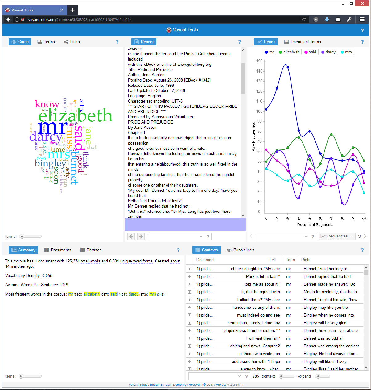
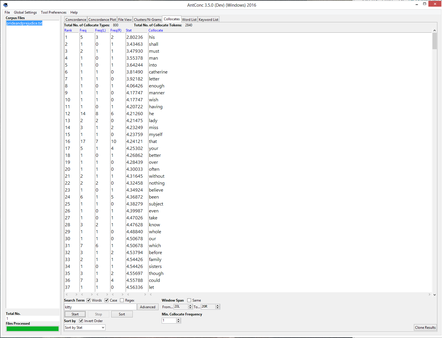
Voyant and AntConc both analyze text in mostly the same way but display their results very differently. Voyant uses for an colorful, interactive, and flexible model of panels which allows for the display of a great amount of information about the text all on one screen. AntConc opts to use a system of tabs, so the user can only see one type of analysis of the text at a time.
Here is Voyant’s multi-panel design:

And here is AntConc’s tabbed design:

I think Voyant’s design is more conducive to the discovery of patterns in the text. Word counts, frequencies, distributions, and concordances are all visible at the same time, as well as color charts, giving more opportunities to find interesting structure in the text.
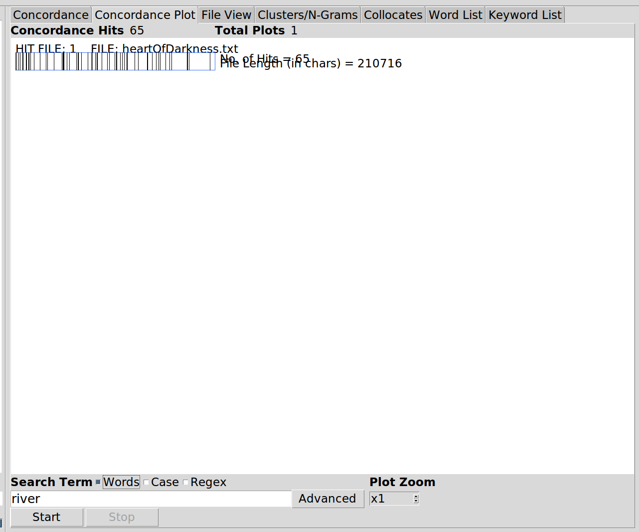
Voyant also automatically analyzes the whole text, which turns out to be a very useful feature. In AntConc, you only receive results onces you’ve searched for a term. Without even a word frequency count like Voyant gives, you might not know which words to analyze with concordance or other measures. Because of this, I think AntConc is more suited to a researcher trying to answer a specfic question about a text they are already familiar with. I analyzed Heart of Darkness - anyone who has read the book would know that ‘river’ and ‘Kurtz’ would be interesting terms to look at. If I wanted to know about references to the river in Heart of Darkness, AntConc could give me that. If you didn’t know what terms to search for, AntConc would not be very illuminating and Voyant would be a better option.
That said AntConc’s user experience is terrible, at least on my computer. All the information is displayed in text, which is jumbled and overwritten by other elements on the page at times. In the picture below, the words ‘rank’, ‘frequency’, and ‘range’(?) are all partially obscured:

AntConc’s display tabs also have a lot of wasted space, as seen in the first picture above from AntConc. The chart shown in the image, which is the most important part of that tab, is much smaller than the space it could fill, and the remaining space is just white screen. I think AntConc was built by someone who was mostly concerned about the functionality of the program and added a minimal graphical interface on top as almost an afterthought.
Voyant is definitely the better program of the two. It is visually appealing, gives a comprehensive overview of the text in addition to word-specific results, and gives a lot of information all in one place.