Narratives of Time and Space Comments
The “Narratives of Time and Space” section of Tufte’s Envisioning Information contains an excellent selection of charts that show both good and bad patterns in chart design. All the charts were concerned with showing information about events associated with a specific time or place or both. Examples include train schedules and the locations of Jupiter’s four inner moons. The main takeaway from the section is that a good chart design make a clear and intuitive relation between the location of information on the page and the location of that same information in space and time.
One chat I particularly like was this “corkscrew chart” showing the relative positions of Jupiter’s moons over time:
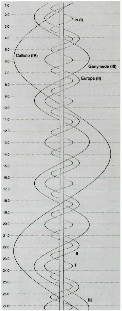 Since the time of Galileo, astronomers used charts like this to plot their observations of Jupiter’s moons each night. Each moon would be drawn as a point on a horizonatal line representing a certain night. The key innovation though, which appararently didn’t come until centuries after Galileo, was to interpolate the smooth curves seen in the chart above. With that addition, the chart became at once nicer to look at, more clear, and more useful. The interpolated curves actually allowed the distant moons to serve as a world-wide synchronized clock, which was of great use to maritime navigators. I thought this chart was incredibly elegant. It shows so clearly how one should expect the moons to weave back and forth over time. I also appreciated how useful it became with the addition of the curved lines.
Another chart that had an excellent match between location the page and location in time and space is this Chinese railway map.
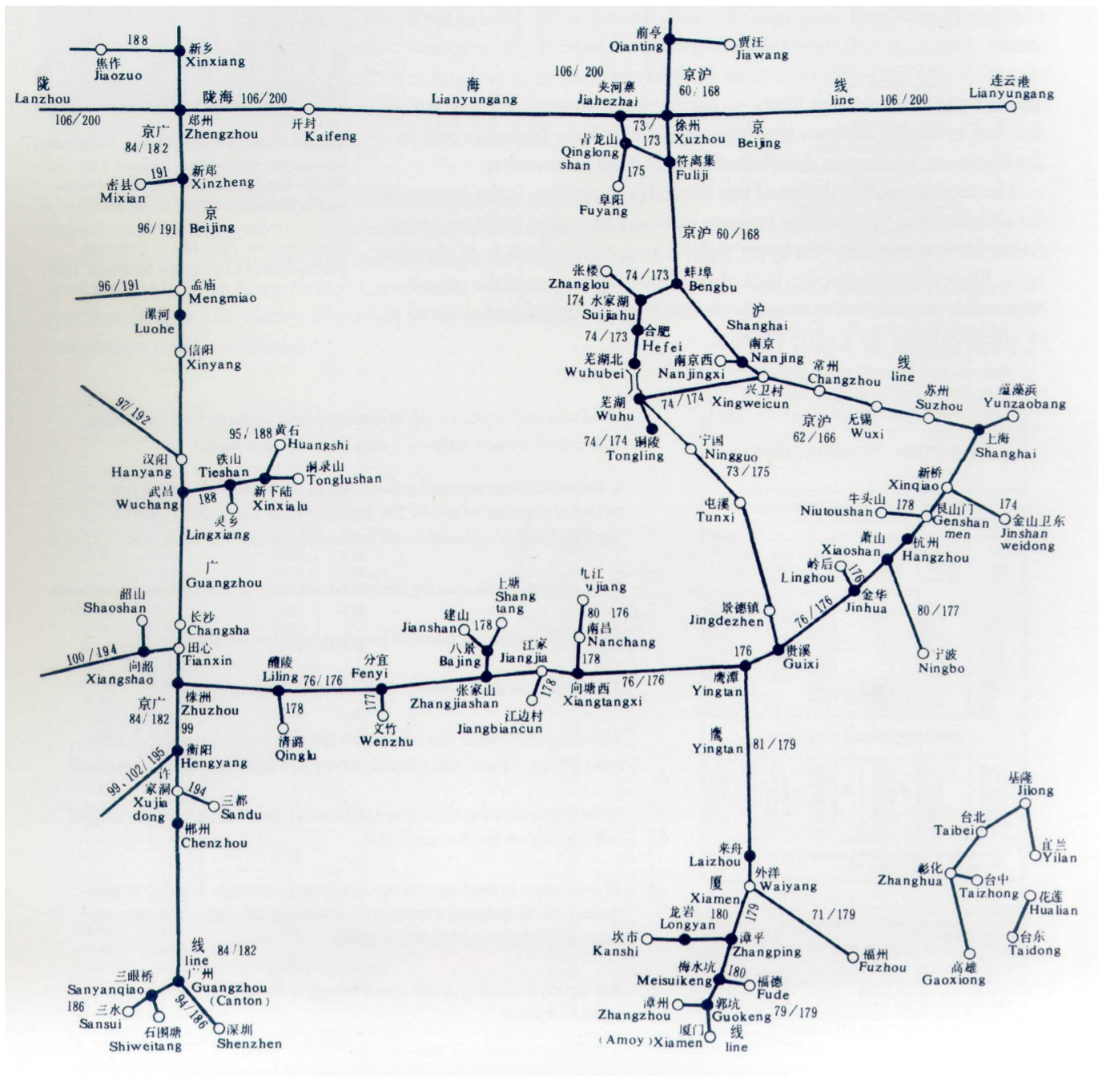
This map preserves both spatial and temporal relationships between the stops on this particular rail line. Although Tufte admits the chart has some aesthetic flaws, he commends it for its graphical organization. According to Tufte,
the full spatial relationships of towns, [are] patterns usually reduced to a witless alphabetical ordering in a conventional typographical index
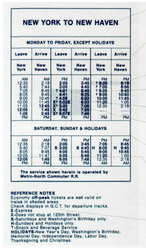
This map, however, encodes in its design the real shape and timing of the actual railway. The match between image and reality makes it so much more clear to the audience, unlike this old New York to New Haven schedule, which lies closer to the witless alphabetical ordering side of the chart spectrum. Its dense arrangement, extraneous lines and whitespace, and general clutter make it much harder to understand even after some examination.
These three charts best exemplify Tufte’s thoughts on charts of space and time. I would really recommend even just looking through the section because there are some fantastic images in there with more types of information and even more creative designs.