The ChartJunk Debate
The ChartJunk Debate starts off with this heated argument between Tufte and Holmes about the chart “Diamonds were a Girl’s Best Friend.” Tufte, in this case, disliking the unncessary overload of visualization and the failure to even represent the data correctly. Holmes, on the other hand, being of the opinion that design and interest are what attract the readers. The debate then really being between embellishments (or “ChartJunk” as it was coined) and minimalist.
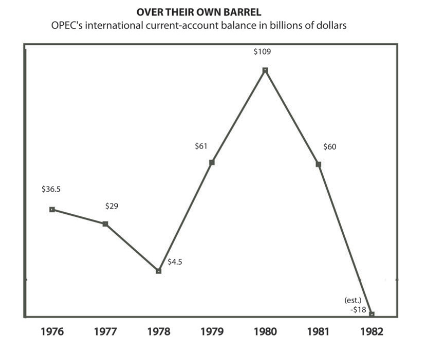
The debate paper then goes on to show examples of embellished and just plain charts as well show their pros and cons for each types. After having read this debate, I am of the opinion that I think it’s important to know which design to use for certain data sets. It’s also important to have that balance between embellishments and minimalism. Obviously even minimalistic charts can go wrong as they showed in the chart below where there is now reference line for zero.
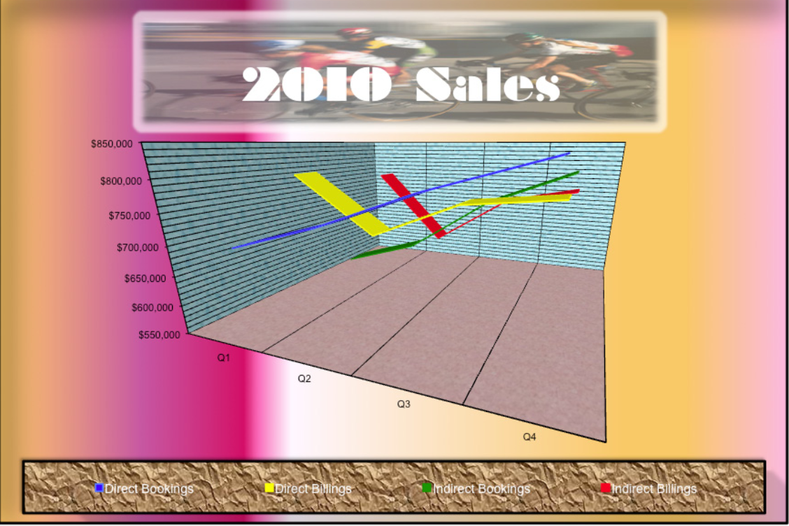
Or charts which are too embellished with too many aesthetics may not only be distracting but they can also be confusing to read if there is just too much going on. One example would be like the chart below where it’s difficult to tell exactly what the chart is supposed to represent or it’s also hard to see all of the data.
In any case, this paper describes how important it is to really understand the data and make sure to apply a good design which will enhance the message from the data to the user but in a way where it doesn’t come across as overwhelming.