What counts as Chartjunk? Does it matter?
In The Chartjunk Debate, Stephen Few weights in on an aesthetic question concerning the design of charts, graphs, and other data visualizations: is there room to incorporate more artistic elements that don’t have as much importance with regards to information transfer?
Few claims that the debate springs from Edward Tufte’s comments in Envisioning Information, where he railed against the practice of including elements in a visualization that don’t directly and uniquely further the goals of the author. In other words, no unnecessary repetition, and certainly no visual elements that detract from the readers’ ability to understand the author’s message. As an example, Tufte criticizes Nigel Holmes’ graph of the price of a diamond over time:
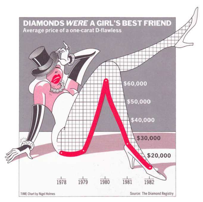
Beyond the question of taste, Tufte claims that Diamond’s chart fails to serve its purpose because it doesn’t adjust the numbers for inflation. So more than a failure of aesthetics, it’s a failure of visual communication of a particular point, and the aesthetics happen to distract from that failing, which makes him dislike the aesthetics.
Of course, none of this made Holmes particularly happy. Hence the birth of the “chartjunk” debate – Tufte on the side of minimalism, Holmes on the side of entertainment. But as a question of aesthetics more than anything else, there were no firm answers.
Enter a study produced by Scott Bateman, Regan L. Mandryk, Carl Gutwin, Aaron Genest, David McDine, and Christopher Brooks of the University of Saskatchewan: “Useful Junk? The Effects of Visual Embellishment on Comprehension and Memorability of Charts”. In it they claim to test the impact of chart junk, and find that embellishments can help make a chart’s core message easier to understand after some time has passed since it was last viewed, although it has no impact on a viewer’s immediate interpretation thereof.
Few’s critique points out that this study only tested charts against 20 different undergraduate students, used particularly well-designed charts (by Nigel Holmes, natch) that might not actually fall into a stricter definition of “chartjunk”, and used particularly badly-designed charts as examples of “not-chartjunk”. After looking at the charts used in the study, Few arrives to the conclusion that as long as an element of the chart serves to accurately and effectively communicate the author’s message, it should not be considered “chartjunk” – even if it is an embellishment.
Rather than debate the specific definition of “chartjunk”, which seems endless and political, I think academics in this field would be better served by advancing the idea that user studies should be performed on the visualizations that they produce. A/B testing and user experience testing is de rigueur in the software world from which I come, and serves to help authors better communicate their messages by helping them understand the weaknesses in their methods of presentation. Rather than dictate certain stylistic choices as globally off limits, why not advocate for a process of discovering the best stylistic choices for a given situation?