Assignment 4 Commentaries
Reading 1: Cartographies of Time
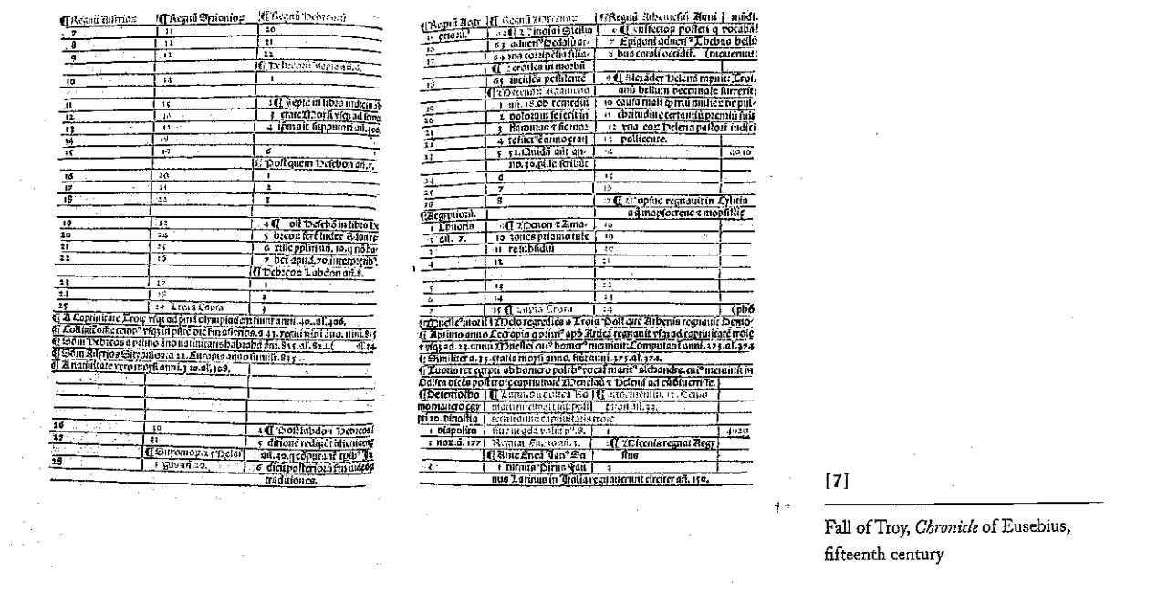
Eusebius’s chronological tables provide a well-organized look at different events and when they occurred. They are formatted with parallel columns and are made specifically to be easy to reference. I think that Eusebius’ goals in creating this table are particularly interesting in how they informed his final result. Although there is room for improvement, the tables are overall easy to understand and reference. I find it surprising that this model went in and out of fashion and am curious about any other methods for delineating chronological distance that appeared in between these phases.
The description of how our perception of time has changed throughout the ages and how that has affected the way that we represent it and the emphasis we put on chronological display was interesting. Thinking about timelines as both recent and as a metaphor rather than the only way to represent time is something that challenges many common conceptions of time itself and is a reminder that data visualizations directly relate to one’s understanding of underlying concepts.
Reading 2: The Potential of Spatial Humanities
This article’s main ideas were similar to those in the Drucker article. The biggest disadvantage of GIS is that it ignores swathes of information that add context and perspective to the data portrayed. However, it has the potential to display large amounts of information in accessible formats, and can change as people discover new, more comprehensive, ways to show data. It is also more robust than the mapping methods that were previously available.